|
All 5 books, Edward Tufte paperback $180
All 5 clothbound books, autographed by ET $280
Visual Display of Quantitative Information
Envisioning Information
Visual Explanations
Beautiful Evidence
Seeing With Fresh Eyes
catalog + shopping cart
|
Edward Tufte e-books Immediate download to any computer: Visual and Statistical Thinking $5
The Cognitive Style of Powerpoint $5
Seeing Around + Feynman Diagrams $5
Data Analysis for Politics and Policy $9
catalog + shopping cart
New ET Book
Seeing with Fresh Eyes:
catalog + shopping cart
Meaning, Space, Data, Truth |
Analyzing/Presenting Data/Information All 5 books + 4-hour ET online video course, keyed to the 5 books. |


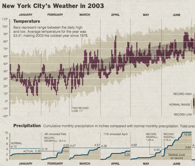
New York Weather Chart
January 4, 2004, p. A-15
The annual review of the weather by The New York Times appears below. It shows daily high and low temperatures for 2003, for a normal year, and for record days, along with cumulative monthly precipitation. Some interesting inferences about average, variation, and rates of change over the seasons can be made visually. Note the flat part of the cycle through mid-December to mid-February and then a fairly rapid rise in temperature mid-February to May. And so on.
 |
 |
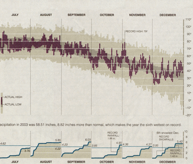 |
-- Edward Tufte
Response to New York Weather Chart, 2003
I feel that this graph could be improved by displaying the rainfall data as bars as well. Rainfall as measured by meteorologists is a discrete event, recorded as a total for each day to 9am, not a continuous one as inferred by the lines. It is hard to tell when the rain/snow fell. For example, if you look at December, on what day did the records actually occur? The first slope marked as a record covers about 4 days.
If you had a bar for each day it would be easy to see how many days it actually rained in a given month. A different coloured bar could then indicate whether or not the rain value was measured as rain or snow.
Can someone tell me what the conversion factor for snow to rain is? What is a foot of snow in inches of rain?
-- Andrew Nicholls (email)
Response to New York Weather Chart, 2003
The figure I've always known about was for centimetres and a factor of ten. For example, 17cm of snowfall will be 17mm of rainfall. Of course, this is, at best, an estimation as the flake formation plays a part in how well snow packs.
Snow depth is a very difficult thing to estimate, too. Wind disturbance and melting all have to be taken into account. It is even more complicated when there is a mixture of snow and rain. The snow depth needs to be measured, then all the snow and rain in the rainguage (including the collecting funnel) is melted and measured, and the snow to rain converted value of the snowfall is subtracted to get the rainfall amount.
-- Adam (email)
Response to New York Weather Chart, 2003
Here's a six month cloudiness and solar azimuth map in Bristol UK, created with a can, a pinhole, and a piece of film. All data formatting is done by celestial motion.
https://antwrp.gsfc.nasa.gov/apod/ap090115.html
-- Ron Wurtz (email)
Response to New York Weather Chart, 2003
Since seeing this graph, I have searched for a web site that would show such data for any location and time-span. I have found one: WeatherSpark.
-- David McCabe (email)
|
|||||||||||