|
All 5 books, Edward Tufte paperback $180
All 5 clothbound books, autographed by ET $280
Visual Display of Quantitative Information
Envisioning Information
Visual Explanations
Beautiful Evidence
Seeing With Fresh Eyes
catalog + shopping cart
|
Edward Tufte e-books Immediate download to any computer: Visual and Statistical Thinking $5
The Cognitive Style of Powerpoint $5
Seeing Around + Feynman Diagrams $5
Data Analysis for Politics and Policy $9
catalog + shopping cart
New ET Book
Seeing with Fresh Eyes:
catalog + shopping cart
Meaning, Space, Data, Truth |
Analyzing/Presenting Data/Information All 5 books + 4-hour ET online video course, keyed to the 5 books. |


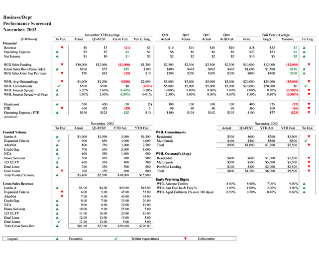
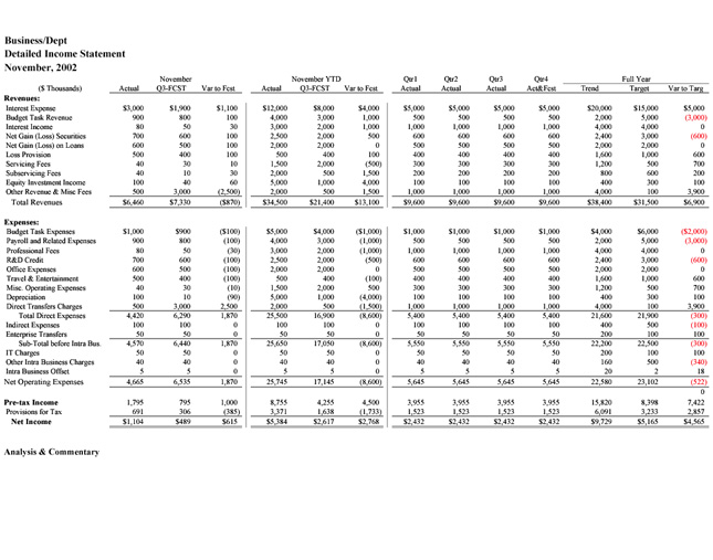
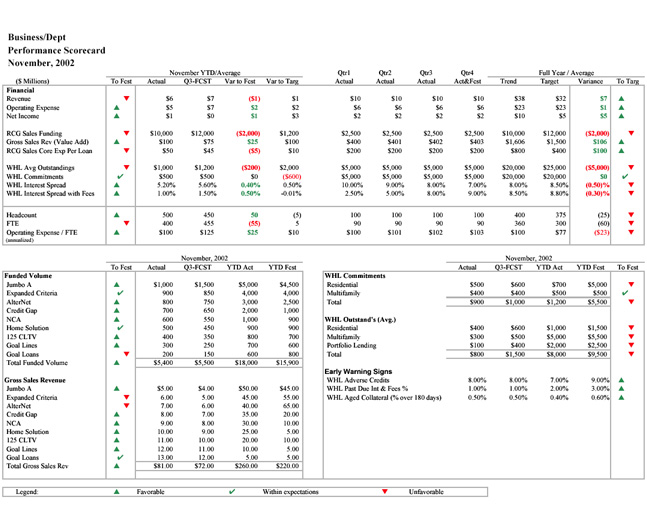
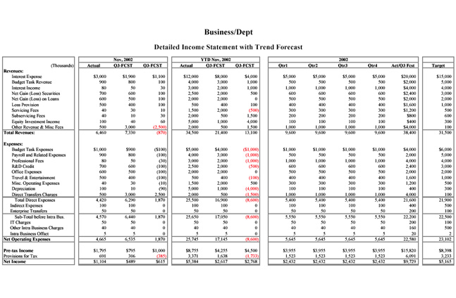
We are redesigning a set of scorecards and related financial reports intended for Senior Management. Our company has a history of using black boxes to visually separate and organize blocks of data. We have been slowly changing this practice by first adopting 50% gray boxes, then doing away with some boxes and eventually moving to 25% gray for remaining boxes and heading underlines, etc. In the current design cycle, we are removing even more, but have run up against the question of whether or not some level of "outlining" is necessary to visually organize the data or to provide visual weight.
The pdf files below show two prototypes that highlight the types of reporting design issues we are confronting. The first page is a Scorecard, and the second is an example of a detail page that would typically supplement scorecard information. The examples do not "foot" as we doctored up the data out of concern for confidentiality.
We would like feedback mainly on the use of lines to visually organize the data, but we are also concerned with the appropriate use of color, bold face and other formatting techniques. Bear in mind we are working in EXCEL, in a fast-turnaround automated environment.
Thanks in advance for any feedback.
Paul Grande
PROTOTYPE 1 (2 pages):
 |
 |
PROTOTYPE 2 (2 pages):
 |
 |
-- Paul Grande (email)
Well my poor eyesight had difficulty reading the charts at 1280/1024 screen resolution, so I sent it to the printer. On laser printer I failed to "see" what you were describing. Then I printed to color inkjet (less resolution than laser, but w/color) and I noticed the line differences between the examples. For me, the additonal lines/boxes aid in seeing the distinctions between the horizontally displayed data categories.
-- Gene Prescott (email)
Original PDF files are available upon request.
The imbedded images do not fully highlight the differences. If anyone is interested in reviewing the protoypes in native PDF format, please send me an E-mail and I will send them to you directly.
Thanks
Paul Grande
-- Paul Grande (email)
The emailed PDFs were much better to view. My quick perception is still the same though ... that the vertical lines that divide the kinds of data being displayed help. Without the lines my eyes track across without necessarily noticing the data type has changed.
-- Gene Prescott (email)
Why aren't these data plotted over time, in a run chart or control chart? Two point comparisons (last month to this month, this month last year to current month) are not useful and are usually misleading. See Donald Wheeler's excellent little book - Understanding Variation, available from SPC Press.
-- Steven Byers (email)
Vertical lines help.
Also, in answer to the previous responder, presumably the reason these numbers are not shown as some kind of chart is that there are so many different metrics on one page and this is important to the concept of "scorecard".
What does it look like close to the start of the financial year? Much more white space I'd guess.
-- Matthew Leitch (email)
|
|||||||||||