|
All 5 books, Edward Tufte paperback $180
All 5 clothbound books, autographed by ET $280
Visual Display of Quantitative Information
Envisioning Information
Visual Explanations
Beautiful Evidence
Seeing With Fresh Eyes
catalog + shopping cart
|
Edward Tufte e-books Immediate download to any computer: Visual and Statistical Thinking $5
The Cognitive Style of Powerpoint $5
Seeing Around + Feynman Diagrams $5
Data Analysis for Politics and Policy $9
catalog + shopping cart
New ET Book
Seeing with Fresh Eyes:
catalog + shopping cart
Meaning, Space, Data, Truth |
Analyzing/Presenting Data/Information All 5 books + 4-hour ET online video course, keyed to the 5 books. |


This video is also available on YouTube and Vimeo
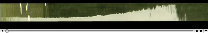
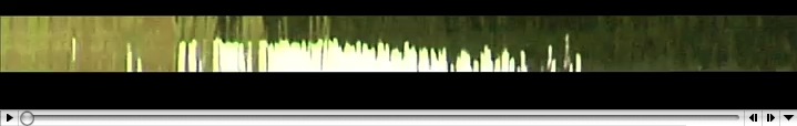
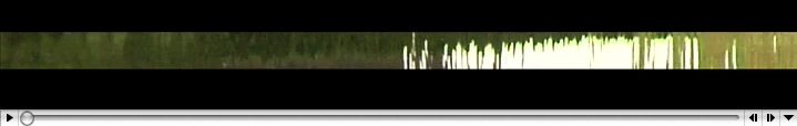
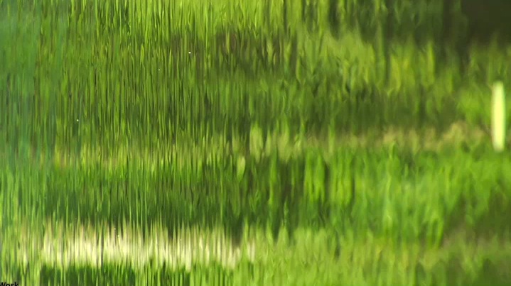
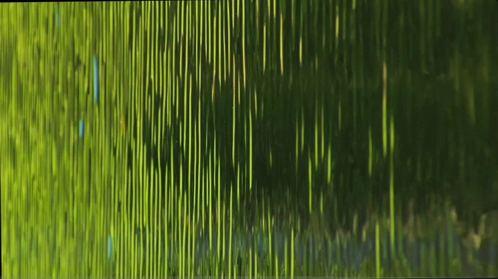
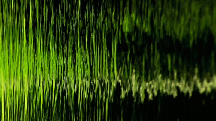
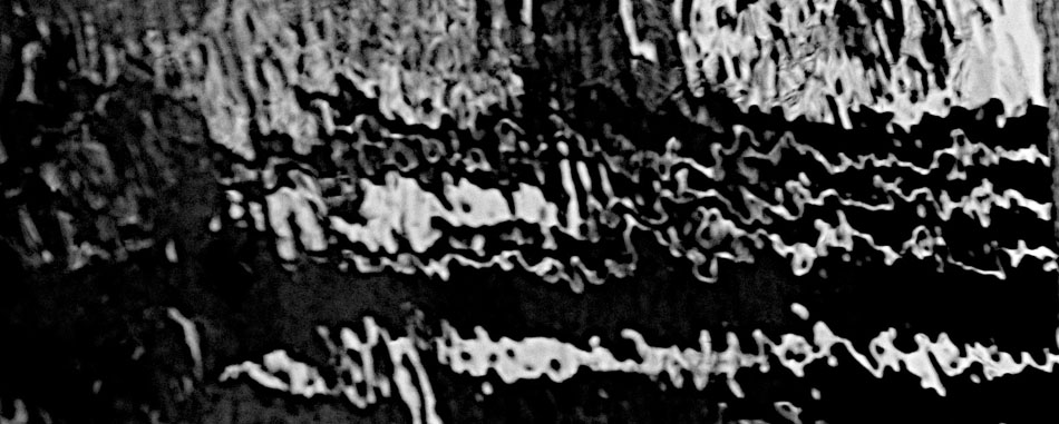
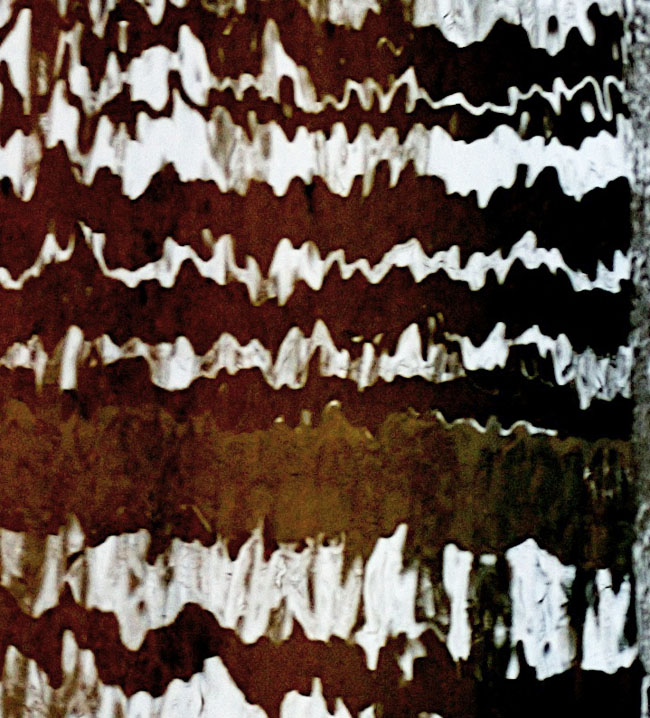
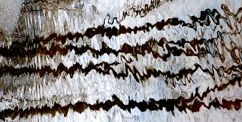
"Wavefields" are data graphics that draw on and completely fill the entire
display surface, using every pixel on the data plane to show high-resolution,
complex, multiple, animated statistical data-flows. Wavefields extend my work on
sparklines.
These high-definition videos of waves (that is, very rich 3D time-series projected
onto screen flatland) sketch out methods to bring color, layering, cross-flows,
overlaps, and animation to the display of statistical data. Note the vertical
flows on an apparent plane separate from the horizontal flows.
To see wavefields more deeply, it is helpful to slow or stop the animation by the
movie controls for pace and forward/backward.
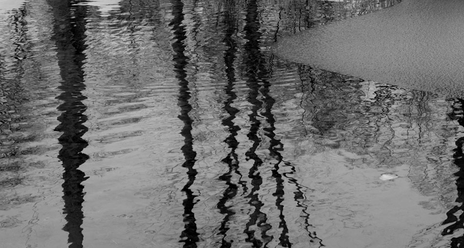
Andrei Severny and I generated these wavefields by editing HD movies of water
waves and reflections on those waves. The thin white sparklines result from
waves activating edges of a big sculpture (Hogpen Hill #1) reflected in the water.
The ideas here are to blur and to reduce distinctions between movies and statistical
graphics, to get some visual depth to data graphics, and to bring all the capacities of
HD movie-making to data-graphics-making. As the metaphor for sparklines is the
resolution of typography, the metaphor for wavefields is the HD video (which
records approximately 1 gig per minute, an excellent data throughput).
The next steps are to show full 2D fields instead of the strips of data shown here,
to provide some subtle grid-lines for scaling and reference-stabilizing the data flow,
and to use some arrows and letters to label key elements.
 |
 |
 |
 |
 |
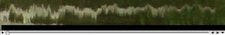 |
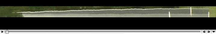
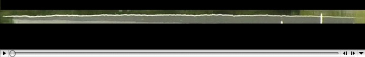
During slow scrolling across the image immediately above, note the vertical line artifacts,
which suggest that error bars, data extremes, and scaling lines could appear intermittently
during animated displays of sparklines or datafields.
-- Edward Tufte
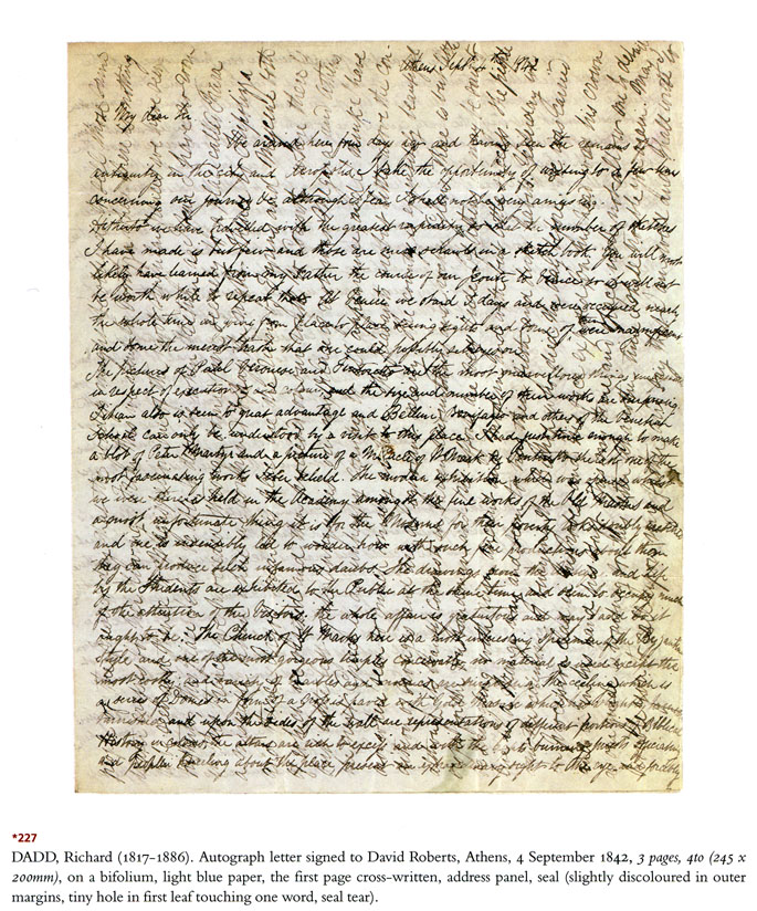
Cross-writing
Here's an intriguing, albeit nearly unreadable, example of cross-writing, a technique with some vague similarities with wavefields:
 |
-- Edward Tufte
User-controlled scrolling in datafields
Further exploration of the movies above indicate the value of mixing still-land and movieland in looking at complex data.
(Use the mouse roller-ball to shift among the moving, slowing, and still.) These shifts also might eventually allow showing
measurement scales and typography in particular scenes.
-- Edward Tufte
wavefields + medical data
Cardiac visualization, esp. Ultrasound, is frequently used to show heart motion. It seems to me that this could be augmented by an overlay of the 12-lead, 360-degree ECG trace (i.e., aVr, aVl, I,II,III,...) The real-time waveform would be shown synchronously with the PQRST complex using your suggested method, and could highlight ST segment elevation or J-point arrhythmias. Furthermore, a dynamic tracing of cardiac output and stroke volume would serve to illustrate both visually and numerically situations in which stroke volume is shallow and changes in pulse as these would complement and provide the physical "translation" from the numeric to the visual chane in cardiac output. Also applicable to visualzing intra arterial balloon pump (IABP) operation. I could also see the application used as a diagnostic adjunct in emergency departments for patient with acute cardiac ischemia or congestive heart failure.
Just a thought.
-- John Zaleski (email)
Applied wavefields
Zach Beane has put together some very interesting box office graphics, sort between bump charts and wavefields: http://www.xach.com/moviecharts/
-- Niels Olson (email)
Response to Wavefields: intense animated data graphics (+new movie with sound)
If you want to work with a programmer to make actual, data-based wavefields, I am at your service.
(I assume this isn't some kind of self-parody.)
Regards, David McCabe.
-- David McCabe (email)
Event waves
I was recently reviewing the excellent video work on this site, and
thought a short video I created might interest this board.
The video considers the problem of illustrating an event wave, that is
the space of time between when an event occurs and the time it takes
that event to affect an observer.
The video relates to ET illustration of events via slow motion in
video, the wavefield videos, as well as ET writings about and photos of
horizons.
Event Wave Propagation: Time
Music: "Revolve" by hisboyelroy
In my initial video test, I split the video frame into 7 columns. The
width of each column increases until the 7Th column encompasses the
entire right side of the video frame and displays a complete 4:3 video.
Each column displays a specific offset of about -.33 seconds so that
the first column is nearly 2 seconds ahead of the final column. In this
way one can watch the video at full speed while anticipating future
events.
The idea is also reversible if the spectrum is reversed on the right
side of the video and the time offset is set to positive values,
allowing events to linger.
A more granular test with smaller offsets with many more columns, would
allow for a much more fluid example.
I also wanted to thank you for the inspiration and the content provided
on this board.
I'd also be interested to know what ET thinks of Major League Baseball's
introduction of slow motion instant replay video for home run calls.
Sincerely,
Jeff Berg
-- Jeff Berg (email)
Wave Field at Storm King
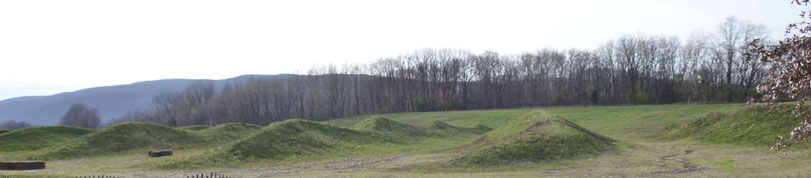
Maya Lin has a new outdoor piece Wave Field at Storm King Art Center in Beacon, New York. Here's The New York Times video.
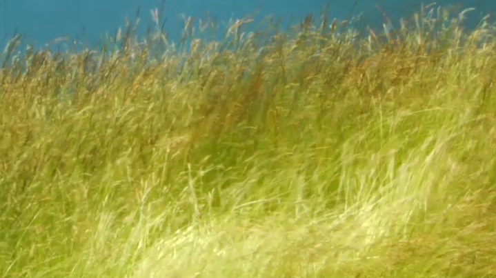
A trade-off in wavefield artworks in the landscape is between static vs. dynamic waves. Still waves frozen in contoured land provide the viewer with many good shifting local horizons by means of comfortable walking around the shaped but unmoving land. Dynamic waves, such as windblown hayfields growing on contoured land, are active, flowing, changing (as shown in our wavefield videos above), but are less comfortable for walking around. Dynamic wavefields do, however, provide magnificent views at a distance.
Maintenance of both static or dynamic fields is somewhat difficult because of mowing the wavy ground. Also dynamic wavefields require annual farming operations. Those operations might well generate interesting new seasonal versions of the artwork.
It would be interesting to see Maya Lin's Wave Field planted in winter rye. That way the shape of the land beneath would be projected to the top surface of the waving winter rye, almost as if the land itself was flowing in the wind. Both the static and dynamic versions will look good covered by snow; in fact both will look pretty much alike although the hayfarm dynamic version might be somewhat more textured.
At Hogpen Hill Farms last month we planted 6 acres of winter rye on gently contoured ground to study (1) dynamic wavefield art and (2) how to install large outdoor sculptures on a farmland of waving grain. Maybe we'll have good results in the spring. Those results should provide some evidence and experience relevant to my word-art handwaving above.
-- Edward Tufte
Storm King: May Lin's Wave Field
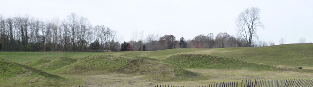
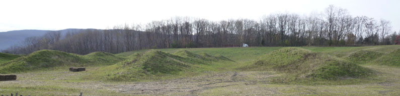
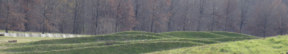
A few days I visited Storm King Art Center and saw the amazing-reaching-for-the- sky Calders, de Surveros, and Libermans. The only David Smith Tower, one of Smith's very best works, was gone, back to the Smith estate.
Below are pictures of Maya Lin's Wave Field. It is very difficult to grow grass on hills in the northeast, with hot summers and cold winters. It takes several years to establish a good grassy field. The tops of hills dry out in the summer, which favors patchy weeds over grass. There was also lot of rain this summer also which in turn provokes erosion and drainage problems for landscape sculpture in the northeast U.S. And so the piece shown below was caught in a chronically complex and difficult climate. The concluding photograph, nonetheless, captures the subtle local horizons produced by the landscape piece.
There are land maintenance problems to be solved before the piece can be fully assessed.
 |
 |
 |
 |
-- Edward Tufte
Response to Wavefields: intense animated data graphics (or landscape art)
code_swarm - Python
from Michael Ogawa on Vimeo.
Python is the language of choice for Google's App Engine.
Guido is Guido van Rossom, currently at Google.
-- Niels Olson (email)
Response to Wavefields: intense animated data graphics (or landscape art)
Roger Ebert passes along a letter from Walter Murch, the sound engineer of small art films like "Apocolypse Now".
The biggest problem with 3D, though, is the "convergence/focus" issue. ... the audience must focus their eyes at the plane of the screen -- say it is 80 feet away. This is constant no matter what.In Murch's usage, 3D refers to virtual images, and "holographic" refers to real images.But their eyes must converge at perhaps 10 feet away, then 60 feet, then 120 feet, and so on, depending on what the illusion is. ... And 600 million years of evolution has never presented this problem before...
it is like tapping your head and rubbing your stomach at the same time, difficult. So the "CPU" of our perceptual brain has to work extra hard, which is why after 20 minutes or so many people get headaches.
Nothing will fix it short of producing true "holographic" images.
-- Niels Olson (email)
Wavefields spotted in the wild
Brendan Gregg is a Solaris wizard, author of two
books, and his illustration of vibration effects on disk latency made the rounds a couple years ago. His latest
illustration includes not only a fairly novel sparkline (like these: ![]() ,
, ![]() ), but what is actually old fare in dtrace work: wavefields. In this case,
using them to visualize performance in a
production cloud of 5,312 virtual machines.
), but what is actually old fare in dtrace work: wavefields. In this case,
using them to visualize performance in a
production cloud of 5,312 virtual machines. 
-- Niels Olson (email)
Response to Wavefields: intense animated data graphics (or landscape art)
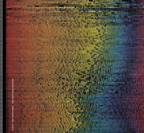
Vijay Pandurangan has a nice interactive presentation of the colors found in movie posters over the last century.
http://www.vijayp.ca/movies/new_page.html
-- Niels Olson (email)
|
|||||||||||