 |
French and English Translation,
Losses of the French Army in the Russian Campaign
This poster shows both the French original of 1869 and our new English translation.
Printed in two color on fine archival paper, 20.5” by 22.4”. Minard's sources. Minard's biography.
Poster: Historic Visual Diary of Spaceflight: Cyclogram
Handmade by a Russian cosmonaut, Georgi Grechko, this cyclogram shows a 96-day flight of Salyut 6. Some 22 parallel time-series show
1500 sunrises and 1500 sunsets during the flight, a schedule for space walks and baths, and visits of resupply ships bringing equipment,
fresh fruit, and gingerbread. Printed in six colors on fine paper, 36” by 20”.
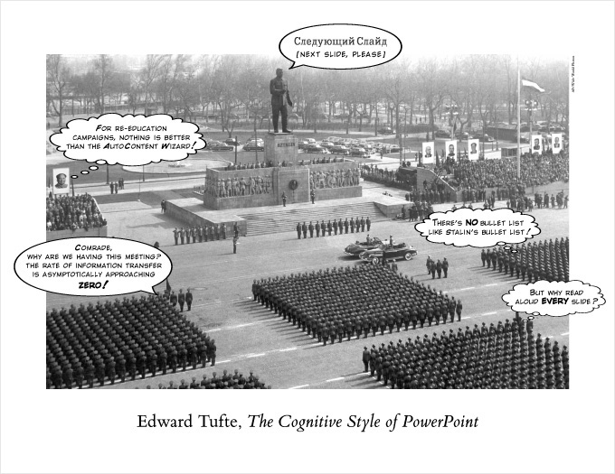
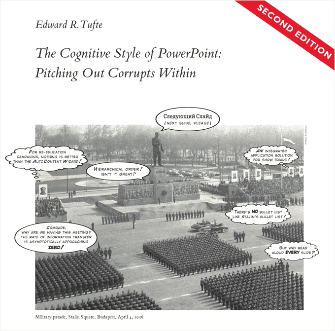
Poster: The Cognitive Style of Powerpoint
Poster, The Cognitive Style of PowerPoint, 22" by 17"
Ebook:
The Cognitive Style of Powerpoint: Pitching Out Corrupts Within
In corporate and government bureaucracies, the standard method for making a presentation is
to talk about a list of points organized onto slides projected up on the wall. For many years,
overhead projectors lit up transparencies, and slide projectors showed high-resolution 35mm
slides. Now "slideware" computer programs for presentations are nearly everywhere. Early in
the 21st century, several hundred million copies of Microsoft PowerPoint were turning out
trillions of slides each year.
Alas, slideware often reduces the analytical quality of presentations. In particular, the
popular PowerPoint templates (ready-made designs) usually weaken verbal and spatial reasoning,
and almost always corrupt statistical analysis. What is the problem with PowerPoint? And how
can we improve our presentations?
32 pages.
For more about PowerPoint, here's a sample from the essay: PowerPoint Does Rocket Science--and Better Techniques for Technical Reports
|
Archival Graph Paper for Artists and Scientists
Graph paper with a ghost grid printed on acid-free paper (same paper used in the books), 48-sheet pads.
|