|
All 5 books, Edward Tufte paperback $180
All 5 clothbound books, autographed by ET $280
Visual Display of Quantitative Information
Envisioning Information
Visual Explanations
Beautiful Evidence
Seeing With Fresh Eyes
catalog + shopping cart
|
Edward Tufte e-books Immediate download to any computer: Visual and Statistical Thinking $5
The Cognitive Style of Powerpoint $5
Seeing Around + Feynman Diagrams $5
Data Analysis for Politics and Policy $9
catalog + shopping cart
New ET Book
Seeing with Fresh Eyes:
catalog + shopping cart
Meaning, Space, Data, Truth |
Analyzing/Presenting Data/Information All 5 books + 4-hour ET online video course, keyed to the 5 books. |


Dear Mr. Tufte,
I am looking for some feedback on the use of interactive data maps on the web. I'm experimenting with a 'histogram key' for b/w data maps.
My concern here is that the use of quasi-continuous shading might lead to 'eye bobbing' between the data map and the histogram key.
More experimental is the use of color data maps.
In this case I'm hoping that interactivity is the path to understanding, at least for the mixing of two colors.
I would be grateful for any criticism you or your readers could offer.
I look forward to your seminar in Portland later this month.
Sincerely,
Joe Meyer
-- Joe Meyer (email)
Response to interactive data maps
An interesting concept, but the message gets lost in a bit too much interface. After looking at these three links and selecting some data, I am not sure what I am seeing. These maps should be a means of analyzing locational distributions and spatial patterns. Right now they are more data displays and don't highlight to me the important, if any, differences in the data. However, this could be because I am not familiar with the data and how it might be used. Some brief, if scattered, comments on the maps follow...
The most important fact is that the chloropleth color values are not labeled, and I have no idea what the range is. The histogram is a bit cluttered and hides too much data. I'd give a clear labeling system to both map values and the histogram. Also, an accompanying table would be helpful to sort through the spatial data with plain old rank order information.
Also, the colors on the screen are too dark. Go lighter and let the country boundaries show through. The heavier colors bleed together and leave little for the viewer to distinguish between different counties.
The options for color and data choices are confusing to the user, or this user at least. It seems that there is a range of variables but no way to know how they relate. Instead of having most of the screen space dedicated to choosing contrasting (and not very pleasing visually) color schemes, I'd look at how to get this school data to the user in a meaningful way to communicates something about the data itself, and allows the user to select appropriate bits of that data. This is no easy task, I am sure.
By allowing too much choice in colors and displays of data, you are heading towards the "Excel Complex" of information display, i.e. the display becomes more important than the message. Focus on how this data can help the people who might need to use it. A good start would be to separate in different pull-downs all the data types. This is opposed you the current selection method of all data in one pull-down. Right no it is unclear if the data are all related, how they relate, ect. Also, provide tabular data with the results above.
I think you off to a great start by providing some meaningful spatial data instead of just tables upon tables. I am just wondering how to get at all the information and what it means. I'd like to see this as time passes and you make changes.
-- Chris Gillis (email)
Response to interactive data maps
The state of the art in color blot maps is Linda Pickle, et al., Atlas of United States Mortality (National Center for Health Statistics, 1996); and for gray-scale blot maps, see the revised cancer maps on pp. 16-20 of Edward Tufte, The Visual Display of Quantitative Information.
But there are much more important issues than coloring schemes for blot maps. Indeed, the coloring issues are trivial compared to the problems of wise statistical inference here.
First, usually the analyst is trying to make inferences about individuals. But the data are at the highly aggregated level of counties! And county-by-county correlations can even have the wrong sign when compared to individual level correlations. For example, county-by-county correlations in some states indicate lower levels of voting turnout as county income increases--clearly untrue at the individual level (in survey data). This is called the problem of "ecological correlation;" there is a big literature on the matter.
Second, looking at blot maps mixes up acres with people. Such maps wrongly equate the visual importance of each county with its geographic area rather than, say, the number of people living in the county. Our visual impression is entangled with the circumstances of geographic boundaries, shapes, and areas--the chronic problem endlessly afflicting shaded-in-area designs. A partial solution is seen in Envisioning Information, pp.40-41, the Japanese mesh maps. The U.S. Bureau of the Census has also done some mesh-map work; maybe someone can add some information on mesh maps to this thread.
Blot maps (choropleth maps in the jargon) might now and then be helpful for finding intriguing hot spots, or detecting relationships between the encoded variable and geographic location (and the many variables entangled with location), or letting people know how their county compares with others. These are all worthy aims in making blot maps; but you had better be careful and find out if the blots maps are telling you the truth. You will need a lot better data than county-by-county aggregate numbers to learn what is really going on. That is the big lesson in using the maps for teaching purposes (as you appear to be), not having students play with color schemes.
So, for teaching, blot maps are helpful in learning about statistical detective work, about levels of data and levels of inference, about ecological correlation, about the need for replication and confirmation, about spurious correlation, and about how to get serious about statistical data analysis.
For news reporting, blot maps are very good at letting readers compare their areas with others. In the last 5 years or so, the New York Times has published a brilliant series of blot maps for the country and for New York city on voting, ethnicity, disease, etc. You should look at those.
-- Edward Tufte
C.G. and E.T.,
Thanks for the comments.
I have made small improvements to the page such as adding a title to the map and adding descriptive headers to the pull down menu.
I have also decided to shelf the work with color.
I should have mentioned in my first post that by clicking on the map brings up a table of the values plotted: selecting a county gives a table of districts in that county while clicking on the white background of the image gives a table of counties in the state.
These tables are sorted by clicking on a column header and the scope of investigation is changed , (e.g. from districts in a county to schools in a district), by clicking on a row name. Furthermore, selecting a control variable gives a table of the residuals as well as a OLS fitted scatter plot.
What I am after with this effort, (and would appreciate feedback on), is the use of exploratory interactions to promote understanding of a data set.
I had a look at the Japanese Mesh maps in my brand new autographed copy of Envisioning Information pp 40-41 and see great value of these. (I was surprised that a key was not provided.) The data are available for me to reproduce this type of effort here. However, the variation in the density of schools (821 in Harris County to 10 in Washington) seems to make an appropriate grid size impossible to find.
-- Joe Meyer (email)
We have just released a beta version on the web of Social Explorer, which uses both chloropleth and dot maps to visualize information from the 2000 and earlier US Census. The web link is www.socialexplorer.com. It allows one to create and print data and reports starting with the US and working down to the Census Tract. Streets are also shown. We also have some slideshows of change in NYC, and one can make and show, but not yet save ones own slideshows. We are soliciting any comments or feedback. The navigation tools are typcial of windows, a drawing box to zoom in or out, a pan tool, etc. We have set it up with adaptive scaling, and a number of other things. There are several hundred data elements from Census 2000, and we have map sets for LA and NY historicallly, and one of Queens neighborhoods. Direct any comments to me or post them. Thanks.
-- Andrew A. Beveridge (email)
Examples of information design/conceptual graphics (cagtegorical/ordinal/dimensional/properties oriented)
Can someone point to a reliable on-line source which presents a useful variety of conceptual or analytical graphics? My gap or need is centered less on quantitative oriented graphic examples, and more on conceptual relationships (some of which may have at least categorical or ordinal properties). For example, relating trends or several dimensions in buying behavior, showing trends in the market (offshoring of work, early vs. late adopters, insourcing/outsourcing work, use of open source software/vs proprietary software, etc.).
Often, the habit in the IT industry is to use 2 by 2 graphs to juxtapose such dimensions...I am looking for alternative ways to relating/examining/revealing concepts which may not have precise values, and I thought that if I could examine a bunch some ideas might come to mind. Thank you.
-- Bill Hutson (email)
Tim Klimowicz has produced an interesting transient map of non-Iraqi casualties in Iraq. While he identifies limitations of the data sources and presentation (eg he set out to include Iraqi casualities but spatial and temporal information is lacking), he has made some interesting efforts to convey casualty concentrations over time. Some absolute numbers would probably enhance the map together with the range of estimated Iraqi casualties for comparison.
-- Simon Shutter (email)
https://www.theatlantic.com/images/issues/200703/saydia-map.jpg
Atlantic Monthly, found through Andrew Sullivan's blog page. Atlantic has better than average maps in most issues.
This example is a fascinating map of a Baghdad backstreet - each house is keyed to a block of narrative describing the fate of the family that occupied/occupies the property (generally the past tense, as most of them are now vacant - this is conveyed by a color code). Detail map is keyed to a larger district map that shows how this set of private local trgedies maps onto the totality of the city. There is a lot of detail that could be criticized (though the thing probably looks better in print than on the Web), but a shockingly good fusion of indirect political criticism, data aggregration and design all the same.
-- Brian Davies (email)

John Tukey would be proud of this map of the Somme, from the archives of the Western Front Association. The density of bodies on the battlefield has been simply written on the map by the surveyor, square by square.
-- Derek Cotter (email)
The Census Atlas of the United States, 2007 is available for downloading at http://www.census.gov/population/www/cen2000/censusatlas/
All 300 pages are available in 19 PDF files.
-- David Cerruti (email)
John S. Brownstein*, Clark C. Freifeld, Ben Y. Reis, Kenneth D. Mandl. Surveillance Sans Frontieres: Internet-Based Emerging Infectious Disease Intelligence and the HealthMap Project. PLoS Medicine Vol. 5, No. 7, e151 doi:10.1371/journal.pmed.0050151
Wired summarizes: Researchers Track Disease With Google News, Google.org Money
There are a couple of obvious challenges for further work. First, common diseases are underreported, thus the systematic, mandatory reporting via the CDC's Morbidity and Mortality Weekly Report. Perhaps Boston Children's and CDC can collaborate. The total number of reports emanating from developed countries is presumably higher than developing countries, and the effects of underreporting common diseases and over-vs-under reporting are likely to interact at different orders of magnitude. Finally, there is the potential for unblinding, as discussed by the same author, Brownstein, in the New England Journal of Medicine last year*.
-----------------
*John S. Brownstein, Ph.D. No Place to Hide -- Reverse Identification of Patients from Published Maps New Eng J Med, Volume 355:1741-1742.
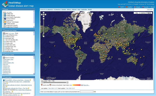
-- Niels Olson (email)
Here is a wonderful use of mapping/animation, giving a graphic representation of the American Civil War in 4 minutes. It offers an ongoing display of the changing territorial lines of North/South, when and where major battles occured, Lincoln's elections/assasination, all with the mounting death toll rolling by...I would presume to say that Minard would have been fascinated.
http://www.idkwtf.com/videos/latest-videos/the-civil-war-in-four-minutes
-- Dean Meyers (email)
|
||||||