|
All 5 books, Edward Tufte paperback $180
All 5 clothbound books, autographed by ET $280
Visual Display of Quantitative Information
Envisioning Information
Visual Explanations
Beautiful Evidence
Seeing With Fresh Eyes
catalog + shopping cart
|
Edward Tufte e-books Immediate download to any computer: Visual and Statistical Thinking $5
The Cognitive Style of Powerpoint $5
Seeing Around + Feynman Diagrams $5
Data Analysis for Politics and Policy $9
catalog + shopping cart
New ET Book
Seeing with Fresh Eyes:
catalog + shopping cart
Meaning, Space, Data, Truth |
Analyzing/Presenting Data/Information All 5 books + 4-hour ET online video course, keyed to the 5 books. |


Project Management Graphics (or Gantt Charts), by Edward Tufte
Computer screens are generally too small for an overview of big serious projects. Horizontal and vertical scrolling are necessary to see more than about 40 horizontal time lines for a reasonable period of time. Thus, for large projects, print out the sequence on a big roll of paper and put it up on a wall.
The chart might be retrospective as well as prospective. That is, the chart should show actual dates of achieved goals, evidence which will continuously reinforce a reality principle on the mythical future dates of goal achievement.
Most of the Gantt charts are analytically thin, too simple, and lack substantive detail. The charts should be more intense. At a minimum, the charts should be annotated--for example, with to-do lists at particular points on the grid. Costs might also be included in appropriate cells of the table.
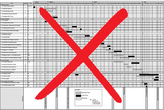
About half the charts show their thin data in heavy grid prisons. For these charts the main visual statement is the administrative grid prison, not the actual tasks contained by the grid. No explicitly expressed grid is necessary--or use the ghost-grid graph paper. Degrid! See The Visual Display of Quantitative Information on chartjunk, Envisioning Information on layering and separation, and Visual Explanations on the ghost-grid graph paper. Here is an excellent bad example:
 |
The typography can be improved. The practice of first-initial-caps makes every word read a proper noun. Other problems are all-caps, poorly chosen fonts, mysterious acronyms.
The column of tasks too often is organized in an elaborately baroque hierarchy, emulating the organization chart. Maybe tasks should be organized differently. For a start on clear thinking in this regard, see the great book by Fred Brooks, The Mythical Man-Month,which is about managing large programming projects.
Project management must have a vast literature; presumably business schools teach this all the time. What are the deep principles and how can they show up in the design and organization of a project? That is, have some real analytical thinking behind the chart, not the guesses and generic thinking about project management made by those who write Project-type charting programs.
Find out what the very best project managers do.
How could all those big projects in the last 3,000 years ever been done without a Gantt chart? Very complex things can be done without the aid of the central authority of the Gantt chart.
The graphical timetable might be an alternative model. See all the time/activity schedules in Envisioning Information, particularly on pages 45, 101-119.
The design of project charts appears to have regressed to Microsoft mediocrity; that is, nothing excellent and nothing completely useless. (Is the reduction of variance around a modest average the consequence of monopoly?) Most the project charts (do Google search on "project management charts" or "Gantt charts" to see plenty of examples) look the same and make the same mistakes: analytically thin, bureaucratic grid prison, not annotated, little quantitative data. The computer Gantt charts, so lightweight and tinker toy, do not appear to have been designed for serious project management.
Of course, there is also the perfectly reasonable common sense of the Gantt chart. Such a chart might be helpful, if only to reveal guessing, but don't make a big deal about it. Just put a big long roll of paper up on the wall, updated every so often.
Ten years ago I sketched out a project-management interface. The ideas are:
• Multiple series of different types in parallel at top. (See chapter on parallelism in Visual Explanations).
• A context-bar for overview, with the detailed display shown beneath. The color box on the context-bar should show the overall location of the detail below. This is the same idea I used in the thunderstorm animation described in Visual Explanations; that is, a large-scale animation ("large scale" means the houses are big) placed in context by a still-land small multiple showing the entire history of the storm.
 |
• Vertical linkage showing how the elements are sequentially inter-linked, over several functions simultaneously.
• Fairly detailed notes exposed on the top; further animation and data residing underneath each box.
• Grid is self-defining by position. No lines for grid prison at all. Pixels are devoted to content, not heavy-handed lines.
THE BASIC DESIGN: DETAIL WITHIN CONTEXT
 |
The global project chart then can go at least two ways. First, pull apart local detail for special subgroups. Note the labels on both sides
of graphic--for the categories (left and right) and for the times (top and bottom). Also note that many boxes are enlarged, not just one.
LOCAL DETAIL IN PROJECT MANAGEMENT
 |
Then there are multiple projects, which can be looked over by bringing together multiple context bars from the various projects,for whatever that's worth.
MULTIPLE PROJECT OVERVIEW = MULTIPLE CONTEXT BARS
 |
-- Edward Tufte
Placing the plan on the wall is a big help and changes the nature of the discussion. Instead of sitting around the table and talking about what each person is doing, people are more inclined to get up, walk to the plan on the wall, point to a task and say "This is what I'm working on, but I cannot finish until Mary finishes, and I can see that Jim is waiting on me, and he has to complete his task by - good grief, by Friday!". The other people gather around and people are actually talking about their tasks, interdependencies, milestone dates. The stuff you want them to be talking about.
We were taping the paper together, wasting lots of time and tape, when someone said "They print floor plans for furniture and stuff. How are they doing that?" I found a plotter in an office used by the building maintenance guys, so we started printing on this 36" x 150' paper. Much better. Well, we put up these 36" x 48" project plans, and then everybody wanted to know about it. Pretty soon they were printing network diagrams, database diagrams, software architecture plans. People are starting to understand information a lot better.
-- Robert Towry
I have found that wall charts can sometimes be a mixed blessing, although it does give people visibility.
First, if the project manager is analyzing the risks and proactively updating the project plan, the wall chart tends to be outdated as soon as it is posted. If a wall chart is used, and reposted at least weekly, that's certainly an effective option (and may be the only one) for large scale projects. However, I've seen several organizations post a wall chart and leave it up for a month or longer. At that point, the chart could very well be useless. So, the caviat is that it should ideally be reposted at least weekly. In my prior posting, I was primarily referring to people who post a wall chart like it's the permanent plan to be followed (believe it or not, I've seen it done). I'd still suggest using work packages as well, to make the plan easier to read and maintain.
While any major changes to the bottom line (i.e. end date, end deliverables, total cost) should be run by the approval process, changes to individual tasks or methods can and should be done frequently by the project manager and the team, as long as they don't negatively impact the original charter. This is often done to mitigate risks as they are identified throughout the project. Sometimes it's done in response to the technical team's discovery of a better solution.
An alternative method to wall charts is the use of work packages. Rather than including all the minute detail in the project plan, make the project plan less granular, but have hyperlinks to more detailed "work packages", which contain the detailed activity and associated timelines and responsibilities. This way, only the high level deliverable needs be on the plan, making it less cluttered (and one that will more likely be followed and maintained). However, people can "drill down" to the detail.
For more on that, see my article "Project Management According to Napoleon."
Combined with annotation, that could be a powerful tool. As for the format of the chart itself, the ones listed above by Edward Tufte are, in my opinion, better than any computer generated Gantt chart I've seen. I'd be curious as to what tool was used to create that, and if it could be loaded from MS/Project or Excel.
More and more, I've been seeing the use of "swim lanes" like that (that list the person or group responsible on the sides, and chart out the timeline by responsible party). As long as the resources are somewhat limited (or can be grouped into a limited number of groups), that's a great way of displaying it. I suppose it would even work with a large number of resources, but I haven't seen one like that. It's a great way to show at a glance who is doing what at any point in time.
-- Jerry Manas, PMP (email)
I'm glad you like my sketches for project management charts. They were sketched out in Adobe Illustrator 10 or 12 years ago for a client. The designs are only mock-ups and alas have no operational code behind them.
-- Edward Tufte
Hi folks. A really interesting conversation with some great ideas. I agree with the keys so far - big pieces of paper on the walls of project rooms with scribbles, notes and Post-its on them, replaced at least monthly. My background has ranged from being involved in large vehicle development programmes at Fords, to aircraft development at British Aerospace and for the past 10 years or so large scale change programmes inside organisations, with or without technology components. I'd reinforce the point someone made not to confuse the plan with reality - plans are usually the result of good conversations and decisions and a stepping stone to the next set of conversations. In construction projects my guess (not having been involved in one) is that they are more predictable than most. Most of the projects I am involved with have much less predictability e.g. particularly where people and their reactions are concerned. Things that I would have liked, but haven't managed to find a simple way to do yet, for projects would include:
Plans (both work breakdowns and Gantt charts) where the colour, or density of the line, or something can be changed according to the (un)certainty of the item on the plan e.g. if an activity is due in 6 months both its content and timing will be a lot less certain than something due next week, and it would be good to have that visually (fainter, lighter, etc). I would also have liked real models of what is going on, rather than just paper representations e.g. when helping to create an IT systems distribution business what I wanted most was scale models of the warehouses as they were being built, with boxes inside (or not)as the stock was delivered, and supplier factories with the components in (or not) and trucks on the road - I think you get the picture (literally). Certainly I've found images work better than lines and numbers in uncovering issues, because as humans we translate numbers into images anyway. Maybe the computer games analogy is close to this. Has anyone played SIM or similar where you can build cities and watch 'life' unfold?
Connected to this is that plans are only as good as the data you have to put into them, and I have found some great visualisation techniques which helps people to 'see' things about the project which were not just rational/logical and which they 'knew', but couldn't articulate until they (literally) saw things differently. Too detailed to explain here but they include things like walking up and down imaginary timelines for projects on the floor and predicting what the issue will be at that point in the project. Sounds weird until you try it and it works!
-- Alan Arnett (email)
Breaking the project into chunks and allowing a "drill-down" feature is a good idea in my opinion, as I alluded to in my note about using work packages. A way to offer a high level view, but at the same time allow the viewer to see the detail if desired is ideal. Of course, you in MS/Project, you can explode or hide task levels as desired, but the Gantt chart lacks the multivariate data we need.
With this thread, I'm seeing a convergence between the design principles of ET and the current reporting limitations of Project Management, which is intriguing. A workshop exploring the application of these design principles would be an excellent idea. Perhaps it could be sponsored by or held at the Project Management Institute, which is in Newtown Square,PA., near Philadelphia. If it could be endorsed (and perhaps even guided) by ET, that would be utopia. I'm a PMP certified member of PMI and am involved in several of their specific interest groups and programs. I feel they'd be excited about this opportunity. Not sure if any others are involved in PMI, but I imagine so. What are your thoughts?
I'm thinking we could generate questions and agree as to what reporting problems we are trying to solve, and what audiences we are trying to satisfy. We could then identify various ways of solving the problems, and possibly even develop some prototypes and/or recommended solutions. What would really be of value would be to share and examine different best practice examples.
Personally, I feel that there are definite limitations in the current ways of reporting status and associated info) for multiple projects in a way that follows the Grand Principles offered in ET's class. The current toolset just doesn't do the trick, to my knowledge. To me, the solution would have to involve some sort of manual effort (be it updating a wall chart, or posting weekly earned value measures to a graph, etc.). There must be a better way than creating and maintaining consolidated Gantt charts in MS/Project for multiple projects.
-- Jerry Manas (email)
After having a chance to think about the diagrams above, I realized that while their examples look nice and clean (which appealed to me greatly), as a project gets a bit more complex, i.e., tasks with multiple successors, you'll still have a fair amount of spaghetti going on (They examples show some multiple predecessor situations but only single successors).
In addition, the explicit timeline raises another potential problem as well. In my implementations of critical chain-based project management, I encourage clients to use display projects with network diagrams (like the one usually called PERT) rather than Gantts. Gantt charts, with their "predictions" of the future present too much distracting fiction in terms of the time line and dates associated with future tasks. The presentation of anything that can be construed as interim due dates that, if met, imply that the project is "on track," run the risk of introducing Parkinson's Law behaviors into the project, and threaten the schedules speed and schedule performance.
A network diagram and an indication of current project buffer status should suffice to describe a project, its status, and its health. If necessary to determine corrective action when buffers get too consumed, the PM can dig into the Gantt info to see where assumptions about future task durations provide opportunities for improvement.
What I do like, however, about the Tufte diagram is the idea of the vertical axis containing resources with the sense (if not the detail) of time (via the logical dependencies) along the horizontal. The resource structure, resulting in a swimlane-like diagram, will allow resources and their mangers to more easily see where their activity is, and as tasks get checked off as complete, their approach.
So I guess a reasonable variation would be network diagrams organized by a vertical depiction of resources.
-- Frank Patrick (email)
I know this is a discussion of graphical representations of project timelines, but I do wonder if the question as to the purpose of the timeline graphic should be asked. Do we need the graphic to help develop the plan (work breakdown, dependencies, schedule), to manage the project, to communicate with team members, or to report to the client/sponsor/etc.? The requirements of each tend to dictate solutions that are quite different.
While I could theoretically agree that a wall-size graphic representing a project timeline could be used help develop a project plan, in practice I would find the static-ness of a printed graphic too cumbersome to work with. I would instead choose to take advantage of MS Project's outline features (and/or subproject capability) to reduce the scale of what I am working on to something that can be displayed on my monitor while I edit it. I have also used these features in conjunction with a projection monitor to explain project plans to team members and other stakeholders, expanding and collapsing outlines and revising tasks interactively during a presentation. I believe this works better than expecting a group to look at a wall-size graphic that can't be updated in response to "what-if" questions from the audience.
For large projects, I also don't find a printed timeline of the entire project to be an effective management tool. Rather, focus must bear on the tasks or groups of tasks where performance is over budget or behind schedule. Once a project has more than a couple hundred tasks in its WBS, it has to be managed by exception or the team members spend too much time in project communications. For this, I have found that earned-value analysis is very helpful, although it's a technical discipline that many project managers don't practice.
Unless my sponsor was himself a PMP, I would not plan to use a timeline graphic as a way to report project status. Sponsors primarily tend to be interested in when the project will be completed and how much it will have spent, both in relation to the project plan. Reporting which at regular intervals provides a projection of expected completion and final cost, together with a clear assessment of known risks, is in my experience usually appreciated a lot more than a wall-size Gantt.
In fact, although I really tried, I could only come up with one good application for a large infographic showing all aspects of a project's status: to bring a new project manager up to speed quickly on a project that is in trouble. I have been brought in to look at projects in this state, and I can say large project plans tacked to walls are helpful. They tend to show things like tasks with no dependent successors, uncompleted work in the past, and other design flaws that prevent the plan from being used to predict the project's completion date.
I am a strong proponent of the principles contained in Professor Tufte's books and his lecture. However, I believe that most project managers can better spend their time learning formal techniques like plan development and earned value, as well as features of MS Project like the "Update project..." command, than worrying about how to make a more informative timeline graphic, if their goal is to improve the performance of the projects they run.
-- Gib Veconi (email)
Let me ask a heretical question. Are Gantt (or PERT) charts necessary? If so, are they necessary in their entirety? Do you need to see EVERY dependency for EVERY task, or just those that have come to attention for exceptions of one kind or another?
MS Project (and several other packages) have flaws or shortcomings unrelated to the graphic display of data. We have multiple costing processes and need to track changes and variances to each scenario... each one can have different staff (in-house vs. outsourced) and getting that data for resources and tasks into MS Project, let alone displaying it coherently, is not possible.
Our solution, not necessarily relevant to anyone else's situation, is to have a Visual Basic program in which these factors (project scenario, task, resource, hours per time period, internal cost, charged cost) are entered. Any change to the system is reflected in the overall time/cost totals for the scenario. Exceptions in time, cost, or completion can be set to simple parameters and cells in the VB grid displaying the requested slice of data will change color to indicate the nature of the exception.
The VB program can export to MS Project, but it doesn't allow for task dependencies. However, our experience has been that if the dependencies involved are too complex for the relevant segment manager to understand and trace, there's no point in making a spaghetti diagram in MS Project to spread the blame. Unless you're building a bridge or an airport, nothing is *that* complicated!
Most of the posts in this thread illustrating better visual representations have made an impression because they displayed simplified fragments of the plan. The point of my post is not to tout my low-tech solution, but to ask whether Gantt charts themselves have outlived their usefulness on complex projects if no one can understand them. Maybe the failure of our visual representation is not due to lack of skill in presenting the data, but that the data itself is telling us that it's useless.
(I have the same objection to Entity Relationship diagrams, but that's another story.)
-- Gordon Fuller (email)
This is one of the best discussions I've ever found. I wonder why.
This same problem of viewing information and relationships exists in describing application requirements. I used to use butcher paper for that, unrolled and tacked on the wall, then using it as a forum for discussion and notes with the users. There seems to be some need to see the whole picture rather than the detail. Is it the need to see graphics rather than data in fonts? Why does a whiteboard work for discussions?
There seems to be agreement that current computer screens are too small and need feedback capability (touch screen, mouse). What size do they need to be? Would a 4' x 6' screen do the job? Two of them?
Has anyone ever seen any research on the mind's ability to process data graphically vs. textually?
-- John McIntosh (email)
There is Project Management software available called Primavera Project Planner (P3). It's an extremely powerful data driven platform that is used to produce Gantt charts and PERT diagrams. I'm surprised P3 hasn't been discussed in this thread. It's the recognized standard for high-performance project management software. Project activity data can be sorted and filtered for display on screen; however, nothing at this time can replace the need for oversize plots of activity charts. http:\\www.p3.com
-- Paul M Campanella (email)
A superb piece on project management by Christopher Reynolds of the Los Angeles Times describes the work of Terry Bell, who managed the construction of Frank Gehry's Walt Disney concert hall. The hall was designed and planned out with heavy-duty computing--and massive amounts of paper.
For the past five years, as Gehry has juggled the concert hall with other commissions around the world, getting Disney Hall built has been Bell's sole professional focus. And in the next six weeks, Bell says, "there are a lot of things that have to happen. Things that I have to help happen."
As project architect and manager -- and, since a promotion about a year ago, a partner in the Gehry firm -- Bell is the designer's chief delegate to the site, a seldom-celebrated job that means countless aesthetic and economic decisions large and small: minute-by-minute negotiation with clients, contractors, subcontractors and inspectors.
I saw the concert hall over the course of several weeks a few months ago. The stainless steel cladding, curved and soaring, generates amazing reflected light, so beautiful and changing, from the sun. The new Bard College performance center in New York near the Hudson River, also by Gehry, generates similar beautiful light. For both buildings, the light is ever-changing, depending on the angle of viewing and the ambient light during the course of the day.
-- Edward Tufte
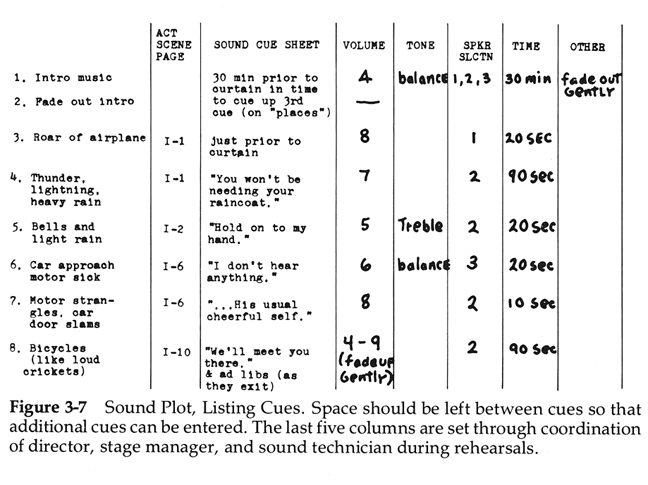
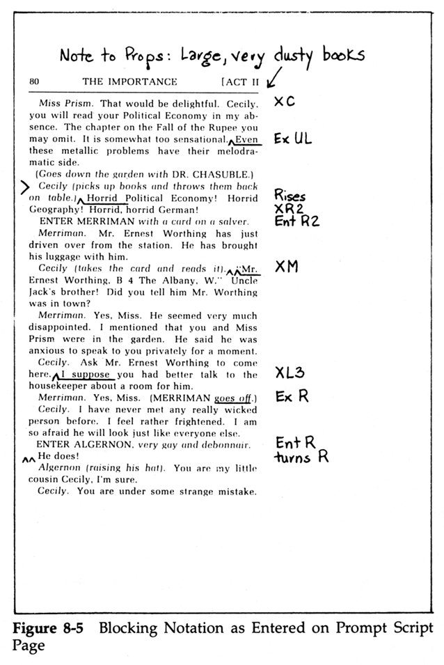
There are elaborate time-by-activity sheets used in staging and coordinating theatrical productions, to synch lights, sound, voices, actions, scenery. In the books on theatrical productions, these sheets are nice practical workaday schedules (although the gridlines are often way too heavy).
 |
 |
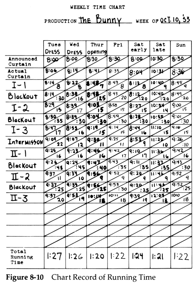 |
Source: Lawrence Stern, Stage Management (Boston, 1992, fourth edition), pp. 29, 108, 117.
Lawrence Stern's book on stage management is excellent, very helpful for mounting road shows, filled with good hands-on guidance.
-- Edward Tufte
In answer to Sean's question on how movies are organised: the current tool of choice (according to my film producer friend) is Movie Magic Scheduling (and its partner budgetting package). These are used for everything from corporate videos to Hollywood blockbusters.
Before computers (and today, for low-budget or traditionalist producers), they were scheduled using special strips of paper that fitted "production boards" which could be easily carried around the studio or location. Each scene has a vertical strip which shows the requirements of the scene (location, actors, camera, special effects, vehicles, makeup etc). The strips are then moved around to find the best shooting sequence. You obviously want all scenes in the same location shot together (as far as possible), and want to manage the various crew and cast members' workloads.

The beauty of the strips is that it's easy to move things around to meet contingencies (say the weather's no good on a location or a cast member is ill).
In fact these strips are Movie Magic's printed output format. Specially perforated paper and mounting boards are sold to complement the product.
-- David Glover (email)
I saw one contribution that suggested that perhaps we may be trying to use the wrong tool (detailed timelines) for the wrong audience. While that's certainly a valid thought (and I agree when it comes to Gantt Charts, I still feel that a web-based simple view to show the status of a project, along with key milestones and major issues, with the ability to drill down to the dirty details for those who dare, would be a valuable tool in the project management community. Perhaps Primavera's P3 does this. I'll have to check it out. I just know that Gantt Charts are not the tool we want to be using to convey project status to a broad community (although they are useful for project managers). I keep thinking of a map analogy. The underlying detail is very complex, but the best maps appear simple on the surface. How can we very simply convey the status of a project, in terms of its cost, schedule, and deliverables, as well as relevant annotated information, such as risks, issues, and milestones?
-- Jerry Manas, PMP (email)
One of my clients builds large cross-country gas pipelines and recently gave me a project chart produced in a package called Tilos, from German software developer Asta.
Tilos produces charts that show project progress against location, time and other factors. For instance the pipeline project I saw showed bushfire and bird migration seasons for particular locations, as well as rainfall over the pipeline route (which was shown as a blue background of varying density).

My client uses this as well as Primavera Project Planner, though I'm not sure quite how they mesh the two. Certainly I found the Tilos printout put an incredible amount of detail into a location (horizontal) and time (vertical) grid that I was able to quickly interpret.
Asta is available in English and German, though the website seems to be in German only.
-- David Glover (email)
Many years ago a friend who was responsible for some of the logistics of the British Army during the first Gulf War told me that they had given up with computer programmes and had instead drawn large charts on rolls of wallpaper, which were pinned up on the walls of the briefing room. After the war, the charts found their way into the regimental museum.
-- Dean Madden (email)
When I worked at NASA/JSC, we used Primavera and Artemis.
With MS Project, you can change your symbology using the style feature.
I document user interfaces, so I use MS Project to map features, then documents, and then the project. I use the zoom feature in the printer driver to make my charts smaller, so they take up less wall space. MS Project was not designed to be used the way I use it. At one conference I attended someone used IEF2 instead.
An MS Project file can be saved to Access. Once there it could be written out as a series of Excel spreadsheets that could be organized into a data cube and pushed into a data warehouse. Once there any number of visualizations should be possible. Last year, we were looking at using business rules and transaction data to do space visualizations of annuity portfolios. The successor-predecessor relationship between tasks is a good match for OLAP databases.
-- David Locke (email)
Most people who want to do process maps think of a flow chart that shows the life story of one case. (Typical Visio task.)
However, you are right and perceptive to notice that in fact activities are going on in parallel.
The half way house is to divide your organisation and put each department/function/team/whatever into a swim lane. As your flowchart moves along you draw arrows to show how work is handed from one swim lane to another. It becomes like a project so some kind of project drawing tool becomes a possibility.
The way to fully recognise parallelism is to drop the life-story idea altogether and draw your business as a set of communicating sequential processes. Each dept/team/function is an oval on your diagram. Arrows between them show "channels" for communication. A channel could be a flow of documents of the same type, or of related types, or conversations. (If the documents flow in both directions that's two channels.)
If you want to you can explode the ovals to show what happens inside, which will be more ovals as you break the team down into sub-teams. You can also write little fragments of procedure that show how each process reacts to or uses incoming messages on each channel, and generates messages for outgoing channels.
For this you're back to something like Visio.
I think the life-story and communicating-sequential-process (CSP) views are complementary and would do both. The life story helps you work out what work should be done. The CSP view helps you allocate the work to people and understand how the work will look to each person/team.
-- Matthew Leitch (email)
Accompanying a new NASA safety group, I recently visited the NASA Michoud (often pronounced ME-SHOW) Assembly Facility in Louisiana where the large external tank (ET) filled with LH2 and LO2 for the shuttle is made. We also toured the ET factory where I observed that the tank is very large. It is constructed in a 43-acre plant all under one roof; workers move around on bicycles. There they are working on a redesign of the external tank to reduce the ice debris and insulation foam debris breaking loose from the tank and striking the orbiter (which led to the loss of the Columbia) and to monitor possible debris issues.
In a presentation room, where I saw a 49-slide PP pitch (not all that bad), mounted up on the wall were perhaps 100 to 200 8.5 by 11 inch linked pieces of paper that traced out the RTF (return to flight) plans for the ET. This appeared to be a good way to make a large high-resolution management chart without a fancy printer.
By the way, it is interesting how soon one starts talking in acronyms in the engineering business.
-- Edward Tufte
I am a writer with a parallel challenge: "character management." In my current novel, I have nine characters, four countries, three pivotal events, 27 story arcs, and five deceptions. I've been using the long wall/duct-taped note card method to track it all. I need to have it laid out large scale, so I can see it all at once, and on paper, so I can scribble notes, draw arrows, etc.
Doesn't travel well, though; I imagine I'm not the only one who wants to take a hardcopy plan over to someone's office for review. Also, major re-editing is nasty. (And once the cats went after a dangling scene.) After reading through this thread, I will get myself a blueprint-scale printer and perhaps test out some commercial software, either writing-oriented or project-management. I'd be interested in any suggestions on this.
-- Katie Thompson (email)
Regarding Katie's storyboarding inquiry:
I do a huge amount of storyboarding similar to what you describe, using either index cards or post-its. My wife has been working on a complex novel, so I also have some sense of what you're trying to keep straight.
I find a digital camera is all I need to complement the storyboard. I take multiple "tiled" shots so I can read them when printed. That way I can quickly take a snapshot, print it for the road, distribute a pdf to others, etc. A camera is insanely fast compared to software products (which I also use heavily). Just a thought.
-- Dave Lash (email)
One thing that always fascinates me about these process diagrams is that they reflect a rather poignant human desire to predict the future, to capture the chaos of the unknown and render it in a coherent, logical framework as way to assuage fear. In this way they are almost more talismanic than practical. Unlike statistical charts, they try to project what might be as opposed to what has already transpired.
I work in a museum that manages a great number of complex projects, many of them discrete and overlapping, involving many people and tasks, over a number of years. In my experience, when we use the Gantt charts, they are usually used as a crude forecasting device, an attempt to describe the project in an idealized fashion, as it might happen if all went according to plan.
Invariably, it doesn't turn out that way, however. A vender misses a delivery date, somebody gets sick or leaves for another job, a pipe bursts, the fund raising drive falls short and on and on. (What experienced project manager doesn't have a gut sense of exactly how much "slop" is contained in each strand of the Gannt chart? But you don't spread it around. You hoard it as a contigency, a secret shadow fund of time that doesn't get shared on any chart.)
We could go back and ammend the chart, but this rarely happens. By this time, management is tactical rather than strategic. Because we are all experienced in our respective roles, we are usually already each carrying in our appointment calendars, our PDA's, or our heads what we need to know and, usually, we know know how to pull it out. We respond to change and we adapt. We have many spur of the moment conversations to solve immediate problems, we make decisions, communicate outward and we move on. A forensic ammendation is irrelevant.
The chart, it turns out, scarcely carries the detail, the resolution, necessary to capture these kinds of situational adjustments and their rather more minute ramifications, nor is it very useful to add these back in after the fact. The chart is especially poor at predicting sheer human effort, where it will bulge or go slack. Where the burnout closes in, where someone falls idle with nothing to do.
I think the project chart is a comforting reminder that shows that we know what we are doing, that we have some assessment of all the key variables, a feasible plan. Perhaps its most important function is to act as a bellweather, to trigger anxiety when a blown deadline will pile up onto the next link in the chain. It shows us the time critical points which, when we don't hit them, means we'll have to work especially hard to get things done. It's a confidence builder. But its utility seems to be as a beginning rather than an end.
-- Daniel Spock (email)
Interesting, this discussion. I too have struggled with the conflicts between the macro views that must be prepared routinely for communication upward and the micro views to which day-to-day management of the project is bound. I have found MS project to be a useful "what if" tool, as has been alluded to by others. Beyond that however, I find that it's enforced conventions don't serve my disparate audiences' needs.
In a prior life, I was attached to a large aerospace firm whose job it was to plan and execute the development of commercial flying machines. When completed, 5-10 years of corporate effort had to bring together some 3 million parts from 3 thousand suppliers in a sequence such that this marvel of imagination could scoot down the runway and take gracefully to the air... at a certain time, on a certain day, which had been announced 18 months in advance.
As I recall, we relied on three principal tools to manage the process. The first was textual and was a listing of individual activities, what they comprised, how much effort they would take, and when they were supposed to be done. Generated from a classical work breakdown structure, the detailed commitments of resource and time were hashed out in a series of scheduling meetings named after the color of the rooms in which they were held when the company was young. They were the micro view provided to the implementers and were used to track and to hammer the day to day events. We statused this as "tier III" schedules. As a minion, all you had to do was to meet the commitments on these sheets and all was right with the world.
A principal tool we used to generate the WBS was called the "number one flow" diagram. Sort of like a swim lane diagram, it's horizontal axis represented time, but rather than organizations or people, the vertical axis listed various tasks. At the very top was what I called (to myself) the Hollywood task, the one that we would track and report on at the summary level to our masters. This looked pretty Gantt like but included milestone dates, description of activities along the way, and the flow time of each activity. Deviations from plan were shown with different symbology, but that's a detail. On the lines below Hollywood, we listed all of the "major" things that were needed to make Hollywood go and drew them in the same Gantt-like manner. A key difference is that "start" dependencies for a task were drawn on that task's line, not somewhere else with an arrow. So if I needed a quote before I could write a contract, the task line started with "quote, 1w" which flowed into "write contract, 3w". This was mostly to simplify the diagram. At the end of each of these little sub tasks, an arrow was drawn up to Hollywood to show when that task would complete. I found that this technique worked well to show the day-to-day people where their work fit in to the larger picture, and to help with planning the workarounds that comprised the bulk of my day.
At the macro level, the big Hollywood lines (called tier II and rolled up from the tier III reports) were shown, but they were on HUGE sliding whiteboards, updated with black tape and little symbols by elves the night before. There were no subtasks or dependencies, these were big enough to stand on their own. These charts were also missing the resource information (which was tracked by earned value methods and reported on separately) but provided "at-a-glance" looks at both the current tactical situation as well as gave a view to the strategic. There was no drill down capability in the large charts, if someone needed more detail then an overhead of the tier III was nervously produced and discussed. Ultimately, the tier II charts were consolidated into tier I charts for distribution to the press and marketing, we workerbees never paid them much heed.
The point of this rather long winded description is to agree with many of the musings of ET with respect to the inability of our automated software tools to actually produce output with sufficient information density. To ask a static tool (software program) to serve my unique needs in the flying machine business and at the same time wow my contemporary who is keeping track of the construct of the plot of a future best selling novel is asking a bit much... in my opinion. Remaining chained to our "tools" simply means that we must eventually change how we do our jobs in order to comply with the demands and limitations of the tool -- the tail will wag the dog. Powerpoint is a shining example of this phenomenon.
The sad part is that it's very hard to automate the production of quality documents. That perhaps, is our grail?
-- Kim Hansen (email)
Here are some ideas for showing causal arrows and linking lines that may be relevant to project management charts. (These are draft pages from Beautiful Evidence)
 |
 |
-- Edward Tufte
At my company, a large aerospace contractor, "cards on the wall" are popular for day-to-day use by large project teams. They have sufficient detail and size to make them useful when the teams have subscribed to the philosophy. Experienced Project Managers say that the translation to electronic project management software such as MS Project is difficult for the many reasons that have been described in this and other threads. The auditing and accounting requirements in our sector make it mandatory to have the program plans in that format.
-- Ravi Narasimhan (email)
We have done several large moves of data processing equipment infrastructure. The beauty of the wall during planning is great as you find people coming up with things like you can't do this before I do that. (I can't change the network if you have taken it down). But the real beauty is in the execuction phase (the moment of terror after the weeks of boredom) when you put the pert chart on the wall and let individuals responsible for cetain tasks color them in with markers as they finish. What a cool sight to see the thing march along before your eyes and what a neat motivater for the people doing the work.
-- W. P. "Doc" Holiday (email)
Doc Holiday's phrase "wall planning" is a wonderful name, as well as an excellent summary of this thread. Bravo for our Kindly Contributor, Doc Holiday.
-- Edward Tufte
One rule for wall planning: don't make a poster out of a wall plan; keep the type reasonably small and don't use poster-sized type or images. If done poster-style, then resolution of the wall plan is lost as the viewer backs away to read poster-sized type at a distance.
Another idea: leave some space for handwritten annotations, to be incorporated in the next printing of the wall plan.
Another one: make updating routine, frequent, and easy. (It will be easier, for example, to tack up and collate 11 by 17 sheets than 8.5 by 11.)
Another one: integrate various modes of evidence. That is, use text, graphics, images, tables, sparklines in wallplans.
There is an excellent wallplan for managing the Shinkansen (bullet train) in Japan that I picked up in the control room of the Japanese National Railroad in 1985. See Envisioning Information, page 45. I'll try to post the whole plan.
How about a short chapter, "Wall Plans for Managing Big Projects" in Beautiful Evidence? Should "wallplans" be one word, like "sparklines"?
It is very interesting how getting a good name for this idea (already up a long time on this thread) has activated thinking.
-- Edward Tufte
1. "Paper and pens are still far better than any software program for preliminary work." -- David Person, above
Why are paper and pen better? My guess is that not only because of flexibility and speed of work they allow; kinetic (body movement) aspect can be a hidden yet important element in the activity of project planning. When I taught a PM course, I asked people to start by drawing the time line, by hand; then mark start and end points, then milestones, stages, and so on. It appears to be a certain challenge, for many, to draw a straight line, and fit all project activities into the chosen length. Aren't thinking and drawing connected?
2. Is the left-to-right straight time line the best representation of time? According to some anthropologists, cultures can be divided into two classes: some use the linear concept of time, some view time as cyclical. Could we use a circle for showing time? A cyclical chart can convey the idea that project must return to its origin (by fulfilling its goal or requirements). It could also function as an illustration of the energy level of the project--first half is downhill, the rest--uphill.
3. There is another very interesting comment above: "project plans are used to initiate conversation". Do hand-drawn (hand-made) (wall) plans perform better in this function?
-- Priit Parmakson (email)
Regarding software that is useful for preparing process charts, I have found Inspiration (www.inspiration.com) to be extraordinarily helpful. Somewhat like Visio in that it has preset standard flow-chart symbols, it also allows a high degree of customization and allows you to toggle between graphic and outline formats. While not robust enough for serious project management along the lines of the Gantt chart discussion above, it is very intuitive, cross-platform (Mac/Windows) and inexpensive. One other inexpensive program I have found useful in its relative lack of sophistication is FastTrack Schedule (www.aecsoftware.com). The product is at least 10 years old and the latest version is Version 8. At a beginning level, one can make simple Gantt charts without needing to embed links, dependencies, etc. As one advances, one can add such intelligence. However, what is so wonderful is that this is like "smart graph paper" [yes, you can turn off the grid]. In other words, you can use its low-tech mode to do what needs to be done rather than having to be a Gantt jockey.
-- Roger Goldstein (email)
With respect to the suggestion that people use Post-its and a whiteboard for the initial draft of a process map (before transfering to some electronic format), I would like to suggest the following:
Instead, buy a long role of butcher paper and tape long pieces of it to the wall (or lay it out on a conference table). Use this surface instead of a whiteboard.
The chief advantage is that you can roll up your draft and move it easily. It can also be archived for future reference, whereas clearling the whiteboard for the next user or process removes access to the original content.
Hope that's helpful to someone....
Peter
-- peter linde (email)
From a German supplier (can't be more specific I'm afraid, because I've been unable to trace them to re-order) you can buy rolls of white plastic sheet with a surface that works like a white board. The rolls are about 60 cms wide and perforated every metre, and because it is plastic film it will stick electrostatically to any wall without tape. It is expensive, but you get the advantage of an instant whiteboard of any length, or multiple whiteboards that can be shifted around into different sequences . . . and you can roll it up and take it with you.
-- Martin Ternouth (email)
Brilliant! And also serves to underscore my observations submitted in April 2004. E.T.'s suggestions so far have been with respect to legibility of PM tables which truly are awful and unwieldy. But in essence these charts are predictive and, as such, often must rely on estimations and guesswork. The quality of these prognostications is only evident with the unfolding of time and no chart can capture the fortuitous exigencies any project invariably faces, a priori, and few contain any real visual depth to convey the special character of problems incurred by unanticipated changes. So what makes the project chart rise above "junk content?" The experience and gut of the project manager who, usually secretly, builds in resource allowances for failures. This mixture of intuition and experience is belied by the apparent rationality of the project chart. One of the chief, but often unacknowledged uses of the project chart is to persuade stakeholders of the feasibility of a plan of action and to elist commitment to the execution of each part of the plan within the time resource allocated. In that sense, the project chart is really more rhetorical in nature than anybody has really acknowledged. But if stakeholders are not alert and experienced, well a bad plan charts as rationally as a good one. I suppose, though, that legibility would have the one advantage of making shoddy estimates easier for stakeholders to identify. I guess my main point is that a lot still rests on the skills of the planners and their cohort.
But, to the extent that project charts are about anticipating the optimum timing and sequence of stages of a project, things tend to go wrong with more than just the schedule. It is the interaction of time with the relative volumes of human effort and cashflow that create smooth or dysfunctional projects. As seasoned project managers know, an increase to any one of the three variables almost invariably increases the other two. So what would a project timeline look like that factored in visual representations of all three combined along the same continuum? Such a visualization might be of real use, not merely academic, as it would show more plainly the implications of change factors over the life of a project. Because, let's face it, coping with changes to the plan and understanding implications in a tactical sense, are the great weaknesses of these mostly strategic tools.
-- Daniel Spock (email)
Daniel Spock identifies three variables for the project manager: time, money, and effort. Admiral Gehman, head of the Columbia and Cole investigations, identified four in a lecture at the Naval Academy: time, money, quantity, and performance margin. It seems then that time is strictly the passage of time on the calender, not man-hours; quantity and performance margin are the products of effort, and effort is the product of man-hours and the experience gained through previous man-hours. Feynman wrote about how he and Hans Bethe learned to do math faster on the Manhattan project by teaching each other arithmatic patterns. They saved time through effort. In this interview with Chris Capossela, a former director of MS Project, said his group didn't like using their own product to log their work hours. This is admittedly anecdotal evidence, but it certainly seems to support the notion that effort is harder to track than it's products: quantity and performance margin. I suppose this last fact is in covered in Business 101, but I found it an interesting way to arrive.
-- Niels Olson (email)
I guess my point is that, whether the time charged to a project account is accurate or not (and I agree, this can never be properly ascertained with anything like absolute certainty, especially in projects where you've outsourced big chunks,) time does represent money. In any project, practically speaking, what gets charged against a project, represents the "actual" expenditure and will be where overruns will happen. Big construction projects in the US quite regularly now wind up in court where overruns are litigated one line item and vender at a time.
All project management tools allow for the break out of discrete tasks, with timelines for the completion of each, and even some critical path demarcation to indicate that, if the deadline isn't met, it will interfere with the completion of another contingent task. But a graphic, dynamic, at-a-glance tool that shows you when a delay is starting to incur compounding overruns caused by staff costs still doesn't exist to my knowledge. Might be more useful than the rather two dimensional graphics currently in use? I don't know.
-- Daniel Spock (email)
I am a specialty subcontractor working on multiple simultaneous projects from a few thousand dollars to a few hundred thousand dollars. We usually have a dozen or more contracts running at a time. For scheduling, we get either a date or two in our contract documents or the ubiquitous Gannt chart which is invalid before it's printed as it's someone's inexperienced idea of how our work should progress. We are continuously impacted by slow responses from the construction team (contractor, architect, designer, owner) to our requests for information and/or submittals. I am laying out a scheduling grid using the French train schedule format similar to the cover of ET's first volume to chart out contractual schedule requirements (time across the bottom and tasks up the sides) with distance between the tasks relative to the available time for submittal preparation, submittal review (train waiting at the station), purchasing, fabrication, delivery, installation, and closout tied to contractual completion date. I am planning to use a comparative chart on same page to track actuals and update the powers that be as needed to keep them informed of progress or lack thereof. To me this seems like a simple task with an annual grid laid out with colored pencils on a template, scanned and emailed. Does anyone have any other ideas? I am looking to not only push the process forward, but to protect my firm's rights to collect for delays. I may also chart anticipated vs. actual cash flow as we experience schedule slippage and are forced to expedite toward the end of the project to make up for delays by others that impact our work. Thanks for any response.
-- Michael Berry (email)
I have stumbled into a different kind of problem in the realm of project management. We have a number of projects with income from grants (that is, the income is fixed regardless of actual costs).
Some personnel costs are shared among projects. Joe might work on project A and project B. Sue might work on project A and project C.
Project start and end dates are not synchronized. Project A might start on July 1, 2003 and end on June 30, 2005; project B might start on Sept 1, 2002 and end on Aug 30, 2007.
For each employee, we know the percentages of salaries that come from each project. Joe spends 50% of his time on project A and 50% of his time on project B; 50% of his salary comes from A and the other half comes from B. Sue's effort is different - her salary is split 30% from A and 70% from B.
I am looking for some way to view these salaries and their sources over time - so we can easily see when we need to shuffle people and their salary from one project to another when a grant is about to expire. My supervisor suggested Gantt charts in MS Project, but I'm not sure if that is really the best way to visualize this information. Moreover, I'm having trouble wrapping my head around the various project management software packages in order to get them to fit our data. Any thoughts?
-- Jennifer Steinbachs (email)
Fascinating thread! One of the obvious drawbacks to the Gantt chart is that it is such a sparse chart -- each horizontal line contains one and only one task. I saw only one response in this thread that mentioned Artemis, but that tool offers a very simple improvement to conventional Gantt charts -- multiple activities can be grouped together and displayed on one line. Imagine that each line represents a resource (person, equipment, or facility) -- i.e., swimlanes, which have been discussed in this thread -- and the activities associated with that resource are displayed as bars on the right. Resource specific information can be displayed along the vertical axis, and timing information (e.g., milestone dates) on the horizontal axis. Task information can be printed inside the bar itself. The result is a farily dense display of project information that from a distance gives a picture of resource availability, and at a mid-level shows which activities are being done by what resources when, and at a detailed level can tell you specific information about the resources and activities.
This is a view I have seen widely used in a manual fashion for shop scheduling -- I am actually surprised it has not made into MS Project.
-- Greg Gruber (email)
Some of you may be interested to know about a a book which illustrates an early approach to project management -- "Perpignan 1356: The Making of a Clock and Bell for the King's Castle".
I came across it by chance one day in the Engineering library at the University of Toronto. At the time, Gantt charts were being used where I was working and it was fascinating to find a point of comparison for project management which was so far removed from what we were working on (phone billing databases) yet which still yielded so many similarities.
The book is a translation of the detailed account book from the Perpignan bell project. It gives a view of the processes involved at each stage of construction (building the tower, building the foundry to cast the bell) and shows every expense incurred, from the cost of materials and the different forms of labour, to the cost of the food and bedding that had to be provided for the labourers.
A nice companion piece to that book: "The Measure of Reality: Quantification and Western Society, 1250-1600" by Alfred W. Crosby, about the major shift in perspective of which the making of the bell tower was a part.
-- Eleanor Allen (email)
ET asked if someone would post in the PM thread some excerpts from today's Wall St. Journal on Ford Motor Company's "spiritual re-think" within the company, dubbed the "Way Forward."
The operation is run by Mark Fields, who previously ran North and South American auto operations.
"'Way Forward' Requires Culture Shift at Ford"
Jeffrey McCracken
staff Reporter of the Wall Street Journal
January 23, 2006; Page B1
. . .Mr. Fields, who says his goal is to create "a sense of crisis, but not panic," among Ford employees, believes this cultural shakeup will work where others failed because fear is a good motivator. He is fond of using the phrase "change or die" in meetings.
Mr. Fields's focus on culture is evident in the drab, cold, windowless conference room deep inside Ford's Product Development Center here that has become the Way Forward war room. High on the wall, hangs a big, white sheet of paper on which is written: "Culture eats strategy for breakfast." The room is ground zero for the group of managers that has worked for the past two months to develop the Way Forward plan. Among other maxims on the wall: "Culture is unspoken, but powerful. It develops over time -- difficult to change."
In an effort to make this restructuring succeed where the previous efforts failed, Mr. Fields tapped several hundred workers across Ford to be part of the Way Forward planning process. . .
. . .His top two lieutenants on the effort are Anne Stevens, a Pennsylvania native who is chief operating officer of the Americas, and Robert Shanks, vice president and controller of the Americas who worked with Mr. Fields at Mazda and Ford of Europe. . .
. . .Ms. Stevens and Mr. Shanks have had day-to-day control of the Way Forward plan, meeting every day for two hours or more in the windowless conference room with a group of 20 to 50 people who were working on the plan. . .[this is] the Way Forward room, where about 20 sheets of papers are posted around the off-white walls, encircling a long, rectangle table that is actually smaller desks placed together.
Mr. Fields, who banned PowerPoint presentations for Way Forward, said he likes to see plans posted up on the wall where he can see the development of an idea. On these big sheets are detailed lists of what customers Ford wants, a discussion of how a turnaround is supposed to feel "uncomfortable but exhilarating," and something called the "Rules of the Road" which implores employees to remember "conflict is healthy."
At the top of one wall is a chart showing the timeline for the plan that launched Oct. 3 and needed to be wrapped up in time for presentation to Ford's board of directors on Dec. 7. A "Days Remaining" calendar has a big zero showing.
-- A.H.
This is as pathetic as the New Orleans recovery plan posted in the rocket science thread.
-- Edwrd Tufte
What a great confluence of experience! Music to theater to novel-writing to aerospace to IT and everything else. Except for Mark D, however, who mentioned 5S, I don't see anything from what is termed "lean manufacturing." Don't get hung up on the word "lean." Except for those misusing it, it doesn't mean getting rid of people.
To my point, and I'll add a fuller post soon, the quest for visual management is part of this philosophy, with Toyota being generally credited for its fullest implementation.
A few months ago, I had the good fortune to meet up with Takashi Tanaka, who has had many years experience in product development projects at a world-leading Japanese automobile manufacturer. We worked together on a paper (his knowledge with my writing experience) about visual management of projects. Imaging being asked to design a new vehicle for the European market - a hybrid - twice as fast as products are usually realized. The "oobeya" is the center of the project management, with a set of visual tools that bring all project stakeholders together. Before you say "we have a war room too - what's the big deal?" consider that the key lies in the discipline and subtlety of what takes place there in this company's use of it.
-- Karen Wilhelm (email)
I have been asked by the RAF (Royal Air Force) to look at the visual management of their projects, so I have read this thread with interest and tried to apply the ideas to a simple exercise. So my attempt at using swim lanes and many of the other suggestions has resulted in quite a good visual diagram.
-- Nicola Bateman (email)
I have just produced a wall chart that combines a few of the topics raised in this forum, and though it was produced quite quickly, it was made me re-think a lot of questions about processes and project management. The chart in question is showing 'Earned Value Management', developed on the back on new Lean procedures on a major aerospace project. It is made from nine, eight foot by four foot printed panels fixed together and mounted on the hangar wall.
The chart uses 'swim lanes' to show the responsibility for actions. Although the layout is fixed (being printed on the boards), the documents that are referred to on the chart are actually in plastic wallets attached to the boards, so it is possible to walk the chart, read and update the documents as required. As long as the process connections are fixed and in place, this should work out ok.
It is quite an investment to print this in full colour at this size (especially if the connections change), but I was surprised how you could actually stand back and follow it from start to finish, before moving in to read actual documents.
-- Adam Poole (email)
In an interesting coincidence, I'm a composer (who stumbled onto this thread via a link from a page that lists open source project-management software, http://proj.chbs.dk).
I've been looking for -- and may end up designing for myself -- software that can graphically represent the life cycles and deadlines of my pieces, their relationships to other things (performers, conductors, grant applications, competitions, etc.) and the relationships of all these things to the rest of my life (travels, money, long-range plans, etc.).
An orchestra score might look complex just because you're not used to the language, but it's actually VERY simple in terms of information design, in that it's completely flat -- there's no need for "zooming" to a lower level of detail, because there's nothing further you need to know/represent about any given note or phrase (i.e., any given task).
The issue I'm tackling (and I see it's a common thread here) is how to make a simple yet highly zoomable design -- one that produces several results equally well:
1) a long-range visual overview I can use for planning and scheduling via eyeballing ("Can I say yes to these January residency dates? Well, let's see which pieces/grants/etc. I'll have in progress that month and whether I can afford to get to that country...");
2) many easily-accessible bits of detail re. each element in this overview;
3) links among all these details, as in a relational database (piece tied to performer and commissioner and deadlines and grant applications -- conductor tied to piece and ensemble and dates and pieces-in-progress-I-should-send-to-conductor -- etc., etc.); and
4) the ability to UPDATE all these details and links by making one change at one central point (again, as in a database).
So far, I've actually been keeping all this info in a set of many text files inside my favorite simple text-file manager (Palm Desktop). This only works because I have a good memory and I'm naturally organization-inclined and good with symbols & abbreviations. I think the time I would spend creating some db/reporting system like this would pay for itself pretty rapidly in future time savings. But I'm only in the first stages of designing it, and I only have the db/etc. knowledge I've taught myself (these ain't skills you accumulate in a conservatory)...
-- Kala Pierson (email)
Another thought, for project managers who need to present complex info to their team members: even more useful than the orchestra-score example is the example of orchestra "parts."
The conductor is the only person who uses the full score with all the instruments' lines. If you're a member of the orchestra, you play from a "part." In a part, most of the page is just your own instrument's notes, but some of the page (and here's the important point for this thread) is taken up by cues. Cues are short phrases of music, printed just above your own notes and using miniature notes, that occasionally show you important things other people are playing. This lets you listen for important moments and it works as a reality check ("Okay, in case you weren't counting perfectly, just know the violins come in here and does this phrase, then you start your next phrase just after the violins play the F natural, right HERE.")

So the issue with big complex projects is deciding exactly how much an individual needs to see in order to perform her own role perfectly yet avoid wasting time on comprehending (and materially dealing with) the entire project chart. In some cases it might be useful to think of a project manager as the conductor, and team members as the instrumentalists who don't necessarily need to see EVERY detail at once, but frequently need very localized & very detailed glimpses into other people's tasks, in cases where those tasks precede, "cue" or otherwise intersect with their own tasks.
-- Kala Pierson (email)
I have a four-metre roll of paper that contains the whole of the last movement of Beethoven's Seventh Symphony: I use it in seminars to illustrate how reality (a recording of the movement) cannot be summarised, but can only be visualised by the complex detail of individual events - the individual notes and their relationships at any one point in time.
Kala is right that not everybody needs to see everything: she is equally spot on when she recognises that when when you do need to see what other people are doing it is not sufficient to have an edited summary: "glimpses" must be "very localized & very detailed".
-- Martin Ternouth (email)
"A company can recover from anything... except running out of cash" - Lou Mobley
The element of cost and more specifically cash management has been lightly touched on in this thread, most likely because of the large scale of most projects alluded to. In some industries, startups and smaller companies, the issues of cash flow and project management can not be separated. Construction projects are regularly delayed because a sub hasn't paid a bill and can't get materials - although they won't tell you that. I have struggled for years to find simple project management software that deals as well with dollars as it does with whether the conference room is available Tuesday afternoon.
This brings up the thought that once the tasks are set, an ideal system should allow each user to specify what elements will impact their task whether it is manpower, the weather, billing cycles or use of a facility. Then the system should ask where the necessary information can be found for all the various impact elements throughout the project. Once identified, the proper user (or satellite weather feed) can be prompted for timely input. The output likewise would be tailored like an individual instrument score complete with different cues.
The difference between an orchestra and an airplane is that the flute can forget a passage while the plane can not be built without the left flap. Somehow the manufacturing process has to be rearranged to make the flap, a symphony can not played in any other order than that in which it was written. This may mean any output based on a score paradigm, may not work too well. An aside on information display. There used to be a notes program, pre windows, called Tornado Notes. New notes came up with different colors, shapes and screen locations at random. Often you might not remember the contents, but you could remember it was yellow, square and on the left side of the screen. A fantastic amount of information could be stored without any key words or index.
-- CG Yerkes (email)
Some very interesting concepts continue to be discussed here, even after all these years. This is certainly the world's leading forum for discussing project management visuals, especially given the eclectic perspectives.
I'd like to contribute a few additional perspectives. First, I've seen several analogies here to orchestral arrangements and parts. While I love the visual and multivariate data aspect of musical notation, there are some nuances in project management that pose a special challenge.
First, most projects are abstract as opposed to concrete. In music, it's OK to lay out a complex orchestral arrangement and people can play their parts and it gels (in fact the parts can be likened to "work packages" in project management).
In projects, however, situations change soon after the project begins. We must have a way of keeping the plan fluid to changing events, but we must also keep the parts in synch. If we're on the subject of music, project management in many cases could be more likened to jazz, where some musicians change tempo or go off in a different direction, still within the general theme (or "rules of the game"). Soon the other musicians catch on and things are gelling again. In music it might be the mood or feel that caused the change --- in a project it might be a fact-based discovery mid-stream, or an unexpected event. Good principles can help insure "controlled chaos." (ironically, "Controlling Chaos" is the name of a popular PM blog site, but I digress).
Also, it's usually not adequate for someone just to know "their part" in project management I'm reminded of the man who walked up to two stone cutters and asked what they were doing. One said, "I'm cutting stones." The other said, "I'm building a cathedral." In most projects, we want people to be the latter or we could get unexpected results.
So, we can probably assume the following requirements for project visuals:
1) They need the ability to be easily changed on the fly---frequently. Of course for some projects in some industries, things are less fluid, but in the IT field, the BDUF (Big Design Up Front) method is rare. More likely projects are progressively elaborated.
2) They need to show the big picture, while allowing focus on one part (or allowing team members to view their part alone or in context with the other parts - including dependencies).
3) They need to show multiple variables during the project lifecycle:
- Tasks (explodable at a summary or detailed level)
- Schedule Performance
- Cost Performance
- Task interdependencies
- Resources assigned
- Technical/Functional Performance (i.e. scope, quality)
- Value Delivered (real value to the client and organization)
- Customer Satisfaction (this should be tracked throughout the project to accomodate course-correction)
- Milestones (with comments or notation on any or all of the above)
The value and customer satisfaction measures in particular are often ignored during a project lifecycle. Often a qualitative measure or annotation would suffice in these areas, but it needs to be part of the picture to avoid project myopia.
I'd be curious as to others' views on the requirements of a good visual, but these come to mind. I still think music is a good place to begin for research because it has similarities (depicting time, instruments, scales, players, etc). Tools like audacity, Cakewalk, propaganda, etc. for recording just keep getting better. There must be some lessons there. We just need to be cautious of the different requirements between music and project management.
Wallcharts and Cards-on-the-wall are great for design and communication, but because of the above requirements, I find them lacking when it comes to a visual tool for status tracking and ongoing management of a project, unless everyone is co-located and the wall is kept fresh.
Incidentally, I've had no luck with the PMI research community sponsoring an official research project on this, so it looks like this thread is the unofficial one.
-- Jerry Manas (email)
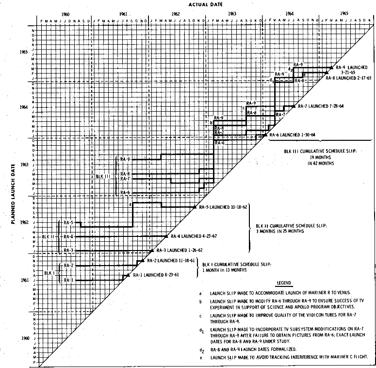
In project management charts, it would be useful to show, at least in part, what has already taken place, experiences intensely relevant to theorizing about what will happen in the project's future. See the NASA slip chart above.
-- Edward Tufte
Great point. I missed that one. Even with standard Gantt charts, there's a "progress" version (or "tracking Gantt" in MS/Project) that shows actual completion vs scheduled -- by way of colored bars. Only thing is, there are no annotations to show major successes, failures or ommisions---just a bar marking the time spent. It would be ideal to build into a visual model a way to see that historical perspective where it has some meaning beyond just the passage of time. Sounds like another requirement.
-- Jerry Manas (email)
Four of us are planning to work on a book together. I was wondering, Professor Tufte, how you organized your last book.
-- John Eckstein (email)
By chapters. Within a few chapters, sometimes an initial historical sequence, which I later would recast and break up into topics within chapters. Given my actual research and writing practice, I am utterly unqualified to give advice about effective project management! Surely there some good essays on collaborative authorship.
Over the years, I've worked with many co-authors (1 book, 10 or 15 articles). Each collaboration went well and so I have no particular theory about collaborative work, other than all my co-authored pieces got done a lot faster than my singletons. I expect, however, my co-authors would agree that none of our co-authored pieces are among our better works.
It might be a good idea to have the writer with the best style (clear, elegant) do a final pass through the whole book. Four co-authors might lead to an over-long book so at some stage near the end there might well be a ruthless pruning and tightening up of the book; this may be difficult in dealing with author of the original material but will probably make for a better book.
It will be helpful to identify several classic books (co-authored or not) in your field and see what those books do in organizing their content.
There's more on how I came to organize my work in the thread on Beautiful Evidence.
-- Edward Tufte
For a project management chart (or perhaps a technical report) in sports, see this recent article in the New York Times.
"Coaches Use Laminated Game Outlines for Any Situation"
Judy Battista

When Baltimore Ravens Coach Brian Billick takes over the play-calling Sunday against the New Orleans Saints, he will carry with him the football equivalent of a cheat sheet.
On two double-sided, 11-by-14-inch laminated pages, he will find lists printed in small type that feature every play he could call, and a whole lot more.
Billick can review clock-management situations to remind him when his offense can safely take a knee. He can peruse a list of the officials' calls that can and cannot be challenged. There is a formula for when to go for a 2-point conversion. A spot is even reserved for the names of the referees working the game, so Billick can act as if he remembers them well.
Coaches have long carried notes about plays they like, but in recent years the National Football League has embraced the outsized play card, making the computer-generated, weather-resistant accessory as common on the sideline as Gatorade and ankle tape. From the pages of plays that coaches once stuffed in their pockets to the card that a secretary for the Cowboys' Tom Landry wrote by hand, the stigma of a coach referring to a play card to call the offense is gone, taking with it much of the freewheeling creativity that fans like to imagine enlivening a huddle.
Some traditionalists are not thrilled.
"They drive me nuts," said Ernie Accorsi, the general manager of the Giants. "They remind me of the menu at Denny's."
. . .
The point of the cards is to avoid the possibility that in the cacophony of the sideline, as the clock ticks down, a coach cannot summon a play he spent the week preparing. The card is structured for ease, and each coach shuffles his a bit differently.
In a normal game, the offense will get about 65 plays. To cover all possibilities, the Ravens will enter their game considering 100 to 115 different plays. Billick said some teams prepared 300 plays.
"Most of the cards are color-coded -- for quick recognition," said Dick Vermeil, the former coach of the Eagles, the Rams and the Chiefs who is now a broadcaster for the NFL Network. "Things happen so fast."
(continue)
-- Edward Tufte
A couple of themes through this thread caught my attention:
1) Reliance on paper charts on walls 2) Emerging web technologies 3) Interacting with data on the gantt chart
and I will say this: after some 20 years of looking at office automation and presentation software, most of these problems are still with us and will continue to be.
My own personal bias is that (1) paper charts get very old very quickly, so that teams lose the ability to collaborate (2) on real data after initial planning is done and that most project managers are not facile enough with the tools to actually reschedule plans after the initial pass when change intrudes upon their lovely vision. Absent a live connection between the team and the management, most projects fail. (3) We also have to be careful that as visualization tools become more complex (OLAP cubes on the desktop) that we don't lose the connection between the data (in a SQL database) and the graphic (whether charting, tabular or graphic in nature), as different minds approach the same information more effectively in one medium or another, and it is critical that one update in one medium also update the other.
It seems to me that some of the features common to Geographical Information Systems (shaded area) would be especially useful to apply to Gantt charts, so that PMs could show relative temperatures (status? risk? value?) of tasks.
I look forward to additional advances in this field.
-- Mark E. Read (email)
We are general contractors, and much of our work is aviation-related construction in a major U.S. city. I have read this thread with great interest and offer my thoughts.
A typical city contract requires us to use Primavera brand Critical Path Method (CPM) scheduling software. This is the big-daddy of scheduling programs. Micro$oft Project, for example, performs much of the same tasks as Primavera. One wonders about the propriety of sole-sourcing a vendor like this, but that's what the contract requires. A city consultant dislikes the more current versions of Primavera, as do I--the earlier versions produce more somewhat detailed GANTT charts, believe it or not! Oversaturated colors and rigid formatting are two complaints. Constant scrolling and reliance on visual memory are major annoyances. Pasting the schedule on the wall is the solution, as others have suggested.
Every pay estimate requires the dreaded schedule update. Every request for extra time (that's not our fault, of course) requires us to demonstrate that the delay has lengthened the Critical Path. Since there are penalties for not finishing on time, a lot of money rides on the Critical Path. The city's consultant checks the effect on the CPM, and will not grant additional time unless the Critical Path has lengthened.
Our contracts are predominantly unit-price, and tying the schedule to individual pay items forces over-compartmentalized, linear thinking. Estimating software vendors will boast "our program will export the estimate into Primavera." Is that such a help? Four potential pay items (catch basin, frame/lid, pipe and stone) could generate four activities. Install a catch basin, then the frame and lid, then some pipe, then some stone, then another catch basin, etc., rather than "install storm system." One time, the engineer on a wastewater treatment plant project insisted that our schedule have separate activities for forming, placing rebar and placing concrete for each cast-in-place structure--no matter how small the structure--even a structure smaller than a typical office cubicle. Obsessing over schedule minutiae distracts everyone from more important things.
I feel that using fewer activities produces a clearer and more realistic schedule. To borrow from another thread: "Better to be approximately right than exactly wrong."
The schedule creation itself is the most useful part of the schedule--the process forces the contractor to simulate the project. At the least, it will show conflicts or bottlenecks at an early, correctable stage. Whether or not the schedule models the project correctly, well that's a different story!
A wise municipal engineer once said: "Schedules are great when they first come out, but after time, they go bad and you just gotta toss 'em out."
-- Jon Gross (email)
Thanks to Kindly Contributor Jon Gross for a most thoughtful contribution. In reducing detail, It is obviously important to distinguish between routine detail and relevant/unique/ important detail. The distinction for sorting information should not be the level or mode of information but rather its potential for problems.
-- Edward Tufte
Many problems in project management (PM), including PM graphics, are the result of blending -- and thereby confusing -- planned outcomes with planned actions. Planned outcomes are the desired ends, including interim results expected along the way. The purpose of defining planned outcomes is to provide direction, stability and control. Planned actions are far more chaotic and more detailed, but they are the only way to provide forward motion. Planned outcomes are the best way to describe and organize project scope and they can remain relatively unchanged. Outcomes are the rudder and actions are the oars. Blending outcomes and actions is an error that causes miscommunication -- the most common cause of project failure. This error happens very frequently in the design of the work breakdown structure (WBS), an important first step in project management. I have just posted a complete re-write of the Wikipedia article on Work Breakdown Structures to convey that a WBS must be composed only of planned outcomes (the ends) not planned actions (the means). Inputs and feedback are most welcome.
Blending outcomes with actions is an information design error that is perpetuated by most PM graphics, including Gantt charts. Even advanced methods such as classic Earned Value Management do not clearly distinguish outcomes from actions. The optimal PM chart will visually distinguish four things: planned outcomes, accomplished outcomes, planned actions and accomplished actions, and provide a direct line of sight between them. Also, outcomes provide context for actions so PM visuals should communicate this context visually.
-- Garry L. Booker (email)
...In other words, "relevant/unique/important detail" include all actions that relate to a SPECIFIC PLANNED OUTCOME of interest. When a project team blends actions with outcomes, simply because their tools treat them as same class of data, one person's signal becomes another person's noise. A high signal-to-noise graphic with rich detail is possible only when planned outcomes and planned actions are treated as a different class of data, and actions are linked to outcomes.
It is far better to be exactly right in ALL details. A team that decides collaboratively on project actions can track great detail with great accuracy, but it requries filtering planned actions according to discrete planned outcomes. For example, I should be able to create an animation of my (or all) planned actions related to "WBS 3.4.1 Foundation Inspection Complete." I can say with some certainty that this capability does not exist today, but it probably will within a few years. There is hope!
-- Garry L. Booker (email)
Interesting reading, especially in that we all seem to have the same issues, etc. in easily representing various levels of project management information. I think the general sense is that MS Project does not fit the bill and Gantt charts in general display to little info for the space they consume (which is unfortunate since PM and Gantt charts are often seen as the same thing).
The downside to wall charts and any printed information is that, as soon as the project information is printed, it's dated/old and most likely out of date with what is actually going on. The need to have the chart/tool/etc. reflect future planning instead of past occurrence or set schedule (like a train schedule) is probably the biggest challenge in the design.
The tool I most heavily rely upon is MS Excel, I've created some simple spread sheets that show multi-level information by Project such as: Component/Area, Task/Function, Status, Health, Est/Act Start/End Dates, Ownership and a timeline. This provides for a high level that can be drilled down. It would be nice to have this DB driven so the rollup/drilldown could be automated based on entered info instead of the manual approach.
-- Meade Rubenstein (email)
It should be noted that I have no experience in project management - I have never worked on a project professionally. However, in order to manage my own, complicated projects (designing and implementing a programming language is the main complex one), I figured out a graphic much better than a todo list.
For anyone familiar with mathematical graph theory, my representation is essentially a directed, connection weighted graph. In more common words, it is a chart of tasks connected by dependancies of varying weight. Low weight connections indicate that ideally, yet not necessarily, one task would be completed before the next. High weight indicates that it is truely imperative that one is done before.
The graphical rendering of this scheme is textual summaries of tasks, with arrows from tasks towards dependant tasks, with arrow width corresponding to qualitative dependance. I would post pics, but they were done more fast than visually appealing.
I realize that this doesn't satisfy the seemingly main requirements of project management, of assignment and timing. I believe that this information could be integrated into the chart. Possibilities include integrating images/names along tasks, and positioning based on time estimates, after the graph has been 'resolved'.
You will find that this view of the task gives much insight into what needs to be done - things which open up more additional tasks are generally higher priority. Sometimes you will have interesting things like cycles - indicating that at some point a dependancy must be broken.
-- mgsloan (email)
Thank you very much for insights. I am the PMO of a business group of a large financial institution that loves PowerPoint and VISUAL scorecards. On the other hand, pipeline and project tracking is held in MS Project. I build scorecards/quadrant maps out of MS Project by using the Gantt chart and formatting the bars/milestones/associated text so that they are just plotting points on a white timeline. Great data/ink ratio, but it does not seem that I can also customize the COLOR or the FONT of the TEXT associated with the "bars" in the bar style customization of MSP, although I would like to also use the text color to convey meaning beyond the words. Does anybody have further advice for me - I believe what I am trying to do is very relevant to this thread and evidence presentation, so I would appreciate publication and help. Thank you .
-- Paul LeBon (email)
The above poster was mentioning how he wanted to do some formatting with his projects,
so hopefully this sparks some ideas in how to get more information onto gantt charts.
And it just happed to tie into something I was already playing around with, which
is trying to reproduce Napoleon's march in a gantt chart. For me it was an attempt at how
much information I could cram onto a gantt chart, and still have it be usable. I'm not
totally happy with the result yet, but I think that there is some potential.
In order to get the relevant information into the chart, I had to use more text than I'd
like (all of the positional information and weather conditions are text). The completion bar
(black/gray bar) is being used to show how much of the original
army is dead. So on the downfall march, its pretty much entirely black. This of course isn't
best since we have different sized bars and the percentage is much harder to comprehend,
but I hope to find a better way. I'm also using resources to show much of the army is dead
at any given time point. At the end 1% of 100% is still alive, for instance.
While this doesn't have the same elegance as the Minard, it can be made by mere mortals.

PDF Version
This was made using the recently released OmniPlan, which I'm
shamlessly plugging, and my current file can be found here. Suggestions on
how to better convey the Minard data glady taken.
-- Rowan Christmas (email)
Rowan's dilligent hard work has done us a service. The graphic is attractive and easy on the eye, but by attempting the task of representing Minard in this way he demonstrates just how unsuitable GANTT charts are for displaying information about sequences of events. Minard communicates instantly to the untrained mind: I suggest that Rowan's graphic would not be understood without very careful study by anyone who had not seen the Minard original; and even those of us with long familiarity will struggle.
Rowan's comment about 'mere mortals' interests me. Minard can be reproduced in a fraction of the time and with a fraction of Rowan's skill with OmniPlan by using two different coloured crayons on paper. All too often we (I am as guilty as the rest) allow technology to determine what we communicate, and assume that digital is more grown-up than analog.
-- Martin Ternouth (email)
I've saved a copy in case it's deleted here, but I thoroughly concur with Martin. The juxtaposition is marvelous.
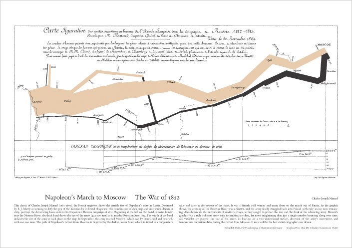
-- Niels Olson (email)
Why is the Gantt chart so widely used if it displays information in such an unsatisfactory manner?
I would imagine that it has something to do with its simplicity. Time on the x axis, activities on the y. The ability to quickly and easily understand / create something with little or no training goes a long way, especially in a fast paced work environment.
Taking the musical score example, we need to display pitch (translated into an action by the musician) & rhythm (time). From a violinist's perspective, when reading music, the vertical position of the dot dictates the placement of the finger on the string (what action to take), the horizontal placement of the dot indicates the point in time that it is to be played (when to action). To me this seems uncannily similar to the layout of a Gantt.
I have only dealt with a few fairly small projects so far but I have found a large, wall based "Activity vs. Time chart" (dare I say Gantt chart?) at the centre of a kind of spider diagram works well. Descriptions and exploded views of activities linked to the chart with coloured string and tape / pins. Maybe a little "Heath Robinson" but it seems to work and anyone can understand where the project is up to within 30 seconds of walking into the room. Also, scale props and models always seem to be a help.
-- James Leek (email)
Why is the Gantt chart so widely used if it displays information in such an unsatisfactory manner?
I don't think it's fair to malign a structure without considering their context of use. Gantt charts are an excellent illustration of the Match-Mismatch conjecture:
"In general, every notation or information structure highlights some information at the cost of obscuring other information." [1]
Gantt charts clearly present time and duration information (witness Rowan's astonishment about the short duration of Napoleon's march). But they obscure other information, such as dependencies, unless they are expressible as a tree. And Gantt charts don't scale well to large numbers of items in the vertical.
I think the frustration with Gantt charts arises more because of tool issues. People's contexts of use may require information that is obscured by a Gantt chart. But Gantt charts are the dominant (sometimes only) visualization in many tools, and it's difficult to impossible to extract and present the data in other forms.
[1] DJ Gilmore, TRG Green (1984). Comprehension and recall of miniature programs. Int J Man-Mach St 21(1):31--48
-- Brian de Alwis (email)
Response to James Leek
James Leek said "anyone can understand where the project is up to within 30 seconds of walking into the room." An increasingly large portion of project teams are not able to walk into the room, because of their geographic location. But more importantly, we should visit the project team members IN THE SAME BUILDING and ask basic questions like "Are you aware of the latest Gantt chart update?" "Do these updates have a strong influence on how you focus your attention every day?" "Does the Gantt chart tell you anything about our cost performance relative to our scope performance?" "Does the Gantt chart help you communicate YOUR status to YOUR stakeholders?"
While the Gantt chart may be popular for some project managers, it may not be that popular with the front line (or with clients), if we would only ask them.
-- Garry L. Booker (email)
Two fascinating diagrams comparing process calls in Linux and Windows servers delivering the exact same html webpage with a picture. Each unreadably small horizontal line of text represents a system call and each spaghetti line connects it to its parents and children. Seems significant to this thread for a few reasons:
- Reorients time on the vertical, which may be a virtue in our scrolling-browser Internet-world.
- The Linux implementation instantly reminded me of ET's unimplemented design near the top of this thread; thus this post.
- Shows the complex interconnections of tasks.
- Reorganized the vertical conceptual system of a Gantt chart as a more true-to-form interweaving of parents and children.
- Illustrates how the crowd-solution of Linux has forced incredible discipline on the development.

Windows Server:

Richard Steinnon posted these on ZDNet to illustrate why Windows is less secure than Linux (no longer online but summarized over at Visual Complexity), but it seems to me an excellent way of illustrating how a project can be designed well, or not so much.
Is it really a project? It has a real deliverable and all the Gehman-Ternouth variables can be measured: cost, machine-hours, it is implemented billions of times a day, and there's a quality element in that every dropped call or packet requires implementing feedback loops to correct the error, costing machine time and energy.
The difference between the two also illustrates the Spock effect: time and money can be saved through a difficult-to-quantify-in-advance thing called effort.
-- Niels Olson (email)
While the function diagram is interesting, I don't think it works well as an analogy to project management, especially for large projects. The chart does not take into account execution time. It simply shows dependencies.
-- Matthew (email)
Matthew said:
I don't think it works well as an analogy to project management, especially for large projects. The chart does not take into account execution time. It simply shows dependencies.While it is true that the Y axis does not show time, per se, dependencies drive the temporal organization of a Gantt chart. Resolving unforeseen dependencies strikes me as the project manager's reason for being once the sponsor commits to the project; those unforeseen dependencies are a deep source of over-runs in time, cost, quantity, and quality. Historians have written libraries full of books about projects, from pyramids to wars and recoveries, but delivering an HTML page is a project that has enjoyed unparalleled analysis. Perhaps other projects could benefit from the lessons that have been learned. Surely there are project managers out there who know the generalized details of certain archetypes an: Bridges need pilings laid before the roadbed is put in position, though the steel for the roadbed may need to be ordered, predictably, before the piling design ever starts.
A friend of mine from Washington state told me a story of negotiating with a railroad on behalf of a saw mill to get a spur run to the mill. The railroad said it was unfeasible because they would have to either spend $40 million to design a bridge over a river and run five miles of track, at $1 million per mile, or run sixty miles of rail up to the river's head. This friend of mine, driving past the rail yard in Seattle on day, stopped in and asked someone if they had kept the plans for bridges built in the area. Not only did they have that, they had stock plans for bridges of all types, shelved by width and depth of the chasm that needed crossing. Cost estimates were included and the bridge he needed would cost $5 million in inflation-adjusted dollars.
I don't recall if the spur was ultimately built, but the point is that these archetypes have been thought about (particularly I would think in the years after WWII), charts like these Linux and Windows charts can be modeled based on previous experience, and some may already exist. Make them openly accessible and cataloged on the Internet, encourage iterative, public development and project management may quickly develop some amazing meta-forms.
-- Niels Olson (email)
I work at Sana Security. I wanted to correct an error concerning these graphs.
The graph marked "linux server" is actually for the Apache web server running on windows.
The graph marked "windows server" is actually for the IIS web server running on windows.
So this is not about the difference between Linux and Windows, but about the design/software architecture of Apache (open source, multi-platform) and IIS (closed source from Microsoft, windows only).
The graphs were made with the Graphviz software from ATT (www.graphviz.org).
-- Matthew Williamson (email)
My premise that open source beats closed source still holds, though "Linux" must be replaced with "Apache", but thank you, Matthew, thank you for correcting that. For other readers: two people at Sana Security were contacted on 5 February about this thread. Richard Steinnon has been emailed about the error in his ZDNet post and the error has been recorded in reddit's comments section.
-- Niels Olson (email)
Reading through all these responses brings me to the reason why I searched and read this thread. I can't seem to provide acceptable Project Plans, Gantt Charts, views or other means of status that all levels accept. Upper management wants the quick details only with the ability to ask micromanagement questions for the high levels shown. Mid management wants to see the details in their area in a format other than that presented and the contributors want to see everything they will be doing. I have reviewed hundreds of samples, tried Microsoft Project, Excel and even PowerPoint to present, but all are difficult to update quickly for meetings at acceptable levels. The projects I deal with are almost always integration projects with construction, building renovations, IT implementations, office moves and client implementations for call centers. Getting it done successfully isn't the issue, it is that of presentation to encourage better understanding and participation. All the responses are great examples with the same question: "How can it be done better"?
-- Alan Robitaille (email)
I recently completed a design project for an automotive OEM. MS Project was used at the project manager level for whatever segment was appropriate (large projects might have multiple PMs for various sub-projects).
At the executive presentation level, a VBA application was written to take the various .mpp files and consolidate them into several Access reports. These reports would, among other things, show late milestones by project and color-code the degree of lateness. MS Project does not have a good way to document remediation steps for those late aspects - each PM would also have an Excel spreadsheet for issues.
Monthly executive reports would have PPT slides with a simple traffic light metaphor for standard categories of project execution, and the PM would fill in the problem and remediation for each category. For a VP with $80 million of projects running representing 25 different objectives for 12 different business owners, any lower level of detail was self-defeating.
I suspect this is fairly typical, though not necessarily ideal. It's cheap and uses common tools. If there is a one-size-fits-all product out there that can record detail for the team level and useful aggregation for executives, that would be great. But remediation and action items can have a many:many relationship with specific tasks in the project plan and I think any product would have great difficulty in properly making those connections. Once the plan is revised based on the remediation, all those connections must be revisited. Spaghetti diagrams can illustrate complexity, but they don't do a good job of explaining it - there are simply too many connections.
Whatever tool leads to a desirable result - use it!
-- Gordon Fuller (email)
This past week I've started on a new project at work. One of the first things I was asked to do was put together a project plan. Normally at my firm this is done using Project or (strangely) Excel (columns are dates, tasks arranged vertically). I decided to try something new and use the layout ET prototyped at the top of this forum.
Since no package actually exists to produce those diagrams I did it all manually in Visio (its a smallish project). I must say, the response from the business sponsors was fairly positive.
At the top of the project was a timeline with days and months marked out. Above that were the proposed milestones and textual description of what that milestone was trying to achieve.
Below the timeline were the subtasks that need to be done. Those tasks were divided between Coding, Deployment and general Project Management tasks.
I wouldn't try this on a large project since there are no tools to support this format but the readability and transparency of what and when we are planning on doing things was quite good.
Only issue going forward will be trying to maintain the diagram.
-- Matthew (email)
In the construction industry, it is common to have to consider "delay claims", which are legal claims against various parties to recover the costs associated with carrying the construction project for longer than anticipated. Because of this there is a considerable interest in "scheduling".
The evolutionary pressures in this environment have caused schedules to become massive lists of short term activities, (on the order of 2 days). In a 1 year construction project for a single moderate size building you might have 700 activities. The problems I have seen are several fold:
- There is a focus on representing the timeline above all else (the Gannt chart is identified with the process of scheduling in the minds of practitioners).
- The logic of 700 tasks is impossible to get right, but this number of tasks occurs because of conflicting needs for what the schedule is supposed to do. People use the schedule as a combination plan and calendar. They are reserving specific days for the waterproofer to show up rather than putting that in an electronic calendar and using the schedule for planning of achievements (rather than tasks).
- Manipulating the definition of the plan in a graphical mode is terribly inefficient... click and click and click.... Computer programmers manipulate complex descriptions using computer programming languages. The project plan is a similar computer model... it is more efficient to manipulate using a textual description.
Combining all of these misunderstandings, user interface problems, and multiple requirements means that the schedule is a piece of garbage not worth the paper it's printed on. That's why so many of them wind up in court. Because although it's garbage, it is codified garbage, so eventually someone winds up in court claiming money because the plan said one thing and what actually happened was different.
The project plan is a model of reality. Like all statistical models, there is a tradeoff between bias and variance. By increasing the number of parameters (tasks) the project planner/scheduler is seeking to reduce the bias (ie. "leave nothing unaccounted for") however this rapidly moves into the high variance range... any random fluctuation in the actual events rapidly causes the model to break down. In the machine learning literature, a statistical model typically reaches its minimum sum of squared errors with around 4 or 5 parameters. For a typical construction project plan, I suspect that the right number of parameters is usually around 20 to 50, contrast this with 700...
On a computer, tasks are typically scheduled as follows: anything that is not waiting for dependencies is put on a "run queue", based on the available resources, the highest priority tasks are then assigned the resources they need, and are allowed to run. When they block, waiting for a new dependency, they are placed in a wait queue, until the next scheduling timeslice.
This is a completely reactive process, but it is similarly applicable to short term lookahead. By digesting the project plan down to goal achievement, rather than individual tiny subtasks, the project plan can become a realistic model. leaving a project scheduler to look ahead 1 to 2 weeks for short term tasks. The main issue is that subcontractors need to be able to have resources free to service the short term tasks. Long term lookahead can be done at the level of the project plan... arranging several months in advance to have the waterproofer available at some point for 5 days between week 7 and 9... with the two week lookahead giving a much more accurate picture when week 6 comes along.
By facilitating short term scheduling using "run queues" the day to day work can be better managed.
So I guess in summary, what we need is not necessarily better graphics for an existing process, but rather a re-evaluation of the process, and then better computer tools to support that process.
-- Daniel Lakeland (email)
I'm interested in a slightly different application of Gantt charts than most of the posters on this thread. I am using them first for analysis, and secondly for communication. My current subject of interest is a schedule of software batch jobs that implement a number of integrations between computer systems.
The schedule is a repeating cycle of events (tasks) that occur on a daily basis, so my timescales are from several minutes to several hours. In the group of integrations for a particular subject area, there are a number of individual integrations. Each integration involves two or more (usually three) systems to run in some sort of sequence.
We started out designing the schedule in a spreadsheet. There are lots of columns for keeping track of various attributes: for each task, the task ID, name, system, start time, expected duration, buffer or lag before starting the subsequent task, expected data volume, dependency on another task or artifact, etc. The detail was great, but the spreadsheet makes your eyes cross -- very hard to glance at it and find problems. Also, the person who started it entered all the data as literal values, making it very tedious and error-prone to maintain.
I redid the spreadsheet to be formula-driven: rather than a static value for start time, duration, expected end time, and the start time for the next task, I put in the start, duration and lag, and calculate their sum to find the next available start time. This makes maintenance easier -- if a job runs longer than expected, I change one number, the duration, and the subsequent jobs automatically move later.
But the spreadsheet data are still very hard to visualize. And the visualization is the most important thing for me. A big part of the analysis involved in designing the schedule is finding dependencies and conflicts. In a grid of numbers, it's very hard to see those things. So I re-entered the data in MS Project, and got a decent Gantt chart that makes it much easier to see where tasks overlap -- in some cases, that's a conflict to be avoided -- and the dependencies between tasks. Hooking up the dependencies allows me to move one task and ensure the dependent ones move automatically. And the chart view helps reviewers confirm I've picked the correct dependencies, and found all of them.
The problems I have with Project are mostly to do with the lack of fine-grained control over the visuals. You can't modify the built-in colors. You're restricted in typography. Setting text to display above a rollup bar makes ALL the rows double-height. The drawing tools are very crude. The dependency lines overlap one another, so if a task is dependent on 2 or more other tasks, their lines and arrowheads merge together. And Project makes it hard (but not impossible) to work in minutes and hours rather than days.
Finally, there's no indication of the cyclical nature of the data -- this 'project' repeats each day, but for Project, it's a single day on a linear calendar -- if I select the wrong date while printing, I get a blank Gantt chart.
The visual problems are mitigated in tools like Visio and Illustrator -- but I find that the more visual control you get, the less automation you get. And the automation is key -- I need to be able to change a number like a start time or duration and have the chart update all the associated tasks. Each step on the path from Project > Visio > Illustrator gives me better visualization at the cost of increased maintenance through loss of automation.
So, unlike many on this thread, my particular problem seems well-suited for Gantt charts -- I don't have too much extra data to cram onto the chart. But while the underlying engine seems to work well, and is a mature domain (there are lots of competitors to MS Project, as noted above), the people who create these tools don't seem to really grok what good graphical representation really means. Maybe Adobe and Microsoft can trade some designers and programmers?
-- Val (email)
During a spaceflight, like the recent shuttle mission STS-123 to the International Space Station, there are very many tasks performed by each crew member. Many of these tasks must be performed in exactly the right order at exactly the right time. To handle this task management, NASA writes extremely detailed "flight plans" for each mission. I've attached an excerpt from the 255-page (!) document. They cover flight day 7 (FD07), the day two astronauts installed the arms on Dextre, the Canadian Space Agency's robotic maintenance worker.
As you'll see, there is a combination of Gantt charts with time increasing horizontally to the right (can't you just imagine the long strips of paper running around the room at Mission Control) and also extremely detailed *vertical* charts, where time runs vertically from top to bottom, that track every action and task of every astronaut in 5-minute intervals. Yes, 5-minute intervals over a 16-day mission. That's why the flight plan is 255 pages long. Of course, there is quite a bit of white space recording the astronauts' sleep.

Because there were so many participants on this mission, the vertical pages come in pairs (3-56 and 3-57, 3-58 and 3-59, and so on.) They can be fairly quickly browsed by focusing on the astronaut's name at the top of each column, for example, the commander (CDR) Dom Gorie.
I wonder how they display these vertical charts? Perhaps flipping pages (or pairs of pages) is sufficient.
There is an incredible amount of information included on these charts. You'll see the date (in GMT), mission elapsed time (MET) and more. One beautiful component is a simple, alternating black and white bar that tracks "day" and "night" on the shuttle/station. With 16 sunrises and sunsets every day, "day" and "night" don't mean much but it is critical information for astronauts outside the Station on a spacewalk.

These flight plans, to me at least, share some of the beauty of ET's favorite graphics. I would certainly be tempted to print off an excerpt and hang it on my wall as a piece of art.
-- Peter Newbury (email)
Consider this recipe:

I wonder how it would scale for projects consisting of, say, 200-300 hundred tasks.
-- Marek Kowalczyk (email)
Isn't that just a PERT chart, but with nested-boxes imagery instead of branching-tree imagery?
(Typically, boxes-within-boxes and binary-trees describe the same structures)
-- Derek Cotter (email)
On the recipe charts referred to by Marek Kowalczyk on July 5, three possible improvements to broaden their applicability leap to mind:
1. Have the time dimension running along the top horizontally. The horizontal dimension of the boxes could then be proportional to the time spent on them (although in some cases that might make it challenging to insert readable text into the box).
2. To expand them to dozens or hundreds of tasks, it seems to me that ET's "small multiple" designs might work best, especially if they all shared a common time dimension. I could imagine preparing six or eight dishes for Thanksgiving dinner, each with their own recipe chart. Line the charts up, and you know at a glance when you should be chopping various things, when you should be minding the stove, and how to plan the use of the oven throughout the day.
3. To aid in those comparisons, color-code the verbs (which state the key activity -- simmer, chop, etc.) so that all instances of a given activity pop out from throughout the chart. An alternative might be to color-code all applications of a given piece of equipment, to make sure there are not overlaps/bottlenecks. (And lighten or eliminate the grid lines to take all of this out of "grid prison"!)
Maybe this is just reinventing the Gantt chart, but at least it breaks it down into modular pieces that can be printed easily.
-- Bill Eisenstein (email)
The recipe diagrams are great. They remind me of my favorite software engineering tool Nassi-Shneiderman diagrams although the flow is top to bottom instead of left top right NSDs have the advantage of including the standard flow of control elements (if then, while do etc), and also have a great self governing aspect in that when it is difficult to diagram them I take this as the clue to decompose the tasks.

-- David Pitts (email)
In March 20, 2002, E.T. asked `What are the deep principles and how can they show up in the design and organization of a project?". I have been planning and managing projects for forty years. The deep principle behind all of this was to "improve the quality of the discourse". But what does that really mean? Well...
In 1978, I was responsible for planning the construction of a billion dollar desalination and power plant in Saudi Arabia. I started my work at the construction company's head office in London. The engineering, drawing, purchasing and manufacturing scope of work was taking place not only in the UK but also at major suppliers and partners in Germany, Italy, Japan and the USA. When the project moved into the construction phase I moved to Jeddah where the plant was being built.
We set up a "war room" on site with schedules and charts pinned around the walls, artist's impressions of the finished buildings and even a scale model of the whole plant showing the mechanical equipment, pipe bridges and cable runs.
Every week we held a planning meeting in the war room. This lasted most of the day and systematically reviewed progress in each area and on each system. This was the opportunity for civil, mechanical, electrical, instrument and commissioning teams to resolve the sequence and priority of work at critical interfaces: where the big cooling water pipes went under the road, how the pipe bridge cut off crane access to the transformer bays, when the continuously-cast chimneys would get precedence on the concrete batching plant.
Dramas of goods lost in transit, failed machinery, even sudden death from heatstroke unfolded, were discussed and consequent problems resolved in this theatre. The meeting was structured so that people need only attend the part that affected them. The Project Manager chaired the planning meeting. I took the minutes, aiming to have them typed and circulated the same day. On the rare occasions when we couldn't be there, the meeting went ahead without us. It wasn't the Project Manger's meeting or my meeting. It was everybody's meeting; they needed it to do their job. If they couldn't talk about their problems, they wouldn't be able to solve them.
Civil construction (and especially the marine work) was a challenge on this project. Situated on the Red Sea coast, the porous ground consisted of compacted rock and coral. The construction of a quay was a particular concern. We were building this to offload the big roll-on roll-off (RO-RO) vessels that were bringing our three-hundred-ton evaporators from Japan.
A desalination plant is basically a huge kettle to distil fresh water from seawater or rather a series of such kettles. On our project, there were sixty evaporators, fabricated in a Japanese shipyard and shipped to us twelve at a time. These would to be brought ashore by a massive flat-bed trailer.
When the first shipment was already on its way it became clear that the quay was not going to be ready on time. The quay was built of pre-cast slabs resting on forty piles drilled into a shore that sloped rapidly to depths of a hundred feet. Drilling the piles was immensely difficult because the drills could easily be deflected by the granite boulders that were embedded in the coral.
We drew up a bar chart to monitor progress and posted it on the war-room wall. This detailed each step of the process: drilling the hole, inserting the steel liner, fitting reinforcement, pouring the concrete and moving the piling rig to the next position. The piles were all numbered but it was hard to relate the bars on this chart to the piles on the shore, so we put up a plan of the ship-offloading quay and colored-in the circles as each pile was completed.
It was easy to see that we were slipping behind but unclear what we could do to retrieve the delay. So we drew another chart that plotted the number of piles completed cumulatively against a time scale and showed the target: forty piles before the ship arrived.
It was obvious that we would have to double our drilling rate to get the quay ready in time. This was impossible. The existing crew was already working twenty-four hours a day in shifts, and we could not hire another piling contractor as the work demanded specialized equipment which would never get to Jeddah in time.
When we hit real problems on site our Lebanese owners would don their traditional Arab costumes ("thawb", "ghutra" and "igaal": the ankle length cotton shirt; red diagonally-folded headdress; and double-coiled cord circlet that holds it in place), and request a meeting with the Saudi client in the war room.
We were quite open, we told the client that we were having a problem with the ship-offloading quay and that we did not know what to do about it. What did they think? By now, we had pinned up a photograph of the roll-on roll-off vessel and, to complete the picture, a diagram of the stowage of the evaporators on its deck. Someone noticed that the evaporators were arranged in two rows of six along the length of the ship and asked the question "couldn't we focus on completing a quay of just half the width, moor the ship to roll the evaporators off on one side, re-anchor the ship and roll the evaporators off on the other side?" So this is what we did. By the time the second shipment arrived the whole quay was complete.
Our Saudi clients were delighted to have been invited to discuss the problem and thrilled to feel that they had contributed to its solution.
Summarizing and confirming your understanding of a situation are vital steps in creating understanding. Displaying this understanding in a graphic form - creating one of E.T.'s Visual Confections - is a further huge stride in helping people spot patterns and find solutions.
(excerpt from "Yala: How to manage complex relationships")
-- Geoffrey Morton-Haworth (email)
A callgraph, similar to the Apache vs IIS web server graphs above. This one is by wasapeas, an artist on Flickr.

From the artist:
This is a visualization of a linux boot sequence where each function is a node and each edge represents a function call, direct branch, or indirect branch. Nodes are laid out using an unweighted force-directed layout algorithm, where each node is simulated as if it were electrically repulsive and had springs between nodes.
The little "lobe" on the left is made up the interrupt processing routines (irq vectors, irq_svc, etc). The tail at the top is the bootloader. The main thing in the middle is the linux boot sequence.
The entire graph represents a call chain from the bootloader up until it jumps into userspace to a shell prompt
By comparison, here is a Gantt chart of another, similar, Linux boot sequence. This is the automated output of Ziga Mahkovec's Bootchart program.

-- Niels Olson (email)
At the time of this posting I am a Project Manager for an owner for a medium sized hospital project in California, taking it from concept through to opening.
I hate Gantt Charts. I loathe MS Project. I'm not that keen on Primavera. But I love this thread.
I like tools, visuals etc. that are intuitive, that come close to 'just working'.
The main problem that comes up repeatedly in projects I have managed is that the participants don't truly understand the dependencies between tasks. And they don't know exactly what each others' tasks are.
I think for small projects handled by a team of people that's done similar project multiple times before, they may well inherently understand and be sensitive to all the dependencies of a project (maybe a company installing pools at residences in the same county) - but outside of that I don't believe that's ever close enough to being true that it helps.
Gantt charts are extremely bad at showing the dependencies between tasks that don't appear on the same screen / sheet of paper. Even then they only remain clear if you have a predominance of one to one dependencies. They also often have cryptic abbreviations of what the task is (because if they were long, you either get less tasks on a sheet (multiple lines in a narrow column describing the task), or you get almost no room to show the bars of the Gantt chart (long single line describing the task)) and that leads to confusion.
You can get the dependencies sorted out using post-it notes on a whiteboard, if the people writing the post-its and drawing the lines between the post-its are the people who actually carry out those tasks.
In projects you often have multiple many to few to many (again) relationships. And knowing exactly what the deliverable that the task is to produce can change the dependencies between tasks and the duration of those tasks.
You will typically find that people disagree at first, that there are misunderstandings about what a task is (e.g. when you say "provide the design to the fabricator" do you mean a design that's on a sheet of paper in pencil, in a 2D version in a CAD computer program, in 3D in a 3DCAD computer program? Do you want the printout mailed to you? A pdf emailed to you? Or the working electronic file?).
It's not true that the team knows what it's going to do and all this exercise does is get them to cough up what's sitting there in their head. The team as a collective mind does not know what it's going to do until it tries to cough it up.
The importance is that after the coughing up and arguing - there's one plan describing the dependencies, and it's created by the team that's engaged to execute the plan, and because it's boxes joined together by lines. Tt's visual and it's easy to understand.
For projects that are not too complex (note; the circular definition :) - ie. not so complex that what I'm about to describe will not work!) the post-its and lines can be put into Visio and made to look very nice and printed out as a record of the effort, and then some editing as people see (from the effort to neaten the lines and layout of boxes) that some if it is wrong but you soon get it to "Correct Version - draft 1".
On complex projects - such as this hospital project - there is some software that I'm using that now has a graphical interface that puts real planning and scheduling intelligence into those boxes and allows you to generate a sequence of work that has dates in it that you can then start to adjust based on - is your end date late? , is the intensity of work looking crazy at certain points, does it all really need to be done?
My main point is it remains in essence post-its on a whiteboard connected by lines, but it lives in software, and thus can be updated as often as is needed, and printed out (on big plotter sheets, tacked to a wall - still the best method, even smart board screens aren't as big and flexible as paper on a wall).
I don't use a Gantt view at all except to visually show how a target date for the end of a sequence of tasks has slipped - seeing the slip as a visual distance hits home harder than seeing that a projected date is later than a planned date (inside the post-it box,in the post-it on a wipeboard view).
The second an indeed more important part is Replanning. If you don't have a team that can replan fast, and replan often you may not succeed. On a small project, you can continually revisit the post-its (lots of) on a wipeboard (very big) and keep tweaking it, and when necessary ripping post-its off, erasing lines and completely replanning sections of it. The software I'm working with has a rudimentary editing ability that allows me to delete lines to break relationships and add lines to create them, and add boxes (tasks) and connect them in, as necessary. I.e. I'm trying to make it possible for the team to continually replan in a visual intuitive way on a complex project.
It's tough to do in MS Project and even harder to do in Primavera I understand.
Note: I managed a local General Contractor on a small but complex project at another hospital. He did his planning in ... Word. And it worked. I found a six page list of tasks, 1 page per week of work, with the days of the week being noted on the first couple of pages and then not on the later ones, a better visual guide to the project than a Gantt Chart. And it's much easier and faster to change. But like I said - this was a project of narrow (if tricky) enough scope for that to work. And boy did he and his crew know their work, and yes they'd being doing similar work for many many years.
-- Digby (email)
Re: Digby on Gantt Charts, etc.
Some planners/schedulers/managers appear to avoid Primavera, because they expect it to be too complicated. I've used P3 for 20 years or so, and don't consider it difficult, but my opioion might be biased. You can easily use it for simple networks. Then as you become familiar with the other features, it's there for you. I've frequently said that [in using Primavera] you are limited by your imagination. If you don't need to use the enterprise version, i.e. you are only working on one project at a time, then the Contractor version is a good solution and its cheaper than MSP, with all the project level features of the $4,000 P6 enterprise version. There's no excuse not to use Contractor, as a serious planning and scheduling tool. [This is just my opinion. I don't sell it; I just use it a lot and deal with users who could do better, with good tools.]
Displaying logic strings got much easier when Primavera added the capability to sort activities by Float Path, then the Float Order in those paths. This solves the old problem of TF numerical sorts not allowing for different calendars. This Gantt-style plot shows the float paths very clearly, allowing us to confirm the logic, and directly see the results of conservative durations. If you are crashing the schedule, this plot shows you where to concentrate your efforts.
As Digby indicates the Gantt chart has its uses, such as quickly displaying relative dates for users who won't be reviewing the network for more than a minute. The Gantt Chart is only effective with logic, if you are sorting by float paths, as above.
Logic plots [frequently called PERT charts] are a planning tool. That is, when you are planning the job, you are concerned with the relationships between activities. The resultant dates are not usually considered, as they are hard to assimilate as simple date fields. It's more visual to see an activity duration, and the activities that may occur at the same time on parallel paths. The previous version of Primavera P3 3.1 presented a better logic plot that the current P6. The boxes were configured with more data and the relationship lines were more legible. Hopefully, the graphics will be improved soon.
Trace Logic is another interesting logic review tool. This allows us to show the predecessor and/or successor logic before and after, respectively, a particular activity on the screen. Then, as you click on a successor activity, for example, it will now show the predecessor activities for that activity. [I believe this is limited to show 10 levels on each side of the activity at a time, which is more than you can read on the screen.] This is very interesting when you are stepping through and confirming logic.
After the logic is confirmed, then a Gantt chart is plotted as a scheduling tool to confirm the flow of the work. If it appears that all the work is flowing with reasonable dates, then check that the late date bars are also reasonable. Anyone who just looks at the early dates is dooming themselves to failure, as you cannot logically perform all the work on the early dates. Always use a median curve between early/late as your target curve.
Planning and scheduling is an iterative process to get the baseline to the point that the entire team agrees their input is accurate and correctly related to all the other activities.
The under-appreciated power in Primavera is the very robust activity coding structure that allows you to sort and select activities. In addition to the WBS codes, you may define any number of codes fields, even hierarchical fields to 20 levels. This permits multiple ad hoc WBS structures, which don't disturb the real WBS. These codes are used to sort and select activities. For example, rather than reviewing a 30-page printout, you can filter down to the dozen or so activities you are actually interested in discussing. It's much more effective to show a subcontractor a print of his work for the next month, rather than sharing a plot of everything, and expecting him to dig out the details.
Primavera is not limited to Gantt Charts, but uses a set of graphics tools for the different aspects of the planning/scheduling operation. We are now seeing more and more add-on programs that use Primavera data for 4D applications, GIS applications and very interesting graphics, which can be very illustrative and helpful. However, we need to build and maintain the network, and that starts with Post-Its or 3x5 cards on a wall, and Primavera.
-- Jim Simons (email)
Publishing 2 million books at Graphics Press over the years has required Advanced Project Management Display Decision Methodologies. Here's a recent example of APMDDM graphics from my Executive Editor:
 |
Acme is our bookbinder, who may have only 3,000 copies of Beautiful Evidence in storage. It turned out, looking at further data, that we have more than 3,000 copies left, but, nonetheless, we had better get going soon on another printing of Beautiful Evidence.
-- Edward Tufte
That is 2 more colors than we use at my company for our stoplight charts. Looks like we need to upgrade.
-- Sam Perry (email)
I've worked for a Project Management firm for the past 10 years and we have struggled with same issues when using the current scheduling software options. One of my responsibilities has been to recreate or illustrate project schedules in a graphics program so we could have a presentable version.
The firm owner and CEO decided there was a real need for an application that would provide an activity network-based process for simplified collaborative interactive planning and scheduling. This was not just about the graphical presentation, he really wanted a tool that would better facilitate the planning process by using graphical tools and techniques that could be implemented directly by project stakeholders. In essence an electronic full-wall scheduling tool, but with real logic and math to configure float and critical activities. Here is a sample schedule from the application, NetPoint (found at www.pmatechnologies.com).


Draw and link activities intuitively, directly on a time-scaled network diagram.

Move or extend an activity and instantly see the effects on the rest of the schedule.
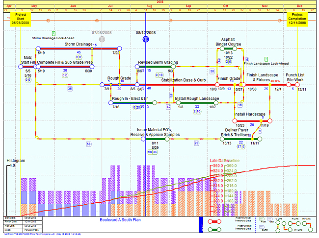
-- Bryan Ritch (email)
Near the top, ET asked about the deep principles. He then offered some of his "doodles" of an alternate way to show project management information.
I've just been struggling through this issue, and I reached a similar solution to ET. Furthermore, if you look around you can find this concept referred to as a "swim lane" chart or a "cross functional process flow diagram" (what an awful term!). When lots of people are re-discovering a similar solution, it would seem a deep principle is nearby.
Roughly speaking, a project consists of tasks. These tasks must be done by a person at a time. Hence, we have a triple: (task, person, time). The big advantage of a Gantt chart is to make an list of all the tasks, and that's really nice to have. Then you tack on time. Locally, a Gantt chart is dense, but globally it's sparse. Also note that the tasks are almost certain to be different from each other.
The swim lane approach relies on the ability to group all the people into a small number of clusters. This clustering is key because it allows you to plot the data differently. Instead of plotting "yes" or "no" at each (x,y) location of (time, task), you make a grid of (time, who), and then at that location you put the task.
Because you've only got a few clusters for people, the figure is now much more dense. As ET points out again and again, high data density + good design = deep understanding. We have found this to be true in my project.
I'm not saying this approach can or should replace Gantt charts, but it's nice to have a good alternative.
In my recent project, we also needed to share test cells, and there were only 3 available. Hence, we had 4-tuples: (task, team, time, test cell). After some experimentation, the best solution seemed to be two adjacent swim-lane figures. Time goes across the top of the page. There are rows for the teams, and then below that are rows for the tests cells. In the upper part of the figure, the task is put at the (time, team) location. Below, the team name is put at the (time, test cell) location.
-- Ted (email)
Project management readings
For a big set of readings on software project management, see
http://www.projectreference.com
It would be interesting to see how Apple manages projects, given their minimization of process. Also I miss references in the reading list to Philip Greenspun's books on project management for web sites and software.
-- Edward Tufte
We use a simple reporting system to visualize progress on high-rise buildings. A white block denotes an activity that has not started, a green one that has been completed and a red one, one that is constrained and cannot start. Three or four charts plotted side by side can be used to describe a timeline and hence used as a planning tool. Simple but effective.

-- Yannis Lazarides (email)
Project charts on smartphones and tablets
Interesting to hear ET concepts for project management interface for modern phones and tablets. What is a right concept of the interface for iPhone/Android? What is for iPad and Kindle Fire? We have got smaller screen but we also got touch interface.
ET response: Don't change anything, use the regular interface. On smartphones, users accommodate all the time to websites designed for desktops. A good example is that many many people read The New York Times on the iPhone screen. And the iPad has better resolution than some Dell laptops already and there is no reason to do an iPad-specific chart.
ESPN has a terrible iPhone and iPad implementation (worthy of a PowerPoint slide) and then ESPN makes it difficult to find the desktop version. More generally, avoid product-specific dumbing down of content and interfaces. That why they're called smartphones.
-- Vasyl Mylko (email)
Who owns "float" in a construction project?
Engineering News Record has an interesting article on project float here, along with a deliberately convoluted flowchart of how things can
get complicated.
We live in a new era of construction cooperation. When it comes to project float, sharing it between the contractor and owner is in, while exclusive float ownership by either party is out.
Although float is generally understood in the industry as extra time or leeway for completing a project schedule, its use remains controversial. At stake in the float debate are hundreds of millions of dollars lost or won in timely completions or delays. Some fervently support float sharing, believing it epitomizes fairness and harmony.
Others say float calculations are fraught with deception. Even if calculated honestly, float rightfully belongs to the owner or contractor for their exclusive benefit.
Sharing of float is rarely clear in case law regarding contracts, Hess argues, and it harms contractors in significant ways. By depriving contractors of use and control of the schedule they create and execute in carrying out the work, float-sharing cuts the connection between risk, responsibility and control. If timely completion resides in the contractor's domain, Hess claims, control of time belongs there, too.
Float can lead to other problems. Under most shared-resource contract clauses, the first party to need the extra time is permitted to use it. But to Hess, "first come, first served" doesn't seem like a good idea. With much of the owner's design work and preparation taking up time at the start of a project, sharing disproportionately helps the owner; if contractors run into problems later in the work, all or some of the float may have been burned already.
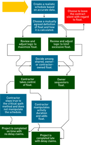
There are different types float and definitions for each; however, one definition/example of float is slack time that is available to a particular activity. If an activity with float is delayed, it won’t delay the whole project, until the float is exhausted. For example, float could enable certain activities to proceed out-of-sequence without delaying the project. This could be beneficial if, say, a supplier’s factory burns down during construction. That actually happened to us!
Virtually all public works projects have financial penalties if the contractor does not finish in time. Incidentally, contracts insist on not calling them “penalties.” Instead, contracts call them by the euphemistic equivalent “liquidated damages.” If a project has late penalties, then I think that the contractor owns the float.
Others argue that the project owns the float, (now there’s an abstract concept!) and it should be available to the owner, or shared between the parties.
-- Jon Gross (email)
The Github Network Graph is an interesting contribution to software project management visualization. Github is a collaboration environment built around the Git software configuration management (SCM) tool.
With Git, when a software developer wants to contribute to a project he or she forks the project (see the blue line that diverges from the black line) and then makes a change (see the dot on the blue line) and then asks to merge the change back into the main project (see the blue line merging back into the black line where the blue arrow points to the black dot).
The purpose of this graph is to help the project owner (1) identify risk, (2) decide what change to merge next, and (3) see what project contributors are working on.
RISK
Let's say the owner of the green line requests to merge his or her code back into the black line. You'll notice that four
black dots (changes) have been created since the green line diverged from the black line. That means there is a lot of
risk that the green code is out of date with the latest black code. So, before the green code is merged, the green
developer must first update his or her code with the latest changes from the black code.
PRIORITY
Let's say the pink developer is working on a really important feature. The Network Graph helps the black developer see
where the pink developer is in his or her work and what help might be needed to get the pink code ready for a merge.
Other team members can also see what is going on.
FOCUS
Each developer gets a swim lane and each line references commits to the code base that are linked to changes to the
code. That means team members can see what parts of the code other developers are working on and identify potential
conflicts or opportunities to team up.
The Github Network Graph isn't the greatest diagram ever, but it attempts to solve some problems faced by geographically distributed teams working on largely textual projects that are difficult to visualize.
-- Michael Hogan (email)
This thread is an excellent resource for both project management and the display and presentation of complex information.
I am involved in a complex IT project and have used the input and comments and the original Edward Tufte examples to develop a version of a Gantt chart which may be helpful to others, so I have attached an example.
The approach was to combine a higher level schedule spread over 20 months - with a more detailed scheduled with associated tasks and resources based on examples in this thread. This is a subset only of all the tasks in the project.

-- Mike Lees (email)
The method of a PERT chart with swim-lanes works well for a process that will be repeated over and over again. It provides a context for communication - people can call their customer ahead of time to prep them and eliminate queueing delays. See my blog post here.

-- Ed Fontana (email)
Software implementation of ET's basic design
Overview
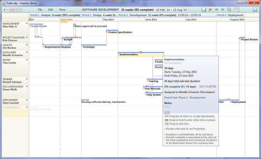
Detail within context
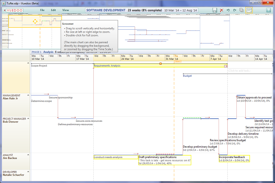
About 7 years ago, while working at HP, I had the misfortune to use MS Project to manage two software development projects. This was my first time using it, and I was appalled and incredibly frustrated at just how bad it was! Far worse than any of their other products. Apart from the many shortcomings well-documented above, I just couldn't believe how hard it was to use.
Around the same time, I became aware of this wonderful discussion thread, and thought that surely there must be something better out there. But no, after much searching, all I found were hundreds of clones of MS Project.
I became so incensed and passionate about this, that eventually I quit my job at HP, and in 2008 began work on developing a PM app based on ET's design, extended with ideas of my own. Facing many obstacles, getting funding etc, it all took much longer than I thought it would. But now finally version 1 is almost complete, and we have a free Beta version available for download at vuedoo.com. The name of the app is Vuedoo -- "view all you do."
Of course, in the meantime, MS Project has improved somewhat, and now has a resource view that bears some similarity to ET's swim lane chart. But it's not that great and it's only available in the professional version, which is incredibly expensive and over-engineered. I think ours is better :-)
-- Jarryl Wirth (email)
|
||||||