|
All 5 books, Edward Tufte paperback $180
All 5 clothbound books, autographed by ET $280
Visual Display of Quantitative Information
Envisioning Information
Visual Explanations
Beautiful Evidence
Seeing With Fresh Eyes
catalog + shopping cart
|
Edward Tufte e-books Immediate download to any computer: Visual and Statistical Thinking $5
The Cognitive Style of Powerpoint $5
Seeing Around + Feynman Diagrams $5
Data Analysis for Politics and Policy $9
catalog + shopping cart
New ET Book
Seeing with Fresh Eyes:
catalog + shopping cart
Meaning, Space, Data, Truth |
Analyzing/Presenting Data/Information All 5 books + 4-hour ET online video course, keyed to the 5 books. |
I have red-green color blindness and have difficulty seeing traffic lights under certain conditions. In bright sunlight, red lights look dim and fail to stand out against the background of sky, trees, and buildings. At night, green lights look white, and become nearly indistinguishable from the street lights. Consequently, I live in Manhattan and avoid driving in bright light and at night.
What is the rationale behind choosing colors that cause problems for 5% of men and 1% of women? This seems to be an example of poor information design, considering the severe consequences of an error. Do you have recommendations for an alternative set of colors?
-- LS (email)
I wish I did, but I do not have a recommendation for an alternative set of colors, yet I would like to contribute two ideas.
1. Concerning the color red, I recall reading about studies conducted nearly 100 years ago that found bright red to be the first color that registers on our retinal nerve endings. Therefore, for people without color blindness, bright red catches the eye fastest--hence its traditional use as the universal color for fire, safety, danger, and perhaps traffic lights.
2. Though not a color-related solution, a possible aide to detecting the changes of traffic lights is a device I witnessed last month in China. In the beautiful city of Qingdao (Ching dow), at intersections between the pair of overhanging traffic lights is a large digital clock (or more like a stop watch) that counts down the number of seconds remaining before the light will change. The number started at 30 seconds, 29, 28, and on down to 1. If such a device were present at every intersection, you would at least know when a light was changing. The problem would still remain: "Should I stop or go?"
-- Michael Buschmohle (email)
Rather than worry about particular colors, the answer might lie elsewhere.
Having symbols that glow would allow differentiation of the signal lights and provide an alternative that would be color neutral.
-- Yusuf Mohsinally (email)
From far away, or for people whose vision is not 20/20, the symbols may get too small, and be percieved as circles.
What about blinking? This doesn't depend on color perception or visual acuity.
-- LS (email)
I'm not sure a different color choice would be such a good idea. Red's use in stop signs and car tail-lights (for instance) is pretty widespread, and using different colors in a traffic light might hinder the universality of the color's meaning in those applications. Anectdotally, changing traffic light colors brings to mind the Cultural Revolution in China, where there were some attempts to change the interpretation of traffic lights so that Red (the color of the Communists) meant go.
Perhaps a better solution to this problem would be to conceive of a better presentation method. I seem to remember that in New Mexico (or at least around the Los Alamos/Albuquerque area) the traffic lights were arranged horizontally instead of vertically, which I think was somehow meant to aid people with color blindness. But this doesn't address the brightness or contrast issue. I know that in parts of the Bay Area, particularly San Jose, they strobe the red light right when it changes to red, so there's a bright red flash right when it changes to red. This is technically possible because of the LEDs they've started to use in place of normal lightbulbs in the traffic lights out here. Again, this doesn't help if you're looking at a traffic light that's already turned red, and I'm sure people wouldn't appreciate a constantly strobing red light.
Perhaps a solution might be to install a sensor in the car that would respond to a certain radio signal or wavelength of light (infrared?) at a traffic-light controlled intersection and would make a sound or somehow alert the color-blind driver to the state of the traffic light. This would leave the traffic light unchanged in its traditional appearance (thereby preserving the universality of its function) while adding to its functionality. Or perhaps there's a means of augmenting the red wavelengths through the windshield via a filter or coating (or something akin to polarization) to make the red and green colors more noticable.
As an aside: In the Bay Area, some of the pedestrian signs have timers, which helps people guage whether they have enough time to cross the street before the light turns colors. This works for pedestrian crossings, but counting down the time until the traffic light changes is too analagous to drag racing. When I visited Hong Kong in the late-80s - early-90s, they would cycle the traffic lights such that the red would be steady and then they'd show the yellow before turning both off and turning on the green. Ostensibly, showing the yellow allowed people driving manual transmissions to get into gear before the light turned green. Of course everyone started driving once the yellow light came on, and woe to any pedestrians in the crosswalk!
-- Dave (email)
How about this?
No light - Go Blinking - Prepare to stop Stable - Stop
Wouldn't we be saving energy too? I must be missing something here since this doesn't sound like an out-of-the-world idea.
-- Sridhar Krishnamachari (email)
The problem w/ no light, flashing light, stable light
The problem with:
- no light = GO
- flashing light = TRANSITION
- stable light = STOP
What if there were an intersection control device that when compared to a semaphore:
- required less electrical power
- had greater throughput (i.e., cars per hour)
- resulted in cars passing through the intersection more quickly (i.e., less overall waiting)
- reduced the number and severity of vehicle-vehicle accidents
- reduced the number and severity of vehicle-person accidents
Well, take a look:
- http://www.tfhrc.gov/pubrds/fall95/p95a41.htm (first of many pages; see arrow in lower-right)
-- J. E. Ivancich
Excellent recommendation!
-- Edward Tufte
I like roundabouts, or traffic circles. I have one around the corner. More efficient than putting in stop signs or traffic lights. But, I don't like the fact that they are not easy for pedestrian traffic.
I do not feel comfortable with my kids crossing at a roundabout, because unlike traffic lights and stop signs they don't have designated areas for crossing pedestrians. With the roundabout, my kids have to cross the street 3 times to get home- it's a free for all in that regard. How does a good roundabout handle pedestrian traffic?
-- Alison Fraser (email)
For amusement value, here is a junction in Swindon known as 'the magic roundabout': http://www.swindonweb.com/life/lifemagi0.htm
It's basically six mini-roundabouts arranged in a circle. US readers looking at it need to bear in mind that traffic goes on the left in the UK. Newcomers often find it daunting, but the locals like it, because the rule for navigating it is simple, although not obvious - go round the outside, unless this would require you to use four or five roundabouts, in which case you go round the *inside*, the other way!.
There's another, with six mini-roundabouts, in a different town - also called 'the magic roundabout'
As far as pedestrians are concerned, the best advice is to cross each of the roads separately - away from the roundabout.
-- Alex
A good roundabout for pedestrians is one with separate pedestrian crossings on each of the roads round it. They can't really be incorporated into the roundabout itself. Or at least, the only place I've seen that done is a roundabout with a pedestrian subway between each road to an open, but below ground level, area in the centre of the roundabout. Architecturally cute, but expensive.
-- Alex
The magic roundabout is very nice.
-- Edward Tufte
I would recommend a change in presentation of the lights to include a symbol which would signify the action to take. Stop could be either the stop sign signal or an hand facing the direction. I like the caution blinking since it is used in many intersections already with that meaning. Green should include arrows which show directly which way you can "go". This would cover color blindness and lower any confusion. Of course in my state there is a traffic signal which has a red solid light and a green arrow straight ahead. Figure that one out!
-- P. White (email)
On my last trip to Quebec, most of the traffic lights that I encountered had both color and shape. If I recall correctly, green is a circle, yellow a lozenge, and red is two squares. This innovation made things extremely clear to me -- as it presumably would to a color-blind driver. Moreover, it also provides a backup if one of the red lamps should go out. The only startling thing was that Quebecker engineers apparently feel free to arrange the lamps in random order (though the reds are usually on the outside), as opposed to the traditional red-yellow-green (from left to right or top to bottom).
-- Joe Levy (email)
A color-shape combination may not be the best mechanism for the "stop-light" issue, if you need to preface your remark with "if I recall correctly"! I sure hope if we meet in an intersection in Quebec, we have a mutual understanding about "who has the right-a-way"!
Mike Round
-- Michael Round (email)
That is an interesting observation about Quebec. I live in Ontario and it's a common theme here that driving is fast and scary in Quebec. So much so that it's a standing joke about colour of light - green and yellow both mean go, and red means slow down and look. Of course it's an exaggeration, but I do find the traffic light system an intriguing take away of that province (known for its great food, music, nightlife).
-- Alison Fraser (email)
In "The Origins and Globalization of Traffic Control Signals," Journal of Urban History 25 (March, 1999), 379-404, Professor Clay McShane of Northeastern University explains that the first red signal lamp was used at an English lighthouse in 1806 and was selected because red was the most tranlucent color of stained glass then available. From lighthouses, red (and, later, green) lamps spread to ships, then railroads, and then, in 1914, to street signals. By 1923 some engineers realized that the frequency of red-green colorblindness could cause problems, but they judged that changing to another scheme, such as blue and yellow, would sacrifice years of work teaching drivers how to obey traffic signals.
-- Zachary Schrag (email)
While round-abouts may have their place, they take a lot of getting used to, if you don't grow up with them. After several years of living in central London, one of the most exhilirating driving experiences imaginable was to go full tilt through the Hyde Pard Corner or Marble Arch roundabouts and emerge unscathed. Some years ago, for whatever reason, the London authorities modified these round about by - installing traffic lights midway around them.
I was also living in Norway, when the city of Stavanger decided to construct roundabouts. Since traffic goes around them counter clockwise and has the right of way over entering traffic, this was counter intuitive to a very strict Norwegian driving rule to yield to traffic entering a roadway from the right. In the case of the roundabout, traffic entering the roundabout had to yield to traffic from the left. This caused no end of confusion, initially.
-- Jim Heimer (email)
The first railway signals used red for the stop aspect and clear for proceed aspect. The light source was a paraffin/kerosene lamp so it gave off a relative feeble, yellowish light. The red was supplied by a coloured glass plate, usually coated. True red glass was a much later development. The clear aspect was provided by no plate. Obviously not fail-safe, and after several accidents because the red glass plate was missing, green was eventually substituted. Because of the yellowish light, early spectacle plates were actually quite blue in colour. It was not until the widespread adoption of electricity that the "green" plates really became green.
For the trivia buffs, the sequence of lights is different for road and rail. From top to bottom a road light is (usually) red/yellow/green while a rail light is (usually) green/yellow/red. The rail rationale is that this prevents a red aspect being missed due to snow, etc build-up on the light hood below (since there isn't one!).
Flashing aspects are being introduced on railways, but in every case only where failure to flash yields a more restrictive interpretation. I'm not too sure just how you would implement that concept on the highways of the world!
-- Stan Patchet (email)
I just noticed this question and wonder whether the contributors actually drive cars. I lived in Nova Scotia for a year, where roundabouts were common. Regardless of the "right of way" rules, the way people actually drove was to speed up on approach to or within a roundabout. Faster, perhaps. Exciting, definitely. Safe, well, good luck!
-- Dale Lehman (email)
I am pretty sure that if I were driving in Britain and came upon the magic roundabout, I would park and walk. Thus, I share Alison's concerns for pedestrian safety.
When I lived in Birmingham a few years ago, I often found pedestrian crossings were down the street from the circles, with stop lights and marked cross walks. This was much safer, and generally just as convenient, as long as you could plan ahead which roads you needed to cross.
-- Kent Karnofski (email)
I remember driving in Maryland a while back, near Washington, DC, and traffic lights were like so:
| Meaning | Color | Symbol |
| Go | Green | Arrow pointing up |
| Caution | Yellow | I don't remember, it's been a while |
| Stop | Red | X |
Combining color, symbol, and standard positions (go above, caution in the middle, stop on the bottom) gives people redundant signals for assessing whether they should stop or go. Add to that the presence or absence of cross traffic, and whether the car ahead of you is going through the light (since in bigger cities there's almost always a car ahead of you), and a driver is likely to have enough signals to avoid a catastrophic traffic failure.
Addressing the concern of symbols not resolving properly for people with poorer than 20/20 vision, it seems that the solution would be to make the symbols large enough that anyone whose vision is adequate to drive legally can resolve them from some minimum distance. For increased error margin, one might make the symbols even a bit bigger than that, to help account for adverse viewing conditions (fog, rain, snow, etc.). After all, we count on drivers resolving a number of symbols (street names, "one way" signs, "do not enter" signs, a variety of construction warnings, etc) already. Provided the traffic-light symbols were at least as meaningful as those signs, someone could drive with complete loss of color vision and still have confidence in their traffic control information.
-- Adam G
One need be careful of "enough signals to avoid a catastrophic traffic failure", as additional information may cause confusion and catastrophe ... not prevent it.
Does a green light IN CONJUNCTION WITH a straight arrow mean I have the right-of-way, but only straight ahead?
A police officer I know once told me, after an arrest, interrogation, and subsequent jailing, he had read the individual his rights three times - "just to be safe".
I asked, "If I were the defendant's attorney, I would use that as evidence in my client's behalf. 'You're certain you read my client his rights after the arrest?" Yes. "Then why did you read them a second time - and a third? You must have had some doubt."
Redundancy is not always a good thing.
Michael Round
-- Michael Round (email)
I suppose we could collect statistics on traffic accident rates (at controlled intersections only, of course) in states with color-plus-symbol traffic lights and color-only traffic lights. We would have to account for other confounding factors, such as traffic density and speed, but if we also distinguished based on the degree of color-blindness of the participants in the traffic accident, we might be able to answer these questions about whether a symbol helps the color blind and whether it confuses any drivers, regardless of color perception.
Otherwise, we're just speculating.
On the miranda rights, I would argue that a better analogy would be handing the suspect a printed copy of his rights, reading them to the him, and showing him an informational video about his rights. Then, the courtroom defense of presenting the information all three ways is simple: different people learn different ways, and we wanted to be sure not to leave anyone confused regarding their rights.
-- Adam G
I live in a downtown area. There is no way we can discard lights for roundabouts without removing many buildings to make the space needed for the insane activity of driving in circles until you're facing the direction you want to go. I think we are smarter than that. Having grown up in northern New England, where there are Round Abouts (We yanks call them Rotaries.), I can attest to the complete mayhem and danger they present!
Actual statistics aside, if the problem did hypotheticly need to be solved, the discussion is worthwhile in a mere problem solution analysis.
If we get back to the original question on solving the issue of color blindness in the current traffic light schema, I have been thinking on the issue quite a bit.
I looked at this problem as a programmer. I see the lights as a computer program with a definitive GUI. When modifying an old or already distributed program it is usually imperative the program keeps major components of its previous functionality. (Hopefully Microsoft won't head such advice on the next version of Powerpoint!)
So we would need to do two things.
We cannot discard the current system, else we'd have major accidents and death for about nine months while people re-grow their brain connections to adapt to new color/symbol schemes. We have to keep the current color scheme and functionality.
The next thing is we need to modify the program so that the color, for those users who cannot discern hue, is moot.
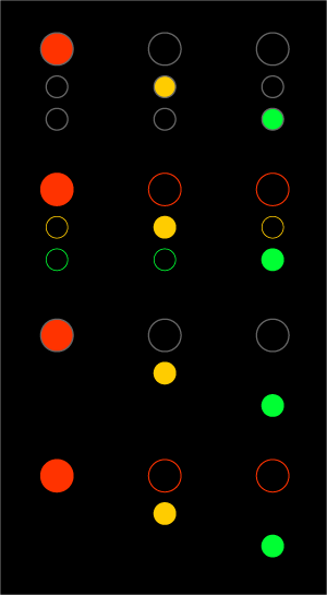
My proposed solution shows ONE box with 4 states of display. The bulbs change color to accommodate those accustomed to the current program we have on the road today.
The modification to program is that the bulbs change their numbers to accommodate color blind drivers who can now use the number of lights as a means of determining the status of the light.
![]()
The concern about the integrity of the fail state of the schema in this configuration is the same as the current program we see on the road already.
An advantage to the solution would be that the function states (3 of them, with an added sub state of 'slow'.) are the same as the current program, the light box object would only need to be replaced, current electronic circuits or underlying objects supporting the light box object should support this new solution, making this an actual economically viable solution.
So my proposed solution keeps the same program, but modifies the GUI.
-- Jeffrey Berg (email)
In the instance of the traffic light as GUI, the red light with only one circle (as opposed to the green with 4) results in the least amount of conspicuity for the most important signal state.
-- Estes
Although none of these colors is truly recessive (all are dominant to some degree) red is the most dominant. We "see" red first. It is a color which signals a danger of some sort at a very primal level. In lighting design you will be more aware of red than any other color except magenta. Very little red is necessary to make a point. Of course it only remains red if it is in a non red environment.
This does not take into consideration color blindness but is a universal of color perception for the vast majority of the populace. Total color blindness is very very rare. I do not know of a medical condition where you are unable to perceive value. Depth perception is a virtual universal for the sighted.
Visual cues are good when driving because vision is a darn good survival tool for threats at a distance... you see the lion or the lions motion before you smell the lion or before you hear the lion...
What do we perceive as visual cues to danger other than color? Proximity and motion are two likely candidates. Stop lights used to include a metal bar which flipped up with the word "stop" when the light changed to red and "go" when the light changed to green. You will also find some old models where the red lamp is considerably larger than either the green or the yellow lamp. Scale can easily be a substitute for depth (nearer=bigger). Both of these options are no longer used because of issues related to manufacturing costs.
Aside: Roundabouts in snow can be an interesting spectator sport.
-- Ziska Childs (email)
I strongly agree that Quebec signals are useful for the color-blind, using shapes as well as colours and using two reds instead of one. My aunt is colour blind, she lives in Prince Edward Island, Quebec style signals with the double red lights are used there, she finds them useful as red is two squares, yellow is diamond then green a full circle or arrow.
-- Sim (email)
The issue of dim looking red lights, and green lights that are confused with street lights because they appear white may be addressed by using LEDs. LEDs would both make the red light more distinct and the green light (that appears white to the red/green color blind) differentiated from street lamps. I believe there are already some cities considering this, and it has been a heavily researched area in airport lighting.
Additionally, adding some contextual cues the current US standard for traffic lights might be helpful. Rather than changing the current lighting system in any way, adding simple delineating lights make it possible for the color blind to rely on the "red at the top" heuristic. Making radical changes to the current system is, I believe, undesirable. Even something as simple as changing to the "Quebec" lighting system could cause havoc, albeit temporarily. In the image below, the white lines are simply used to suggest lines of white light. The white lights provide spatial context. At night, under reduced visibility, or at some distance, spatial context, which would normally be provided by the lamp casing, isn't available. By using the white lights as delineators or outlines, you get information about the location of the light in the casing. If the top light is illuminated you know it is red (even if you can't perceive it is red and you aren't provide a spatial context). Additionally, the extra lights make it quite distinct from a street lamp. Making the red light larger doesn't really address the problem, because it is only larger when compared to the other lights. If the lamp casing can't be seen (as is the case in these conditions) no context for "largeness" is available. At any old rate... 
-- Estes
Aside from the failsafe issue there's a further problem with flashing lights: as I'm approaching your flashing lights and look up, if I see no lights on how long must I stare at the lights to determine that the lights are indeed off and not merely momentarily off and actually flashing?
Incidentally, speaking as a Quebecer the lights described above aren't universal here. They're more of a suburban thing especially in places where they've put horizontal lights up. Presumably precisely to work around the problem that there isn't really a standard horizontal ordering for colour blind drivers.
-- greg (email)
Traffic lights and sleight of hand...
The outlines and the delineators are interesting but I wonder if the white light would actually make the coloured circles disappear.
It is a well known stage magician tactic that was exploited to perfection during the Second World War by Jasper Maskelyne when he made the the Suez Canal disappear.
https://www.google.com/search?hl=en&q=Jasper+Maskelyne
-- Tchad (email)
Can a Kindly Contributor show a thinner gray circle around the lights? Maybe 40% black.
-- ET
There are a couple of traffic light images on Google and the 40% black is compelling but it may be useful to take a photo of a mock-up using christmas tree lights around a make-shift red light.
Light in the sky and ink on paper are quite different. The magician trick plays on the eyes' ability to resolve the differences in brightness. I am sure the more medically inclined will have a better explanation but for the moment light coming towards the eye may confuse the perception of the colours or even objects between the light sources.
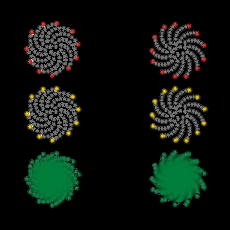
If we are dealing with LED technology as discussed above, and imagine a that the littel LEDs are packed in a certain order - maybe even in an organic configuration such as a honeycomb or sunflower [ http://www.wolframscience.com/nksonline/page-411 ] - could we not just light up a few LEDs at a low level to indicate the presence of the two lights that are not currently lit?
-- Tchad (email)
Here the lights are outlined with 40% black and with the light's color. Perhaps only the red light needs an outline.
 |
-- Dave Nash (email)
Well my suggestion didn't help much, if we can make judgments based on the screen here. But how do we make judgments based on actual realistic practice?
How about some little holes in the hood that surrounds the light, so a color glow could leak out from around the light? Or little light tubes that come out like whiskers from the hood?
-- ET
A bit off-topic, but interesting : http://www.newyorkmetro.com/nymetro/news/people/columns/intelligencer/11022/
-- Remy Jon Ming (email)
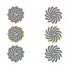
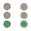
LED EXAMPLE
Would either of these solutions work using LED technology?
 larger |
 larger |
By lighting only the perimeter LEDs it would give a rough
indication of the context. Also the LED traffic light might be
more resilient to failure since one dead LED would not render
the light useless.
-- Tchad (email)
In Maine (at least in the Portland area) the red light has a vertical white light that strobes when the red is illuminated. This, I presume, serves two purposes - helps color blind people, and also brings more awareness of the need to stop for drowsy/drunk/inattentive drivers.
-- A Kerin (email)
Traffic Light Panels
I have been studying Red Light Running, Intersection Accidents, and other colorblindness related aspects lately. I came across something very very crude - nonetheless very effiecient. By searching some patents, I found a Patent for Traffic Light Symbols. The default colors are still the same, but are now improved with an outline of various shapes. Red Light has an Octagon shape, Yellow has Triangular shape, & Green is circular.
-- Rick (email)
Would it be better and fail-safe not to have the green circlar, as this could be red on a standard set of lights. Octangle red like a Stop sign, Triangle amber like a warning sign, that leaves a few distict symbols Arrow; multi-head arrow; square; diamond or rectangle for green - arrow is like a one-way street sign.
Green actually means give-way (or yield) in the UK, which is a triangle sign with an edge across the top. The warning sign triangle has an edge across the bottom. Our very old trafic lights had the word "STOP" written accros the red light.
To retro fit existing lights, a silhouette of the shape/word could be stuck over the lens. The LED lights could have the LED removed or replaced with a complimenty colour in the shape of the symbol.
-- Bobby (email)
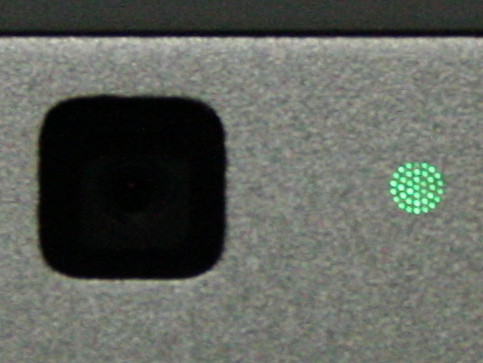
This is a photo of the "On Air" indicator on the new MacBook Pro.
Apparently it cannot be seen when the light is off and there are no
obvious holes in the case.
It is interesting to see the pattern as well as the production method.
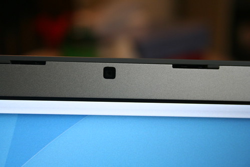
PHOTO BY NOBIHAYA
https://www.flickr.com/photos/nobihaya/
-- Tchad (email)
Update: I'm the original poster of this question, which I posted here in 2003. In Manhattan where I live, they have since installed new LED traffic lights, and, surprisingly, the red lights are much brighter than the old incandescent traffic lights, and are easy to see in the sunlight. So, assuming similar lights are eventually installed throughout the country, it looks like the problem is solved, at least for my type of color vision deficit.
-- LS (email)
Here's a link to an interesting article ostensibly about a traffic engineer:
http://www.wilsoncenter.org/index.cfm?fuseaction=wq.essay&essay_id=462572
Not only is the article pertinent to this particular discussion, but to the larger issues of information design (and usablilty for that matter) that goes on here.
There are a lot of ideas mentioned in the article that sound very similar to ET's thoughts on chart junk and data resolution. Specifically, the notion that "When you treat people like idiots, they'll behave like idiots."
I would be interested in knowing your thoughts.
-- Bryan (email)
Vertical signals: Red is always on TOP. Horizontal signals: Red is always at the LEFT.
This is a standard to help the color blind.
Also, red signals are required to leak some yellow, Yellow signals are required to leak some red, and green signals are required to leak some blue, so color blind people can at least tell green from the rest.
Some history.
Red is the universal color for danger, because both fire and blood are red.
The colors were originally chosen for railroad use. They decided early on red for the danger (stop) signal, but the original colors were:
Red - danger (stop) Green - caution (next signal is red) White - proceed
The caution indication is necessary for railroads because the stopping distance of a train usually exceeds the sight distance of the engine driver. So each signal was repeated at two places, usually half a mile apart. The first signal was called the distant signal (warning of the upcoming stop, had only the green and white lights), and the second was the home signal (where the stop was actually required, had only the red and white lights).
The problem with the above colors was that, if the lamp for the signal was out, the engine driver often mistook some other fixed (white) light as the signal, and proceeded when the signal was supposed to be red.
The next version had only two colors. Whether the signal was at caution or stop depended on the type of signal backplane, as the caution indication meant the next signal was at stop. If the home signal and the distant signal were to be on the same post, the distant was mounted 3 feet under the home.
Red - danger (stop) or caution Green - proceed
The final version used yellow for caution instead of red, because some signals displayed the red for stop, and also displayed the caution indication to indicate the next signal was red.
Most early traffic signals used red for stop, green for go, and yellow for get ready to do the opposite of what you were doing.
-- midimagic (email)
Red wasn't always on top.
I remember many years ago (and I mean prior to 1950) in Atlantic City, New Jersey, the traffic lights were set up with red, yellow, and green for one direction and green, yellow, and red for the other. I believe there was only one light bulb in the traffic light, which made such an arrangement necessary.
In those days, most New York City traffic lights didn't have a yellow signal. There was just red and green. To indicate that a light was about to change, both red and green lights came on briefly when the light was about to change.
-- Bill Sharpe (email)
The newest version of the US Manual of Uniform Traffic Control Devices will include a backplane behind the signal with a reflectorized yellow rectangle around the entire signal face. This has two functions:
1. Help the color blind person see which lamp is illuminated.
2. Locate a signal during a power failure (indicating, in most states, that the intersection becomes an all-way stop intersection).
Here is a slideshow featuring this. Go to page 242.
http://mutcd.fhwa.dot.gov/resources/proposed_amend/08npa_comp_presentn.pdf
-- Larry Robinson (email)
In Tianjin China they have an interesting solution that although not very good for those who are colour-blind, is elegant and provides countdown information without numbers. It's essentially a single rectangle (horizontal or vertical) that starts full of red or green, then losing that colour until only 1/3 is left, then flashes yellow (only prior to turning red), and then turns fully red (or green), only to progressively lose that colour until only 1/3 is left, and so on.
For a photo and a fuller description, see http://en.wikipedia.org/wiki/Unusual_uses_of_traffic_lights#Traffic_lights_in_Tianjin.2C_China
-- Des (email)
AutoBlog posted a picture and description of a new traffic light design:
"The Uni-Signal is aimed at helping those who are red-green colorblind to have an
easier time with traffic signals. Instead of using circles for all three lights, the red light
gets a triangle, the yellow light remains circular, while the green light goes square."

SOURCE
http://www.autoblog.com/2010/06/18/traffic-light-as-redesigned-for-the-color-blind/
-- Tchad (email)
magic roundabouts are not hard to drive around
The presentation of magic roundabouts as an aerial view of the whole system makes them seem a lot more complicated to use than they really are. I've driven across/around one without even realising until afterwards.
The user experience is much more along the lines of: "here's a (small) roundabout that I go around until the exit I want. Oh look here's another another round about, that I'll go round until the exit I want. Oh look here's ..." rather than plotting a route through the global system as you are inclined to do if presented with the diagram. The big roundabout doesn't even really exist in the sense of paying attention where you are driving.
-- Ben Clifford (email)
Response to Traffic Light Colors from a Red-Green Color Blind...Traffic Lights colors in Japan
I am Red-Green blind as well. To be honest, I never had problems with traffic lights. What I see is probably different from what other people see but I got used to the sequence of colors (top to bottom or left to right) rather than to the color themselves. Probably it is because I am used to deal with my small handicap in my work practice and I 'improved' my way of feeling colors. What I generally see when I stop at a traffic light is a kind of red (my red) for the red light and a white for the green. I have lived in Manhattan for a while and I did not remember having problems with traffic lights. Funny thing, in Japan the green light is called Blue...well at least in the Kansai area. This has been told to me by different relatives when I was in Japan and I think it should be confirmed by Japanese contributors. Prof. Tufte, thank you for the lecture at the Royal Geographical Society.
-- Maurizio Gibin (email)
Just a small observation: I have seen traffic lights in a few smaller Norhtern German towns that have no green light at all. The traffic light tells you to slow down or stop, but "dissapears" when you're allowed to go.
Railway crossings use the same idea: if the red lights are off (and not flashing), the coast is clear. I found the concept refreshing and it made me more cautious when crossing the intersection, which I think is good.
-- Stephan Quednau (email)
I see a potential problem with no light for 'go' as there is no fail-safe condition. With the 3-light convention, in a power outage the absence of any signal alerts drivers to treat the the intersection as a 4-way stop. With no light indicating 'all clear' there could be disasterous consequences.
-- Mike H (email)
I'm not sure nowadays (as it has been some time since I have been there), but I believe traffic lights in Japan were Red-Yellow-Blue originally and then became Red-Yellow-Green.
Again even current "green" lights (pedestrian walk signals even) are a sort of blue-green mix as well. Its distinct from the blue location signs used in Japan and the green we see in the US.
Around Asia, the terms for blue have been used to describe green (and objects that are green) as well. I know Korean and Japanese do this as a previous poster mentioned. It probably is linked to older language definitions of colors, or of what the main colors are considered. Basically that green is a shade of blue, vs considering green as part of a continuous color spectrum.
One story on this: A Japanese manager my father worked with came to a manufacturing plant in Mexico. The building was not painted at the time so he asked for the building to be painted "blue". This literally translated by my father, would lead to the building being painted blue.
As such the day after it was painted the manager was surprised... "I thought I asked for it to be blue?" (in Japanese to my father) "Huh?, It is!" (my father).
-- MJI (email)
HOUR GLASS CONCEPT
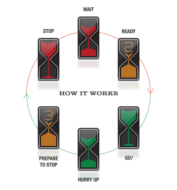
This is not the strongest design concept for a traffic light but it does take
a novel look at what can be done with individual LED pixels.
SOURCE
http://www.yankodesign.com/2010/11/18/sands-of-traffic-times/
-- Tchad (email)
While walking around downtown Kansas City recently, I stopped at an intersection. Here, not only did the lights provide a visual timer countdown, there was also a beeping sound. What a great idea, I thought.
Until I closed my eyes to imagine I could not see.
The beeping sound was constant - it gave no signal time was running out. It might have beeped rapidly to let me know, but it was constant. I did not know.
That was bad enough. But there was more.
The beeping sound never - ever stopped.
Why?
When my "walk" light turned red, and the opposing light green, the beeping sound for that direction's right-of-way started!
So standing there with my eyes closed, I had no idea when to go, or which way to go!
What appeared good design wasn't so!
Mike Round
-- Michael Round (email)
These "lane control" traffic lights were designed with different shapes in mind to improve visibility for those with color blindness.
-- Scott (email)
Luckily in Toronto they have the green-yellow light countdown so If I see it is counting down from 10 I know a yellow is coming soon. Usually there is a lot of traffic in Toronto so If needs be, I just look around at what others are generally doing if the sun is shining directly on the lights. The only other problem I get is from black frame traffic lights like the ones in unionville. That is the only time that I have difficulty. If there is no traffic around in these type of conditions it is better to stop on green then not sure and go through a red. It only happened to me once and I have been driving for 20 years. I actually love driving at night or when it is very cloudy. Color blind people have an advantage over regular site people at night. We see more clear because we have less color cones. I guess we are really like deer in the night. What is freaky is in Australia they have orange fire hydrants. And if placed on green grass we can't see it from far. Same as orange pilons on grass.
As a rule of thumb if it is difficult to see the lights I try to see what position they are in. This really only works at night or when theit is not sun very sunny.
We are lucky we are not in Turkey as we would not be allowed to drive if we were red-green color blind.
-- steve Lehman (email)
In my opinion, the most effective way to give a solution would be a redundancy of simple signage. In my country (Brazil) some traffic lights (here almost all traffic lights are vertical) have a white stripe at the middle, and I think that stripe helps a lot colour blind people to have a reference on where the lights are.
So, for me, an ideal traffic light would have this stripe, but not just that: it would add universal shapes to the universal colours. Unlike "uni-signal" proposal, I think the universal shape when it means "stop" would be the square, not the triangle, and the "go" would be better represented by a circle.
This is represented below. I think my goal was to be redundant but simple at the same time.

-- Marcos Sandrini (email)
Using beeping noises for blind people at pedestrian crossings
Here in the UK they have a small ridged cone hidden under the push button unit which you press to indicate that you want to cross. When the light goes green to signal it is safe to cross the cone spins round so that a tactile signal is given. This is specifically designed to avoid the problem that mentioned with sound, i.e. that where there are two crossings within a short distance one can't be sure which crossing is beeping.
As seen here:

Also the signal light which is red or green is a picture of a standing man for red or a walking man for green, and so works for people who are colour blind.
-- Alex C-O (email)
|
||||||
