|
All 5 books, Edward Tufte paperback $180
All 5 clothbound books, autographed by ET $280
Visual Display of Quantitative Information
Envisioning Information
Visual Explanations
Beautiful Evidence
Seeing With Fresh Eyes
catalog + shopping cart
|
Edward Tufte e-books Immediate download to any computer: Visual and Statistical Thinking $5
The Cognitive Style of Powerpoint $5
Seeing Around + Feynman Diagrams $5
Data Analysis for Politics and Policy $9
catalog + shopping cart
New ET Book
Seeing with Fresh Eyes:
catalog + shopping cart
Meaning, Space, Data, Truth |
Analyzing/Presenting Data/Information All 5 books + 4-hour ET online video course, keyed to the 5 books. |


i am looking for theories and concepts regarding symbols used in cartography.
i have questions like:
many maps present information about quantity by scaling a distinct symbol. obviously this can become a problem when one has to combine different symbols which are in close neighborhood.
wouldn't it be better to keep the size of an symbol constant but alter instead it's "decoration" (that is, one could have a simple box, a box with one star, a box with two stars...) ?
cheers from berlin,
jan
-- jan (email)
Names of towns on maps are sometimes scaled, as bigger towns have larger type for their name. That seems perfectly reasonable, although it is not always clear if the scaling variable is area or population.
One can, as you suggest, make a fixed-size symbol more dense to indicate an increase in quantity (a very Bertin-like idea), just like using a color gradient to signal changes in quantity. The main issue is ease of reading; too many encodings and the map's legend may receive more attention than the map.
-- Edward Tufte
Cartography is a small interest of mine, so I hope the brief examples here will be of interest. All eight maps reproduced here represent the same area on the page: approximately 3mm by 3mm. The first five are to the same scale: a kilometre is the distance between the blue verticals on the fifth and final one of the series. The other three are also to the same scale: 1: 4.5 million on the printed page, although larger in reproduction here.
The first series of five are all of the small village of Kingston-near-Lewes, East Sussex, UK, which is two miles south west of my home town of Lewes. The first map is from John Ogilby's "Britannia" of 1675, which is a a collection of 100 road maps in strip form covering the whole of England and Wales.
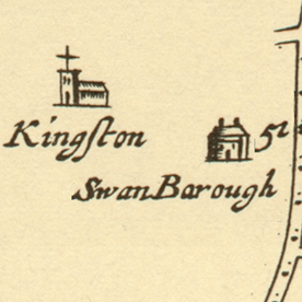 |
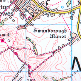
It has the distinction of being the first atlas to use one inch to the mile as the scale throughout. The number "51" by the road at Swanbarough marks the milepost from London. Note the spelling of Swanbarough (Swanborough in the four later maps). This reminds us that borough/burgh comes from a word for mound, and the term "barrow" is used especially in the South of England to mean a burial mound. On later maps we will see these on the hill to the left marked as "tumuli". The dots in the road mark the furlongs (eighths of a mile). The atlas is for travellers and gives all that the traveller would need: on the Newhaven road out of Lewes there is a right turn to Kingston: if you reach milepost 51, you've gone past it.
The second map is from the Ordnance Survey (OS) One-inch First Series which ran for almost the whole of the 19th century.
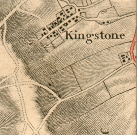 |
From the railways shown elsewhere this particular map was issued sometime between 1847 and 1858. They were printed from copper engravings which allow particularly fine lines to be drawn, as in the hachuring to show the gradients. The village name has (temporarily) gained an "e". Swanborough is not marked, but the individual buildings are. In the village itself, the church is marked with a cross, with vertical hachuring possibly identifying the surrounding graveyard. The colouring on the road is not part of the map: it is the crayoned trace of a journey taken in 1875 by a Samuel Nixon.
The third map is from the third series of the OS One-inch, the hachuring of the gradients has not yet been abandoned, but contours have been introduced.
 |
For me, this is the finest series. It still retains, close-to and at a distance, the appearance of a landscape viewed from the air but with necessary cartographic detail. Individual buildings are still shown. Hand-engraved lettering is used in different sizes and styles to differentiate between feature. This map includes "Minor corrections to May1912".
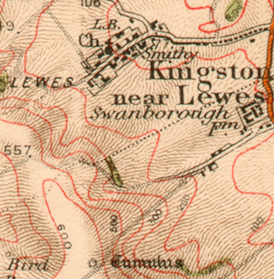
The fourth map is the last OS One-inch series and dates from 1969.
 |
The One-inch series was subsequently photographed, enlarged, and reissued at a scale of 1 : 50,000 (2.5cm to the kilometre) as a new "First Series". As the maps are redrawn by computer they are resissued as a "Second Series". The hachuring has gone to be replaced by more frequent contour lines. Individual buildings are no longer shown except when isolated. This is a loss at fine detail, but in the previous series as building proliferated the maps gave the appearance of having been scattered with soot. A particularly attractive feature of this series is the cream paper on which it is printed: all subsequent series have been on bright white.
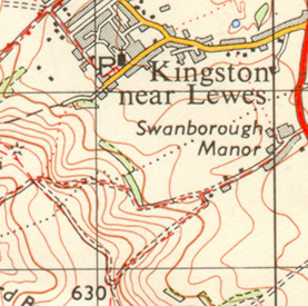
The fifth and final map in this selection is the current version (2002).
 |
These can most easily be distinguished from the photo-reproduced 1 : 50,000 First Series by the heights being shown in metres and not feet, but closer examination shows many differences — not all of them improvements. The lettering is less attractive, and the greater density of contour lines leads to an arbitrary abandonment of them when they come too close together. The use of a deciduous-tree symbol on the woodland is especially pointless when the stand of trees is too narrow for it to be shown complete.
The other series of three maps that follow are all taken from the Macmillan World Atlas published in 1996 at US$60. As an atlas, the quality of the maps varies directly with what is being portrayed and the three samples here illustrate the deficiencies of any cartographic exercise that presents the world at exactly the same scale throughout.
The first map illustrates the atlas at its best.
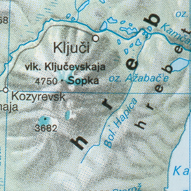 |
Bearing in mind that this is exactly the same area on the page as the maps of Kingston, the level of detail is comparable. Indeed, for parts of the world like the Kamchatka Peninsula and North Korea, this atlas gives maps at a smaller (more detailed) scale than other atlases which reduce the scale for places of little interest to Europeans and Americans. This is not a bad idea: I am old enough to remember British world atlases that devoted 30% to the United Kingdom, 50% to the Empire, 15% to the countries in Europe that we had variously trashed over 500 years of history — and 5% to the remaining ragbag of principalities and ex-colonies like Monaco and the United States.
But same-scale atlases have their disadvantages.
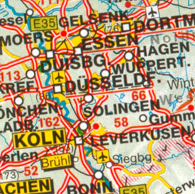 |
This is an area I know well having worked there. The longer, larger towns are abbreviated, and the city names have yellow backgrounds that obscure the detail completely. This is the cartographic equivalent of the Powerpoint effect: no cartographer working by hand would paint out an area of one or more dozen square kilometres in order to have a background against which the name could be read. He or she would find some other solution. But with a computer all you do is set a typeface and a background and punch a button. The LONDON label on the same map covers over a hundred square kilometres of the densely populated M3 corridor: if we had lost the Crimean war and it had been renamed NEW SEVERODVINSK it would reach the Bristol Channel.
The last map is the reverse:
 |
a piece of land of the same area in the Sudan. Any textural detail on this map is an artefact of printing.
At the end of this long posting I think there are two lessons to be learned: computerisation separates a vital connection between cartographer and the printed page; and the cartographic detail depends on what the map is intended to show. Detail that works at one scale or in one area will not necessarily work in others.
-- Martin Ternouth (email)
Thank you, Martin. What a clever and beautiful contribution! Thanks for the time well spent.
-Kent .
-- Kent Karnofski (email)
I share Kent's gratitude for a thoughtful and well-presented essay. There is one point to be made in favor of the same-scale atlas and that is that Western Germany is, in fact, much more cluttered with objects of cartographic interest than the Sahara. If one were depicting just one of those regions, different scales and cartographic conventions are, as you point out, absolutely essential. However the last two examples are quite informative in comparison.
Of course, cartographic interest is a value not to be taken for granted. To a mapmaker with intimate knowledge of the Sahara and no interest in what goes on between Köln and Aachen, a very different comparison would emerge.
-- John Morse (email)
Several web-based archives exist that allow a chronologic study of United States Geologic Survey topographic quadrangle maps. For example, a very nice University of New Hampshire site http://docs.unh.edu/nhtopos/nhtopos.htm has archived USGS maps covering New England and New York from the 1890s to the 1950s. Just as in the UK's Ordinance Survey explored by Mr. Ternouth, there have been obvious changes in the USGS's typography and symbology, but most of the nuts and bolts have remained somewhat constant. It is interesting to note that the OS and the USGS seem to have followed rather parallel paths in the general appearance of their respective map sections. A notable exception is the 2002 OS example given above- to the best of my knowledge, the USGS continues to employ the same palette it has used since the 1950s.
Specifically regarding Mr. Ternouth's 2002 Ordinance Survey example and suggestion that "computerisation separates a vital connection between cartographer and the printed page", I suggest that the "vital connection" need not be, and is not, lost by modern cartographers (professional and amateur alike) when they understand both the graphical limitations of today's cartographic software packages AND the basic qualities that go into any good map (line weights, palettes, typography, etc.). It is not, in fact, uncommon to develop a base map in a GIS package and then export the image to a high level graphics package to do image processing and add artistic elements.
However, the "vital connection" IS all too often lost when the map maker simply uses their software's force-fed layouts, templates, and colors, and basically adopts what I'll dare to call a "Cognitive Style of Computerized Maps".
-- Mark B. Kasinskas (email)
I have never seen a successful indicator to show the declination between a topographical map and the (moving) magnetic north. The most successful I have seen have been where the indicator is lined up with the gridlines. I would be interested in seeing one that: a) indicates whether it is East or West of the true and grid north b) indicates graphically whether it is gaining/losing angle and by how much/year. I am also curious for any effective way to teach this declination and the concept of the 3 norths (True, Grid and Magnetic). I have tried many times to teach this with limited success.
-- Bill Paton (email)
An excellent topic; surely our Kindly Contributors can help.
-- Edward Tufte
Declination Diagram Improvements
Unfortunately I can't post my diagram but looking at the old one and reading my improvements should help
I have come up with what is to me a much improved declination diagram on maps that would help with the average map-user to understand and apply declination to his map/compass.
The improvements are:
a) E (East) or W (West) listed directly.
b) The Magnetic North arrow in red, so it is obvious it is for the compass.
c) Annual Increase with an arrow direction indicating it directly (and removing it from the explanation)
d) The true north arrow as a dotted line. This is done because it is less important than the Grid North in the context of the map itself.
I believe this system will make the declination diagram much more "user friendly" in the field.
OLD DECLINATION DIAGRAM http://gsc.nrcan.gc.ca/geomag/field/images/fig19.gif
IN CONTEXT http://gsc.nrcan.gc.ca/geomag/field/magdec_e.php
-- Bill Paton (email)
Londons Kerning
A map of London, using only the names of places as cartographic symbols.
http://www.blanka.co.uk/Design/NB_Studio/Londons_Kerning
For example, a bridge is the name of the bridge across some white space, since you don't often need to name the river. On the larger image, you can see the meandering course of the Thames, and the undeveloped white space of parks, estates, and cemeteries. On the smaller image, you can actually see the names.
-- Jason Catena (email)
|
||||||