|
All 5 books, Edward Tufte paperback $180
All 5 clothbound books, autographed by ET $280
Visual Display of Quantitative Information
Envisioning Information
Visual Explanations
Beautiful Evidence
Seeing With Fresh Eyes
catalog + shopping cart
|
Edward Tufte e-books Immediate download to any computer: Visual and Statistical Thinking $5
The Cognitive Style of Powerpoint $5
Seeing Around + Feynman Diagrams $5
Data Analysis for Politics and Policy $9
catalog + shopping cart
New ET Book
Seeing with Fresh Eyes:
catalog + shopping cart
Meaning, Space, Data, Truth |
Analyzing/Presenting Data/Information All 5 books + 4-hour ET online video course, keyed to the 5 books. |


Just wanted to mention a set of redrawn maps of the county-by-county Iowa caucus results, from a former student of E.T.: http://www.style.org/ iowacaucus/. Iowa was interesting to work on because the state is divided into an almost even grid of counties.
-- Jonathan Corum (email)
Response to Mapping the Iowa caucus results
Jonathan Corum shows a fine set of designs at his style.org.
-- Edward Tufte
Response to Mapping the Iowa caucus results
I particularly like the weight-adjusted network diagrams; they seem impossibly geeky up front, but allow meaningful data to be readily visualized. Just one quibble: the color scheme of the first color-coded map suggests an intensity scale, where Dean > Edwards > Kerry (an apoplexy index, maybe?). Shouldn't the different candidates be represented with different hues of roughly equal intensity?
-- Pierre Scalise (email)
Response to Mapping the Iowa caucus results
Michael Gastner, Cosma Shalizi, and Mark Newman of University of Michigan have a fascinating take on the red vs. blue 2004 presidential race electorate distribution cartogram, weighted by population density of states and counties, and using blends of red to blue to show concentrations.
http://www-personal.umich.edu/~mejn/election/
-- Paul Choate (email)
The choice of purple as an intermediate color between red and blue in recent political maps obscures the data. Is that a reddish purple (Republican) or a bluish purple (Democrat)?
Using white as neutral and then increasing saturation toward either extreme (perhaps in the HSV space or ideally a more perceptually uniform space like L*a*b*) is a better way to represent bimodal differences.
There may also be problems with using purple as a "midtone" for people with certain forms of colorblindness.
Here are some 2004 election maps as examples: http://www.jeffmatherphotography.com/dispatches/archives/2005/12/2004_election_r.html
-- Jeff Mather (email)
Speaking of political mapping, donation mapping has just gotten more interesting, as well.
First there was http://www.fundrace.org, an Eyebeam project which allowed you to get lists of donors in a zip code, along with some mapping.
Now, you can get that data in a Google Maps mashup at http://www.cs.indiana.edu/~markane/i590/contributors.html.
Now, I can my spy on my neighbors even better. And prank call them! Oh sure, and investigate probable political registration patterns.
-- Karl Hartkopf (email)
I had the same feeling as Jeff Mather when I saw the 2005 results mapped by county by Princeton University's Robert J. Vanderbei. His map, called Purple America, was apparently dedicated to debunking the maps that showed whole states as uniformly "red" or "blue" when close to half the actual voters voted for the minority candidate. His map achieves that admirably...

...but, I fear, at the cost of information some of us might be glad to have. So, using Paint Shop Pro, I changed the palette for one more to my liking:

In response to emails requesting a version of the map like the one I made, Vanderbei agreed that it would present more information, but obscure the point he wanted to make when he chose the purple:
I think such a plot distorts the essential point which is that a 55/45 community is almost the same as a 45/55 community. I'd rather not introduce artificial devices to facilitate making such distinctions. Maybe tomorrow I will feel differently.
So he was making a colour choice to deliberately obscure one story, "here's who won", in favour of another story, "a narrowly red county is hardly any different from a narrowly blue one". Personaly I feel my white version obscures the identity of the winner in close races as effectively, while allowing the geographical patterns (blue near the sea and the rivers, red in the mountains and the plains) to show up more starkly. But that was what I was interested in.
-- Derek Cotter (email)
Compare the above to the New York Times version, which has been submitted for an AIGA 2005 design award. http://designarchives.aiga.org/ The whole site is flash, but click on the "View the 365:AIGA Year in Design selections from 2005" and then "information design"
-- Niels Olson (email)
Cotter's map emphasizes Red or Blue, but not the hazy middle, which tells me that his map's purpose is different than the original, which is fine--if that's the aim. If the aim is to show the many areas where there is no clear domination by either 'color', then it is not.
The eyes will be drawn to the red, then to the blue, but the Cotter map misses the central element of the cartogram, that population density is also a salient point in the election. You know, a 10x10 mile blue county with ten people versus a 1x1 red county with 1000 people, and a 3x3 county with 45 blue and 55 red.
Perhaps the color scheme should suggested by color specialists in the display/cartography field, and not reporters or artists?
-- M.G. (email)
I took the liberty of capturing some screenshots of the New York Times' Election 2006 pages, particularly the flash explanation of the quasi-map they used for the House race.
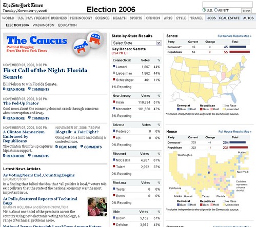
The House map gives equal area to each Congressional district by alloting simple squares, creating a version of the wasp waist that is so characteristic in cartograms of the American electorate (see Paul Choate's post above). If you clicked on the House map, it would take you through the Flash illustrated in these thumbnails. The House map's page then provided further drill down into each of the districts.
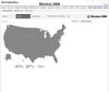
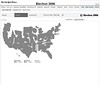
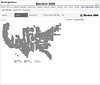
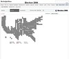
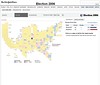
See the screenshots as a slideshow here.
In case they decide to keep it up after the election, here's the NYTimes permalink.
-- Niels Olson (email)
I rather prefer The Boston Globe's election results map, which sacrifices geographical accuracy, but (IMHO) improves the readability of political party alignments and especially of actual congressional district seat changes.
Boston Globe House Election Results
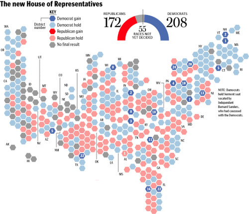
I think that slavish dedication to district geographical boundaries tends to place too much emphasis on the map, and shows too little of the true political impact.
On the other hand, the above map suffers from the need to use callouts to indicate state locations, rather than relying on our ingrained (one hopes) familiarity with US state boundaries.
Thanks,
--kirby
-- Kirby Files (email)
I don't see the need for a cartogram of House results: could they not be shown just as well by a conventional US map in white or lightest gray, across which are scattered 435 spots, each of equal size, and each centered on its Congressional District?
(flyouts may be necessary where the districts are too small to contain their spot without crowding its neighbors)
-- Derek Cotter (email)
There's a fun project called Mapeteria that makes doing quickie geographic data maps pretty trivial, but the developer noted a non-trivial problem in her blog followup:
Politics. What if somebody submits a data file with information for the USSR? Or Yugoslavia in 1970? Or Ethiopia in 1950? Or East Germany? I only have boundary information for 2006, not for all possible boundaries for all time.
What's the most realistic decade for which one could mine political boundaries? Are we always stuck copying or creating historic maps for which we want to show data?
-- Jack Johnson (email)
After the strong voter turn out in the recent French election, I got to thinking about voter
turnout in the U.S.. The Purple America map cleverly and clearly made the point that
states are not wholly red or blue. I would argue that not only are
states not wholly red or blue, but that the most consistent political affiliation is no
expressed affiliation at all as represented by voter turnout (and the lack thereof).
As an experiment in visualizing this, I have modified the Purple America map. It seemed
transparency was an apt way to visualize this voter turnout such that the fewer people
voting, the more transparent the color coding. I implemented this is Google Earth and
would be curious as to folk's reaction. I'm less than satisfied, but as a test it serves its
purpose. You can download the .kmz file at http://bbs.keyhole.com/ubb/download.php?
Number=897993. As this is only a test, Georgia is the only state depicted.
-- Tap
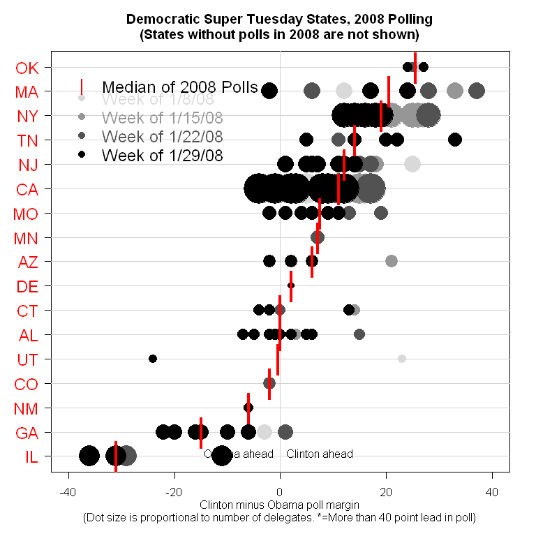
Pollster.com does an excellent job of presenting a fair amount of polling data concisely and clearly. The attached chart shows numerous poll results for each of the 24 states that voted in yesterday's (Feb 5th) 'super dupper Tuesday' primaries. They are organized not alphabetically, but by the support for either Clinton or Obama. Most helpfully, the size of the circle represents the number of delegates at stake in each state, so readers can quickly assess the relative importance to attach to an advantage in a given state. Two additional pieces of information it would be beneficial to have represented are: 1) whether each state holds a primary or a caucus. 2) whether each state is "open" or "closed" - meaning whether independents can participate or not. Overall, an excellent, rich data presentation. I believe Charles Franklin deserves the credit here.
-- Myles (email)
|
|||||||||||