|
All 5 books, Edward Tufte paperback $180
All 5 clothbound books, autographed by ET $280
Visual Display of Quantitative Information
Envisioning Information
Visual Explanations
Beautiful Evidence
Seeing With Fresh Eyes
catalog + shopping cart
|
Edward Tufte e-books Immediate download to any computer: Visual and Statistical Thinking $5
The Cognitive Style of Powerpoint $5
Seeing Around + Feynman Diagrams $5
Data Analysis for Politics and Policy $9
catalog + shopping cart
New ET Book
Seeing with Fresh Eyes:
catalog + shopping cart
Meaning, Space, Data, Truth |
Analyzing/Presenting Data/Information All 5 books + 4-hour ET online video course, keyed to the 5 books. |


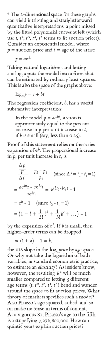
It is possible to use Bembo for mathematical typesetting with careful work by a colleague. An excerpt from Beautiful Evidence:
 |
 |
-- Edward Tufte
Response to How to make presentations: techniques, handouts, display technologies
I shouldn't have implied that it was impossible to use Bembo for technical work, only that it is more difficult unless one invests not only in the basic font but also in expert sets, etc., and also hunts around for a much better version of Symbol than the one that comes free with the system. One can correct some of the problems by using a smaller size of Symbol than the surrrounding text (e.g. 11-point Symbol mixed with 12-point Bembo), but that didn't work well on the early LaserWriters because one got all sorts of spacing problems if one used a non-standard size like 11. These problems can probably be solved with more modern software than what I used for testing 15 or so years ago.
Your example does show that Bembo is possible for technical work, but it doesn't include contexts where the worst difficulties arise: there are no Greek letters apart from Δ, the variables are not italicized (as another contributor has noted), and in particular you have nothing like n2 f2.
-- Athel Cornish-Bowden (email)
Response to How to make presentations: techniques, handouts, display technologies
The fourth mention of the italics problem on this board prompted a look at The Chicago Manual of Style, which says, yes, italics. They also show e in italics. So what should be in Roman other than the numbers in the series expansion? What is the history of mathematical notation that produced italics rather than Roman?
I've also left out the carets (hats) for on symbols that are statistical estimates.
-- Edward Tufte
Response to How to make presentations: techniques, handouts, display technologies
These traditions are hundreds of years old.
Italics help distinguish between variables and other things like numbers and operators. For instance cosine of x is written "cos x". (This issue comes up in other symbolic systems; programmers need that distinction too, but today almost universally use color coding instead.)
But like any centuries-old tradition, there are a lot of quirks, for example vector variables are sometimes bold, non-italic. Also which letters you use for which variables is important. A lot of today's traditions were introduced by Descartes, like using the end of the alphabet for unknowns and the beginning for known quantities. At one point people used vowels vs. consonants, I think, but no longer.
-- a reader
Response to How to make presentations: techniques, handouts, display technologies
The use of italics for variables is all but universal in serious mathematical publications in English, but some of the other conventions are more arguable. As you say, the Chicago guide uses e for the base of natural logarithms, as do many publishers on both sides of the Atlantic; however, the Oxford Style Manual says baldly on p. 394 that "the exponential 'e' always remains in roman", though they do not make it very clear if they are making a recommendation or stating a fact about the world. In any case, three pages later they forget what they have said when they print e in italics at the bottom of p. 397.
Likewise, I think the Chicago Manual is confusing reality with their preferences when they say, on p. 533, that "mathematical expressions are sentences or parts of sentences, and they should be punctuated accordingly". The second half is, of course, given as a recommendation, but the first half, on which it depends, is an interpretation masquerading as a fact. Some publishers do indeed punctuate equations, but others consider, rightly in my opinion, that although punctuation may be acceptable in in-line mathematical expressions it is unnecessary and confusing at the end of a displayed equation.
The hats that you omit from symbols that are statistical estimates likewise seem to me to be a convention of lower status than that of printing variables in italics. Certainly, they are widespread, but they are usually defined at first mention -- e.g. "where a is an estimate of α and â is the least-squares estimate". I'm less bothered by the omitting of the hats than I am about putting variables in roman type.
-- Athel Cornish-Bowden (email)
Response to How to make presentations: techniques, handouts, display technologies
I'm sorry to say that I must disagree with several of the contributions on the typesetting of the math. The variables p and t should be italicised to indicate that they are variables. The exponential <function> should not be italicised so as to indicate that it is a function. A similar convention applies to the differential operator dx/dt where the d's are roman and the x and t are in italic. For references see the CBE manual (Scientific Style and Format 6ed 1994 CUP cf p208) and Swanson's Math into Type.
On the topic of mathematical fonts, for simple math, such as presented here, any font with sufficient symbols will do. This may involve the use of expert sets. However for more complex mathematics very few fonts exist with a sufficient complement of symbols. I am here referring to a ranged of symbols designed to be consistent with teh style of the font in question. For examples of the use of inappropriate math fonts with book fonts see Hoenig's Tex Unbound by OUP.
One of the reasons for the use of only a few fonts in a range of scientific publishing is the absence of appropriate math symbols. Computer Modern Roman, Monotype Modern, Lucida, Times New Roman, Palatino are most of the fonts for which special math fonts existAs Prof Tufte has pointed out the Symbol font is a poor match for Bembo, it seems to be designed to complement Times Roman, however there is little choice.
I would also point out that R^2 should be italicised (see CBE guide) and is used without definition. Perhaps something like the "...the coefficient of multiple correlation (R^2)..." would help the non-insiders.
Regards
John Walker
-- John Walker (email)
Response to How to make presentations: techniques, handouts, display technologies
I fixed the math typesetting above if anyone wants to take a look.
Soon we'll move the math typesetting contributions here to a separate thread.
-- Edward Tufte
Response to How to make presentations: techniques, handouts, display technologies
I think the revised version conforms with mathematical conventions and should satisfy everybody, but I think the roman e seems larger than the italic p or t and hence stands out in the equation. I would suggest that either the italicised letters need to be enlarged by a point (more or less) or the roman e needs to be reduced.
-- John Walker (email)
Response to How to make presentations: techniques, handouts, display technologies
Agree on e, will post fix tomorrow.
-- Edward Tufte
Response to How to make presentations: techniques, handouts, display technologies
Athel, the R is in a style known to typographers as Small-Caps (though there may be another more technical term). Capital letters are used full-size at the beginning of words to set them off from the lowercase letters, but in a fully capitalized word like an acronym THEY LOOK LIKE SCREAMING AND ARE VERY DISTRACTING. To address this problem typographers will use what can be thought of as "lowercase capitals" by reducing the font size by perhaps 20% so things flow better.
This is similar to the practice of using 'uppercase and lowercase numerals', where inline numerals have ascenders and descenders so they flow better with the text, but numerals set in a table are regularized above-the-line so they match up.
-- John Stoneham (email)
Response to How to make presentations: techniques, handouts, display technologies
"20% reduced capital in place of small caps"--what an excellent idea. I discovered, by chance, that in Georgia 11 pt text, italicized words appear much better when reduced to 10.5 pt.
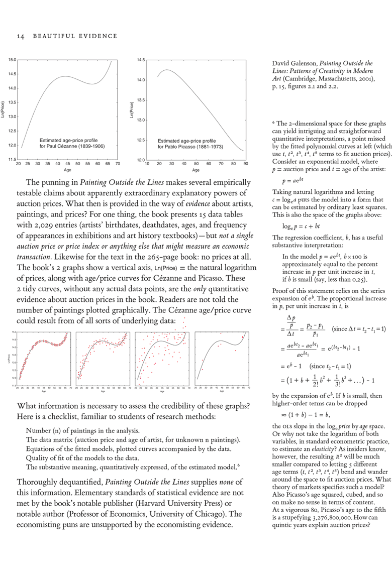
In the excerpt above (page 14), the typography and layout of the "checklist" in the lower half of the page is worth careful study --because it goes contrary to the current orthodox view of list layout, and because it still works. A list with no bullets, no space after list item, no first line indent! Or, maybe it might be called a semi-list?
Also very interesting is the way how Dr Tufte introduces new concepts by placing these in italics at the beginning of paragraphs. (Italicized words followed by perhaps three or four spaces; no period after the italicized word). I have started to use that technique. I would say that it helps improve not only the appearance of the text but quality of the content as well.
-- Priit P (email)
Response to How to make presentations: techniques, handouts, display technologies
An excellent book on typography is Robert Bringhurst, The Elements of Typographic Style. Everyone who is interested in typography should read it.
Small caps (found in the "expert" font for a serious typeface) are deliberately designed differently (more squarish) from regular caps. So knocking down the size of regular caps may calm the shouting effect of all caps and lining figures but real typographers use real small caps. Usually small caps should be tracked out or optically letter-spaced. Optically spaced small caps are used in the running heads of my books and for acronyms and, sometimes, for beauty reasons. The colophons of Enivsioning Information and Visual Explanations are set in small caps.
-- Edward Tufte
I think there is some misunderstanding here: I am not talking about the use of small caps in general, which is, of course, perfectly legitimate, for example in the abbreviation OLS (though in this case it would be nice to have an indication of what the abbreviation means), but with the use of a reduced-size italic R in the mathematical symbol R2. Section 14.55 of the Chicago Manual (pp. 546-547) discusses the use of small caps, and in their example
PROOF. Let A = B. Hence C = D.
the caption is indeed in small caps but the mathematical variables A, etc. are not.
In any case in the example above I question whether the R is a small cap, because small cap fonts do not usually come with italic variants. It seems to me to be a capital italic R set in a smaller size than that of the surrounding text. As ET rightly says in one of his answers, a small cap is not the same as an ordinary capital set at a smaller size, because it has a larger width/height ratio than an ordinary capital has. Incidentally, although "more squarish" accurately describes this characteristic for most letters, it does not do so for all, because, for example, an ordinary capital W has a bounding box in most fonts that is closer to a square than that of a small cap W.
-- Athel Cornish-Bowden (email)
As a previous poster said, there are strong traditions about mathematical typography. Whether "e" is italic or roman is not a matter of taste. (It is italic. End of story.)
The majority of professional mathematics is typeset using a program called TeX, created by the brilliant Donald Knuth of Stanford. The program makes a lot of typography decisions on its own, and its output is a good reference at this point.
The best thing you can do is look at a bunch of papers by a top mathematician. A lot are available online. To take a random example, consider the publication list of Curt McMullen at Harvard.
--
To add to the enigmatic `--', for math style, the Chicago manual is not as good a choice as say, the American Mathematical Society, who have encoded their choices in a TeX stylesheet. See http://www.ams.org/tex/author-info.html for details. e is italic, just like pi.
-- Adam Shostack (email)
Even in matters as vital and emotionally charged as whether e should be Roman or italic, the use of the rhetorical ploy "end of story" should be avoided by those wishing to make convincing analytical arguments, for it may unfortunately lead the audience, however wrongly, to infer that the presenter is another internet ranter in pajamas spending the day banging the keyboard. Indeed, the audience may even take the use of the ploy "end of story," like "shut up, shut up," as evidence concerning the presenter's credibility and ability to construct an argument.
The big problem with the derailing "end of story" and "shut up, shut up" is that they both attempt to foreclose argument and to deny the right of reply to one's colleagues. For some reason, audiences tend to remain unpersuaded by such an attitude.
-- Edward Tufte
In statistics, e really is a variable, "errors" or residuals off a fitted model. It almost always has subscripts, which would distinguish it from the constant e. Also the context, if not the typography, will make the distinction between a universal constant and a particular variable.
Don Knuth, an expert on typography and mathematics, must have resolved the typographic issues in the best way.
-- Edward Tufte
Certainly the history of the typographical representation of e and other operators has been inconsistent.
From my immediate bookshelf, Fisher's Statistical Methods for Research Workers (1924--74, Hafner Press), uses an italic e and an italic differential operator d. The CBE style manual (6ed, 1994, CUP) is itself inconsistent in usage. It clearly recommends the roman e for the construction e^x (and a roman d for the differential operator) but uses the italic e for the log_e(x) in the same table (p208) and a few pages later uses the italic e in an example of the form e^(x^2+1) (p215). The textbook Models in Biology by Brown and Rothery (1993, J Wiley) uses the roman e for exponentiation and the roman d for the derivative. Slayter and Slayter's Light and electron microscopy (1992 CUP) uses the italic e (contrary to the CBE style guide also published by CUP), McMahon's Muscle reflexes and locomotion( 1984, Princeton) uses the italic e and italic d, A.V. Hill's Trails and trials in physiology (1964, Edward Arnold) uses the roman e and the roman d (A.V. Hill trained as a mathematician), Altman et al Statistics with confidence (2000, British Medical Journal) uses the roman e for both exponentiation and as the base of the log.
Several books used the exp(x) form: Armitage and Berry's Statistical methods in medical research (1994, Blackwell), Milnor's cardiovascular physiology, Cornish-Bowden's Fundamentals of Enzyme Kinetics (1995, Portland) all with the roman d, Cold Spring Harbor Symposia on Quantitative Biology vol 37 (1972 CSH press), Hill's Free energy transduction and biochemical cycle kinetics (1989, Springer).
Just from this censored sampling (I omitted books prepared from camera ready copy provided by the authors) of various authors and publishers I think we can see that the typographic representation of exponentiation is not necessarily agreed upon. Nevertheless I think that the CBE recommendation of variable in italic, function or operator in roman, is useful because it makes it clear that the e in this case is not a variable. The roman e becomes shorthand for "where e is the exponential function..." that would normally be required for clarity.
While I have not found an explicit reference to the use of an italic e in the American Mathematical Societies materials (I have looked at the website and the AMSLatex users guide and other pdf's available there), The Royal Society Proceedings Series A (Mathematical and Physical Sciences) have a style file (rspublic.cls) that specifically defines a macro to use for exponentiation that uses the roman e.
On this basis I would suggest that there is no universally accepted convention for e, but that recommendations do exist and that e should be roman to indicate a function.
However while recommendations may have logic it is ultimately usage that determines convention. The state of the art in tools for typesetting mathematics is certainly Don Knuth's TeX system. While TeX's exponentiation function is in roman, TeX does not specify whether roman or italic should be used for the short form e. It is however much easier to use the italic form in TeX (ae^{bt})than the roman (a\mathrm{e}^{bt}) and despite the logic of the CBE recommendation it may be that this ease of use ultimately determines which form becomes standard.
-- John Walker (email)
I agree that the small-caps "R" will seem a bit strange, abnormally small (looking like a typo) to those who read a lot of math texts. Although some other elements, such as integration signs, square roots and fractions, have different optimum styles in math displays and inlined math (math expressions inside text paragraphs), I don't remember seeing such a transformation into small-caps for uppercase variables, even when a lot of them appear close together (A=B+C/D-EF+G+H+...).
A situation where small-caps would seem `natural' for typesetting variables (but then also for displays, not only inlined math): simple expressions where for some reason variables are represented by upper-case words (TOTAL = TWEEDLE + DEE/DUM - SHIFT).
Some other typos in the Beautiful Evidence page currently above: the first display (p=aebt) lacks a period; in the first line of the largest display, upright "t" and "p" in fraction denominators were not converted into italic; also in that display (and in inlined powers of t) some subscripts and exponents use very different font sizes (compare p1, t1, ... with t1, t2, ...).
-- Jos?? M Cerqueira Esteves (email)
My feeling is that both the upright differential "d" and the upright constant "e" sometimes end up looking a bit pedantic or resulting in a clumsier `flow' in the typeset math, not necessarily improving readability.
The choice between upright roman and italic for those "e" and "d" should perhaps take into account a few characteristics of the text being typeset. Upright can be helpful for casual or novice readers of math, or convenient in texts with very sparse use of mathematical expressions; it can also prevent some confusion when "d" or "e" are regularly used to represent variables (although in many cases one can simply avoid that use). But in many works with lots of integration/differentiation, using regular math italic for those `special' "e" and "d" seems not only to be perfectly safe for the reader but also to result in more nicely flowing math expressions. Lots of nicely or at least acceptably typeset books and papers have used the italic forms.
A few additional examples: italic "d" and "e" are used in Goldstein's Classical Mechanics (Addison-Wesley), Feller's An Introduction to Probability Theory and Its Applications (Wiley), Sneddon's Elements of Partial Differential Equations (McGraw-Hill), Martin Braun's Differential Equations and Their Applications (Springer) and, if I remember correctly, all Donald Knuth's works I have seen. Cohen-Tannoudji's Mecanique Quantique (Hermann) uses the upright forms.
The Greek pi used for the constant seems to get no special treatment: usually, in math, lowercase Greek letters are italic and uppercase ones are upright. This is also the default behavior in TeX/LaTeX.
Concerning the choice of italic versus upright in subscripts and superscripts: the "rules" for those are simply the usual ones. In a sum of xi+k+2 with varying i, i and k should be italic. On the other hand, when a letter, word or word fragment in a subscript represents some "label" instead of a variable, it is convenient to write it in upright roman: for instance, Tcrit or Tc for a critical temperature, (xmin, xmax), PJones. Inside LaTeX math mode, one would simply write "x_{i+k+2}", "T_{\text{crit}}", "x_{\text{max}}" and so on, resulting in proper font, font size and spacing choices for "crit" and "max". "T_{crit}" would result in a subscript in math italic (more spacing than regular text italic) , where "c r i t" could stand for (depending on the context) 4 tensor indices or the product c×r×i×t.
-- Jos?? M Cerqueira Esteves (email)
As John Walker was kind enough to mention my kinetics book (thank you!) I cannot resist asking which of the various John Walkers he is: the famous one who won the Nobel Prize for Chemistry in 1997 and whom I used to know (slightly) when we were students in the 1960s, the parasitologist at Bristol, a biochemist at Canterbury, New Zealand, or another John Walker altogether?
-- Athel Cornish-Bowden (email)
Athel Cornish-Bowden asks, "which of the various John Walkers he is". I was thinking the same question. Based on the texts cited in John Walker's messages, I expect that one of Athel's guesses is correct. Another candidate is the John Walker who founded Autodesk and co-wrote AutoCAD, a program that definitely influenced the graphic display of information. Will the real John Walker please stand up? I hope this is not too far off topic.
-- David Cerruti (email)
...Or John Walker of Pixar, who produced The Incredibles? It seems that there can be a certain anonymity in being a highly accomplished John Walker.
-- Alex Merz (email)
Sorry to keep you in suspense, but I was away for thanksgiving (Yes I'm in the USA) with no internet access.
Alas I am none of the above, I am an expatriate Australian who is an Assistant Professor (UK equivalent = Lecturer) in the Department of Physiology and Biophysics at the University of Illinois at Chicago.
In answer to your questions: I would like to win a Nobel Prize (unlikely), I enjoyed Athel Cornish-Bowdens textbook (highly recommended for anyone learning biochemical kinetics), I liked the Incredibles, I have used biochemistry but I washed my hands afterwards, I have heard of parasitology (no first hand experience fortunately), and I have struggled with AutoCad for several hours to produce what I thought was a nice clear drawing only to find that my five year old son could outdo me in a few minutes with paper and crayons.
-- John Walker (email)
Adjustments, in response to your advice, have been posted in the proof above. I'm still contemplating the Roman/italic e. Thank you so much everyone for your thoughtful and helpful contributions, as well as for your patience with my stumblings around on this.
It would be useful now if an authoritative mathematical expert could provide our readers with a few fundamental links on mathematical typography (links to a few major style sheets, for example) that show the best practices (note the plural) of experts; this would help our readers interested in the general topic.
With best regards to all the contributors to this thread,
ET
-- Edward Tufte
To be certain, I'm no authoritative expert on mathematical notation, but the subject interests me as I do have occasion to typeset math notation and find a goodly measure of aesthetic pleasure in the look of the equations as well. I've followed this thread with keen interest; it's one of the best on the board.
I did a fair amount of looking around for information on this subject, especially on conventions for setting "e" (natural log), and found that most sources have set "e" in italic type, or at least obliquely. Indeed, "e" is set completely in italics in Eli Maor's popular treatment, "e, The Story of a Number," 1991 from Princeton University.
However, the U.S. National Institute of Standards and Technology (NIST), in their on-line style guide, "Guide for the Use of the International System of Units (SI)," instructs that the natural logarithm "e," along with other constants, be set in roman type. "e," when indicating a variable, as for elementary charge, should be set in italic type. To my eye, this makes good sense, as the roman e in a good typeface has the dignity befitting one of the fundamental mathematical constants; the italic e just looks more, well, variable. This link takes you the section "More on Printing and Using Symbols and Numbers in Scientific and Technical Documents": http://physics.nist.gov/Pubs/SP811/sec10.html .
I'm still looking for who decided to set variables in italic. The answer may be in the one source that comes up most often and which I haven't looked at, Florian Cajori's "A History of Mathematical Notation" of 1928-29.
I also found a very interesting little web site, put together by Jeff Miller, on the origins of mathematical notation: http://members.aol.com/jeff570/mathsym.html (he sets "e" in italics). From this I quote the proper use of variables (Jonas Moore in "Arithmetic," 1660): "Note alwayes the given quantities or numbers with Consonants, and those which are sought with Vowels, or else the given quantities with the former letters in the Alphabet, and the sought with the last sort of letters, as z y x, &c. lest you make a confusion in your work." Indeed.
-- Steve Sprague (email)
One other minor (but non-mathematical) typographic point—there appears to be a full word space before the period following the first indented equation:
p = aebt .... but no word space before the period following the second indented equation:
logep = c + bt.... and no word space before the comma when the first equation is used again:
In the model p = aebt, b x 100 is ...This might not show up well in my HTML, but in print the difference really catches the eye, and there appear to be three different spacings: full space, no space, thin space (the thin space only appears because the superscript characters are not kerned to the punctuation).
-- Jonathan Corum (email)
Has anyone put eyeballs on the ISO standards cited by NIST? I ask because I'm a bit suspicious of whether the NIST writer elected to set e rather than e simply because e had already been committed to the elementry charge. I haven't found a style sheet that recognizes the special relationship between e, i, and π. It seems to me eiπ=-1 itself supports the idea that all three transcendentals should be set in the same face. Results of my bookshelf survey: Feynman's Lectures on Physics, Guenther's Modern Optics, the CRC Handbook of Chemistry and Physics, Kittel's Thermal Physics, Tipler's Physics, Harris's Nonclassical Physics, Lehninger's Principles of Biochemistry, and Eisberg & Resnick's Quantum Physics all set e, i, and π. The American Medical Association's style manual calls for e but uses e, Chicago calls for i, e, and π. Webster, MLA, APA, and the Associated Press don't seem to care. Cohen & Whitman's translation of Newton's Principa doesn't use any of them. Interestingly, NIST is in conflict with the GPO Style Manual (admittedly a poor resource on this to begin with). I found very few references to any of these in chemical or biological science books. I did find a K+E Deci-Lon slide rule that is set with the roman e. Looking beyond the sciences, Burchfield's New Fowler's Modern English Usage says nothing about the base of natural logarithms but does discuss the mute e.
-- Niels Olson (email)
I had come across this discussion by accident, when doing a web search for information about the typesetting of mathematics.
When I saw the question come up of whether or not e should be an italic in equations, I did not immediately remember the answer. Using the Roman form of the e did seem like a good idea for reducing confusion.
Taking a look at my copies of Whittaker and Watson, Abramowitz and Stegun, and another mathematical book taken more or less at random, I found that all three used the italic form of the e to represent the base of the natural logarithms.
However, these days, I think that a bold soul who would wish to experiment with the other usage would escape censure. I do recall that occasionally, operators like cos or sin in equations will appear in boldface as well; this is rare, but if this is done, should e be in boldface as well? My first inclination would be to shudder in horror and say "No", but, on the other hand, if one were using a variable named e in the same equation as e standing for 2.71828..., it may well be that the distinction between Roman and italic would not be enough to prevent confusion.
And, thus, in copy handed to a typesetter, particularly as the italics in equations are not normally indicated each one by underlining, it had not been considered worth-while to indicate e as not being italicized as a standard practise.
As to the question of whether or not Bembo is a suitable medium for mathematical typography, I might note that I have a foreign-language book on some aspect of mathematics (not immediately accessible at the moment; I think it may have been in Hungarian) which is set in a font resembling Linotype's Antique No. 1 - or, to take a better-known example, the _Golden_ type of William Morris.
At one time, the question "can you typeset mathematics in..." was very meaningful, and had only a limited number of answers. One could use only those fonts for which matrices for superscripts and subscripts were cut, and this formerly meant that mathematics was usually typeset in 11 point Monotype's Modern Series 7 (as illustrated in _The Printing of Mathematics_, Oxford) and then in 10 point Times New Roman, when Monotype developed their experimental system of 4-line mathematics into a standard product.
Today, thanks to the computer, one has more-or-less complete freedom in this regard. None the less, your example did illustrate _one_ difficulty that is encountered when choosing an Old Style typeface for mathematics; I see that the equations, unlike the text, make use of lining figures.
I am quite sure that I have seen the older style of number used within equations in older works, but I do agree that this would strike the modern reader as bizarre and as an affectation. (There is also the danger that the numeral 1 could be confused with a small capital I.)
None the less, I applaud your efforts to make use of other typefaces, generally recognized as beautiful, in the typesetting of mathematics, than those most commonly used. In this connection, I might also note that my first-year Physics textbook (_Fundamentals of Physics_, by Halliday and Resnick) was set neither in Times Roman, nor in one of the modern typefaces, like most of the others, but in Baskerville.
-- John Savard (email)
I have just discovered, through downloading a PDF file which Google pointed out under the URL
http://www.tug.org/TUGboat/Articles/tb18-1/tb54becc.pdf
that not only is making e=2.71828... roman instead of italic no longer forbidden, it is now compulsory... if one wishes to be compliant with ISO standards and recommendations made by the International Union of Pure and Applied Physics.
John Savard
-- John Savard (email)
Italicizing of "e"; and what space of models to use
Should e be italic or roman when it denotes the base of natural logarithms? I say it should be italic. The argument given above is that it represents a function, namely the exponential function. It doesn't. The exponential function has a name: "exp". When you use that name, you don't use italics, just as you don't for "sin" or "cos". But in ex, it's just the name of a particular number, different from x only in being constant rather than variable. There is no mathematical tradition of setting constants in roman rather than italic type. (There is one of using Greek letters; but they are almost always italic Greek letters, in so far as that terminology makes any sense.)
I'm at work at present, and almost all my real mathematics books are at home. But I've just checked the following, and they all use an italic e for the base of natural logarithms:
- Cormen, Rivest, Leiserson: Introduction to algorithms, published by the MIT Press
- Press, Teukolsky, Vetterling, Flannery: Numerical recipes in C++, published by the Cambridge University Press
- Nocedal, Wright: Numerical optimization, published by Springer
- Feynman: The Feynman lectures on physics, published by Addison-Wesley
- Jackson: Classical electrodynamics, published by Wiley
- Abramowitz, Stegun: Handbook of mathematical functions, Dover reprint, originally published by the US National Bureau of Standards
That's quite a range of books and publishers, and so far as one can tell from superficial appearance they aren't all using the same typesetting software or the same style guide. I think it's reasonable to conclude that italicizing e is the usual choice.
Another stylistic quibble, though here I'm on more controversial territory: You will very seldom see a real mathematician write "log" with a subscripted "e" (italic or otherwise). Usual practice is simply to write "log" for natural logarithms. In school textbooks and other contexts long infected by base-10 logarithms, "ln" is lamentably common. Subscripted "e" is very rare.
And a mathematical point, for a change! ET protests at the use of quintic polynomials to describe the variation of price according to age, citing the enormous size of 805 to point out the absurdity. But the enormous size of 805 is neither here nor there. The space of quintic polynomials can be spanned by, say, the first 6 Chebyshev polynomials (scaled to the appropriate range of arguments), all of which have values oscillating smoothly between -1 and +1; the only differences between that and using powers of t are in algebraic convenience and numerical stability.
Also, surely there are 6 terms in Galenson's model rather than 5: there must be a constant term, unless the age/price curve is constrained to pass through (0,0).
Taking logarithms of the artist's age seems like a peculiar thing to do. Sure, it means that the gradient of your curve is an elasticity. But the only reason why economists are interested in elasticities is that changes in many quantities (notably prices) are best considered as fractions of the quantities themselves. But this doesn't seem to be true of ages; at least, I see no reason why it should be.
Galenson's polynomial fitting is certainly pretty arbitrary. It may be a daft thing to do; I haven't read his book, and the "dequantification" ET mentions is good reason to be suspicious. But it's not obviously insane; if you have a bunch of data points which you think may be error-contaminated samples from an unknown smooth curve and no convincing underlying theory yet, fitting a lowish-degree polynomial is a decent enough thing to do. A 5th-order polynomial doesn't seem like an unreasonable choice here. What I have grave doubts about is the assumption that the curve should be smooth, which ET makes too when suggesting fitting a linear model to the log prices. Artists may go through fairly clearly delineated "periods"; one of the clearest and most famous examples is Picasso, represented by the right-hand graph above. If there's a meaningful price-versus-time curve, why should it be smooth (or even continuous?) at period boundaries?
Lest I be misunderstood, let me add that I think it's preposterous for such a book as I understand Galenson's to be to be so light on quantitative price data.
-- Gareth McCaughan
Gareth McCaughan's comments are very thoughtful and interesting.
Yes, there are 6 terms. I forgot the intercept term (with t to the zero power). Its meaning is mystical, however, providing an estimate of the ln price of the artist's non-existent paintings at the artist's instant of birth. Depending upon what space we're in, the especially mystical ln (0) may arise by forcing (0,0).
My concern with quintic age are problems with units of measurement and interpretation. Other than expressing a bend, the regression coefficients have no interpretative substantive meaning. What do we learn by calculating that "a 100-million year change in the quintic age of an artist corresponds to beta (sub 5) unit change in ln price of the artist's paintings" ?!
Better that summaries, such as regression coefficients, have quantitative interpretations. With regard to the lower-power terms, sometimes I almost understand what a square year is, but certainly not a cubic year, or quartic year . . .
By the way, the age of the artist is profoundly entangled with the year the painting was painted. For example, when Picasso was 26, it was 1907, the beginning of the Cubist movement among several artists. So what is it here, the age of the artist or the time that the painting was made? Age might, now and then, or even more often, be a proxy for art history and not for career status.
Since the world is often multiplicative and log-normal, elasticities have their virtues. Auction-price discontinuities could be picked up by residuals off the ln-ln fit. Not "an artist's discontinuities" since the Y-variable is ln price; a lot more evidence is needed to turn auction prices into inferences about careers. There are surely better ways than auction prices to identify an artist's style discontinuities. Looking at paintings, for example.
Also why should a style-change necessarily imply a bend in the age-price curve?
In addition, varying styles might be confounded with the number of paintings (which may well affect auction prices) made in that style (for example, Picasso, with a scarcity of Rose period paintings but a large supply of early cubist paintings). Given also that various artists make different numbers of paintings, by several orders of magnitude (Cezanne v. Picasso), and at different times of their careers, how is the supply side in relation to age adjusted when curves of different painters are compared? All told the model is seriously misspecified, and since the missing variables are correlated with the variables in the model, there is likely to be serious misspecification error.
Local regression fitting might be a better way to take a walk through the scatterplot; see the good work of Bill Cleveland at http://www.stat.purdue.edu/~wsc/
But, most importantly, why not at least first show the actual data in scatterplots for each of the many artists passing through the curve-fitting grinder? If the regression coefficients have no good substantive interpretation within each artist's work, they have no good substantive interpretation in comparing artists.
For the big conceptual problems with the auction-price work, see my full thread "The Economisting of Art" at
https://www.edwardtufte.com/bboard/q-and-a-fetch-msg?msg_id=0001Zl&topic_id=1&topic=
Given the passionate certainties and the authorities cited on both sides, I had vowed never to speak of the italic/roman e again, but, at any rate, my choice of the roman e involved these 2 considerations: variables are in italics and e is not a variable, and in statistics italic e means residuals, which do vary. If the residuals weren't involved, Feynman's italic e would have probably decided it.
-- Edward Tufte
According to http://www.tug.org/TUGboat/Articles/tb18-1/tb54becc.pdf, ISO 31/XI is very specific about the issue of upright mathematical constants. Of course, nobody is forced to abide by these rules. Personally, I am in favor of the official standard.
-- Philipp Baecker (email)
Oops. The ISO source was already mentioned. Should have read the thread in its entirety before commenting.
-- Philipp Baecker (email)
The minus signs seem awful small (and the plus and equal signs kind of heavy) for the most part --- only the last one in:
$\approx (1 + b) - 1 = b$.
begins to look right, and there the equal sign is smaller than the \approx --- shouldn't they have equal importance?
There's a math symbol set being made for Minion --- probably it'd be a good match for Bembo.
William
-- William Adams (email)
The Minion suggestion is a very good. Minion's pi fonts are better than those of Bembo, despite the fixes we made in ETBembo.
Minion, in many weights, is sitting right there in my font file and it is helpful to be reminded that it is there. Definitely a bit slow of me to miss this.
-- Edward Tufte
One last comment on the "upright e issue": For a physicist using $\mathrm{e}$ to denote the elementary charge it obviously makes sense to opt for an "italic" $e$ as Euler's number.
As far as Minion for mathematical typesetting is concerned, it is worth noting that, thanks to http://developer.berlios.de/projects/minionpro/ and http://www.ctan.org/tex-archive/fonts/mnsymbol/ (the symbol set William alluded to?), there now is full support for Minion Pro in LaTeX, also including optical sizes and OsFs. Combining the latter package with Bembo should be straightforward, but I haven't tried it in practice.
As an alternative to Bembo, I find Linotype's Sabon Next very interesting.
Any final thoughts on mixing lining and oldstyle figures in a mathematics context? $b\times 100$ in the initial example looks like a slight inconsistency to me. Compared to Baskerville (mentioned previously), Bell MT has the distinct advantage of smaller lining figures that look good in displayed equations and body text. However, like Computer Modern, both typefaces are probably too thin to remain legible under all output conditions.
-- Philipp Baecker (email)
MathJax 1.0 was released in August. It provides well-rendered, scalable, cut-and-pastable math for all web browsers. Up to this point, most math on the web has been written in LaTeX and rendered as clunky images. By moving from images to characters, the underlying code may still be LaTeX, but the user should be able to have rich math editors.
-- Niels Olson (email)
Something I think no one has mentioned, either in this thread or the parallel one on book design, is XeLaTeX.
Following some excellent suggestions from John Walker and others in the two threads, I decided to prepare the 4th edition of my enzyme kinetics book in LaTeX, and that allowed me to satisfy almost all my needs -- all illustrations on or very close to the double page where they are referred to, wide enough margins to put most figures in them, literature references in the margins (no list at the end of the book), biographical notes also in the margins, automatic cross-references to other pages (by page number, not by section number), as many footnotes as I wanted, etc. One thing I worried about was whether the publishers would mess it up so that their proofs would look quite different from what I expected, but that was an unnecessary worry: their proofs were virtually identical to what I wanted. Whether readers will like the result it's to soon to say (the book won't appear in Europe until the end of this month, or in the USA until May), but I like it.
However, there was one thing I didn't manage to solve, and that was to use the fonts of my choice, because I didn't figure out how to prepare all the metrics files that LaTeX needs. I used MathPazo, which is OK, but not what I would have chosen. Also, I wanted to have one or two Greek words in footnotes (about etymology) , but the results were so awful that I decided against it. Individual Greek letters are easy, of course, in mathematical material, but getting whole words with diacritical marks to look right is almost impossible. There is a package called polutonikogreek that is supposed to solve the problem, but the results it gave me were very unsatisfactory.
I realized a week or two ago (too late!) that the solution was already installed in my computer and not at all difficult to use (if one already knows LaTeX): XeLaTeX. I realized it was available as an option in TexShop, but I had no idea what it was for until I opened a template file one day when I had nothing better to do. In short, it allows you, in a simple way, to typeset in any font you have in your computer. Although my own needs don't go beyond roman and, very occasionally, greek and cyrillic, you can type stuff in Amharic or Telugu or Cherokee if that's what you want and you have the necessary fonts.
-- Athel Cornish-Bowden (email)
More generally, the IUPAC and IUPAP defined in depth typesettings notations for everything related to physics (IUPAP) or Chemistry (IUPAC). They also give general guidelines for general typesetting.
As a chemist, I personaly use a lot the green book about Quantities, Units, and Symbols in physical chemistry published by the IUPAC (which is freely available) .
Those two organizations define really thoroughly all kinds of notations (see pages 183 to 193 of the green book for examples) which is extremely convenient for typesetting in those domains.
For example, they recommend a roman j when it stands as an equivalent of i for complex numbers to be sure that it is not confused with a surfacic current j which should be in italic.
They also published some recommendations on how to represent chemical molecules in a one hundred and thirty pages long manual (Graphical Representation Standards for Chemical Structure Diagams). The effort of standarzing the field of chemistry and physics is greatly improved tanks to the IUPAC and IUPAP. As a student, I thought that these organizations were useless but as a teacher, it is a really valuable tool. Having standardized definitions and notations is the best way to have the right words and the right notations for everything.
It is quite strange that there are only some sparse recommendations (ISO rules) for purely mathematical typesetting. I am not aware of something similar for mathematics where a lot of efforts are devoted to standardize notations and definitions (on an international scale).
-- Martin Verot (email)
|
||||||