|
All 5 books, Edward Tufte paperback $180
All 5 clothbound books, autographed by ET $280
Visual Display of Quantitative Information
Envisioning Information
Visual Explanations
Beautiful Evidence
Seeing With Fresh Eyes
catalog + shopping cart
|
Edward Tufte e-books Immediate download to any computer: Visual and Statistical Thinking $5
The Cognitive Style of Powerpoint $5
Seeing Around + Feynman Diagrams $5
Data Analysis for Politics and Policy $9
catalog + shopping cart
New ET Book
Seeing with Fresh Eyes:
catalog + shopping cart
Meaning, Space, Data, Truth |
Analyzing/Presenting Data/Information All 5 books + 4-hour ET online video course, keyed to the 5 books. |


David Hockney has published many spatial "joiner" photographs, an overall image built out of many smaller photographs.
Hockney's spatial joiners provide multiple local perspectives that create a richer 3-D perspective in the overall image.
Here is Hockney's Pearblossom Hwy. 11-18th April 1986, #2.
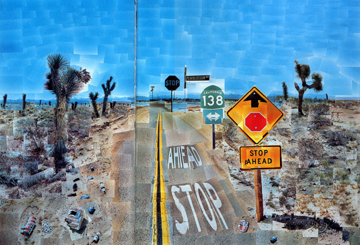 |
In his very beautiful and smart book, That's the Way I See It, Hockney writes, "I started Pearblossom Hwy. when I was
commissioned by Vanity Fair to illustrate a piece by my friend Gregor von Rezzori, retracing Humbert Humbert's journey
in search of Lolita. It was my last photo-collage and the most painterly. I spent nine days doing the photographs and two
weeks assembling it. I see it as a panoramic assault on Renaissance one-point perspective."
Joiners can be simultaneously temporal and spatial. Here's a small experiment.
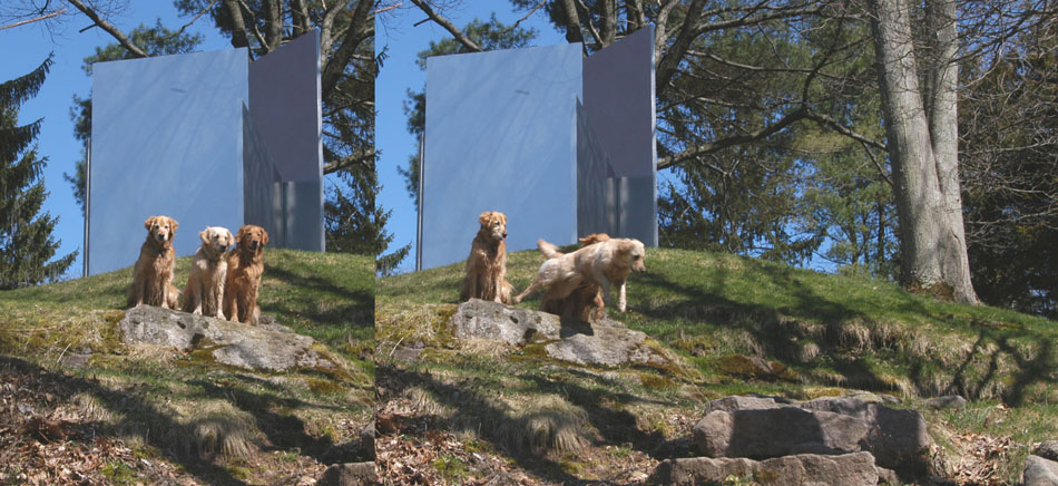 |
And shown here in a large screen JPEG.
Note the intensified 3-D quality resulting from Abby's leap in the direction of the expanded space. The sculpture is Escaping Flatland #3;
its stainless steel surface is borrowing (indeed directly appropriating) light from the sky.
-- Edward Tufte
A wide-eyed gaze very nearly resolves the joined photos into a stereo image, adding an extra touch of depth to the Abbey leap.
-- Steve Sprague (email)
This worked on the large jpeg: close left eye, view left and right dog combo back and forth using the right eye only--and then Abby leaper comes strongly forward (probably against the remembered background of flat left cluster of dogs).
Stereo viewing: all I can get is a merge of the righthand edge of tall right sculpture plane; a tall silver line in the middle, not much stereo.
Large jpeg looks amazing on 100dpi 23-inch Apple Cinema screen.
-- Edward Tufte
My gaze gives me three full images: the originals on the left and right and a composite, faux stereo image in the center, with the sculptures intact in each. This last combines all 3 dogs sitting as in the leftmost shot, the dog on the left with two heads (one looking at the camera and one looking at the Abby leap), the dog on the right looking out towards the camera and also ducking behind Abby, and Abby leaping into the foreground. The leaping Abby is somewhat blurred in the composite image.
Do we have names for dogs left and right?
Curiously, and as is true with all steroe images I try to resolve, I have to take my glasses off in order to set my optical focus behind the image. My bifocals must force a particular resolution I just can't overcome without removing them. Does anyone else so bespectacled experience this?
-- Steve Sprague (email)
My gaze produces the same results as Steve Sprague. Glasses (not bifocal) are not a problem.
-- Mark Kasinskas (email)
I like the idea. I think it can be built upon by the same characteristics you're discussing. I would assert that Hockney's work is spatio-temporal in the sense that all of the photographs were not taken in the same instant, leading to differences in light and tone that create much of the richness. In addition, their collage is neither orthogonal nor formally systematic, hence his assertion of its painterliness. The temporal joiner experiment is interesting and successful, but I don't think it captures all of the lessons Hockney's work (and, for the record, I admire his photocollages but prefer his paintings) has to teach us. As narrative graphics (e.g. comic book composition, (and I don't mean that at all in a negative way)) the experiment is very successful; the slightly-more-than-a-third to slightly-less-than-a-third working well as a classical composition, especially (as I suspect but haven't bothered to determine) if it is based on a sophisticated ratio. But as spatio-temporal composition, I think it can be expanded upon. First, I think Hockney uses 'happy accidents' that confound literalist perspective (i.e. "panoramic assault") to great effect in his photocollage. I think the equivalent in the photographs of the dogs and sculpture suggests the use of the sculpture as a unifying element rather than an identifying one. Please see example (and note that use of the existing example requires an otherwise undesirably tight left panel to right panel ratio):
 I think the effect would further be improved by a change in perspective (acknowledging the photographic realities in this particular example,) either more parallel or more perpendicular to the dog's leap, not only to demonstrate motion but to enhance the dimensionality of the sculpture as backdrop.
-- Ben Libert (email)
I am not sure this is relevant to this topic, but this video was making the rounds on the internet this morning and reminded me of the cover of Beautiful Evidence, and topics such as this one on Ask ET.
Dogs Filmed At 1000 Frames Per Second. Youtube link:
https://www.youtube.com/watch?v=mUCRZzhbHH0
Source:
http://creativity-online.com/work/pedigree-catch/19004
-- anonymous (email)
Dear ET,
I have been researching the role that randomness plays in some forms of art, I already posted about Tom Phillips and his alteration of a victorian book to create A Humument. When thinking more broadly about this I ended up at collage - which links to the Hockney work you base this thread on.
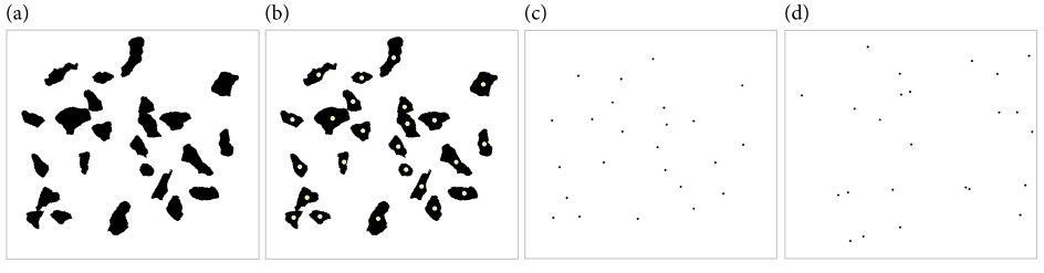
Collage is a distinctively twentieth century art form that explores the boundary between random juxtaposition and conscious arrangement. For example, the Dadaist artist Hans (Jean) Arp (1887-1966) is supposed to have made `chance collages' by tearing paper into pieces, dropping them onto a larger sheet of paper and then gluing the pieces where they happened to fall.
However, when you look at actual examples of Arp's work, for example According to the Laws of Chance (1933), they show spatial arrangements of torn paper that are not typical of a truly random pattern, thus indicating that he did not fully relinquish his artistic control to the laws of chance.
This is shown in the Figure below (for a larger version see http://www.datadeluge.com/2010/12/hans-jean-arps-non-random-chance.html).
(a) A binarised version of According to the Laws of Chance by Hans (Jean) Arp made in 1933. This is a collage of painted pieces of paper that have been dropped at random onto a board and glued down. An image of this piece is shown on the Tate website.
(b) A small yellow dot has been placed at the rough centre of gravity of each of the 24 pieces of paper.
(c) Here just the 24 dots are shown in a box the same size as the original piece of art.
(d) A Poisson point process of 24 events within a bounding box the same size and shape as the original piece of art.
The Poisson point process is a standard way of analytically generating a pattern of a given number of events that show complete spatial randomness (CSR). The Poisson process has some very interesting properties, here it suffices to be used qualitatively as an example of a pattern that has been randomly generated. Note that in a Poisson process the points in the pattern can end up arbitrarily close to one another.
The Arp composition is very unlikely to have been generated by the Laws of Chance; the arrangement of the paper centres of gravity are too spread out (or regular) for a completely random pattern.
Have a great 2011
Best wishes
Matt
-- Matt R (email)
|
||||||||||||||||||