|
All 5 books, Edward Tufte paperback $180
All 5 clothbound books, autographed by ET $280
Visual Display of Quantitative Information
Envisioning Information
Visual Explanations
Beautiful Evidence
Seeing With Fresh Eyes
catalog + shopping cart
|
Edward Tufte e-books Immediate download to any computer: Visual and Statistical Thinking $5
The Cognitive Style of Powerpoint $5
Seeing Around + Feynman Diagrams $5
Data Analysis for Politics and Policy $9
catalog + shopping cart
New ET Book
Seeing with Fresh Eyes:
catalog + shopping cart
Meaning, Space, Data, Truth |
Analyzing/Presenting Data/Information All 5 books + 4-hour ET online video course, keyed to the 5 books. |


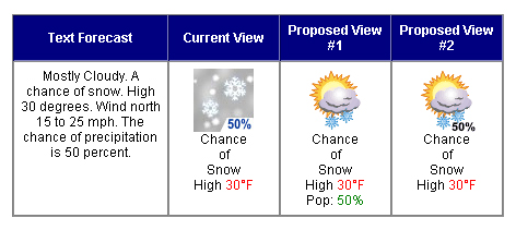
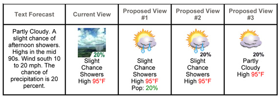
The National Weather Service is proposing to replace its excellent pictoral symbols with some corny icons: https://www.weather.gov/icon_comments/
This link solicits comments about the new icons. The worst are:
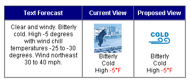 |
 |
 |
-- Edward Tufte
Looks like NOAA is succumbing to the impulse to Yahooize it's web site.
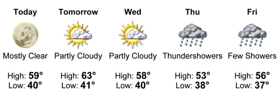
Interestingly, the NOAA San Diego office currently uses icons that are somewhat different than those on the national NOAA new icon survey page. Hybrids of the old and the new, it seems to me; maybe we're a test market. Here's this week's forecast for the San Bernardino Mountains in southern California:
 |
Compare Thursday's or Friday's to this from the new icons survey:
 |
I like the inset probability of precipitation percentage of the old; we didn't see them here in soCal. I find it ironic that the government, in its efforts to reduce our "dependance on foreign oil," would drop the nice little promo for wind power on windy days. And we all thought irony was dead.
This is what Yahoo offers up for this week:
 |
The NOAA icon proposal has all the look of a fait accompli, but I'll send in my "Don't do it" today.
They really could drop all the icons, as I read the text forecasts for the real scoop. The special bulletins are especially well set; in all caps they have the feel old teletype messages and convey the importance of the situation well; in my experience they are usually quite specific and accurate in their appraisal of the close-in weather. No icons there, it's too important. We don't have any impending serious weather in southern California; this "Hazardous Weather Outlook" is for southern Louisiana:
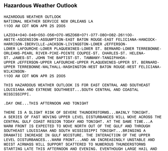 |
Then there's always the old George Carlin bit: "Tonight's forecast? Dark." Nicely textual.
-- Steve Sprague (email)
Well, it might not make any difference which icons are used if nobody can see them:
Feds' weather information could go dark
By Robert P. King
Palm Beach Post Staff Writer
Thursday, April 21, 2005
Do you want a seven-day weather forecast for your ZIP code? Or hour-by-hour predictions of the temperature, wind speed, humidity and chance of rain? Or weather data beamed to your cellphone?
That information is available for free from the National Weather Service.
But under a bill pending in the U.S. Senate, it might all disappear.
The bill, introduced last week by Sen. Rick Santorum, R-Pa., would prohibit federal meteorologists from competing with companies such as AccuWeather and The Weather Channel, which offer their own forecasts through paid services and free ad-supported Web sites.
snip
http://www.palmbeachpost.com/news/content/news/epaper/2005/04/21/m1a_wx_0421.html
-- Michael Olan (email)
It's too bad they are focused on icons. What I want to know is the degree of volatility, variability, or stasis in the weather pattern. Even here in San Diego County (California), the phrase "Partly cloudy" means very little; having an icon to accompany it adds nothing.
So here's a challenge to Tufte readers who know some meteorology: figure out how to take weather models and come up with a simple way to present a sense of how much, and in what directions, the weather is likely to change over the next 24 to 48 hours.
-- Mark Hineline (email)
To be honest, I like the proposed icons for "cold" and "windy." The little pictures are too hard to decipher and I think the new designs are elegant. However, why not add the word "Bitter" to the cold icon and add a mph range to the windy icon? While we have lost information that is presented by the fellow hunkering down in the first picture, the picture of the windmills doesn't give us any additional information other than a plug for alternative energy. For its elegance I prefer the current view of the snow flakes. The colors in the new picture are kitschy. At least proposed version #2 keeps that clever percentage figure in the picture. Hope you had a chance to visit the sculpture garden in Minneapolis, though it was a bit "cold" and "windy." I very much enjoyed your lecture yesterday! Very inspiring!
-- Amy Dwyer Frankfurt (email)
I am surprised that no one has suggested a small
sparkline
Possible variables
_____________________
current temperature
ambient light
visibility in miles
wind chill
wind speed
wind direction
humidity
-- Steve Johnson (email)
I dislike the proposed views above and the much of the clip-art used in Powerpoint presentations for similar reasons. The stylized icons/art while purporting to convey meaning quickly and simply, actually lose information. In contrast the detailed thumbnail sketches pack in meaning by referencing experience and shared knowledge. They're intuitive and memorable. I commented and hope the Weather Service keeps them.
-- Prem Thomas (email)
I know this is off-topic, but the irony of Santorum's proposed legislation is that the commercial providers base their forecasts on National Weather Service data, models, and forecasts. Accuweather etc. claim greater accuracy, but I do not know if their results have been impartially evaluated.
More on topic, here's an image I worked on to illustrate an article about NOAA, NASA, and European weather services using satellite-derived wind speeds to improve forecasts.

more info:
Satellites Measure Polar Winds
Polar Wind Data
Blow New Life into Forecasts
-- Robert Simmon (email)
Sparklined weather information
We found that the 19 x 19 px size of MSN Messenger emoticons is sufficient to adequately depict weather conditions. In our sample we combined weather icons with conceptual elements of the sparkline idea.

A professional designer can surely improve the readability of the icons.Yet, it becomes apparent that the size is adequate - this was an important insight for us. The icon size determines the sparkline's size, which in turn allows for extensive labeling. (Strictly speaking, this is no longer a sparkline because it is not word-sized.)
Some onlookers have argued that there is more data from the past than about the future. However, we believe that contextual information is always important due to the fact that human memory is not always reliable. We have all more than once heard stories about past weather conditions which turn out to be pipe-dreams ("Last summer must have been the worst in living memory, I can tell you...!"). If in doubt, the number of past and future values could be a parameter that the user can decide on.
-- Nicolas Bissantz (email)
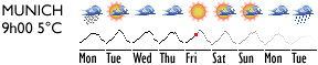
Nicolas,
Interesting chart; I have heard about a study that allegedly compared a year's worth of TV weather predictions with a prediction that tomorrow's weather would be the same as today's. I have not been able to locate this paper for this post so it is possible that it is an urban legend but interesting all the same. Today's technology may make it easier to accurate predictions but some weather stations may still like telling people that it will be sunny tomorrow because it makes viewers happy...until tomorrow: but that's the weather.
Questions on the graphic: Would it make sense to put the days MON TUE WED centred under the bar or are you planning to make negative values go below the baseline.
How could we make the shades of blue mean something. Perhaps the bars could be black in "history" section and lighter shades of grey as we attempt to forecast the future. The darker the bar the more reliable the forecast.
If we give up on the bar, would it be better to show temperature as a traditional "sparkline" that spans the week, this would show the evening temp as well as the daytime temp. 19 pixels could be 24hours or maybe 24 pixels could be 24hours and the line could be datapoints. Min / Max would now be visible in the hourly reading. The colour scheme could remain the same with black for "facts" and grey as we move into the "grey area" of the future. A little red pixel could show where we are NOW.
-- Tchad (email)
The BBC's new weather graphics replace probably the clearest, most easily, widely understood graphical weather symbol systems with a load of difficult to interpret 3d junk.
Edward, please comment.
-- Stefan Magdalinski (email)
Nicolas:
I took the weather graphic you posted and played with it for a short while:

The new graphic is 15% narrower, but also 15% taller, which makes it less like a sparkline. I don't know if that makes it more or less useful.
These are the changes I made:
- I changed the snow icon to look less like the rain icon
- I highlighted "today" (Heute) with a bordering rectangle
- I added weekday markers below the temperature bars. They could also be day-of-the-month markers.
- I made all days past and future the same color
The changes might be useful, or they might not be. Feel free to use them if you like.
-Dan McCarty
-- Dan McCarty (email)
The debate on the BBC's decision to change it's method for displaying weather data has kicked up an interesting fuss in the UK. The new display has massively increased data density. However, people seem to find a cloud icon slapped over the east of the country to be more informative than a carefully shaded landscape showing *exactly* where it will be cloudy, sunny, raining, frosty, etc...
Perhaps the BBC is trying to make people work to hard for information they don't really want?
Neil
-- Neil Barrett (email)
Given the error in predicting the weather,
there is a certain charm in having a simple
cloud over Cambridgeshire.
It's a bit like ET's comment about wearing
white gloves to display his rare books: it
says "Don't touch"
A single cloud drawing says take this forecast
with a pinch of salt.
-- Tchad (email)
I'm a little disappointed that no one has picked up on what I wrote above. The characteristic of the forecast I'm most interested in knowing is the degree of stability, instability, volatility in the day's weather. That is, I want to know how changeable the present weather pattern is. That way, if the icon signals a blizzard, and I open my door to find blue sky and 73 degrees (F), I can make a judgment as to whether (a) I can expect the weather to change significantly, or (b) I should assume that the meteorologist got it wrong.
Seems as though there would be an easy and intuitive way to represent this characteristic (although I don't have the solution in hand).
-- Mark Hineline (email)
Mark,
The 11th of May post is an extension of your concept using the colour saturation to show the accuracy or reliability of the forecast.
Is there another way that is more obvious that should have been developed further?
-- Tchad (email)
Ok, I'll chime in.
I live in Raleigh, NC. Every day the local paper publishes the weather page and the forecast by the local weather celebrity. The forecast consists of estimates of the high and low temps and something like 'partly cloudy' or 'sunny' or 'windy' or whatever for the current day and the next four days into the future. As I write, it is Friday, so today's paper had the forecast for today as well as one for Saturday, Sunday, Monday, and Tuesday. Tomorrow's paper will predict Saturday, Sunday, Monday, Tuesday, and Wednesday.
Similar multi-day predictions can be found on a number of websites. I like the newspaper one best. Why? It makes Captain Weather commit. If you track the web-based forecasts, they are always moving and tweaking and adjusting. The newspaper is printed once; it gives me the weather guy's best guess.
Why is this important? It allows me to measure the accuracy of the prediction(s) and place weight on how good a job the weather dude is doing.
Today's high temperature was predicted, in the paper, 5 times: Monday through Friday of this week. Was Monday's prediction of today's weather of any value? In general, how far in the future can the prediction be done?
In investigating a very small (month-long) sample of the five predictions of the weather here in Raleigh earlier this Spring and comparing them to the actual temperatures, I found something interesting: I think the weather guy biases his high temperature estimates low, typically about 4 degrees. In fact, the joke at our house is "The forecast says 71 degrees; you'ld better make it 75!". We think this is so that people will be happier with the predictions: if it really is going to be 67 and weather guy says 63 then people are pleased that is was more pleasant than normal. Of course, time will tell if this is maintained throughout the course of the year. In August, will a prediction of 94 degrees really mean 98? Or will the bias be flipped, so people will be happy that it didn't get too hot?
Anyway, the point is this: the weather guy is making a point estimate where he ought to be using either a confidence interval or a Bayesian posterior estimate. They've got several computer models; why not tell me what they all say, instead of doing some sort of "professional meteorologist averaging"? So, to answer the question of how should one give the uncertainty, I say, give me the 10th and 90th percentiles of the Bayes posterior. Or the confidence bounds.
(And the rant continues...) And when reporting the temperatures the next day, don't give me the 'average high' and the 'average low' for this date over the last century. Show me the distribution of high temps and highlight where today fell. Same for the low. They only report the records; show me the quantiles.
And probablility of rain: what does 30% chance mean? Does that mean that 30% of the viewing area will have rain? That, given the current scenario, 30% of past days with similar conditions produced rain? What about these localized storms? We had so much rain yesterday morning at our house North Raleigh that I was sure Noah was loading the animals, but my friends in Durham and Chapel Hill were complaining of dying lawns? What does 30% mean? Does anyone ever check the residuals?
So, to come back around: show the distributions, whether (weather?) they are predictions or realized data. Avoid summarizing when not necessary. Show the raw data and compare it to the distribution of what is typical.
-- rafe donahue (email)
Those who wish to see how nauseating the BBC's new weather graphics are in reality can read an article on the BBC News web site in which they try to defend the gaff. Go to http://news.bbc.co.uk/1/hi/entertainment/tv_and_radio/4554999.stm and then click on the "See the graphics" link to watch a promo video. But have your motion sickness bag ready just in case especially as they slam the brakes on over Plymouth and rush up over Cardiff and veer off to Belfast.
Some of the motion sickness issues with this new format could be resolved by altering the compositing of blue screen. Copying the way that sign language interpreters are overlayed on other BBC programmes so as to be out of the way would probably be enough. Also the BBC ought to have had a signer watch the female presenters hands in this video from timeclock 0:50 through 0:53, at 1:07, and 1:38.
-- Trevor Jenkins (email)
Here is a rough version of what was described
in the 11th of May post.
Still not sure about the little icons but at least it is possible
to see the hourly readings.
The red dot is now: to the left is "history," thus in black and white;
to the right is the future in shades of grey depending on the
reliability of the forecast.
-- Tchad (email)
My neighbor is an oceanographer in the Navy. In June he's moving to Japan to take command of the Navy's weather operations for the Seventh Fleet area of operations, basically Hawaii to Diego Garcia in the Indian Ocean. He said this issue of variance and confidence in the models is very topical right now. Apparently they aren't yet compounding even the uncertainties in the measuring devices.
-- Niels Olson (email)
As the Director of Internet Services for NOAA's National Weather Service (and a attendee of one of ET's seminars), this dialogue has been very interesting. As an FYI, we received about 18,000 comments on the icons - many, many more then expected. The jury is still out. We solicated public opinion for a reason!
But with this crowd, I'd love to hear comments on two other types of graphics we are using:
Watch/warning maps. Click on the map to zoom in to a local area (hint, the changing scale presents some fun challenges). This map can display up to about 80 different "products". A list is here. For a couple of years, had about 30 different colors. We received complaints about assigning more than one product to the same color. This time, as you can see, we pulled a color for each. Now we get complaints about too many colors. A recent suggestion is to only use four colors ... red, yellow, brown and grey.
These maps are very dynamic: they update very 10 or minutes and can range from almost nothing displayed to a large number of different products. This time of year (spring), it's most fun to watch it during the early evening when there is alot of weather.
The other are new graphical forecasts:
http://weather.gov/forecasts/graphical/.
Here's a sample:
Comments are most welcome.
-- Robert Bunge (email)
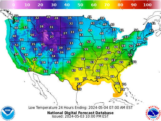
The temperature map looks like a rainbow
or at least an inverted one. I flipped the
legend around to see it "red to violet"
and although it was easier to look at it in
Red Orange Yellow... it doesn't seem to work
for me seeing hot temperatures first.
Overall, there seem to be a lot of colours to essentially
show one variable. Who are the consumers of this
map? What do they want to know? Personally, I would
be happy seeing cold in white and warmer areas in progressive
shades of another colour: perhaps white to red.
This may be a little too minimalist for the mass
audience so maybe blue for cold fading to a white
"neutral zone" and then a gradual fade to
red for hot areas. This would take advantage of something
we use everyday ( Cold water tap is blue / hot water tap is red )
It would also be interesting to find out what most
Americans consider "hot" and "cold." Is cold 50 and below?
Is "hot" 80 and above? The white area between 50 and 80 could
be the comfort zone.
A couple of other things that jumped out at me:
a) The large pixelated squares in Kansas, Texas, etc.
Are these the result of fewer stations? When I see
jagged edges in charts/images - I think sample size issues
or data errors; sometimes it is neither one.
b) The weather data seems to extend into the oceans and
the gulf but not Canada or Mexico. Is this on purpose?
If so what was the reasoning? Is it access to data or
a deliberate decision to only show the USA since it is
a "National Forecast" It would seem that the Mexico
data to the west of Texas would be useful to someone
in Texas just as Canada data to someone in New York.
Could you adopt an X mile border all the way around the
map?
c) Is it confusing to people near the Great Lakes to see
Lake Michigan in the same colour/texture as a state? What about other
large bodies of water?
On the Watch/Warning, less would seem to be more. There are about 6 different colours for floods. I would think that as a consumer of the
map information I would just want to know if my area is under a
Warning, Watch or Advisory. Then clicking on the area I could find out if it is earth, fire, wind or water
There is probably a high correlation between a Thunderstorm Warning and a Flash Flood warning - at present the map could have five different colours for storms and 6 different colours for floods the
compounding of these colours in a region make the map unreadable, not to mention the legend does not appear to be grouped by intensity, weather type, colour - although it may be alphabetical...
Flash Flood Watch
Flood Advisory
Flood Statement
Flood Warning
Flood Watch
Gale Warning
Hazardous Weather Outlook
High Surf Advisory
Lake Wind Advisory
Marine Weather Statement
Minor Flood Advisory
-- Tchad (email)
Response to Robert Bunge
In addition to Tchad's comments, which I second, I have a couple of suggestions.
The roll-over effect for the "Graphical Forecasts" map is pretty handy and cool. However, there are a couple of problems with it:
The rollover elements and the map are disconnected. First, the roll-over elements appear to be in a separate box, as if they represent different content (and, indead, they could be interpreted as such). Second, they don't fit on the same screen as the map, forcing the user to scroll between rollo-over and map, reinforcing the impression that there is no real tie.
Worse, the fact that they appear on separate screens can actually hide the roll-over effect. I only noticed it because I had about a twenty-pixel slice of one of the "Additional Graphical Forecast" elements showing on the same screen as the main map, and I happened (accidentally) to scrub the mouse over one of them. You might try a different arrangement that puts them together. I think that, for most screens currently in use, there's enough space to put the rollovers next to the main map. In fact, if they're side-by-side, you probably don't need the "Additional Graphical Forecast" images to be nearly so big. As little as one-fourth the size might convey the necessary information
Regarding the color problems with the "Warnings & Forecasts" image, you are attempting to encode two different kinds of information: weather severity and weather type, and you're doing it in a non-obvious fashion. The current method uses different colors to encode twenty-one different meanings on the weather map. It's not quite clear if each meaning gets its own color, though it appears that it does not. The user is essentially forced to store twenty-one separate items in short-term memory in order to make sense out of the map (except for counties in red; that one, alone, stands out), and probably, if you're using the same color for some items, people need to remember additional rules (like "this shade green means multiple things"). This is way beyond the capabilities of anyone I know.
One approach to improving might be to simply improve the legend. You might, for instance, use a hue-saturation-value (or hue-saturation-luminance) scale to encode the weather conditions and severity. For instance, holding saturation constant, value might take on one of three settings to indicate severity (the maximum of value typically results in the color white, which would conveniently mean "zero severity"), while hue might be varied to represent weather condition. The legend would then be a three-by-seven grid of colors, which should be easier to remember and easier to decode.
Unfortunately, this still doesn't seem terribly elegant to me; it's still a lot of colors and information to encode, and there's still a disconnect between the map, which is what the user is really interested in, and the legend, which tells the user what he/she needs to know. A better approach would embed the relevant information in the map.
Perhaps just encoding the severity (red, yellow, green) is enough for a map of warnings, as Tchad suggests. To build in further information without requiring excessive page loads, you might use tool-tip-like javascript windows to provide additional information for each county. I've seen this sort of thing in multiple places, though the only example I can think of right now is the Teleportation Map at LineageDB.
-- Thomas Hopper (email)
The NOAA National Weather Service:

http://www.spc.noaa.gov/products/wwa/wwa_new.gif
On the actual page, there are links to pop-up text reports
organised by the type of the information.
http://www.spc.noaa.gov/products/wwa/
-- Tchad (email)
Jeff,
The Flash is interesting, especially as it brings up measurement and central tendancy: topics that have been discussed several times on this site in other areas.
In the case of weather ( over several days ) we are likely to see a sinusoidal variation that could be quite interesting in predicting the future curve.
The high temp is likely to be in the afternoon and the low sometime in the middle of the night but how did we get there? The story that unfolds over time, especially when grouped with other indicators, as shown in the flash chart, could show some interesting correlations.
In May, the forum looked at the possibility of displaying an hourly temperature reading as a sparkline. For the purpose of simplicity, each reading was represented as 1 pixel on a 24 pixel horizontal axis yielding an EKG style temperature reading. It would be interesting to see this on the flash diagram along with the other measurements that have been proposed ( Chill, Wind and Precipitation )
The NOAA surely have live data that could be used for a week.
-- Tchad (email)
The Week in the UK reports that:
"...the Met Office ordered its weather
forecasters to take a sunnier look.
Guidelines sent to television, radio,
and internet forecasters suggest replacing
the phrase 'chilly in areas' with 'warm in most'..."
isolated showers = hot and sunny for most
-- Tchad (email)
Here in southern California, it's been a commonplace, for as long as I can remember, for weathercasters to describe the coming day's weather thus: "morning fog burning off into hazy sunshine." We all know what that means: it's going to be smoggy.
-- Steve Sprague (email)
Heat in the Wallet
Here is an interesting use of a weather map:
GAS PRICE TEMPERATURE MAP
[ http://www.gasbuddy.com/gb_gastemperaturemap.aspx ]
Gas Buddy shows the gas price per gallion in the USA by county
using a
weather map.
GOOD CANDIDATE FOR SPARKLINES
[ http://www.gasbuddy.com/gb_retail_price_chart.aspx?time=24 ]
-- Tchad (email)
Now you can get weather icons on your coffee maker. The Melitta Smart Mill and Brew comes with MSN Direct that provides local weather info via FM signals to the coffee machine, which is then displayed on its LCD screen, complete with weather icons:

-- Michael (email)
I recommend a look at the following web site to see weather information presented in a dense, intuitive and value-packed way. There are layers of information in these charts that take a while to appreciate, such as the way shading indicates dawn and dusk.
I'm not acquainted with the author of these pages but I admire and use their work often. What's especially interesting is the rate at which they're improving and adding to the charts.
Enjoy.
http://www.seabreeze.com.au/graphs/sa.asp
-- David (email)
Oddly enough, the graphic display of weather icons has been an obsession of mine for years.
In my academic career,I have studied social work with an emphasis on meta-level research methodologies. In the future, I plan on focusing on the application of analytical design as well as other industrial design rudiments to social services research with the ultimate goal of developing software that will combine large quantitative data sets in order to quantify social needs (as well as how well these needs are met) for large geographic locations as well as display the information in a novel and intuitive way.
This pursuit has led me in an artistic path as well (as, i have come to find, many of those of us interested in analytical design are also interested in the inherent aesthetic value of such work). This path has resulted in the creation of an artpiece composed of the graphical representation of the weather of every day of my life.
therefore, i have given a huge amount of thought to how best, and most simply, to graphically represent basic weather trends.
Research into the weather of my life led to many hours spent looking at archived newspapers and, therefore, exposure to many variations on the basic icons and symbols used over the years.
The literal goal of such a work is to communicate the data set effectively; therefore, each symbol must accurately display the basic conditions of "snow" or "windy." Imagine if the proposed icons above were placed out of context; i cannot imagine they would accurately communicate the information (specifically the last series, which i feel scales badly).
-- Christopher Lyden (email)
Weather on Wolfram Alpha
The temperature output chart from Wolfram Alpha.
Source:
https://www.wolframalpha.com/input/?
i=weather+in+new+haven
-- Tchad (email)
I must say I am in love with the way that Wolfram|Alpha displays weather information. Mostly this is due to the contextualization of the information. When I look every morning at the weather report in my local newspaper, I can see the predicted high and low for the day, which is fine. But I always ask myself, "XX??, huh? So is that colder than yesterday, because yesterday i was on the verge of needing a sweater..." But sadly, most newspapers do not print yesterday's data. So I view the numbers as I do the celebrity-gossip section: mostly meaningless trivia.
I have always marveled at the way this display of information can make universally useful information into lotto- number like trivia. I can only conclude that newspaper editors are the sort that can see the temperature will by 56?? and know *exactly* what that will feel like and how to dress appropriately. Or that they are the sort that never spend more than 5 minutes in a space that is not climate-controlled in some fashion.
-- Dent Earl (email)
I discovered this weather presentation just a week after attending ETs course in Boston.
This may be the best weather iconography I've ever seen.
-- Nellie Cohen (email)
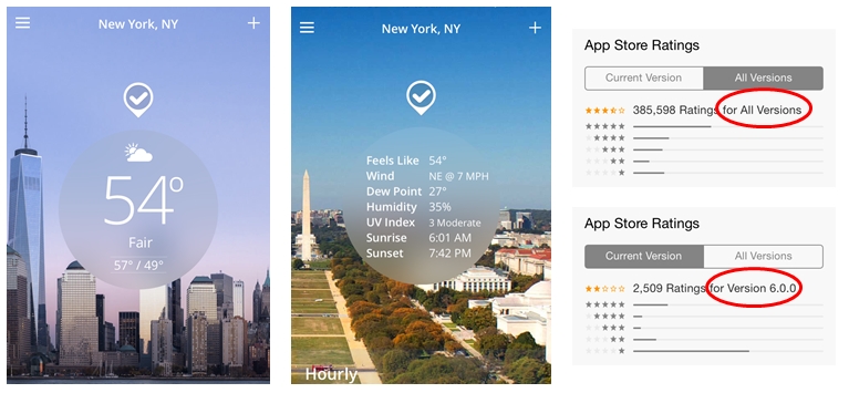
Weather Channel iPhone App Version 6.0.0
The latest version of The Weather Channel iPhone app has 4 pieces of weather data on the home page (one of these is displayed with a description and an icon).
If you press in the circular center area, you are treated to 7 additional pieces of data.
On each of these screens, the data occupies about 1/8 of the screen. The rest of the screen is filled with a stock photo image. As you can see in the example below, the photo locations do not necessarily match the data location!
I looked at the app ratings. The ratio of 5 star ratings to 1 star ratings for all versions is more than 2:1, but the latest version has a ratio of less than 1:3.
While the prior version was not perfect, it did have a much greater information density on the home screen. I am searching for a better weather app, and it looks like many other users are too.
-- Mike (email)
|
||||||