|
All 5 books, Edward Tufte paperback $180
All 5 clothbound books, autographed by ET $280
Visual Display of Quantitative Information
Envisioning Information
Visual Explanations
Beautiful Evidence
Seeing With Fresh Eyes
catalog + shopping cart
|
Edward Tufte e-books Immediate download to any computer: Visual and Statistical Thinking $5
The Cognitive Style of Powerpoint $5
Seeing Around + Feynman Diagrams $5
Data Analysis for Politics and Policy $9
catalog + shopping cart
New ET Book
Seeing with Fresh Eyes:
catalog + shopping cart
Meaning, Space, Data, Truth |
Analyzing/Presenting Data/Information All 5 books + 4-hour ET online video course, keyed to the 5 books. |


The directory of safety and security for a large airline asked me to take a look at airport runway maps and how runway incursions might be reduced by better maps. This is pro bono work and should be an interesting case study of maps and how they should be designed to produce satisfactory performances in the real world. I hope that Kindly Contributors who know about maps for flying and runways can help with this.
There are obvious issues with map design here, but let's begin instead with the content side: What goes on at runways? What are the causes of incursions? What are the issues for pilots? What about links between the tower controllers and pilots? What about the links between what the pilot sees out the window and what the runway map shows? How can words, maps, and what is seen out the window provide accurate and consistent guidance--and thereby, one hopes, reduce runway incursions?
I have not yet done any research on this so some tours of Google would be useful.
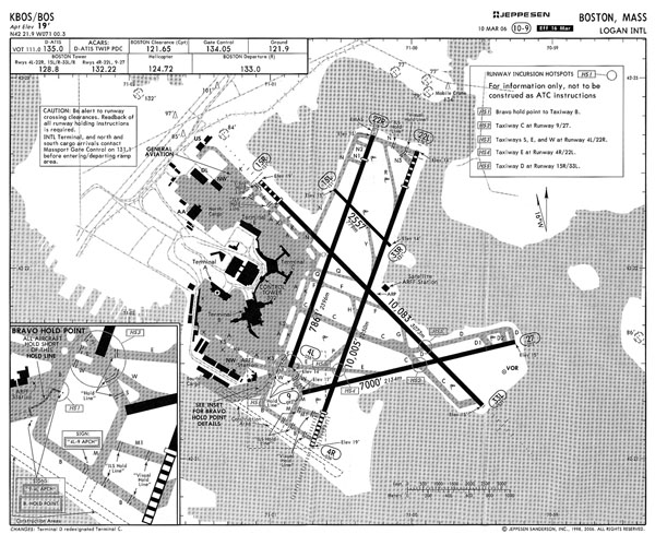
Here's a map for Boston's Logan Airport:
 |
-- Edward Tufte
Some links to help understand the situation:
Aeronautical Information Manual, Official Guide to Basic Flight Information and ATC Procedures. http://www.faa.gov/atpubs/AIM/Chap2/aim0203.html
A summary from AOPA. http://www.aopa.org/asf/accident_data/incursions.html
The FAAs Runway Saftey Site. http://www.faa.gov/runwaysafety/
-- Jordan Meek (email)
This is quite interesting. I have never heard the suggestion before that some runway incursions may be caused by poor taxi diagrams. I'll try to briefly address most of the questions you poised.
What goes on at runways? Pilots interact with runways in one of three ways: landing, takeoff, and crossing. I think the information provided below will expand on this sufficiently.
What are the causes of incursions? I'll provide some well-known causes of runway incursions. This is in no way meant to be exhaustive.
Controller Error - The controller clears an aircraft into the runway environment when it is not safe for the aircraft to enter. This is an incursion that is not the fault of the pilot.
Pilot Error - There are several types of pilot errors including disorientation, distraction, and forgetting errors. It is possible the map could contribute to the disorientation error. However, it is worth mentioning that pilots familiar with an airport often pay little attention to the taxi diagram (map).
Vehicle Driver Error - These are errors that involve a vehicle (repair truck for example) on the runway surface which are the fault of the vehicle driver.
A couple of excellent animations, describing two types of errors (controller error and pilot disorientation) can be found here http://www.ntsb.gov/Events/2000/incursion/ incur_video.htm
In addition, there is an intriguing account of computation cognitive models of pilot errors that result in runway incursions. That can be found here http://www.humanfactors.uiuc.edu/Reports&PapersPDFs/TechReport/03 -14.pdf
What are the issues for pilots? At an extremely high level pilots are doing two very different things as they move either from the gate to the runway or from the runway to the gate.
The first is the basic task of navigating. In the case of moving from the gate to the runway, the controller will provide a clearance to the runway. For example, "American 123, taxi to runway 36 via Yankee, Delta, Foxtrot. Hold short of runway 36." The controller is then to move to the runway along that path.
In addition to this basic task of navigation to the runway the pilot must also go through a series of checklists to prepare the aircraft for takeoff.
Accomplishing these very different tasks makes taxiing to and from the runway unique. This dual task environment can give rise to disorientation, distraction, and even interference or decay based memory errors.
What about links between the tower controllers and pilots? At a towered airport (which are the only types of airports you'll be concerned with) the pilot is never to enter the runway environment without clearance from the tower controller. When taxiing to either takeoff from or cross a runway, the pilot can expect to here several clearances. Here are some examples.
American 123, hold short of runway 36 - This is an instruction to the pilot that there are not to enter the runway environment. The pilot will stop at the hold line and await further instruction from the controller.
American 123, clear to cross runway 36 - The pilot is cleared to cross the runway. Pilots (or crews) perform a check before proceeding. In crews, the pilot in the left seat will look down the runway and vocalize "Clear left" and the pilot in the right seat will look down the runway and vocalize "Clear right".
American 123, cleared to position and hold on runway 36 - The pilot is cleared into the runway environment. Once they enter the runway environment they position themselves so that they are ready for takeoff as soon as the tower issues the clearance for takeoff.
It's the controller's responsibility to maintain separation between aircraft on the ground. This is why the controller determines when the pilot can enter the runway environment.
What about the links between what the pilot sees out the window and what the runway map shows? Out the window the pilot can identify their surroundings through vertical signage, painted indicators on the surface, lights, and landmarks like the tower. Vertical signage comes in two flavors - yellow signs with the taxiway letter and red signs with the runway number. This link shows the signs the pilot would see. http://members.cox.net/firestation51/sign.htm If I can be of any assistance, feel free to contact me by email.
-- Steven Estes (email)
I am not a pilot, but I have experienced many unfamiliar airports from the right seat of small aircraft. One of the things that occurs to me is the visual clutter of runway lights and taxiway lights at night. It isn't a serious issue with pilots who are familiar with the airport, since they already have a mental map of the aiport, just like we all have a mental map of our homes and neighborhood streets. Unfamiliar airports at night, however, can look like a cluttered dot-to-dot puzzle requiring left-brain concentration that can be easily distracted by other left-brain activity, such as an unrelated conversation. Perhaps it would be an improvement if taxiway/runway lights were connected with continuous lines, even if only for short-range viewing. Extending this idea one more step, could graphic styles on a taxiway map be used to match the actual taxiway outlines? Just a thought.
-- Garry L. Booker (email)
I imagine that colour coding on maps to identify changes in context may be useful to consider as they are multi-dimensional in use. This may lead to sequences rather than one static map.
-- Roger Daventry (email)
Well, I always thought the map for DIA/KDEN was a bit cluttered. Actually, a lot cluttered if you compare it to Logan's above. If there are any pilots out there, is the second-scale accuracy that the KDEN map gives necessary (all the ticks make my eyes water)?
That said, looking at the Logan map at Wikipedia, it seems to be a matter of FAA regs versus common sense. It looks like the FAA *requires* 6-second ticks in these maps. The problem is that the very large size of DIA makes 6 seconds a bit too small for the scale of the airport. But, if a pilot needs those ticks, I really don't want to deny them to him/her.
-- Matt Thompson (email)
You can download taxi diagrams for most tower controlled US airports from -
http://www.aopa.org/asf/publications/taxi/
This appears to be the source for the wikipedia diagram in Contributor Matt Thompson's post above. It also has links to other information on ground signs etc.
Are different charts used for landing and then taxiing? If not it appears to me to be a case of trying to fit too much information onto the one chart. One chart should be used to get you onto the ground, another to get you around once there or when leaving. To me they are two conceptually separate functions. A bit like using a street directory and a road atlas in planning a trip.
-- Andrew Nicholls (email)
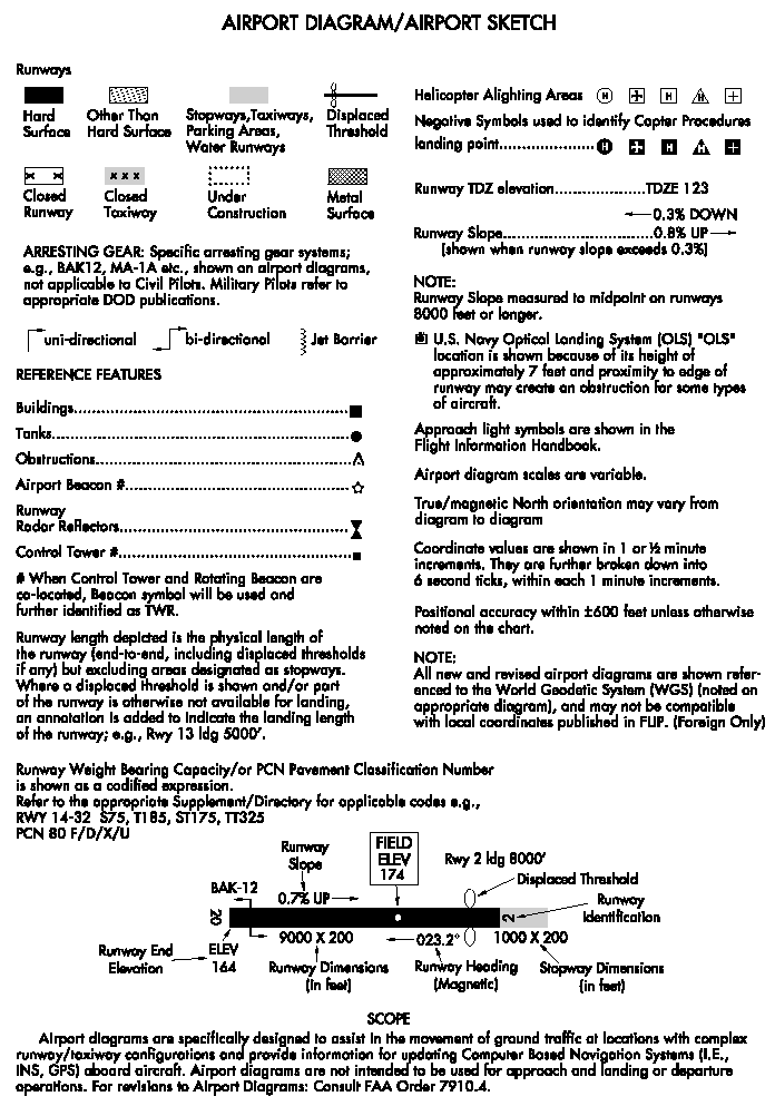
The FAA's digital Terminal Procedures Publication describes four other types of charts used for approach and departure and tells us
Airport Diagrams are specifically designed to assist in the movement of ground traffic at locations with complex runway/taxiway configurations and provide information for updating geodetic position navigational systems aboard aircraft.
Here's a legend for the airport diagrams. It is taken from page 12 of the 44 page PDF of the publication frontmatter.
-- Dave Nash (email)
I wonder if the pilot can keep the map oriented. Does the map sit on some sort of board that rotates, allowing the pilot to reorient the map as the plane turns a corner? It is much easier to navigate when you can orient the map and reorient it.
-- Michael (email)
The complexity of content for this issue is well illustrated by the detail revealed during the investigation of a particular runway incursion in October 2001 at Milano Linate airport. The report of the accident was published by the Italian National Air Safety Agency (ANSV - Agenzia Nazionale per la Siccurezza de Volo).
The immediate and systemic causes included poor visibility; high traffic volume; lack of visual aids; one aircraft entering wrong taxiway without clearance; inadequate publications, runway marking and signage; as well as non-standard radio communications conducted in two languages.
ANSV accident report (196 pages)is at: http://www.ansv.it/En/Detail.asp?ID=177
Moving from the particular to the general, EUROCONTROL (the European Organisation for the Safety of Air Navigation) has recently published a plan to minimise runway incursions.
EUROCONTROL action plan to reduce runway incursions (90 pages) is at: http://www.eurocontrol.int/runwaysafety/gallery/content/public/docs/EAPPRI%201_2.pdf
The documents contain voluminous reference material as well as appendices containing photographs, charts and diagrams.
Mark Reilly
-- Mark Reilly (email)
The runway maps are simultaneously low resolution and cluttered, a pessimal combination. Nearly all the type, grid boxes, arrows, buildings, runways, and backgrounds operate at the same active visual level. There is no cartographic intelligence to these unsophisticated diagrams.
Good maps layer and separate their information, partly in terms of a hierarchy of relevance but, more importantly, in a pluralism of differences. In good maps, active viewers can read several separate layers of information. These runway maps are extremely flat. These maps were probably put together piecemeal over the years, as each newly added piece of data competes with what was already there. For example, some type is added but it doesn't get enough emphasis compared with what is already on the map--and so the type goes into a bureaucratic box with a clunky arrow. Everything is saying "look at me now." This masks the relevant data sought by the user. It is like a bad cocktail party; someone is talking louder because someone else is talking loud . . . and the result is cacophony.
A way to see this is to put a competent map, from a commercial atlas of roads or a geological survey map, adjacent to a runway map.
But who knows whether good cartography would reduce runway incursions? Part of the problem is the mismatch between the maps and what is actually viewed by the pilot; thus maybe clear in situ markings are what is needed.
-- Edward Tufte
A very nice response by Mr. Estes.
It is (unfortunately) true that familiarity breeds contempt, and pilots do not use airport diagrams at airports they are familiar with. The goal of a task such as this must be to produce diagrams that assist pilots while they are building such familiarity.
I do not believe color should be considered for this exercise. Most pilots print or receive their diagrams in black and white. We must also remember that some pilots, myself included, are color vision impaired (a very interesting topic for presenting data in graphical formats).
When creating new diagrams, we have to consider that many pilots do not use the large diagrams shown. Commonly, "knee-board" formats are used which are much smaller and harder to read. Even more reason to reduce the clutter!
To help solve the task at hand, reducing runway incursions, we need to concentrate on producing diagrams that inform pilots of where NOT to go, such as clearly identifying "Hold Short" lines (lines that cannot be crossed without permission). Providing a map for directional purposes should be secondary, although I hasten to add, a very close second!
-- Trevor Cudmore (email)
This source may be worth a scan not least because it's written by a pilot for other pilots and refers - amongst other commercial product developments - to the Runway Incursion Prevention System (RIPS) being developed by NASA at Langley Research Centre.
Professional Pilot article is at: http://www.airspecinc.com/article2_june.pdf
The source states:
"Using head-up displays, digital datalinks and 3D moving maps, RIPS provides crew members with a complete view of the airport situation. This project shows what can be achieved using state-of-the-art technology. Moving map displays, in both 2D and 3D formats, show "own ship" position on taxiways and the position of all other aircraft taxiing or flying near the airport. Digital datalinks allow aircraft controllers to send taxi route clearances directly to the aircraft' s computers. The route is displayed to the crew as text, as highlights on the moving map and through the HUD."
The NASA Runway Incursion Prevention System is at: http://www.nasa.gov/centers/langley/news/factsheets/RIPS.html
Of course, this does not get away from the need for better cartographic design but suggests that this would need to go hand in glove with other on-board systems and external cues.
Although additional to the immediate question of runway maps, I wonder if having a look at other printed aids for pilots might help to place the quality of runway maps in perspective. The landing approach chart for pilots (Runway 13L approach shown below at JFK for example) may not be visually appealing but it seems to be data dense and displays critical material in the same visual space no matter what the runway or airport location. Could any of the `good' features from the approach charts compensate for the `bad' on the ground maps?
ILS approach plate for Runway 13L at New York JFK airport is at: http://204.108.4.16/d-tpp/0607/00610IL13L.PDF
Mark Reilly
-- Mark Reilly (email)
I think that the runway incursion problem has two components; navigation and traffic management. I think therefore automobile navigation and traffic management may offer some help with this problem. The design of road navigation systems and traffic management systems overlap. Navigation requires good maps and a well designed system of signs that reinforce directional cues. Traffic management is based upon static and dynamic signs (e.g. Stop signs are static;; Traffic lights are dynamic) and early notification of directional choices so that traffic may be streamed. If navigational aids are poor, traffic is often bad when choices have to be made with littel notice.
An examples of a navigation maps is a good street directory. One of the best of this class is the material provided by the Melway/Ausway company in Australia (http://www.ausway.com.au/ausway.html) (I have no relation to the Ausway company other than I have been a customer and user of their products). These are far better than any I have seen in the USA and I think they should receive the same attention as the London underground maps. The Ausway maps are highly detailed yet easily deciphered and are consistent with most of the principles espoused in these forums. These maps may provide some guidance as to the layout of the airport maps (use of color; symbols for various items such as traffic lights, oneway streets etc may be reusable).
The runway signs need to be designed to accommodate wingspan of planes on the runway, be easily visible from a small commercial craft to a large jumbo jet and should use place names coincident with those on the map. Choice of color and font is important here, as is visbility at night and height and angle of sign.
Clearance and hold signals (traffic lights) should be managed by the ATC from a central console or by a clerk who monitors the ATC instructions and provides a check on the actual traffic patterns before setting the lights. These lights would provide a visual confirmation of the ATC instructions and lack of agreement would require a check with the tower. The placement of these lights should be noted in the map (ie. indicate the intersection where lights are expected as in the Melways maps) and then these lights can do double duty as traffic management and landmarks.
Another thought would be to landscape the inter-runway areas to provide landmarks to aid in navigating with the map. Of course the landmarks should be unchanging and require minimum maintenance (e.g. rock formation) and should be present on the maps.
-- John Walker (email)
@Trevor:
I was wondering what the pilot response was to ARINC's eFlybook that uses eInk technology. I know that there exist EFBs from Jeppesen and the like, but I have to imagine the superior resolution of eInk (which is *remarkably* like paper) can convey these diagrams much better than an LCD screen.
-- Matt Thompson (email)
I think more analysis might be in order before fixing anything.
Steve Estes asks and answers "What are the causes of incursions?" Although a good start, what is missing includes; what is the share of each type of error, what are the explanations for each error that occurs, what can be discovered by comparing incursions throughout the history of a single airport, between airports, over time, across pilot experience, weather conditions, etc six ways to Tuesday....
Point and path maps of incursions might show clusters of incursions, or similarities in incursion locations. Photographs of the view as the incursion instigator saw the scene might help, as well. Are there different findings for nighttime and daytime incursions? Etc...
A systems analysis, business process dissection, or whatever it is called when done here, needs to be conducted to understand what a runway entry, lineup and takeoff looks like when done properly so that when it goes wrong, weak points along the way can be identified.
Do pilots actually use those maps in real time? Does the co-pilot? Or does a pilot read them ahead of time and then just have them hanging next to her for reference?
Finally, if signage, signalling and lighting are the culprits, serious research, experimentation and analysis ala "Instructions at the point of need" https://www.edwardtufte.com/bboard/q-and-a-fetch-msg?msg_id=0001HD&topic_id=1&topic= needs to be done. As mentioned earlier in this thread, since the majority of pilots are men and thus colorblindness will be a problem, solutions need to use other attention getting solutions - light shapes, light flash patterns, signage visible from only certain viewing angles, and various sensor and response solutions like proximity alarms could be considered.
-- Karl Hartkopf (email)
An interesting example that combines chilling personal experience of the issue with at least some statistics comes from Robert Baron in an editorial in 'Airline Safety.com'.
Robert Baron Guest Editorial in `Airline Safety.com' is at: http://www.airlinesafety.com/editorials/RunwayIncursions.htm
The quest for the objective evidence that helps better understand the risks is vital but importantly this search still needs to take place at the same time as trying to reduce the risks that we know about now.
Sir Austin Bradford Hill neatly summed up the `evidence versus action' dilemma in 1965:
'All scientific work is incomplete whether it be observational or experimental. All scientific work is liable to be upset or modified by advancing knowledge. That does not confer upon us a freedom to ignore the knowledge that we already have or to postpone the action it appears to demand at a given time.'
-- Mark Reilly (email)
This is pretty off the wall, but how about ATC computer controlled, GPS reporting, robot rovers that acts as automated pilots (as in channel pilots or tugboat pilot) moving in front of, and guiding the aircraft through the airport to the appropriate holding point. A set of lights on it's surface indicate to the aircraft pilot when it is safe to proceed past the rover and on to the runway.
-- John Walker (email)
Not so of the wall, really. The Air Force has been using "Follow Me" trucks (manned pickups, generally, but might be Hum-Vees or SUVs, maybe cars, all having a big sign with the words FOLLOW ME mounted on their backs) at Air Force bases for as along as I can remember. They meet just arrived pilots, who may be unfamiliar with the base, at the runway and lead them to the proper hanger or parking spot on the ramp, and guide them back out to the correct runway when leaving, although my dad, an F-106 pilot, once told me their real purpose was to make sure visiting pilots didn't get lost on their way to the Officer's Club.
-- Steve Sprague (email)
Here are some further thoughts on the 'big' picture and the small, some news of a FAA competition and a suggestion.
1. Pictures large and small - The FAA Runway Safety site mentioned at the start of this thread (Jordan Meek, 3rd link) includes some evidence of numbers of events by time, region, runway location and cause. Incursion totals (link in the left-hand column) are shown as absolute numbers by month, year and region. Event occurrences per 100,000 takeoffs would be more informative. The link under `publications' to the Runway Safety Report includes incursion locations in 2000 and 2001 at selected airports plotted together on a schematic runway. This diagram (page 9, figure 7) is not the best (no scale) but it shows that the majority of incursions occur in what are described as `high energy' (and presumably potentially lower survival) areas.
For pilots and others closer to the daily action, the cartographer at DeKalb-Peachtree airfield has been working overtime to produce some local `hotspot' maps. By using a larger scale base map for each hotspot, it focuses attention on the danger of incursions in ways that would be more difficult on smaller scale maps of a whole airport. Such a combination of maps, photographs and text might be the important ingredients for an effective product. The practice of using very simple `mapped pictures' (discussed elsewhere on this board) is also evident: issues of position, place and problem are now in one scene. It's worth comparing all four `hotspots' to see how the evidence could be adapted for any potential conflict.
Example of runway incursion `hotpots' at DeKalb-Peachtree airfield is at: http://www.pdkairport.org/Runway%20Incursions/incursion.htm (Note terms and conditions of use)
2. A suggestion - From the commentaries in the national and international resources, the long-term solution seems to be heading in developing more and better ground signalling and traffic lighting (operated by ATC ground controllers when not automated) coupled with more sophisticated cockpit visual/audio alerting. These efforts will still need to go hand in hand with more pilot awareness of risk. A Chief Flying Instructor writing recently reminded students that situation awareness begins at engine start and not after takeoff. Bearing in mind that many technological solutions will not be available at non-towered airfields or installed in smaller aircraft, then the map in hand comes back into its own for general aviation users.
In terms of further raising and maintaining pilot awareness of risk, what about designing a suggested layout that focuses on the known higher risk points/sections on the airfield? This would be based both on data (where available) and local knowledge. At the minimum, this layout would include:
1. a clear plan view with labels
2. appropriate (mapped) photographs (aerial and/or pilot's view and/or important signs in black & white)
3. plain text providing context and any commands
4. standard operating advice with additional airfield advice.
We still need all the bells and whistles but I'd still like my pilot to have that little bit of paper in hand when the bell doesn't ring.
3. A challenge from the FAA - For those interested in fame, if not a large fortune, the FAA is currently running a design competition (April 2006 to April 2007) for universities. One part of this competition includes the challenge to reduce runway incursions by developing, for example, "techniques to record, analyze and display annotated spatial data for improved situational awareness of ground operations." There's a first prize in this category of $2,500.
-- Mark Reilly (email)
Could you put a little number by each crossing, the number of incursions that have occured at that crossing for every 100,000 takeoffs at that airport over all recorded time? Maybe stack little tick marks next to the number to indicate how many years since the number was last updated?
8. 8 per 100,000, one year since last update12: 12 per 100,000, two years since last update
3| 3 per 100,000, three years since last update
-- Niels Olson (email)
Airport maps and runway incursions: Cost of printing, Language issues and Lighting Cues
Clearly, the maps have graphical design issues. Unforunately, one of the most common forms these maps are distributed in is the "US Terminal Procedures". These are 5 3/8" x 8 1/4" and printed on newsprint in one color. They are updated every 56 days, after which they must be replaced, so cost of printing is a substantial factor which precludes making any use of color. Thus, any redesign should be black and white in order to be practical.
Some runway incursions, particularly at international airports, are contributed to by language barriers. This is particularly true at Los Angeles International, where large numbers of flights from Mexico operate, despite english being the international language of aviation.
One program being undertaken to reduce runway incursions is an elecrtonic version of the "Follow Me" car. At London Heathrow, the runway lighting system is designed to be controlled from the tower, allowing the controller to use the lights to direct aircraft.
-- Michael C. Collins (email)
This subject is near and dear to my heart as I'm trying to get improvements to these taxi diagrams for several years. A safety officer at my airline suggested coming here.
I am a frustrated user (737 Capt) of these taxi diagrams and find them woefully lacking--enough that I went to the trouble of redesigning one particularly difficult map and am trying to get Jeppesen (provider of charts to nearly all airlines) to make changes that incorporate these concepts. Improving taxi diagrams will improve safety by requiring less time to translate taxi instructions.
The inforamtion is on a special page of my website that details various safety improvements that would affordably reduce risk: www.FootFlyer.com/Airline. Scroll down until you see the taxi diagrams.
Thanks for taking the time, Jeff Goin
-- Jeff Goin (email)
There is some possible changes coming concerning the way these airport maps will be distributed and printed. A company in Rhode Island, Astro-Med, Inc [www.astro-medinc.com] has been award contracts with Boeing and Airbus to provide cockpit printers in order to provide pilots, amoung other things, airport runway maps, pardon the pun if you will, "on the fly".
(Full disclosure: I had previously worked for Astro-Med in another division but no longer work for them and have NO financial stake in the company or affilietes).
You can read about these contracts in several company press releases,
"Astro-Med Wins Contract for Cockpit Printers from Boeing" 12/08/03 [1]
"Astro-Med Wins Contract to Supply Cockpit Printers for Airbus A380" 02/23/04 [2]
"Astro-Med Signs Contract with Panasonic for Cabin Printers for Airbus A380" 04/25/05 [3]
"Astro-Med Wins Contract from Honeywell to Supply Flight Deck Printers for the Boeing 787 Dreamliner" 08/15/05 [4]
"Astro-Med Awarded Contract for Cockpit Printer for Airbus A400M Military Aircraft" 07/17/06 [5]
These types of printers and how they will be used by pilots might affect your discussion here (such as color vs grayscale printing, size of printouts, cost of printouts, etc.).
Ed Manlove
[1] http://phx.corporate-ir.net/phoenix.zhtml?c=120530&p=irol-newsArticle&ID=475749&highlight=
[2] http://phx.corporate-ir.net/phoenix.zhtml?c=120530&p=irol-newsArticle&ID=497746&highlight=
[3] http://phx.corporate-ir.net/phoenix.zhtml?c=120530&p=irol-newsArticle&ID=700385&highlight=
[4] http://phx.corporate-ir.net/phoenix.zhtml?c=120530&p=irol-newsArticle&ID=743082&highlight=
[5] http://phx.corporate-ir.net/phoenix.zhtml?c=120530&p=irol-newsArticle&ID=882606&highlight=
-- Ed Manlove (email)
Tragic but timely for this discussion ...
http://www.cbsnews.com/stories/2006/08/27/national/main1936906.shtml
The crash and death of 49 people in Kentucky appears to be the result of getting clearance for takeoff on runway 22, but attempting takeoff on runway 26 (with 1/2 the distance of runway 22).
-- Michael Round (email)
This appears to be the Lexington Airport, showing the proximity of runways 22 and 26 ...
http://204.108.4.16/d-tpp/0608/00697AD.PDF
-- Michael Round (email)
On August 1, ET said: "But who knows whether good cartography would reduce runway incursions? Part of the problem is the mismatch between the maps and what is actually viewed by the pilot; thus maybe clear in situ markings are what is needed."
With respect to the Comair tragedy, is the length of the runway part of the in situ information? Is the appropriateness of the runway for a given aircraft part of that information? It would seem to me that fairly simple iconography at the entrance to the runway could help to prevent this kind of problem.
Do pilots check the map while taxiing, and if so, are their eyes off the runways? Do they commit runway incursions as a result?
---Michael B.
-- Michael Bolton (email)
Another issue that I did not see discussed is that at certain towered-airports, there are portions of the airfield that cannot be seen from the tower, either due to man-made or terrain features. These obstructed views should be clearly marked on the map such that the pilot is alerted to the loss of visual continuity from the tower.
- Jerry Mahone
-- Jerry Mahone (email)
Might satellite navigation, such as we have in automobiles, provide an aid to pilots needing to find their way on the ground? A download from control tower to incoming aircraft, in their own language perhaps, could be used in the cockpit to instruct and guide pilots to their correct pathways once landed. The Sat Nav commentary could help pilots recognise signs, lights, signals and other landmarks. Similarly, Sat Nav could help pilots make their departure and take off in certainty and safety.
-- Philip Kipping (email)
The GIS industry has a concept of "geo-fencing", where a GPS unit combined with a digital "fence" in a map database sounds an alarm whenever the object in question leaves their authorized area or enters a forbidden area. Those monitored areas can be static or dynamic and rule-based, e.g. when a controller starts clearing aircraft to cross a runway, the whole runway is "green." Think of it as an invisible, digital "follow me" truck.
-- Jim Herries (email)
Posts above list 3 factors that favor black & white printed charts - usable by color blind pilots, charts are often printed on personal printers which are most likely black & white, and the increased cost of color printing. A fourth factor is use of the charts at night. Pilots flying at night must keep their eyes dark adapted. See pg 7 of this reference.
http://www.faa.gov/pilots/safety/pilotsafetybrochures/media/Pilot_Vision.pdf
The eyes take a while (minutes to 10s of minutes) to adapt to darkness. This adaptation is ruined by even brief exposure to bright light. As a result, cockpit lighting is kept low, and general illumination (e.g. overhead cockpit light, flashlights) are usually red in color. Red is good for keeping the eyes dark adapted, but is poor at illuminating color charts.
-- David Dannemiller (email)
Proposal: Add historical intrusion data to the airport layout plan. This could be similar to internet traffic congestion maps, with black where the highest concentrations of incidents occur and graduated shades of gray as the frequency goes down. To avoid adding more detail to an already busy chart, add an inset in a smaller scale. Runway sparklines offer another variation.
-- Steve Evans (email)
1)Are there any TWR to A/C transcripts already available on the net? My brother-in-law, a retired airtraffic controller and flight instructor in Germany is asking and I'm his volunteer connection to make his instructions the best possible.
2)He also has a question on an unrelated subject: What is the definition for 'screen height' required by departing aircraft. He knows about it for landing aircrafts but has been unable to find one for departing flights.
Thank you for providing a link to the airport diagram he also had been asking for. You made my life so much easier.
-- Awe (email)
I am looking at this as an outsider rather than as a runway-user, but I think it is important to look at this holistically, rather than just in terms of maps.
It is important to look at the whole taxiing process. In ideal conditions, how does the pilot orientate himself on the plan when he stops the plane or begins to make his way to the runway? Does he depend mainly on landmarks, or on signage, or knowledge of which runway he planned to land on? How high up is he above the ground (this will determine his ability to see landmarks)?
On the face of it, the Logan map is too inaccurate to be much use for this purpose. It shows where the terminal is, which is good, but it does not show the fact that there is a large area of settlement to the Northeast of the airport, which is presumably brightly illuminated. Looking at the map, you might assume this area is a giant red zone, uninhabited, the same as the small island nearby.
A lot of accidents are somehow weather and visibility related. If it is foggy and he or she cannot seem more than 30 or 40 feet, what will the pilot do? Will nearby signage show unambigously where the plane is? How does that relate to the map?
Finally most importantly, what visual or tactile queues does a pilot get when he is entering a different kind of zone, i.e., moving from a taxiway onto a runway. The queues in this situation should really be self-explanatory, even if the pilot has somehow picked up the map of the wrong airport or has a map which is years out of date. On the face of it, it was at one of these junction points where the Comair pilot seems to have gone wrong.
It also depends on cockpit conditions. What is the lighting like? If it has a strong cast, colour codes or grey shades on the paper map might not be visible. If the light is from a point source, shiny paper (perhaps the result of lamination) might cause problems. It looks to me like the contrast on the map Edward Tufte has posted leaves a lot to be desired. Is there a lot of vibration? If so, the map is more likely to be misread.
What scale is, or should, the map be? If the map is big, he will want to fold it with the result that he won't be able to see the whole context of the airport. If it is small, on the other hand, he may not be able to see an important detail clearly.
I think it is interesting to see the debate about technology. Personally, I think guidance technologies should be enabling, rather than prescriptive. It is better to give the pilot the information he needs to do his job, rather than making judgements for him and giving detailed directions. Centrally controlled 'Follow-me' systems could take too much responsibility away from the pilot (although admittedly this may need to be done at the largest airports). A lot of these solutions don't look that practical, because they would be expensive to implement on all planes at all airports.
At first face, the most practical technical solution that I can see for this would be to put full runway and taxiway details into the maps that are sold for automotive GPS systems. This would cost almost nothing and at least guarantee that the reasonable quality, equipment would be available to pilots on even the smallest budgets. Of course you would still need high quality runway markings.
-- Antoin O Lachtnain (email)
Jeppesen is reissuing their chart of Lexington via the satement and link below:
"The Lexington, KY (KLEX) airport diagram chart 11-1, dated 27 JAN 06, depicts taxiway identifiers that have since been changed. The newly formatted (KLEX) 10-9/10-9A chart, available at the link above, incorporates the new identifiers and other important changes and should be used immediately in place of the 27 JAN 06 chart. This updated chart will be distributed in the 8 SEP 06 revision of the Airway Manual."
http://www.jeppesen.com/download/navdata/klex109apt-109aapt.pdf
-- Jon Gross (email)
The following web site may be of interest to your discussions on Runway Incurions. www.groundmarker.com
See Testimonials and Project History.
-- Nigel Corrigan. (email)
Slightly off topic, but aviation related.
After the recent crash of the Yankee's pitcher Cory Lidle into a building in Manhattan, the NY Times developed an excellent online graphic showing the plane's track and impact, presumably developed from radar data.
Clean and clear, it zooms in from the radar track to the presumed left turn to the south into the building, and ends with a floorplan of the building with the damaged area outlined.
Well done, NY Times.
http://www.nytimes.com/packages/khtml/2006/10/11/nyregion/20061011_CRASH_GRAPHIC.html
-- charles a. judge (email)
My friend Philip Greenspun's diagnosis suggests that the accident sequence might have been provoked by an ambiguity in the the charts showing controlled and uncontrolled airspace. See
http://blogs.law.harvard.edu/philg/
the entry for October 11, 2006.
-- Edward Tufte
Another airport runway incident. This one in Chicago between an A320 and a 737: http://www.chicagotribune.com/news/custom/newsroom/chi-061107ohare,0,3820811.story?coll=chi-newsbreaking-hed
-- Dave Froberg (email)
I hope this isn't to far off point. The aircraft in question was cleared on runway 26 and departed runway 22, sadly. This seems more of a tragic instance of pilot error than misleading graphics. It is common in pilot training to be taught to verify the magnetic compass against the heading indicator against the ATC clearance. I can't assume to quess the root of this problem and it may very well be that clearer graphics could have prevented this tragedy. Even with the prevalence of glass cockpits and the advancement of technology to guide pilots through ground operations, paper maps will be needed for a good many more years, so any improvement is a is an investment in safety.
-- Jay (email)
Aviation Safety Reporting System
My design group is in the process of redesigning the site for NASA's Aviation Safety Reporting System (ASRS): http://asrs.arc.nasa.gov/main_nf.htm (yes - it's curretly awful)
The site doesn't provide graphical data, but there's a wealth of raw data - reports directly from pilots and ground crew for everything from runway incursions to passenger conduct problems. By filing with ASRS, aviation staff can limit liability (to some extent), and some of the reports are quite humorous.
While it may not answer some of the points directly, it could be an interesting basis for graphical comparison. And it has the actual report text filed with the agency.
Eric Robbins
-- Eric Robbins (email)
A runway incursion in South Dakota:
"Attorney general's flight hits coyote on runway"
http://www.argusleader.com/apps/pbcs.dll/article?AID=2006611170309
I don't think the coyote had a map.
-- Gregg Drube (email)
I and my ex-husband have flown for years professionally for over 20 yrs. (He is heavy rated and currently corportate employed, I am commercial/insturment rated and employed in corporate) We have discussed the on going problem with maps and airport directories. Biggest problem we see is a combination of what we have available for maps and also the ground lighting and visual navigational aids at the airports. One huge problem is the true distinction between runways and taxiways intersections while on the ground. They also could be labeled being geared to persons not familiar with the particular airport would be a great help. Too many aircraft get lost in their way getting to terminal or where they are going. (one thing we have wished.. as in ILS approach lighting (the over/under lights)... for example-to the terminal might show white, brighter and gets you out of the way faster.. to the runway might show the blue. As it is known, if one is disorientd on the field, there are no visual aids for directional help without taking time to reorganize yourself on the field and this can be lethal in an unfamiliar environment. (suggestion, color code the taxiways as to where they go) The readability of the signers might be improved also. Weather and impaired visibility makes these signs, sometimes, almost impossible to distinguish and read clearly. Suggestion, to have the size increased and a bit higher up rather than being suseptible to snow drifts and ground fog. Thanks
-- Kathy -Warwick, RI (email)
After taking into account yours and other's suggestions I have further improved the design of the 10-9 diagram. This is just for FLL airport, who's chart is particularly difficult to interpret, especially while taxiing an airplane.
The updated diagram is right under the current jeppesen chart. Go to http://footflyer.com/Airline/ and scroll down.
Let me know what you think and I will take that to my airline's safety department.
Thanks,
Jeff Goin 737 Captain
-- Jeff Goin (email)
Boston's Logan Airport has opened a new 14/32 runway. Compare this new Logan Airport diagram to the one at the top of the thread. Link via Philip Greenspun.
-- Niels Olson (email)
The map at the top is a Jeppesen map, the map you linked to is a government map. In this case, the government maps are clearer.
The one at http://footflyer.com/Airline/ is a modified Jeppesen version.
I would be curious to get input from Mr. Tufte on the sample FLL chart (scroll down the footflyer page about halfway).
Thanks,
Jeff Goin
-- Jeff Goin (email)
I have been a professional pilot for 25 years and currently flying the Airbus 330 internationally and I would like to relate my experience in flying operations while taxying on the ground.
There are generally two distinct states pilots can be in while taxying around an airport - stressed or unstressed. While it seems obvious and a normal human experience consider: just landing from an approach which is in bad weather, high crosswinds and a wet slippery runway. or landing on a clear crisp morning where the winds are light and variable and the taxi pattern for the airport is clearly visible. There are so many enviromental and personal factors which can place stresses on crews and exasapate their ability to be situationally aware. While the NTSB full report on the Lexington accident is still in production, the commercial pressures on crews to dispatch on schedule is huge, I can quite easily place myself in the position of making an action slip and being tempted to use the wrong runway.
One of the best solutions I have seen to this problem is unique to major airports in the United Kingdom. The control tower has the ability to switch a series of Green follow me lights, coupled together with Red 'Stop Bars' embedded in the taxi ways, on and off to visually demonstrate the parameters and specific limits of the taxi clearance. This way there is no doubt in the mind of the crews where they should go or when they should stop. The Red 'Stop Bars' are so sacrosanct, that if the 'Reds' fail ON the aircraft is still prohibited from crossing them and they have to wait until someone comes out to manually turn them off. The whole system is elegantly simple (like all good ideas) and at London Heathrow is operated by two controllers, one does the North side and the other the South. Each block of Greens and Reds has a push button so as the ground controller issues the clearance, the push buttons are operated to set the ground lighting.
It is very unfortunate that this is not a globally mandated system, however one great system of visual information presentation.
-- Mark Cameron (email)
A picture of the Heathrow system, posted by Emerald2810 on Flickr. She attributes it to the BBC, and Google has a thumbnail cached, but the BBC has stopped hosting the original, which went with this story about fog.

Here another from Flickr showing the red bar, by purplespace
-- Niels Olson (email)
I looked at Jeff Goin's very interesting FootFlyer Web site. One question, regarding the reformatting of NOTAMs suggested there: why are these notices in all caps? Wouldn't they be much more readable if they used capital letters only where necessary, with the rest in lowercase? Text in all caps is notoriously hard to read. It looks like a holdover from computer printouts of the mid-1970s when lowercase letters weren't available. As Jeff mentions, these notices need to be read and understood by pilots who are under considerable time pressure.
-- Miles Ehrlich (email)
I'm a graphic design student creating a book about flight. I found a really great resource. www.flightaware.com. It's free to sign up, you can enter forums with other pilots to talk to more experienced and reliable sources. And they have graphs and information about all the U.S. Airports, maybe some international ones, but I have really looked into that side.
-- Jessica (email)
GAO just released a study of runway and ramp safety:
http://www.gao.gov/new.items/d0829.pdf
-- Michael (email)
It has been two years since this thread started. By now the average Cessna pilot has a $1500 handheld GPS or $10,000 panel-mounted bigscreen display that shows a very readable map of the airport with a bright green airplane symbol showing the position of his or her airplane on the field. What do the professional pilots in $50 million airliners have? A piece of paper like the one cited in the original post.
The moving map solves the problem of "pilot did not know where he or she was" but not the problem of "pilot did not understand the clearance limit".
The FAA has declared yet another war on runway incursions just recently with CD-ROM interactive courses distributed to nearly all airline pilots.
My personal recommendation for cutting down on this problem by 90 percent would be to eliminate the practice of voice communication on the ground. Currently all airplanes on the ground at a typical airport at on one frequency. If you're driving an airplane on the ground you might (1) miss a radio call from the Ground Controller that was intended for you, (2) mistake a radio call from the Ground Controller intended for someone else, (3) misunderstand or misremember something you heard.
If I am cooking Thanksgiving dinner and need someone to buy me 10 ingredients, I write down a precise list; I don't rely on their memory of my voice communication.
What would be a solution? A pilot who wants to taxi requests this with an instant messaging system. The controller responds via instant message. The airplane's electronics parse the instant message text string and display the route to be followed and the clearance limit on an airport moving map, as described above. The electronics beep if the pilot deviates from or exceeds the clearance.
What would it cost to build this? It costs $39 for Microsoft Flight Simulator, $10,000 for a similar "synthetic terrain" in a little Cessna, and maybe $100,000 to show the surrounding mountains to an airline pilot. If the U.S. had a reliable low-speed universal wireless Internet, it wouldn't cost too much to add text communication among controllers and pilots. But we don't, so if we did this whole thing through the FAA it is tough to see how the cost would be less than billions of dollars and therefore it almost surely won't happen within our lifetimes.
Instead there will be an increased emphasis on training and awareness. We have runway incursions, however, by flight crews of major U.S. airlines. These are pilots with 10,000 hours of experience and superb training. The FAA sees an incursion and says "we need to train these people better". I see an incursion and say "If these guys are having trouble it means the system is beyond human capability."
To end on a positive note... the FAA figured out that pilots tend to concentrate obsessively on the yellow taxi centerline. They've recently painted dotted lines adjacent to the centerline when approaching runway hold short lines. This has helped quite a bit, thus proving Tufte's Seventh Law ("Information Design is Everything").
-- Philip Greenspun (email)
Our University has been tasked to look at runways incursions caused by vehicles. Most vehicle incursions seem to re-occur at certain places. Focus on paths that fuel, maintenance trucks. Etc. take from one non-terminal location to another non-terminal location. i.e. East Cargo to West Maintenance Facilities on the other side of the airport. Usually by a vehicle taking a short cut or missing a turn at an intersection that includes a taxi way. We are looking at new lighted signage in plain language for drivers, also in Spanish. (Suggestions are welcomed)
For technologies, we are currently evaluating GPS locating using IP Radios and/or cell phones. Also looking at the value of vehicle GPS map systems such as Garmin. For wildlife looking at laser range finders used in a similar fashion to radars.
-- john priest (email)
Still using lousy airport diagrams. I am assisting the FAA Runway Safety Office and would like to see this thread pick back up again, we can try again to implement some of these suggestions.
I for one can't figure out why Jeppesen wants to put black letters on top of a grey background. Nearly impossible to see at night. With the Comair mishap, the KLEX 10-9 aiprot diagram compressed all of the information into about 6 square inches. And both the NACO and Jepps charts were wrong, as well as the NOTAMS, which still aren't fixed. People are still obsessed with compressing data NTO ABBEV AND TLAs (Three Letter Acronyms) when just spelling it out would be much better in proper English would be better.
Edward you are right that information was added to the charts piecemeal, as tribal knowledge was made available.
Kent
-- Kent Lewis (email)
I too am a pilot but with a lot less experience than a professional and no time in large aricraft. Nevertheless I spend a fair amount of time at unfamilier, small and large airports. From my perspective, the problem in runway "navigation" is a combination of poor maps and very very poor ground visual cues. The signs are too small and placed in odd places to provide clear description of what the correct ground path should be. At night its close to impossible to taxi at unfamilier airports (ones with more than one runway anyway). Ideally the signs would come up off the ground. Imagine driving a complicated route in your car with your signs only being about 1-3 feet off the ground and with no words. Street names apppear adjacent to the street rather than before them. Now place yourself in a "vehicle" with restricted view from all angles. The obvious problem with signage at airports is that planes have wings that conflict with tall signs. This constraint is similar to Dr. Tufte's analogy about how Powerpoint restricts presentations. The aircraft design apears to be controlling how the signs are placed rather than what information the pilot needs to taxi. New "real view" GPS systems from Garmin et al. provide real time data on where you are on the taxi diagram-a HUGE help in understanding where you are and where to go--but many general aviation aircraft don't have these and few pilots carry these units with them. Still, the taxi signs need to be at eye level, larger and with more description of direction (aka arrows). At night, who ever thought blue lights for were the answer? Blinking, alternating color etc. as was mentioned in the post fomr the airline pilot above is key to "guiding" pilots in the right direction after they land. For me, the solution is to completely re-invent how signs at airports are used and placed.
-- Jay Rothstein (email)
Idea 1: Every taxiway intersection would have an LED panel at the side of the taxiway right above the taxiway designator. The LED panel would be visible from the cockpit and would have the call sign of the aircraft and an arrow pointing which way to go at the intersection. Controllers would populate the panels with the next N aircraft that will cross that intersection from a given direction.
Idea 2: Tablet computers are entering the cockpit. Imagine if a pilot could browse to a URL specifically for their flight. They would see a map of the airport taxiways with a clearly visible line marking the path specified by the controller. GPS could mark the plane's current position.
-- Baron Roberts (email)
The FAA has begun implementing Runway Status Lights (RWSL) at various airports around the USA. The government produced charts do not yet have standardized symbols to depict this new system. Development is currently in progress.
More information about RWSLs can be found at the following locations:
http://www.rwsl.net/
http://www.faa.gov/news/fact_sheets/news_story.cfm?newsId=10255
http://www.faa.gov/news/updates/statuslights_video/
http://www.skybrary.aero/index.php/Runway_Guard_and_Status_Lights
-- Jordan Meek (email)
|
||||||