|
All 5 books, Edward Tufte paperback $180
All 5 clothbound books, autographed by ET $280
Visual Display of Quantitative Information
Envisioning Information
Visual Explanations
Beautiful Evidence
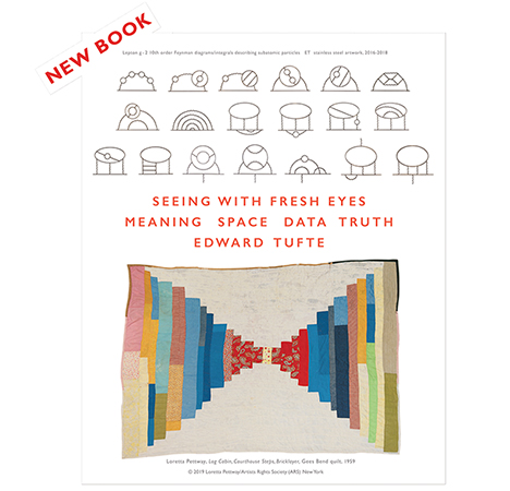
Seeing With Fresh Eyes
catalog + shopping cart
|
Edward Tufte e-books Immediate download to any computer: Visual and Statistical Thinking $5
The Cognitive Style of Powerpoint $5
Seeing Around + Feynman Diagrams $5
Data Analysis for Politics and Policy $9
catalog + shopping cart
New ET Book
Seeing with Fresh Eyes:
catalog + shopping cart
Meaning, Space, Data, Truth |
Analyzing/Presenting Data/Information All 5 books + 4-hour ET online video course, keyed to the 5 books. |
Here's the website for the Whitney: http://www.whitney.org/
The front page is a bit thin, with lots of space devoted to the background rather than to more pictures of the art. This thinness leads to lots of drill-downs, which may lead to viewers dropping out and off the site.
The boxed clickdown buttons on the Whitney frontpage do not seem to display properly in the Safari browser, or maybe they are just clunky.
Here's a review by Perry Garvin: http://www.perrygarvin.net/blog/2009/11/12/whitney-website-redesign/
The review helpfully links to several other museum website redesigns for comparison.
Perry Garvin's Whitney review emphasizes deficiencies in the details of hierarchical ordering of information. The solution to this is not more orderly hierarchies but a flatter structure. Better to show 200 links on the opening screen so that viewers can scan many options arrayed adjacent in space rather than stacked in drill-down hierarchies--in other words, more like the frontpage of a news website or the iPhone. A link-heavy and art-rich homepage would serve as a reliable common base for returning from drill-down forays (again like the iPhone).
More generally, why are museum websites hierarchical and concealing instead of flat and revealing? Another instance of Conway's Law? "Any organization which designs a system . . . will inevitably produce a design whose structure is a copy of the organization's communication structure." More on Conway's Law and design at
https://www.edwardtufte.com/bboard/q-and-a-fetch-msg?msg_id=00025o
-- Edward Tufte
I agree with Dr. Tufte, less drilling (same as I tell my dentist). I have a good friend who developed some of the first large scale hierarchical databases in the 60s and 70s and his advice is always: 4 levels max. That means three clicks from the home page. It's hard to do, especially with an extensive and changeable amount of data, and I have to admit that the best I've been able to do with a similar amount of information is 5 levels. And it makes the return paths a challenge. So it takes some good, solid, design work.
Most people going to a museum web site want to know four things: What's showing, what are the hours, what does it cost, and where is it. All these should be on the home page and rarely are. The Whitney gets close but still has a way to go.
One example: the map. It's nice to see a map of the museum location on the home page, but then it takes 2 more clicks to get to a working Google map applet. That could have been right there on the home page.
The Whitney site gives up a lot of the home page to white space. Not that white space is of itself a bad thing, but it could be designed better. They kill the potential positive effects of the white space with all the boxes, lines, oddly misaligned text and images and other bits of designery.
Here be monsters. At least a third of my screen is faded into a black space at the right; that's a lot of real estate to give up. I realize they're probably trying to fix the width of the viewable page to a smaller screen standard, but if they're not going to use that space it at least they could have put a dragon or two over on the dark side. !
The boxed links are clunky, but the mouseover effects seem to work OK in Firefox. Garvin gives a good analysis of the link issues on the Whitney site. Text links should always look the same. The boxes actually imply that the you are on that page, not that there's a link to be clicked; as Garvin says, all the different links styles paralyze the viewer.
They have done a pretty good job with the image quality of the artwork, always a plus for a museum web site.
-- Steve Sprague (email)
The reason the Whitney site will never spend much time in my browser is that it uses an animated favicon. That's just rude! (Favicons are icons associated with sites and are used by browsers in a number of ways. See: http://en.wikipedia.org/wiki/Favicon. Firefox uses sites' favicons to help identify tabs; Safari doesn't use them in tabs but does use them to help identify sites in the history list.)
The designer possibly believes that having a blinking icon helps the Whitney site to stand out from other tabs in the user's web browser. What actually happens is that that the tab gets closed prematurely by the user. Worse, the impression of the Whitney that the user is left with is one of visual irritation.
-- Adam Nieman (email)
I think it's very true that poor IA often reflects larger institutional problems and practices.
A flutter structure would certainly be more user friendly, and a better match for their idiosyncratic navigational structure, which only works with two levels of content. As it stands, the site feels thin and one must drill down a bit to find content.
A missed opportunity for the museum certainly.
-- Adam (email)
Another view
http://www.mediaite.com/online/the-whitneys-re-design-web-done-nearly-right/
-- Edward tufte

