|
All 5 books, Edward Tufte paperback $180
All 5 clothbound books, autographed by ET $280
Visual Display of Quantitative Information
Envisioning Information
Visual Explanations
Beautiful Evidence
Seeing With Fresh Eyes
catalog + shopping cart
|
Edward Tufte e-books Immediate download to any computer: Visual and Statistical Thinking $5
The Cognitive Style of Powerpoint $5
Seeing Around + Feynman Diagrams $5
Data Analysis for Politics and Policy $9
catalog + shopping cart
New ET Book
Seeing with Fresh Eyes:
catalog + shopping cart
Meaning, Space, Data, Truth |
Analyzing/Presenting Data/Information All 5 books + 4-hour ET online video course, keyed to the 5 books. |


Construct bunch (5 to 8, maybe) x/y scatterplots of
50 > n > 500 with widely divergent scatter patterns
that all generate the same identical set of 5, say, vertical boxplots.
N can vary across scatterplots if you wish.
This is a sort of reverse of Anscombe's Quartet, pages 13-14
in my book The Visual Display of Quantitative Information.
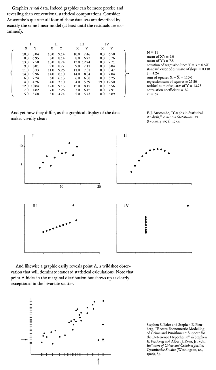 |
The point is that the binning of the x variable, and the summarizing of y,
can sometimes mask what is going on in the underlying data,
and may at times create the appearance of a stronger and smoother
relationship between x and y than actually appears in the data.
For example, you might shows scatters that one might expect for that
set of boxplots, but also make a scatter that rides a sine wave from
lower left to upper right on the xy plane. See Anscombe's Quartet for other ideas.
Provide the matrix of the raw data for each scatterplot.
Since many boxplots are used to report categoric data, the 2D issue above
can be turned into a one-dimensional issue of how well boxplots represents
the behavior of the data within a category and comparing across categories.
Different categories may have very different n's. Sometime pseudo-categories
are creating by binning data. Sometimes the categories are ordered if not
measured more exactly. Or the categories and the boxplots may all reside
in a pool of noise and misclassification. Thus the 1D y-binning of box plots
should be carefully examined. Again provide the matrix of plotted data.
Post down below via the CONTRIBUTE button.
Provide a working email (masked to our readers)
so I can get in touch with you.
The 5+ best answers get a set of all 4 of my books, autographed.
At some point, I will probably publish some of the contributed material.
I will give you credit for your contribution.
-- Edward Tufte
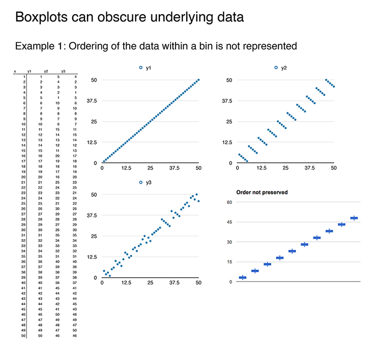
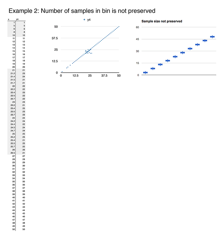
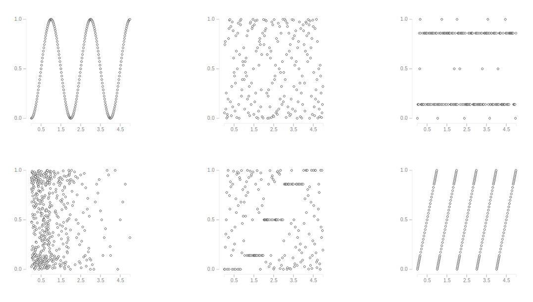
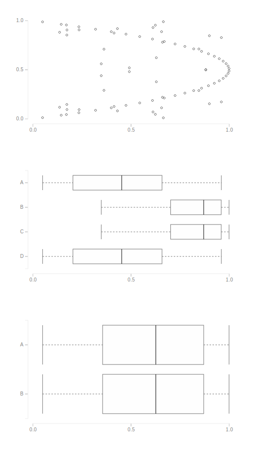
Boxplots obscure the underlying data in two ways 1. The order of the data in a bin is not represented. 2. The number of samples in a bin is not represented. Examples of data, scatter plots, and box plots below.
 |
 |
-- Lou Franco (email)
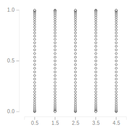
The sets were chosen to give a basic box plot with all boxes being equal to simplify the data creation.
A sin wave, random data, data concentrated at 1st and 3rd quartiles, random data with higher concentration at lower x values, step-wise increasing data with a lot of noise, a repeating pattern of linearly increasing values and data concentrated at discrete x-values were chosen to demonstrate that the appearance of data can change when summarized in a box plot.
-- Varuna Jayasiri (email)
Hello Mr. Tufte,
Thanks for the challenge. I'm always learning from your books, and site--the forum here must be one of the most thoughtful boards online. After seeing multiple references to this, I recently checked out one of Medawar's books to learn more about perceiving relevance and "the art of the soluble."
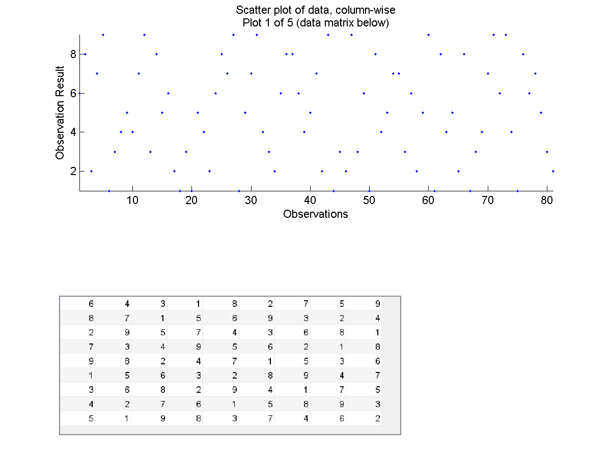
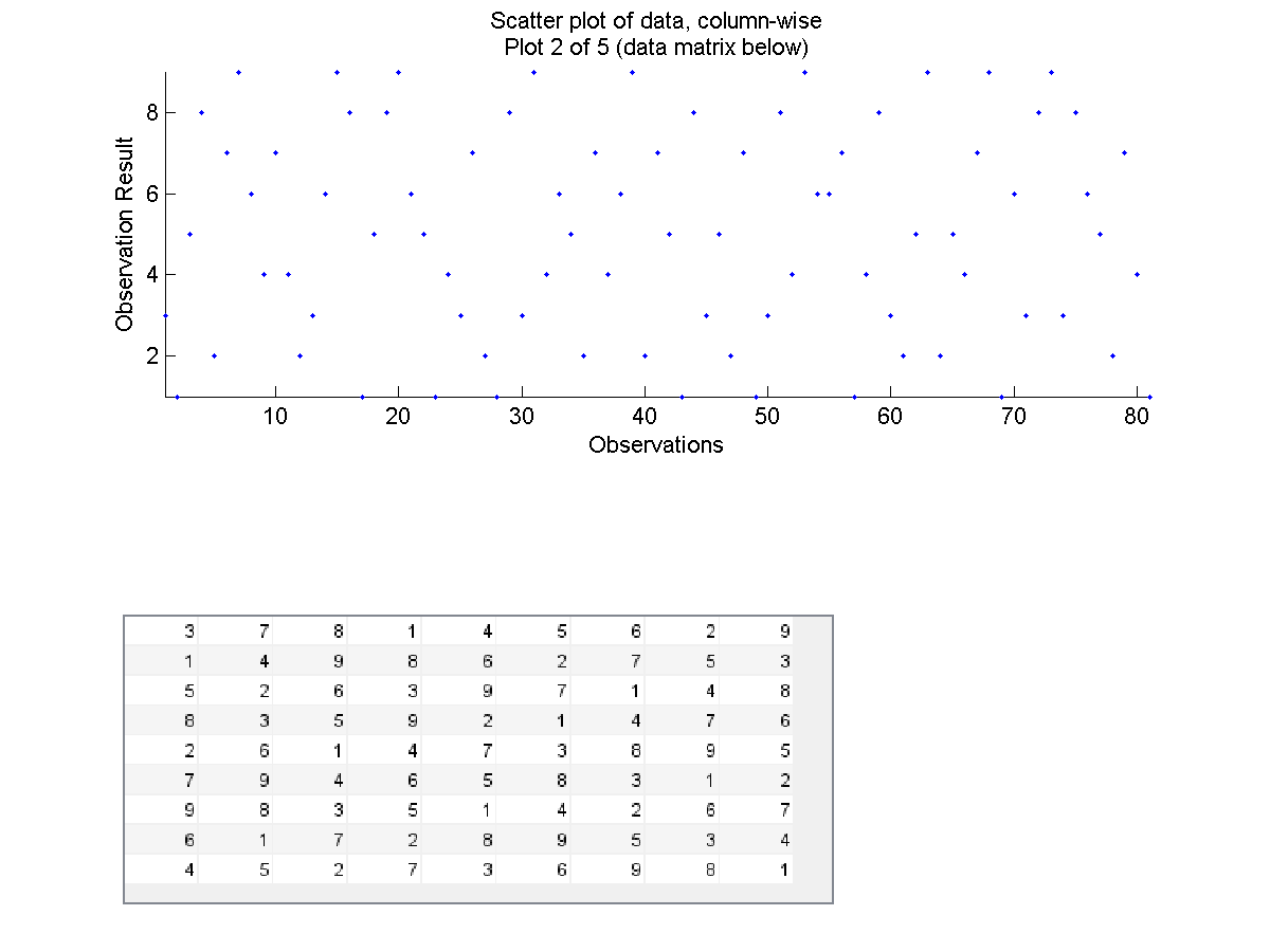
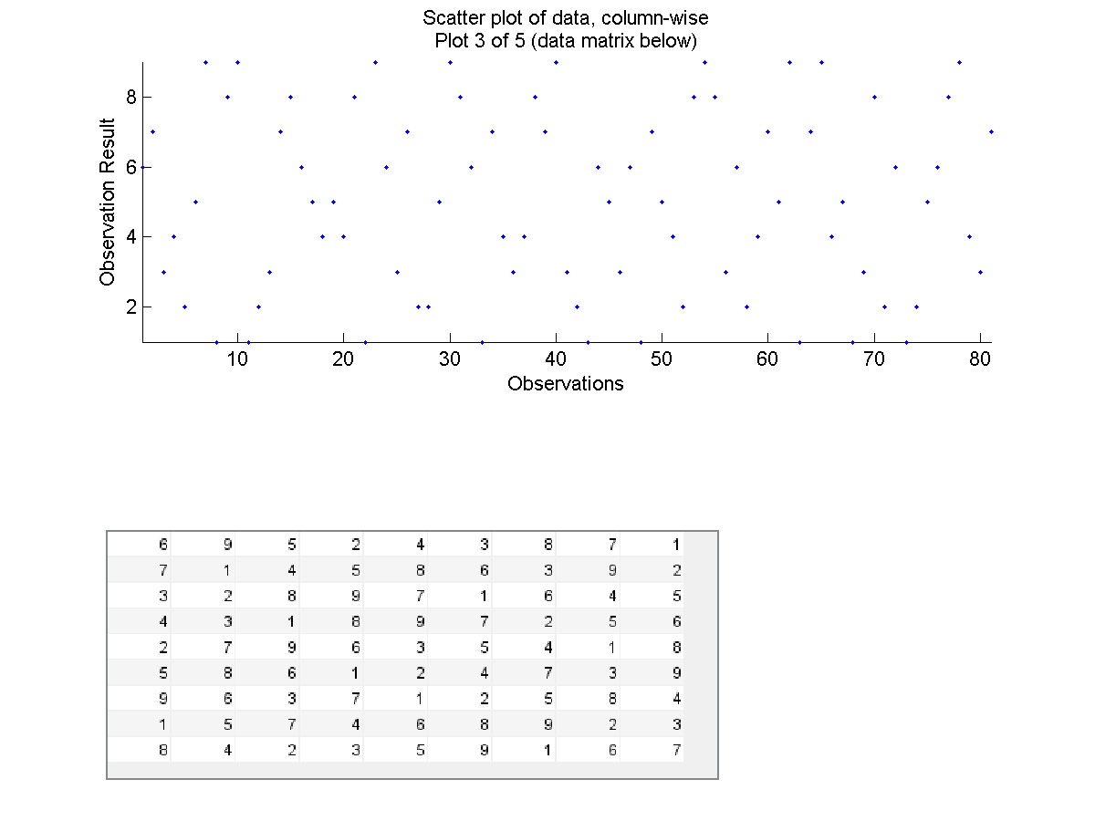
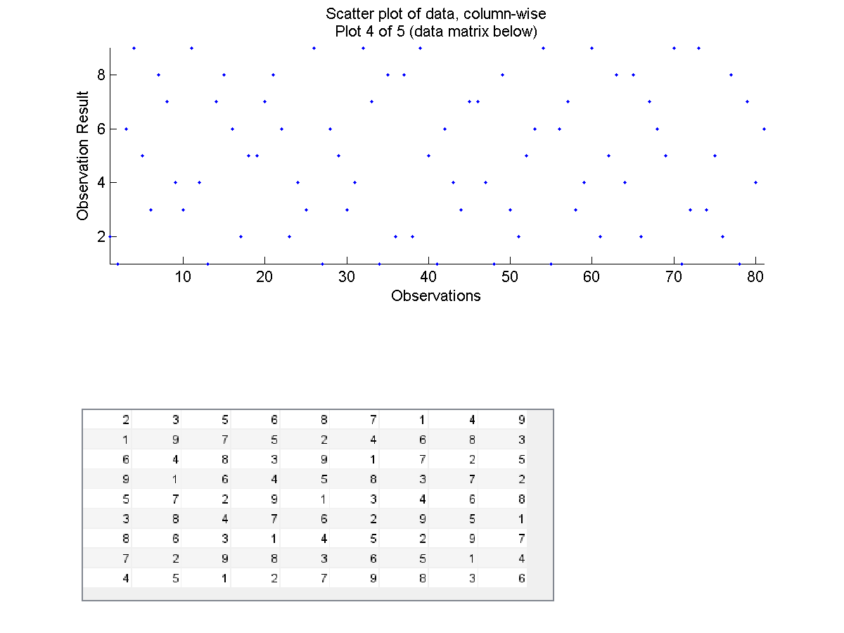
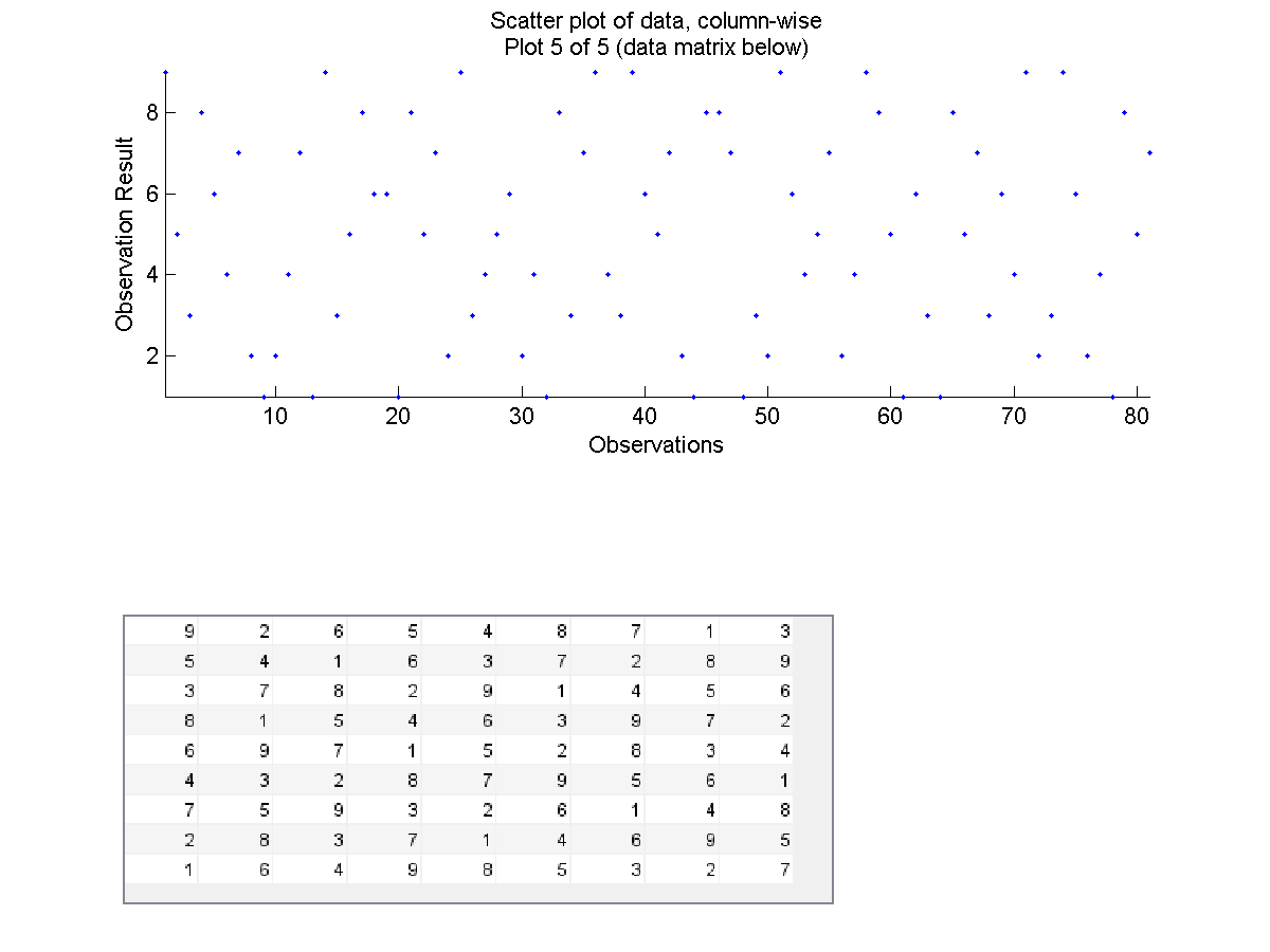
Regarding the plotting challenge, I plotted the results, column-wise, of five Sudoku puzzles. The data appear random, but of course due to the nature of the puzzle model, the distributions are the same across each puzzle.
The plots and data for each plot are attached (zipped). I also attached the plots and data files individually in case the zipped folder doesn't unzip easily.
Joel Kady
- TufteScatterPlotBoxPlotChallenge_JoelKady.zip
- ScatterPlotBoxPlotChallengeDataMatrices_JoelKady.csv
- PlotAndDataMatrix1.png
- PlotAndDataMatrix2.png
- PlotAndDataMatrix3.png
- PlotAndDataMatrix4.png
- PlotAndDataMatrix5.png
-- Joel Kady (email)
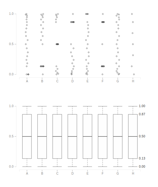
The categorical data was generated with the same code used to generate 2D data (variable X). A bit of noise (x-value) is added to the scatter plot to clearly show the points concentrated at same y-value.
Note: We once observed a similar pattern in supermarket sales (A - D), where each category would be a branch and each data point a total bill. Lot of bills of almost same value were present due to daily promotional offers of the form "Get a free AAA if your bill is over $Y", where AAA would change daily. People who made purchases little below Y would buy some thing more to get a free AAA, and those who get bills for little over Y would leave some purchases for the next day so that they can get the offer on 2 days.
-- Varuna Jayasiri (email)
The chart shows the issue with y-binning; data may be interpreted differently based on how it is categorized.
-- Varuna Jayasiri (email)