THE DATA ARTIST | PAGE 2
Denouncing the presumption that graphics are "devices for showing the obvious to the ignorant," Tufte advises designers instead to assume a smart, curious reader who's willing to explore complex information as long as it's presented with grace and clarity. He quotes E.B. White: "No one can write decently who is distrustful of the reader's intelligence, or whose attitude is patronizing." That's from "The Elements of Style," another classic to which Tufte's books, particularly "The Visual Display of Quantitative Information," earn a comparison.
Like that perennially rewarding writer's guide by White and William Strunk Jr., each of Tufte's lovingly designed, pristinely produced books exemplify the principles they codify. For instance, you never have to turn a page to follow a graphic reference in the text. It was the author's own demanding printing requirements that led him away from the commercial publishers to the do-it-yourself market; each of Tufte's books has appeared under his own Graphics Press imprint, and though retailers carry them more widely today, they're still most easily obtained directly from his Cheshire, Connecticut office (the information number is 800-822-2454).
It could be, too, that the big publishers unfairly pegged Tufte as a bit of a crank. His writing sometimes exhibits a curled-lip testiness toward its targets, and he's unafraid to wield the knife of the polemical critic. He declares, for instance, that a ludicrously overwrought chart of 1970s college enrollment from American Education magazine "may well be the worst graphic ever to find its way into print," or that a bar-style listing in a small-aircraft flight guide is "perhaps the worst index ever designed, a rare perfect failure."
![[Pravda graphic]](graphics/chart3970310.gif)
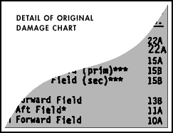
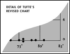
But most of his books' worth lies in practical demonstrations well beyond the realm of critical derision. In case after case, Tufte offers step-by-step accounts of how to edit a bad chart, erasing distractions, removing unnecessary "data prison" grids, replacing meaningless labels with self-explanatory ones, steadily reducing clutter and adding context and increasing the amount of valuable information per square inch. These are unforgettable little performances for brain and eraser that will almost certainly transform the way you read.
Each of Tufte's volumes also provides a trove of inspiring examples, ranging from thousand-year-old Chinese maps to representations of the entire charted universe of galaxies, from photos of Roy Lichtenstein murals to Japanese railway timetables. From such examples, Tufte builds a set of common-sense principles for data design: Tell the truth. Show the data in its full complexity and let viewers make their own discoveries. Highlight the "differences that make a difference." Ruthlessly remove unnecessary ink. Offer "visual access to the subtle and difficult." Reveal what is complex.
Tufte largely succeeds in following his own prescriptions; if he has one failure, it's the way his three books blur together. Though he has described the trio as being dedicated in turn to "pictures of numbers," "pictures of nouns" and "pictures of verbs," the distinctions are more evocative than absolute, and there is a small amount of repetition from volume to volume. Yet each of the books provides so much extraordinary, otherwise unavailable material that such complaints are quickly forgotten in the rush of discovery and connection. Voraciously eclectic, Tufte has no trouble in his latest book finding common threads between a two-decade flow-chart of rock 'n' roll ancestry and a Soviet cosmonaut's graph-paper chart of a 96-day orbit. Part of the fun of reading his work lies simply in wondering what obscure masterpiece of graphical problem-solving he'll next unveil.
This kind of connoisseurship isn't simply an archival diversion. One chapter in the new "Visual Explanations" provides terse, stunning evidence of the real-world consequences of bad information design: It contrasts a Victorian doctor's successful use of maps to isolate the cause of a cholera epidemic with the misconceived charts used in the disastrous decision to launch the Challenger space shuttle. With heartbreaking thoroughness, Tufte shows that the industrial engineers who tried to persuade their bureaucratic superiors to delay the launch because of cold weather had all the data they needed to make an irrefutable case -- but failed to include the right figures or to arrange them convincingly on the page. As Tufte edits and revamps the charts to highlight the cautionary logic in the numbers, you realize, if you hadn't already, that this stuff really matters.
"The visual display of quantitative information" isn't a very sexy phrase, and at the time of Tufte's first book, it might have been possible to view his agenda as fascinating but marginal. Today, as machines whose entire function is "the visual display of quantitative information" -- computers -- swallow up whole chunks of our economy and our culture, his work unmistakably addresses the very heart of our public lives.
Surprisingly, Tufte has little to say directly about digital design. He's appalled by the low resolution of computer screens compared to the versatile data-density of paper; he's dismayed by the way "computer administrative debris" and pointless decoration eat up so much of the already limited onscreen turf. Mostly, he's alarmed by the way the tools of computer design have made it easier than ever for bad designers to litter their work with unnecessary icons and distracting "chart junk" -- all of which has culminated in the reader-hostile pages of Wired magazine, with their jumbled type, their deliberate confusion of ad and editorial space and their gaudy inks that hide information rather than illuminating it.
With the exception of some deserved praise for Robert Winter's CD-ROM explication of Beethoven's Ninth Symphony, Tufte has nothing good to say about what he sees on computer screens. And sure enough, that index he cites as the "worst ever designed" looks dismayingly like the vertical bar-indexes you find all over today's leading Web sites.
This hostility has understandably led some digital designers to dismiss Tufte as a backward-looking engineer who doesn't understand the nature of interactivity. That's too bad, because the fledgling field of interface design can only benefit from the kind of historical perspective Tufte offers -- and from his unwillingness to let technological possibilities and limitations shape the substance of his work. Much of Tufte's theorizing explores different visual techniques for making three-dimensional information readable on the "flatland" of the two-dimensional page. This is precisely the problem confronting computer designers -- who get to employ an unthinkably powerful tool for multi-dimensional modeling and then have to squeeze its complex output into the narrow windows and pixels of flat little monitors.
Three-dimensional digital imagemaking already dominates arcane fields like genetic modeling and aircraft design; faster than any of us expects, it is also going to invade the workday worlds of finance and telecommunications. As the speed and complexity of information multiply geometrically, the demand for visual tools to make sense of that information will only grow. The kind of cyberspace that uses real-time transformations of 3-D shapes to track the flow of financial markets and individual investments is no longer a cyberpunk pipe dream but a likely evolution of today's hair-trigger trading environments. We'll all be better off if the designers of such virtual spaces share Tufte's commitment to clarity and truth.
In Tufte's ethos of information design, "clear and precise seeing becomes as one with clear and precise thinking." We need such clarity and precision more than ever. To think intelligently about almost any urgent controversy today requires an alert reading of statistical evidence -- whether it's an economic issue like the interplay of budget deficits and Social Security, an environmental issue like greenhouse warming or a social issue like the containment of medical costs.
Grasping our world demands grasping numbers -- and trusting that we have grasped them correctly. Under these circumstances, Tufte's work becomes a friendly compass in an informational wilderness -- and, when necessary, a machete to chop through thickets of disinformation.
March 10, 1997
Back to previous page
Reprinted with the permission of Salon.com
|