|
All 5 books, Edward Tufte paperback $180
All 5 clothbound books, autographed by ET $280
Visual Display of Quantitative Information
Envisioning Information
Visual Explanations
Beautiful Evidence
Seeing With Fresh Eyes
catalog + shopping cart
|
Edward Tufte e-books Immediate download to any computer: Visual and Statistical Thinking $5
The Cognitive Style of Powerpoint $5
Seeing Around + Feynman Diagrams $5
Data Analysis for Politics and Policy $9
catalog + shopping cart
New ET Book
Seeing with Fresh Eyes:
catalog + shopping cart
Meaning, Space, Data, Truth |
Analyzing/Presenting Data/Information All 5 books + 4-hour ET online video course, keyed to the 5 books. |


There was a discussion about you today on the SIGIA mailing list. It seems that you said in your seminar that "a good web design means that you don't have to user test"... This is a very interesting view. How do you think one can reach such a good design without knowing the user needs and capabilities? Do good designers just have it intuitively, like the romantic artist of the XIXth century? Or maybe does good design not include usable design (what is "good", then?)
On a related matter: how long can a web design last? Is it possible for a web interface to be so perfect, in terms of interaction, that would just stay forever, although the technology is always changing. Of course, there are trends in graphic design and the use of technology: one day it's CSS, the other Flash, etc. But on the level of interaction, can it be possible to reach perfection on the web? Any examples come to mind?
Thanks a lot!
Sylvie
-- Sylvie L (email)
User testing and analytical design
Analytical Design
The purpose of analytical displays of information is to assist thinking about evidence. Consequently, in designing an analytical graphics, the first question should be: What are the evidence-thinking tasks that this display is supposed to serve?
Analytical grapics should be constructed to serve the fundamental cognitive tasks in reasoning about evidence: describing the data, making comparisons, understanding causality, assessing credibility of data and analysis. Thus the logic of design replicates the logic of analysis; design reasoning emulates evidence reasoning.
Converting principles of thinking into principles of design helps answer the most difficult question of all in the theory of analytical design: Where do principles of analytical design come from? The deep principles of analytical design are derived from cognitive tasks of analytical reasoning. This is appropriate, for the purpose of analytical displays is to assist evidence-thinking.
All this might have something to do with the field of human factors. But in practice, nearly all the great analytical designs have come from those possessed by the content; people who have learned something important and want to tell the world about what they have learned. That is, content-driven and thinking-driven, and not at all driven by bureaucratic externalities of marketing, human factors, commercial art, focus groups, or ISO standards.
In working on 4 books on analytical design, I have often turned to the human factors literature, and then left in despair, finding few examples or ideas (beyond common-sensical) that were useful in my own work. This contrasts to the work of scientists, artists, art historians, and architects--work overflowing with ideas about evidence, seeing, and the craft of making analytical displays.
I believe that work about analytical displays should be self-exemplifying; that is, the work should show us amazing displays of evidence. My despair about human factors began many years ago upon going through volumes and volumes of the journal, Human Factors, where evidence was reported using statistical graphics of wretched quality, with thinner data and worse designs than even in corporate annual reports. Also the methodological quality of the research was poor, and so nothing was credible. The findings seemed entirely context-dependent, univariate (design and seeing are profoundly multivariate), and without scope: what did it matter if some students in freshman psychology in Iowa preferred one clunky font compared to another clunky font in an experiment conducted by a teaching assistant? Later, while consulting, I saw this naive dust-bowl empiricism fail again and again for nearly a decade in trying design a competent PC OS interface. (And with the Mac interface sitting there, smiling, all the time. Apple's superb interface guidelines seemed to me to be a retrospective account of the beautiful hands-on craft of a few brilliant designers, not a reason to have experimental psychologists attempt to design OS/2 and Windows.)
At any rate, if this was the scientific practice and the design craft of applied psychology, I concluded the field did not have much to contribute to my own work on analytical design.
I happily fled to the classics of science, art, and architecture.
-- Edward Tufte, November 27, 2002
Here are some more thoughts (borrowed from another answer I gave on software design) on this issue.
This book by Ron Baecker and Aaron Marcus seems to me to be a notable contribution on how design arrangements might help programming: Baecker, R.M., Marcus, A., Human Factors and Typography for More Readable Programs, ACM Press, 1990.
I believe the interface should be designed FIRST, by people who deeply understand the specific content and the specific analytic tasks that the interface screens are supposed to help with. Screen after screen should be specified in intense detail by content experts, completely independently and without reference to how those screens might be created.
Only then do we turn to the technical implementation, which becomes simply a by-product of the interface screens and interface activites. The interface design, the content design should drive the entire development process. Thus the lead managers for development of a project management program, for example, would be people who actually manage projects and who teach courses in project management. Too often, the available software drives the design, rather than the content/analysis needs of the user.
There are a lot of software solutions around desperately looking for some kind of problem to solve--that is, inside-out design. But better tools for users will be more likely the product of outside-in design which make the content-substance and analytical tasks of the user the driving priority. Doing good outside-in design probably requires a thorough-going independence in specifying the interface; that is, the interface should be content-specified by people completely independent of the software development process. If not, the content-specification will be governed and distorted by the needs of the already-existing software.
Content-driven design requires a radical shift in power and control. The Vice-President for Programming reports to the Senior Vice President for Content!
-- Edward Tufte, December 4, 2002
-- Edward Tufte
Response to Good web design vs user testing
I've been doing web design for 6 years now, and I've found the content-first approach (described above) to be very successful. My typical process for effective interfaces is:
- Receive all content the client has to offer, and ask them what their goal is with the site.
- Organize that content into a site map, and prepare a visualization to discuss with the client. My visualizations are similar in style to Dan Brown's well-known example [PDF].
- Draw the interface screens. For web applications, I like to make HTML dummies that demonstrate the process of using the application without actually doing anything. For normal static sites, I create images showing the interface and design.
- Meet with my developer(s), and determine any technical limitations imposed on the interface designs by the available software.
- Adjust the designs, or developers, accordingly :)
- Produce final interface designs.
- Let the programmers do their thing (ie: make it work).
This process first addresses content, then interface, then back-end - and it works.
[Link updated January 2005]
-- Ryan Singer (email)
Response to Good web design vs user testing
"Good web design means you don't have to user test." That is a statement that I heartily agree with and totally disagree with at the same time. In my work on printed assembly instructions I have done a lot of user testing. Over time, recognizing the failures revealed by the user tests I know what "designs" work. For example, I expect that because the design has been tested many times my presentation of the hardware in an assembly will work. The words, illustrations, numbers, placement in the assembly sequence, etc., are sufficient for the user to use the right bolt at the right point in the assembly. When I user test a new set of assembly instructions I am no longer testing the mode of presentation of the hardware - not testing those aspects of the design. So good design does mean you don't have to user test.
However, I am still a human being who makes mistakes. Despite careful proofing and editing, errors happen, even gross errors like omitting a step or a bolt. A user test is very efficient at finding those. When I believe my design is perfect (my draft instruction sheet is complete and error free) a user test detects the things I missed.
When developing a design, a user test can tell you if the design you believe will communicate does that or not. If the user test is well designed, when a communication fails the user test also pinpoints the point of failure. That lets you concentrate your design efforts on correcting the communication failure. So developing a "good design" benefits from user testing.
-- John Juskevice (email)
A variety of self-proclaimed experts give advice on what constitutes good web design, but it seems to be conflicting and not always what I would consider "good." After attending the one-day seminar last summer, I am convinced that I would agree with whatever Edward Tufte says about web design. Could you consider making a canonical list? Where should the navigation bar be placed - top or bottom or side? Should pages be limited to 800 pixels or liquid to fill the user's screen? What color combinations should be used? So much of the answers to these are based on outdated "websafe" standards for last decade's computers. I'd love to know what the current thinking is from a design perspective.
-- Warren (email)
Whatever reasonably serves the content, avoids non-content pixels (including navigation and designer pixels) as much as possible, favors user scanning over substantial amounts of material rather than premature linking, reduces impediments to learning, and never requires the phrase "skip intro" on its frontpage. All this usually implies that there should be between 100 and 400 content links on the frontpage, just like a good news site.
Nearly all users come to a website for a content experience, not a designer experience.
This philosophy of workaday content-centered design is for websites that present a reasonable amount of content. The design methodology should be to find a handful of good relevant websites and do what they do. Successful news websites (Google news, NYTimes, etc.) are a good place to start.
Usually the greater the fees for commercial artists, then the more compromised the content, the greater the difficulty in navigating the website, and the more the website looks like a corporate annual report (or, in other words, pretentious, expensive, over- produced, and useless). Spend the money instead on really good content providers and editors. For Google and the NYTimes websites (which are, by the way, very well-designed), the allocation of resources between generating content material and designing the screens for that content must be something like 10,000 or 100,000 to 1.
Good sites largely stand or fall depending on their content; the design should at least avoid doing much harm to the content.
-- Edward Tufte
Going back to one of Professor Tufte's earlier comments ("What are the evidence-thinking tasks that this display is supposed to serve?"), this highlights one of the common problems with design (an issue discussed with particular lucidity in the December issue of the Harvard Business Review - no link available unfortunately, as it's subscriber-only access). I work in finance and, too often, interfaces (web-based or other) are based upon a collection of different tools requested by different groups within the bank that are then assembled by the web developers. However, the thinking needs to start earlier by asking the question "What job is it that users want to do?", instead of the more common approach taken of "What tools do we need to develop?" In the words of Theodore Levitt "People don't want to buy a quarter-inch drill. They want a quarter-inch hole!"
Having these discussions at an earlier stage of planning helps development teams approach the design of such interfaces, especially as these will tend not to be developed in full and then delivered, but instead will tend to be delivered incrementally.
In the case of Google and the New York Times, the job people want to do when they go to Google is to find something, so a very clean, simple interface is exactly what's required. However, with the New York Times, the job people want to do is to read well-written news articles.
The implication of this is that discussions with users should focus on what it is that the users want to do, rather than how the users think the site should be designed.
-- Will Oswald (email)
Jakob Nielen's April 17, 2006 article contains some interesting thoughts on how web pages are read by users. He suggests that users' eyes follow an F-shaped pattern across the page.
-- Simon Shutter
I don't agree with the author that the F shape tells you how to write a web page. Has he ruled out the possibility that the readers were coached by the pages, and that the F pattern was telling them how to read a web page? Because it seems to me that the pages they gave the test users to read were themselves F-shaped, with a title, a first paragraph, and a left sidebar. I note that where a right small side panel was present at the top of the page, that was the subject of a "hot spot".
I'm a frequent reader of a web site with a very long right sidebar which is of more interest to me than the main content. I expect my eye "heatmap" on that site would look like Ч: a cursory glance down the "main" column, followed by a scan of the right bar as far down as it will go.
The heatmap diagrams show how much time was allotted to the text, but not in what order: it's up to the accompanying narrative to discuss that. I wish they'd found a way to show the order of eyetracking events, perhaps with a thin white line with isochronic "ticks" along its length.
-- Derek Cotter (email)
Whoa. I've got to agree with Derek. Looking at the article and the images provided, I would have to conclude that viewers look at *content*, and, when looking at content, viewers go in general left-to-right within top-to-bottom. Goodness. That seems to be like reading a Western language.
Check the image in the middle, the one with the most pronounced F pattern: there is no content between the two horizontal lines of the F and the readers didn't look there! Amazing.
Anyway, the data show how people looked at pages that had been designed but it didn't seem to measure any sort of efficiency or optimality of information transfer or outcome. It doesn' say anything about what design might do best.
Cool pictures but the inference is weak. Rafe's conclusion: people look at content and read it. People don't look at empty space.
-- rafe donahue (email)
Its my own interest in usability and user-centred design that brought me to this blog, and I've found a lot of interesting material. I have to agree with Prof Tufte's rather dismal summary of the quality of most research in usability (especially having been a Research Fellow for Usability in the UK).
The depth of craftsmanship, destail and care in the resources found on this site and in the books are a great inspiration.
In terms of the imporatance of putting content first: in my time at the UK Open University, I saw they had a very good sense of this in the production of online learning systems. the 'vp' of technology did report to the svp of content: the academic dean! However the practical reality of this was a continual balancing act.
Also, it is quite hard to be a pure 'content expert', since so many academic content experts had an interest in the different opportunities afforded by the new technology.
For example, some teachers found inspiration for new methods of teaching by looking at the activities afforded by the technology. This produced some very successful courses - where students actually learned things well (i.e. accomplished the analytical needs of the content).
-- Alexander
Stacy Schiff, writing for the New Yorker, reports in her article Know it All
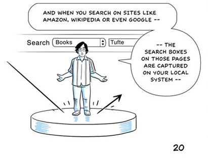
Wattenberg and Viegas, of I.B.M., note that the vast majority of Wikipedia edits consist of deletions and additions rather than of attempts to reorder paragraphs or to shape an entry as a whole, and they believe that Wikipedia's twenty-five-line editing window deserves some of the blame. It is difficult to craft an article in its entirety when reading it piecemeal, . . .The ubiquitous and small text-entry box is probably the most important limitation on the quality of discourse on the Internet. Blogging software, forums, customer service e-mails, even this site suffers from this fundamental design flaw. It has its roots in the hacker's 'terminal' which is traditionally 80 characters across, and 25 rows tall. They, however, have the fortune of a check on the quality of their product: either the code works or it doesn't. The great writers knew no such absurd limitation to the visual display of their written thoughts.
Link via Arts & Letters Daily.
-- Niels Olson (email)
Excellent point. The small text-entry boxes are inherently frustrating to real writers and editors, although there are sometimes workarounds.
-- Edward Tufte
I noticed that the folks at Google gave a tip of the hat to ET in the cartoon about their new Chrome browser:

-- Eric Miller (email)
The Sunday NY Times ran an article about the Google design process.
http://www.nytimes.com/2009/03/01/business/01marissa.html?ref=business
The storyline about Ms Mayer is most interesting. A design review story starts
On a recent morning, a handful of program managers and other executives huddled around a long table in Building 43 on the Google campus here in Mountain View to review changes to products in development ...
The story does conveys that a high sense of power is being afforded to one person (Ms Mayer), but it also conveys the deep reach of Google's self-enforcing design process. And while there is substantial room for debate and dispute about certain elements of the Google designs, (and I do not mean just the search engine page -- I personally like the design of Google mail, groups, and docs), you might think more web sites would become 'Google-like', given their success.
But there are prominent, almost exact opposites. For example, I use various stock market and financial data sites that seem to be purposely making hard to find data -- see WSJ Market Data http://online.wsj.com/mdc/public/page/marketsdata.html and Bloomberg http://www.bloomberg.com/?b=0&Intro=intro3 Both have maddening rows of menus that rarely convey a straightforward way to find anything specific.
Compare these established giants to the new comers to the financial data world -- http://finance.yahoo.com/ -- https://www.google.com/finance that I have started to gravitate toward.
With regard to Bloomberg, clutter and poor design is not only on their free public site-- the Bloomberg Professional service that require a special feed to specialized terminals is even less intuitive to use.
-- Michael Boldin (email)
|
|||||||||||