To provide the best experiences, we use technologies like cookies to store and/or access device information. Consenting to these technologies will allow us to process data such as browsing behavior or unique IDs on this site. Not consenting or withdrawing consent, may adversely affect certain features and functions.
The technical storage or access is strictly necessary for the legitimate purpose of enabling the use of a specific service explicitly requested by the subscriber or user, or for the sole purpose of carrying out the transmission of a communication over an electronic communications network.
The technical storage or access is necessary for the legitimate purpose of storing preferences that are not requested by the subscriber or user.
The technical storage or access that is used exclusively for statistical purposes.
The technical storage or access that is used exclusively for anonymous statistical purposes. Without a subpoena, voluntary compliance on the part of your Internet Service Provider, or additional records from a third party, information stored or retrieved for this purpose alone cannot usually be used to identify you.
The technical storage or access is required to create user profiles to send advertising, or to track the user on a website or across several websites for similar marketing purposes.


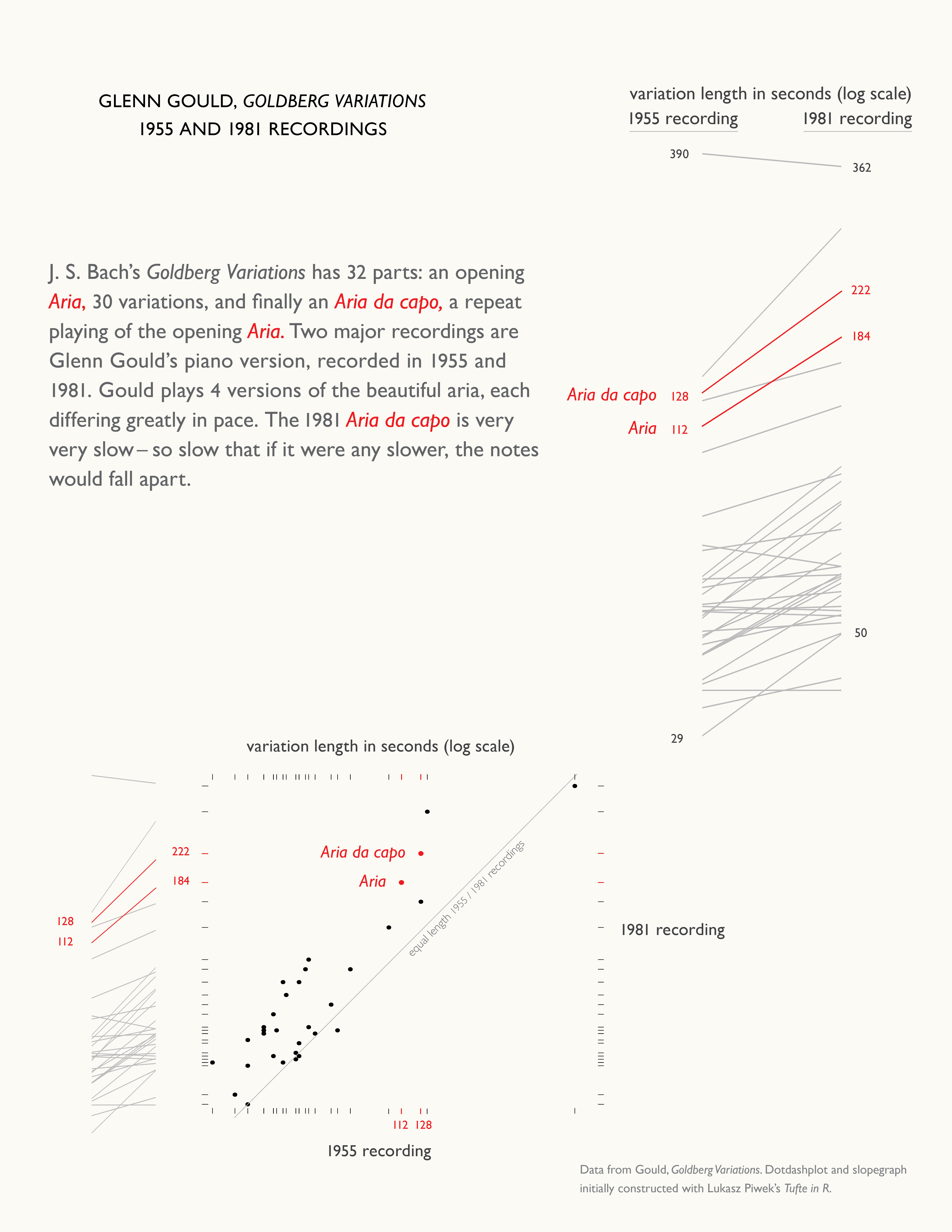



I believe the “dashplot and slopegraph” diagram has the leftmost of the two red “ticks” on the bottom (labeled “1955 Recording”) assigned to the wrong color. And, therefore, black “tick” to the right of the red one also. (Please see the top tick bar for comparison.)
Excellent catch. The dot-dash-plot above has since been corrected.
Here’s what happened:
While there is an individual dot for each data point, some of the dashes here represent multiple data points. Because we’re plotting the variation lengths on a logarithmic scale, this happens not only when the variations have the same length in seconds (for example, in the 1955 recording variations 2, 5, 9 are all 37 seconds long), but also when the rounded logs are the same. You can see here that there are three times a pair of data points have been collapsed into a single dash, thus throwing us off a bit when adding the red highlight.
This is a good point to note when comparing the relative merits of the different chart types as implemented by Lukasz Piwek’s Tufte in R. While each data point is represented by the slopegraphs and by the dots of the dot-dash-plot, the dashes of the dot-dash-plot don’t represent the repeated values.