Corrupt Techniques in Evidence Presentations
January 13, 2005 | Edward Tufte
24 Comment(s)
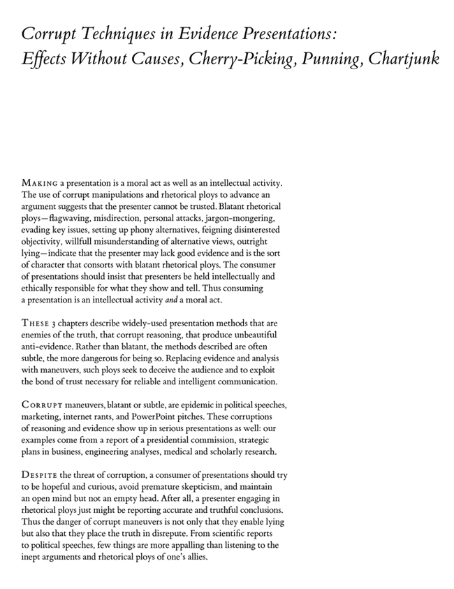
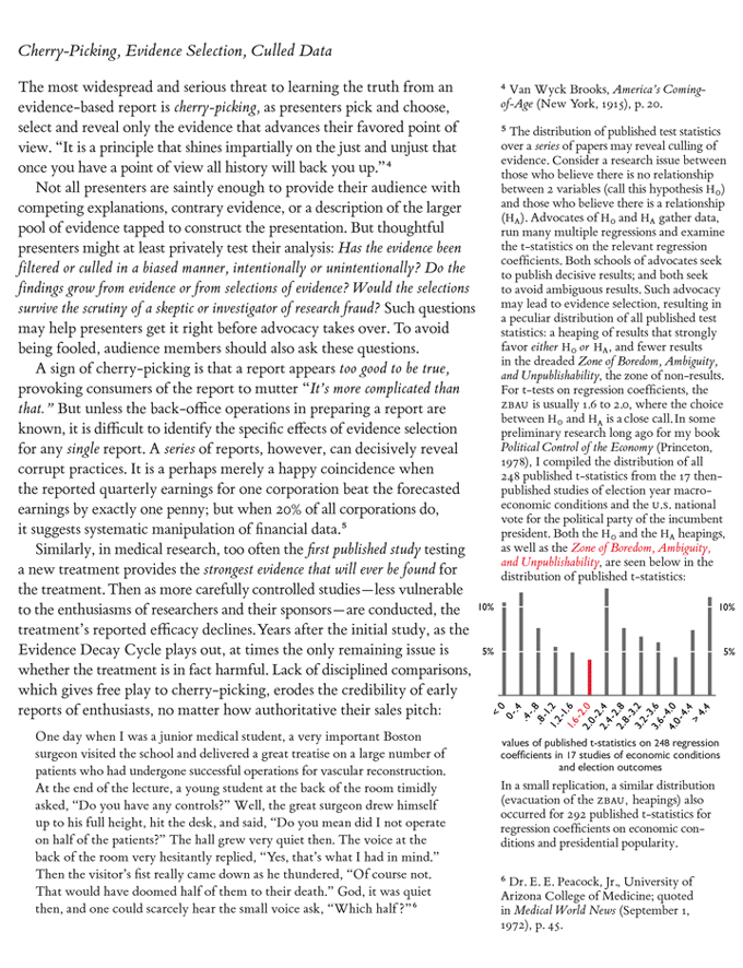
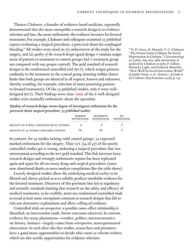
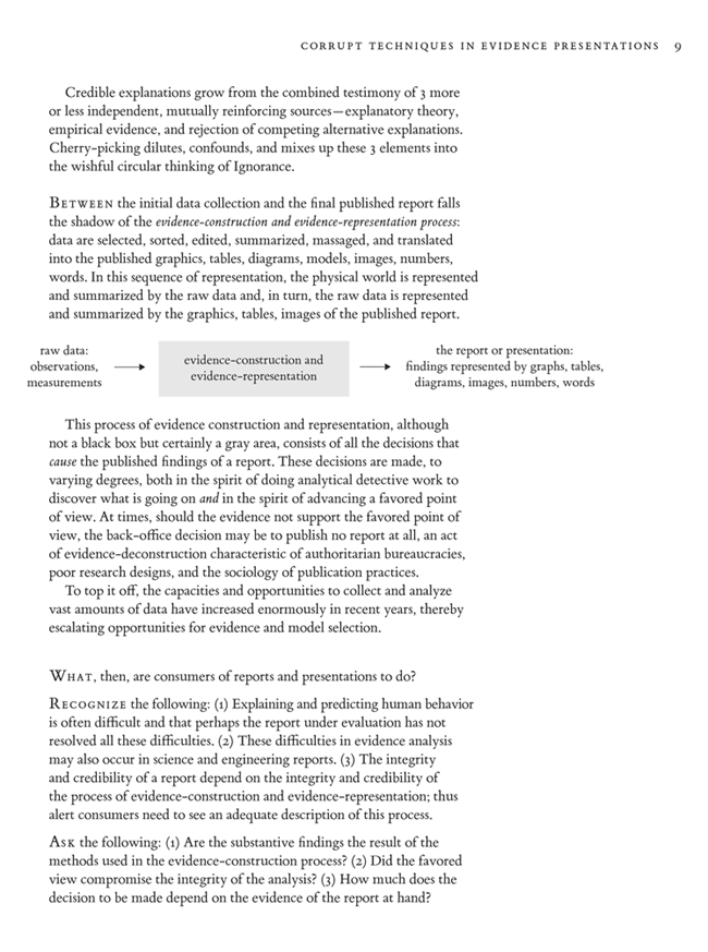
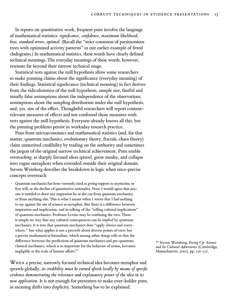
Here are a few pages from a draft of a Beautiful Evidence chapter (which is 16 pages long in the published book) on evidence corruption, along with some of the comments on this draft material.
The emphasis is on consuming presentations, on what alert members of an audience or readers of a report should look for in assessing the credibility of the presenter.



Topics: 3-Star Threads, E.T., Science


In “The Bell Curve,” Atul Gawande discusses the moral and social consequences of presenting, or not presenting, medical statistics.
Published in the New Yorker.
An interesting and powerful critique of an evidence presentation is Richard A. Posner’s review of Malcolm Gladwell’s book Blink: The Power of Thinking without Thinking.
Posner makes me seem bland!
Published in The New Republic.
One corrupt technique that I see see or hear in business presentations is “reasoning via analogy”. This is where the presenter introduces an analogy — masquerading as an aid to comprehension — but then goes on to reason about the subject using the analogy rather than any evidence or analysis.
A (paraphrased and bowdlerised) example: “New product revenue at company X is like a rollercoaster ride. After the last quarter’s sharp ramp we expect flat to down new product revenue this quarter”. While historical analysis of new product revenue may suggest that it will continue to oscillate, no such evidence is presented — nor is it explained why the past is a good predictor of the future.
I enjoyed the discussion of Galenson’s methods for dequantifying his evidence. I thought I would share a graphic I made to demonstrate what I think is a double standard in the convention for visually “quantifying” categorical versus continuous data sets:
All of these panels show the relationship between one independent (predictor) variable and one dependent (response) variable, with varying levels of quantification. When showing the relationship between a continuous predictor and a continuous response (upper panels), I most often see scatterplots that have both the fitted equation and the underlying data points (top right). But for categorical predictors (lower panels), I most often see bar graphs with standard errors (bottom center). Bar graphs show only the fitted means (or other measures of central tendency) without showing the underlying data. Furthermore, standard errors are only effective if there is a large, normally distributed sample. (On page 223 of The Elements of Graphing Data, William Cleveland discusses other reasons why standard errors are graphically suboptimal.) These problems can influence interpretation. For example, in the more quantified bottom right panel, we can see that the distribution of values for ‘small sagebrush’ may be skewed toward higher values.
Galenson’s dequantification is more flagrant, but dequantification of categorical data is more common. Because I believe that the dequantification of categorical data impedes interpretation–just as E.T. showed for Galenson’s continuous data–I would be excited to see this convention overturned.
An excellent demonstration by Kindly Contributor Anthony Darrouzet-Nardi. Showing only the path of the category means is often the sign of a serious problem in the analysis; at a minimum, it is a failure to report variability and the sensitivity of the analysis to outliers. Every editor of every scientific journal should read this contribution and act on it, by insisting that averages must be accompanied by detailed statements of variability. And the reporting of smooth curves only (without any actual data points) has always been suspicious. I believe that Professor David Freedman (statistics, Berkeley) has discussed these matters in his devastating critiques of statistical analysis.
Tukey’s box-and-whiskers plot is an effort to provide a responsible summary; the bottom figures could also be represented by 3 box-and-whiskers-plots in parallel. See The Visual Display of Quantitative Information, pp. 123-125, for such an example (and for my redesign of box-and-whiskers plots).
From today’s New York Times, on the FDA advisory group hearings on cox-2 pain pills:
I remember Gerry Spence’s graphical illustration of prosecutorial cherry picking (presented on CNN during the OJ prelim trial). Spence set up a table with about 70 white Dixie cups and around 10 randomly placed red Dixie cups. He said they represented all the evidence in a case, then he ham-handedly shoved all the white cups off the table and said “See, the cups are all red!”
In this article from yesterday’s New York Times on evaluating medical computer systems, note especially:
Here is the full article, by Steve Lohr:
External link to the original article
For support for the chapter above, see “Why Most Published Research Findings Are False,” by John P. A. Ioannidis from the Public Library of Science:
Note how problems such as selection effects and other biases are revealed over a series of medical studies.
The initial argument is based on a little model; the intriguing but speculative corollaries have some support based on a selected history of research literature in various medical fields. I think most of the corollaries are correct at least in the particular cases cited and are probably correct overall for many fields of study. And the paper has a lot more systematic evidence, via the citations, than my chapter. Lurking in the background is the powerful work of Tom Chalmers, whose remarkable table appears in the chapter.
The powerful defense of the scientific process is that it all eventually works out over a series of studies, at least for important matters. What emerges ultimately from the process is the wonderful capacity to identify what is true or false. So at least the truth may come out eventually. The article exemplifies this: to be able to say what is false requires knowledge of what is true.
For medical research, with enormous and demonstrable problems of false reports, there are some big costs along the way to ultimate truth. Induced to take a harmful drug based on biased and false evidence vigorously marketed, medical patients may not be consoled by the fact that the truth about the drug will discovered in the long run. Medical patients may feel they have better things to do than being part of medicine’s learning and marketing curve.
Note the great virtues of the Public Library of Science here: the study is out quickly, publicly and freely available, with the citations linked to online.
Matching image fingerprints helped detect fraud in this account of the Woo Suk Hwang stem-cell fabrication. See articles in Telepolis and in Nature:
And the incipient retraction of 2 papers by the editor of Science.
The fabrications by Jan Hendrik Schon, the Lucent Bell Labs researcher, were in part given away by duplicative graphs:
And the full internal Lucent report which is very interesting.
As someone who’s refereed a lot of papers in the social sciences and statistics, I think is difficult to detect wholesale fabrication on the basis of evidence that comes with the manuscript itself. Fabrication is not the obvious competing hypothesis, well until recently, to the hypothesis advanced by the submitted article. Perhaps one principle that would apply to both these cases above is that extraordinary findings require extraordinary reviews, possibly on-site reviews of the research, before publishing. Of course extraordinary findings will doubtless receive extraordinary reviews after publication, thereby eventually detecting fabrication. Big-time fabrication of extraordinary results will consequently be caught fairly quickly; fabrication in trivial studies maybe not ever because nobody cares. Recall that the median citation rate for published scientific papers is 1.
Pre-publication reviews within the authors’ research laboratories would be useful in detecting problems; there are certainly greater incentives for internal pre-publication reviews nowadays.
And what must be the elaborate self-deceptions of the fabricators as they slide down the slippery slope of fabrication, since in both these cases above the fudging appears to have lasted over several years in a series of papers?
In “Surely You’re Joking, Mr. Feynman”, Feynman talks about his revealing a new Mayan codex was indeed a fake …
Feynman then goes into the psychology of how one could go about faking a discovery.
Michael Round
Detective work at Science:
Panel recommends changes at Science
From PLoS Medicine, an article on the relationship between funding source and conclusions reached.
Here’s the summary of the article, which replicates similar results in drug research:
Relationship between Funding Source and Conclusion among Nutrition-Related Scientific Articles, Lenard I. Lesser, Cara B. Ebbeling, Merrill Goozner, David Wypij, David S. Ludwig
Background
Industrial support of biomedical research may bias scientific conclusions, as demonstrated by recent analyses of pharmaceutical studies. However, this issue has not been systematically examined in the area of nutrition research. The purpose of this study is to characterize financial sponsorship of scientific articles addressing the health effects of three commonly consumed beverages, and to determine how sponsorship affects published conclusions.
Methods and Findings
Medline searches of worldwide literature were used to identify three article types (interventional studies, observational studies, and scientific reviews) about soft drinks, juice, and milk published between 1 January, 1999 and 31 December, 2003. Financial sponsorship and article conclusions were classified by independent groups of coinvestigators. The relationship between sponsorship and conclusions was explored by exact tests and regression analyses, controlling for covariates. 206 articles were included in the study, of which 111 declared financial sponsorship. Of these, 22% had all industry funding, 47% had no industry funding, and 32% had mixed funding. Funding source was significantly related to conclusions when considering all article types (p = 0.037). For interventional studies, the proportion with unfavorable conclusions was 0% for all industry funding versus 37% for no industry funding (p = 0.009). The odds ratio of a favorable versus unfavorable conclusion was 7.61 (95% confidence interval 1.27 to 45.73), comparing articles with all industry funding to no industry funding.
Conclusions
Industry funding of nutrition-related scientific articles may bias conclusions in favor of sponsors’ products, with potentially significant implications for public health.
Talking, rational, telepathic animals one more time. See the article on the African Grey Parrot by Robert Todd Carroll, The Skeptic’s Dictionary.
Richard Feynman’s principle “The first principle is that you must not fool yourself–and you are the easiest person to fool” might be revised to cover the propagation of foolishness:
“The first principle is that you must not fool yourself (and you are the easiest person to fool), but also that you must not attempt to fool others with your foolishness.”
See David Sanger’s article in the New York Times on how reporters are handling leaks and intelligence briefings in light of getting fooled in recent years.
I have been teaching bioscientists for the past 15 years how to conduct QUANTITATIVE experiments using microscopes. The technical solution is easy (stereology) but the persistent problem we have is pareidolia (wikipedia describes this as “involving a vague and random stimulus, often as image or sound, being perceived as significant”). People read things into 2D images of 3D structure that either cannot be or are not there. How does pareidolia affect the practice of information visualisation and display?
Wikipedia List of Cognitive Biases (Please read this before continuing below.)
After reading through the list, one wonders how people ever get anything right. That’s called the “cognitive biases bias,” or maybe the “skepticism bias” or “paralysis by analysis.”
There’s also the “bias bias,” where lists of cognitive biases are used as rhetorical weapons to attack any analysis, regardless of the quality of the analysis. The previous sentence then could be countered by describing it as an example of the “bias bias bias,” and so on in an boring infinite regress of tu quoque disputation, or “slashdot.”
The way out is to demand evidence for a claim of bias, and not just to rely on an assertion of bias. Thus the critic is responsible for providing good evidence for the claim of bias and by demonstrating that the claimed bias is relevant to the findings of the original work. Of course that evidence may be biased. . . . And, at some point, we may have to act what evidence we have in hand, although such evidence may have methodological imperfections.
The effects of cognitive biases are diluted by peer review in scholarship, by the extent of opportunity for advancing alternative explanations, by public review, by the presence of good lists of cognitive biases, and, most of all, by additional evidence.
The points above might well be included in the Wikipedia entry, in order to dilute the bias (“deformation professionnelle”) of the bias analysis profession.
In Wikpedia, I particularly appreciated:
Thus the essay “The Economisting of Art” is about what I view as the early limits in the microeconomic approach to understanding the prices of art at auction.
In my wanderings through various fields over the years, I have become particularly aware of deformation professionnelle and, indeed, have tried to do fresh things that break through local professional customs, parochialisms, and deformations.
In his consistently excellent Economists View blog, Professor Mark Thoma points out an excellent – and amazingly transparent – example of corrupting visual evidence to advance a preconceived point of view. That this amazingly innumerate chart comes from the Wall Street Journal (a presumably respected member of the mainstream media) makes this even more amazing.
Determined to see a Laffer curve in there somewhere, the author blissfully ignores almost all of the data points and confidently draws the one curve that justifies his preconceived agenda that corporate taxes are too high! Note how the curve starts at the artificial (0,0) data point for the UAE, goes to the clear Norway outlier and then drops in an arbitrarily precipitous manner. Arbitrary, that is, other than the fact that the US finds itself to the right of the curve, thereby confirming the authors opinion that US corporate taxes are too high and that the government could increase revenue by decreasing it. Q.E.D.!
Mark demonstrates how an alternative linear function – also somewhat arbitrary, though arguably more defensible – would prove the (not exactly radical) notion that government revenue tends to increase with increased tax rates. But that is exactly the oposite of what the article’s author wanted to prove…
Further evidence that data will confess to anything if you torture it enough!
Andrew Vickers, a biostatistican at Sloan-Kettering, reports on failures to share data sets
here in the New York Times:
The reasons cited by researchers unwilling to share their data — the difficulty of putting together a data set, the chance that the data might be analyzed using invalid methods — were trivial. Preparing the data set would have to be done anyway in order to publish a paper, and the validity of analytic methods are surely a judgment for the scientific community as a whole. This is, Vickers concludes, an indication that “the real issue here has more to do with status and career than with any loftier considerations. Scientists don’t want to be scooped by their own data, or have someone else challenge their conclusions with a new analysis.” However, this is exactly what cancer patients need — to have new results published as quickly as possible, encouraging a robust debate on the merits of key research findings.
Steve Lohr in The New York Times, “In Modeling Risk, the Human Factor Was Left Out“:
Models used on Wall Street not only included a lot of wishful thinking about house prices, but also depended a great deal on other people’s beliefs. These behavioral factors are very hard to model.
Better modeling would have helped, the article concludes, but the ultimate cause of the crisis lay with Wall Street senior management, who chose to disregard warnings and chase profits in the good times.
An extraordinary report by Gardiner Harris of The New York Times, a ghastly brew of a Harvard University child psychiatrist, big pharma (Johnson & Johnson), and pediatric (!) anti-psychotic drugs:
Now thousands of parents have sued the AstraZeneca, Eli Lilly and Johnson & Johnson, claiming that their children were injured after taking these risky antipsychotic medicines; they also claim that the companies minimized the risks of the drugs. Documents made public as part of the lawsuits offer a glimpse into Dr. Biederman’s relationship to these drug companies, who provided him with at least $1.4 million in outside income. For example,
See “Introductory physics: The new scholasticism” by Sanjoy Mahajan, Physics Department, University of Cambridge, and David W. Hogg, Physics Department, New York University:
I found the article about air resistance very interesting, and, like the authors of one of the texts quoted, I was surprised at how big the effect is.
A similar (more elementary) case in biology where the textbooks say something that contradicts the everyday experience of some readers is the description of human eye colour in elementary accounts of Mendelian genetics. The general idea is that brown eyes are dominant over blue, so if both parents have blue eyes then so do their children; if either parent is homozygotic for brown eyes then the children have brown eyes, but if either or both parents are heterozygotic the child’s eyes may be either brown or blue. All that is true enough if we confine attention to people whose eyes are bright blue or dark brown, but that leaves out a lot of people who will read the textbook account and wonder how it applies to them. My eyes are neither brown nor blue, and there are plenty of other people who can say the same. Of course, it’s fine for a textbook to describe the simplest case, but it’s important to say that it is
the simplest case and that real life is often more complicated.
A BP vice president confusing integral and derivative here.
As the link explains,
In a new video explaining the “top kill” strategy, BP senior vice president Kent Wells shows this graphic for the amount of oil being captured from the Deepwater Horizon by the suction tube. Wells says that BP has been tweaking the tube to “maximize” the collection of oil from the gushing well.
“There’s been a lot of questions around how much oil is being collected,” Well says at around 4:11, pointing to the graph. But if you look closely at the chart … those green bars go up because the tube has been in place since May 16. The longer it stays, the more gallons it collects. It’s not necessarily collecting more oil on successive days, let alone “most” of the oil as Wells says they’re trying to do.
Wells mentions some of the technical adjustments to the siphon, then says, “Here you can see how we’ve continued to ramp up.” If only that were so.
From commenter Brandon Green: “Wow, if you look at the tapering off in the last few bars, it would seem the graph proves the exact opposite point they are trying to use it to make – that they are somehow managing to become LESS efficient at collecting the oil.”