Design of walking maps, indoors and outdoors
Designs for Walking Maps
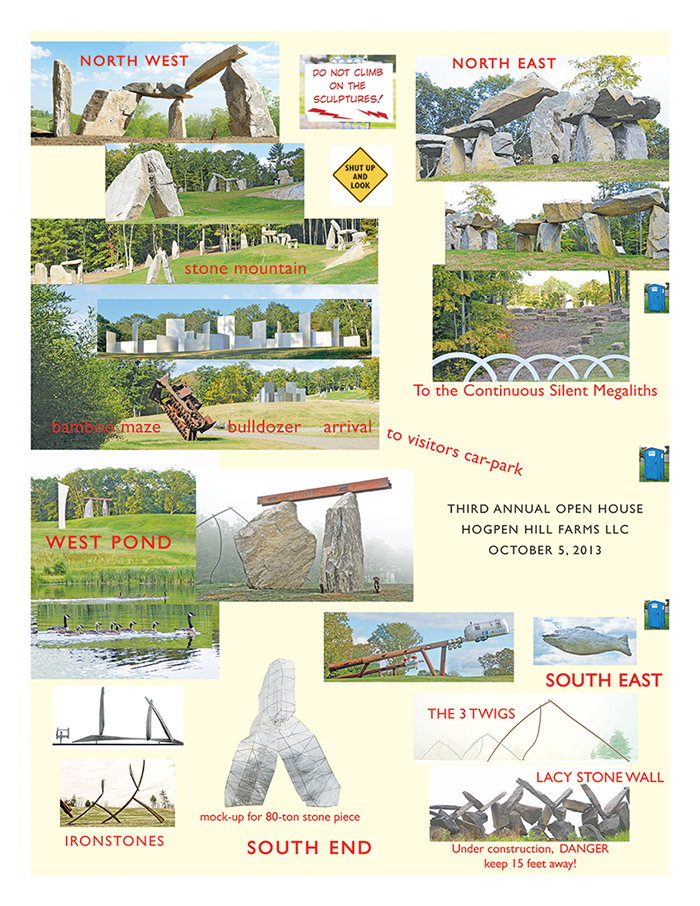
Here’s a visual map guide for walking around a 234 acre sculpture park. Constructed in 4 hours, and printed just in time for our open house, this unrefined map/guide uses a confection of 24 artwork images, enabling visitors to know where they are and how to find their way around the artworks.
The guide started out, conventionally but unwisely, with flatland plot-plan (like a floor plan of a house), which requires viewers to orient themselves to their position on the land. Instead, such a guide should show our visitors What they actually see: large artworks, bamboo mazes, rolling hills, fall foliage.
The North direction is strongly enforced on the image map and also on the ground as visitors drive in. The security staff, after greeting guests with a show catalog, then point to the north and to a sign that says, of all things “NORTH.” None of the 600 visitors got lost and the take-away paper map memorialized their visit by showing what they saw.
Such designs might well serve outdoor and indoor museums. I once reviewed a sculpture park map in which basic navigation was conducted through codings derived from a damn Acoustiguide. Those codings reappeared on a paper map. And so the visitors’ art experiences were mediated through a contraptionary code for an interface (Acoustiguide) to an interface (map). No one has ever
come to an art exhibit to see an interface to an interface.
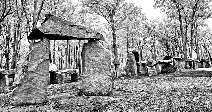
Amazing artworks and their images can construct their own guides just fine.
Look for visual solutions for visual problems, imaging the scene to be seen.
National Gallery Information Kiosks (and minimizing the visible interface)
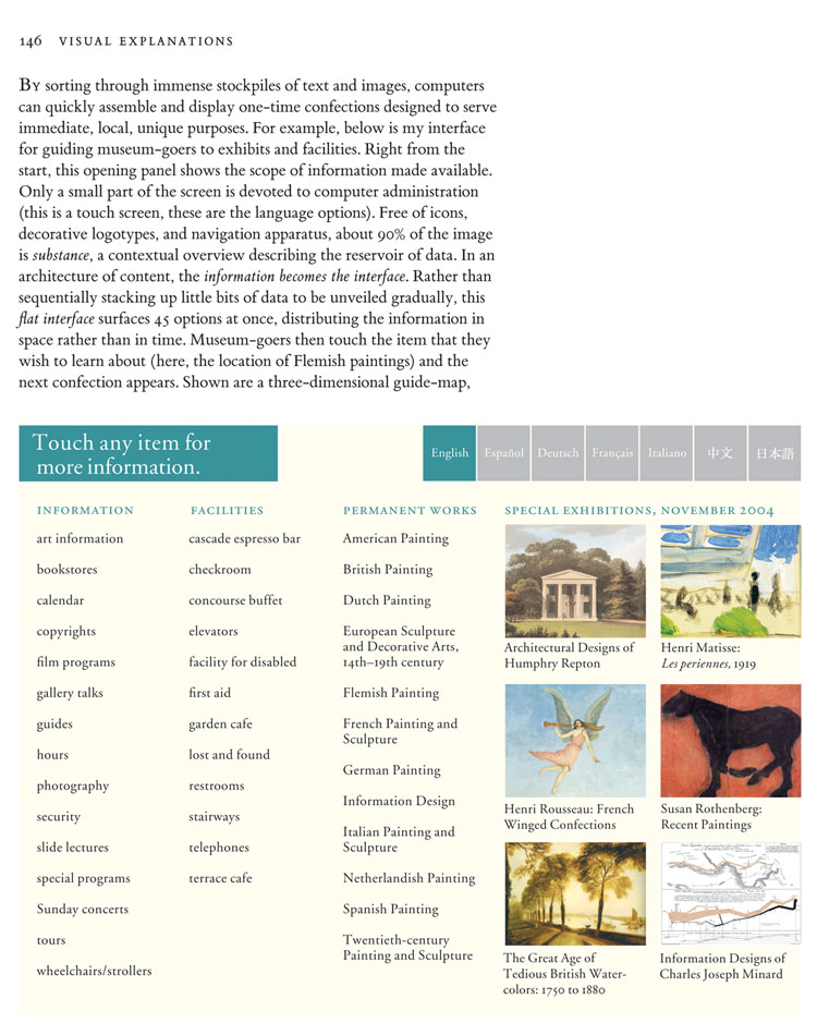
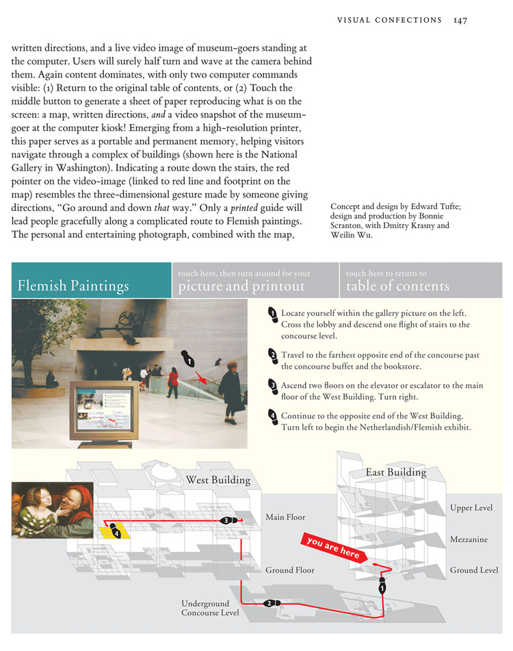
In 1994-1995 I designed (while consulting for IBM) screen mock-ups for navigating through the National Gallery via information kiosks. (The National Gallery had the good sense not to adopt the proposal.) For several years these screen designs were handouts in the one-day course in my discussion of interface design, and were then published in my book Visual Explanations (1997).
The metaphor for my National Gallery proposal is: The interface is the information. Design ideas include high-resolution touch-screens; minimizing computer admin debris; spatial distribution of information rather than temporal stacking; complete integration of text, images, and live video; a flat non-hierarchical interface; and replacing blimpy 3D icons and buttons with flat words. Thus the iPhone got it mostly right, 13 years later.
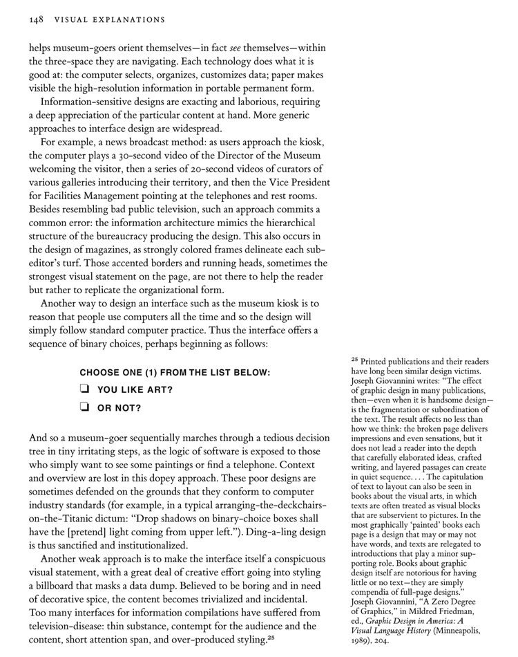
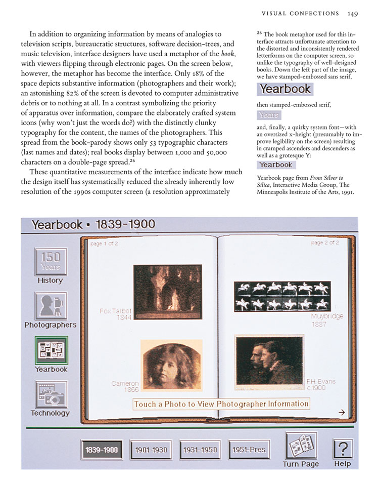
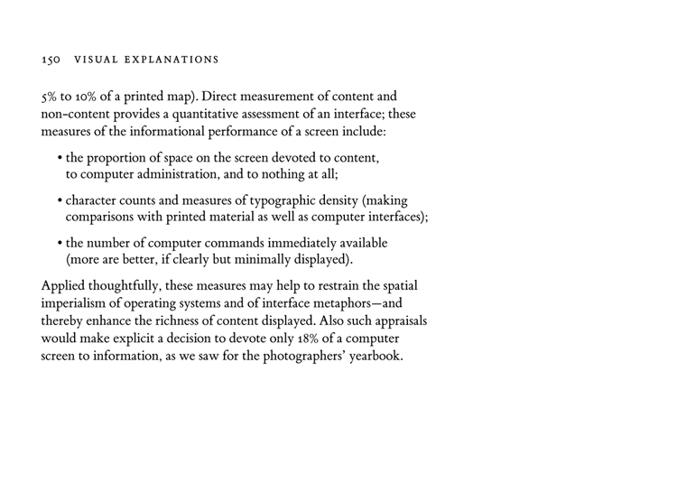
Here are pages 146-150 from my book Visual Explanations (1997) that describe the National Gallery proposal and then suggest general principles of interface design.
