Graphic: Stock Performance
September 2, 2003 | Michael Anderson
5 Comment(s)
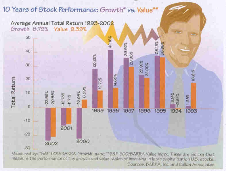
Is that a sparkline coming out of the ear? See anything peculiar about the graphic?

Is that a sparkline coming out of the ear? See anything peculiar about the graphic?

By unusual I assume you mean that the time axis is the reverse of the conventional depiction. I think it’s a rather neat example of the application of the principles of disinformation (see chapter on magic in Visual Explanations) to hide the fact that the most recent returns have been losses. While I’m sure the publishers of the report are happy with the designer I wouldn’t be too sure about the investors.
What are the trade practices in doing investment-performance graphics? Are any of the investment fund graphics done honestly? Are fees taken out? Why are all the funds above average, like the children in Lake Woebegone?
The Association for Investment Management and Research (www.aimr.org) has put together a series of Performance Presentation Standards for institutional investors such as corporate pension plans, state retirement funds, and the like. The Securities and Exchange Commission has, in addition, set forth some guidelines for mutual funds. There is some overlap, but also some important distinctions.
The indices in the chart presented by Mr Anderson are market-capitalization-weighted, meaning that companies with higher market capitalizations (number of shares outstanding multiplied by share price) have a greater weighting than others with lower market capitalizations. There are some interesting implications in this methodology, of course. Moreover, the indices are not a true representation of what an investor would actually own – even so-called index funds typically take a sample of stocks in the index, rather than investing in all 500, to use the S&P 500 example above. Exchange-traded Funds, another type of index investing, are priced off of the underlying index (SPDRs off the S&P 500, for example), but do not actually buy the 500 stocks in the index. As an aside, on the Callan Website (www.callan.com), it notes that the BARRA/S&P500 Growth and Value indices are mutually exclusive. They are not, therefore, indices of 500 Growth stocks and 500 Value stocks, respectively, but rather a subset of the S&P 500 Index itself, ranked by their price-to-book ratios (another interesting set of attendant implications in methodology).
Mutual funds are required by law to report returns net of fees. Most fees are included in the fund’s Expense Ratio, which includes the management fee, custody fees, administrative fees, trading fees, and others. There are also various classes of mutual fund shares that can have different additional fees. The SEC and the National Association of Securities Dealers work closely on oversight and enforcement. Indeed, if the graphic above were to be included in a presentation to the general public, it would need to be approved by the NASD before publication. Typically, such graphics are approved, since indices are usually considered to be generic background information. If there were a specific mutual fund included in the graphic, however, the design would need to include more information in both the chart itself and in footnotes.
In contrast, the AIMR Performance Presentation Standards are designed for institutional investors, where many fees are negotiated. Accordingly, performance is reported gross of fees to offer a better comparison of one money manager versus another (although firms are required to deduct all trading expenses). Money management firms are also required to put together a composite of similar portfolios (for example, US Large Capitalization Equity) so that the firm cannot select a single, strong-performing client portfolio to represent the entire firm. As AIMR states, “The composite return is the asset-weighted average of the performance results of all the portfolios in the composite. Creating meaningful, asset-weighted composites is critical to the fair presentation, consistency, and comparability of results over time and among firms.”
Much of this applies to the standard public markets for stocks and bonds. Once investors look into the other realms, such as venture capital, hedge funds, and real estate, requirements and standards change significantly.
Long-term averages of indices are interesting background information, but suffer from survivorship bias, in that constituent companies change frequently: successful companies remain in the index, while failures drop out either through acquisition or bankruptcy. The composition of the Dow Jones Industrial Average or the S&P 500 Index in 2003 is very different from their respective compositions in 1993 or 1983.
As you can see, it is an area of great interest to market participants, and may be of some interest to others.
I’d appreciate any thoughts from the collective on the use of candle sticks for measuring price performance.
I have recently discovered the ‘Encyclopedia of Candlestick Charts’ by Thomas Bulkowski and the companion website http://thepatternsite.com/index.html. The book consists of approximately 100 candlestick formations bearing compelling titles such as ‘Dark Cloud Cover’, ‘Identical Three Crows’, each reduced to a simple graphic snapshot representation of market conditions. I find this fascinating from an art perspective because they are very pictorial. They also are essentially ‘sparklines’, but of the vertical/spatial variety.