Graphical timetables

Edward Tufte, The Visual Display of Quantitative Information, pages 31, 116.
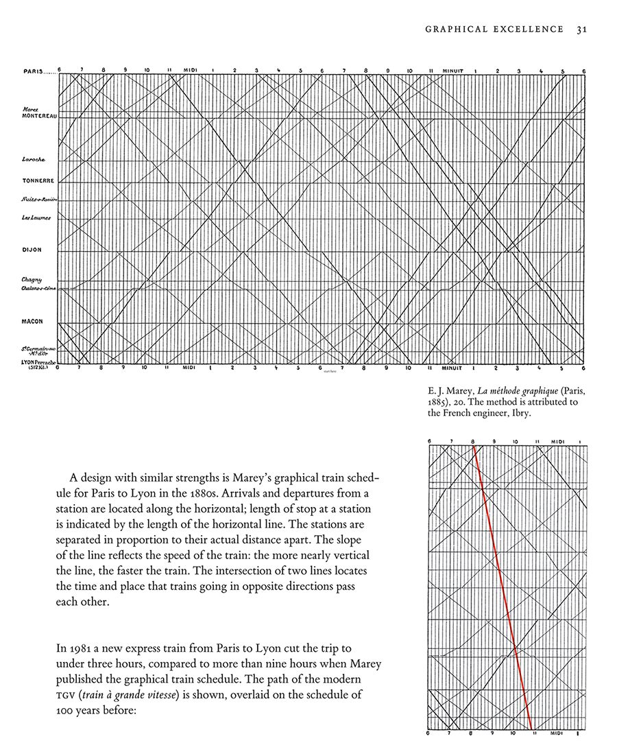
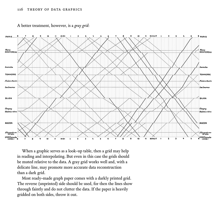
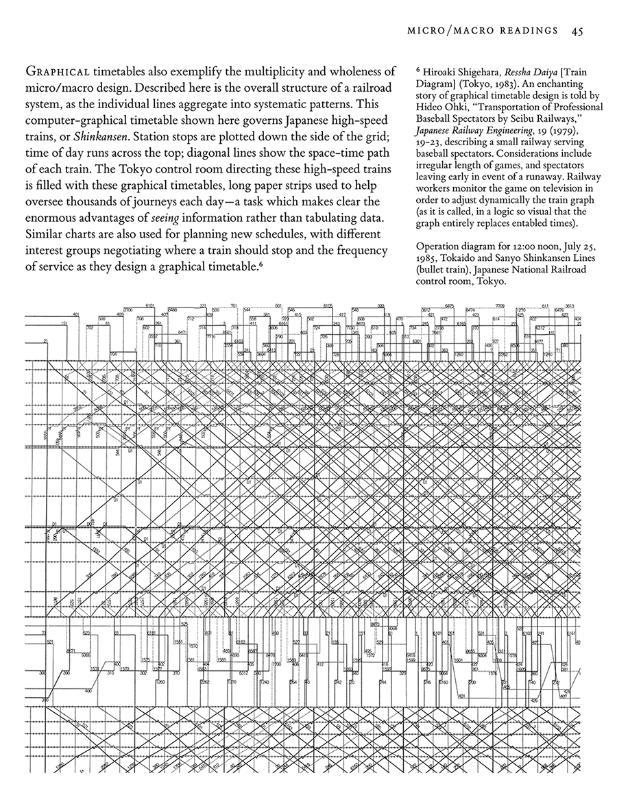
Edward Tufte, Envisioning Information, page 45.

Edward Tufte, Envisioning Information, pages 108 and 109.
My design of a bus schedule and route combines a graphical timetable with a route map overlaid on a precisely detailed aerial photograph, so much richer than the typical schematic diagram of bus routes. Hourly, daily, and weekly rhythms of the buses are clearly revealed, as well as details of each journey.
During rush hours, lines densely crowd into spaghetti–but then service is so frequent that the jumble of lines informs the rider simply to show up, for there will be virtually no wait for whatever bus it is that arrives. The gray grid is set at ten-minute intervals in order to ease visual interpolation of the times of arrival.
The aerial photograph unveils the area mostly at the level of house resolution, that is, with sufficiently fine details to show individual buildings. Indeed, the reaction of those who live in the area is to explore the photograph, personalizing the data, seeking to discover their own residence, school, or workplace. Same picture, but many stories.
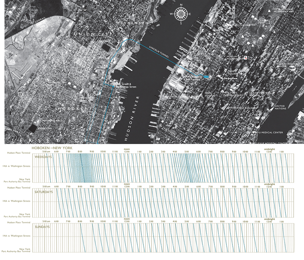


Just a short note pointing out that the slopes of the lines change above/below the 14th & Washington Square stop, and those slopes also change throughout the day. Trains travel faster if the line is more vertical, and slower if more horizontal, although slopes can only be compared relatively above/below since distance is not captured in this display. Still, one can see that the 5:30 PM weekday train travels slowly compared to its neighbors, or that the last train weekday (slow then fast) behaves differently on Saturday (fast then slow).
Mike Barry and Brian Card have used a lovely interactive Marey Diagram to visualize train movements on Boston’s MBTA.
http://mbtaviz.github.io/