
Source: Économie Politique, Librairie Paul Jammes, Catalogue 276, 2009.
Warning: Trying to access array offset on value of type bool in /nas/content/live/graphicspress/wp-content/themes/edwardtufte/archive.php on line 21
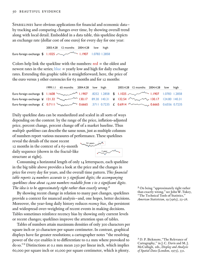
Financial data displays
Warning: Undefined variable $count in /nas/content/live/graphicspress/wp-content/themes/edwardtufte/archive.php on line 24
Warning: Trying to access array offset on value of type bool in /nas/content/live/graphicspress/wp-content/themes/edwardtufte/archive.php on line 21
ET work on iTunes (Podcast), YouTube, Vimeo
ET works are now available as a podcast and can be accessed via iTunes:
 |
http://itunes.apple.com/WebObjects/MZStore.woa/wa/viewPodcast?id=297775181
(If you use Windows, iTunes needs to be installed.)
Slide show pan/zoom for museum computer screens: advice needed
For my show at the Aldrich Contemporary Art Museum, I would like to show a continuous looping full-screen sequence of about 200 slides that are panned and zoomed. The images will appear on a wall-mounted Apple Cinema monitor integrated into the show.
We need the ability to specify for each image the pan/zoom path, as well as the time the image appears, along with a simple dissolve. Nothing fancy needed. No chartjunk should appear during the slideshow. This should run on OSX.
We are currently playing with the OSX screensaver (which works fairly well) but need greater control over the pan/zoom/dissolve of each slide. Aperture and iPhoto don't appear to give the necessary controls.
I would be grateful for any advice.
Thanks, ET
Data mining coincidences: Bellwether electoral districts
Lurking in this story below are general points about data-mining and the constant need for genuinely predictive replication. There are big incentives in data-mining to produce (false) alarms, for what data-mining consultant is going to say "We found nothing at all in your data"? Also, in many domains (such as medical testing, security systems), the money is in the false alarms. The current notorious example is prostate cancer testing, which requires mutilating surgery on 47 men to extend the life of one man. That is, there are 46 false alarms, 46 wrong unnecessary surgeries, and $1,000,000 in medical fees. Our paper suggests methodologies for validating--or not--the results of data mining.
For years journalists have data-mined election returns to find "bellwethers," geographic units whose overall vote division mimicked the national result in election after election. I published an article (along with my Princeton undergraduate student Richard Sun) that showed that bellwether electoral districts have no predictive value (at least winner-take-all bellwethers; we did find some evidence for barometric and swingometric districts, which we constructed for fun). Journalists haven't always gotten this news and so 30 years later I still get emails from reporters asking about some area that has voted for the electoral winner in the last 00 elections and whether that miracle will continue in the upcoming election.
Edward R. Tufte and Richard A. Sun, "Are There Bellwether Electoral Districts?"
Public Opinion Quarterly, 39 (1975), 1-18.
Click here to view the article, which shows some ways to test data-mined results and avoid being caught by coincidences.
Here's the summary at the end of paper, concluding with a wonderful quote from Somerset Maugham:
"Are there bellwether electoral districts? No, at least not if they are chosen before the fact. Some counties are more barometric than others, both in retrospect and in prospect. While spectacular in their postdictions, these counties are not sufficiently barometric or swingometric in their predictions to provide a precise or reliable guide to upcoming elections. Several alternative methods of prediction are also preferred because their underlying inferential logic is more secure than the unknown mechanisms producing the highly variable barometric and swingometric behavior observed in our data.
The all-or-nothing counties are only a curiosity and probably should be forgotten. It is a waste of time to send reporters out to interview non-randomly selected citizens of Crook County a week or two before the election--at least from any sort of scientific point of view.
There perhaps remains a magical air about the bellwethers of the past. Some of these districts, considered individually, seem to have such phenomenal records, and while we know better than to take them seriously, still. . . . It may be best to look not to the election returns for the source of the mystery, but rather to ourselves. Somerset Maugham once wrote:
'The faculty for myth is innate in the human race. It seizes with avidity upon any incidents, surprising or mysterious, in the career of those who have distinguished themselves from their fellows, and invents a legend to which it then attaches a fanatical belief. It is the protest of romance against the commonplace of life.'"
Rainbows and Moonbows
Moonbows: http://www.atoptics.co.uk/fz158.htm
Courtesy of the wonderful http://spaceweather.com/
Airspaces
My new piece, Airspaces, stands approximately 16 feet or 5 meters tall and is constructed from aluminum paraboloids of revolution.
The photograph immediately below shows Tong Bird Mobile in the foreground, with the new piece Airspaces in our test field. There remain some issues of metal surfacing and wind loading.


 When installed at the museum sculpture garden, the 2 aluminum fins of Airspaces will go directly into the grass and the I-beam support structure (seen in the very top picture above) will be buried in the earth. Below, is a photoshopped grass-surround at the base of the piece.

When installed at the museum sculpture garden, the 2 aluminum fins of Airspaces will go directly into the grass and the I-beam support structure (seen in the very top picture above) will be buried in the earth. Below, is a photoshopped grass-surround at the base of the piece.
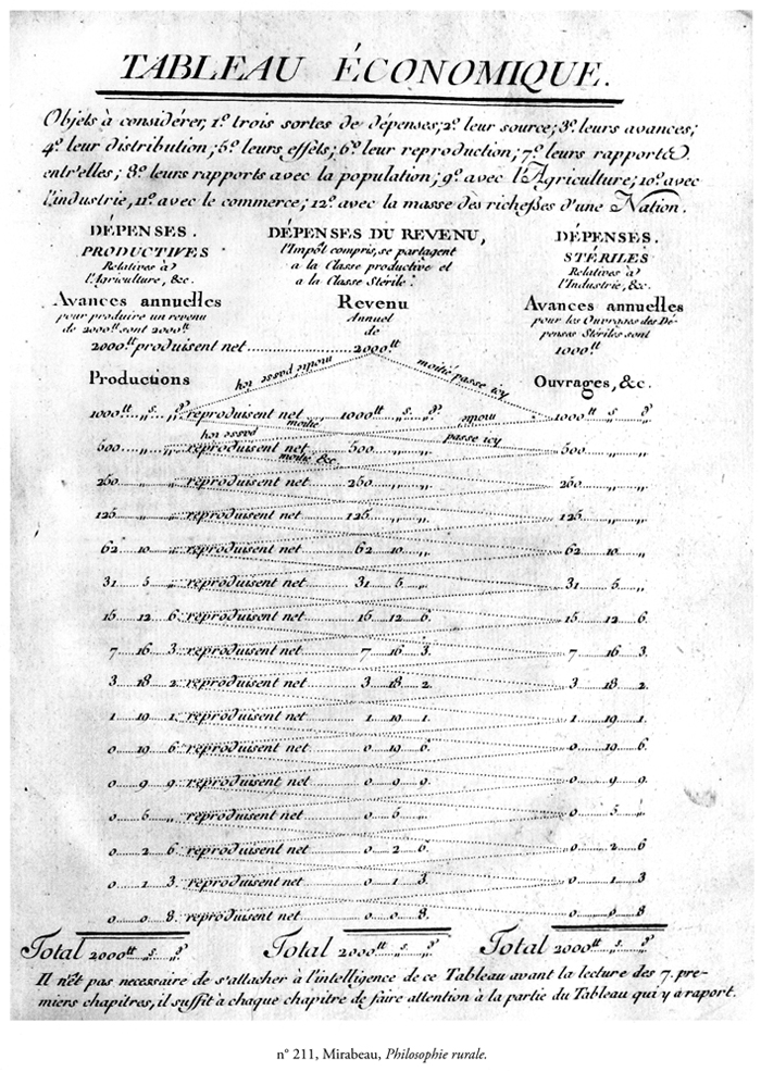
Election data displays
Easily the best map (because of its notable content):
Electoral college outlook, Obama v. McCain, from 2 years ago (mid-October 2006):
 Source: SURVEY USA
Excellent reporting of pre-election polls: Pollster.com graphics and tables. Run by first-rate scholars of surveys, pollster.com provided individual survey results in a long-run context, which reduces the tendency for partisans and news reporters to go crazy with every little daily random bounce. The main bias of the media is hyped news, which too rapidly discounts olds, context, stability, and trends moving at a weekly or monthly pace.
Below, pollster.com graphics for some 550 presidential election polls for all of 2008, along with summary smoothing lines. Particularly helpful is the visual comparison of all the polls each day on the vertical alignment. Also each new daily addition to the graphic (during the course of the campaign) locates that day in relation to all previous daily polls in the campaign. This graphic provides both overview and detail; in well-designed data displays, there does not have to be a trade-off between a quick-read overview and some detailed data showing the pieces going into the overview. Notice how the stronger colors of the smoothed path are cleanly separated from the lighter daily dots from each poll. Also interesting is the increase in the number of daily polls during 2009.
Source: SURVEY USA
Excellent reporting of pre-election polls: Pollster.com graphics and tables. Run by first-rate scholars of surveys, pollster.com provided individual survey results in a long-run context, which reduces the tendency for partisans and news reporters to go crazy with every little daily random bounce. The main bias of the media is hyped news, which too rapidly discounts olds, context, stability, and trends moving at a weekly or monthly pace.
Below, pollster.com graphics for some 550 presidential election polls for all of 2008, along with summary smoothing lines. Particularly helpful is the visual comparison of all the polls each day on the vertical alignment. Also each new daily addition to the graphic (during the course of the campaign) locates that day in relation to all previous daily polls in the campaign. This graphic provides both overview and detail; in well-designed data displays, there does not have to be a trade-off between a quick-read overview and some detailed data showing the pieces going into the overview. Notice how the stronger colors of the smoothed path are cleanly separated from the lighter daily dots from each poll. Also interesting is the increase in the number of daily polls during 2009.
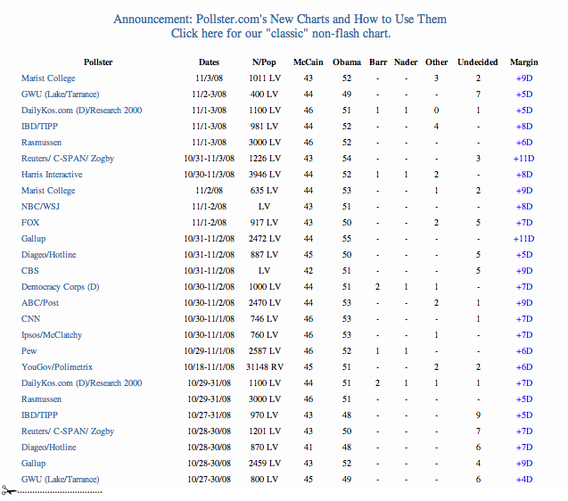
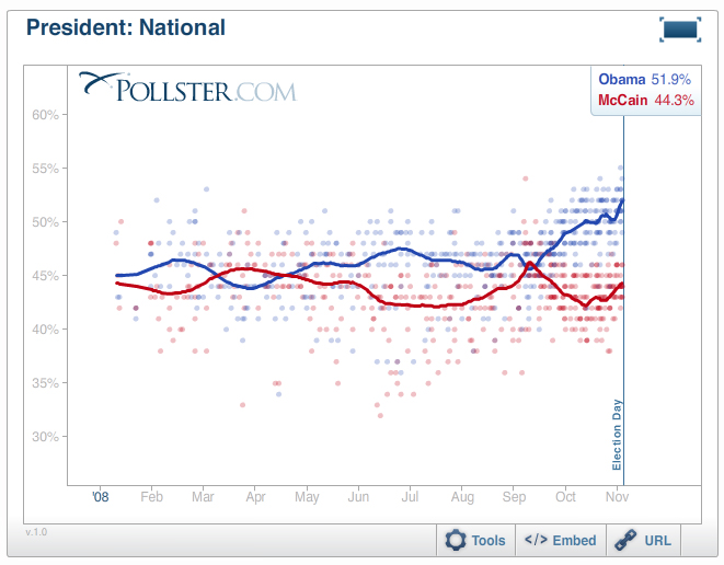 Below, here's a part of accompanying database table, and so on through all 550 surveys:
 The above graphics and tables serve well as models for reporting quantitative evidence in government and business (who might well ask "why aren't our evidence displays up to pollster.com? And why are we still using PowerPoint templates for data presentations?") The success of pollster.com on the internet indicates that these displays have met a market and usability test: millions of visitors have come to appreciate intense data presentations that combine both overview and detail.
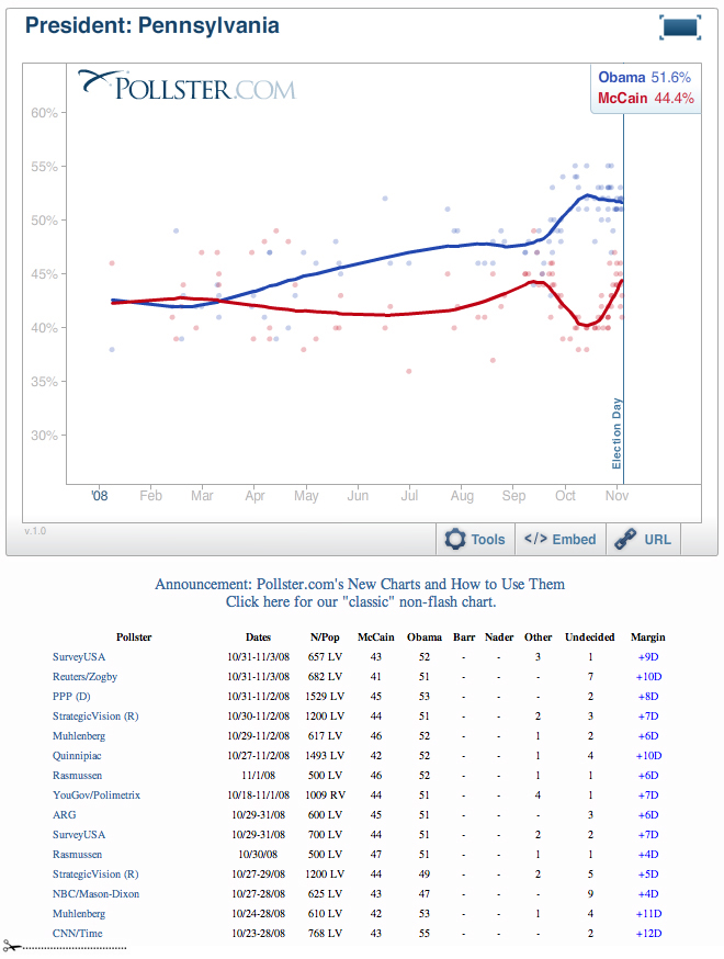
Below, pollster.com's display for a state:
The above graphics and tables serve well as models for reporting quantitative evidence in government and business (who might well ask "why aren't our evidence displays up to pollster.com? And why are we still using PowerPoint templates for data presentations?") The success of pollster.com on the internet indicates that these displays have met a market and usability test: millions of visitors have come to appreciate intense data presentations that combine both overview and detail.
Below, pollster.com's display for a state:
 Real Clear Politics provided a well-designed summary table showing the immediate polls, betting, and electoral college distributions. Most of the mainstream media relied on this table for polling coverage. RCP's Jay Cost of wrote several thoughtful pieces puzzling over polling data. And pollster.com produced many high-level and deeply informed discussions of polling methodology. My conclusion: journalists should have relied on both pollster.com and RCP.
Here are some good tables and graphics from RCP on election day:
Real Clear Politics provided a well-designed summary table showing the immediate polls, betting, and electoral college distributions. Most of the mainstream media relied on this table for polling coverage. RCP's Jay Cost of wrote several thoughtful pieces puzzling over polling data. And pollster.com produced many high-level and deeply informed discussions of polling methodology. My conclusion: journalists should have relied on both pollster.com and RCP.
Here are some good tables and graphics from RCP on election day:
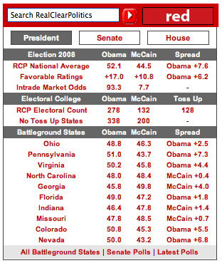 Below, a beautiful table from RCP:
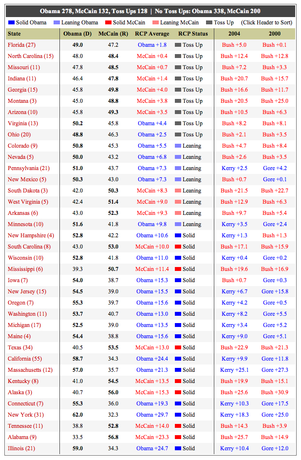 Here's RCP on Florida; note the betting data:
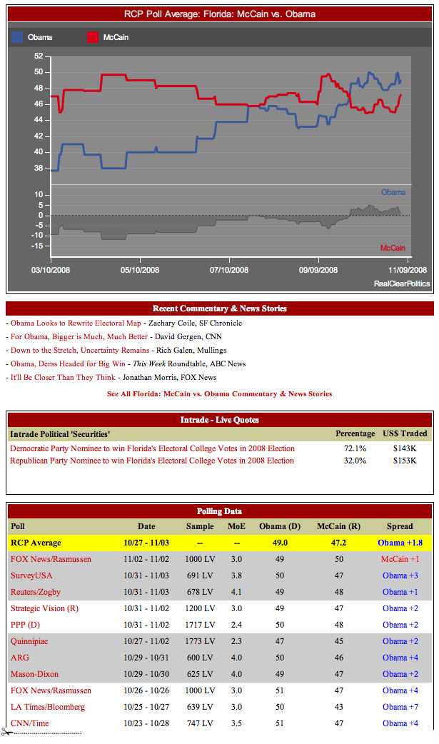 All these screen dumps were collected around 2.00pm on election day, November 4, 2008. I should have also picked up the excellent displays of fivethirtyeight.com as well.
Source: SURVEY USA
Excellent reporting of pre-election polls: Pollster.com graphics and tables. Run by first-rate scholars of surveys, pollster.com provided individual survey results in a long-run context, which reduces the tendency for partisans and news reporters to go crazy with every little daily random bounce. The main bias of the media is hyped news, which too rapidly discounts olds, context, stability, and trends moving at a weekly or monthly pace.
Below, pollster.com graphics for some 550 presidential election polls for all of 2008, along with summary smoothing lines. Particularly helpful is the visual comparison of all the polls each day on the vertical alignment. Also each new daily addition to the graphic (during the course of the campaign) locates that day in relation to all previous daily polls in the campaign. This graphic provides both overview and detail; in well-designed data displays, there does not have to be a trade-off between a quick-read overview and some detailed data showing the pieces going into the overview. Notice how the stronger colors of the smoothed path are cleanly separated from the lighter daily dots from each poll. Also interesting is the increase in the number of daily polls during 2009.
Below, here's a part of accompanying database table, and so on through all 550 surveys:
The above graphics and tables serve well as models for reporting quantitative evidence in government and business (who might well ask "why aren't our evidence displays up to pollster.com? And why are we still using PowerPoint templates for data presentations?") The success of pollster.com on the internet indicates that these displays have met a market and usability test: millions of visitors have come to appreciate intense data presentations that combine both overview and detail.
Below, pollster.com's display for a state:
Real Clear Politics provided a well-designed summary table showing the immediate polls, betting, and electoral college distributions. Most of the mainstream media relied on this table for polling coverage. RCP's Jay Cost of wrote several thoughtful pieces puzzling over polling data. And pollster.com produced many high-level and deeply informed discussions of polling methodology. My conclusion: journalists should have relied on both pollster.com and RCP.
Here are some good tables and graphics from RCP on election day:
Below, a beautiful table from RCP:
Here's RCP on Florida; note the betting data:
All these screen dumps were collected around 2.00pm on election day, November 4, 2008. I should have also picked up the excellent displays of fivethirtyeight.com as well.Dog sculpture (Porta the Portuguese Water Dog)
Rusted steel, 29 by 8 by height 19 in or 73 by 20 by height 48 cm.
The dog is not shaped in the third dimension, but there's some depth since the dog is made from a 1 inch or 2.6 cm thick steel plate. This flatness is carried over in the dog's ball, which is a disc not a sphere (in a little visual joke).
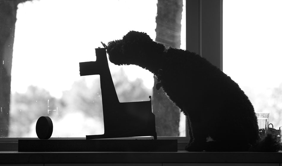
Then the real dog Porta checks out the new piece.
(photographs by ET and Andrei Severny)


Distant assistants: real-time collaboration
http://philip.greenspun.com/flying/ground-monitoring
Can Phillip's intriguing idea be extended to other types of live collaboration in which all parties have simultaneous full information??


