Warning: Trying to access array offset on value of type bool in
/nas/content/live/graphicspress/wp-content/themes/edwardtufte/archive.php on line
21
Scaling and scale models
This example begins a thread on scaling and scale models.
A good general discussion of scale models is Ian Gibson, Thomas Kvan, and Ling Wai Ming, "Rapid prototyping for architectural models,"
pdf.
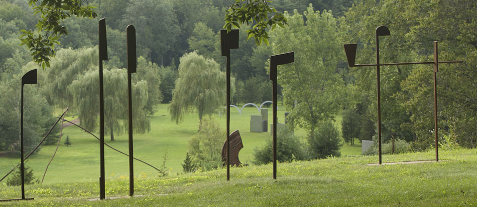
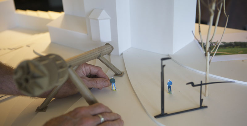
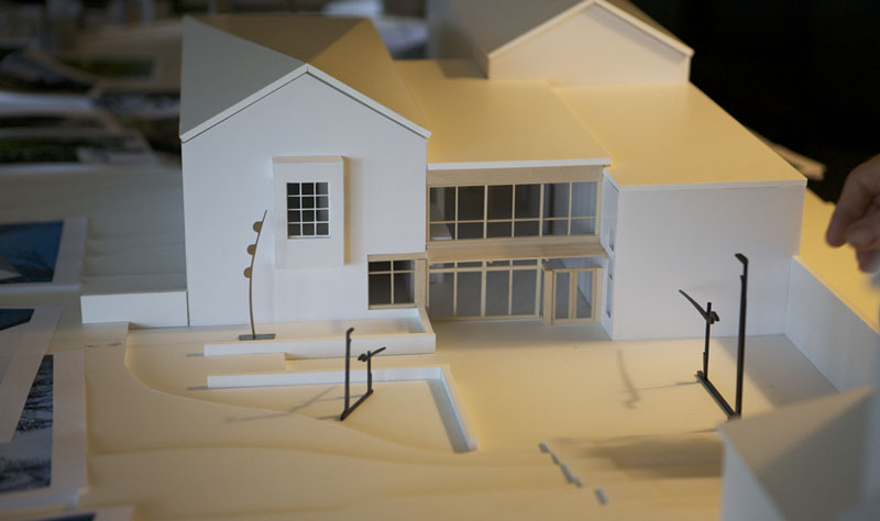
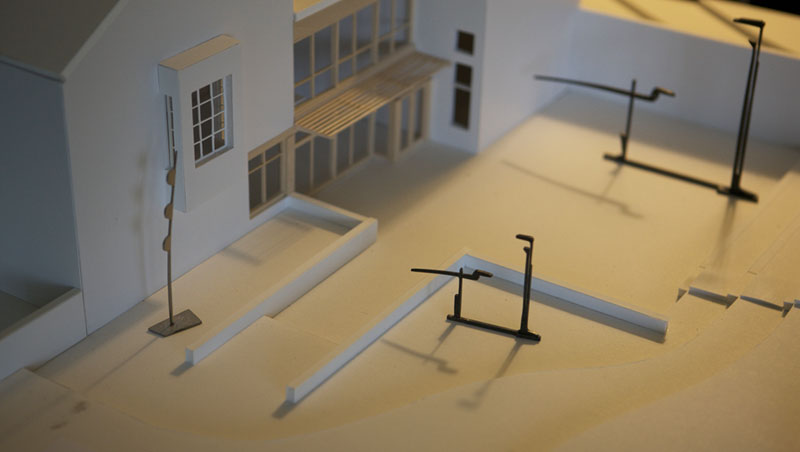
Here are pictures of our scale model for the Aldrich Contemporary Art Museum, at a scale of 1/4 inch = 1 foot, or 1/48th size. The purpose of the model is to prepare for my upcoming sculpture show at the Aldrich. We also made sculptures and human figures at 1:48. This set of pictures shows the pieces
Rocket Science, Zerlina's Smile, and 2 sizes of
Tong Bird of Paradise (10 feet and 20 feet tall or 2.5 inches and 5 inches in scale) placed on the model.
Here are studies of sculpture placement near the Aldrich buildings (our plans for the 1.5 acre Aldrich Sculpture garden are still in progress).
The scale model is on a fairly high table. I then roll around the model on a low chair so that my view of the model simulates the view of a museum visitor. Everyone seems to enjoy the model and especially all the little scaled sculptures that we usually see 48 times larger.
The model shows shadows over time. Our sun shadow is not all that different from the Aldrich sun shadow. The model is correctly oriented NSEW and is located only 35 miles away from the Aldrich:
model location 41.49N, -72.91W
Aldrich location 41.25N, -73.49W
So far I've learned that the abrupt contours shown in scale models are contrary to the land, visually noisy, and sometimes are alas the strongest visual element in the scene. Maybe we'll drape some grass-colored light paper over the abrupt foam contours. I also learned that scale models should be checked for errors and omissions.
For the sculpture show, it appears that
Zerlina's Smile will cast good shadows on the museum building, that
Rocket Science should be moved away from its planned position, and that it is great fun to move the little pieces around the little buildings and grounds.

Below, images of the real museum:


: Undefined variable $count in
/nas/content/live/graphicspress/wp-content/themes/edwardtufte/archive.php on line
24
Warning: Trying to access array offset on value of type bool in
/nas/content/live/graphicspress/wp-content/themes/edwardtufte/archive.php on line
21
Google Chrome platform
GOOGLE CHROME NARRATIVE
 Cartoons with real voices
This is a good example of complex information made simple by paying attention to information density and respecting the reader's intelligence.
The Google Chrome Comic Book
https://www.google.com/googlebooks/chrome/index.html
We have been watching Scott McCloud on this thread for quite some time... see above ( 2001 ).
Scott, if you are reading: Well done.
Scott McCloud's website
http://www.scottmccloud.com/BibliOdyssey: wonderful website about illustrations
http://bibliodyssey.blogspot.com/
Books, illustrations, science, history, visual Material Obscura, with an excellent collection of links as well.
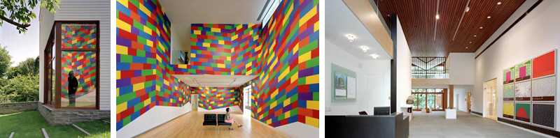
Seeing Around: New ET essay published
Seeing Around is a 36-page essay about optical and analytical experiences in the 3D spaceland of landscape sculptures.
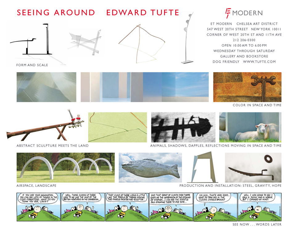


36 pages, $5 eBook (
order)
Paradox sculptures
Theater Museum artworks
The idea of
theater museum suggests abstract structural themes for artwork: stage, 3 interacting active dimensions, enclosed space, narrative scenes of sculptural elements, activities behind the scene, upstage/downstage, partially blocked views, a focus on the stage, and so on. Theater museums are intensely unflatlandly (at least if they're presenting plays rather than movies).
Here are
Theater Museum 1 and
Theater Museum 2, pieces that differ in their vocabulary of elements but sit and pose together well in these photographs.
The stage name of
Theater Museum 1 is
It's More Complicated Than That.
The stage name of
Theater Museum 2 is
Linear Buddha, as perhaps suggested by its 2 wooden vertical elements.


Calendars and schedules
An alternative display for visualizing and managing group schedules
Microsoft Outlook is one of the most widely used applications in the world but its calendar has frustrated many users who want to view several schedules at once. With Outlook you can view multiple calendars side by side but after you add a few calendars the information disappears into a forest of heavy gridlines and background colors.
Here are some alternatives to the cluttered calendars offered by Outlook and other off-the-shelf solutions. The alternative designs incorporates many ideas from Dr. Tufte's books and this discussion
forum.
The following thumbnail images are linked to the original images, which were all recorded at 1024x768 resolution on a 19" monitor.
Week view

Outlook 2003

Outlook 2007

Alternative display
Each display above represents a five day view of 10 calendars. Each display arranges appointments in columns with a day for each column and hour divisions running vertically. However, Outlook 2003 and 2007 render the individual calendars as columns, which tends to stretch each appointment vertically while the alternative display organizes the calendars as rows, which tends to stretch the appointments
horizontally.
Outlook 2003 and 2007 are both characterized by heavy grids and background shading and the calendar names, dates and appointments are truncated and camouflaged. The alternative display has a cleaner look, a much more subtle grid (which can be turned off by the user) and calendar names, dates and appointment boundaries are not obscured. In most cases there is space for a text label on the appointment but tooltips are available in lieu. The appointments can be colored using Outlook's default colors (representing free/busy, out of office and tentative) or, as show here, with category colors (see legend to the right). Hour labels are only drawn for the first calendar to avoid unnecessary repetition.
Month view

Outlook 2003

Outlook 2007

Alternative display
When the time scale extends to a month the differences between the Outlook versions and the alternative display become more pronounced. In Outlook 2003 the appointments have disappeared altogether while in Outlook 2007 the appointments are visible but only just. To be fair Outlook 2007's month view appears to display seven day weeks rather than five day weeks so space is taken up somewhat unnecessarily by weekend days, which in most organizations is beyond normal working hours. The week range is also repeated in a redundant fashion for each calendar. Another problematic issue is that the layout of appointments has changed from the week view show in the first triptych. Each week of the month is now laid out on a different row so the user has to contend with three different time axes.
In contrast, the alternative display is able to clearly render a month of appointments (even in the thumbnail). The layout is consistent with the week view in that the calendars are still rendered in rows and each column of data represents a day. The time scale labels are dynamically adjusted for the displayed time period and to fit within the available space.
The display is also consistent in hiding weekend days although the user can add these as required. The alternative display can also be rendered as working hours (eg 0900-1700) or a full 24 hour day.
A feature of the alternative display is a reference calendar that provides context if the user chooses to zoom in and pan across an area of the main display to view part of the calendar in more detail. The blue shaded rectangle in the reference calendar changes size and location to help orientate the user. A check box allows the user to constrain the zoom so that the horizontal axis is scaled but not the vertical axis.
Alternative display modes

Calendar mode

Timeline mode

Bar chart mode
The alternative display is implemented using Scalable Vector Graphics, which is
the web standard for describing two-dimensional vector graphics. The useof SVG facilitates coordinate transformation and thus it is possible to translate and scale objects like appointment rectangles. In the screen shots above the appointments have been transformed into two other modes: a timeline view and a bar chart view.
In the timeline view the hour labels have been removed as the horizontal time axis now represents a continuum of time, which can be useful when viewing activities that extend over several days like project tasks.
In the bar chart view the appointments have been collapsed into a stack rising from the bottom of each calendar row. The hour labels have been replaced by a percentage scale that represents the
utilitization of the resource. The percentage utilization is calculated based on either the number of working hours in a day or the full 24 hours depending on the option chosen by the user.
Choropleth Overlays and Aggregate Bar Charts

Calendar overlays

Aggregate bar chart - sorted by category

Aggregate bar chart - sorted by resource
Using SVG transformations the display can be viewed as separate side-by-side rows of calendars or combined in a single row that covers the plot area.
When the calendars are combined they are superimposed on each other in a series of overlays that fill the display. By giving each appointment a monochrome color and an opacity that is proportional to the number of calendars (in this case ten) the display becomes a choropleth. White areas indicate that all the resources are available while progressively darker areas indicate times when more resources are busy. This can be useful for analysing resource availability and booking meetings. Moreover, as the user moves the cursor across the display the resource names listed on the left side change color to represent the category of activity they are participating in. Individual layers can be turned off. Meeting rooms that have
insufficient capacity for the number of people in the group are flagged and their calendars are automatically hidden.
When the calendars are combined in bar chart mode, the appointments of each resource are stacked together to produce an aggregate view of the group. The display can be changed to sort appointments by category or resource. In the latter case the appointments of each resource are assigned a common color.
Longer term calendar views

Calendar mode

Timeline mode

Bar chart mode
Sometimes it is useful to look at calendars over a much longer period of time. In the above examples the period is twelve months or twenty to fifty times the maximum range that Outlook can display legible appointments. In the alternative display, individual appointments are discernable at 1024x768 giving each calendar a sparkline appearance.
Again the display is consistent with the week and month views of the same data. The timeline view is less helpful given the appointments are mostly less than a day's duration but even the thinnest appointment
rectangles will produce a tooltip when moused over. All the same functionality is available in the year view (zoom and pan, choropleth overlays and aggregated bar charts).
Detail within context

Single resource - two time scales
This last screen shot illustrates how a single calendar can be displayed at two time scales simultaneously. This enables the user to see both the big picture context while looking a smaller periods of time in more detail. The user can change the time span in the lower calendar display by clicking on the arrows (to move one day at a time), the scroll bar (to move one week at a time) or by dragging the slider on the scroll bar. The two time scales are linked by a translucent polygon object that changes shape as the user navigates the lower calendar.
Conclusion
The alternative displays demonstrate a number of different ways of visualizing calendar data. Although the alternative displays are compared with Microsoft Outlook they are not tied to a particular
implementation and can be used in conjunction with other calendar data sources. SVG documents are not only derived from a World Wide Web standard but they can be viewed in multiple browsers and by many mobile devices.
Geese taking flight (at 300 frames per second)
My favorite parts are the 3D foot-splash prints left behind as the geese lift-off and the details of the wings.
This video is also available on
YouTube and
Vimeo
Gentle humor in design
For updating ID's, the sample ID shown is for Elihu Yale, who founded in 1701 what became Yale University.

Complex sculptural shapes