An excellent collection, with thoughtful analysis, of quirky maps formerly at strangemaps.wordpress.com, now at Big Think, here. See also book: Strange Maps: An Atlas of Cartographic Curiosities, by Frank Jacobs.
Warning: Trying to access array offset on value of type bool in /nas/content/live/graphicspress/wp-content/themes/edwardtufte/archive.php on line 21
Unusual maps
Warning: Undefined variable $count in /nas/content/live/graphicspress/wp-content/themes/edwardtufte/archive.php on line 24
Warning: Trying to access array offset on value of type bool in /nas/content/live/graphicspress/wp-content/themes/edwardtufte/archive.php on line 21
Megan Jaegerman's brilliant news graphics
Edward Tufte,
Megan Jaegerman produced some of the best news graphics ever while working at The New York Times from 1990 to 1998. Her work is smart, finely detailed, elegant, witty, inventive, informative. A fierce researcher and reporter, she writes gracefully and precisely. Megan has the soul of a news reporter, who happens to use graphs, tables, and illustrations--as well as words--to explain the news. Her best work is the best work in news graphics.
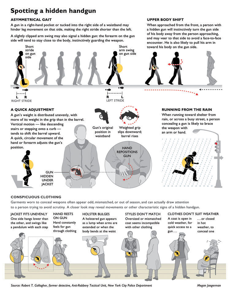
In 2004-2005, she revised one of her Times news graphics for my book Beautiful Evidence (pages 116-117), shown below. The revision includes several private jokes: images of E. J. Marey (from BE), Kenneth Noland (from Mark Tansey's The Myth of Depth in Visual Explanations), ET in the sculpture studio, and a friend of Megan's--somehow the four of us have unfortunately become involved with handguns. This work took months; for example, Megan and I exchanged many emails and 3 redesigns figuring out whether the stoplight should be red, green, or yellow.
Color is used to highlight how the gun moves and how the gun reveals itself, short visual noun-verb sentences that indicate the key signs that help detectives to spot someone carrying a hidden handgun. Thus the color usually has a distinct substantive point and is not just used to depict surfaces or to decorate the news.
Most of all, the content is really interesting; we learn something new from Megan Jaegerman's fine reporting work. Details of the reporting are discussed in the text immediately below the graphic.
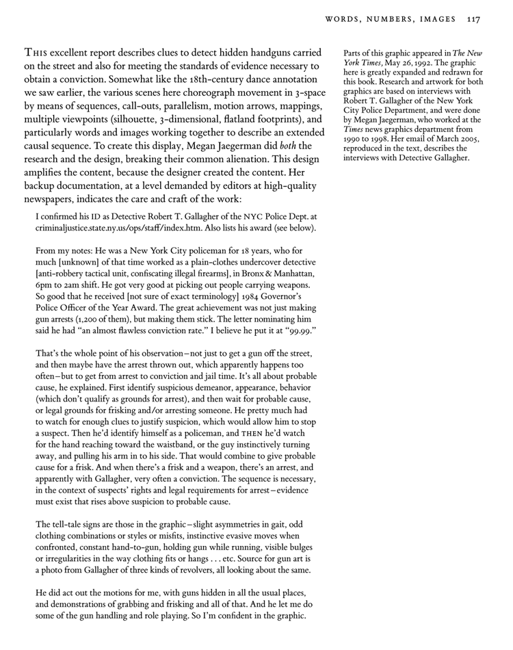
 Here is my text from Beautiful Evidence analyzing the graphic:
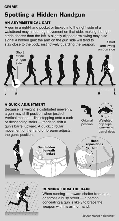
 Below, Megan's original handgun graphic from The New York Times, May 26, 1992:
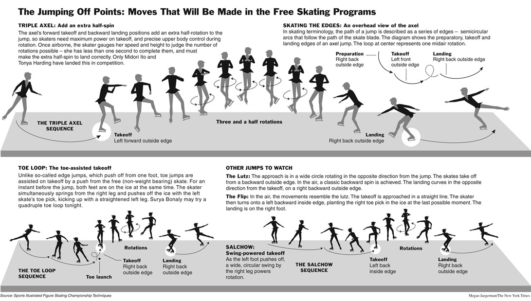
 Here are more of her greatest hits:
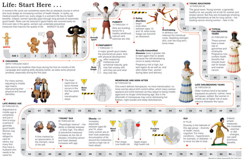 Below, Megan's classic instructions for basic exercises became widespread refrigerator-door art in New York City (according to an editor at the Times).

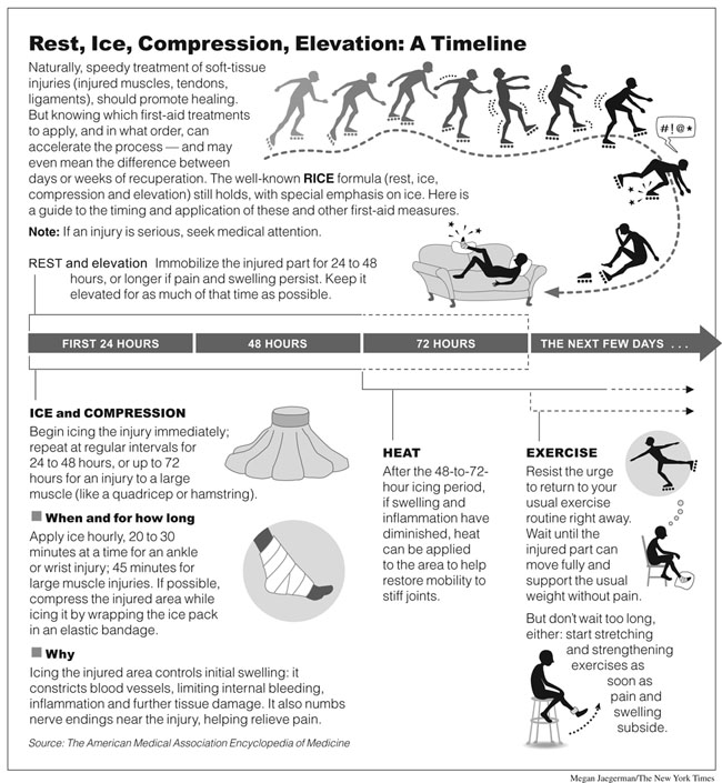 The next 2 displays below beautifully combine tables, images, text--whatever it takes to explain the content. Megan Jaegerman's work has consistently this spirit: content-driven, no segregation of information by its mode of production, whatever it takes to explain something.
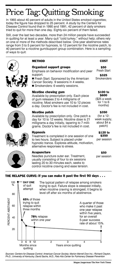
In this graphic below on quitting smoking, the data graph at the bottom showing the relapse/time curve is a fine touch, a reminder of the temperature/time graph in Minard's French Invasion of Russia in 1812.
The next 2 displays below beautifully combine tables, images, text--whatever it takes to explain the content. Megan Jaegerman's work has consistently this spirit: content-driven, no segregation of information by its mode of production, whatever it takes to explain something.
In this graphic below on quitting smoking, the data graph at the bottom showing the relapse/time curve is a fine touch, a reminder of the temperature/time graph in Minard's French Invasion of Russia in 1812.

Here is my text from Beautiful Evidence analyzing the graphic:
Below, Megan's original handgun graphic from The New York Times, May 26, 1992:
Here are more of her greatest hits:
Below, Megan's classic instructions for basic exercises became widespread refrigerator-door art in New York City (according to an editor at the Times).
The next 2 displays below beautifully combine tables, images, text--whatever it takes to explain the content. Megan Jaegerman's work has consistently this spirit: content-driven, no segregation of information by its mode of production, whatever it takes to explain something.
In this graphic below on quitting smoking, the data graph at the bottom showing the relapse/time curve is a fine touch, a reminder of the temperature/time graph in Minard's French Invasion of Russia in 1812.
Notebooks for Project 5
From an interview with Sidney Pollack and Frank Gehry, Telegraph, 22 June 2007 here
Benjamin Secher: Did making Sketches of Frank Gehry teach you anything about architecture?
SP: All I know is that Frank may have a harder job than me, but I have a worse job. Because, while he really has three dimensions to create three dimensions, as a filmmaker, I have only two dimensions to represent three dimensions, and so everything I do has to be a trick and a lie.
I can't generate emotion without a lens and an f-stop, and the actors have to be wearing the right clothes, and the room has to have exactly the right coloured wall. But, when it works, it's magic.
FG: The hardest thing is translating the feelings from the original idea, through the thousands of people involved, to the final thing.
Successfully holding on to the initial emotion - not letting it become sterile over the three-, four-, five-year process of getting a building made - is the key to the game.
BS: The quick preliminary sketches we see you make in the movie must help with that. There seems something old-fashioned about them. Do you ever feel you'll give up the pen, and design directly on computer instead?
FG: Never. I'm a dinosaur. When I look at a computerised image, all the emotion is lost. Although in the studio we've got all the most sophisticated software and all that crap, the longest I've spent on developing an idea on screen is 3.5 minutes. I can't stand it.
Wavefields: intense animated data graphics
This video is also available on YouTube and Vimeo
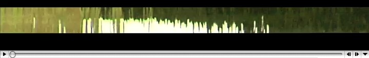
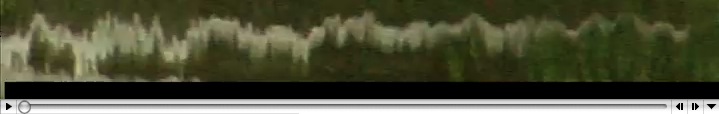
"Wavefields" are data graphics that draw on and completely fill the entire display surface, using every pixel on the data plane to show high-resolution, complex, multiple, animated statistical data-flows. Wavefields extend my work on sparklines.
These high-definition videos of waves (that is, very rich 3D time-series projected onto screen flatland) sketch out methods to bring color, layering, cross-flows, overlaps, and animation to the display of statistical data. Note the vertical flows on an apparent plane separate from the horizontal flows.
To see wavefields more deeply, it is helpful to slow or stop the animation by the movie controls for pace and forward/backward.
Andrei Severny and I generated these wavefields by editing HD movies of water waves and reflections on those waves. The thin white sparklines result from waves activating edges of a big sculpture (Hogpen Hill #1) reflected in the water.
The ideas here are to blur and to reduce distinctions between movies and statistical graphics, to get some visual depth to data graphics, and to bring all the capacities of HD movie-making to data-graphics-making. As the metaphor for sparklines is the resolution of typography, the metaphor for wavefields is the HD video (which records approximately 1 gig per minute, an excellent data throughput).
The next steps are to show full 2D fields instead of the strips of data shown here, to provide some subtle grid-lines for scaling and reference-stabilizing the data flow, and to use some arrows and letters to label key elements.

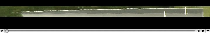
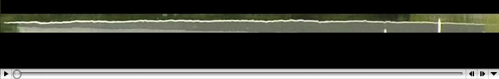

 During slow scrolling across the image immediately above, note the vertical line artifacts, which suggest that error bars, data extremes, and scaling lines could appear intermittently during animated displays of sparklines or datafields.
During slow scrolling across the image immediately above, note the vertical line artifacts, which suggest that error bars, data extremes, and scaling lines could appear intermittently during animated displays of sparklines or datafields.Multiplicity in visual experiences (ET presentation for a museum show)
In preparation for a visit by some museum people to our sculpture fields, Andrei Severny and I have made a short movie showing several of my pieces.
Our visitors will see the real works outdoors in the landscape along with the more contemplative and focused views of the pieces moving in the movie, as well as prints showing the pieces.
This combination of real-land pieces, a movie, and still-land images is to demonstrate the multiplicity of visual experiences available from certain art works.
The name of the proposed show, for many reasons, is Multiplicity.
[This is a large, 33mb, Quicktime file.]
Water studies: light and motion
Documentation sketches
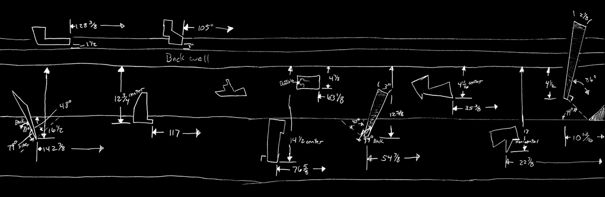
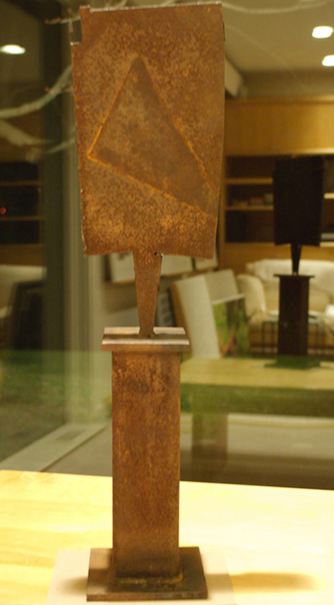
For several months I've been working on a very complicated table piece (similar to this sculpture shown in the first two images here).
In the midst of it all I decided to start removing or revising some of the 11 to 13 elements.
To preserve the progress to date, Andy Conklin, my colleague, made this diagram showing the location of the various elements in the version immediately prior to deconstruction. Here is his wonderful documentation, shown here in reverse for beauty reasons:
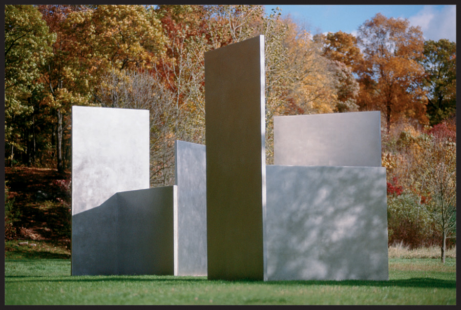
Steel sculptures


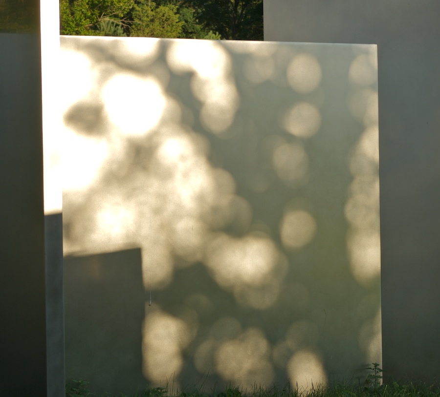
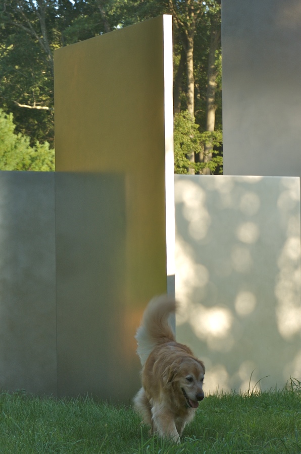
Dappled light
Here are 5 pictures showing dappled light on the stainless steel of various of my Escaping Flatland sculptures. Dappled light is produced when sunlight is filtered through the leaves of trees. The dapples result not because tree leaves have elliptical holes in them but rather because the leaves combine to make many tiny pinhole cameras, which then produce multiple images of the sun's surface on nearby projection surfaces. Thus each dapple is an image of the surface of the sun. If there is a large sunspot on the surface on the sun, that spot will appear within each dapple.
Many intriguing events occur on the surface of landscape sculptures, as they borrow Nature's light.


Sculpture: Negative space studies