Warning: Trying to access array offset on value of type bool in /nas/content/live/graphicspress/wp-content/themes/edwardtufte/archive.php on line 21
Grand truths about human behavior
It's more complicated than that.
Unintended consequences inevitably attend purposive social action. (Robert K. Merton)
"It is a principle that shines impartially on the just and the unjust that once you have a point of view all history will back you up." (Van Wyck Brooks)
All the world is multivariate.
Much of the world is distributed lognormally.
People are different.
Rehearsal improves performance.
Effective intervention-thinking and choice-thinking necessarily require reasoning about comparisons, approximations, opportunity costs, and causality.
All grand theories, other than perhaps the scientific method, ultimately err (and some collapse) by overreaching. Another version: many good ideas ultimately over-reach and turn into bureaucratized rackets.
"For a successful technology, reality must take precedence over public relations, for Nature cannot be fooled." (Richard Feynman)
In explanations of human activities, both muddling through and incompetence are under-estimated, and both rational optimizing and conspiracy over-estimated.
Nearly all self-assessments claim above-average performance.
"The rage for wanting to conclude is one of the most deadly and most fruitless manias to befall humanity. Each religion and each philosophy has pretended to have God to itself, to measure the infinite, and to know the recipe for happiness. What arrogance and what nonsense! I see, to the contrary, that the greatest geniuses and the greatest works have never concluded." (Gustave Flaubert)
"Upon expecting fair play in high places: You'll get it if enough folk are watching." ( J. P. Donleavy's variant of Wendell Phillips' "Eternal vigilance is the price of liberty.")
___________________________________________________________________________________
Perhaps our Kindly Contributors will have other Grand Truths about human behavior in the spirit of the material posted above—ideas with a reasonable empirical base that serve to help describe and understand human behavior.
Warning: Undefined variable $count in /nas/content/live/graphicspress/wp-content/themes/edwardtufte/archive.php on line 24
Warning: Trying to access array offset on value of type bool in /nas/content/live/graphicspress/wp-content/themes/edwardtufte/archive.php on line 21
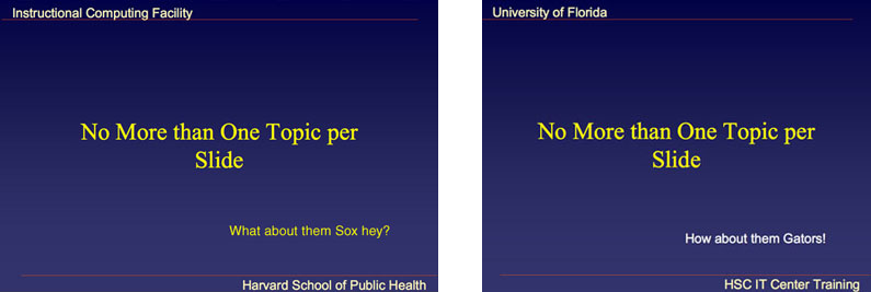
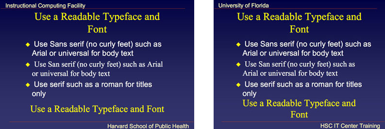
Plagiarism detection in PowerPoint presentations
The unattributed and substantial use of the words of others is plagiarism.
Colleges, newspapers, and some businesses have codes of behavior for defining and punishing plagiarism. Presumably these standards apply to PowerPoint presentations.
Shown below are two sets of selected slides from PowerPoint stylesheets from the Harvard School of Public Health and from the Health Science Center at the University of Florida.
Perhaps the two sets have a common source, or one borrowed from the other.


 The more general issues for this thread are:
How can PowerPoint plagiarism be detected?
What is the extent of PowerPoint plagiarism?
What should be done?
How are acknowledgements to the work of others to be made in PowerPoint?
Should the presenter say at the beginning of the presentation, "Today in slides 3-10 and 22-34, I'm reading aloud from bullet grunts prepared by so-and-so"?
What about a teacher who closely follows or reads aloud slides provided by educational bureaucracies or by publishers whose textbook the teacher has adopted?
The general idea is that, if PP is a serious presentation method, then the usual methods of validation and source credibility should be applied to PP presentations. Maybe a built-in PP plagiarism checker could be a feature in MS Office 2009.
The more general issues for this thread are:
How can PowerPoint plagiarism be detected?
What is the extent of PowerPoint plagiarism?
What should be done?
How are acknowledgements to the work of others to be made in PowerPoint?
Should the presenter say at the beginning of the presentation, "Today in slides 3-10 and 22-34, I'm reading aloud from bullet grunts prepared by so-and-so"?
What about a teacher who closely follows or reads aloud slides provided by educational bureaucracies or by publishers whose textbook the teacher has adopted?
The general idea is that, if PP is a serious presentation method, then the usual methods of validation and source credibility should be applied to PP presentations. Maybe a built-in PP plagiarism checker could be a feature in MS Office 2009.YouTube as an arts performance encyclopedia
Terry Teachout has a large and superb compilation of YouTube videos and, from other sources, audio recordings of performances by Casals, Heifetz, jazz greats, Dylan, T. S. Eliot, and many more. Scroll down on lower right.
Scientific visualization: evidence and/or fireworks
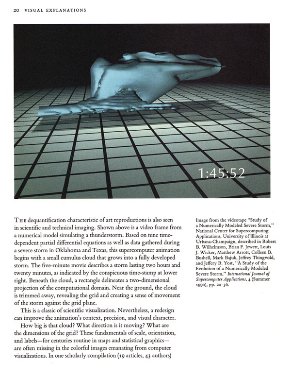
My book Visual Explanations: Images and Quantities, Evidence and Narrative (1997) (with a cover featuring a video still from a scientific animation) suggested some ways of turning flashy visualization solutions (looking for some problems to solve) into credible scientific evidence:


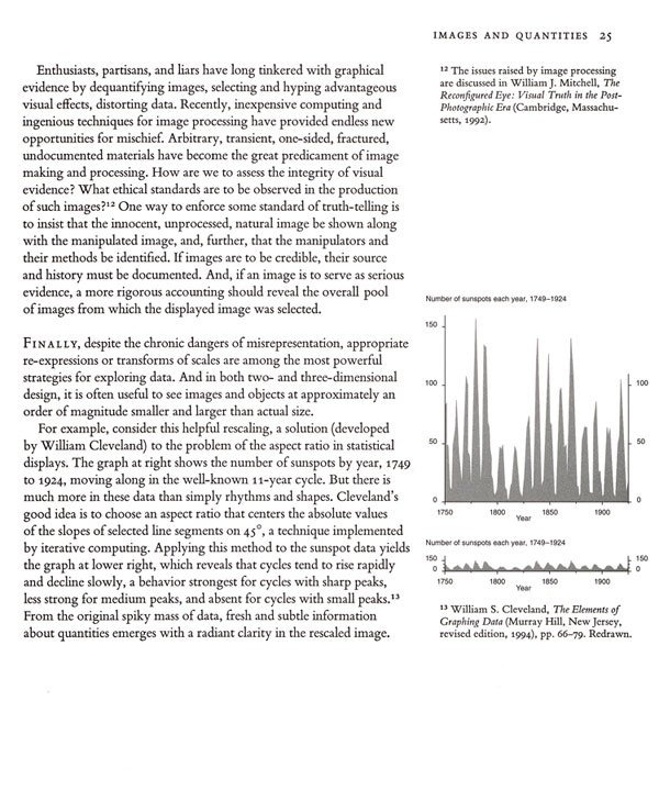 My discussion above deliberately concluded with a brilliant visualization of scientific data by William Cleveland, which indicated how new findings could be achieved by thoughtful visualization.
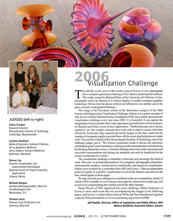
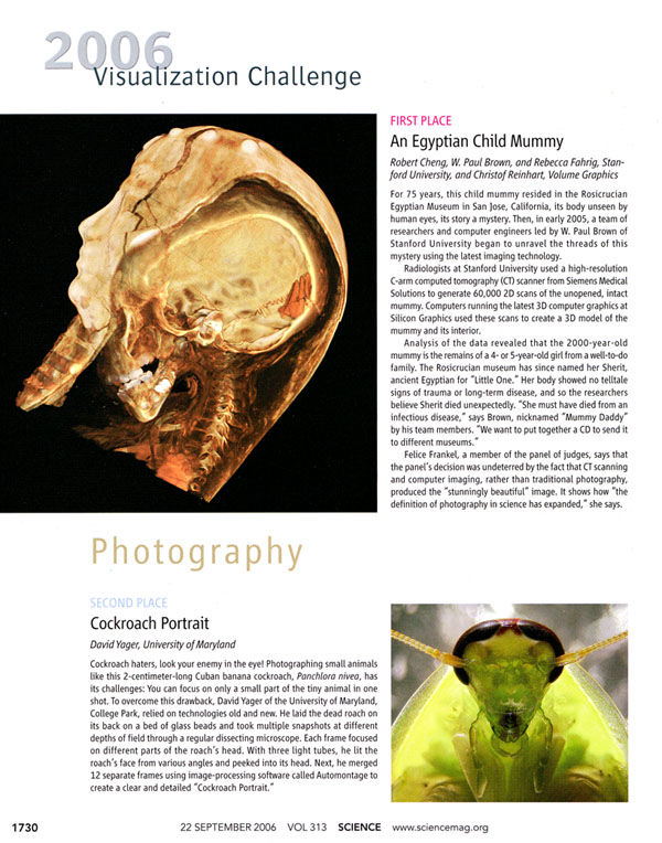
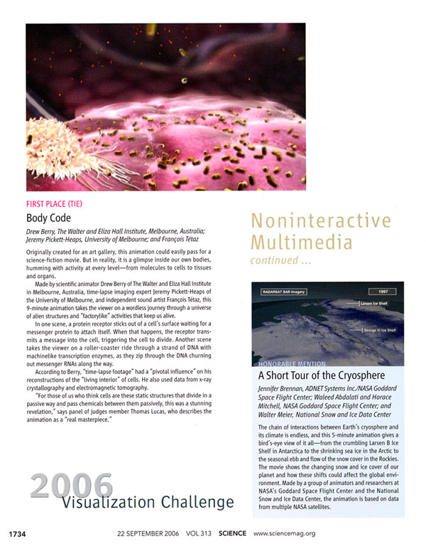
One look at the current state of the art in scientific visualization was published recently in Science 313 (22 September 2006), 1729-1735:
My discussion above deliberately concluded with a brilliant visualization of scientific data by William Cleveland, which indicated how new findings could be achieved by thoughtful visualization.
One look at the current state of the art in scientific visualization was published recently in Science 313 (22 September 2006), 1729-1735:


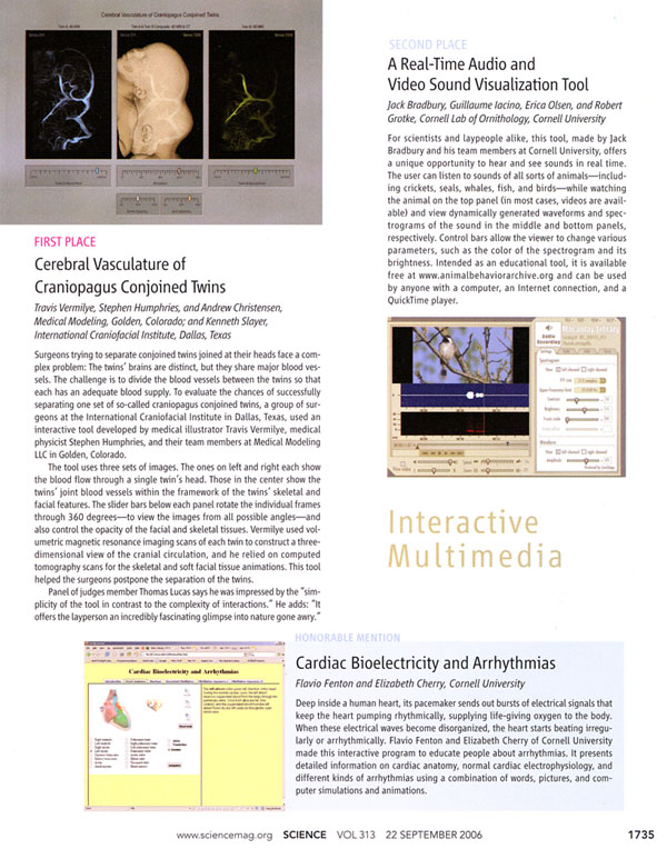 Further information on the Science project is available at www.sciencemag.org/sciext/vis2006
What, then, is the state of scientific visualization on the basis of the Science report?
Further information on the Science project is available at www.sciencemag.org/sciext/vis2006
What, then, is the state of scientific visualization on the basis of the Science report?
My discussion above deliberately concluded with a brilliant visualization of scientific data by William Cleveland, which indicated how new findings could be achieved by thoughtful visualization.
One look at the current state of the art in scientific visualization was published recently in Science 313 (22 September 2006), 1729-1735:
Further information on the Science project is available at www.sciencemag.org/sciext/vis2006
What, then, is the state of scientific visualization on the basis of the Science report?Art Theorists Speak Out Cartoonishly
Here's a small collection of art cartoons revolving around various visits, by sheep and by riggers, to my sculptures.
First, some play with windy verbalizing Art Theorists, who see with predetermined words rather than with open eyes and open minds:
THE ART THEORY OF JOSEPH KOSUTH

Forecasting oil resources
In 1974 the Federal Energy Administration asked 4 statisticians to provide independent estimates of the amount of oil still underground. The four groups worked completely independently; I found out the names of the other three groups long after the reports were filed. The results, as I recall, were one very low forecast, one very high forecast, and two skeptical reports (including mine) in effect saying the error bound around the forecasts covered all reasonable policy alternatives. Thus the collective result confirmed the views of the two skeptical reports!
Here is my analysis: Forecasting Oil resources.
Perhaps this should have appeared as a short case study in Beautiful Evidence, but the idea never occurred to me.
What about now, 36 years later? My skepticism about resource forecasts might be confirmed or might not by a fresh analysis, which would reveal what a fresh analysis of the evidence would reveal. In policy relevant studies of evidence, there is too often a rage to conclude. On this see Beautiful Evidence pp. 154-155:

"Public art"
Metaphors, analogies, thought mappings
Roald Hoffmann has a fine essay in the recent American Scientist on metaphors, which he describes at one point as "thought mappings."
Hoffmann suggests that metaphors may be at times useful for (1) explaining technical results to a general audience and (2) achieving and understanding technical results.
In my work, the thought mapping "data graphics should operate at the same resolution as typography" (more generally: data graphics ~ words) was most helpful in creating and justifying sparklines. This mapping provided direct advice about the design of data graphics, and it also had a sustained quality since it carried through to ideas that sparklines could appear wherever words (and numbers) appear and that paragraphs of sparklines should be constructed. There is certainly something of an after-the-fact quality to some of this, and the mapping (data graphic ~word) has its rhetorical as well as technical value in writing about sparklines.
Of course loose or strained metaphors notoriously produce loose thinking. "When a precise narrowly focused technical idea becomes metaphor and sprawls globally, its credibility must be earned afresh locally by means of specific evidence demonstrating the relevance and explanatory power of the idea in its new application. It is not enough for presenters to make ever-bolder puns, as meaning drifts into duplicity. Something has to be explained." (Beautiful Evidence, p. 151).
A good way for contributors to develop this thread would be to provide examples of specific metaphors that work in the sense that they have some explanatory power. Merely descriptive metaphors--such as the "tree of life" in evolution or the "hockey stick" in global warming time-series or, for that matter, "sparklines"--do not deepen substantive technical thought. Indeed descriptive metaphors may impede such thought. So let us look for some good explanatory metaphors. There needs to be some precision here lest all thought simply becomes defined as thought mappings.
Evidence presentations: At the leading edge of serious practice
This thread will discuss high-level, intense, serious, non-routine evidence presentations. Our first three examples are from Nature and from the Enron trial.
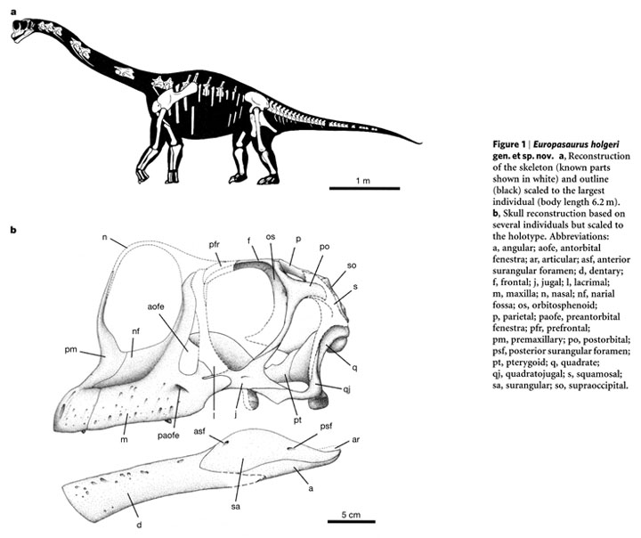 P. Martin Sander, Octávo Mateus, Thomas Laven, Nils Knötschke, "Bone histology indicates insular dwarfism in a new Late Jurassic sauropod dinosaur," Nature, 441 (2006 June 8), 739-741.
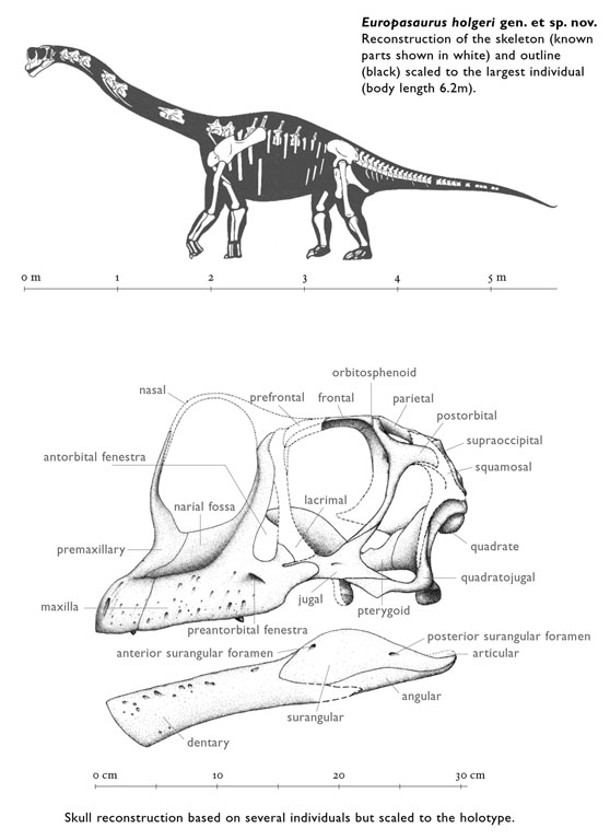
Then below, my redesigned illustrations eliminate the captions by building them into the illustration (why go to a special separate place on the page for words?), use direct labels to avoid the stupid and inconvenient letter code, eliminate the codes for names the illustrations, gray down certain elements to create a cartographic layering effect, fix the typography, and enhance the scales of measurement. The idea is to treat annotated illustrations as paragraphs of evidence, not as special occasions to segregate evidence by the mode of production. These changes took about an hour in Photoshop and Quark.
P. Martin Sander, Octávo Mateus, Thomas Laven, Nils Knötschke, "Bone histology indicates insular dwarfism in a new Late Jurassic sauropod dinosaur," Nature, 441 (2006 June 8), 739-741.
Then below, my redesigned illustrations eliminate the captions by building them into the illustration (why go to a special separate place on the page for words?), use direct labels to avoid the stupid and inconvenient letter code, eliminate the codes for names the illustrations, gray down certain elements to create a cartographic layering effect, fix the typography, and enhance the scales of measurement. The idea is to treat annotated illustrations as paragraphs of evidence, not as special occasions to segregate evidence by the mode of production. These changes took about an hour in Photoshop and Quark.
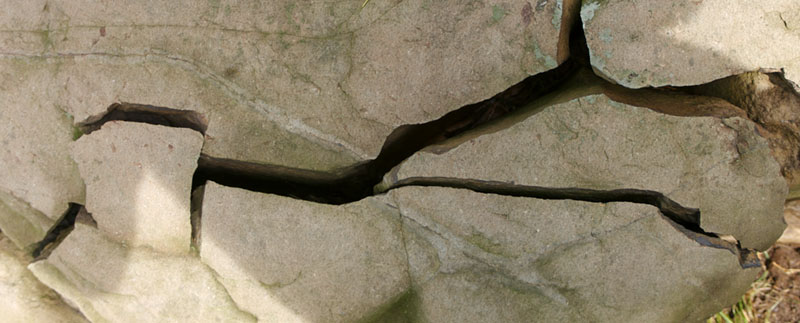
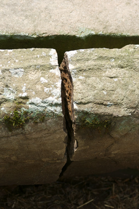
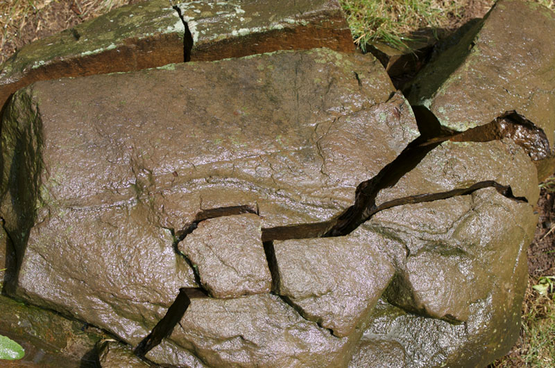
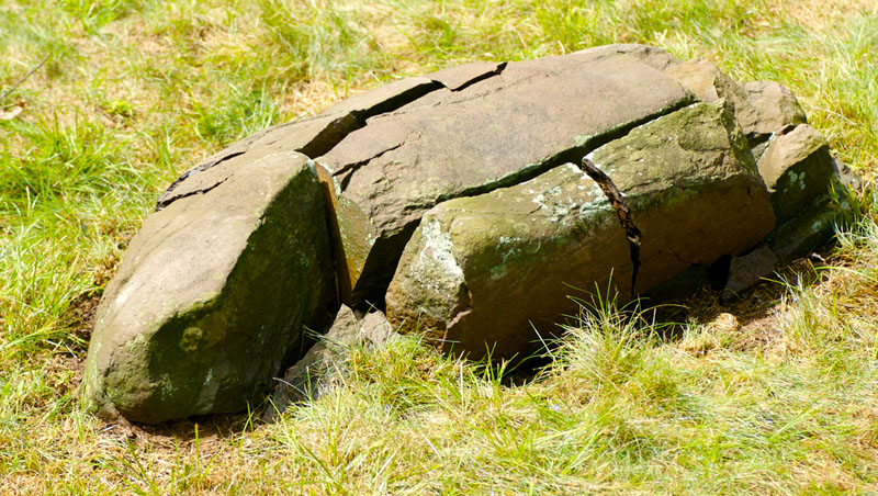
Organized stones in nature and architecture (puzzle stones)
A few days ago Richard Rhodes of Rhodes Architectural Stone visited and showed a draft of his intriguing book on architectural stone. The book is filled with excellent medium-format photographs of antique stone structures (some of the photographs can be seen at the link above).
His photographs suggest that some constructed stone patterns resemble natural stone patterns such as strata and organized fragmentation. Over the years of walking around our land, we have accumulated a big collection of "puzzle stones" (our household name for fragmented and sometimes slightly separated layers of stone scattered around a bit that then are discovered and fit together in a 3-dimensional puzzle.) There came a time when there were so many puzzle stones around the house that I banished the whole lot of them to a little screen house shack by the pond.
Below are some pictures of a big complex puzzle stone, which, had it been constructed, would appear to be perfectly fitted.
Architectural stone is often photographed straight on in order to reveal the flat geometric pattern in stone positions, the 2D surface map. But it also helpful to see fitted stones at an angle and under raking light so as to reveal the depth and darkness of the gaps, and to intensify the 3-dimensionality that makes old architectural stones so wonderful.
The indented path cut in the stone, visible in the second and fourth images, might be a pre-columbian map of a river or, more likely, a deliberate scratch made by a tooth of a backhoe bucket. The puzzle stone documented below turns into a happy sleeping turtle at the end.