Warning: Trying to access array offset on value of type bool in /nas/content/live/graphicspress/wp-content/themes/edwardtufte/archive.php on line 21
Measuring website traffic
Peter Edmonston of The New York Times has an interesting article about how Forbes.com apparently exaggerates the number of unique visitors to the website.
During the dot-bomb times, advertised measures of website activities were bizarrely corrupt. A few years ago NASA (and its then-director) reported that their website during a Mars visit had more "hits" than there are people on Earth.
I gather that "unique visitors" and "pageviews" provide some reasonable measures of website traffic. But the time period for measuring "unique" should be specified, such as unique visitors each day. (Is that what "unique" usually means?) For smaller websites, "pageviews" are substantially inflated by search engine crawlers; our site often gets 1,400 pageviews per day from Google alone and a good many spurious pageviews from spammers, email-address harvesters, and the like. It's just computers talking to other computers, not pageviews by a human.
Traffic measures can also be generated by user polling. I understand that Alexa provides estimates of traffic counts for many websites, but it fails to document that information concerning its biased methodology, which only polls nonrandomly selected users of Microsoft Windows.
Can our Kindly Contributors provide some authoritative information or links on this matter (especially from the point of view of data quality and data integrity)?
Warning: Undefined variable $count in /nas/content/live/graphicspress/wp-content/themes/edwardtufte/archive.php on line 24
Warning: Trying to access array offset on value of type bool in /nas/content/live/graphicspress/wp-content/themes/edwardtufte/archive.php on line 21
Lists: design and construction, by Edward Tufte
Evelyn Waugh famously built long descriptive lists into sentences by separating list elements with semi-colons.
From Waugh's Scoop (1937), my favorite novel:
 My chapter in Beautiful Evidence, "The Cognitive Style of PowerPoint: Pitching Out Corrupts Within," discusses hierarchical lists and suggests that the hierarchical bullet lists of PowerPoint too often replaces the miracle of the sentence with the grunt of the bullet-point list:
 Web design: Lists, not slideshows, not clickdowns, not deep hierarchies
Lists should be distributed over space as much as possible information resolution of the display: the greater the spatial resolution, the lesser the temporal stacking. And the less temporal stacking, the better. Information wants to be spatially adjacent so as facilitate comparisons made within the common eyespan of the viewer.
Here is wonderful analysis by Jonah Peretti, CEO of BuzzFeed:
"Respecting our Readers
We care about the experience of people who read BuzzFeed and we don't try to trick them for short term gain. This approach is surprisingly rare.
How does this matter in practice? First of all, we don't publish slideshows. Instead we publish scrollable lists so readers don't have to click a million times and can easily scroll through a post. The primary reason to publish slideshows, as far as I can tell, is to juice page views and banner ad impressions. Slideshows are super annoying and lists are awesome so we do lists!
For the same reason, we don't show crappy display ads and we make all our revenue from social advertising that users love and share. We never launched one of those "frictionless sharing" apps on Facebook that automatically shares the stories you click because those apps are super annoying. We don't post deceptive, manipulative headlines that trick people into reading a story. We don't focus on SEO or gaming search engines or filling our pages with millions of keywords and tags that only a robot will read. We avoid anything that is bad for our readers and can only be justified by short term business interests." [full email]
Contrast the BuzzFeed approach with the Rolling Stone magazine list of the 500 greatest songs ever. To see the complete list requires 500 separate clickdowns! Each clickdown shows a single song and its one tiny paragraph-description.
The RS 500 is an unusable list and cynical presentation.
Superb outdoor list: Vietnam Veterans Memorial
From Edward Tufte, Envisioning Information, 43-44:
Web design: Lists, not slideshows, not clickdowns, not deep hierarchies
Lists should be distributed over space as much as possible information resolution of the display: the greater the spatial resolution, the lesser the temporal stacking. And the less temporal stacking, the better. Information wants to be spatially adjacent so as facilitate comparisons made within the common eyespan of the viewer.
Here is wonderful analysis by Jonah Peretti, CEO of BuzzFeed:
"Respecting our Readers
We care about the experience of people who read BuzzFeed and we don't try to trick them for short term gain. This approach is surprisingly rare.
How does this matter in practice? First of all, we don't publish slideshows. Instead we publish scrollable lists so readers don't have to click a million times and can easily scroll through a post. The primary reason to publish slideshows, as far as I can tell, is to juice page views and banner ad impressions. Slideshows are super annoying and lists are awesome so we do lists!
For the same reason, we don't show crappy display ads and we make all our revenue from social advertising that users love and share. We never launched one of those "frictionless sharing" apps on Facebook that automatically shares the stories you click because those apps are super annoying. We don't post deceptive, manipulative headlines that trick people into reading a story. We don't focus on SEO or gaming search engines or filling our pages with millions of keywords and tags that only a robot will read. We avoid anything that is bad for our readers and can only be justified by short term business interests." [full email]
Contrast the BuzzFeed approach with the Rolling Stone magazine list of the 500 greatest songs ever. To see the complete list requires 500 separate clickdowns! Each clickdown shows a single song and its one tiny paragraph-description.
The RS 500 is an unusable list and cynical presentation.
Superb outdoor list: Vietnam Veterans Memorial
From Edward Tufte, Envisioning Information, 43-44:

 Richard Serra's famous list of mostly verbs and some nouns is the to-do list of a great sculptor.
The list is notable for its richness, intensity, and long time-horizon.
It also includes one of my favorite ideas: simultaneity.
Makers and viewers of lists should reflect on the time domain of lists:
From what period of time were the list elements collected?
Is there a time-sequence to items listed? Should there be?
What period of time does the list itself cover?
Richard Serra's famous list of mostly verbs and some nouns is the to-do list of a great sculptor.
The list is notable for its richness, intensity, and long time-horizon.
It also includes one of my favorite ideas: simultaneity.
Makers and viewers of lists should reflect on the time domain of lists:
From what period of time were the list elements collected?
Is there a time-sequence to items listed? Should there be?
What period of time does the list itself cover?
 Example provided by Niels Olson
My chapter in Beautiful Evidence, "The Cognitive Style of PowerPoint: Pitching Out Corrupts Within," discusses hierarchical lists and suggests that the hierarchical bullet lists of PowerPoint too often replaces the miracle of the sentence with the grunt of the bullet-point list:
Web design: Lists, not slideshows, not clickdowns, not deep hierarchies
Lists should be distributed over space as much as possible information resolution of the display: the greater the spatial resolution, the lesser the temporal stacking. And the less temporal stacking, the better. Information wants to be spatially adjacent so as facilitate comparisons made within the common eyespan of the viewer.
Here is wonderful analysis by Jonah Peretti, CEO of BuzzFeed:
"Respecting our Readers
We care about the experience of people who read BuzzFeed and we don't try to trick them for short term gain. This approach is surprisingly rare.
How does this matter in practice? First of all, we don't publish slideshows. Instead we publish scrollable lists so readers don't have to click a million times and can easily scroll through a post. The primary reason to publish slideshows, as far as I can tell, is to juice page views and banner ad impressions. Slideshows are super annoying and lists are awesome so we do lists!
For the same reason, we don't show crappy display ads and we make all our revenue from social advertising that users love and share. We never launched one of those "frictionless sharing" apps on Facebook that automatically shares the stories you click because those apps are super annoying. We don't post deceptive, manipulative headlines that trick people into reading a story. We don't focus on SEO or gaming search engines or filling our pages with millions of keywords and tags that only a robot will read. We avoid anything that is bad for our readers and can only be justified by short term business interests." [full email]
Contrast the BuzzFeed approach with the Rolling Stone magazine list of the 500 greatest songs ever. To see the complete list requires 500 separate clickdowns! Each clickdown shows a single song and its one tiny paragraph-description.
The RS 500 is an unusable list and cynical presentation.
Superb outdoor list: Vietnam Veterans Memorial
From Edward Tufte, Envisioning Information, 43-44:
Serious lists: patient gives doctor (and everyone else involved) a problem list
ET's proposal for medical patient lists: There are empirical studies of doctor-patient interactions. An early study reported that doctors on average made their first interruption after the patient had talked for 18 seconds. This 18-second finding produced appropriate consternation hand-wringing, and medical schools began to teach doctors to listen, listen, listen. Years later, the study was redone; the first interruption now came after 23 seconds! Here is a straightforward way to improve doctor-patient communication. In advance of the meeting, the patient prepares a list of all the issues (not "complaints" as the medical world sometimes describes patients' problems) to be covered at appointment with the doctor. This list should include causal speculations by the patient: "This pain on my right side might be a gall bladder issue. A grandparent and my father had gall bladder problems around my age." The patient should make several copies of this list-agenda paper and bring them to the appointment. At the beginning of the meeting, the patient hands a doctor a copy of the list. The doctor, who did not get to be a doctor by being a slow reader, can read about 3 times faster than the patient can talk. Doctor's read such problem lists all the time in medical records. After handing the agenda-list over, the patient should look down at her/his own copy, hinting that it is time to start reading. Or perhaps saying, "Here it all is, read this." This may finesse a little joke by the doctor, "So, what's with the paper dress?" (as a New Yorker cartoon had it). The list gets everything the patient initially has to say out on the table, without interruption. As the appointment continues, the list sets an agenda and a schedule for the allocation of time during the meeting. It also helps to make sure that the patient does not abandon lower-level issues that should be discussed--because there the issues are, already written out. Each item on the list is, in effect, checked off as the appointment moves along. Perhaps the patient should even ostentatiously check off the first point on the list after it is discussed to indicate that this list is what we're going to march through. The idea is that the doctor is not only going to be looking at the computer and at the patient, but also at the list. Because the patient keeps looking at the list. The patient should bring several copies to the list to the appointment, since the patient may see several medical staff members during the appointment. Each medical person gets the agenda-list. For example, my doctor often has a medical student in training who handles the initial discussion and who then goes off to describe the situation to the doctor, who shows up later. Both the student and the doctor get copies of the agenda list. Multiple copies are particularly effective in the emergency room (if it is possible to prepare a list before going to the ER!), since the patient will surely see a good many medical staff members at the emergency room (especially at hospitals affiliated with medical schools). The list-agenda enhances the efficiency, accuracy, and throughput of information presented by the patient. It also helps reduce socially or situationally-determined answers to the doctor's questions; instead the patient information has already been prepared in advance, free of social pressure. This list goes into the patient file and also assists the doctor in preparing notes for the patient record. Someday the patient will provide the list via email in advance of the appointment; even so, the patient should still bring paper copies to the appointment itself. Perhaps now and then such an agenda-list will even improve the effectiveness of medical care. Lists used by patients to inform doctors are discussed in our thread Medical information exchange: The patient, doctor, computer triangle.List-making assumptions revealed by Borges animals list
Here is the list of animals by Jorge Luis Borges from a "certain [no doubt mythical] Chinese encyclopedia": those that belong to the Emperor, embalmed ones, those that are trained, suckling pigs, mermaids, fabulous ones, stray dogs, those included in the present classification, those that tremble as if they were mad, innumerable ones, those drawn with a very fine camelhair brush, others, those that have just broken a flower vase, those that from a long way off look like flies. Borges' animals list reveals and contradicts the logical underpinnings of conventional lists. Borges' list cleverly points to, and breaks, the assumption in most lists that the elements have a good deal in common. Most lists implicitly delimit the eligible scope of elements, and many fail to tell readers what that scope might be, a failure in domain specification. Thus alert readers might ask about lists: What elements were considered and left out? What is the domain specification of this particular list? How would the list differ if the domain specification shifted? If we were make this list on our own, without knowledge of the presenter's list, what would our list look like? If our opponent were to make such a list, what would it look like?Richard Serra's intense to-do list
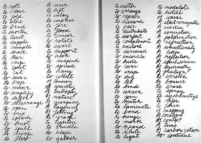
Richard Serra's famous list of mostly verbs and some nouns is the to-do list of a great sculptor.
The list is notable for its richness, intensity, and long time-horizon.
It also includes one of my favorite ideas: simultaneity.
Makers and viewers of lists should reflect on the time domain of lists:
From what period of time were the list elements collected?
Is there a time-sequence to items listed? Should there be?
What period of time does the list itself cover?
"The top ten"? When? Where? For how long? 1week? 10 years? "The best ever"? You examined forever? Your comparison set was for all time?All-purpose time-domain rejoinders to lists of inventions:
"Wasn't that done 500 years earlier in China?" "Didn't Leonardo da Vinci do that in 1506?" "Japanese cellphones had that 6 years ago."Serra image source: http://www.ubu.com/concept/serra_verb.html
Serious lists: aviation checklists
Philip Greenspun on aviation checklists:"Aviation is replete with checklists. One thing that you will never see in an aviation checklist is a bullet. Each item on a checklist is one line, typically challenge/response, e.g., "Thrust Reversers......Armed". Perhaps on one checklist out of 10 there will be an item that is a bit too long to fit on one line in a column. The continuation of the line will be indicated by whitespace underneath the challenge portion of the line and the continuation of the response underneath the first part of the response. If aviation can have tens of thousands of lists and no bullets, how come PowerPoint presentations can't survive without bullets? Bullets are essential when you can't summon the discipline to make each item roughly the same length, or at least make each item fit on one line. How are checklists used in a two-pilot airplane? The first kind of checklist is read silently by a pilot who is preparing part of the airplane while the co-pilot is off doing something else. This checklist is designed simply to remind the pilot to do everything necessary. The second kind of checklist is read aloud by one of the two pilots, e.g., the climb checklist (gear up; flaps up; thrust reversers off; ...). This not only reminds the pilot of stuff that he or she may have forgotten but gives the co-pilot assurance that important tasks have been accomplished. The third kind of checklist is read aloud by the two pilots as a team. For each line pilot reads the challenge item and one reads the respond item. This is done when you want to be absolutely sure that both pilots are paying attention. The before landing checklist is done this way: "Landing Gear: DOWN; Flaps: SET 45, INDICATING 45; Thrust Reversers: ARMED" (lower case read by pilot monitoring; UPPER CASE read by pilot flying (in airline operations these roles are swapped on every leg by the captain and first officer)). Checklists are so important in airline operations that all checklists are run all the time, e.g., if an airliner were doing a simple takeoff and left turn around the pattern to land again, possibly for a maintenance check, the pilots would do lineup, climb, 10,000', cruise, descent, approach, and landing checklists. This despite the fact that the airplane was never up to 10,000', was never in cruise flight, never descended except from 1,500' to the runway, and did not do an instrument approach."
Serious lists: ICU checklists
Peter Pronovost's lists for intensive care: "The Checklist: If something so simple can transform intensive care, what else can it do?" by Atul Gawande[excerpt] Here, then, is the puzzle of I.C.U. care: you have a desperately sick patient, and in order to have a chance of saving him you have to make sure that a hundred and seventy-eight daily tasks are done right--despite some monitor's alarm going off for God knows what reason, despite the patient in the next bed crashing, despite a nurse poking his head around the curtain to ask whether someone could help "get this lady's chest open." So how do you actually manage all this complexity? The solution that the medical profession has favored is specialization. I tell DeFilippo's story, for instance, as if I were the one tending to him hour by hour. But that was actually Max Weinmann, an intensivist (as intensive-care specialists like to be called). I want to think that, as a general surgeon, I can handle most clinical situations. But, as the intricacies involved in intensive care have mounted, responsibility has increasingly shifted to super-specialists like him. In the past decade, training programs focussed on critical care have opened in every major American city, and half of I.C.U.s now rely on super-specialists. Expertise is the mantra of modern medicine. In the early twentieth century, you needed only a high-school diploma and a one-year medical degree to practice medicine. By the century's end, all doctors had to have a college degree, a four-year medical degree, and an additional three to seven years of residency training in an individual field of practice--pediatrics, surgery, neurology, or the like. Already, though, this level of preparation has seemed inadequate to the new complexity of medicine. After their residencies, most young doctors today are going on to do fellowships, adding one to three further years of training in, say, laparoscopic surgery, or pediatric metabolic disorders, or breast radiology--or critical care. A young doctor is not so young nowadays; you typically don't start in independent practice until your mid-thirties. We now live in the era of the super-specialist--of clinicians who have taken the time to practice at one narrow thing until they can do it better than anyone who hasn't. Super-specialists have two advantages over ordinary specialists: greater knowledge of the details that matter and an ability to handle the complexities of the job. There are degrees of complexity, though, and intensive-care medicine has grown so far beyond ordinary complexity that avoiding daily mistakes is proving impossible even for our super-specialists. The I.C.U., with its spectacular successes and frequent failures, therefore poses a distinctive challenge: what do you do when expertise is not enough? On October 30, 1935, at Wright Air Field in Dayton, Ohio, the U.S. Army Air Corps held a flight competition for airplane manufacturers vying to build its next-generation long-range bomber. It wasn't supposed to be much of a competition. In early evaluations, the Boeing Corporation's gleaming aluminum-alloy Model 299 had trounced the designs of Martin and Douglas. Boeing's plane could carry five times as many bombs as the Army had requested; it could fly faster than previous bombers, and almost twice as far. A Seattle newspaperman who had glimpsed the plane called it the "flying fortress," and the name stuck. The flight "competition," according to the military historian Phillip Meilinger, was regarded as a mere formality. The Army planned to order at least sixty-five of the aircraft. A small crowd of Army brass and manufacturing executives watched as the Model 299 test plane taxied onto the runway. It was sleek and impressive, with a hundred-and-three-foot wingspan and four engines jutting out from the wings, rather than the usual two. The plane roared down the tarmac, lifted off smoothly, and climbed sharply to three hundred feet. Then it stalled, turned on one wing, and crashed in a fiery explosion. Two of the five crew members died, including the pilot, Major Ployer P. Hill. An investigation revealed that nothing mechanical had gone wrong. The crash had been due to "pilot error," the report said. Substantially more complex than previous aircraft, the new plane required the pilot to attend to the four engines, a retractable landing gear, new wing flaps, electric trim tabs that needed adjustment to maintain control at different airspeeds, and constant-speed propellers whose pitch had to be regulated with hydraulic controls, among other features. While doing all this, Hill had forgotten to release a new locking mechanism on the elevator and rudder controls. The Boeing model was deemed, as a newspaper put it, "too much airplane for one man to fly." The Army Air Corps declared Douglas's smaller design the winner. Boeing nearly went bankrupt. Still, the Army purchased a few aircraft from Boeing as test planes, and some insiders remained convinced that the aircraft was flyable. So a group of test pilots got together and considered what to do. They could have required Model 299 pilots to undergo more training. But it was hard to imagine having more experience and expertise than Major Hill, who had been the U.S. Army Air Corps' chief of flight testing. Instead, they came up with an ingeniously simple approach: they created a pilot's checklist, with step-by-step checks for takeoff, flight, landing, and taxiing. Its mere existence indicated how far aeronautics had advanced. In the early years of flight, getting an aircraft into the air might have been nerve-racking, but it was hardly complex. Using a checklist for takeoff would no more have occurred to a pilot than to a driver backing a car out of the garage. But this new plane was too complicated to be left to the memory of any pilot, however expert. With the checklist in hand, the pilots went on to fly the Model 299 a total of 1.8 million miles without one accident. The Army ultimately ordered almost thirteen thousand of the aircraft, which it dubbed the B-17. And, because flying the behemoth was now possible, the Army gained a decisive air advantage in the Second World War which enabled its devastating bombing campaign across Nazi Germany. Medicine today has entered its B-17 phase. Substantial parts of what hospitals do--most notably, intensive care--are now too complex for clinicians to carry them out reliably from memory alone. I.C.U. life support has become too much medicine for one person to fly. Yet it's far from obvious that something as simple as a checklist could be of much help in medical care. Sick people are phenomenally more various than airplanes. A study of forty-one thousand trauma patients--just trauma patients--found that they had 1,224 different injury-related diagnoses in 32,261 unique combinations for teams to attend to. That's like having 32,261 kinds of airplane to land. Mapping out the proper steps for each is not possible, and physicians have been skeptical that a piece of paper with a bunch of little boxes would improve matters much. In 2001, though, a critical-care specialist at Johns Hopkins Hospital named Peter Pronovost decided to give it a try. He didn't attempt to make the checklist cover everything; he designed it to tackle just one problem, the one that nearly killed Anthony DeFilippo: line infections. On a sheet of plain paper, he plotted out the steps to take in order to avoid infections when putting a line in. Doctors are supposed to (1) wash their hands with soap, (2) clean the patient's skin with chlorhexidine antiseptic, (3) put sterile drapes over the entire patient, (4) wear a sterile mask, hat, gown, and gloves, and (5) put a sterile dressing over the catheter site once the line is in. Check, check, check, check, check. These steps are no-brainers; they have been known and taught for years. So it seemed silly to make a checklist just for them. Still, Pronovost asked the nurses in his I.C.U. to observe the doctors for a month as they put lines into patients, and record how often they completed each step. In more than a third of patients, they skipped at least one. The next month, he and his team persuaded the hospital administration to authorize nurses to stop doctors if they saw them skipping a step on the checklist; nurses were also to ask them each day whether any lines ought to be removed, so as not to leave them in longer than necessary. This was revolutionary. Nurses have always had their ways of nudging a doctor into doing the right thing, ranging from the gentle reminder ("Um, did you forget to put on your mask, doctor?") to more forceful methods (I've had a nurse bodycheck me when she thought I hadn't put enough drapes on a patient). But many nurses aren't sure whether this is their place, or whether a given step is worth a confrontation. (Does it really matter whether a patient's legs are draped for a line going into the chest?) The new rule made it clear: if doctors didn't follow every step on the checklist, the nurses would have backup from the administration to intervene. Pronovost and his colleagues monitored what happened for a year afterward. The results were so dramatic that they weren't sure whether to believe them: the ten-day line-infection rate went from eleven per cent to zero. So they followed patients for fifteen more months. Only two line infections occurred during the entire period. They calculated that, in this one hospital, the checklist had prevented forty-three infections and eight deaths, and saved two million dollars in costs. Pronovost recruited some more colleagues, and they made some more checklists. One aimed to insure that nurses observe patients for pain at least once every four hours and provide timely pain medication. This reduced the likelihood of a patient's experiencing untreated pain from forty-one per cent to three per cent. They tested a checklist for patients on mechanical ventilation, making sure that, for instance, the head of each patient's bed was propped up at least thirty degrees so that oral secretions couldn't go into the windpipe, and antacid medication was given to prevent stomach ulcers. The proportion of patients who didn't receive the recommended care dropped from seventy per cent to four per cent; the occurrence of pneumonias fell by a quarter; and twenty-one fewer patients died than in the previous year. The researchers found that simply having the doctors and nurses in the I.C.U. make their own checklists for what they thought should be done each day improved the consistency of care to the point that, within a few weeks, the average length of patient stay in intensive care dropped by half. The checklists provided two main benefits, Pronovost observed. First, they helped with memory recall, especially with mundane matters that are easily overlooked in patients undergoing more drastic events. (When you're worrying about what treatment to give a woman who won't stop seizing, it's hard to remember to make sure that the head of her bed is in the right position.) A second effect was to make explicit the minimum, expected steps in complex processes. Pronovost was surprised to discover how often even experienced personnel failed to grasp the importance of certain precautions. In a survey of I.C.U. staff taken before introducing the ventilator checklists, he found that half hadn't realized that there was evidence strongly supporting giving ventilated patients antacid medication. Checklists established a higher standard of baseline performance.
Tendentious, commercialized, and stupid lists
As Google search-results lists are manipulated by search engine optimization, astroturfers, and by the search engines themselves, so are many many top ten lists are governed by pop culture fans or gamed by thuggish or biased opportunists. Wouldn't it be good to have a search engine whose first-page results list was curated, ungamed, governed by some intellectual decent values--a search engine that didn't try to its users into its product? The "wisdom of crowds" is too often the tyranny and stupidity of the mob. I like top 10 lists, but only from trusted and known sources, such as quirky intellectuals and Consumer Reports. Thus viewers of lists constantly need to assess the credibility, intelligence, and interests of the list-maker. An excellent article on top ten lists and their problems: Nick Bilton, "Disruptions: Top 10 Lists Lead to Less Choice on the Web," The New York Times, points out the narrowing that results from top 10 lists, at least those not from trusted sources.The digital age has us living in a perpetual and pervasive popularity contest. Leader boards, top 10 lists, most-liked posts and most-clicked search results define what is successful in business and culture. Amazon's lists of the top-selling electronics, top-selling books, or top-selling electronic books, each with subcategories, tell us what to buy. The top choices of a Google results list are the ones we click on, never the ones at the bottom of the page. Being at the top of these lists can generate substantial windfalls. The iTunes App Store, where apps like Angry Birds, Words With Friends and Pages have spent months at the top of the charts, help the app makers collect hundreds of thousands of dollars in revenue, while those who cannot get that visibility founder in obscurity. "In some ways, the growth of the Internet has forced companies to create filters that help you locate and correlate things you need; lists are the perfect filter for that," said Matthew O. Jackson, an economist at Stanford who studies social networks and game theory. "But, being 11th on a top 10 list on the app store is a lot different than being 10th on that list." Once at the very top of those iTunes charts, it takes a long time to fall off. And with good reason. Would you rather sift through 600,000 apps in the App Store or quickly browse the top 25 list? "We have run into the filter bubble issue, which is a homogenization of culture," said Clay Johnson, author of "The Information Diet," a new book that argues that consumers should take responsibility for the information they seek and consume online. There are plenty of other games besides Angry Birds, he says, but you wouldn't know it from looking at Apple's charts. "Your clicks have consequences. With every action you take online, you're not just consuming, you're voting, too."
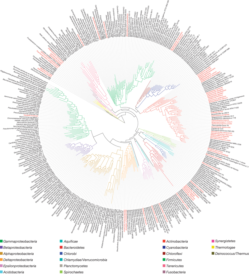
Lists in Real Science
Lists in real science (and therefore based on the forever universal laws of Nature) can be luscious, hundreds of times larger and more complex than short-attention-span lists designed by commercial artists. The best visualizations of all are often best visualizations constructed by first-rate scientists publishing in major scientific journals. From D Wu, P Hugenholtz, et al. A phylogeny-driven genomic encyclopaedia of Bacteria and Archaea Nature 462, 1056-1060(24 December 2009). The red ones have been adopted for sequencing by the GEBA project. More on the GEBA project here
Example provided by Niels OlsonHogpen Hill #1: sculpture installed August 2006
We completed the installation of Hogpen Hill #1 in August 2006.
The piece is stainless steel, 24 feet high, with a weight of about 4,900 pounds.
It was sketched out and mostly constructed during the spring of 2005, then temporarily installed and studied during the next 10 months, and then positioned in its final location. The final location is called Cove 2, which is surrounded by trees and a stone embankment.
(Millstone 8 was installed in nearby Cove 1.) Cove 2 required several months preparation: cleaning up, regrading, contouring, and planting grass.
The gray and rainy weather provided a good soft light. Photographs with the butter light of sunrise and sunset will provide very different views, since the sculpture borrows light.
A history of constructing the piece is at our thread The Levitating Sculpture (and also sculpture theory and practice).


 As usual Zerlina (left) and Anna provide scale information; Hogpen Hill #1 is approximately 9 Golden Retrievers tall.
In this picture with the dogs, a Necker Illusion is generated by reading the center vertical of the piece as either coming forward or receding.
As usual Zerlina (left) and Anna provide scale information; Hogpen Hill #1 is approximately 9 Golden Retrievers tall.
In this picture with the dogs, a Necker Illusion is generated by reading the center vertical of the piece as either coming forward or receding.
As usual Zerlina (left) and Anna provide scale information; Hogpen Hill #1 is approximately 9 Golden Retrievers tall.
In this picture with the dogs, a Necker Illusion is generated by reading the center vertical of the piece as either coming forward or receding.Lousy PowerPoint presentations: The fault of PP users?
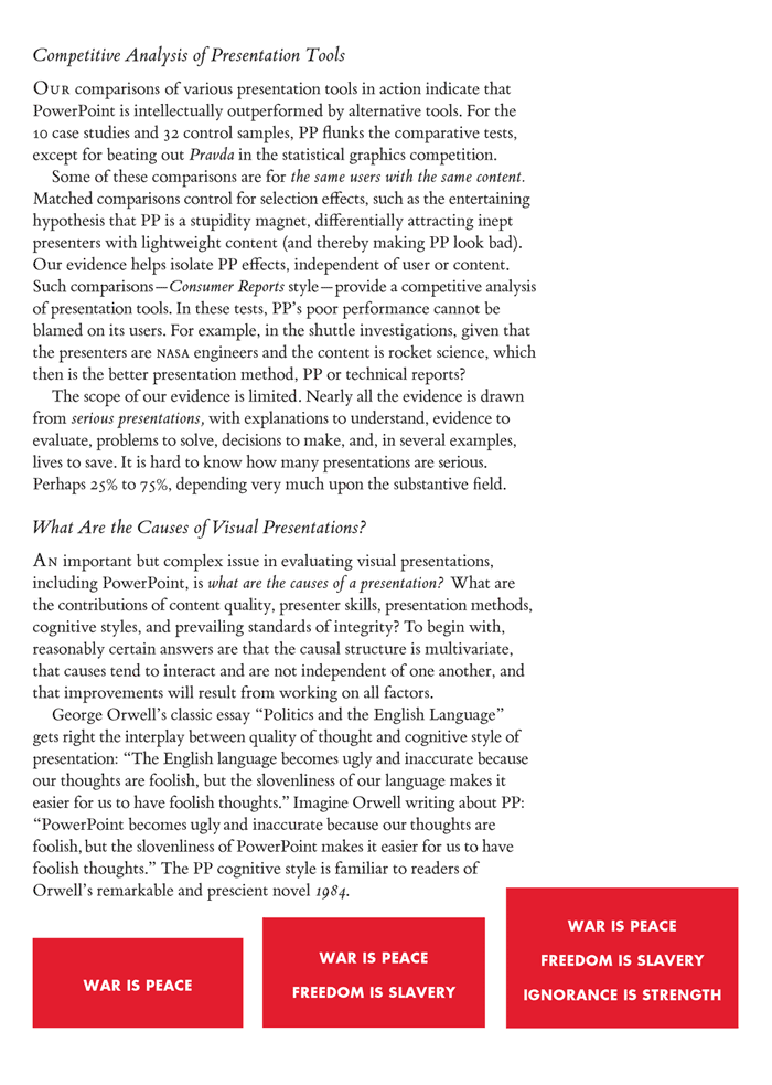
The common defense of bad PowerPoint presentations is that they are the "fault of the user, not the tool."
This point raised by PP advocates in fact provokes a rich and complex question about nearly any type of expressive performance: What are the causes of presentations?
Here are excerpts on these matters from my essay on PowerPoint:
The Vitality of Mythical Numbers
Max Singer published a classic article on policy-making numbers that over-reach and exaggerate the scope and urgency of the problems: "The Vitality of Mythical Numbers, Public Interest (Spring, 1971), 3-9.
For years in teaching evidence for policy-making at Princeton and Yale, I used this article as the first item on my reading list. The conclusion that a particular policy number over-reaches has of course to be earned by some relevant evidence (and not by the generality that policy numbers over-reach). Such evidence can sometimes come from simple calculations, approximations, and cross-checks, as Singer illustrates in his paper.
Journalists pick up, quote, and repeat scary numbers in faux-trend stories.
Edward Tufte
Here is Singer's classic article:
THE VITALITY OF MYTHICAL NUMBERS
by Max Singer
It is generally assumed that heroin addicts in New York City steal some two to five billion dollars worth of property a year, and commit approximately half of all the property crimes. Such estimates of addict crime are used by an organization like RAND, by a political figure like Howard Samuels, and even by the Attorney General of the United States. The estimate that half the property crimes are committed by addicts was originally attributed to a police official and has been used so often that it is now part of the common wisdom.
The amount of property stolen by addicts is usually estimated in something like the following manner:
There are 100,000 addicts with an average habit of $30.00 per day. This means addicts must have some $1.1 billion a year to pay for their heroin (100,000 x 365 x $30.00). Because the addict must sell the property he steals to a fence for only about a quarter of its value, or less, addicts must steal some $4 to $5 billion a year to pay for their heroin.
These calculations can be made with more or less sophistication. One can allow for the fact that the kind of addicts who make their living illegally typically spend upwards of a quarter of their time in jail, which would reduce the amount of crime by a quarter. (_The New York Times_ recently reported on the death of William "Donkey" Reilly. A 74-year-old ex-addict who had been addicted for 54 years, he had spent 30 of those years in prison.) Some of what the addict steals is cash, none of which has to go to a fence. A large part of the cost of heroin is paid for by dealing in the heroin business, rather than stealing from
society, and another large part by prostitution, including male addicts living off prostitutes. But no matter how carefully you slice it, if one tries to estimate the value of property stolen by addicts by assuming that there are 100,000 addicts and estimating what is the minimum amount they would have to steal to support themselves and their habits (after making generous estimates for legal income), one comes up with a number in the neighborhood of $1 billion a year for New York City.
But what happens if you approach the question from the other side? Suppose we ask, "How much property is stolen--by addicts or anyone else?" Addict theft must be less than total theft. What is the value of property stolen in New York City in any year? Somewhat surprisingly to me when I first asked, this turned out to be a difficult question to answer, even approximately. No one had any estimates that they had even the faintest confidence in, and the question doesn't seem to have been much asked. The amount of officially reported theft in New York City is approximately $300 million a year, of which about $100 million is the value of automobile theft (a crime that is rarely committed by addicts). But it is clear that there is a very large volume of crime that is not reported; for example, shoplifting is not normally reported to the police. (Much property loss to thieves is not reported to insurance companies either, and the insurance industry had no good estimate for total theft.)
It turns out, however, that if one is only asking a question like, "Is it possible that addicts stole $1 billion worth of property in New York City last year?" is relatively simple to estimate the amount of property stolen. It is clear that the two biggest components of addict theft are shoplifting and burglary. What _could_ the value of property shoplifted by addicts be? All retail sales in New York City are on the order of $15 billion a year. This includes automobiles, carpets, diamond rings, and other items not usually available to shoplifters. A reasonable number for inventory loss to retail establishments is 2%. This number includes management embezzlers, stealing by clerks, shipping departments, truckers, etc. (Department stores, particularly, have reported a large increase in shoplifting in recent years, but they are among the most vulnerable of retail establishments and not important enough to bring the overall rate much above 2%.) It is generally agreed that substantially more than half of the property missing from retail establishments is taken by employees, the remainder being lost to outside shoplifters. But let us credit shoplifters with stealing 1% of all the property sold at retail in New York City--this would be
about $150 million a year.
What about burglary? There are something like two and one-half million households in New York City. Suppose that on the average one out of five of them is robbed or burglarized every year. This takes into account that in some areas burglary is even more commonplace, and that some households are burglarized more than once a year. This would mean 500,000 burglaries a year. The average value of property taken in a burglary might be on the order of $200. In some burglaries, of course, much larger amounts of property are taken, but these higher value burglaries are much rarer, and often are committed by non-addict professional thieves. If we use the number of $200 x 500,000 burglaries, we get $100 million of property stolen from people's homes in a year in New York City.
Obviously, none of these estimated values is either sacred or substantiated. You can make your own estimate. The estimates here have the character that it would be very surprising if they were wrong by a factor of 10, and not very important for the conclusion if they were wrong by a factor of two. (This is a good position for an estimator to be in.)
Obviously not all addict theft is property taken from stores or from people's homes. One of the most feared types of addict crime is property taken from the persons of New Yorkers in muggings and other forms of robbery. We can estimate this, too. Suppose that on the average, one person in 10 has property taken from his person by muggers or robbers each year. That would be 800,000 such robberies, and if the average one produced $100 (which it is very unlikely to do), $8 million a year would be taken in this form of theft.
So we can see that if we credit addicts with _all_ of the shoplifting, _all_ of the theft from homes, and _all_ of the theft from persons, total property stolen by addicts in a year in New York City amounts to some $300 million. You can throw in all the "fudge factors" you want, add all the other miscellaneous crimes that addicts commit, but no matter what you do, it is difficult to find a basis for estimating that addicts steal over half a billion dollars per year, and a quarter billion looks like a better estimate, although perhaps on the high side. After all, there must be some thieves who are not addicts.
Thus, I believe we have shown that whereas it is widely assumed that addicts steal from $2 billion to $5 billion a year in New York City, the actual number is _ten_ times smaller, and that this can be demonstrated by five minutes of thought.[1] So what? A quarter billion dollars' worth of property is still a lot of property. It exceeds the amount of money spent annually on addict rehabilitation and other programs to prevent and control addiction. Furthermore, the value of the property stolen by addicts is a small part of the total cost to society of addict theft. A much larger cost is paid in fear, changed neighborhood atmosphere, the cost of precautions, and other echoing and re-echoing reactions to theft and its danger.
One point in this exercise in estimating the value of property stolen by addicts is to shed some light on people's attitudes toward numbers. People feel that there is a lot of addict crime, and that $2 billion is a large number, so they are inclined to believe that there is $2 billion worth of addict theft. But $250 million is a large number, too, and if our sense of perspective were not distorted by daily consciousness of federal expenditures, most people would be quite content to accept $250 million a year as a lot of theft.
Along the same lines, this exercise is another reminder that even responsible officials, responsible newspapers, and responsible research groups pick up and pass on as gospel numbers that have no real basis in fact. We are reminded by this experience that because an estimate has been used widely by a variety of people who should know what they are talking about, one cannot assume that the estimate is even approximately correct.
But there is a much more important implication of the fact that there cannot be nearly so much addict theft as people believe. This implication is that there probably cannot be as many addicts as people believe. Most of the money paid for heroin bought at retail comes from stealing, and most addicts buy at retail. Therefore, the number of addicts is basically--although imprecisely--limited by the amount of theft. (The estimate developed in a Hudson Institute study was that close to half of the volume of heroin consumed is used by people in the heroin distribution system who do not buy at retail, and do not pay with stolen property but with their "services" in the distribution system.[2]) But while the people in the business (at lower levels) consume close to half the heroin, they are only some one-sixth or one-seventh of the total number of addicts. They are the ones who can afford big habits.
The most popular, informal estimate of addicts in New York City is 100,000-plus (usually with an emphasis on the "plus"). The federal register in Washington lists some 30,000 addicts in New York City, and the New York City Department of Health's register of addicts' names lists some 70,000. While all the people on those lists are not still active addicts--many of them are dead or in prison--most people believe that there are many addicts who are not on any list. It is common to regard the estimate of 100,000 addicts in New York City as a very conservative one. Dr. Judianne Densen-Gerber was widely quoted in 1970 for her estimate that there would be over 100,000 teenage addicts by the end of the summer. And there are obviously many addicts of 20 years of age and more.[3]
In discussing the number of addicts in this article, we will be talking about the kind of person one thinks of when the term "addict" is used.[4] A better term might be "street addict." This is a person who normally uses heroin every day. He is the kind of person who looks and acts like the normal picture of an addict. We exclude here the people in the medical profession who are frequent users of heroin or other opiates, or are addicted to them, students who use heroin occasionally, wealthy people who are addicted but do not need to steal and do not frequent the normal addict hangouts, etc. When we are addressing the "addict problem," it is much less important that we include these cases; while they are undoubtedly problems in varying degrees, they are a very different type of problem than that posed by the typical
street addict.
The amount of property stolen by addicts suggests that the number of New York City street addicts may be more like 70,000 than 100,000, and almost certainly cannot be anything like the 200,000 number that is sometimes used. Several other simple ways of estimating the number of street addicts lead to a similar
conclusion.
Experience with the addict population has led observers to estimate that the average street addict spends a quarter to a third of his time in prison. (Some students of the subject, such as Edward Preble and John J. Casey, Jr., believe the average to be over 40%.) This would imply that at any one time, one-quarter to one-third of the addict population is in prison, and that the total addict population can be estimated by multiplying the number of addicts who are in prison by three or four. Of course the number of addicts who are in prison is not a known quantity (and, in fact, as we have indicated above, not even a very precise concept). However, one can make reasonable estimates of the number of addicts in prison (and for this purpose we can include the addicts in various involuntary treatment centers). This number is approximately 14,000-17,000, which is quite compatible with an estimate of 70,000 total New York City street addicts.
Another way of estimating the total number of street addicts in New York City is to use the demographic information that is available about the addict population. For example, we can be reasonable certain that some 25% of the street addict population in New York City is Puerto Rican, and some 50% are blacks. We know that approximately five out of six street addicts are male, and that 50% of the street addicts are between the ages of 16 and 25. This would mean that 20% of the total number of addicts are black males between the age of 16 and 25. If there were 70,000 addicts, this would mean that 14,000 blacks between the ages of 16 and 25 are addicts. But altogether there are only about 140,000 blacks between the ages of 16 and 25 in the city--perhaps half of them living in poverty areas. This means that if there are 70,000 addicts in the city, one in 10 black youths are addicts, and if there are 100,000 addicts, nearly one in six are, and if there are 200,000 addicts, one in three. You can decide for yourself which of these degrees of penetration of the young black male group is most believable, but it is rather clear that the number of 200,000 addicts is implausible. Similarly, the total of 70,000 street addicts would imply 7,000 young Puerto Rican males are addicted, and the total number of Puerto Rican boys between the ages of 17 and 25 in New York City is about 70,000.
None of the above calculations is meant in any way to downplay the importance of the problem of heroin addiction. Heroin is a terrible curse. When you think of the individual tragedy involved, 70,000 is an awfully large number of addicts. And if you have to work for a living, $250 million is an awful lot of money to have stolen from the citizens of the city to be transferred through the hands of addicts and fences into the pockets of those who import and distribute heroin, and those who take bribes or perform other services for the heroin industry.
The main point of this article may well be to illustrate how far one can go in bounding a problem by taking numbers seriously, seeing what they imply, checking various implications against each other and against general knowledge (such as the number of persons or households in the city). Small efforts in this direction can go a long way to help ordinary people and responsible officials to cope with experts of various kinds.
Notes
[1] Mythical numbers may be more mythical and have more vitality in the area of crime than in most areas. In the early 1950s the Kefauver Committee published a $20 billion estimate for the annual "take" of gambling in the United States. The figure actually was "picked from a hat." One staff member said: "We had no real idea of the money spent. The California Crime Commission said $12 billion. Virgil Petersen of Chicago said $30 billion. We picked $20 billion as the balance of the two."
An unusual example of a mythical number that had a vigorous life--the assertion that 28 Black Panthers had been murdered by police--is given a careful biography by Edward Jay Epstein in the February 13, 1971, _New Yorker_. (It turned out that there were 19 Panthers killed, ten of them by the police, and eight of these in situations where it seems likely that the Panthers took the initiative.)
[2] A parallel datum was developed in a later study by St. Luke's Hospital of 81 addicts--average age 34. More than one-half of the heroin consumed by these addicts, over a year, had been paid for by the sale of heroin. Incidentally, these 81 addicts had stolen an average of $9,000 worth of property in the previous year.
[3] Among other recent estimators we may note a Marxist, Sol Yurick, who gives us "500,000 junkies" (_Monthly Review_, December 1970), and William R. Corson, who contends, in the December 1970 _Penthouse_, that "today at least 2,500,000 black Americans are hooked on heroin."
[4] There is an interesting anomaly about the word "addict." Most people, if pressed for a definition of an "addict," would say he is a person who regularly takes heroin (or some such drug) and who, if he fails to get his regular dose of heroin, will have unpleasant or painful withdrawal symptoms. But this definition would not apply to a large part of what is generally recognized as the "addict population." In fact, it would not apply to most certified addicts. An addict who has been detoxified or who has been imprisoned and kept away from drugs for a week or so would not fit the normal definition of "addict." He no longer has any physical symptoms resulting from not taking heroin. "Donkey" Reilly would certainly fulfill most people's ideas of an addict, but for 30 of the 54 years he was an "addict" he was in prison,
and he was certainly not actively addicted to heroin during most of the time he spent in prison, which was more than half of his "addict" career (although a certain amount of drugs are available
in prison).
Reprinted with permission from The Public Interest, no. 23, Spring 1971, pp. 3-9. Copyright (c) 1971 by National Affairs, Inc.
Escaping Flatland sculptures
Escaping Flatland 1-10 (1997-2003) by Edward Tufte is a series of 10 stainless-steel sculptures. Each piece is 12 feet high and weighs 4,200 pounds. In the series of 10, Escaping Flatland 1, 2, 3, and 4 have a triangular closed footprint; Escaping Flatland 5, 6, 7, 8, 9, and 10 have an open, linear footprint.


The 2 images below reflect the play of dappled light coming through the trees and reflected by the stainless steel surface. Dappled light occurs not because tree leaves have ellipitical holes but rather because the leaves combine to make tiny pinhole cameras that project the image of the sun's surface onto the steel. Thus every circle is an image of the sun; it is said that if there is a very large sunspot on the sun, then that spot will show up within each sun projected onto the surface. This effect is commonly seen during an eclipse of the sun, when dozens of images of the eclipsed sun are seen around trees. The dapples also sway and move about the projection surface as the wind moves the leaves.
The more general point is that if you put a good projection plane that intercepts some interesting light, you'll see some wonderful things.


Below, these 3 images show surface light coming off the stainless steel sculpture.The surface borrows light from the sky, grass, and trees to make these beautiful painted color fields.
Various edge effects, including edge fluting, are visible if you stare for a while at any color edge.The same effects can be seen looking out an airplane window at atmospheric strata, as the edge between strata shifts and glows.
The third image down would make a beautiful (although unchanging) color field painting. The vertical white line in that image is the narrow (2.5 inches) edge of a stainless steel plate.
Since the surface borrows the changing light, the stainless steel sculptures are always changing with the time of day, the clouds, the environment, and the location of the viewer relative to piece and the environmental light.
A variety of experiments were conducted at the beginning of the construction of the Escaping Flatland series to determine the grinding methods that would produce the best borrowed light.


Bird Books
Here's a Beautiful Evidence leftover, François Nicolas Martinet's drawing of a cockatoo admiring a picture on the wall of himself and his true love. This was one of the first images planned for Beautiful Evidence and we carefully cleaned up and rebuilt the engraving and hand coloring. Unfortunately there was not much to say about the image, other than the pleasant joke about representation: "This is not a cockatoo" in the primary image and "those are really not cockatoos" in the secondary image. Imagine the recursive verbal gymnastics possible with Martinet's triple cockatoo compared to Magritte's "This is not a pipe."
Eventually another Martinet cockatoo made it into Beautiful Evidence because the image contained a built-in scale and was part of a 6 volume work that unfortunately segregated bird descriptions from bird images.
Source title pages below:

 Below, the Beautiful Evidence double-page spread with the David Hockney painting and the Martinet cockatoo (source shown in the BE sidenote):

Below, the Beautiful Evidence double-page spread with the David Hockney painting and the Martinet cockatoo (source shown in the BE sidenote):
The print clock: a method for dating early books and prints
S. Blair Hedges, Pennsylvania State University, has developed an imaginative and intriguing "method for dating undated books and prints produced by hand-operated presses, thus since the 15th century."
At least in the western world. In Korea, China, and Japan, hand-operated presses (using moveable type) were doing printing since around 650. (For example, there is a fine finished book, integrating text and image, printed in China is 860, reproduced in part in Beautiful Evidence, p. 87.) It appears that the method would apply to that work as well. at least if multiple printings were made using the same woodblock illustrations.
Here is the technical report, which is very well-designed, posted on the internet, with links to the published articles.
Airport maps and runway incursions
The directory of safety and security for a large airline asked me to take a look at airport runway maps and how runway incursions might be reduced by better maps. This is pro bono work and should be an interesting case study of maps and how they should be designed to produce satisfactory performances in the real world. I hope that Kindly Contributors who know about maps for flying and runways can help with this.
There are obvious issues with map design here, but let's begin instead with the content side: What goes on at runways? What are the causes of incursions? What are the issues for pilots? What about links between the tower controllers and pilots? What about the links between what the pilot sees out the window and what the runway map shows? How can words, maps, and what is seen out the window provide accurate and consistent guidance--and thereby, one hopes, reduce runway incursions?
I have not yet done any research on this so some tours of Google would be useful.
Here's a map for Boston's Logan Airport:

Retina communicates to brain at 10 million bits per second: Implications for evidence displays?
In all my books, one of the key arguments revolves around the routinely spectacular resolution of the human eye-brain system, which then in turn leads to the idea that our displays of evidence should be worthy of human eye-brain system. This is, for example, the conclusion of sparkline analysis in Beautiful Evidence, where the idea is to make our data graphics at least operate at the resolution of good typography (say 2400 dpi).
Here is a link to a press-release summary account of an article in Current Biology (July 2006) by Judith McLean and Michael A. Freed, from the University of Pennsylvania School of Medicine, and Ronen Segev and Michael J. Berry III, from Princeton University. The research suggests that the human retina transmits data to the brain at the rate of 10 million bits per second, which is close to an Ethernet connection!
Looking around the world is easier than analyzing evidence displays, and there may also be within-brain impediments to handling vast amounts of abstract data, but at least the narrow-band choke point for information resolution should not be the display itself.
The average PP slide contains 40 words, which take less 10 seconds to read. Call that 1000 bits per second, which comes to 1/10,000 of the routine human retina-brain data capacity.
Also most of our evidence displays are in flatland, which is a easier than 3D perceptual tasks. On the other hand, many serious data displays are not in the familiar 4D space/time coordinate system that our eye-brain knows so well.
Memory problems can be partly handled by high-resolution displays, so that key comparisons are made adjacent in space within the common eyespan. Spatial adjacency greatly reduces the memory problems associated with making comparisons of small amounts of information stacked in time (PP slides, for example).
