Warning: Trying to access array offset on value of type bool in /nas/content/live/graphicspress/wp-content/themes/edwardtufte/archive.php on line 21
Popular Music: The Classic Graphic by Reebee Garofalo
The wonderful visual history of pop/rock music by Reebee Garofalo, featured in my Visual Explanations (pp. 90-91), is now available as a big poster at HistoryShots, the distinguished publisher of many excellent graphic prints.
For Reebee Garofalo's life and work, as well as an electronic version of the pop/rock music chart, look here.
Here is HistoryShots' description of their new 36 by 20 inch poster:
This print is a reproduction of Reebee Garofalo's Genealogy of Pop/Rock Music chart which has been praised by many scholars and fans alike.
Covering the time period from 1955 to 1978, more than 700 artists and 30 styles of music are mapped in currents flowing from left-to-right. For each performer, the length of time that he/she remained a major hit maker is provided. The overlapping streams allow you to compare the longevity and influence of multiple artists for the same time period. The birth and genealogy of each stylistic category is presented, along with an estimation of its share of total record sales.
Genealogy of Pop/Rock Music is referenced in Edward Tufte's Visual Explanations: Images and Quantities, Evidence and Narrative (Graphics Press): "With intense richness of detail, this nostalgic and engaging chart fascinates many viewers ... Also the illustration presents a somewhat divergent perspective on popular music: songs are not merely singles -- unique, one-time, de novo happenings -- rather, music and music-makers share a pattern, a context, a history."
This print is printed on high-quality, fine art, acid-free archival paper. It was printed on a Heidelberg offset press. In addition to the four-color printing process, each print is sealed with aqueous-satin coating to provide further longevity.
Credits: Concept and design: Reebee Garofalo. Graphics services: Damon Rarey and Jean Nicolazzo
Warning: Undefined variable $count in /nas/content/live/graphicspress/wp-content/themes/edwardtufte/archive.php on line 24
Warning: Trying to access array offset on value of type bool in /nas/content/live/graphicspress/wp-content/themes/edwardtufte/archive.php on line 21
Music videos with information design material
Royskopp: Remind Me
And DJ Ted Stevens Techno Remix: "A Series of Tubes"
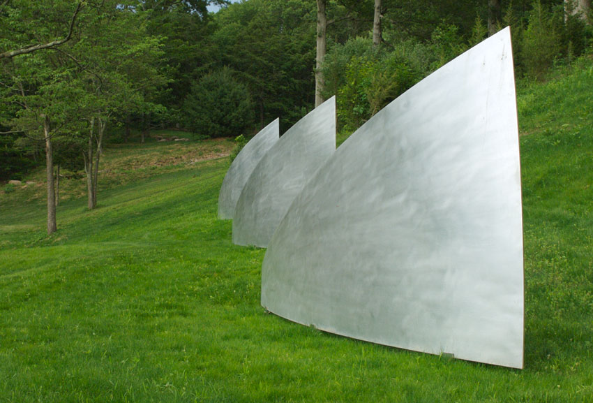
Petals 1-3
Three paraboloid segments, each about 16 feet in length, made from aluminum, installed in a flowing horizontal sequence:

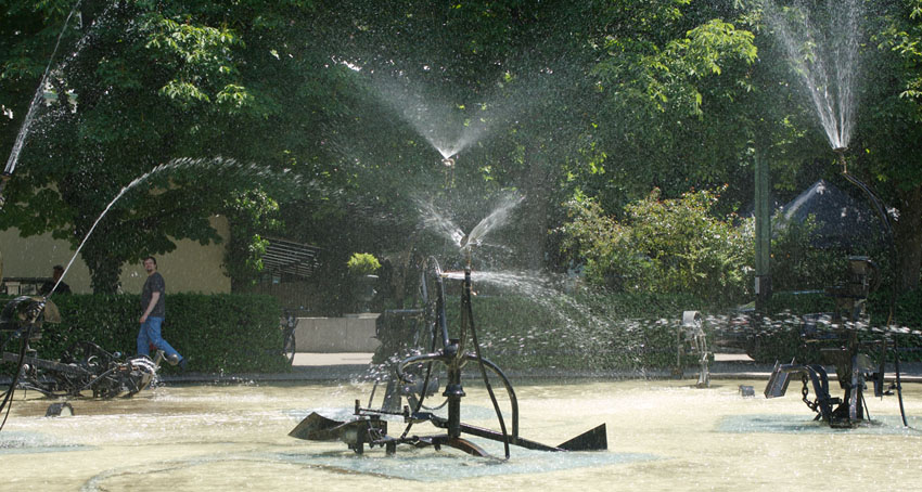
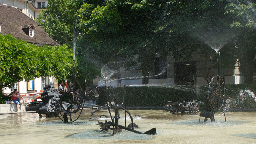
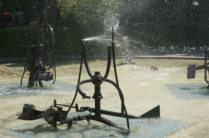
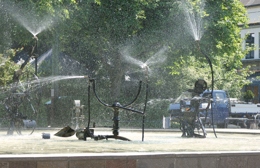
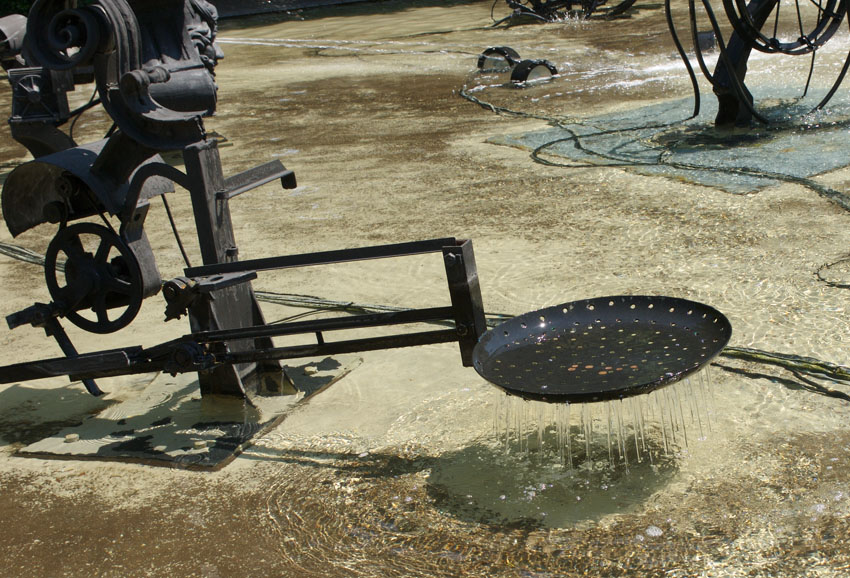
Jean Tinguely: Water-machines sculpture, sprinklers gone wild
Here's a delightful sculpture Fasnachtsbrunnen (1977), the Carnival Fountain, by Jean Tinguely, as photographed last week in Basel:

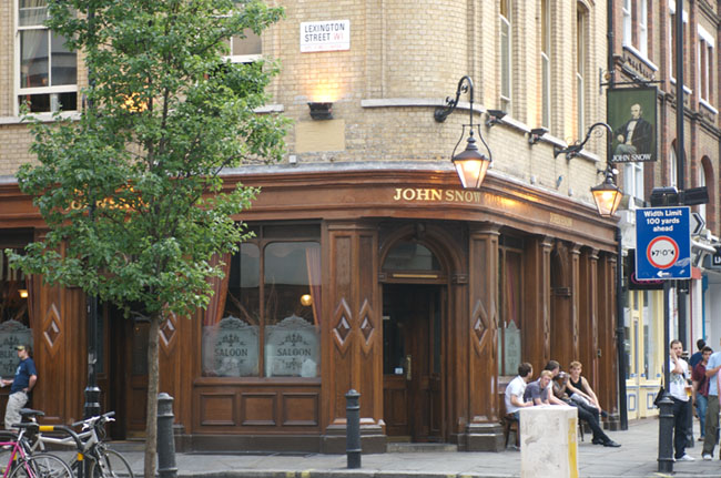
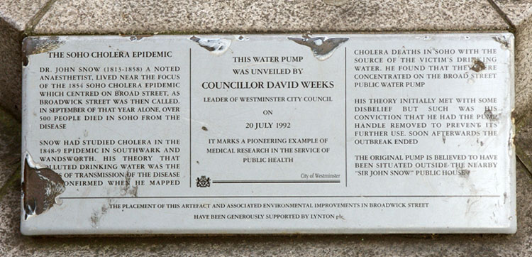
A visit to John Snow's cholera-infected waterpump in London
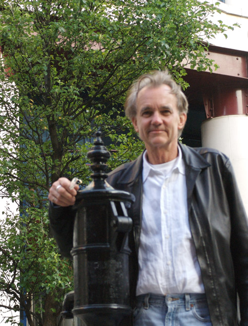
On a walk early Saturday evening June 17 in London I visited the John Snow pub, which is mentioned in my account of the 1854 cholera epidemic in Visual Explanations, pp. 27-37. This is the site of the notorious wellhead pump that supplied the cholera-infected water that took the lives of 600 Londoners in September 1854. During that swift and terrible epidemic, Dr. John Snow did his brilliant street corner detective work (founding modern epidemiology), discovered the cause of the epidemic, and induced the Parish Council to remove the handle of the Broad Street pump, which ended the epidemic. It's more complicated than that, but the great contribution of John Snow was to identify the public health policy that ended cholera epidemics in England: keep the drinking water clean and free of sewage.
Here is a picture of the pub now and the sign with John Snow's portrait.

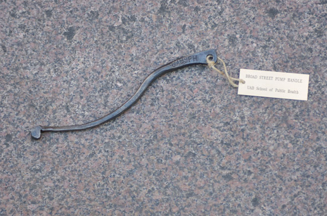
 The friendly barman at the pub, Matthew, produced from a drawer under the bar what he described as the pump handle that John Snow had had removed to end the epidemic. My natural skepticism provoked the thought "Another relic of the true cross?" The handle is stamped and labeled by the UAB School of Public Health (University of Alabama in Birmingham?!) The UAB School of Public Health in Alabama has a publication called "The Handle," named after Snow's work.
Here are pictures of the putative pump handle, way too small to be a pump handle used by many people operating at the public well. And so, a reminder of the Stonehenge fiasco in Spinal Tap:
The friendly barman at the pub, Matthew, produced from a drawer under the bar what he described as the pump handle that John Snow had had removed to end the epidemic. My natural skepticism provoked the thought "Another relic of the true cross?" The handle is stamped and labeled by the UAB School of Public Health (University of Alabama in Birmingham?!) The UAB School of Public Health in Alabama has a publication called "The Handle," named after Snow's work.
Here are pictures of the putative pump handle, way too small to be a pump handle used by many people operating at the public well. And so, a reminder of the Stonehenge fiasco in Spinal Tap:
 Spinal Tap's mini-Stonehenge debacle:
 The above photograph of the souvenir handle in my hands was taken by my photographic assistants, engaged on the spot that Saturday evening at the JS pub. The photograph above was taken by my mate on the far right (holding the alleged pump handle); at far left, in this small world of endless coincidence, is a master's student in information design in London!
 Below is a picture of a replica of the pump nearby and its accompanying rather battered plaque. Note the pivot pin on the pump, where the actual handle might have been, is quite large compared to the tiny pump handle in hand.
The friendly barman at the pub, Matthew, produced from a drawer under the bar what he described as the pump handle that John Snow had had removed to end the epidemic. My natural skepticism provoked the thought "Another relic of the true cross?" The handle is stamped and labeled by the UAB School of Public Health (University of Alabama in Birmingham?!) The UAB School of Public Health in Alabama has a publication called "The Handle," named after Snow's work.
Here are pictures of the putative pump handle, way too small to be a pump handle used by many people operating at the public well. And so, a reminder of the Stonehenge fiasco in Spinal Tap:
Spinal Tap's mini-Stonehenge debacle:
The above photograph of the souvenir handle in my hands was taken by my photographic assistants, engaged on the spot that Saturday evening at the JS pub. The photograph above was taken by my mate on the far right (holding the alleged pump handle); at far left, in this small world of endless coincidence, is a master's student in information design in London!
Below is a picture of a replica of the pump nearby and its accompanying rather battered plaque. Note the pivot pin on the pump, where the actual handle might have been, is quite large compared to the tiny pump handle in hand.
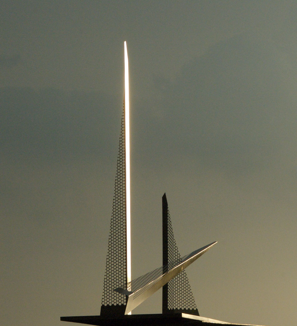
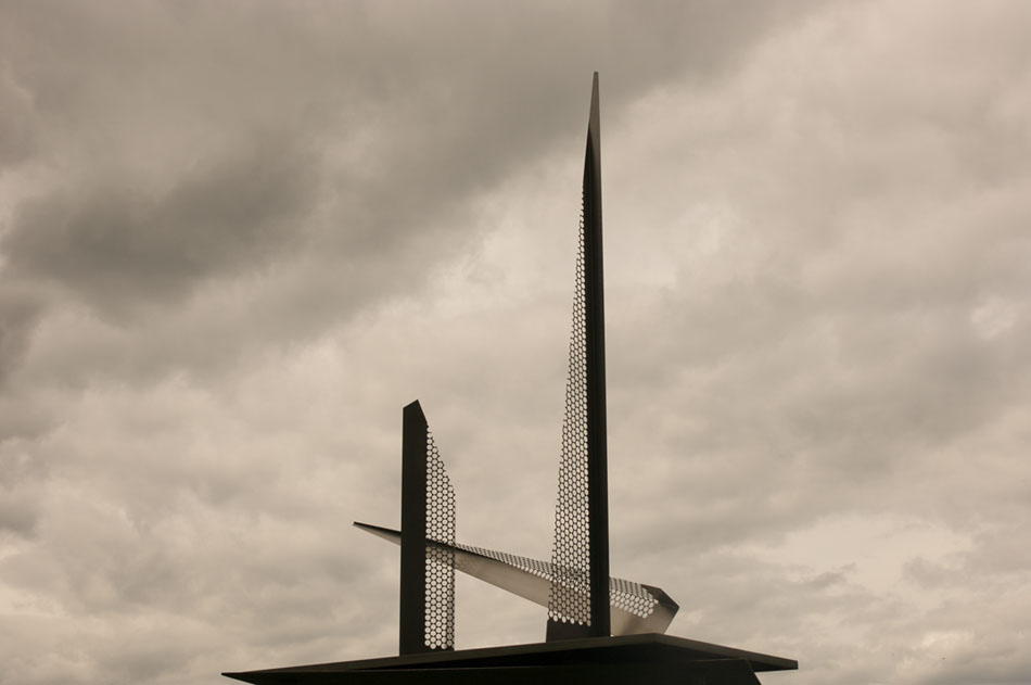
Towers: a new memorial for 9/11
Towers 1, made from stainless steel, seen here against the sky.


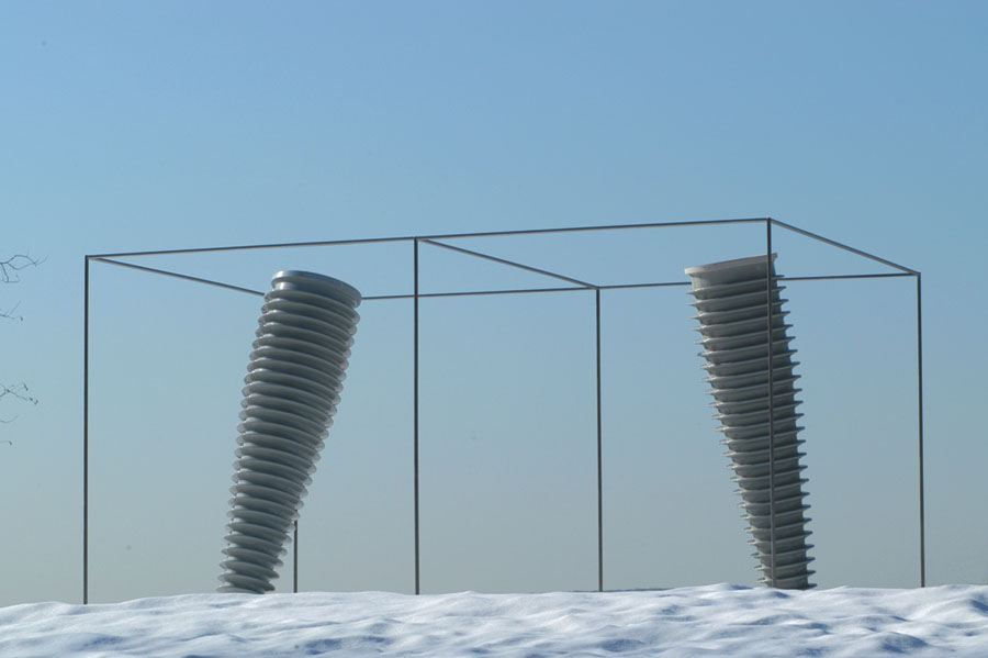
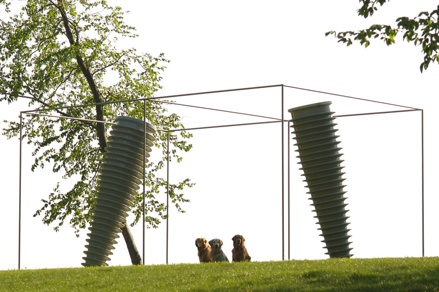
Dear Leader I: landscape sculpture May 2006
Here are photographs of a landscape sculpture Dear Leader I, stainless steel and porcelain, 21'6" by 14' by height 10'6", or 6.6 by 14.3 by height 3.20 meters.
As usual, Anna, Abby, and Zerlina (left to right in second photograph down) are shown for scaling purposes.
There are elaborate stories and creation myths associated with all these pieces but let's just look at them for a while, just a pure visual experience, before wordy narratives take over. As usual, landscape pieces look so much better at the site than in one-eyed, flatland photographs with a dynamic range small compared to the human eye.
 Below, Dear Leader I along with Millstones 5 and 6, 2003-2004 (mild steel, diameter 13"8" or 4.2 meters). At the site, there's an excellent 3D volume of negative space between these two Millstones, a reading possibly encouraged by Dear Leader's perspective box.
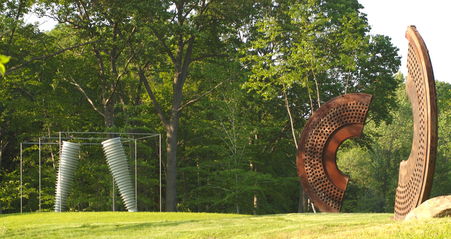
Below, Dear Leader I along with Millstones 5 and 6, 2003-2004 (mild steel, diameter 13"8" or 4.2 meters). At the site, there's an excellent 3D volume of negative space between these two Millstones, a reading possibly encouraged by Dear Leader's perspective box.
Excessively hierarchical organization of information
See Martin Hardee Tufte story: AnswerBook for an account of the problem.
Excessively hierarchical organization of information is sometimes explained by Conway's Law: "Any organization which designs a system . . . will inevitably produce a design whose structure is a copy of the organization's communication structure." So user guides represent Conway's Law squared, a system for understanding a system; a PP user's guide, the Law cubed.
I should have referenced Conway's Law to my client.
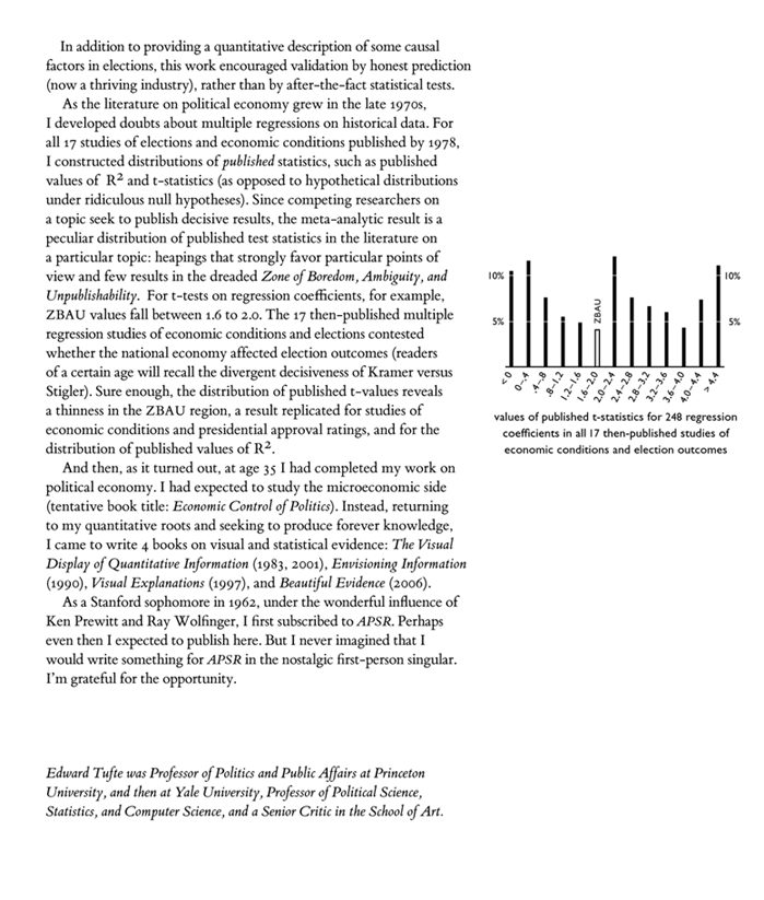
Midterm congressional elections: ET papers
The American Political Science Review (APSR), for its centennial, went through the citation counts for the thousands of articles it published in the last hundred years. For the 20 most-cited articles, the authors (or their surrogates) were asked to write an account of their citation classic.
Here then is my nostalgic account of another career and of "Determinants of the Outcomes of Midterm Congressional Elections," APSR, 69 (September 1975), 812-826. After that, the original article is reproduced, then followed by another APSR paper of mine, which I think is a stronger paper, although it ranked only in the all-time top 60 cited papers: "The Relationship Between Seats and Votes in Two-Party Systems," APSR, 67 (June 1973), 540-554.
 Determinants of the Outcomes of Midterm Congressional Elections, APSR, 69 (September 1975), 812-826.
The Relationship Between Seats and Votes in Two-Party Systems, APSR, 67 (June 1973), 540-554.
Other ET citation-classic accounts are:
Political Control of the Economy
The Visual Display of Quantitative Information
Determinants of the Outcomes of Midterm Congressional Elections, APSR, 69 (September 1975), 812-826.
The Relationship Between Seats and Votes in Two-Party Systems, APSR, 67 (June 1973), 540-554.
Other ET citation-classic accounts are:
Political Control of the Economy
The Visual Display of Quantitative InformationHorizons, vistas, and skylines
One of the topics in my new book (the one after Beautiful Evidence) is horizons and skylines. There is a fascinating scientific literature on visual events apparently occurring near the horizon (such as the moon illusion). In land-use, there is an interesting concept of the "viewshed" and its blocking by new construction and tree growth.
Relevant variables include the position of the viewer in relation to objects viewed against the horizon, 3-dimensional figure/ground relations, and changes in the skyline background itself as the light changes. Horizons, vistas, and skylines are very rich and complex compared to flatland figure/ground analysis.
My local interest is in the display of sculptures against nearby and distant horizons, and the consequent figure/ground effects produced by the piece in relation to its background. As the horizon light changes throughout the day, the sculpture generates changing optical effects. One sculpture, many visual experiences. Of course, the sculpture's structure itself contributes to producing a multiplicity of visual experiences, and the artist can seek to create pieces that encourage such multiplicity.
Some material on vista and horizons can be found in the last chapter of The Visual Display of Quantitative Information (where horizon views of data are advocated), in the micro/macro and layering chapters in Envisioning Information, and in the chapters on Galileo and on pedestals in Beautiful Evidence.
For starters, here are The Top 15 Skylines in the World v3.0, by Luigi Di Serio (via robotwisdom).
The picture of Dallas, with the reflected skyline in the water, is particularly interesting analytically.
It would be interesting to see other sorts of skylines, such as those generated by forests, structural towers, and mountains. Perhaps there is a theory of horizons.
