Warning: Trying to access array offset on value of type bool in
/nas/content/live/graphicspress/wp-content/themes/edwardtufte/archive.php on line
21
Edward Tufte course reviews: 27 reviews of Tufte one-day class
In university halls and conference centers, Tufte's appeal crackles. Fans spend the day looking at art and information through Tufte's eyes, as he walks them through images and analysis of his books. In 4 books and popular auditorium gigs, he teaches by visual example. Next to a bad example of a graph, he positions a sublimely clear treatment, often using the same data. Tufte's work is relevant to anyone who needs to write or present information clearly, from business executives to students. About 10 years ago,
The New York Times crowned Tufte the "da Vinci of data." A more fitting title might be the "Galileo of graphics." Where da Vinci is remembered as an inventor of new technologies, Galileo put right our understanding of the solar system by positioning the sun at its center. Tufte, who owns a handful of nearly 400-year-old first editions by Galileo considers the early scientist a master of analytical design.
BLOOMBERG
"The Best Single Day Class Ever." Richard Bejtlich, TaoSecurity "I had the great fortune to attend Edward Tufte's one day class Presenting Data and Information. This was the best one day class I have ever taken. It profoundly altered the way I think about presenting information and making arguments. If any part of your professional life involves delivering presentations, you must attend this class. It's a complete bargain for the price. I would like to see every professional at my company take this course. Following Tufte's advice would provide the single biggest productivity improvement and corresponding "return on investment" we are likely to see in my tenure . . ."
"One visionary day. Few speak as eloquently as Edward Tufte, whose theories of information design not only illuminate, they inspire. In a full-day seminar, Tufte, author of the classic The Visual Display of Quantitative Information, uses maps, graphs, charts, and tables to communicate what prose alone cannot. For information designers Tufte's work is a model of clarity and craftsmanship. Given that the heart of his enterprise is statistics (of which he's a professor at Yale), one might worry about "lognormal distributions" and "trimetric projections." This would be a mistake. Tufte keeps jargon to a minimum. His insights lead to new levels of understanding both for creators and viewers of visual display. What makes Tufte most persuasive are his works themselves: His books and his seminar embody his belief that "good design is clear thinking made visible." WIRED
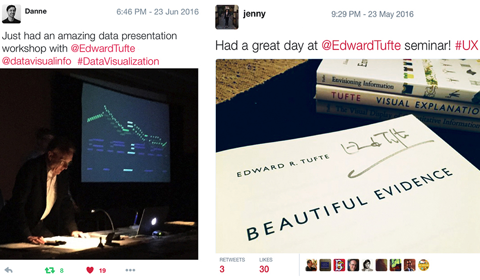
ImageQuilts were first presented at Edward Tufte's one-day course.
For good ideas search Google images, not words; see 1000
relevant images immediately, then quilt them for editing and analysis.
theverge.com on image quilts.

"Edward Tufte's one-day course on "Presenting Data and Information" is the best value-for-money that you can spend if you are involved in any way in presentation of information to users. When I receive this new schedule of these courses each year I get to thinking whom do I know whose career might change for the better if they take this course. I've taken it twice (the content is always up to date with the latest examples of both good and bad information design). Every attendee gets copies of Tufte's four major works on visual display of information. Tufte offers a group discount so your company can send a whole department or product team. And there's a steep discount for full-time students, faculty members, and postdocs.
When we were still not yet cash-flow-positive and had to watch every penny, I insisted on offering to every member of the staff who had either development or product marketing roles in the company, whether in London or Boston, a chance to go to this course. We aspired to be leaders in creating innovative ways for users to browse information from subject encyclopedias. To me it was money well spent and showed that we were a company that takes effective user-centered design seriously. If your boss says there's no money to send you to such a course go to it on your own nickel, but buy a copy of "The Inmates are Running the Asylum" for your boss or boss's boss."
JOHN DOVE
Intelligent Designs: When information needs to be communicated, Edward Tufte demands both truth and beauty.
Fran Smith, Stanford Alumni Magazine
"In 1613, Galileo published Istoria e dimostrazioni intorno alle macchie solari, his remarkable observations of the sun. On a fall day, 4 centuries later, Edward Tufte stands in front of a packed hotel ballroom, holding up a first edition of that book.
The room could be in New York, San Francisco, Cleveland or any of the dozens of other cities where Tufte, '63, MS '64, teaches his daylong course Presenting Data and Information. Today he's at the New Haven Omni, to hear the man who has been called the Leonardo da Vinci of data, the Strunk and White of graphic design, the George Orwell of the digital age.
Tufte has demonstrated how confusing medical charts can lead to mistakes in treatment and how corporate reports that highlight years of rising revenue without adjusting for inflation can mislead investors. He has shown how a lawyer used a simple spreadsheet to defend mobster John Gotti and how 19th-century physician John Snow used detailed maps of London to pinpoint the cause of a cholera outbreak. Tufte is credited with turning chart-making into a discipline with intellectual credibility and moral weight. His course attracts not only visual professionals but also scientists, engineers, journalists, doctors, attorneys and financial analysts--pretty much anyone who analyzes and presents data."
x
Jeffrey, Twitter - June 2016. Nice post @taosecurity. Attended w/ my daughter. She said Edward Tufte's course was more useful than her entire first semester of college.
Nicole, Twitter - 28 Jul 2016. So much insight and wisdom today @EdwardTufte. My favorite part: Bringing voice to this content.
Jared, Twitter - July 2016. If you've never been to an Edward Tufte workshop, you should go. It's a right of passage for every designer.
Shari, Twitter - Jul 12, 2016. Attended Edward Tufte's course many times. Absolutely SUPERB! (I love his old books. I brought my own gloves.)
Tufte in R
Edward Tufte course: Beautiful Evidence and Visual Explanations
- Brad Auerbach, Forbes magazine
"The essence of Tufte's work is that there is a moral, ethical imperative for presenters and readers to insist on simple designs to maximize the rich and luscious data at hand. With his books and lectures, Tufte's goal is to teach the skills that maximize reasoning time and decrease decoding time. Through a series of crisp examples he illustrates what works and what clearly does not. He has honed his craft with professorships (in political science, computer science and statistics) at Princeton and Yale, and his exhibitions at various art galleries.
Tufte in his course pointed out to a rapt audience of about 250 that the advances in technology enable an increase in spatial adjacency, which is another way of saying better computer screen resolution has us approaching the richness of paper.
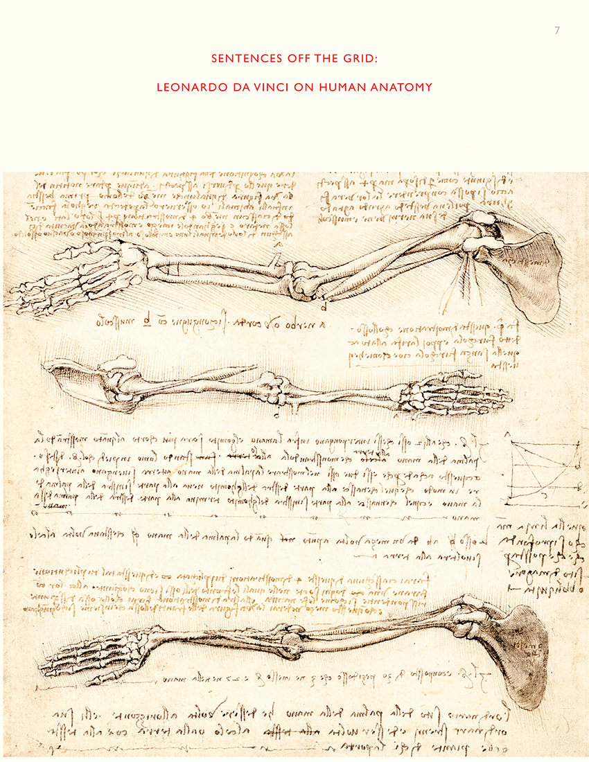
From the bedrock of building better presentations, Tufte dove into big data and how best to handle it. "The rules of inference don't change because N gets larger.In order to illustrate the principal of information integration, Tufte used Da Vinci's studies of the human body, wherein the Italian genius' words were right next to his beautiful drawings. Galileo's writings on the discovery of Saturn's rings perfectly integrated the written description with the visual depiction. Field guides for birders follow
that elegant style.Good maps also evoke an elegant style, where information is embedded in the illustration."
"Ivy League Rock and Roll: Edward Tufte, the world's most renowned visualization expert, holds legendary information design seminars up to 40 times a year. I recently was among the hundreds that flock to each of his live performances. What an experience! The auditorium has filled and the suspense and anticipation begins to grow. Tufte's seminars are legendary. Anyone who deals with data and visualization on a professional level knows his books - and those who don't are probably in the wrong business. Today in Washington's Crystal Forum many participants come from government agencies and military institutions. There are also several students whose majors range from information technology and graphic design to economics, biology and medicine. Some, balancing notebooks on their laps, will take detailed notes so that they can fully absorb Tufte's messages later at home. He gently takes an awe-striking original from Galileo Galilei or a centuries-old copy of Euclid and proceeds to carry it down the aisle. Later, one of his assistants will also walk through the auditorium with one of these precious books in hand." Nicolas Bissantz
Bob, Twitter - July 2016. I met Edward Tufte, the Godfather of data analytics and visualization! Incredible course!
Omar, Twitter - 24 Jun 2016. A very inspiring day with the guru of data visualization.
Carl, Twitter - Jul 13, 2016. Once I had an analyst job, and our team attended an Edward Tufte seminar. It changed forever how I present data.
Jeffrey S., Twitter - 5 Jul 2016. ET coming to Minneapolis. I took his class several years ago and it remains my favorite (most useful) 1-day seminar.
Heiko, Twitter - 24 Jun 2016. Spending the day with #dataviz pioneer Edward Tufte in NYC learning about presenting information. Career highlight!
On-Leadership: Edward Tufte video interview: Government transparency, Analytical thinking, Recognizing excellence and a sense of the relevant.
- Washington Post
Edward Tufte has given his one-day course to over 328,000 students in more than 800 classes. Edward Tufte has given private internal one-day courses at Rockefeller University, Apple, Google, Brookhaven National Laboratory, Fermilab National Laboratory, Centers for Disease Control and Prevention (3 times), Sun Microsystems, IBM, U.S. Joint Forces Command, U.S. Army HQ Hampton, U.S. Department of Agriculture, NASA Headquarters, NASA Houston, NASA Langley, NASA Stennis.
: Undefined variable $count in
/nas/content/live/graphicspress/wp-content/themes/edwardtufte/archive.php on line
24
Warning: Trying to access array offset on value of type bool in
/nas/content/live/graphicspress/wp-content/themes/edwardtufte/archive.php on line
21
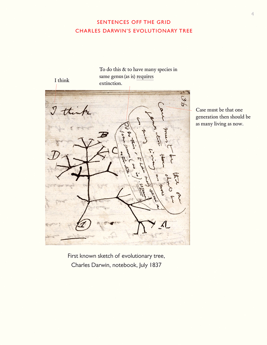
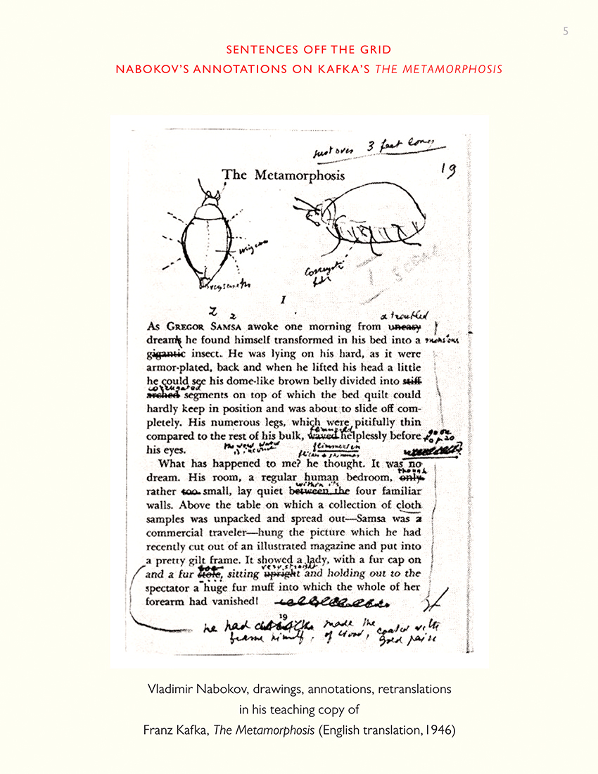
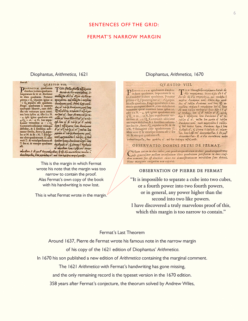
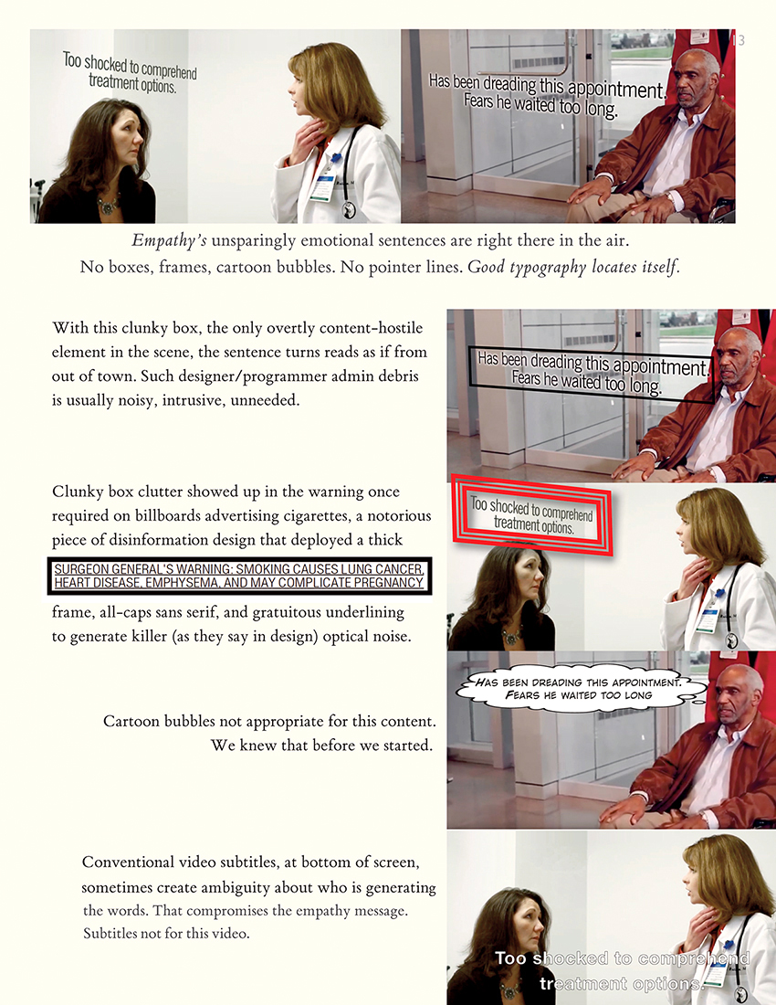
Sentences off the Grid

Here's a good method for showing +/- bounds in LaTex:

Source: L. Anderson et al., "The clustering of galaxies in the SDSS-III Baryon Oscillation Spectroscopic Survey: Baryon Acoustic Oscillations in the Data Release 10 and 11 Galaxy Samples," Monthly Notices of the Royal Astronomical Society 000 (2014), p.14.
PDF
Here is the conventional way in medicine to show +/- in text.
Numbers have different meanings and importance, but are mixed up in a long sentence.
Note the broad limits:
Source:
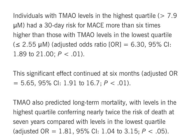
"TMAO Proves a Potent Predictor of Events in Acute Coronary Syndrome"
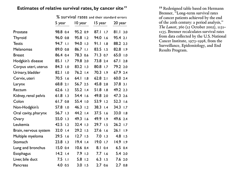
Here is a method I tried in my
Beautiful Evidence, making the standards smaller so they didn't get mixed up with the survival rates when read horizontally within a type of cancer.
For my project on redesigning the sentence, I am interested in sentences that break the standard grid and also in sentences that are graphical, two-dimensional. (The standard grid = one-dimensional, justified lines and hyphenation, with arbitrary line breaks indifferent or hostile to content.)
Please contribute good examples to this thread (see end of thread to make contributions) or
send to etsculpture - geee male - dath kom
Thanks, et

Maya Lin, Women's Table at Yale University, and ET


photo credit (left): Marit ben Israel
Public Affairs Television "Becoming American" Interview with Maya Lin
BILL MOYERS: What about the Women's Table at Yale?
MAYA LIN: The Women's Table at Yale was even a trickier one because it's not a memorial. The then-President Benno Schmidt called up and said, "Could you do a sculpture at Yale commemorating women at Yale?" What does that mean?
I had no idea. That one, I sat on for over a year, reading about co-education at Yale, women at Yale, the history of gender at Yale. And all I remember having gone there for seven years is that every little stained-glass image, every sculpture, every statue was a man.
Because until 1968, Yale had been a male world.
As I start reading, I'm thinking it's not about when Yale officially went co-ed. Because women had been at Yale since the 1700s technically, but we were never known.
BILL MOYERS: What do you mean technically?
MAYA LIN: There was a daughter of one of the professors who was sitting in on a class even very, very early on. I came across a phrase that actually sent chills down my spine. Women were allowed to sit in on classes in the 1800s, and they were called "silent listeners."
BILL MOYERS: Silent listeners?
MAYA LIN: And I thought that was the most atrocious (LAUGHS) attitude about women. And then you find out that when Yale officially went co-ed undergraduate, it went co-ed with a very tough quota system. Because the idea is, we still have to graduate X number of Yale men. Then, we'll let a few other women in.
But again, it was a quota system. And the quota system is fairly—it was highly contested. And then they stopped that. It was about numbers. Did we count? How many were there of us? And little by little, I one day woke up and I wrote a little spiral of numbers.
The Vietnam has a closed time frame. It begins and ends at the apex. For the Civil Rights Memorial, there's a gap between 1954, you walk around clockwise—and you end in '68. But there's a gap, signifying that we've caught the Civil Rights era, but the quote really deals with the future. It's open-ended. Commemorating women at Yale, we have a beginning, but certainly, it's ongoing. So I thought of a spiral. I was looking at one of Edward Tufte's book,
Envisioning Information.
He had a beautiful spiral of numbers. He's a professor at Yale.
I called him up, and both Professor Tufte and his wife Inge Druckrey, who's in the graphics department, were unbelievably helpful in helping me come up with the spiral number, how to lay it out, everything. They were great. And I chose an old-fashioned text because it's what the Yale college blue book, the course book, was printed on. So, any Yalie coming back will recognize that text. And it's a spiral starting with a group of zeros signifying there were no women at Yale for a very, very long time. And then the first women that officially were enrolled were enrolled in the graduate school of art, because Mr. Street,
who donated the money to build the first art building, Street Hall, had two daughters. And his condition in a way, in building Street Hall was that his daughters would go there. And I think the first class is 13 painters in the school of art.
But the pieces are about history. And again, you can say it goes down to, "Can we make a history apolitical?" In all cases, I have just dealt with facts. But again, it's what facts you choose to portray that focus you. But it's always about giving to people information and letting them read into it what they will.
From "Becoming American: The Chinese Experience" on PBS (
full transcript)

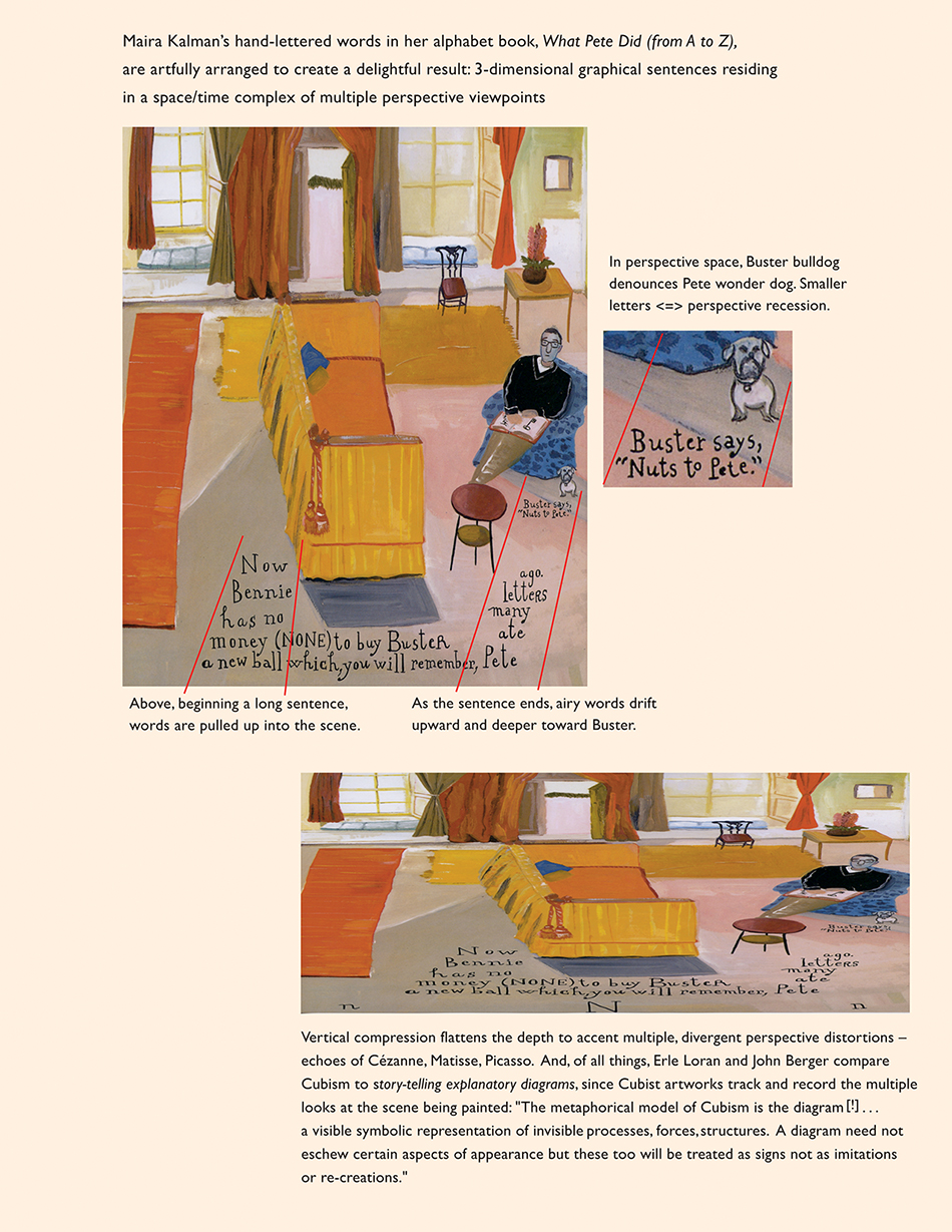
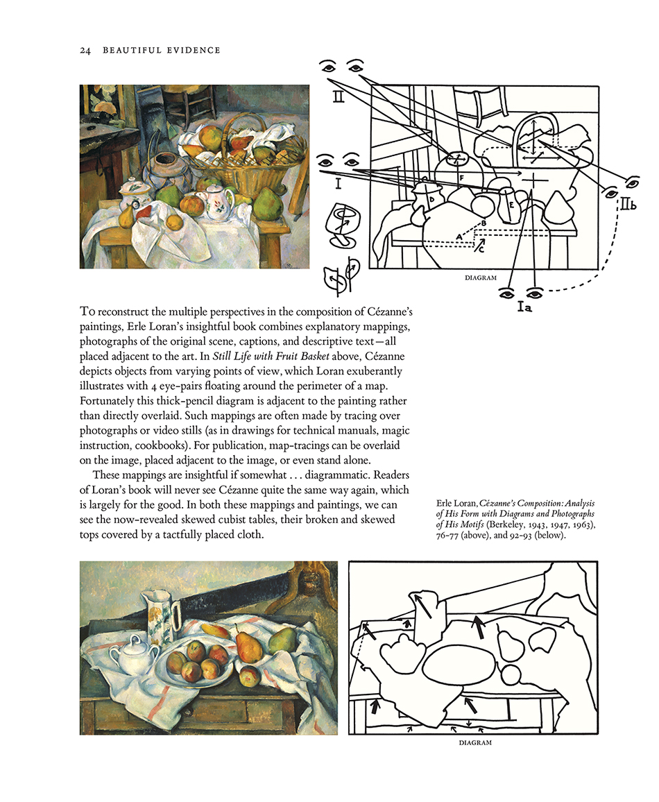
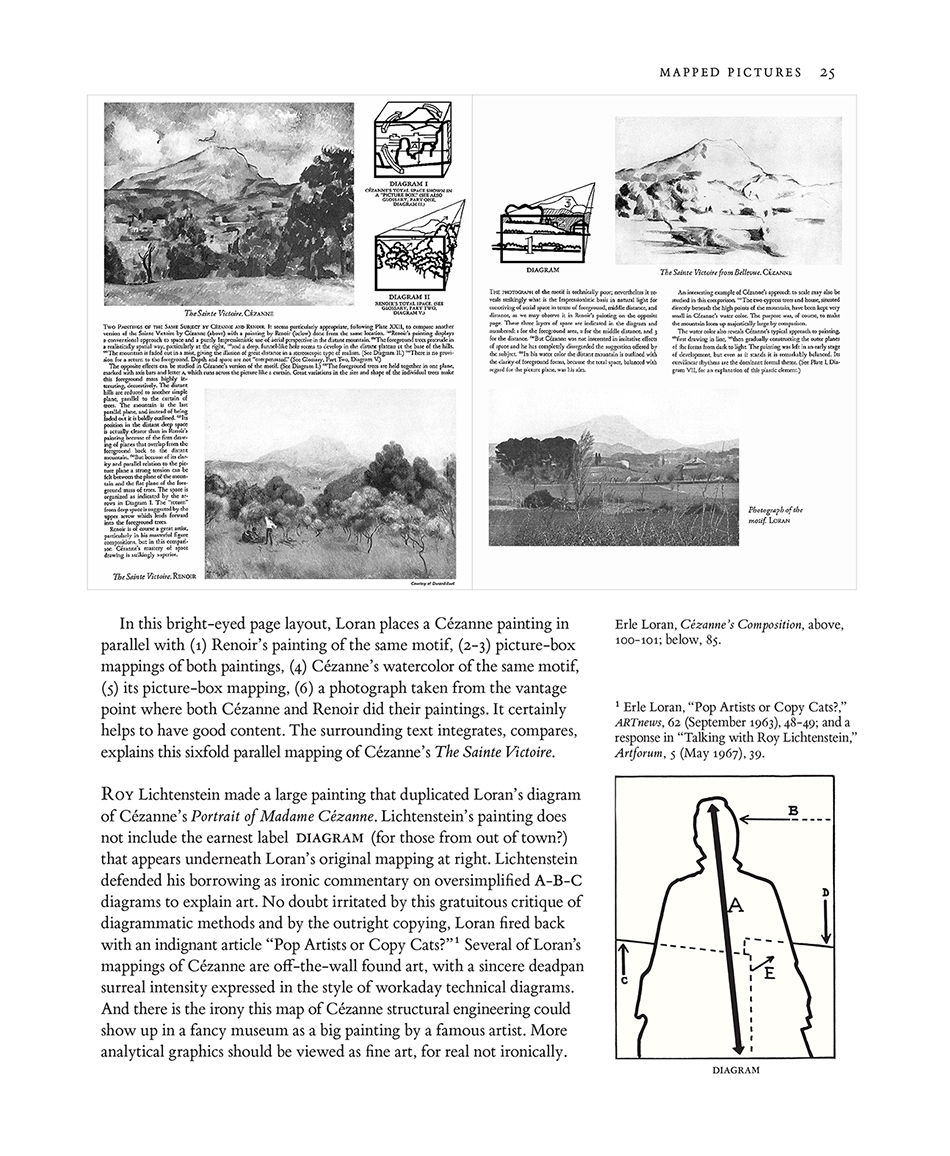
Are diagrams the metaphor for Cubism?
Maira Kalman's illustration (
Beloved Dog, from
What Pete Ate (From A to Z), entry N)
locates a 2 sentences in 3-space perspective, becoming a wonderful example in my essay about
2- and 3-dimensional sentences.Then the idea that Cubism's metaphor is a diagrammatic sequence
of points of view came forward. This metaphor comes directly out of Loren, whom I wrote about in
my
Beautiful Evidence, 24-25. Cubism is said to look like a lot of things: fractured rock,
African art, and planning and zoning in French towns!
First, the Maira Kalman illustration (from chapter in forthcoming
The Thinking Eye):
Below,
Beautiful Evidence, pp 24-25, on Loran's intensely diagrammatic view of Cezanne:
Below,
Beautiful Evidence, pp 28-29:


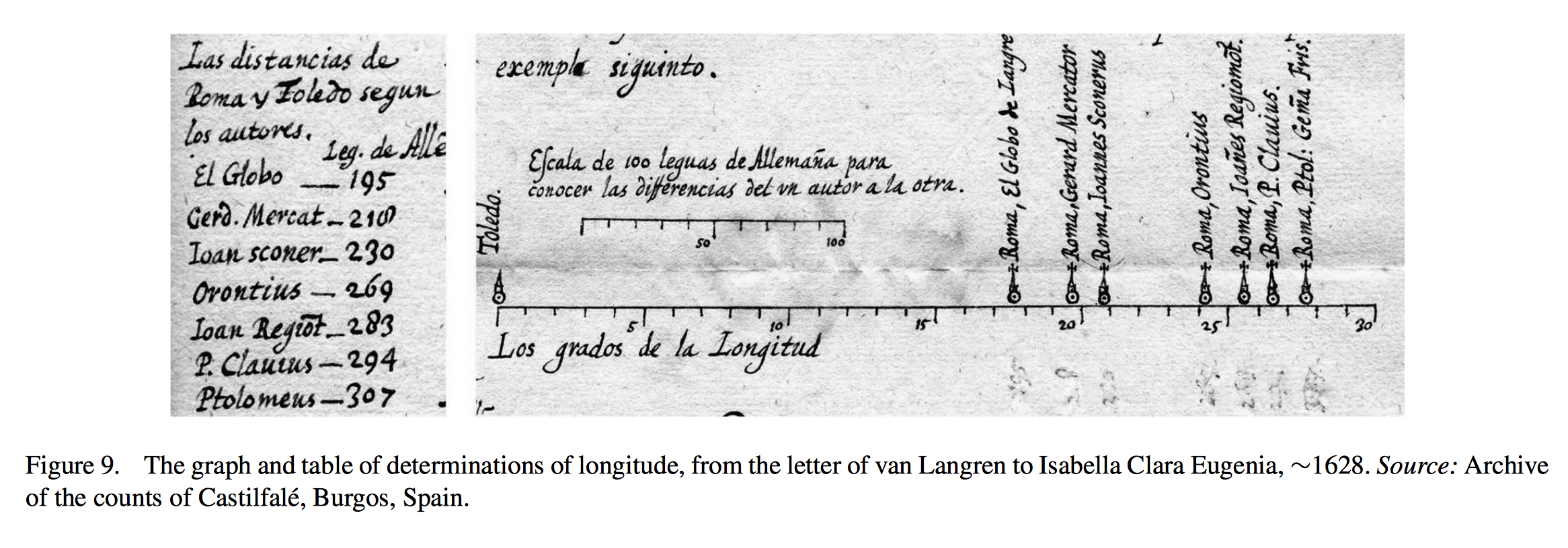
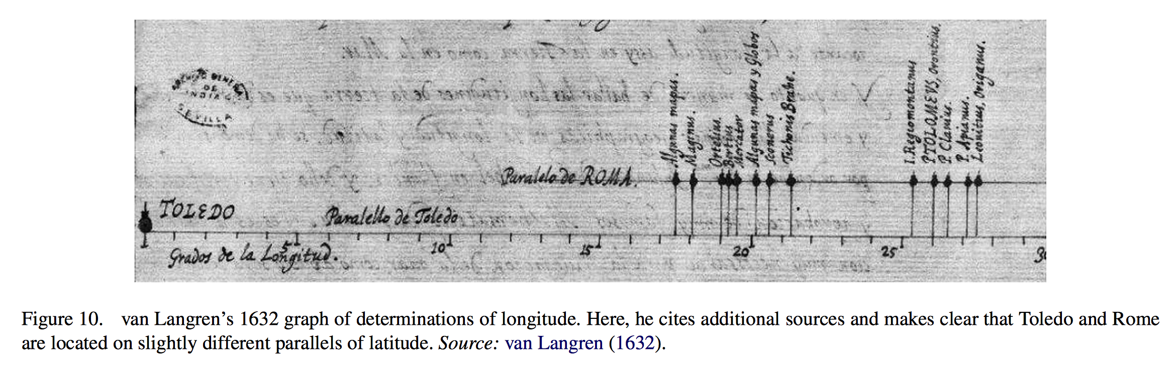
First known statistical graphic
Over the years in research on data graphics, I collected boxes and boxes filled with
old catalogs for book auctions in Europe, UK, US. Usually I bought these boxes from
book dealers who were retiring or selling their reference library.
The auction houses, in documenting even very obscure books for sale, would pick what they saw as notable illustrations and publish them in the auction catalogs used by buyers.
All sorts of intriguing things would show up in catalogs, especially in auctions of books dealing with cartography, exploration, birds, flowers, astronomy, math, physics, navigation.
The best find was a statistical graphic by Michael Florent van Langren published in 1644. I regard it as the first real
statistical graphic, since it showed a distribution of measurements in relation to a putative true value.
Here's what I wrote in
Visual Explanations: Images and Quantities, Evidence and Narrative (1997), p. 15:
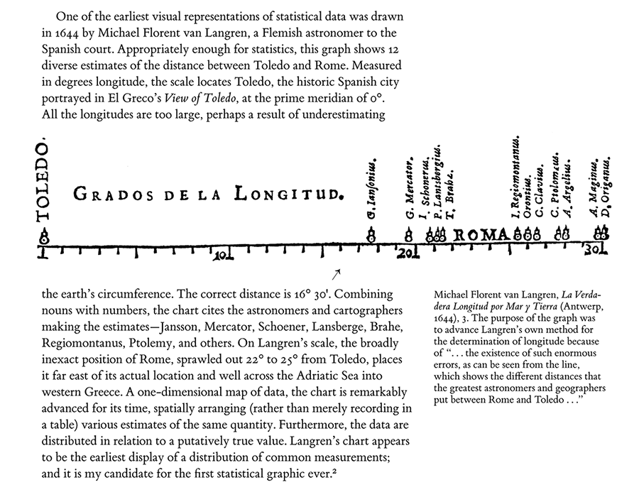
The claim about the first known statistical graphic has held up now for 18 years.
In 2010, Michael Friendly, Pedro Valero-Mora, and Joaquin Ibanez Ulargui published a
detailed account of the graphic (and 2 earlier versions by van Langren) in
The American Statistician. Here are the 2 manuscript versions:
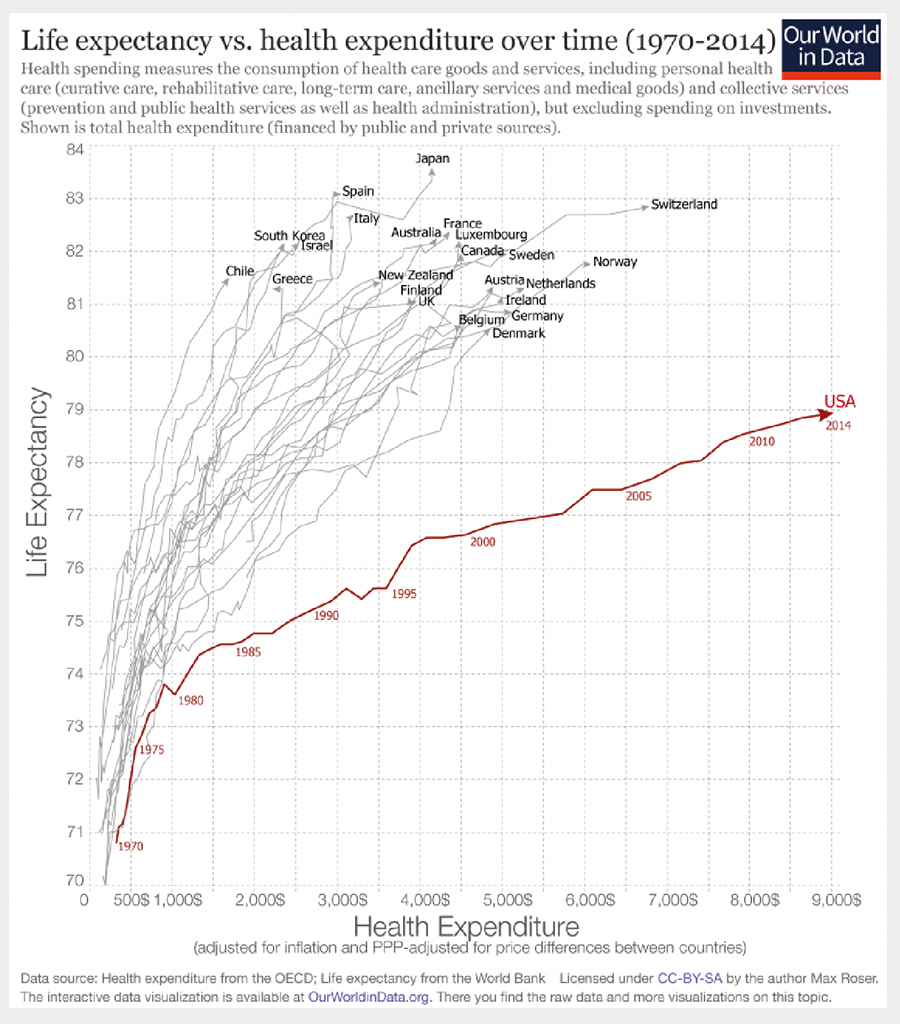
Time-series that move through XY space
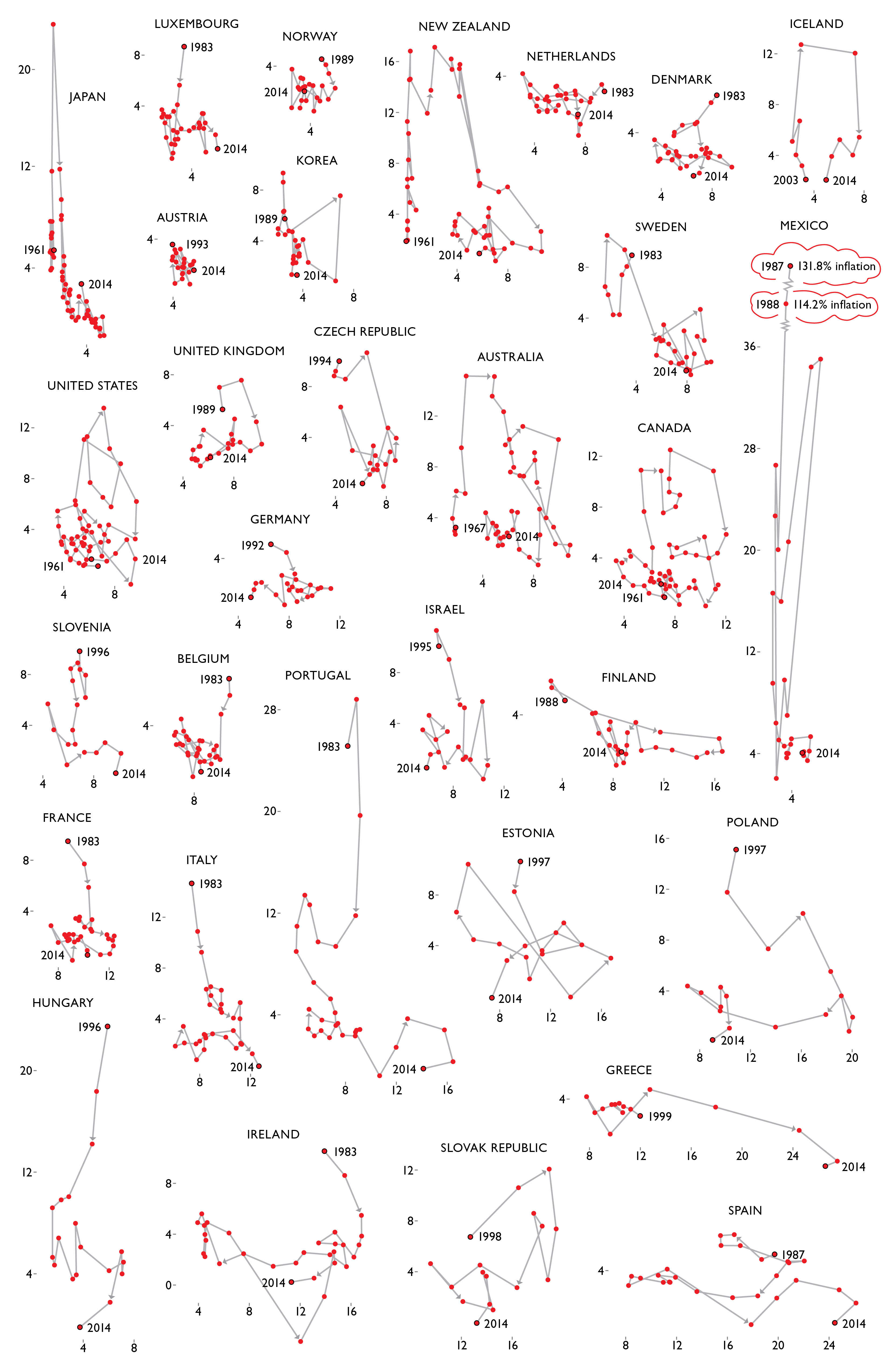
Here are time paths (1970-2014) for 19 countries in XY space of health care expenditures and life expectancy. Toward the upper left are countries that have long life expectancies and comparatively lower health care expenditures for 45 years.
In contrast, toward the lower right, is the path for the United States with greatest expenditures and shortest life expectancy of the 19 countries, a large outlier path suggesting inefficiencies in US healthcare expenditures.
Source and data documentation
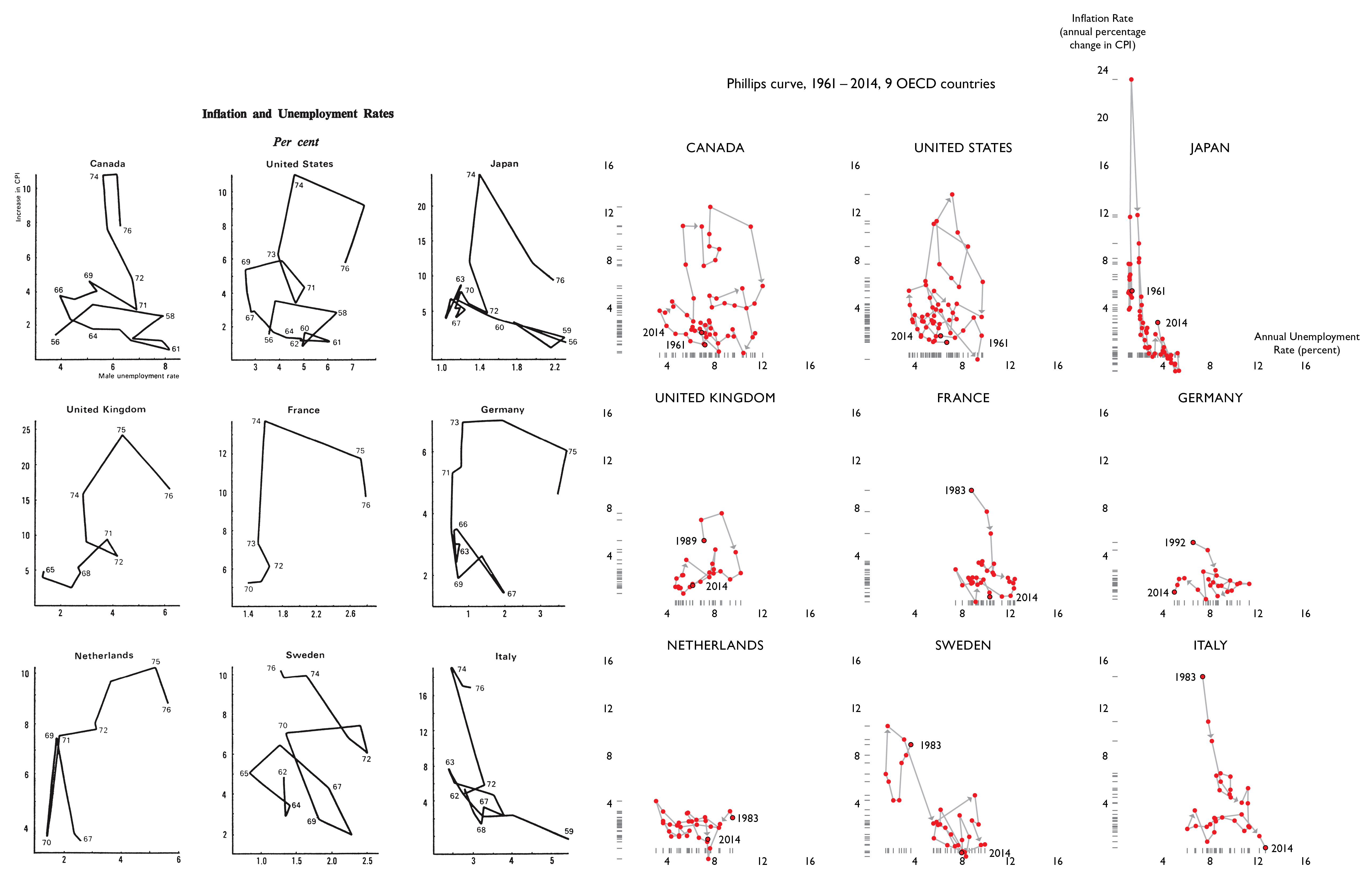
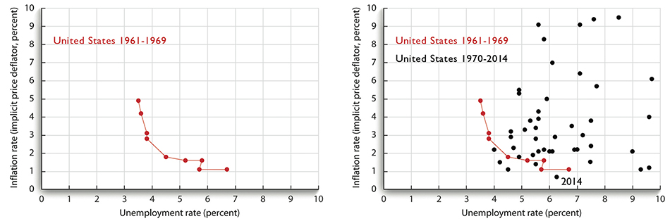
 The Visual Display of Quantitative Information
 presents a small multiple for 9 OECD countries of their time-paths moving through a 2-dimensional space of inflation by unemployment.
This design locates changes in time in a more interesting space than the routine time-series of simply Y against time.
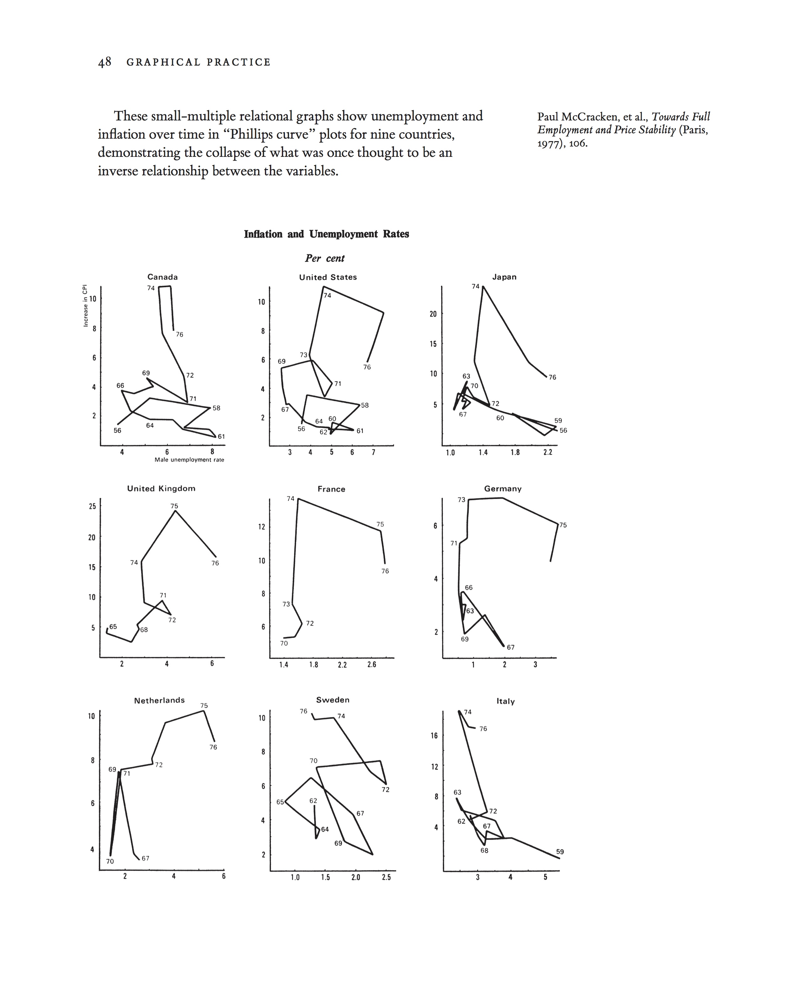
Source: VDQI, p. 48
With only ten years of data for a single country, there appears to be an inverse relationship between the inflation rate and the annual unemployment rate. When over four more decades of data points added to the small multiple presented in the
The Visual Display of Quantitative Information, we see this supposed correlation collapse even further. Rather than a series of neat curves, we see a tangled mess for each country.
Displaying all years for which internationally-comparable datasets are available. Sources: OECD, https://data.oecd.org; World Bank, http://data.worldbank.org.
Unemployment rate is defined as the annual average of percentage of labor force that is unemployed, where the "unemployed" are defined as people of working age who are without work, are available for work, and have taken specific steps to find work. This definition allows for more accurate international comparisons.
Inflation is measured by the percentage changes in the prices of goods and services that households consume (consumer price index, or CPI). Even though they measure only consumer inflation, CPIs are commonly used as a proxy for the general rate of inflation.
Recently Benjamin Morris of fivethirtyeight did a fine display of Stephen Curry's path of 7 seasons through an intriguing basketball space - successful shooting % against attempted shots per 100 possessions. His season-by-season progress moves toward the upper right corner, the area of more shots
and greater accuracy. If you make the shots, you are not taking too many.
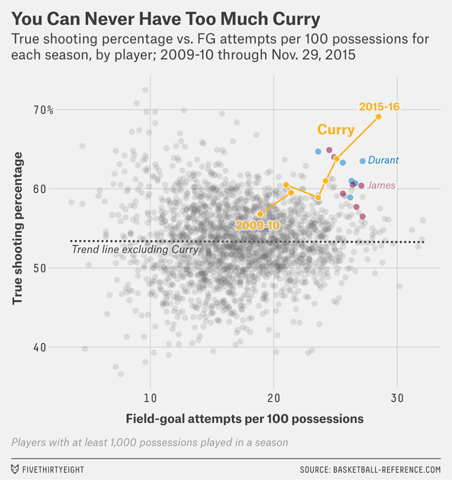
Source:
Stephen Curry Is The Revolution

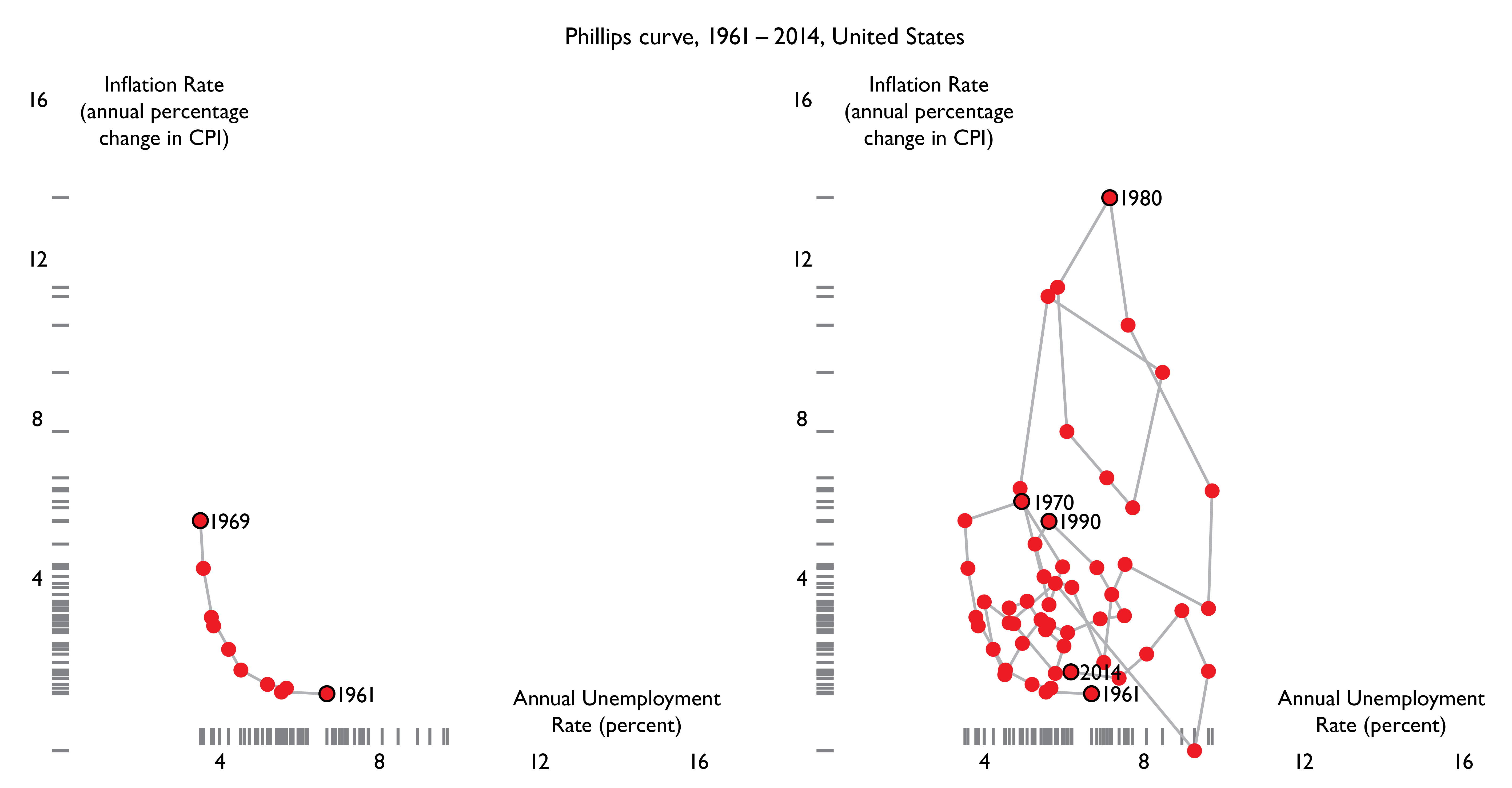
Maps, of course, show all sorts of time-dependent events (weather maps, for example) in Earth's latitude by longitude two-space. But the big historic step in data graphics was to move beyond representing natural physical spaces to abstract spaces (such as inflation by unemployment), a change that took thousands of years. From my
Visual Explanations, p. 14-15:
For the United States, 1961 to 1969, there was an apparent inflation/unemployment trade-off between inflation and unemployment - as inflation declined, unemployment increased.
This immaculate curve for 1961-1969, a 2-dimensional path, was swamped by the next 45 years of data, a period with several large economic shocks. No obvious trade-offs are seen for 1970-2014:
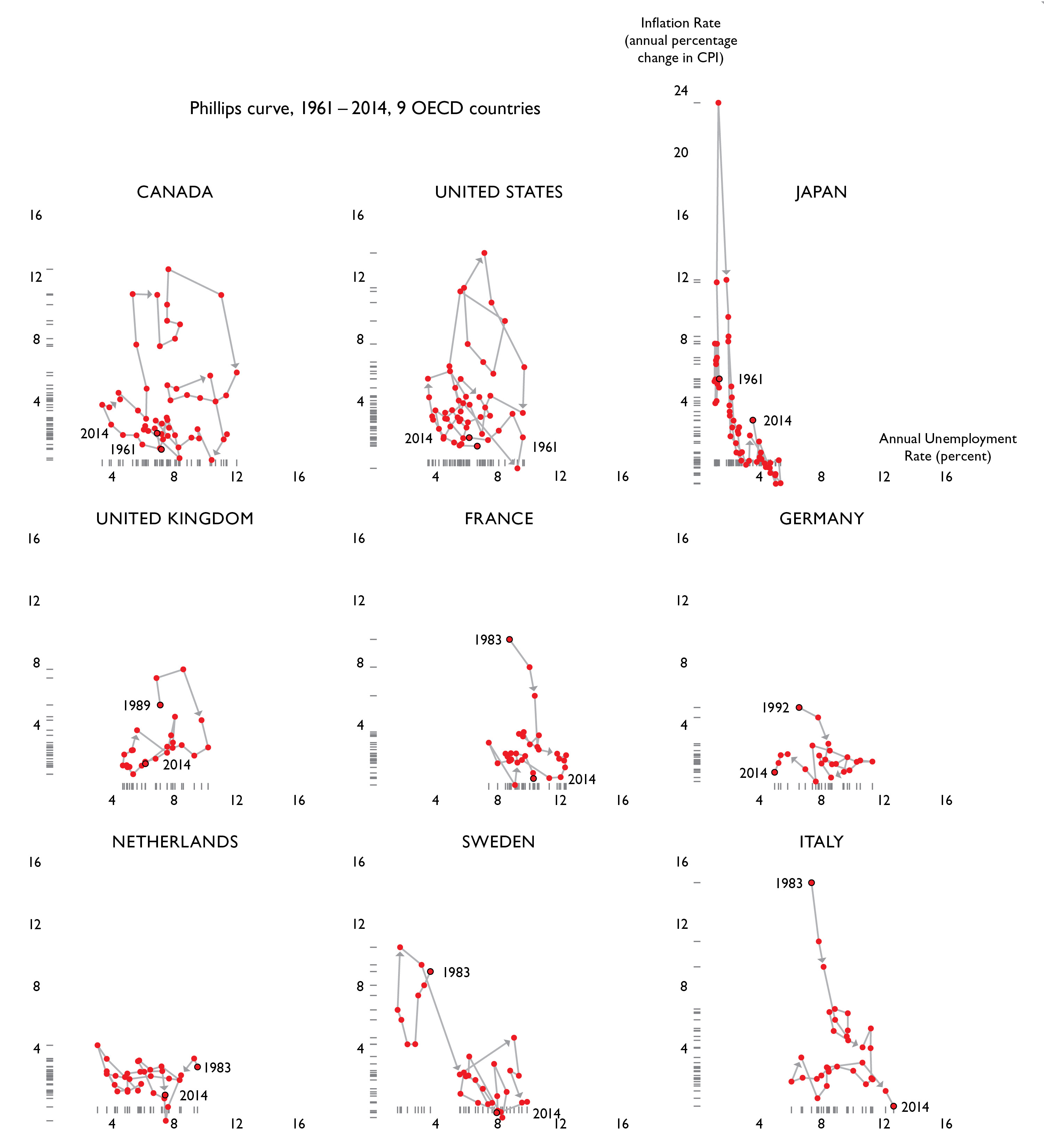
This small multiple below shows time paths in inflation/unemployment space for 31 countries for up to 54 years. Countries are ordered by a "misery index" = sum over all years of inflation + unemployment percents for each country.
The information design strategy:
once you have an interesting plot, small-multiply it, in effect making a data element of each plot.
What we have learned from these comparisons:
economic matters are more complicated than U.S. Phillips Curve early returns suggested.
More generally:
the study of human behavior is not rocket science, it is harder than rocket science.
Two- and Three-Dimensional Sentences
Image Quilts
Our website
imagequilts.com shows the new work of ET and
Adam Schwartz on quilts (a variety of small multiples) that show 100 to 500 images on a single screen.
There is also a free
Chrome app that composes, sorts, and edits the results from Google images.
Video demo:
Georges Vantongerloo
Vantongerloo was a painter and sculptor associated with the DeStijl group.
This quilt places images of his small sculptures in the top row, above an assortment of paintings (with some repeats). The paintings served as design-sketch for stucco cladding of a studio/barn.
 Subatomic Particles
This quilt shows images of collisions of subatomic particles. Many of the original images were decorated in strong colors, now desaturated to black and white.
 Hillside Vineyards
Description of the Hillside Vineyards quilt.
 Terrace Farming
Description of the Terrace Farming quilt.
 Paul Klee
Description of the Paul Klee quilt.
 Paul Klee, High-resolution Elements
Description of the Paul Klee, High-resolution Elements quilt.
 Paul Klee Palette
Description of the Paul Klee Palette quilt.
 Pablo Picasso
Description of the Pablo Picasso quilt.
 The Quilts Of Gee's Bend
Description of the The Quilts Of Gee's Bend quilt.
 47 Animal Sounds Over And Over
Description of the 47 Animal Sounds Over And Over quilt.
 Feynman Diagrams
Description of the Feynman Diagrams quilt.
 Feynman 32
Description of the Feynman 32 quilt.

 Eadweard Muybridge
Description of the Eadweard Muybridge quilt.
 Sorting Algorithms
Description of the Sorting Algorithms quilt.
 Crime Scene Fingerprints
Description of the Crime Scene Fingerprints quilt.
 Georges Vantongerloo Paintings
Description of the Georges Vantongerloo Paintings quilt.
 Chinese Calligraphy
Description of the Chinese Calligraphy quilt.
 Agnes Martin
Description of the Agnes Martin quilt.
 Syed Haider Raza
Description of the Syed Haider Raza quilt.
 Josef Albers
Description of the Josef Albers quilt.
 Taking a line for a walk / on the margins
Below, original graphic from "Battling Infectious Diseases in the 20th Century: The Impact of Vaccines," published Feb. 11, 2015 by Tynan DeBold and Dov Friedman for the
Wall Street Journal as part of
Project Tycho. (article
here)
The number of infected people, measured over 70-some years and across all 50 states and the District of Columbia, generally declined after vaccines were introduced.
The heat map shows number of cases per 100,000 people.

Here, the graphic re-worked, without active whitespace.

Goldberg and Design Variations
Initial graphs (slopegraphs and dotdashplots) constructed in R with Lukas Piwek's
Tufte in R, then edited in InDesign.
By Edward Tufte and Emily Kirkegaard
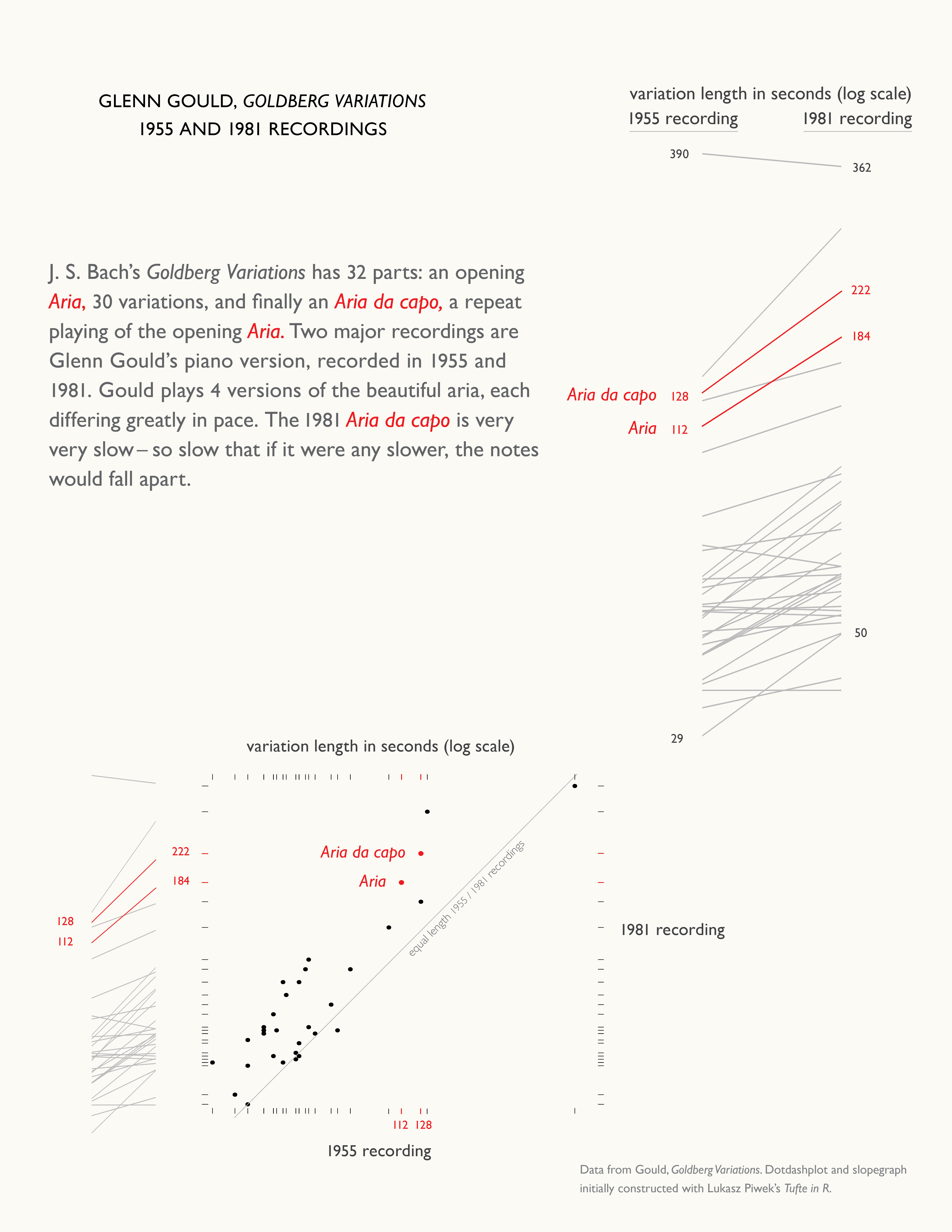

Table and timetable design and typography
From Envisioning Information, pp. 104-105: