Warning: Trying to access array offset on value of type bool in
/nas/content/live/graphicspress/wp-content/themes/edwardtufte/archive.php on line
21
Not spying on users should be a feature: The keep-it-and-lose-it hypothesis
Two provocative reports:
news.com on Google
NY Times on Google
The New York Times report, by Randall Stross, is alas very damaging to the once-pristine image of Google.
Warning: Undefined variable $count in
/nas/content/live/graphicspress/wp-content/themes/edwardtufte/archive.php on line
24
Warning: Trying to access array offset on value of type bool in
/nas/content/live/graphicspress/wp-content/themes/edwardtufte/archive.php on line
21
Complex trajectories in 3-space, or flying Asiatic snakes
Science (July 15, 2005) has several website picks of the week including a very good flying snake in silhouette, in the
last video under snake "take-off".
The
still photographs are also very good.
Bookprints: 16 new prints
I have completed a new series of fine art prints. The signed and numbered prints are based on my books, including
Beautiful Evidence.
"Max Diving 1, 2, 3, and 4" are photographs I took several years ago. In much smaller reproductions, the Max Diving series will be the jacket for
Beautiful Evidence.
All 16 bookprints.
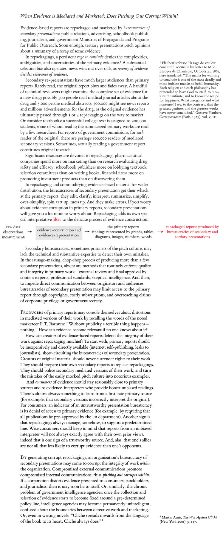
When Evidence is Mediated and Marketed: Does Pitching Out Corrupt Within?
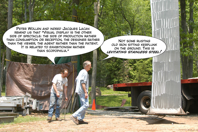
The Levitating Sculpture (and also sculpture theory and practice)
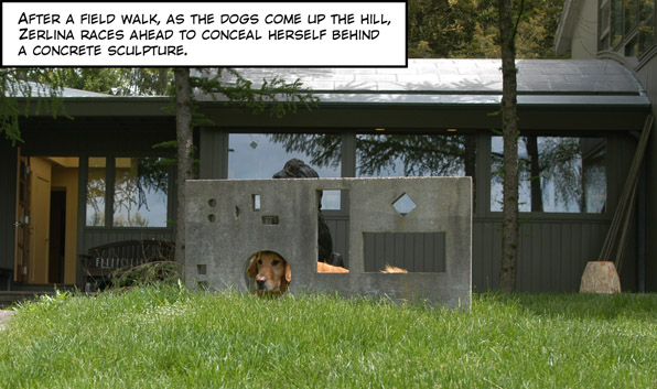
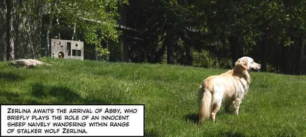
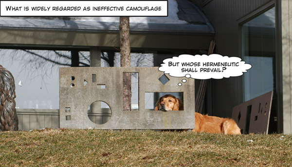
Dog cartoons: Whose hermeneutic shall prevail?
Binterview with ET
Here's the pdf of a 16-page interview that appeared in the
Technical Communication Quarterly:
Technical Communication Quarterly
Hyperbolic paraboloid constructed with scattered data points
I need a 3-D image of a saddle, a hyperbolic paraboloid, the shape of which is defined by a rough scatter of data points lying on its surfaces. In turn the 3-D scatter should be projected on the 3 surrounding 2-dimensional planes making up the box around the saddle. Then the points lying in the 3 2-spaces should be projected to univariate sparklines, those sparklines folded to link the plane-pairs will also serve as the tripod axes of the 3-space.
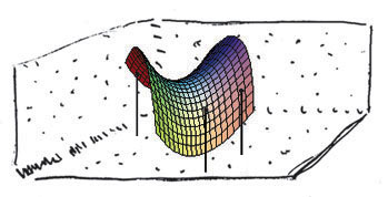
The 3-D saddle (made from data points, not too many I hope) floats within this box.
The idea is that the 2-D and 1-D projections fail to provide sufficient information to identify the 3-D hyperbolic paraboloid! Note that our saddle is not a surface, it consists of just enough scattered data points over the surface to suggest a saddle shape. So this is not about mathematical surfaces but rather about data scatters.
Has this or similar been done and where can I pick up such an illustration? I recall an example of a 3-D letter made from dots surrounded by 3 2-D planes whose projected points from the 3-D object don't give away the 3-D shape.
Surely this has been done already in MacSpin or Statview or a similar 3-D data analysis tool. After all, this is the fundamental logic about why we should do multiviariate analysis. If necessary we can construct the sparkline axes.
Might a Kindly Contributor find a good example or perhaps construct one? This is for the sparkline chapter but I'd like also to slip in the idea about n-1 dimensional projections of data points not giving full information n-space data point activities, exactly the problem of A. Square living in Abbott's Flatland.
Thanks,
ET
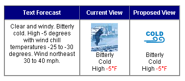
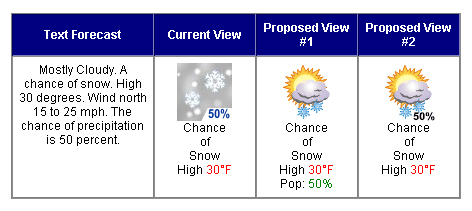
Weather icons
The National Weather Service is proposing to replace its excellent pictoral symbols with some corny icons:
https://www.weather.gov/icon_comments/
This link solicits comments about the new icons. The worst are:

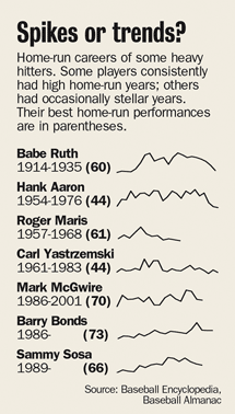
Huntsville Alabama Times scoops New York Times: sports-data sparklines
Lyn McDaniel, design editor of the
Huntsville Times, reports the use of sparklines in their sports section on March 21, 2005:
"Here is a modest first use of sparklines that appeared in
The Huntsville Times March 21.
The graph lines seem fatter because of the process of making a pdf. In reality they are about half-point, and could have been far thinner. Even 85-line presses can reproduce a hairline easily; we have not tried to find the minimum printable thickness on our 110-line press.
They were created to the same scale with Adobe Illustrator's graphing function and imported onto the page individually to give me some flexibility in placement. Actually making the charts took only a few minutes. Freehand has a similar graphing function."