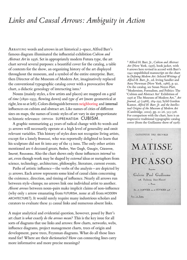
Here is brief excerpt from a draft chapter for Beautiful Evidence. The complete chapter is posted in the thread on "Corrupt Techniques in Evidence Presentations" in the New Answers threads.

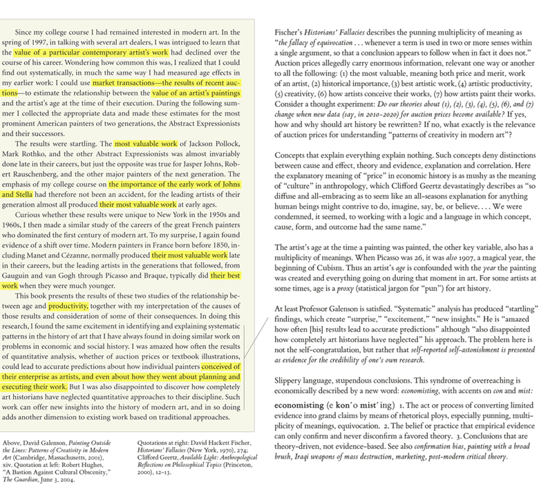
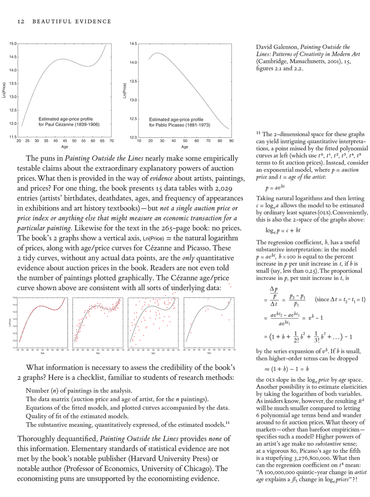
Here is brief excerpt from a draft chapter for Beautiful Evidence. The complete chapter is posted in the thread on "Corrupt Techniques in Evidence Presentations" in the New Answers threads.
It is possible to use Bembo for mathematical typesetting with careful work by a colleague. An excerpt from Beautiful Evidence:
Diagramatic pictures allow more focused, tighter commentary on pictures, compared to text or captions outside the picture frame. I've long been concerned at how the format of this board seems to enforce a separation of text and image. I'll be trying out more mapped pictures here and would appreciate good examples of mapped pictures (for thinking about the issue in Beautiful Evidence).

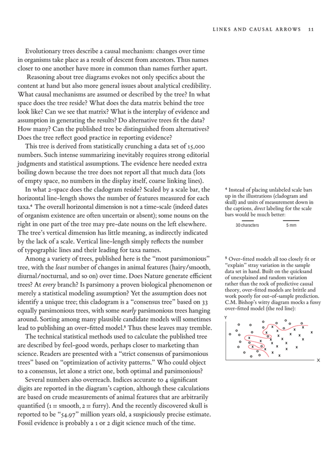
Instead of a mapped picture with direct labels, here's an impediment visual-verbal encoding:

A' = Anna Z = Zerlina A'' = Alex A''' = Abby


 =
=


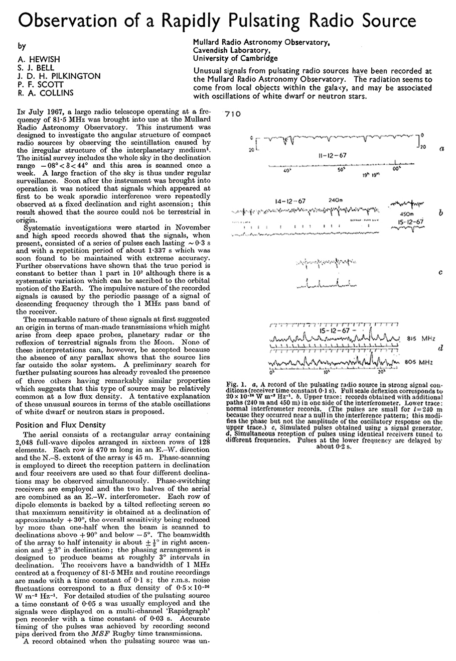
 Pulsars and Sparkline-like graphics.
Nature (vol. 217, February 24, 1968)
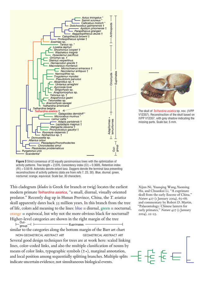
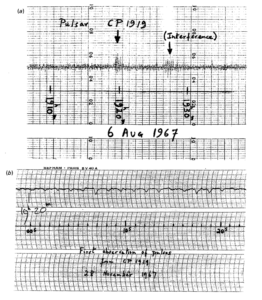
Pulsars and Sparkline-like graphics.
Nature (vol. 217, February 24, 1968)
 Sparkline small multiple
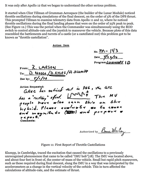
 1970 NASA report of throttle problems in the Apollo Lunar Module.
 Sparklines in Steven Heller and Véronique Vienne, 100 Ideas that Changed Graphic Design (Lawrence King Publishing, 2012), p. 196:
 Apple Watch sparkline, announced September 9, good but should show more detail, more data texture.
Should have design minimization, not data minimization.
Apple Watch sparkline, announced September 9, good but should show more detail, more data texture.
Should have design minimization, not data minimization.

Tutorial here for creating SVG-based sparklines with d3.js..@Mandiant used @EdwardTufte #sparklines to identify attacker activity. Watch No Easy Breach https://t.co/lQMQ6sSAcm pic.twitter.com/oFEFCDAqA6
— Richard Bejtlich (@taosecurity) September 27, 2016
 Implementing angular.js directives for d3.js and nvd3.js, tutorial here.
 Below, sparklines in Twitter analytics, good but routinely longer time periods and more intense detail would be better.
General idea = max[data], min[design].
Below, sparklines in Twitter analytics, good but routinely longer time periods and more intense detail would be better.
General idea = max[data], min[design].
 Diluting Perceptual Cluster/Streak Bias:
Informal, Inline, Interocular Trauma Tests
When people look at random number tables, they sees all kinds of clusters and streaks (even in random data). Similarly, when people are asked generate a random series of bits, they generate too few long streaks (such as 6 identical bits a row), because their model of what is random greatly underestimates the amount of streakiness in genuinely random data.
Sports, financial, and political reports are notorious for their narrative overreach, fantasizing about clusters, streaks, momentum, turning points, trend-spotting. The shorter the attention span of the reporter and the audience, the greater the faux trend spotting.
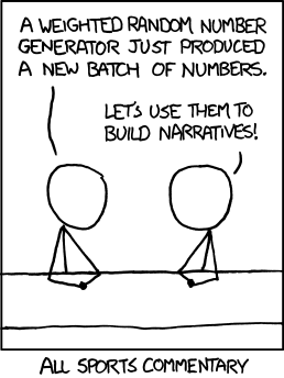
xkcd did this wonderful critique:
Diluting Perceptual Cluster/Streak Bias:
Informal, Inline, Interocular Trauma Tests
When people look at random number tables, they sees all kinds of clusters and streaks (even in random data). Similarly, when people are asked generate a random series of bits, they generate too few long streaks (such as 6 identical bits a row), because their model of what is random greatly underestimates the amount of streakiness in genuinely random data.
Sports, financial, and political reports are notorious for their narrative overreach, fantasizing about clusters, streaks, momentum, turning points, trend-spotting. The shorter the attention span of the reporter and the audience, the greater the faux trend spotting.
xkcd did this wonderful critique:
 A General Manager of a professional NBA basketball team described to me this strategy for escaping over-storytelling in postgame analysis. When coaches watched the video of a game, they would often simply reinforce their prior story: "When we kicked the ball out of bounds twice in the first minute, that was the beginning of the end, we lost all momentum and never caught up...blah blah." To overcome premature storytelling, the team did postgame reviews with the plays of the game in random order. This initially was intellectually taxing to viewers with preconceived narratives. In economics, autocorrelation is regarded as a plague. In sports, it is the main explanatory variable.
To dilute streak-guessing, randomize on time over the same data, and compare random streaks with the observed data. Below, the top sparkline shows the season's win-loss sequence (the little horizontal line = home games, no line = road games). Weighting by overall record of wins/losses and home/road effects yields ten random sparklines. Hard to see the difference between real and random.
The 10 random sparkline sequences can be regenerated again and again by, oddly enough, clicking on "Regenerate random seasons." This is looking a bit like bootstrap calculation. For the real and amazing bootstrap, applied to data graphics and contour lines, see Persi Diaconis and Bradley Efron, "Computer Intensive Methods in Statistics."
The test of the 10 randomized sparklines vs. the actual data is an "Interocular Trauma Test" because the comparison hits the analyst right between the eyes. This little randomization check-up, which can be repeated again and again, is seen by the analyst at the very moment of making inferences based on a statistical graphic of observed data.
(Thanks to Adam Schwartz for his excellent work on randomized sparklines. ET)
A General Manager of a professional NBA basketball team described to me this strategy for escaping over-storytelling in postgame analysis. When coaches watched the video of a game, they would often simply reinforce their prior story: "When we kicked the ball out of bounds twice in the first minute, that was the beginning of the end, we lost all momentum and never caught up...blah blah." To overcome premature storytelling, the team did postgame reviews with the plays of the game in random order. This initially was intellectually taxing to viewers with preconceived narratives. In economics, autocorrelation is regarded as a plague. In sports, it is the main explanatory variable.
To dilute streak-guessing, randomize on time over the same data, and compare random streaks with the observed data. Below, the top sparkline shows the season's win-loss sequence (the little horizontal line = home games, no line = road games). Weighting by overall record of wins/losses and home/road effects yields ten random sparklines. Hard to see the difference between real and random.
The 10 random sparkline sequences can be regenerated again and again by, oddly enough, clicking on "Regenerate random seasons." This is looking a bit like bootstrap calculation. For the real and amazing bootstrap, applied to data graphics and contour lines, see Persi Diaconis and Bradley Efron, "Computer Intensive Methods in Statistics."
The test of the 10 randomized sparklines vs. the actual data is an "Interocular Trauma Test" because the comparison hits the analyst right between the eyes. This little randomization check-up, which can be repeated again and again, is seen by the analyst at the very moment of making inferences based on a statistical graphic of observed data.
(Thanks to Adam Schwartz for his excellent work on randomized sparklines. ET)