Warning: Trying to access array offset on value of type bool in /nas/content/live/graphicspress/wp-content/themes/edwardtufte/archive.php on line 21
Annotating a State of the Union address
James Fallows provides a fascinating annotation of the recent State of the Union speech. The annotation is from several viewpoints: (1) the technical problems faced by speech-writers (Fallows wrote presidential speeches), (2) the parts of the audience addressed by parts of the speech, (3) the quality of argument and evidence, (4) the use of rhetorical ploys in most SOTU addresses (e.g., "Lenny Skutnicks").
Fallows interpolates annotation (italics) between sentences of the speech (roman), an interesting technique. Another method is to place annotations in the margins of the primary document, as in the ICU hospital bill in Envisioning Information and in the analysis of the Boeing-Columbia slide at https://www.edwardtufte.com/bboard/q-and-a-fetch-msg?msg_id=0000Rs&topic_id=1
Here is the link
https://www.theatlantic.com/issues/2004/01/sotu-address.htm (requires registration)
This thread might evoke discussion about techniques of annotation and rhetoric, not about partisan views.
Warning: Undefined variable $count in /nas/content/live/graphicspress/wp-content/themes/edwardtufte/archive.php on line 24
Warning: Trying to access array offset on value of type bool in /nas/content/live/graphicspress/wp-content/themes/edwardtufte/archive.php on line 21
Recommended Children's Books
We recently bought Graham Base's The Water Hole for our young child. It is a beautifully illustrated book that teaches ecology, math, geography. The story centres around a water hole that shrinks as more animals arrive at it with each new page. At the same time the water hole moves continents with each new page. Around the perimeter of the page are a number of animal silhouettes and these animals are drawn again in the main page in camouflage.
The Water Hole also illustrates the principles of parallelism, small multiples and visual confection that are described in Visual Explanations.
Do you know this book, and if so what do you think of it? Are there other children's books by different authors that you might recommend?
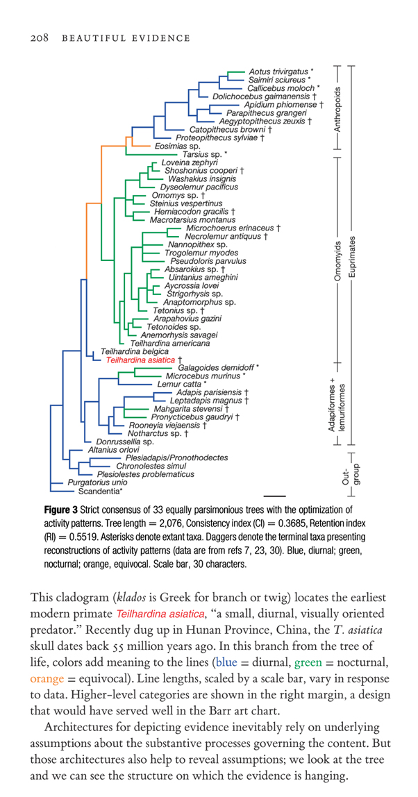
Evidence and assumptions in cladograms (and other tree diagrams)
Legends and Colors
I am working on a report for a company that has a large number of products. The client has stated that in one report the data will appear as both a scatter plot and a table. There could be upward of 40 items in the legend for the scatter plot. So I've hit the following dilemmas.
1. The number of discernible hues available. (Not to mention that this will appear in both soft and hard copy format.)
2. The report will be created by a software package and "tweaking" will not be an option.
Thanks,
Sean
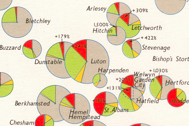
Pie Charts
One of the prevailing orthodoxies of this forum - one to which I whole-heartedly subscribe - is that pie charts are bad and that the only thing worse than one pie chart is lots of them.
However, I offer the attached.
The original is 4cm by 6cm, and within that space I find it difficult to think how else I could represent the information. Location is given by the centre of each circle, and each circle is proportionate to the size of the total of which the segments are part. Obviously there are disadvantages: bar charts for each location would allow us to see whether the red of St. Albans is greater or smaller in absolute terms than the red of Luton — but I think that falls within the normal range of compromises we make in design. The designer has chosen to tell us about proportions and not absolutes. Using a bar chart instead of a circle we should need a separate symbol for the location of the town and perhaps an arrow pointing to it.
Any views?
Visualizing Social Networks
This material may be old hat to readers of this forum, but it looks intriguing.
The Twigs: Landscape artworks made from steel and air
Larkin's Twig In our sculpture fields, with visiting sheep.
Inset: ET with Larkin's Twig, first in what is now a series.
This piece is 32 feet or 10 meters tall.
With 99%+ air by volume,
it has a lightness,
a non-monumental quality,
a large presence.
It is about airspace, torqued steel lines, shadows.
Views looking up to sky at the joinery, with its torquing calligraphy moving in 3-space:
A test installation of the second (30 feet high, legs reshaped) Twig at Hogpen Hill Farms. This is the Aldrich Twig, shown for 9 months in the sculpture garden at The Aldrich Contemporary Art Museum; it is now in a northern California private collection.
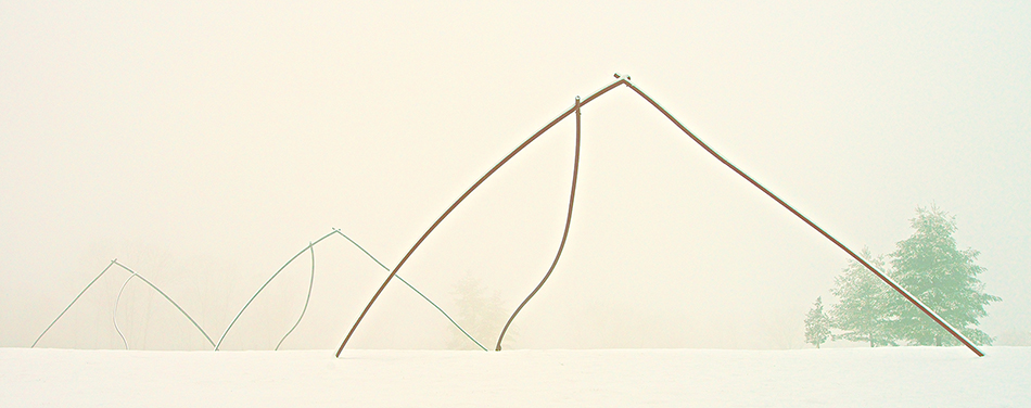
Three Twigs, 2012, steel and air, approximately 300 x 70 x 30 feet, or 90 x 30 x 9 meters, in the snow at Hogpen Hill Farms. Multiple Twigs create complex airspaces both within and between the Twigs.
Below, the piece Two Twigs, generating complex airspaces between the two, as well as the usual Twig internal airspaces
Three-dimensional calligraphy in the snow and against the sky, all for free because the piece is outdoors. Note bird silhouette below.
Above, a scale model, constructed for my show at The Aldrich Contemporary Art Museum, shows the Twig location (along with little statues of the artist and welder).
The idea is to do whatever it takes to learn about the artwork and its context: photographs, scale models, full-size mockups, digital models. Here is Larkin's Twig installed at The Aldrich:
Larkin's Twig, a day's shadows in an amazing time-lapse video, which confirms once and for all that the Earth rotates.
In the past, I've had good results presenting a some scientific results at a conference as a 4x6' poster. I talk people through the poster's figures, which are laid out from left (intro/methods) to right (results/conclusions). I provide a reduced-size handout of the poster, which most visitors to my poster choose to take away. This format seems to work well for communicating what I've done.
So, how can I reproduce this successful experience when I am giving a lecture to a larger, seated audience? The entire argument is visible to the poster viewer, who knows where each figure fits in as I discuss it. The lecture viewer, however, must be shown individual figures in sequence. How can I let them scan through my entire arguement and know where we are within it? You've recommended providing a handout, such as my reduced-size poster. In addition, what about a second screen to project the talk's overall organization? How to do so in a way that could be read at the by back of the room - perhaps a flowchart? Alternatively, perhaps the top of each slide would list the section ("Methods", "Results", etc) that it falls under, similar to the way a book lists the chapter title at the top of pages. The slides' section titles would match those in the handout.
Any thoughts on these ideas, or alternatives, would be appreciated.
Thanks,
Kate
New Map of the Universe
Came across this in the 1-13-2004 NY Times online.
Which in turn has links to the full-text in Postscript, PDF, and Other formats.
[link updated March 2005]
We use cookies to ensure that we give you the best experience on our website. If you continue to use this site we will assume that you are happy with it.