Warning: Trying to access array offset on value of type bool in /nas/content/live/graphicspress/wp-content/themes/edwardtufte/archive.php on line 21
Photoshop manipulations in journalism
Warning: Undefined variable $count in /nas/content/live/graphicspress/wp-content/themes/edwardtufte/archive.php on line 24
Warning: Trying to access array offset on value of type bool in /nas/content/live/graphicspress/wp-content/themes/edwardtufte/archive.php on line 21
Death in the afternoon - the statistical 'fingerprint' of a mass murderer
In January 2000, Dr Harold Shipman, a former family doctor in Manchester, England was found guilty of murdering 15 of his patients. It is suspected that he killed more, possibly as many as 250.
Today he was found dead in prison.
Following his trial, the Chief Medical Officer for England commissioned an audit of Shipman's clinical practice for the years from his appointment in 1974 to his arrest in 1998. That detailed review shows how the deaths of Shipman's patients displayed a number of unusual characteristics with respect to time and place. Perhaps one of the most chilling was the early afternoon peak (during home visits) when the proportion of deaths for Shipman (14% at 2pm) was about 7 times higher than a comparison group of doctors.
To add to the tragedy for victims, their families and other professionals was the fact that this information was already 'in the system' all along but, of course, was not recorded, aggregated, tabulated or graphed in a way that might have compelled investigation.
The difference between life and death sometimes lies (continuously hidden) in the data.
The graph is Figure 5.2 on page 40 of the report.
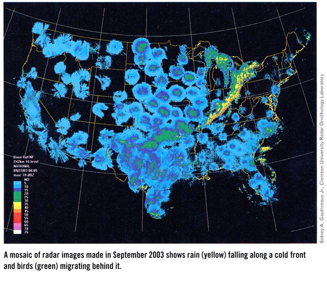
Maps of birds and storms


Electoral-economic cycles: 1972 and 2004, deja vu all over again
A long time ago I wrote a book Political Control of the Economy (Princeton University Press 1978), which sought to show the links between elections and economics (the political business cycle, political parties and macroeconomic policy, support for incumbents and economic performance). The chapter on the electoral-economic cycle featured detailed evidence about the 1972 stimulation of the economy for the re-election campaign of Richard Nixon. I was wondering when someone might comment on the run-up to 2004, where both monetary and fiscal policy are extremely stimulative. Here's a start from the Boston Globe:
THIS BUSINESS CYCLE COULD GET VICIOUS
By Robert Kuttner, 1/7/2004
IN 1975, POLITICAL scientist Edward Tufte and economist William Nordhaus put forth a theory of the political business cycle. Usually, ''business cycle'' refers to the normal ups and downs of the economy. Their insight was that the business cycle is influenced by politics.
These scholars documented that incumbent presidents often used their influence with Congress and the Federal Reserve to artificially pump up the economy for their reelections and dealt with the resulting damage once they were safely returned to office. Richard Nixon's 1972 landslide nicely fit the pattern. So did Lyndon Johnson's ''guns and butter'' economic program of 1967-68 (except that the Democrats were undone by the Vietnam War).
The theory later fell into disfavor. Neither Jimmy Carter (defeated in 1980) nor George H.W. Bush (defeated in 1992) could manipulate the economy well enough to save their jobs. Carter fell to stagflation and Bush I to recession and a jobless recovery.
But the political business cycle is back with a vengeance, and this time the morning after will be a corker. The only question is whether the damage will be visible before or after Election Day.
President Bush has unleashed the most massive fiscal stimulus program since World War II, with immense deficits that only grow after 2004 as the biggest tax cuts for the wealthiest kick in. He has timed the relatively meager breaks for the middle class for this (election) year.
Meanwhile, Fed chairman Alan Greenspan (up for reappointment in June) is doing his part to fuel the election-year boom. Despite his own misgivings about immense deficits -- he was far from shy about this during the 1990s -- Greenspan has loyally kept mostly silent when it comes to Bush's deficits. More important, Greenspan is pumping up the recovery with low interest rates notwithstanding his earlier concerns about the danger of economic bubbles.
Thanks to this short-term hyperstimulation, Bush might well have his election year recovery. For now, corporate profits are up, the stock market is booming, and there is even a trickle of job growth.
But there is not a reputable economist -- left, right, or center -- who thinks this act can continue beyond a year or two. Bush's own treasury secretary, John Snow, and his chief economist, Greg Mankiw, both warned about this danger in their previous lives.
As the deficits spin out of control, interest rates will rise. If Bush is reelected, the deficits would also be used as justification for a round of cuts in social outlays that would make Bush's program cuts to date look like mere tinkering.
Meanwhile, serious social challenges like the retirement of the baby boomers and the spiraling of health care costs would be shifted from society back to the individual through proposed privatization of Social Security and health plans that made the subscriber pay ever more of the costs out of pocket (or go without). The larger fiscal and economic mess would be left for Bush's successor after Bush was safely in his presidential library.
Not only has Bush taken short-term political manipulation of the economy, in Tufte's sense, to new and cynical extremes; he has invented a wholly new kind of political business cycle in the form of programs and policies that look impressive only in the short run and turn out to be disasters later on.
Exhibit A is the recently enacted Medicare drug benefit program. Consumers won't experience the fraud firsthand this year since the program doesn't become available until 2006. Nice touch, that. As the law is written, less than half of actual drug costs for most participants will be covered. And seniors will get only one chance to decide whether to opt for the (inadequate) Medicare program or to stay with (increasingly unregulated) private drug insurance coverage that could deteriorate over time.
No Child Left Behind, Bush's big education program, is even worse. It creates perverse incentives for districts to dumb down tests and ''lose'' dropouts in order to make schools look better. It adds impossible mandates that states and districts have to finance locally. By 2005 the program is likely to collapse of its own weight, but in 2004 Bush is parading as an education president.
Iraq fits the pattern. We have Saddam's head on a platter this year -- and the likelihood of greater regional instability, nuclear proliferation, and anti-Americanism afterwards.
Some of Bush's time bombs may be delayed until after the election. Some could explode prematurely before the election. But all of them could, and should, backfire on Bush now -- if voters are paying attention.
Robert Kuttner's is co-editor of The American Prospect. His column appears regularly in the Globe.
This story ran on page A15 of the Boston Globe on 1/7/2004.
Copyright 2003 Globe Newspaper Company.
odds ratios, graphing positive and negative associations together
How do you graph, on one chart, the results of discrete choice logistic regression in which there are positive and negative associations (odds ratios above and below one) for different categories of different variables? Excel, SAS, SPSS and SUDAAN don't seem to offer anything.
I have been doing it by creating a bar chart, with the origin at 1, that shows the magnitude correctly i.e. 0.2, 0.33, 1.0, 3.0, 5.0 as symmetrical, by transforming the odds ratios, and relabeling the grid.
Any suggestions?
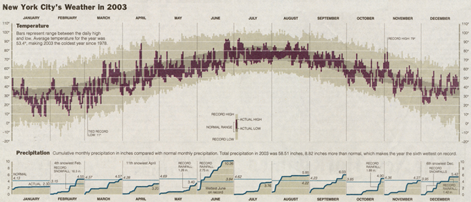
New York City Weather Chart
New York Weather Chart
January 4, 2004, p. A-15
The annual review of the weather by The New York Times appears below. It shows daily high and low temperatures for 2003, for a normal year, and for record days, along with cumulative monthly precipitation. Some interesting inferences about average, variation, and rates of change over the seasons can be made visually. Note the flat part of the cycle through mid-December to mid-February and then a fairly rapid rise in temperature mid-February to May. And so on.


Analog clocks, sorobans, and slide rules
Over the past twenty years I have given much thought to analog clocks, sorobans, and slide rules.
The case of the analog clock is the simplest: for a time, it looked as though analog clocks and watches might be replaced completely by digital clocks and watches. That did not happen. Why? Because (I have surmised, and undoubtedly there is considerable research that backs me up) people cannot organize their time using a digital clock the way that they can with an analog. Twenty minutes on an analog clock is one-third of a pie.
I've thought less, but some, about sorobans. The word is that these analog calculators are still in use in Japan, where most people can add and subtract numbers more quickly with sorobans than they can with digital calculators. Apparently, a calculator is faster for multiplication and division. So, for a while (and it may still be the case), it was common to purchase a soroban with a calculator built on the side.
(A soroban looks and functions much like an abacus, but has a single row of beads in the second column rather than two rows.)
As for the poor forgotten slide rule: engineers tell me that calculators are superior in every way, and have been since Texas Instruments started producing them. I am skeptical, and will remain skeptical. I believe that a slide rule requires its user to function at a higher level in order to do a calculation, and that the higher functioning has positive effects: checking, mental exercise.
Engineers tell me: rubbish.
Anyone want to weigh in on this? Am I making a fundamental category mistake by lumping slide rules with sorobans and analog clocks?
Mars landing
http://marsrovers.jpl.nasa.gov/newsroom/pressreleases/20040104a.html
why we see what we do
There's a wonderful new book called "why we see what we do" by Dale Purves, a neurobiologist at Duke. He's found a way to quantify the strength of various optical illusions and has a theory that optical illusions reflect our mind's attempts to get the real information from ambiguous optical information. For example, the reason why a gray square appears brighter when surrounded by black is because we perceive the dark area as a shadow and "know" that the gray square is actually a lighter square in dim light. His evidence for this is extremely good.
His web site has interactive optical illusions that beautifully illustrate the same points. It's quite the eye opener on visual perception, particularly on how much is going on behind the scenes. It's also interesting to think of his book in relation to those old bauhaus color theory books by Albers and Itten (other favorites of mine).
sonke
