Warning: Trying to access array offset on value of type bool in
/nas/content/live/graphicspress/wp-content/themes/edwardtufte/archive.php on line
21
Mark Lombardi influenced by Envisioning Information
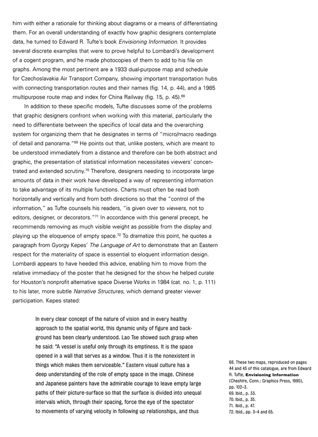
Both the 1933 Czechoslovakian airline map/schedule and the 1985 Chinese railroad map/index in my Envisioning Information have long been favorites of mine (shown below).
It is nice to learn that Mark Lombardi spotted the images and used some of the display strategies described in the book.
Maya Lin's Women's Table at Yale also has some ideas growing out of Envisioning Information, which she talks about in her PBS interview with Bill Moyers.
From Robert Hobbs, Mark Lombardi Global Networks (New York, 2003), pp. 41, 43-46:


Warning: Undefined variable $count in
/nas/content/live/graphicspress/wp-content/themes/edwardtufte/archive.php on line
24
Warning: Trying to access array offset on value of type bool in
/nas/content/live/graphicspress/wp-content/themes/edwardtufte/archive.php on line
21
Music boxes
A recent trip to Maine introduced me to an interesting display of quantitative (in this case, musical) information displayed in a physical medium: music boxes.
In the small town of Wiscasset, about an hour north of Portland, is an amazing private museum called the Musical Wonder House. As frilly as it sounds, it is one of the most rewarding museum visits I've ever experienced. Danilo Konvalinka, the founder, curator, and part-time guide of the MWH has gathered hundreds of antique music boxes which, before the advent of the Victrola, was one of the most popular mediums for musical enjoyment.
The music boxes come in roughly two distinct styles: a round cylinder with small, hand-placed spikes that pluck notes from a metal "comb" (the precursor to today's music boxes); and a flat, rotating metal disc with triangluar divots punched downward that also pluck notes from a comb. The latter style spins the disc horizontally and is obviously the precursor of the turn-table on modern record players.
Aside from the unique and beautiful songs they play, it's fascinating to watch the musical notation laid out in front of you in time and space by the placement of either the pins of a cylinder or the divots of the disc. Arpeggios, finales, trills...they're all placed spatially on the playing surfaces. Unlike an instrumental performance, you can watch the music coming up. It reminded me immediately of the VHS tape I purchased at one of E.T.'s talks, where the musical notation of several classical music pieces was animated on the screen.
The music boxes were also excersises in resolution/depth of content. In contrast to today's five-and-dime, one-song music boxes, some of the cylinders, which are the older and more artisanal of the two styles, had upwards of 10,000 pins placed in them, some no more than a 1/32nd of an inch apart, so that the cylinders had multiple song selections on them (after playing a tune, the cylinder would proceed 1/32nd to the left to allow a new set of pins to align for the next song). These were hand-placed by craftsmen working in the mid to late 19th century.
The metal discs, which are interchangeable like LP records, soon took over the market, as they could be mass-produced by punching the discs on machinery, but are the more enjoyable to watch as you see the divots rotate slowly around to the comb. One box we were shown took advantage of this: the comb had been polished to a bright shine so that the gleam of the "tooth" shone through the disc as it was plucked.
If you are nearby, it is well worth the visit to the MWH to see these music boxes in action. I doubt many other people have seen them as demonstrations of the display of quantitative information, but it enriched my experience to watch and listen to them on several different levels at once!
Charting Use Of Public Open Space
Anyone charted the use (or the none use) of public open space in a city's downtown (inner core) and/or waterfront? And if so - any results to see?
Source of Bell Centennial Font
I recently attended your presentation in Palo Alto. The next trick will be to convince my bosses that your ideas make sense. I'm currently working on a table-rich document and would like to integrate Bell Centennial font. Unfortunately, I am obligated to use Word and do not currently have this font. Do you know where I might find it? Thanks for the input.
Teaching Information Design in Public Schools
It has bothered me for a long time that schools spend so little time and energy teaching students how to organize information in meaningful ways. I recently attended the Science Fair at my children's school and was impressed by the creativity of the experiments, and disgusted by the presentation of most of them. Information was displayed with no sense of organization, and the judges appeared to pay much more attention to the visual style of the presentations than to the content.
Obviously (as you've noted) having students create PowerPoint presentations instead of writing papers only exacerbates this problem. Is there any hope? Any chance of you writing a book specifically for elementary school educators? Or doing a series of seminars for them?
If you don't have any ideas on how we can change the schools, how about an idea of what I can do as a parent to help my kids understand and utilize good information design.
"PowerPoint Makes You Dumb," New York Times Magazine, December 14, 2003
PowerPoint Makes You Dumb, by Clive Thompson.
[Also posted on our NEW page.]
High Resolution Gigapixel Pictures
ET-
Tawabaware has posted information about a recently assembled high resolution photo of Bryce Canyon that is over 1 gigapixel in size. The image measures 40,484 x 26,800 pixels and contains about 1.09 billion pixels. The web page and associated links explain how the photo was assembled along with several comparisons of resolution. It speaks volumes. Especially when compared to a Powerpoint image!
Daniel Meatte
Apple's Keynote vs Microsoft's PowerPoint: Don't get your hopes up
I was just wondering what your thoughts are (if any) on Apple's Keynote, in comparison to Microsoft's PowerPoint.
Wonderful movies about typography: "Behind the Typeface" and "Etched in Stone"
On the lighter side: typography inspires VH1 spoof in a Flash animation, Behind the Typeface: Cooper Black.
The beauty of plans and elevations
In another thread, Dr. Tufte mentioned that everybody should know how to read plan and elevation views. If one is unfortunate enough not to be taught this in school, Anchor building stones provides a very elegant self-study course (albeit a bit expensive)
Go here, and after selecting your preferred language, select Downloads, then Designs, and select a design to open - Pyramidenmonument is fun.
Each design provides perspective views from different angles, then an elevation which assigns a letter to each building course (plan), which is then presented.
What I particularly like about these design booklets is that the builder (me) is assumed to be intelligent. I am expected to be familiar enough with my materials so that labeling each stone used is not necessary. The designs aren't cluttered up with text hints or exhortations.
