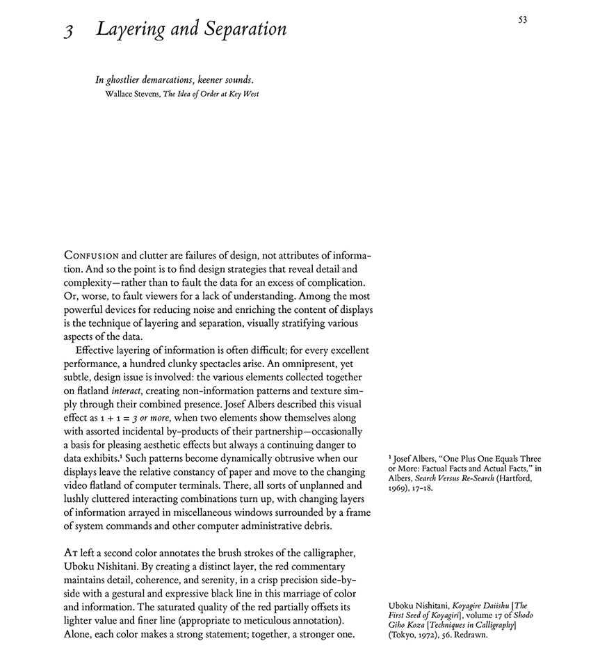
Warning: Trying to access array offset on value of type bool in
/nas/content/live/graphicspress/wp-content/themes/edwardtufte/archive.php on line
21
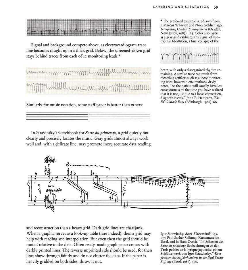
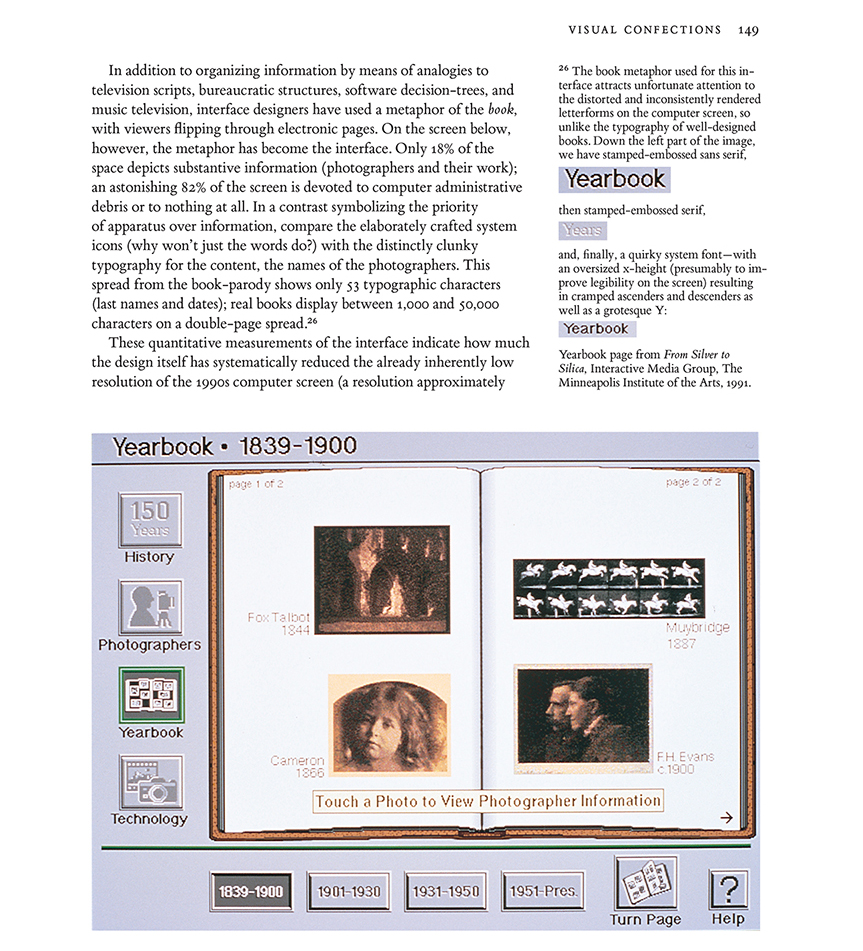
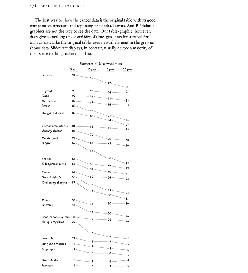
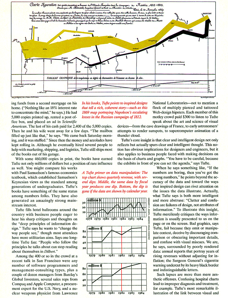
Overlapping data graphics to make comparisons
Here are displays of performances of 10 large mutual funds, first a sparkline-table, and then by various overlaps or stacked piles of sparklines:

Source: Edward Tufte,
Beautiful Evidence, p.51
Then a delightful workaday practical example by Dr. Reuben Strayer, an emergency room expert: "How emergency room clinicians determine regular vs. irregular rhythm without instruments. Cardiologists use calipers. Intensivists write little marks on a page and march them across. Emergency providers fold the ECG in half and hold it up to the light. Or the sun.
Fold the tracing in half. Hold up to the light.

Now align the QRS complexes.
The rhythm is regular.

Here is another example.
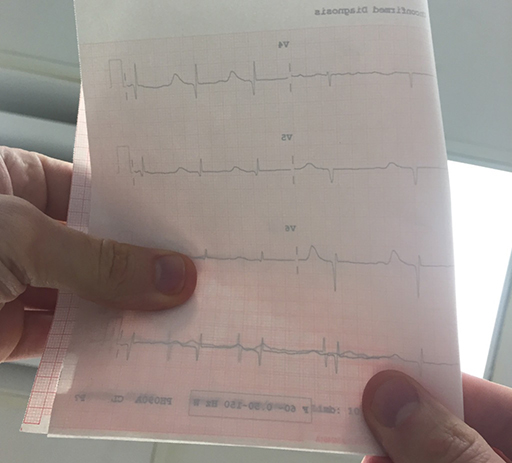
Irregular.
Cannot line up QRS complexes."

link: http://emupdates.com/2015/04/14/how-emergency-clinicians-determine-regular-vs-irregular/
: Undefined variable $count in
/nas/content/live/graphicspress/wp-content/themes/edwardtufte/archive.php on line
24
Warning: Trying to access array offset on value of type bool in
/nas/content/live/graphicspress/wp-content/themes/edwardtufte/archive.php on line
21
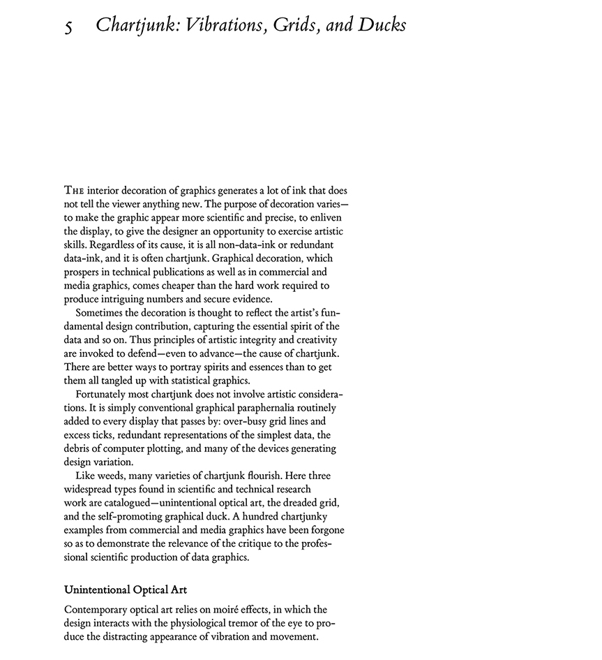
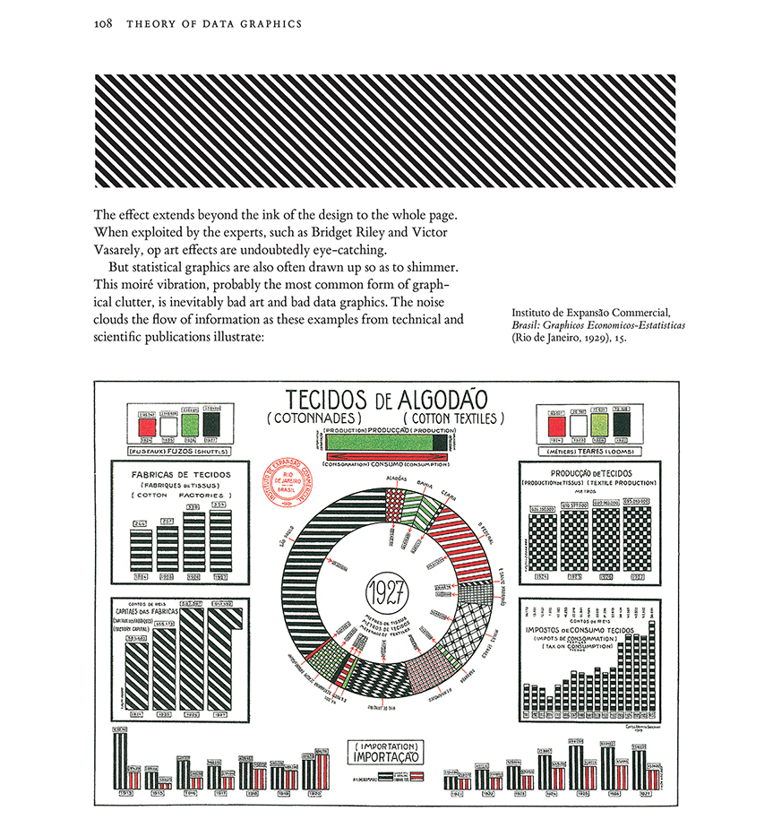
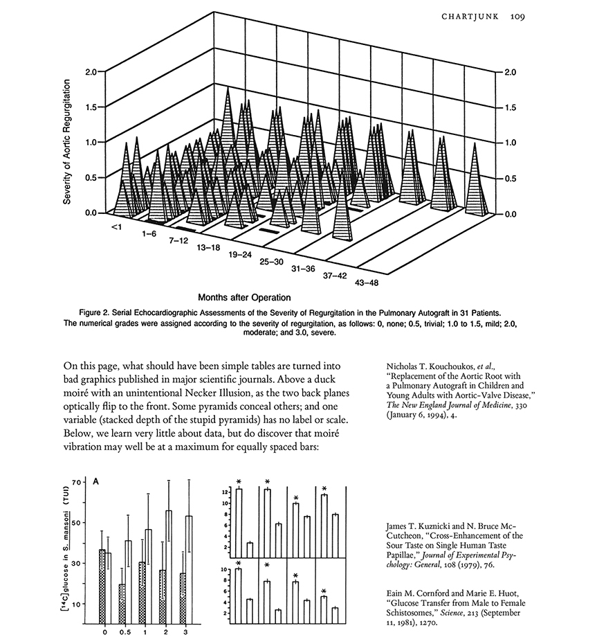
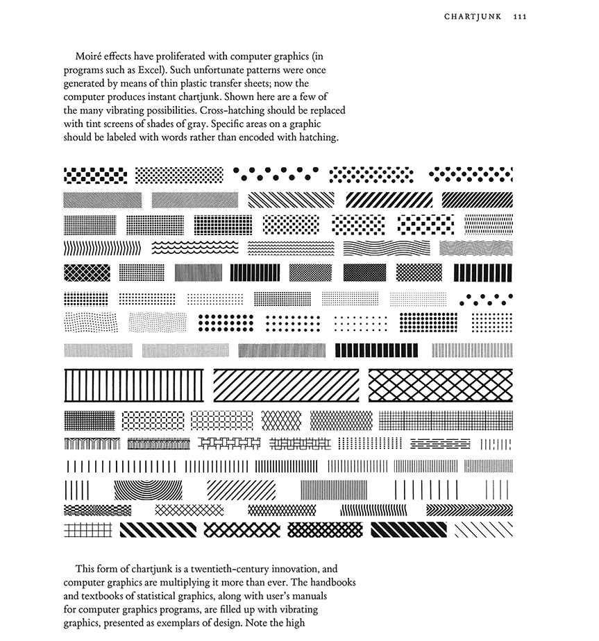
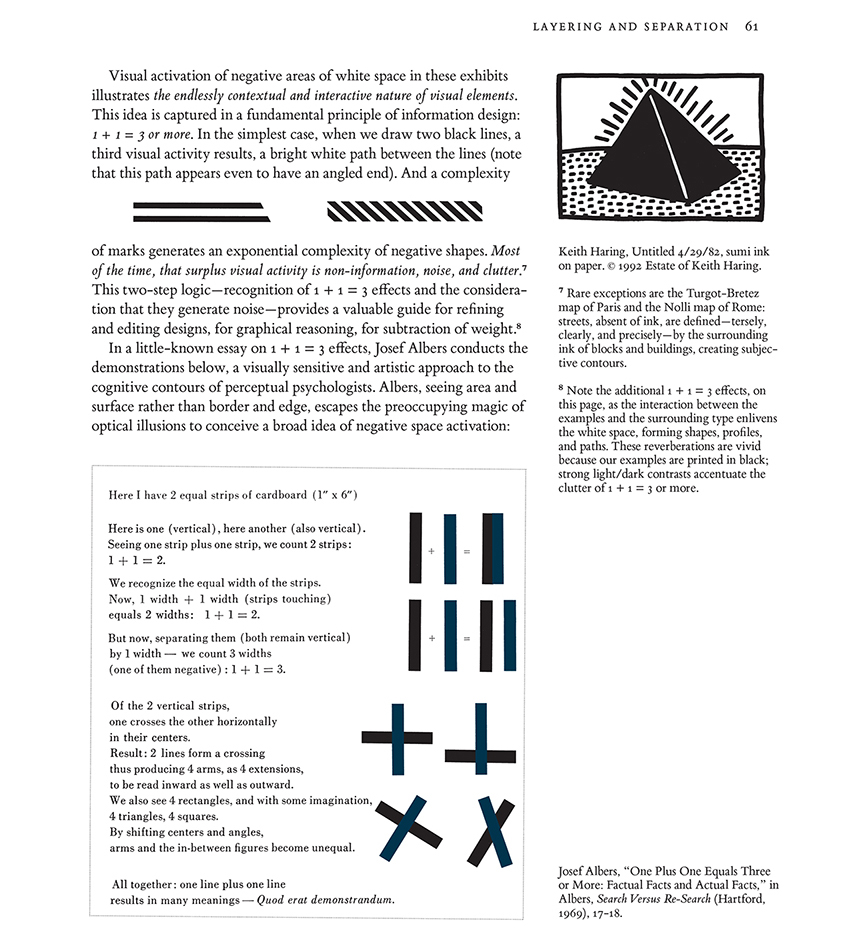
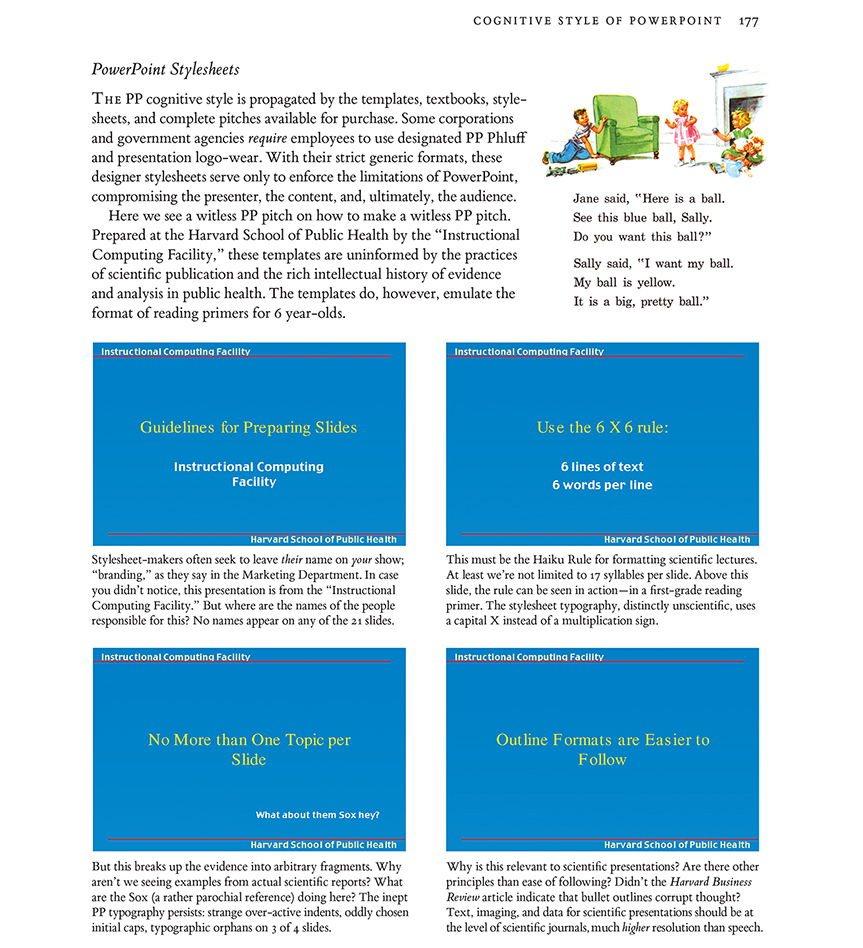
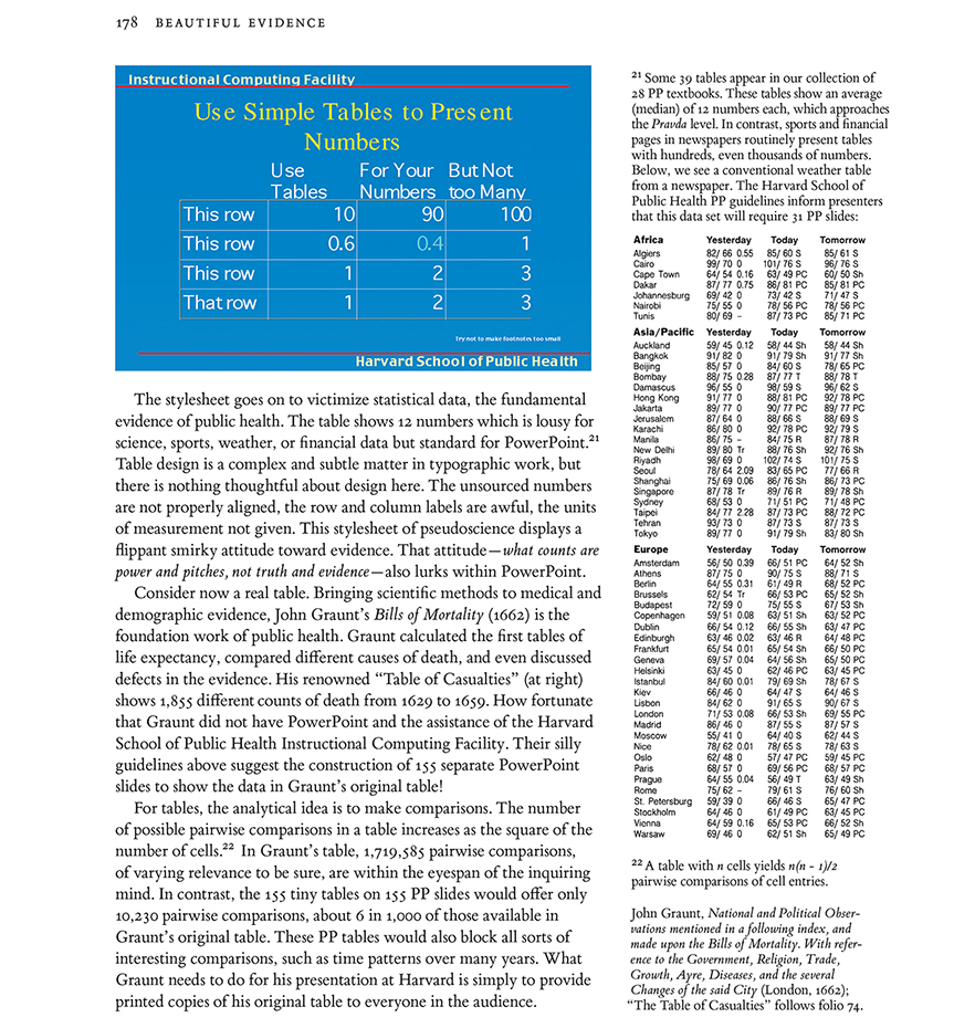
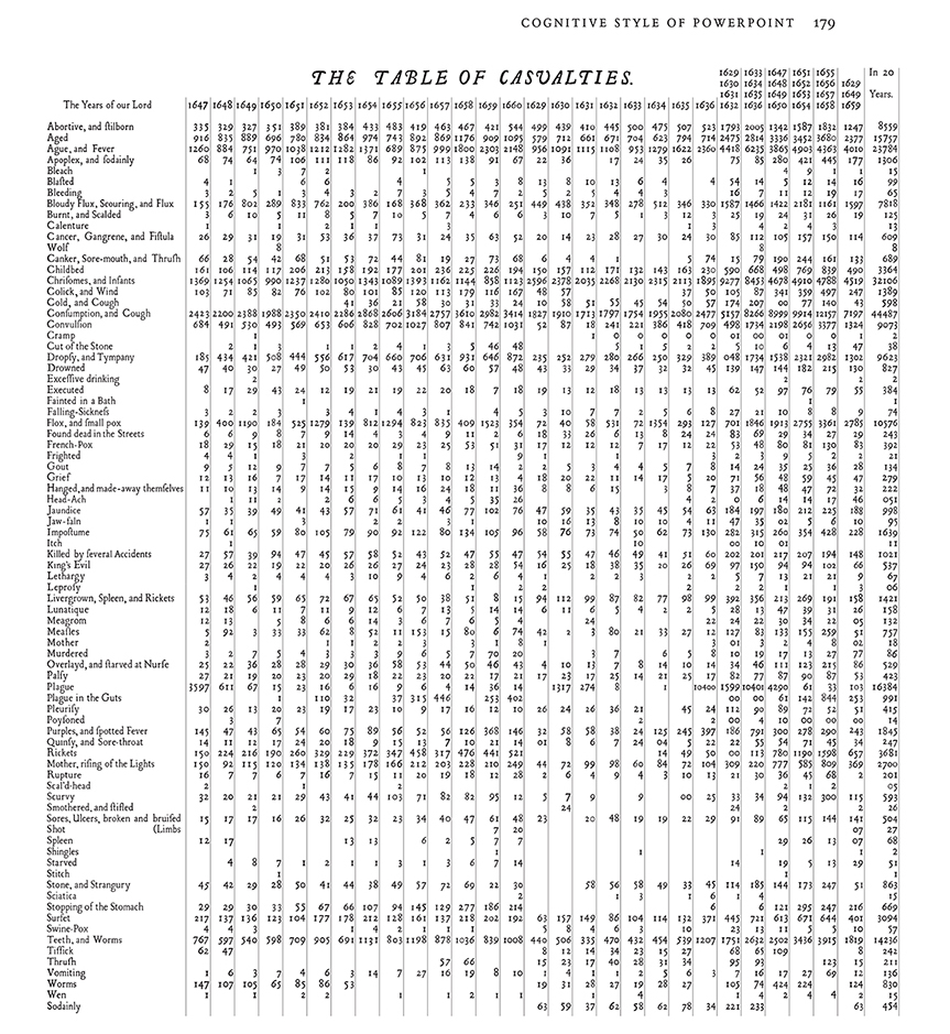
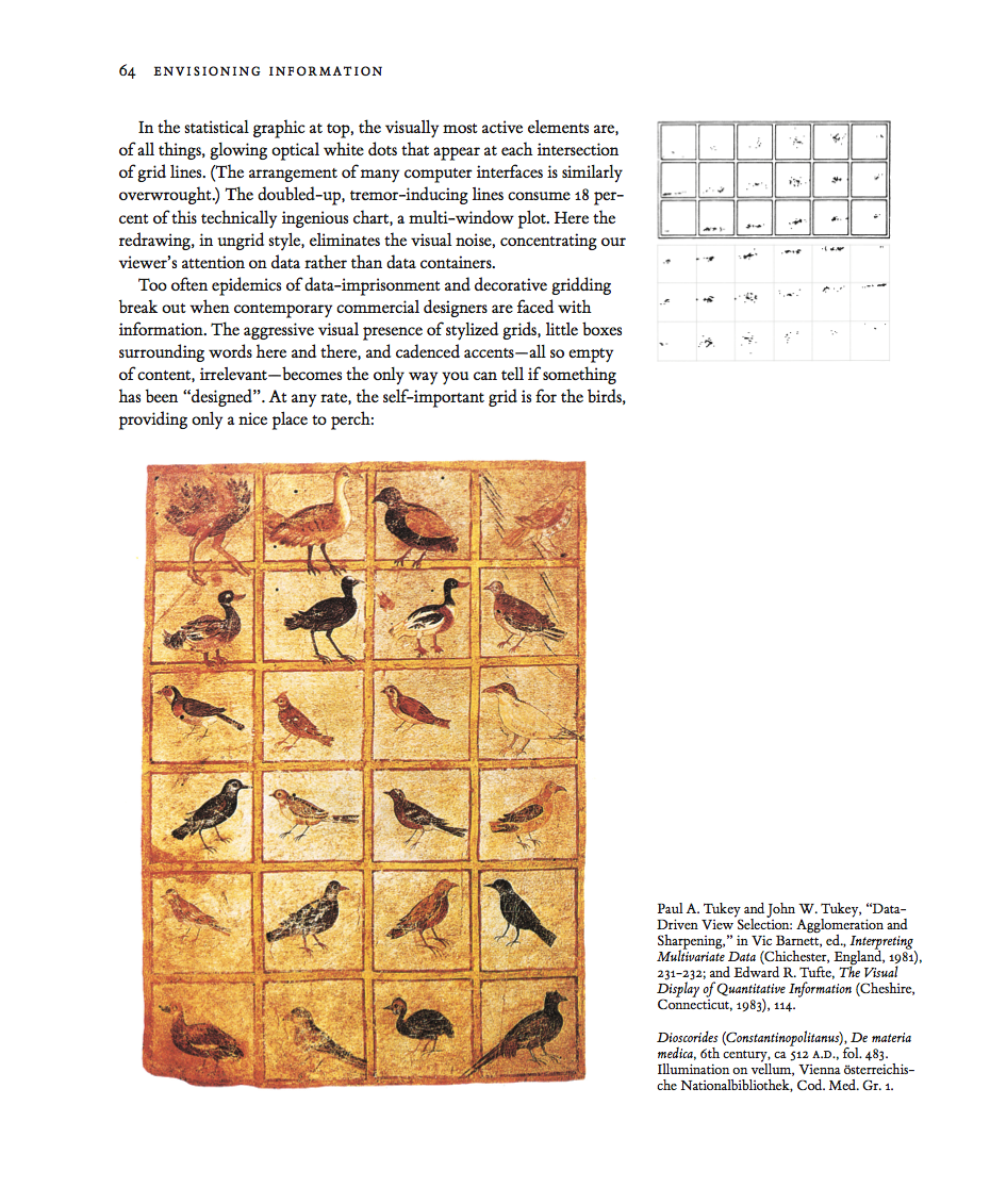
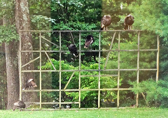
Chartjunk
Consulting stories
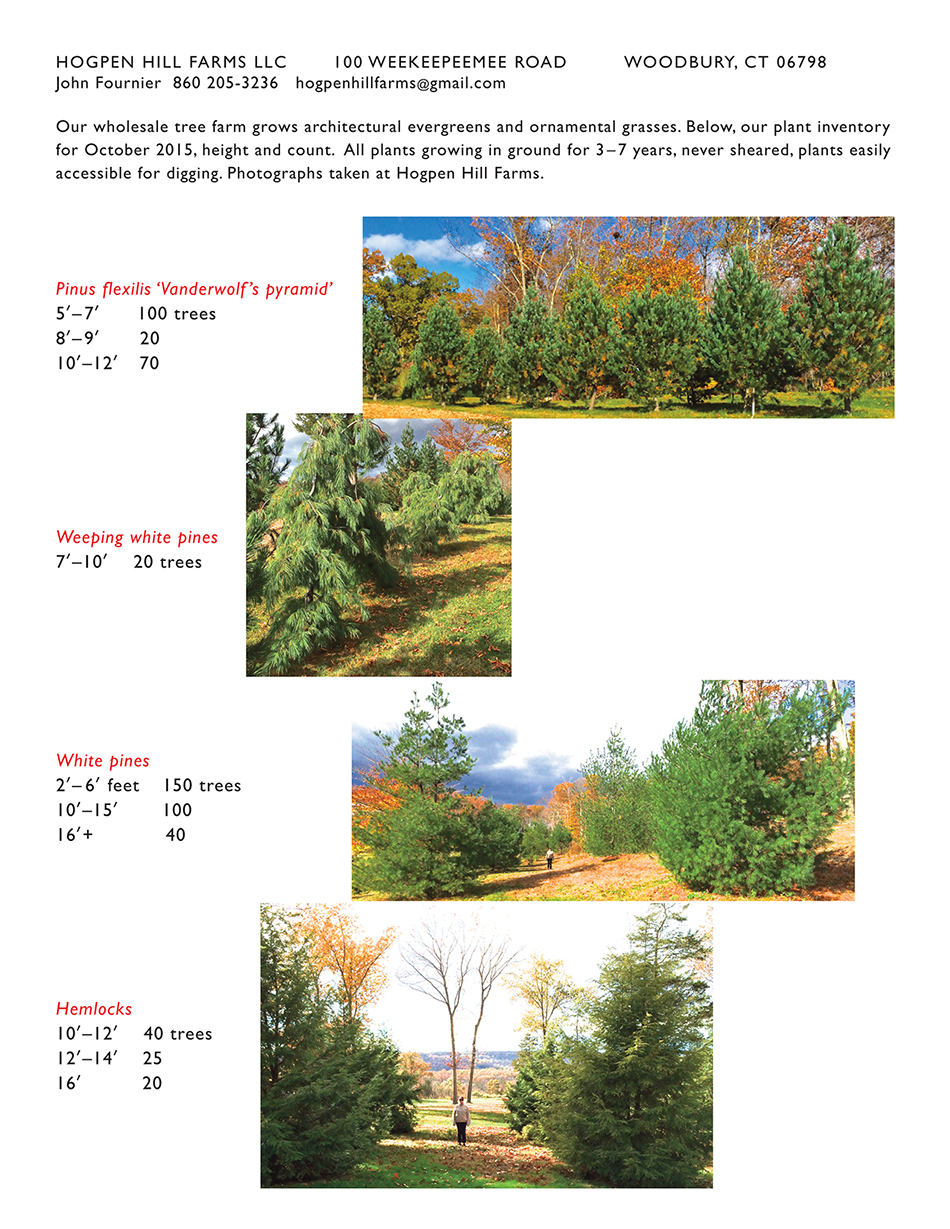
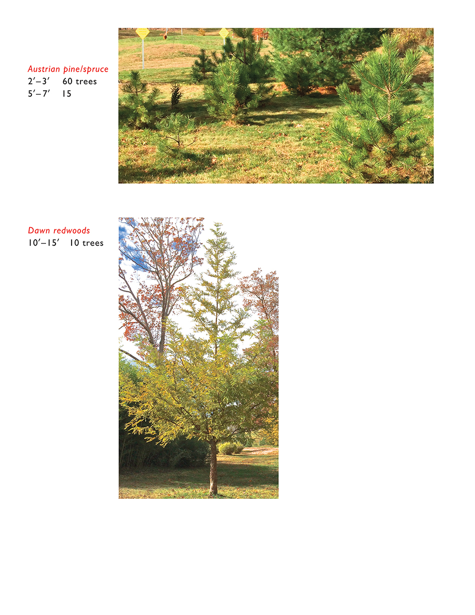
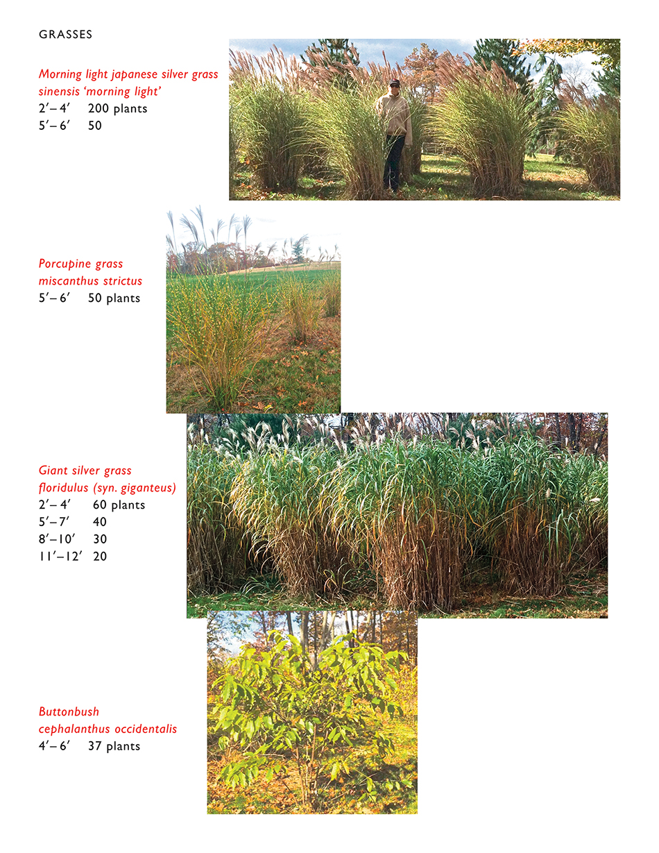
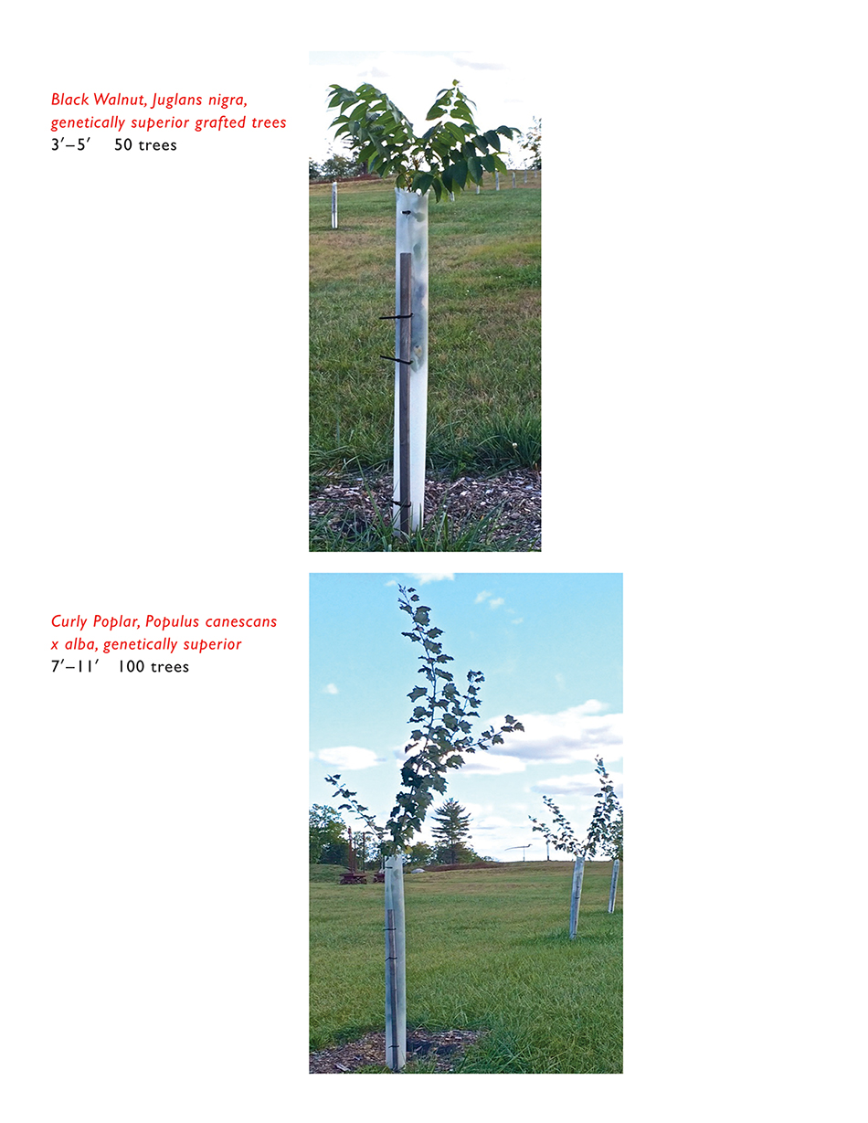
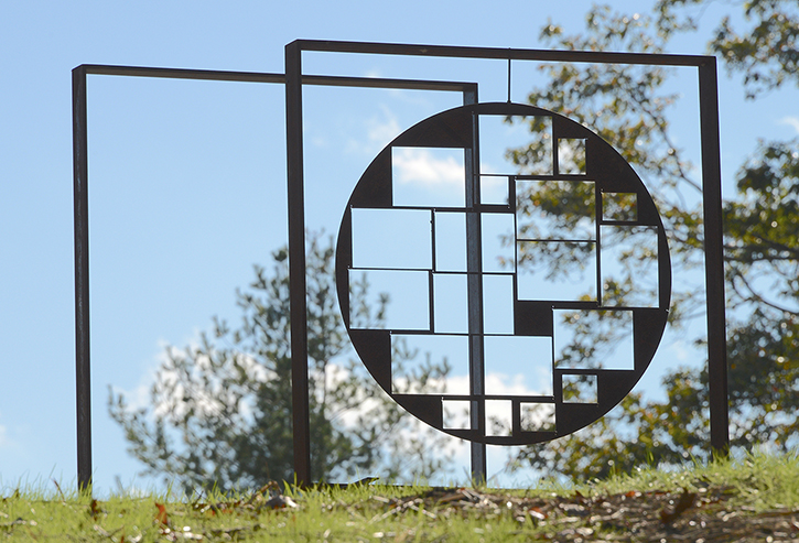
Hogpen Hill Farms LLC: Architectural evergreens and ornamental grasses
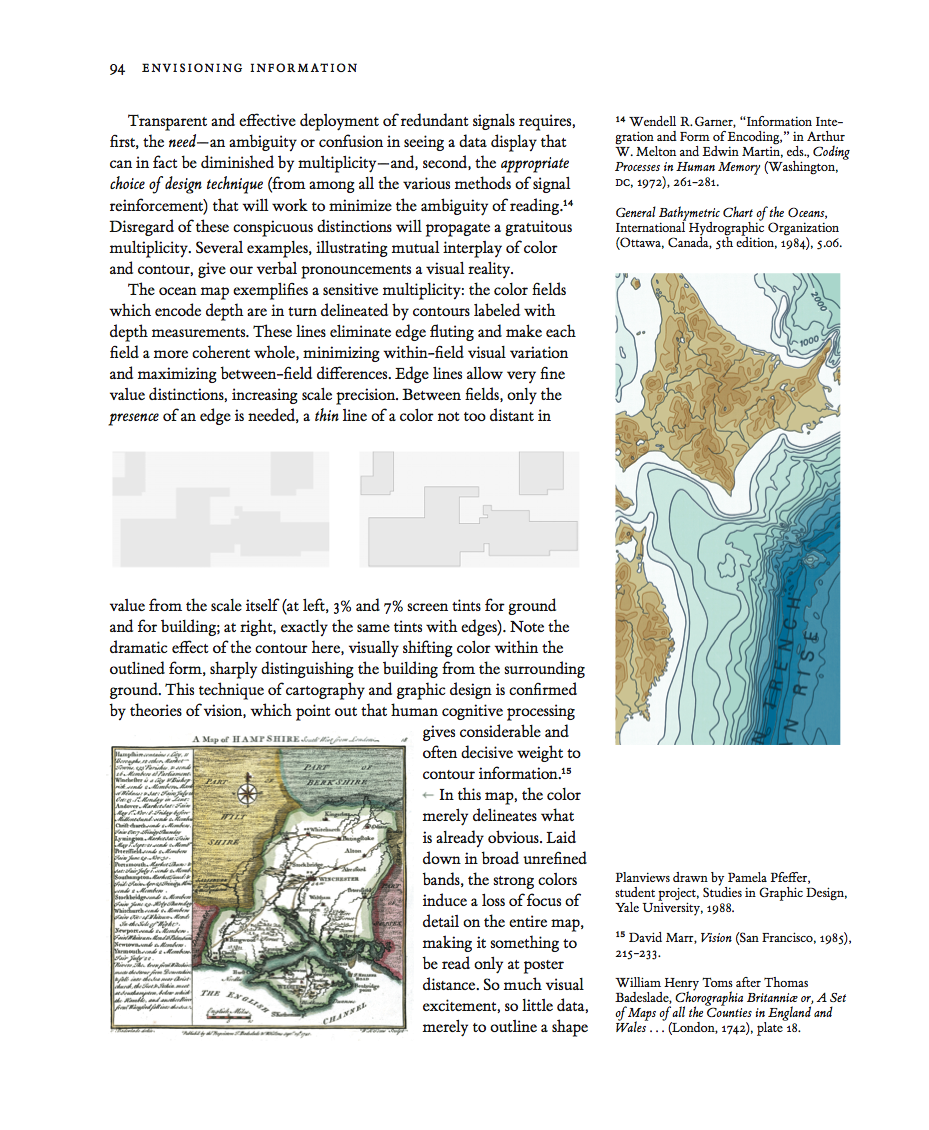
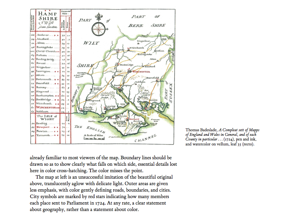
On the Edge, At the Margin: Contours, Surrounds, Frames
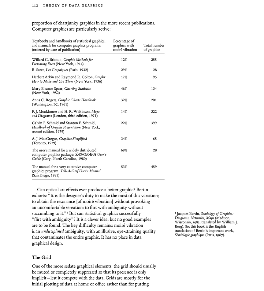
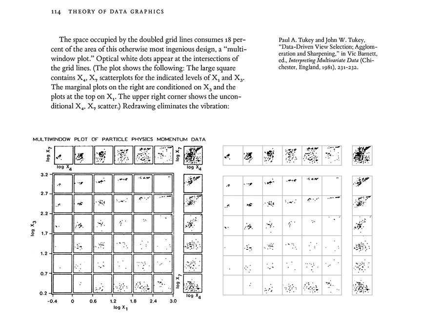
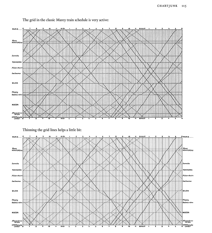
These plan views show the footprints (darker gray fields) of buildings on their surrounding grounds (lighter gray fields). Both plan views are identical, except for the thin lines outlining the buildings at right.
Those thin but highly effective lines shift the color within the building and also the color contrast between building and ground.
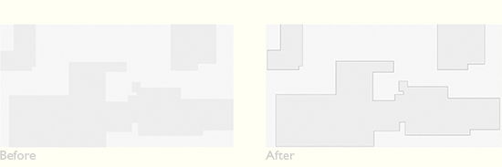
In general, perimeter lines cause the eye to homogenize within the contained area, and to separate and differentiate that area from the surrounding external space. A big optical consequence for a very thin line.

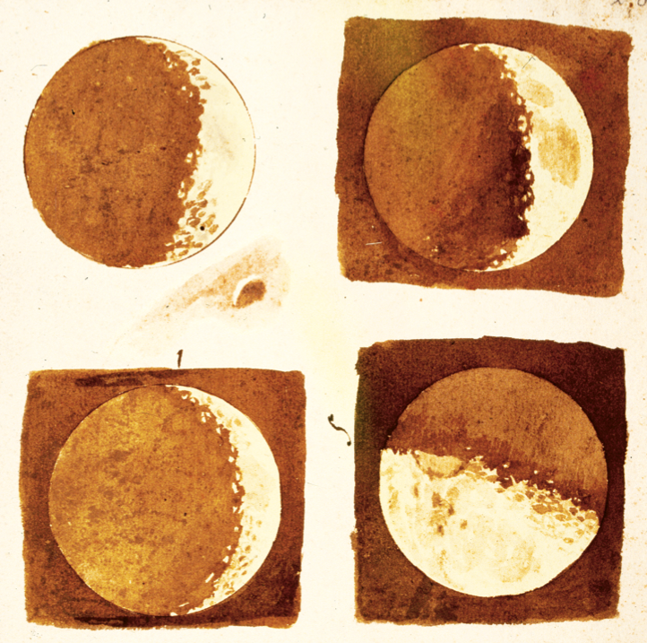
Line and tone drawings exemplify the often wonderful interplay between outline and delicate color-wash tones.
Here Galileo reports his discovery of craters on the moon, with the moon's outline drawn with a compass:
This is how contour maps work: the color fields which encode ocean depth are in turn delineated by contours labeled with depth measurements.
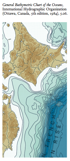
These contours eliminate blurry optical shifts (called "edge fluting") between adjacent colors, make each contour level a more coherent whole, and minimize within-field variation and maximize between-field differences. Edge-lines allow very fine distinctions, increasing quantitative scale precision. And between the color fields, on the merest presence of a edge is needed, a thin thin line.

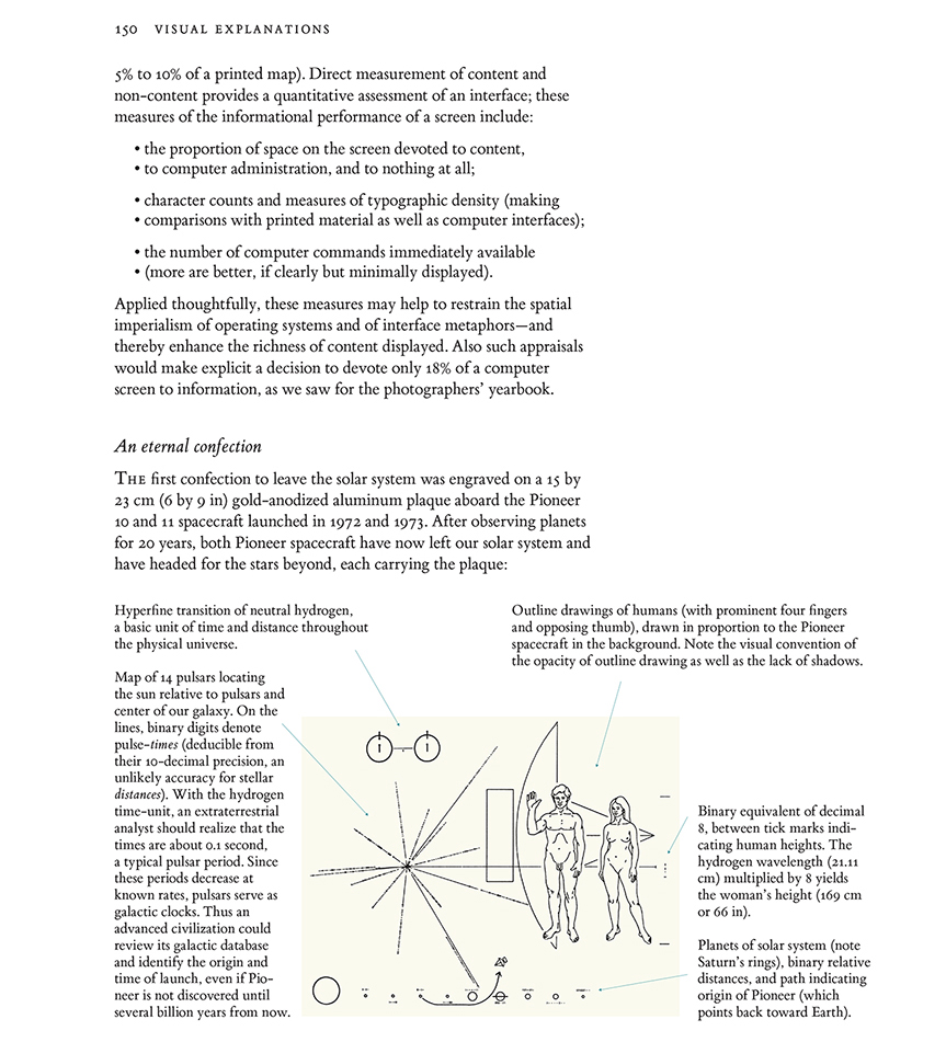
Viewers standing inside the 3 legs of
Twig 5, a large steel and air artwork, come eventually to see a faint transparent surface, an airy triangle outlined by 2 legs and the ground. Viewers can happily regard this apparent surface as the surface of the pyramidal volume of air contained and held by the artwork itself.
For architects and sculptors, air is a material. Airspace is not the absence of material, air is not "negative space." Airshapes are created, shaped, and formed by nearby structural materials--steel, concrete, wood, glass. And so
Twig 5 is made from steel and air, by volume ~0.1% steel and ~99.9% air. By weight, the reverse.
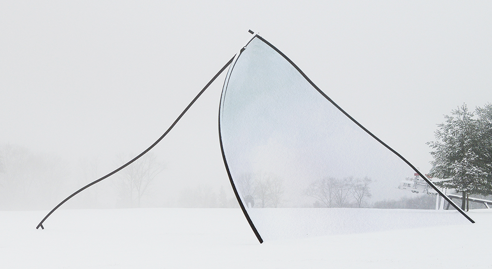
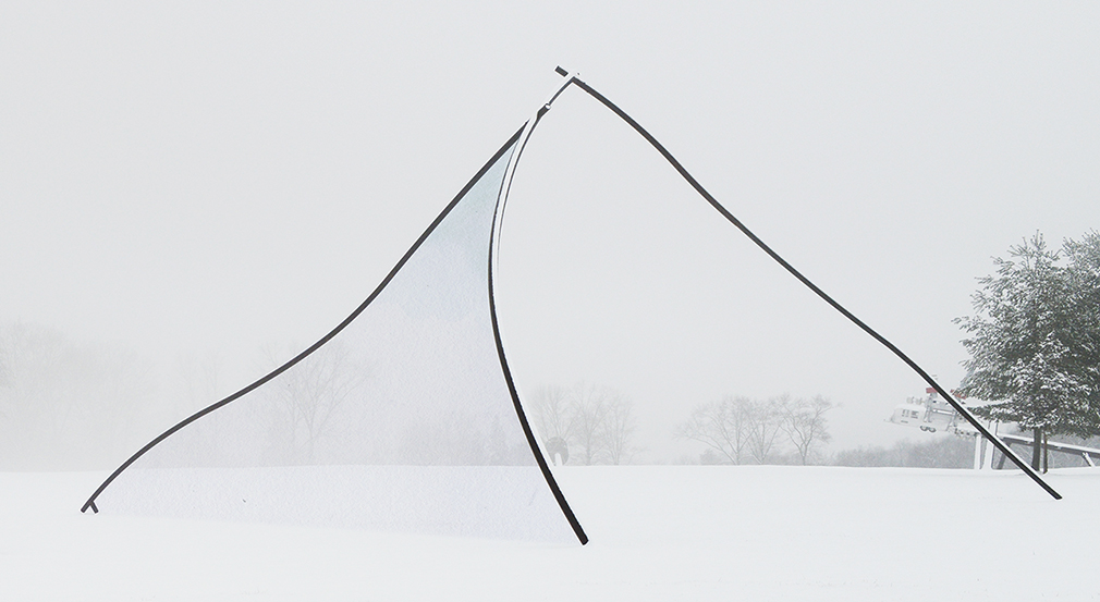


Neil Dawson
Horizons 1994, 15 x 10 x 36m, at the amazing Gibbs Farm in New Zealand.
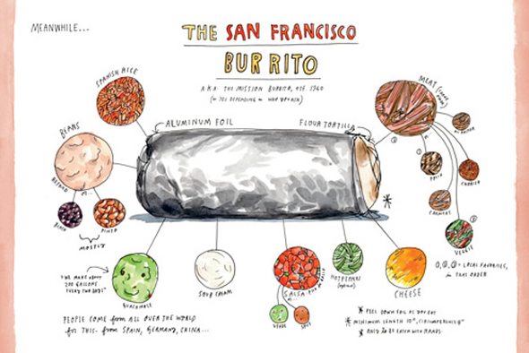
Or the line-and-tone aluminum foil wrapper in Wendy MacNaughton's Burrito:
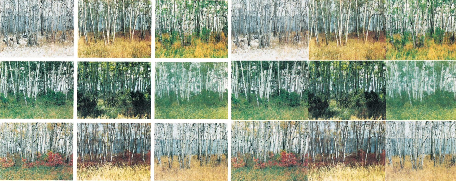
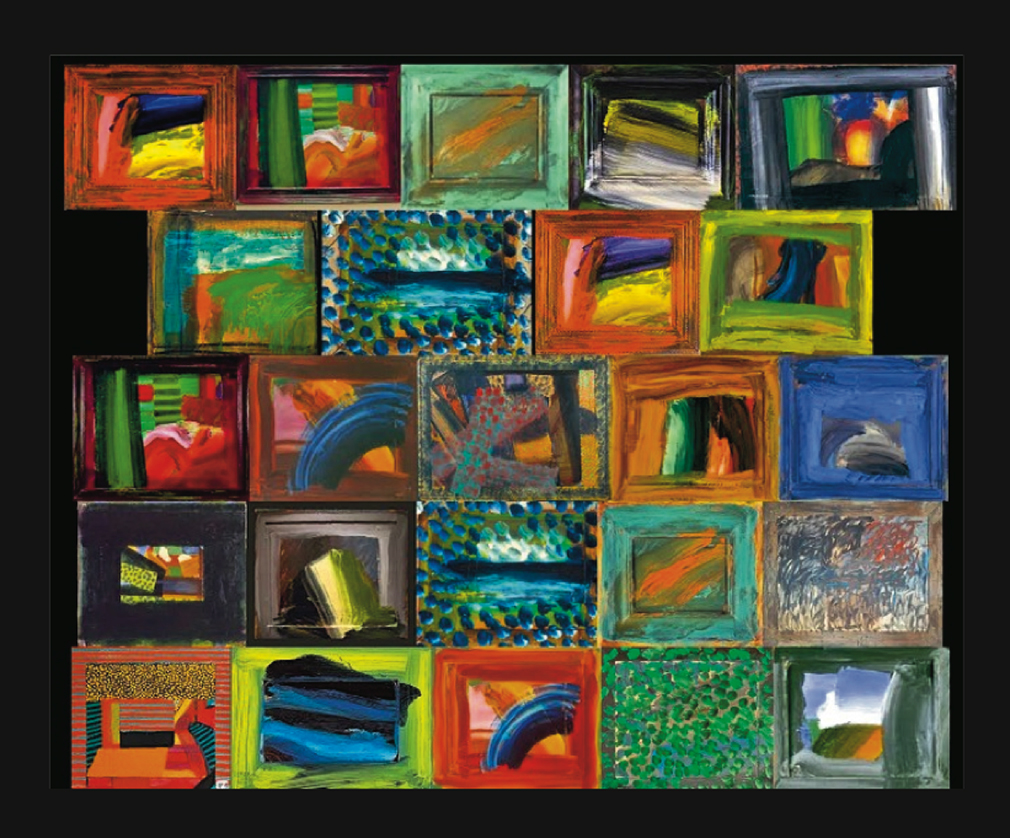
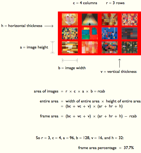
In many arrays of images, the individual images are frames with gaps between images.
[ ET to fill in ]
[ ET to fill in ]
[ ET to fill in ]

[ ET to fill in ]
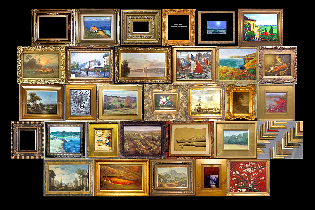
Areas surrounding data-lines may generate unintentional optical clutter. Strong frames produce melodramatic but content-diminishing visual effects. At left, the dominant visual elements are, of all things, the strong stripes of the negative spaces between the heavy frames:

A good way to assess a display for unintentional optical clutter is to ask "Do the prominent visual effects convey relevant content?" In the exhibits above earning the unfortunate X, the most prominent visual effect is usually the clutter produced by activated negative space.
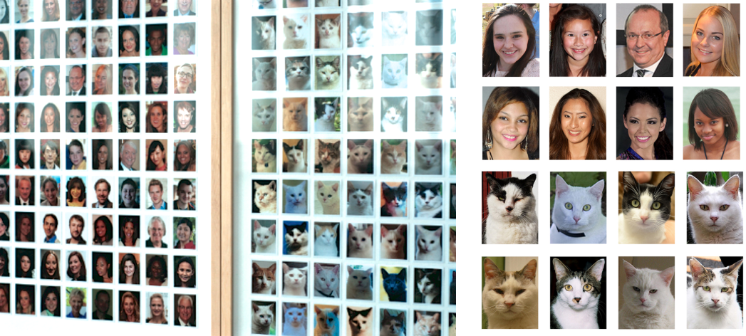
Google Images (2 examples)
 31% frame
 |
 32% frame
 |
Apple iPhone (3 example, including horizontal)
Left: 33% frame Right: 24%
London Portrait Gallery (gold frames)
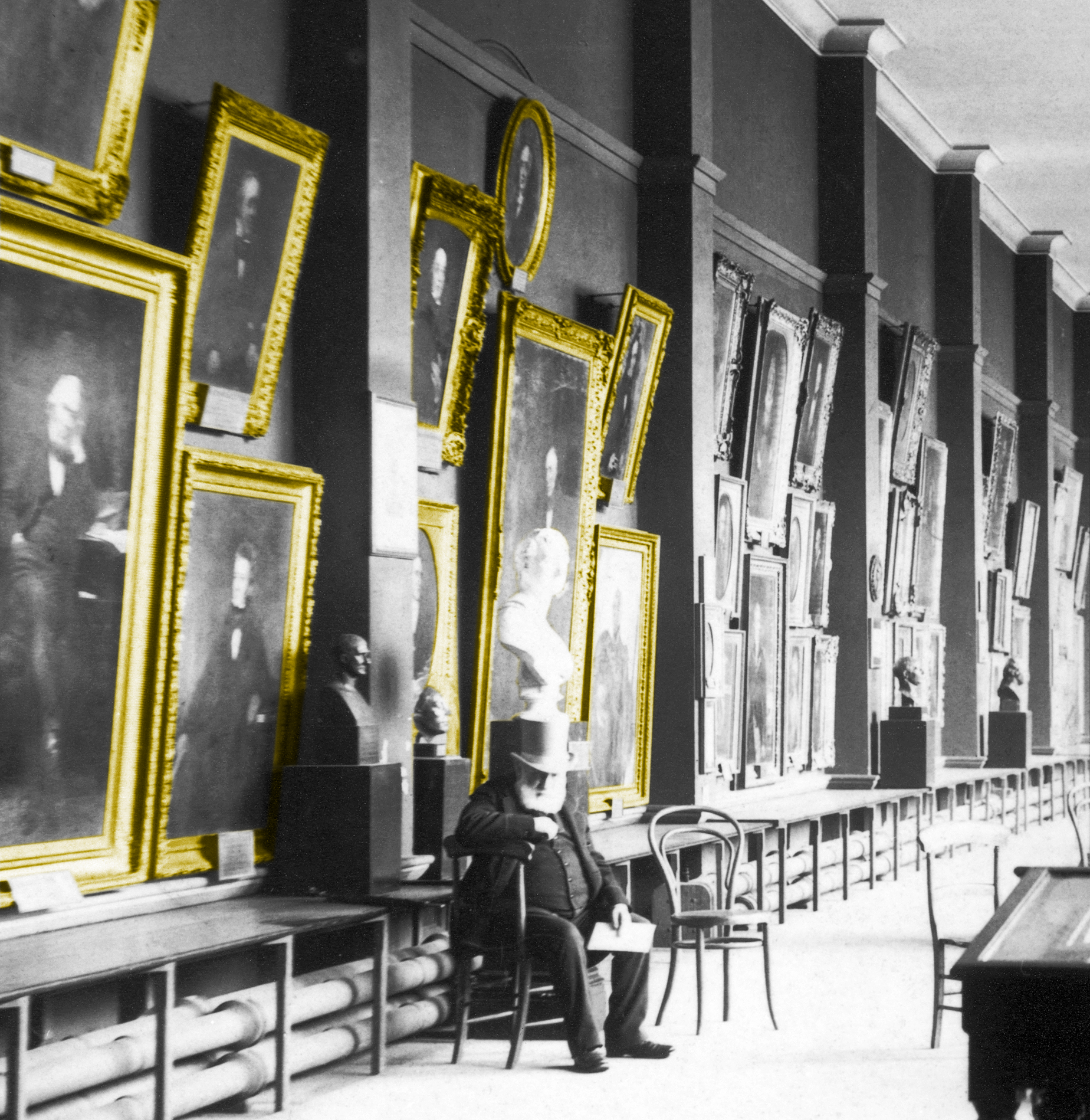
46% frame
| Frame math paragraph |
 |
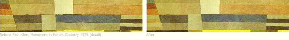
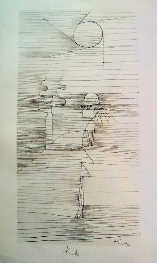
Klee quilt with winking smiley frame
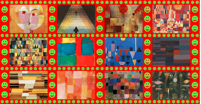 27% frame
 |
 0% frame
 |
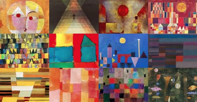
Klee quilt
0% frame
|
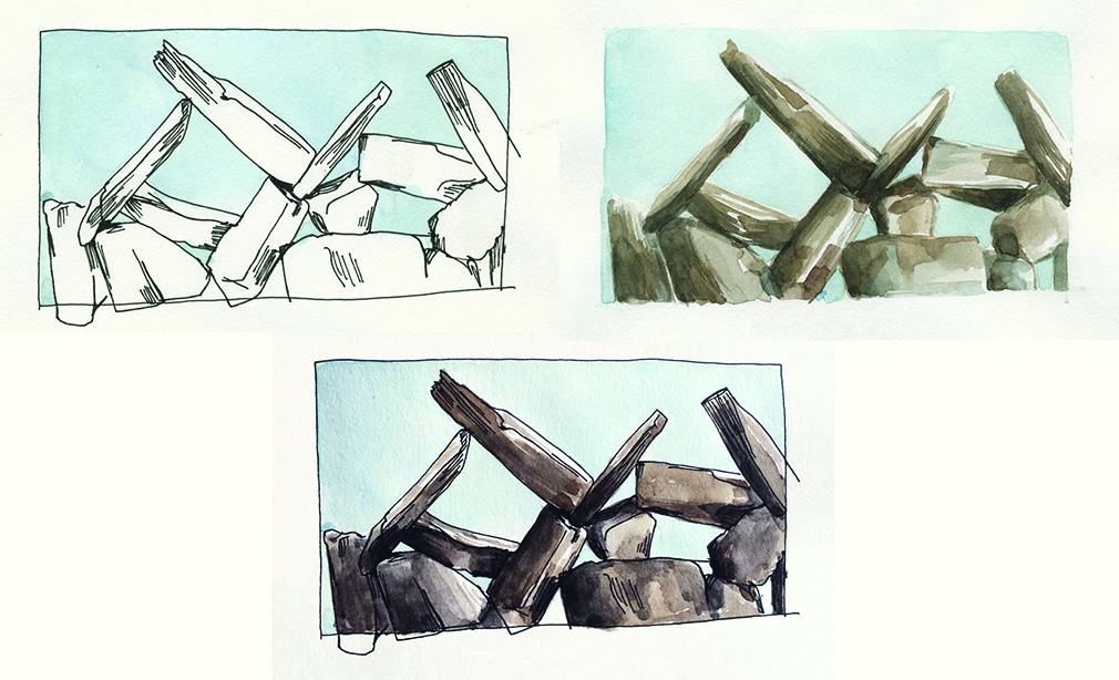
These 3 representations of a stone artwork illustrate the distinctions between stone, air, and intersection between stone and air. Look hard at each, and compare the three:
|
Line and tone drawing by Wendy MacNaughton, of a detail from Lacy Wall (stone and air, 2013) by Dan Snow and Edward Tufte.
|
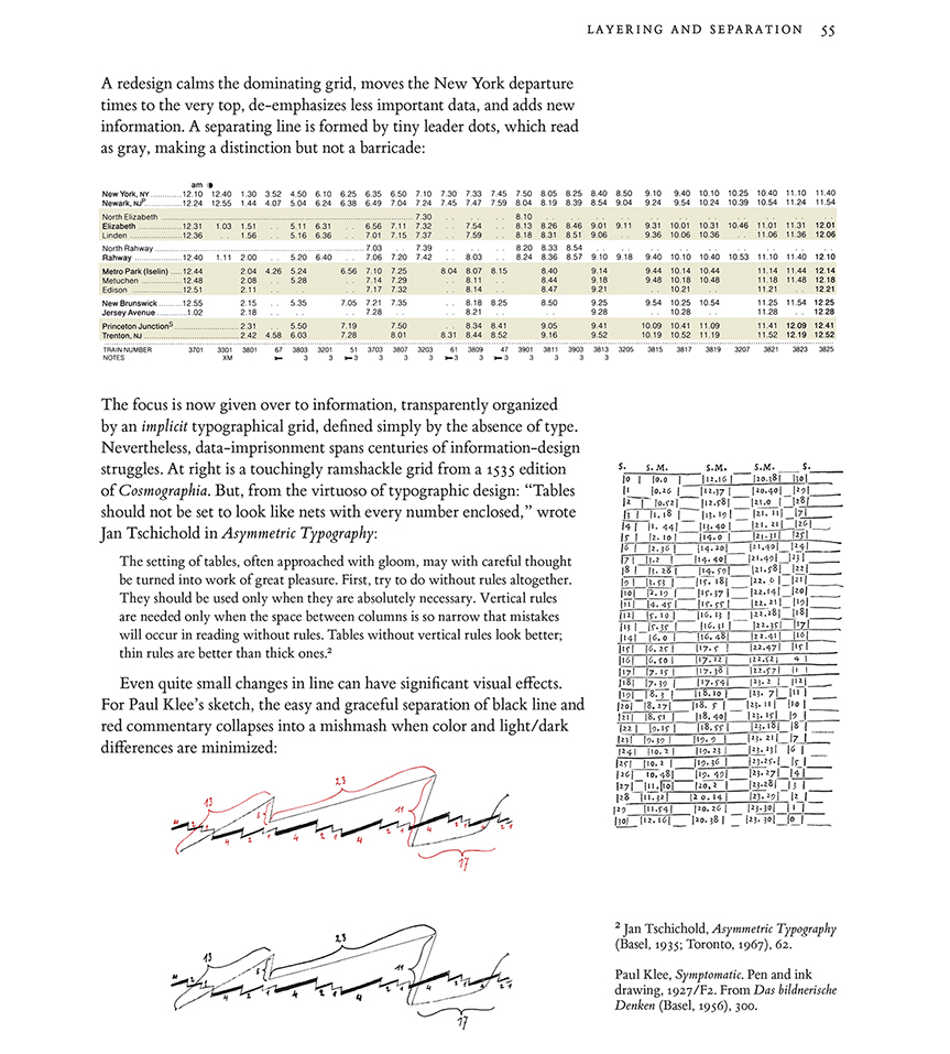
Graphical timetables
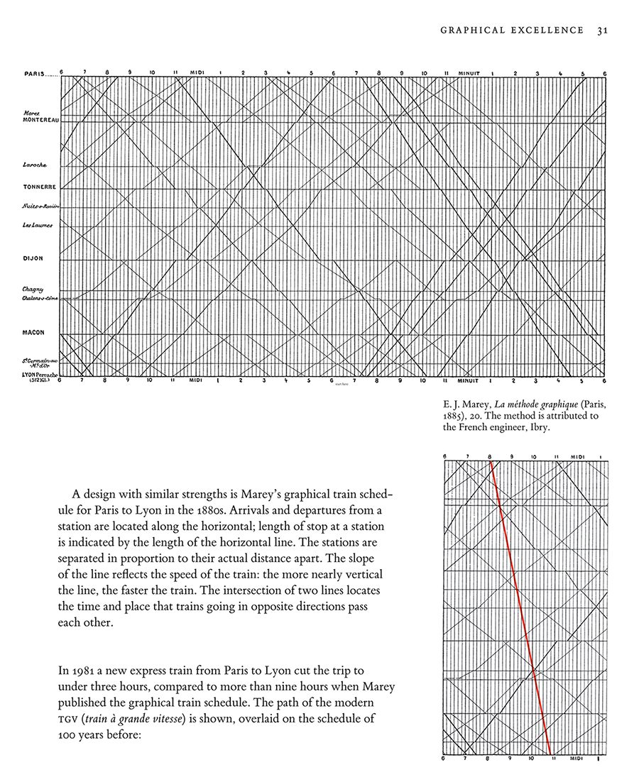
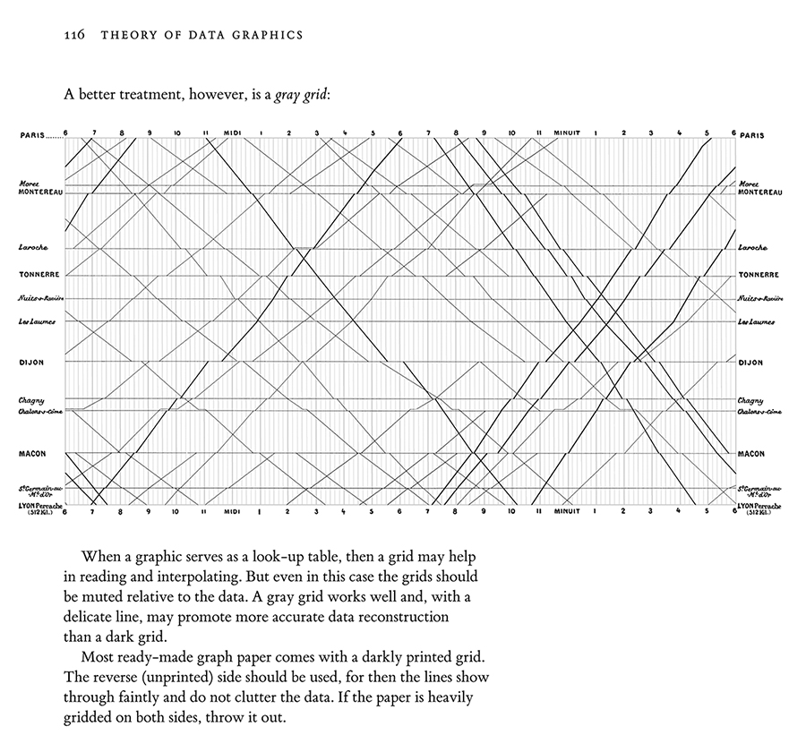
Edward Tufte,
The Visual Display of Quantitative Information, pages 31, 116.
Edward Tufte,
Envisioning Information, page 45.
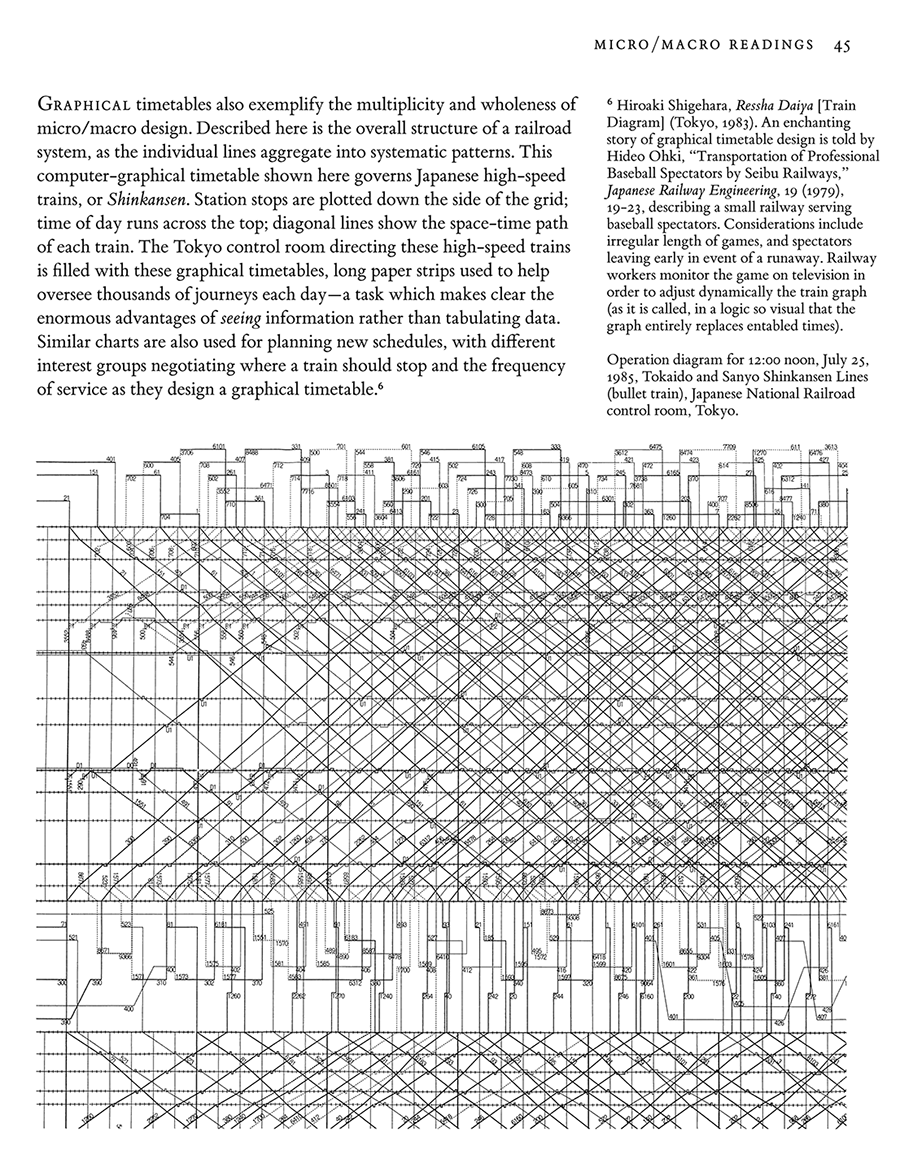

Edward Tufte,
Envisioning Information, pages 108 and 109.
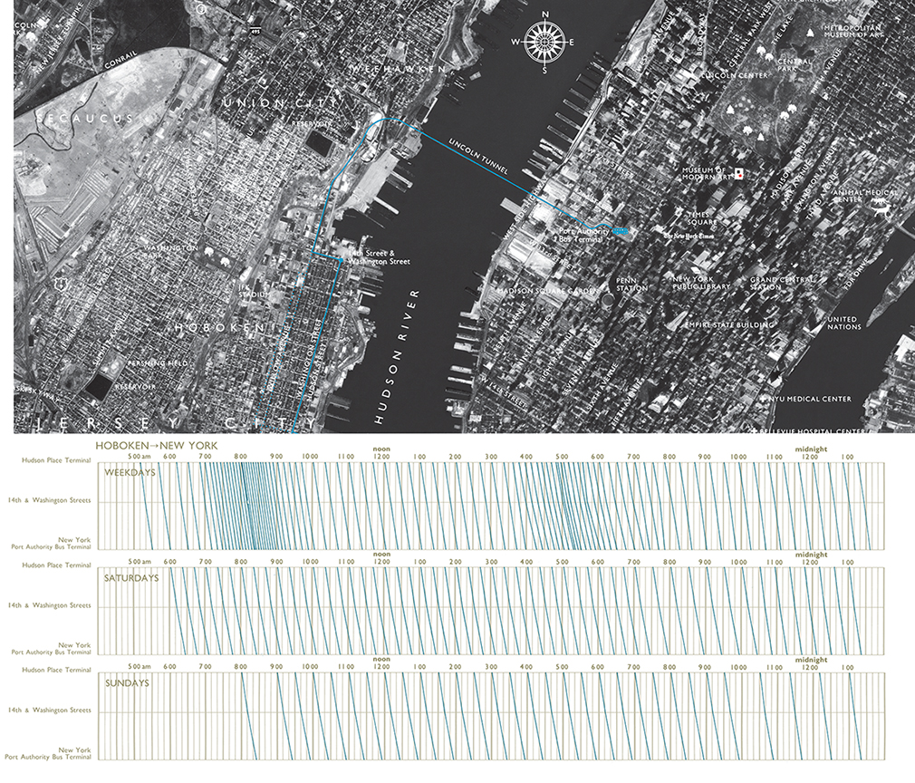
My design of a bus schedule and route combines a graphical timetable with a route map overlaid on a precisely detailed aerial photograph, so much richer than the typical schematic diagram of bus routes. Hourly, daily, and weekly rhythms of the buses are clearly revealed, as well as details of each journey.
During rush hours, lines densely crowd into spaghetti--but then service is so frequent that the jumble of lines informs the rider simply to show up, for there will be virtually no wait for whatever bus it is that arrives. The gray grid is set at ten-minute intervals in order to ease visual interpolation of the times of arrival.
The aerial photograph unveils the area mostly at the level of
house resolution, that is, with sufficiently fine details to show individual buildings. Indeed, the reaction of those who live in the area is to explore the photograph, personalizing the data, seeking to discover their own residence, school, or workplace. Same picture, but many stories.
Boxplots data test
Construct bunch (5 to 8, maybe) x/y scatterplots of 50 > n > 500 with widely divergent scatter patterns
that
all generate the same identical set of 5, say, vertical boxplots.
N can vary across scatterplots if you wish.
This is a sort of reverse of Anscombe's Quartet, pages 13-14 in my book
The Visual Display of Quantitative Information.
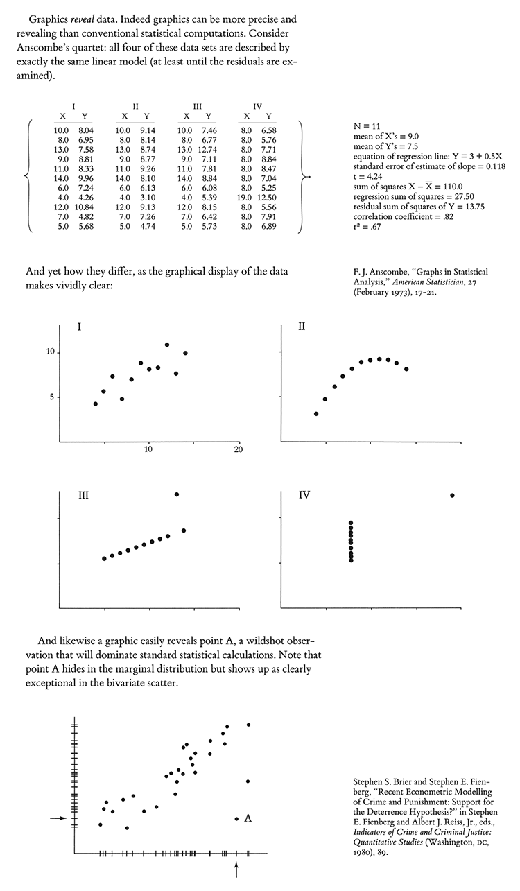
The point is that the binning of the x variable, and the summarizing of y, can sometimes mask what is going on in the underlying data, and may at times create the appearance of a stronger and smoother relationship between x and y than actually appears in the data.
For example, you might shows scatters that one might expect for that set of boxplots, but also make a scatter that rides a sine wave from lower left to upper right on the xy plane. See Anscombe's Quartet for other ideas.
Provide the matrix of the raw data for each scatterplot.
Since many boxplots are used to report categoric data, the 2D issue above can be turned into a one-dimensional issue of how well boxplots represents the behavior of the data within a category and comparing across categories.
Different categories may have very different n's. Sometime pseudo-categories are creating by binning data. Sometimes the categories are ordered if not measured more exactly. Or the categories and the boxplots may all reside in a pool of noise and misclassification. Thus the 1D y-binning of box plots should be carefully examined. Again provide the matrix of plotted data.
Post down below via the CONTRIBUTE button.
Provide a working email (masked to our readers) so I can get in touch with you.
The 5+ best answers get a set of all 4 of my books, autographed. At some point, I will probably publish some of the contributed material.
I will give you credit for your contribution.
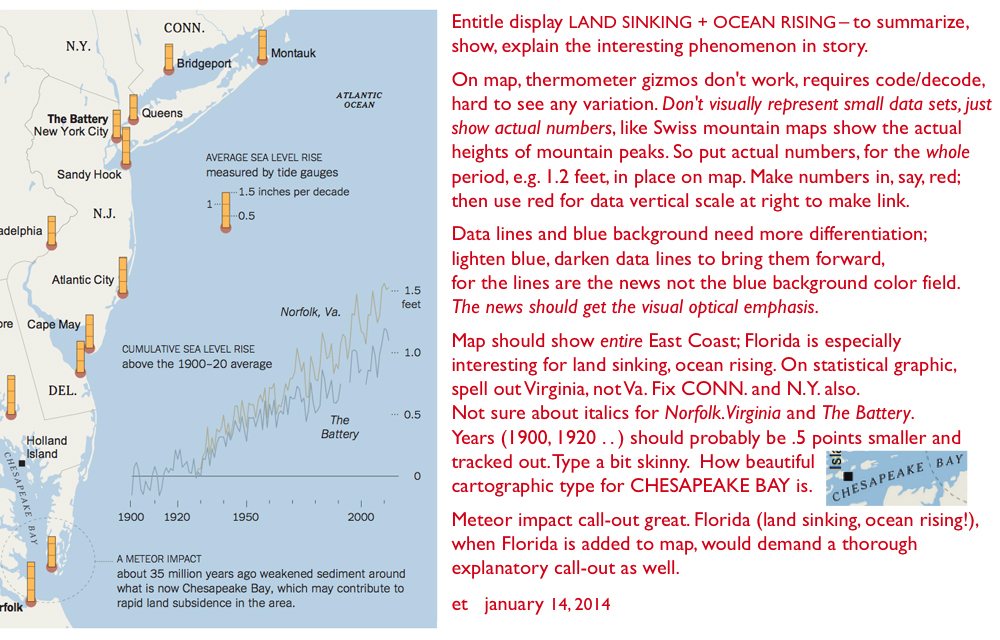
Design review: Improving a good news graphic
The New York Times published an
interesting story containing a very good news graphic, combining a map and a statistical graphic to show that along the East Coast the ocean is not only rising but also the land is sinking. This leads to a lot of floods, with a forecast of more and more to come.
Here is my design review suggesting how the map+statistical graphic might be improved, when done not under deadline and not under the heavy hand of NYTimes style guides.
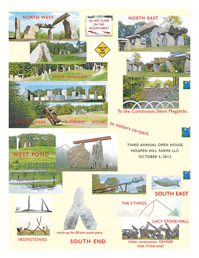
Design of walking maps, indoors and outdoors
Designs for Walking Maps
Here's a visual map guide for walking around a 234 acre sculpture park. Constructed in 4 hours, and printed just in time for our open house, this unrefined map/guide uses a confection of 24 artwork images, enabling visitors to know where they are and how to find their way around the artworks.
The guide started out, conventionally but unwisely, with flatland plot-plan (like a floor plan of a house), which requires viewers to orient themselves to their position on the land. Instead, such a guide should show our visitors
What they actually see: large artworks, bamboo mazes, rolling hills, fall foliage.
The North direction is strongly enforced on the image map and also on the ground as visitors drive in. The security staff, after greeting guests with a show catalog, then point to the north and to a sign that says, of all things "NORTH." None of the 600 visitors got lost and the take-away paper map memorialized their visit by showing what they saw.
Such designs might well serve outdoor and indoor museums. I once reviewed a sculpture park map in which basic navigation was conducted through codings derived from a damn Acoustiguide. Those codings reappeared on a paper map. And so the visitors' art experiences were mediated through a contraptionary code for an interface (Acoustiguide) to an interface (map). No one has ever
come to an art exhibit to see an interface to an interface.
Amazing artworks and their images can construct their own guides just fine.
Look for visual solutions for visual problems, imaging the scene to be seen.
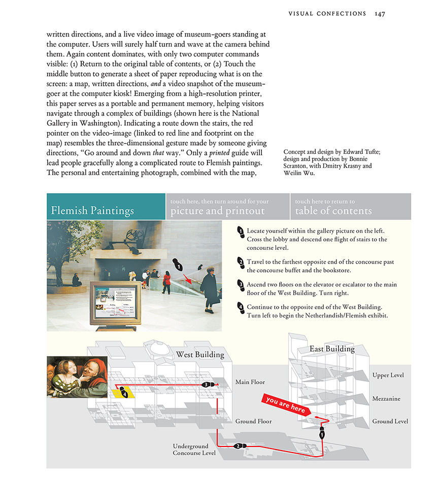
National Gallery Information Kiosks (and minimizing the visible interface)
In 1994-1995 I designed (while consulting for IBM) screen mock-ups for navigating through the National Gallery via information kiosks. (The National Gallery had the good sense not to adopt the proposal.) For several years these screen designs were handouts in the one-day course in my discussion of interface design, and were then published in my book
Visual Explanations (1997).
The metaphor for my National Gallery proposal is:
The interface is the information. Design ideas include high-resolution touch-screens; minimizing computer admin debris; spatial distribution of information rather than temporal stacking; complete integration of text, images, and
live video; a flat non-hierarchical interface; and replacing blimpy 3D icons and buttons with flat words. Thus the iPhone got it mostly right, 13 years later.
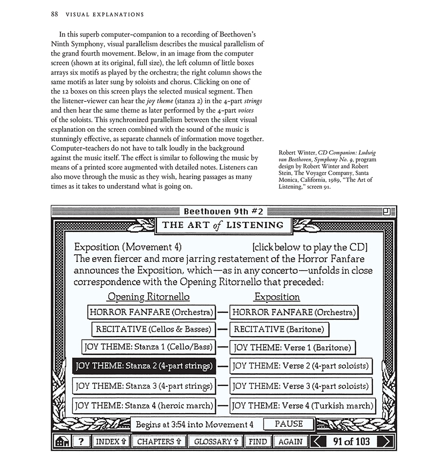
Here are pages 146-150 from my book
Visual Explanations (1997) that describe the National Gallery proposal and then suggest general principles of interface design.
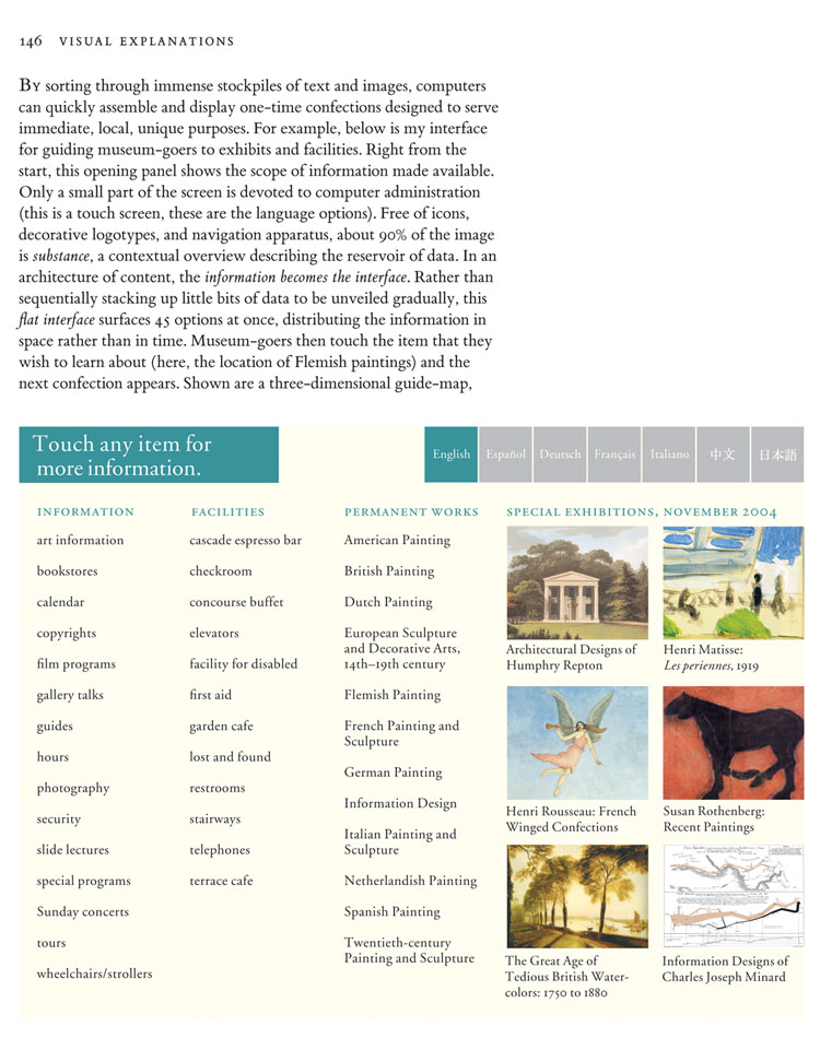
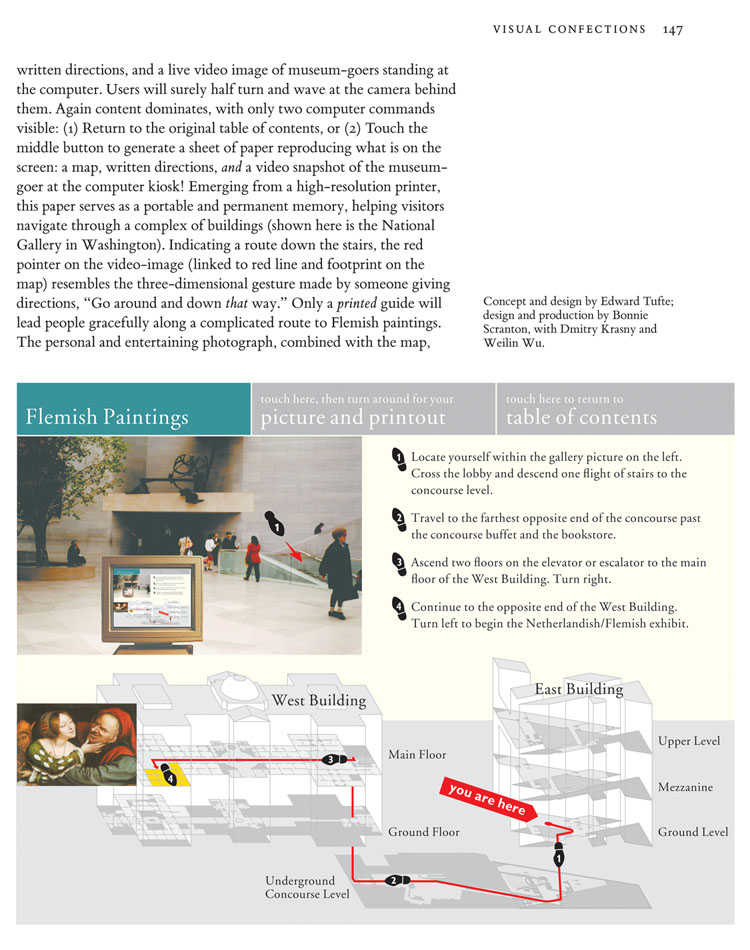
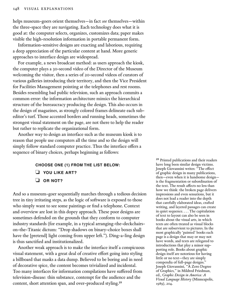
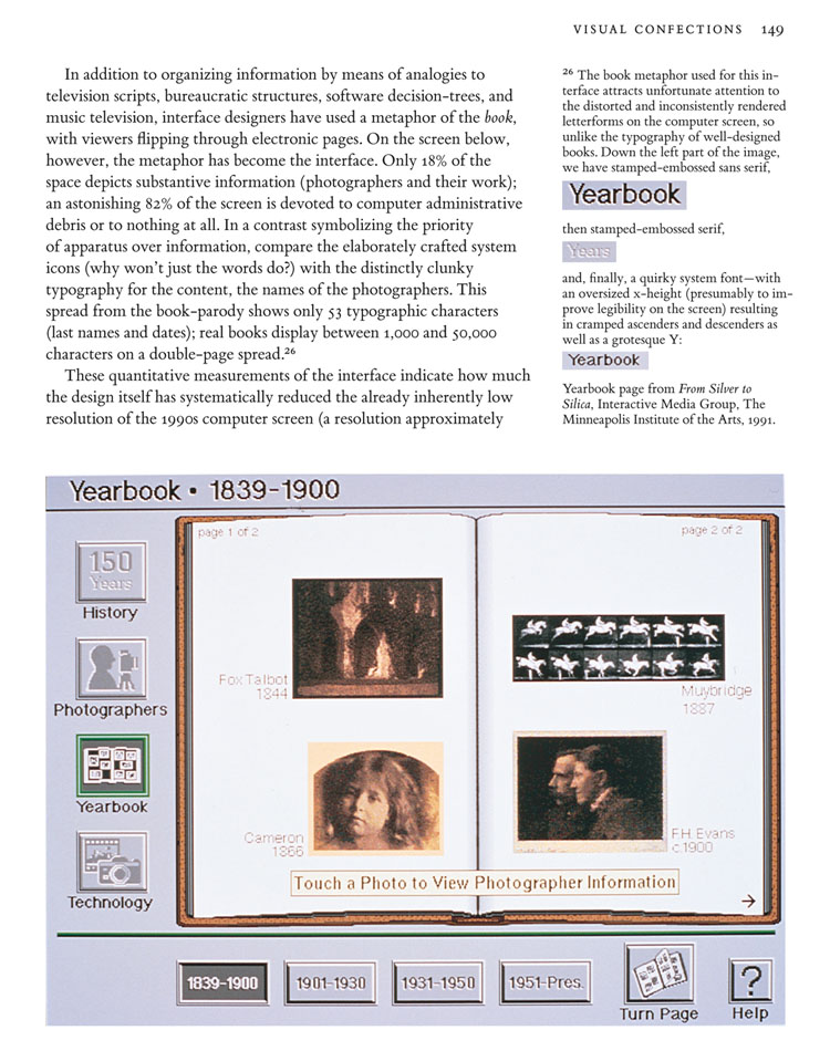
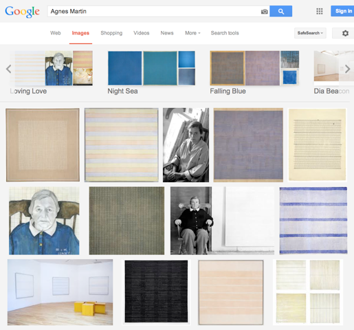
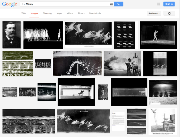
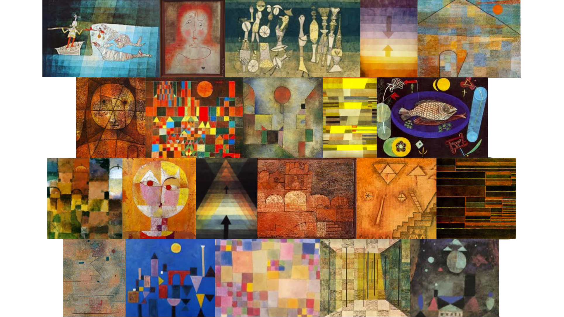
Image data quilts: our new website
Our new website
imagequilts.com shows the new work of ET and
Adam Schwartz on quilts (a variety of small multiples) that show 100 to 500 images on a single screen.
Adam built a free
Chrome app that composes, sorts, and edits the results from Google images.
For now, the idea is to search a topic on Google Images, and then recompose, sort, and edit those images into a quilt of images dealing with your topic. Our Chrome app does the composing, sorting, and editing.
The obvious extension is to be able to go into any large database, pull out the relevant images, and organize into a quilt. (Since the editing sequence is done locally in the Browser, and the images are drawn from a unique confection of Google images, there may be cryptographic possibilities here as well.)
The resulting quilt is scanned by the viewer, who often learns more about than topic than from conventional search results. For many quilts (topics include subatomic particles, Feynman diagrams, Muybridge, Cezanne, Klee, sorting algorithms, Picasso, and, for a quilt of quilts, the Quilts of Gee's Bend), see http://imagequilts.com
I first posted some simple quilts during a frantic weekend flurry several months ago at, of all places,
my twitter account https://twitter.com/EdwardTufte
The Verge recently did a nice piece on imagequilts, with many quilts:
Master statistician weaves Google images into visual quilts
A visionary statistician shares a free tool for data visualization
Edward Tufte is a master of his field. The celebrated statistician is an information design and data-visualization expert, known for his many writings on the subject including Envisioning Information and Visual Explanations, which pioneered the idea that visuals were of the upmost importance when communicating ideas and information.
A vocal opponent against broadly used visualization tools like PowerPoint, Tufte discourages the use of decorative visuals when displaying data, arguing that they can distort and editorialize the facts. His writings have informed and inspired a generation of statisticians and designers alike, and now he's collaborated with software engineer Adam Schwartz to share a free web-app with the rest of us.
ImageQuilts is a Chrome extension that acts as a plug-in for Google Images. After installing the app, you'll see a new button appear above your image-search results, prompting you to make an ImageQuilt. Clicking on the button jumps you into an intuitive interface that lets you build a collage based on the results of your search. There are lots of customization options: you can change the image size, and order; zoom into images; remove images; and also choose between grayscale, inverted, or full-color displays. After tinkering around with the settings and removing irrelevant images, you're left with a coherent (and hopefully attractive) collage that represents your chosen subject.
There are some great examples of how powerful ImageQuilts can be over at the plug-in's website, but we've put a few of their examples together with a few of our own below. As you'll notice, some are more successful than others; but when choosing an architect, designer, or artist, ImageQuilts does a superb job of capturing their essence.
ImageQuilts is a great tool for summarizing and organizing visual data. A viewer scanning over, for example, an artist's ImageQuilt will quickly understand what they're about. Tufte suggests that viewers will often learn more about a topic from ImageQuilts than conventional search results.
"Frank Gehry"
 "Pablo Picasso"
 "Dieter Rams"
 "Feynman diagrams"
 "Vladimir Putin"
 "Scrap metal"
 "Candy"
 "Subatomic particle collision"