You creatively addressed kiosks for giving directions to museum visitors – what would your ideal art museum label look like?
Warning: Trying to access array offset on value of type bool in /nas/content/live/graphicspress/wp-content/themes/edwardtufte/archive.php on line 21
museum labels
Warning: Undefined variable $count in /nas/content/live/graphicspress/wp-content/themes/edwardtufte/archive.php on line 24
Warning: Trying to access array offset on value of type bool in /nas/content/live/graphicspress/wp-content/themes/edwardtufte/archive.php on line 21
information in cartography symbols
I am looking for theories and concepts regarding symbols used in cartography.
I have questions like:
Many maps present information about quantity by scaling a distinct symbol. obviously this can become a problem when one has to combine different symbols which are in close neighborhood.
Wouldn't it be better to keep the size of an symbol constant but alter instead it's "decoration" (that is, one could have a simple box, a box with one star, a box with two stars...) ?
cheers from berlin,
jan
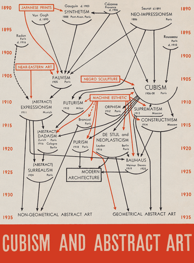
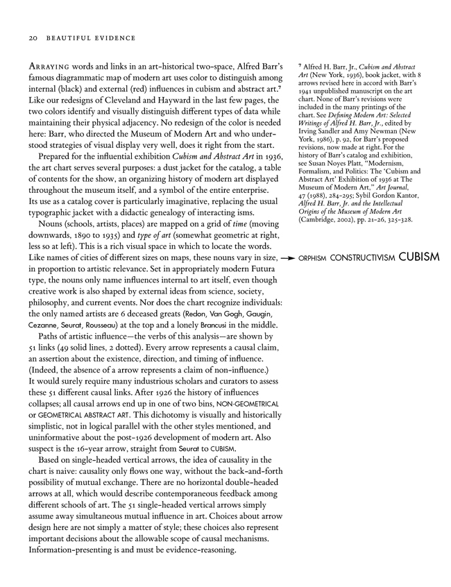
Design of causal diagrams: Barr art chart, Lombardi diagrams, evolutionary trees, Feynman diagrams, timelines
It is easy to draw a linking line or an arrow of implied causality, but very hard to make credible causal inferences.
Linking lines, arrows, and influence trees bring with them many implicit but powerful assumptions. Suppose we take the arrows seriously—how are we to evaluate the evidential quality of influence diagrams? The answer is clear, at least to the open and skeptical mind: by the usual standards for evidence of causality. A good start on what it takes to make causal inferences is found in A. Bradford Hill's classic paper on making causal inferences (in Hill's case, about the link between smoking and lung cancer), posted here. The principles of making sound causal inferences favor no particular ideology or point of view, except that of wanting to find out what is actually going on.
Below is a discussion of the famous art chart of Alfred Barr. The analysis applies to evolutionary trees, Lombardi diagrams, and a good many timelines. The last two paragraphs are particularly important with regard to the assumptions involved in linking lines.
The material below is from a draft of my book, Beautiful Evidence.
making meaningful calculations
I wonder if anyone can suggest good sources of basic information on how to calculate meaningful statistics. Let me explain:
I work in human-resources data analysis. I don't have a particularly strong statistics background, and I generally don't need one -- we mostly report on counts, sums, averages, and percentages. However, I occasionally run into trouble selecting meaningful numerators and denominators. For example, in calculating the percentage of employees who attended classes last year, should the denominator be the average number of employees over the year, the total number of employees at any point in the year, or some other figure?
I see lots of books explaining the math behind statistics, and of course this forum provides copious sources on information design, but I'm not sure where to look for this sort of practical information. I'd appreciate any suggestions.
The Guardian, top 10 book lists
Quirky, interesting top 10 book lists here.
Mapping the Internet
Among subjects that challenge the imagination for how to display it graphically, the Internet would certaintly be a top contender for one of the most difficult.
I was intrigued by this story in New Scientist about a project to create a visual map the Internet. You can see a recent map here (700 x 700 pixel graphic). The homepage for this project is http://www.opte.org.
I'm not sure quite yet of how this adds to my knowledge of the Internet. It does change my view of the Internet, however, by making it beautiful visually, not just conceptually.
I do look forward to the project developing the ability to pinpoint your own website, so I can say, "Hey! I can see my webpage from here!"
Inverted tree of evolution
The NY Times usually has good graphics, but this chart seems inverted. It shows the evolution of chimpanzees, gorillas, and humans from the forest ape of 8 million years ago.
When a "family tree" chart is used, I am used to seeing the passage of time, and successive generations, move down the page. In this chart, it moves upward. Here I found it easier to view when I inverted it, rotating the tree pattern to a root pattern.
After the webpage opens, click the link on the right labeled "Chart: way back when."
[link updated February 2005]
Eames Design
E.T.: I do not recall any writings by you commenting on the information design and multimedia of Eames Design. I can imagine that there must be much that you appreciate about Charles Eames' ouvre, and a few misdirections from the firm that you would gladly point out.
And if you have already published on the subject, may I ask (with apologies) for the citation?
Strouhal numbers and the unladen swallow
An article on Slashdot (http://slashdot.org) links to an excellent article that graphically displays and explains Strouhal numbers. Animals swimming or flying at cruising speed use similar ratios of stroke frequency and amplitude to forward speed, this ratio is known as a Strouhal number. The author, Jonathan Corum, has taken a rather boring graph from Nature, and through a series of neatly drawn diagrams shows what a Strouhal number looks like.
The article can be found here (There is a at follow-up article for Monty Python fans)
Tick marks in graphs
Although this is probably a trivial concern, it nevertheless engendered many long arguments amongst my colleagues and myself in graduate school*.
When rendering a graph of one's results, where ought the tick marks be placed: inside, outside, or both? I have always felt their proper place is inside the graph's axes, purely upon aesthetic grounds. Perhaps someone here would have insight on the matter.
*This is a well known phenomenon. Often the most trivial of issues prompt the most passionate discussions amongst students.
