Warning: Trying to access array offset on value of type bool in
/nas/content/live/graphicspress/wp-content/themes/edwardtufte/archive.php on line
21
Numerical language
Is metric an ugly word?
In the past 6 months, I've noticed the word "metric" used in unfamiliar ways. Once, as an adjective, it referred to measurement systems and rhythm. Now it appears as a noun, vaguely signifying something quantifiable.
From a bit of web checking, I've discovered that "metric" was established use in the IT industry by 1994 as a measure of software quality.I can't fathom changing practice within IT (it has as much right to silly jargon as any other field), but can we rebel against the migration to mainstream language?
I find the new use of metric unnecessary and unhelpful. Many terms already refer to countable information: data, digit, statistics & statistical set, amount, measurement, quantity & quantitative, etc., All these carry distinct meanings with specific rhetorical uses.
From a very quick search, I found this odious example: "define metrics to measure success...Every metric should be specific, measurable, actionable...." Measurable metrics? Would "indicator" or "standard" suffice here? A second example, "many different metrics on one page" seems to refer to numbers or even the lowly digit. And what about the rampant "data metrics"? Is this a case of advance planning, close proximity, and joint cooperation?
With a heavy heart, I found 10 such uses of the word here in Ask ET, some by contributors I greatly appreciate (though never used by our host). In every case, a familiar term could replace the neologism, usually with more precision.
Talking and writing about numbers is hard. Most people are already convinced that they won't understand. So why introduce unaccustomed and vague language? To put it another way, jargon is like chart junk. It clutters rather than clarifies.
Comments?
Warning: Undefined variable $count in
/nas/content/live/graphicspress/wp-content/themes/edwardtufte/archive.php on line
24
Warning: Trying to access array offset on value of type bool in
/nas/content/live/graphicspress/wp-content/themes/edwardtufte/archive.php on line
21
Wildfire maps and media coverage
As I write this, a dense plume of smoke passes overhead from the "Paradise" wildfire in San Diego County. I am in the path of the fire, burning four or five miles away, but it will have to burn through a substantial section of Escondido before it reaches me.
Discovering where the firelines are at present, and the direction the fires are burning, is a hit or miss business. In part, this is the nature of the beast -- the fog of war, to mobilize a metaphor. But I am amazed at the paucity of mapping resources being used by local media. Television news anchors are using hand-held Thomas guides and pointing to areas where fires are burning. Web and newspaper maps are vague at best.
And this is the center of GIS technology! There's no reason at all that there shouldn't be real-time updates of a GIS map showing firelines, areas that have recently burned, wind directions, areas at imminent risk, etc.
(By contrast, the mapping technology deployed by CNN and Fox during the Iraq war was state-of-the-art.)
After the crisis has passed, I will be writing ESRI (the ArcView company), the geography department at San Diego State, as well as county and regional authorities, urging them to develop an appropriate web-based graphic system.
But it strikes me that this is a measure of the immaturity of the internet and associated technologies.
Diacritical marks
It was my inability to produce the diacritical mark for "cliche" that produced "bromide". Another reason to use html?
Remarkable baseball graphic
Some superb technical graphics from the New York Times on hitting the baseball:
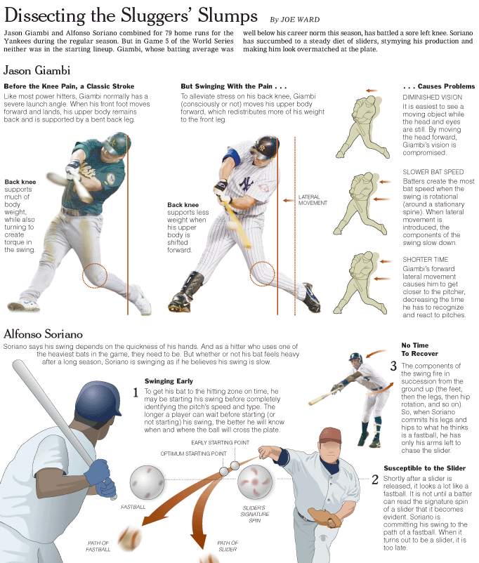
.
[link updated March 2005]
Lineweights in drawings
Here is a good essay about how to effectively use line thicknesses to convey information in drawings:
http://www.ideography.co.uk/infodesign/eigvil/presentations/Linethicknesses.pdf
I wish the programmers at AutoDesk (AutoCAD is the product) had understood the importance of lineweights back in the 90's. They seem to now, but for years it was practically impossible to do drawings as well as an average hand drafter could, because the tools were so poor.
It reminds me of typography, which went way down hill when computers came on the scene. Now, typography is making a strong comeback. I hope the same thing happens for drawing.
-dp-
The loupe in user interfaces
One of the worst limitations of user interfaces is the low resolution of video displays. I'm interested in ways of overcoming that limitation.
1) The Mac OS X dock has a wonderful magnification feature.
2) In a similar vein, this applet uses magnification to eliminate scroll bars in a list box.
This method does have one drawback: the first few items are illegible until the cursor highlights it, but in my opinion that is outweighed by the convenience of not having to scroll.
3) ThumbsPlus, an excellent graphics viewer and cataloger, has a loupe feature in the new version. Press 'q' while viewing an image, and the portion over the cursor is magnified.
4) The new version of OS X has Expose; a demonstration applet is available here (click on the 'try it out' icon).
*************
Magnification can be a powerful tool. I think it is certainly better than many alternatives: reduced detail, sequential display, or scrolling come to mind.
An analogy could be made with the human eye (only a small portion of our eyes can see much detail; much of our field of view is only good at detecting movement), but I am leery of computer-to-human analogies.
*************
Does anyone have any other examples, or insights?
Apples and oranges--a graphical comparison
A classic by Scott A. Sandford. I carried around the graphic in my wallet for years awaiting the apples/oranges bromide from an opponent.
ET on NPR
I heard ET on NPR this morning, discussing the use of PowerPoint in schools. Great quote along the lines of - "Teaching kids PPT in school is better than teaching them to smoke". I wish there was more time to include your thoughts on why it's a poor presentation tool. But of course they had to give time to the MSFT exec. to present her reasons on why it's such a great application. The fact that they're highlighting it's use in *grade schools* to write stories, says enough. It's not as if the NPR story was about how it's being used in high schools or colleges. If this is how kids are being taught to channel their creative energies in school - no wonder home schooling is becoming more popular!
If I find a link to the audio clip, I'll post.
What if handouts aren't practical?
I bought and read "The Cognitive Style of Powerpoint," and I agree that PPt is a highly flawed tool. However, when I was discussing it with a friend in the energy efficiency consulting business, he had a significant objection to one part of E.T.'s thesis.
My friend is well regarded in his field, and as a result he makes many presentations at national conferences, sometimes to hundreds of people, often several times a day. He simply can't afford the money and time to print, transport, and distribute hundreds or even thousands of handouts for a one or two day event.
He told me that up until a few years ago he was the last person at conferences walking around with trays of slides. Over time it became difficult to get a slide projector at conferences. He has gone to PowerPoint, and finds it useful. Given his holdout status as a 35mm slide user, I imagine that he is better with PowerPoint than most.
So, if he is to give up PowerPoint, and if he can't use handouts, what are his options? Could E.T. work with someone to come up with a digitally projected alternative? Condemning PowerPoint for its inadequacies is fine, but there are presenters with unmet needs.
I should note that after reading Mr. Tufte's pamphlet on PowerPoint, I abandoned its traditional use for my last conference presentation. I used a five page text handout and used PowerPoint for photographic images only. It worked well, but there were only forty people expected for the session.
Thanks,
Hilton Dier III
New edition of "The Cognitive Style of PowerPoint"
The first printing of "The Cognitive Style of PowerPoint" has sold out. I have now published a new edition with 4 more pages. The additional material contains the results of the Columbia Accident Investigation Board, a delicious quote from Richard Feynman about bullet lists, and responses to sometimes asked questions (Isn't PP just a tool? Do I have to use PP because all my colleagues do? What are PP-free ways to give a talk? What about that NASA slide with the Earth at the center of universe?).
Little of the additional material will be new to readers to this board. I am most grateful for your comments and questions.
