Warning: Trying to access array offset on value of type bool in
/nas/content/live/graphicspress/wp-content/themes/edwardtufte/archive.php on line
21
Financial and economic journalism
Explanations of daily changes in aggregate stock market indices are among the most ridiculous, speculative, and uncertain causal inferences made by journalists (other than that women tennis players, and only women tennis players, lose because they choke under pressure).
How do journalists know that a videotape appearance by OBL induced a swing of 00 points in a 500-stock index? To what trades did that explanation apply and to what degree? Can the journalist provide even one example of a trade for which that was the case? ("Yes, Lou, I moved out of IBM and into soybean futures this morning because I saw OBL take a walk on videotape.") More that one example? Enough examples to explain the aggregate change? Compared to other reasons and strategies for buying and selling that day?
And financial journalists make these unsupported inferences every day the market is open.
The inference mixes levels of analysis: a few grand macro-events are mobilized to explain the aggregate result of thousands of different trading strategies, many of which are utterly indifferent to the events of that day. Many trades might well have been decided long before the news events of the immediate day. This method of explanation resembles astrology: macro-level astronomical events are used to explain and predict micro-level outcomes.
Note also that the effect is assumed to be a unique, single-day effect; and then the next day, some other news again produces a one-day effect. Just because financial journalists operate on one-day cycles does not mean that what they are trying to explain operates that way. A common error in analysis of evidence about human behavior is to assume that people think the same way the analyst, thinks. (This error also occurs in the analysis of surveys and polling data--as the analyst acts as if people are reasoning about politics as the analyst reasons about politics. Usually the error takes the form that the political belief systems of voters have the same coherence as the political beliefs systems of elites, an error exposed long ago by Philip Converse.)
There may be a self-fulfilling effect in partial operation here; journalism's theory becomes a strategy applied by traders as they try to guess the day's price moves. That is, the Keynes beauty contest analogy: not identifying the most beautiful but rather the one that will be thought to be the most beautiful. Many traders do watch the news flow to make the beauty contest guess. How many trades are based on that logic?
Editors should ask about every such inference: "How does the reporter know that this is the case?" And then publish the inference only if there is some kind of external evidence supporting the causal inference. The New York Times and The Wall Journal do not report the inferences of astrologers, so why these inferences?
These pseudo-explanations represent lazy journalism; the reporter looks at a few indices and at a few leading news stories on the computer screen--and then makes a grand causal inference. At times, this method provides an easy but false integration of the world news with the financial news of the day. When, and under what conditions, is idea that "news drives markets" true?
At a micro-level, this method of inference certainly has some leverage: a particular stock goes up or down in response to the day's news about that particular stock. But it is a fallacy to extend routinely and automatically that method of explanation to performances of aggregate indices.
Here is a discussion of "Single Factor Analysis"
Warning: Undefined variable $count in
/nas/content/live/graphicspress/wp-content/themes/edwardtufte/archive.php on line
24
Warning: Trying to access array offset on value of type bool in
/nas/content/live/graphicspress/wp-content/themes/edwardtufte/archive.php on line
21
Sidenotes or footnotes or what?
Does anyone know how to make MS Word create sidenotes? I & my L.A. are quite stumped by this.
How much is $87 billion for Iraq? Update: How about $1.2 trillion?
Anyone care to comment? I think there is always some bias in the choice of comparisons in
this kind of graphic, but this one seems relatively clean.
Block That Metaphor! The NASA Space Exploration Map
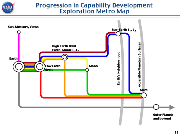
Source: NASA's Strategy for Human and Robotic Exploration, slide 11, Gary L. Martin, Space Architect, June 10, 2003.
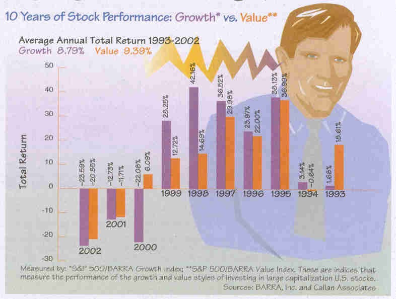
Graphic: Stock Performance
Is that a sparkline coming out of the ear? See anything peculiar about the graphic?
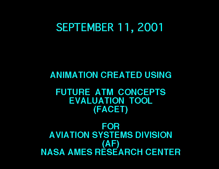
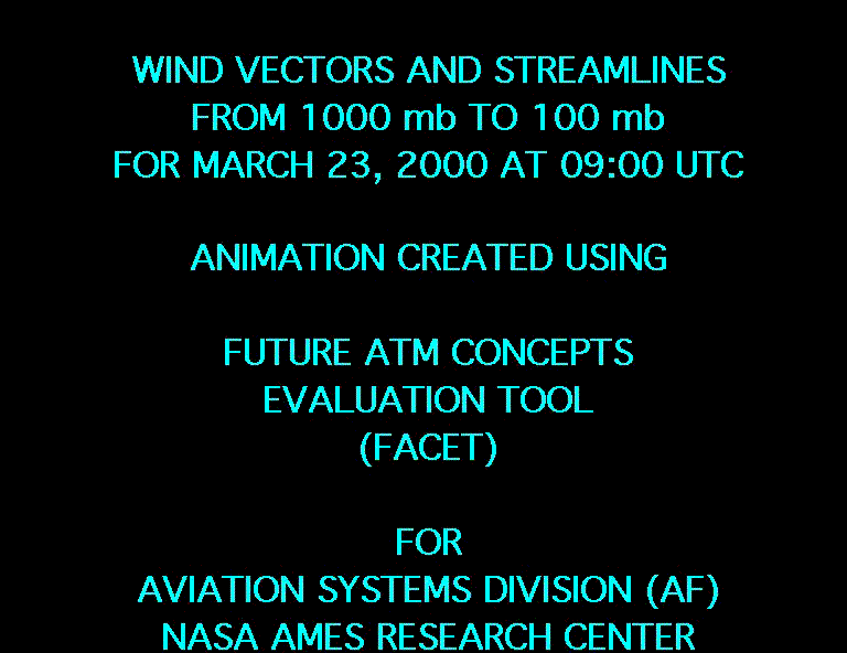
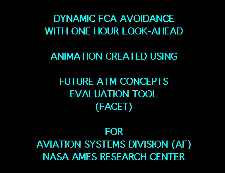
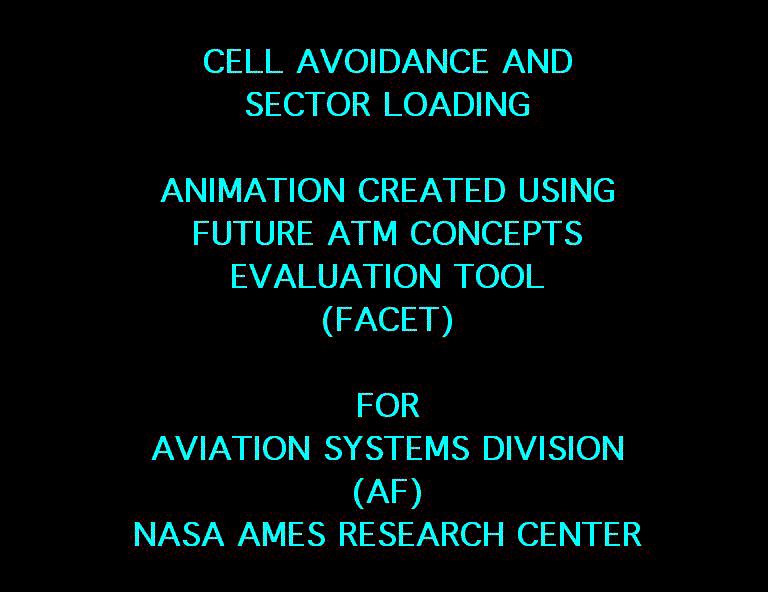
Animations of Air Traffic
Here is a set of animations, of air traffic, wind vectors, sector re-routing done by Dr. Kapil S. Sheth of NASA. This board is hosting these rather large files; a fast connection is required for several files.
First, a description of the 24-hour animation and then links to 7 different animations can be found below:
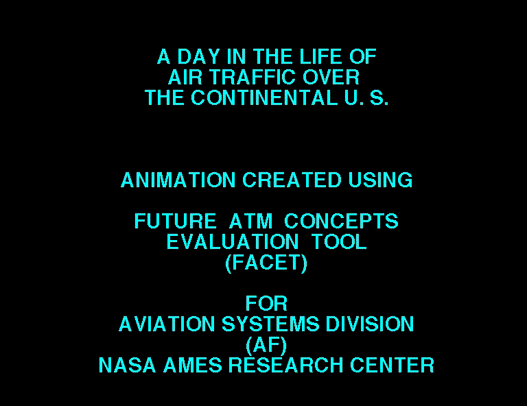
A Day in the Life of Air Traffic Over the Continental U.S.
FACET Animation created by Dr. Kapil Sheth
for the Aviation Systems Division (AF)
NASA Ames Research Center
Moffett Field, CA
This animation was created using Future ATM Concepts Evaluation Tool (FACET) developed at NASA Ames Research Center. The data for September 6, 2001, was obtained from Volpe Center's Enhanced Traffic Management System (ETMS). It covers twenty four hours of traffic data, starting at 00:00Z (7:00 pm EDT, September 5, 2001) through 23:59Z (6:59 pm EDT, September 6, 2001), with each frame being, on average, three minutes apart. The display shows Air Route Traffic Control Center (ARTCC) boundaries in white, high altitude Sector boundaries in brown, and US State Boundaries in red. Each aircraft symbol represents an aircraft (not to scale) that filed a flight plan, including General Aviation aircraft. The total number of aircraft in the National Airspce System (NAS) considered by FACET at any instant of time is represented in the middle of status bar (at top).
The animation was created to visualize traffic over the continental U.S. The animation starts off at 00:00Z, which is 7 pm EDT with roughly 4000 aircraft in the system. One sees bands of transatlantic flights traveling from the northeast (Boston, (BOS), New York (JFK), Newark (EWR), La Guardia (LGA), and Philadelphia (PHL)) towards Europe. Several streams of traffic can be seen across the country, some of them between Los Angeles-Houston-Miami (LAX-IAH-MIA), San Francisco-Denver-Chicago-New York (SFO-DEN-ORD-JFK), Los Angeles-San Francisco-Seattle (LAX-SFO-SEA), etc. As time progresses, one can observe a pack of flights taking off from Memphis, Tennessee, and Louisville, Kentucky, around 08:45Z (3:45 am EDT). These are hubs for FedEx and UPS, respectively. The box-haulers are taking off early in the morning for mail deliveries. In the middle of the night around 8:00Z, the traffic drops to as low as 600 aircraft in the whole system.
Somewhere around 12:30Z (7:30 am EDT), there appears a vertical wall along the center of the country, east of which there is a multitude of aircraft, and west of which (4:30 am PDT), the day has not started for passengers. Proceeding from this time, the traffic gradually moves westward and ultimately the number of aircraft peak at about 4800! Roughly between the times of 15:00Z through 20:00Z, the animation displays transatlantic flights returning from Europe to the northeast. Although not as dramatic as the European flights, the planes between Asia and San Francisco can also be seen during 09:00Z to 11:00Z. During the animation, at various times, the hubs and major airports (Los Angeles (LAX), San Francisco (SFO), Seattle (SEA), Denver (DEN), Dallas/Ft. Worth (DFW), Houston (IAH), Minneapolis/St. Paul (MSP), Memphis (MEM), Atlanta (ATL), Chicago (ORD), Boston (BOS), New York (JFK), Washington, D.C. (DCA, IAD, BWI), Miami (MIA), etc.) in the country become clearly highlighted.
The animation depicts how complex the air traffic system and the air traffic management problem are. It also manifests why the northeast corridor is a very difficult situation, not only for the local air traffic controllers but also for the Air Traffic Control System Command Center (ATCSCC) in Herndon, VA.
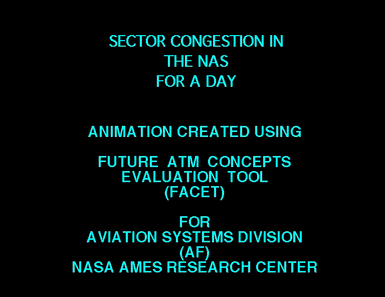
FACET Movies Description
World map with ground-level photos
Thought you might like this...
The Degree Confluence Project has a Composite World Map composed of, and poping up, ground-level images. So one can "walk" the world. On the Medium and Large maps, one can see the individual pictures of the mosaic.
Linkrot: what to do?
In our older threads ("older" on the internet means about 3 months), the links to external material start to break. Especially important material is sometimes imported to our server. This republication raises copyright issues. Graphical snippets may fall under fair use provisions. For the complete articles in the NEW section, we have had good success in obtaining copyright permissions, although in most of those cases we have had some previous relationship with the copyright holder (and even then it has taken several letters to settle on the terms of the permission). Only once has external posted material been challenged (Boeing claimed their Columbia slide was proprietary information). But do we go through the many many links in our threads to get permissions so the material can be posted directly on our server? There are now about 500 surviving threads in the 2 years of this board, with perhaps 500 links wandering around. Or do broken links lead to discarding the thread?
Are there some scholars of linkrot and its cures that can give some advice? Examples of practices at similar sites would be helpful. Some other boards seem to operate on the idea of "don't ask, don't tell," or "don't ask permission but beg forgiveness." But are there better ways?
Columbia Accident Investigation Board: The Boeing PowerPoint Slide
This thread has been replaced by PowerPoint Does Rocket Science, which extends and updates ideas about technical reporting at NASA and elsewhere.
ET, September 6, 2006
See the CAIB report on the Boeing PowerPoint slide at page 191 of the 10MB file of the full report, or at page 15 of the 0.5 MB file for chapter 7:
http://www.nasa.gov/columbia/home/CAIB_Vol1.html
Blackout Graphic
The graphic on the earth observatory website, while visually striking, could use some work in my opinion. Why did they not add the city markers in the second graphic? Or remove the city markers completely?
I found myself scrolling up to see where Columbus was in the first graphic then scrolling down to locate where Columbus was in the second graphic.
I to was in the blackout and created a graphic to illustrate it.
