Warning: Trying to access array offset on value of type bool in /nas/content/live/graphicspress/wp-content/themes/edwardtufte/archive.php on line 21
Executive dashboards
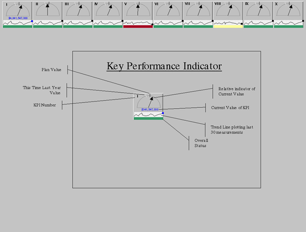
I'm developing an executive dashboard, and I haven't been satisfied with the business graphics that are widely available (e.g. gauges, dials, stoplights). I decided to make a "Zen" version of a KPI status indicator, using as little color as possible, and incorporating E.T's innovative "Spark Line" metaphor for display of trends. The graphic below shows the proposed KPI display across the top of a browser screen with a descriptive example in the middle. Any feedback would be wonderful!
Comments: Because of complex KPI names (e.g. This Week versus Last Week Sales (All Divisions), KPI's were labeled with Roman numerals. Balloon help could display the KPI name when the cursor brushes the KPI indicator.
Best regards,
Barry Tipping
Warning: Undefined variable $count in /nas/content/live/graphicspress/wp-content/themes/edwardtufte/archive.php on line 24
Warning: Trying to access array offset on value of type bool in /nas/content/live/graphicspress/wp-content/themes/edwardtufte/archive.php on line 21
ET software? ET Bembo?
A few questions... Have you ever been approached by a software development company about designing software meant for charting and data representation? It seems like I spend a lot of time hand-drawing my diagrams in order to get them to present data in the correct manner.
My second question is more simple, will an ET Bembo ever be made available to the public?
ISO paper sizes, rational or irrational? And date formats as well.
The aspect ratio or height-to-width ratio of all ISO paper sizes is the square root of 2, an irrational number.
Is this rational?
The rest of the ISO paper geometry seems too clever by half, but maybe some kind of order is helpful. And then what about trim size?
This says that "Inconsistent use of SI units and international paper sizes remain today a primary cause for U.S. businesses failing to meet the expectations of the global economy." What does that mean? Is this a reification error: how does the economy expect?
Driving distance tables
I've been asked to show stats for pairs of items, where every item is paired with every other item. The typical way to do this is with a table that has the list in a set of rows and columns, and the statistic at the intersection, like driving distance tables:
boston
new york
washington
boston
na
200
400
new york
200
na
230
washington
400
230
na
I've found a couple of interesting graphical representations that might be useful if annotated. The first is a link diagram and the other is a, well, I don't know what to call it, but it's interesting. Line thickness, color and annotation could be used to convey some metrics.
Does anyone know of examples of similar charts? I'm curious about ways that might make it easier to visualize the distance, show multiple statistics per pair, or otherwise highlight information between pairs of items that are interconnected.
Explanations accompanying classical music and other live performances
The most lasting memories from my undergraduate days in the classroom come from Leonard Ratner's courses at Stanford on an introduction to music and on the concerto. To this day I remember and enjoy the explanations of Eroica, Don Giovanni, Mozart's String Quintet K. 614, the quartet singing in the last movement of the Ninth, and Bartok's Music for Strings, Percussion, and Celesta. It was so interesting to go to the class to hear the music explained (with pauses introduced by lifting the needle from the record). The essential feature here was dynamic explanation, right in parallel with the music. That form of explanation was much better than reading about the music in advance, which provokes uncertainties about linking the program notes to the appropriate part of the performance. Ever since at opera and ballet I have yearned for such dynamic parallel explanation.
In opera, a translation of the words in parallel with the performance is one good step.
Of course the parallel explanatory channel must be done with care, unobtrusiveness, and quiet precision. It will be tempting for some explainers to place themselves above the music, to create a personality presence, to celebrate a technology, to look like television. But done with an appropriately self-effacing quality, such parallel explanations can be helpful, greatly increasing the intensity of listening. Probably a visual channel (written words, musical score) should be used to explain a sound channel in order to avoid interference. The Music Animation Machine (elsewhere on this board) uses the visual to diagram the music.
Indeed, for 35 years now at a half-dozen disastrous Dylan concerts (broke my heart every last one of them), it would have been helpful to know what the words were instead of asking at the end of the song: Was that "Tangled Up in Blue" or "Every Grain of Sand"?
Cog, the Honda ad
The new Honda ad in the UK has getting attention on various mailing lists recently. This amazing Rube Goldberg stunt using 85 parts from a dismantled Accord took 606 takes before it worked right. No trick photography, no computer animation, all real.
Maybe a candidate for ETs next book.
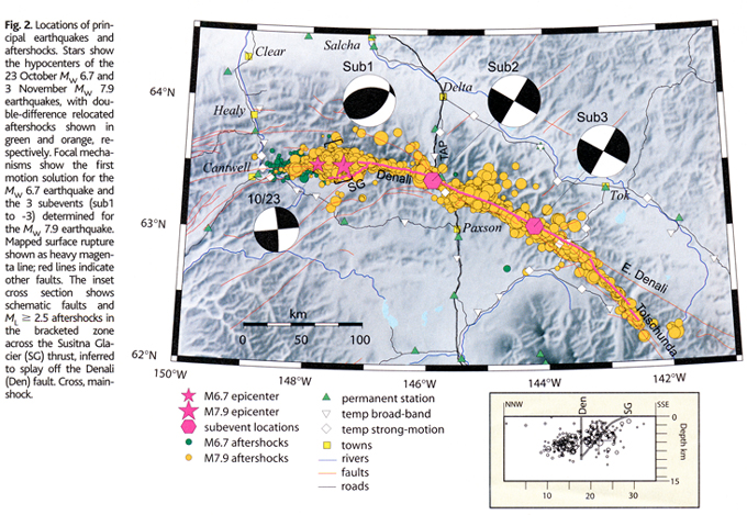
Geological diagrams for 3D motion
Science, May 16, 2003, shows some interesting geological diagrams for describing 3D slippage. Can someone who knows the field please provide a careful explanation of the ball diagrams in these figures?
Figure 2 from David Bowman, Geoffrey King, Paul Tapponnier, "Slip Partitioning by Elastoplastic Propagation of Oblique Slip at Depth", Science, Vol. 300 (May 16, 2003), pp. 1121-1123.
Figure 2 from Donna Eberhart-Phillips, et al., "The 2002 Denali Fault Earthquake, Alaska: A Large Magnitude, Slip-Partitioned Event", Science, Vol. 300 (May 16, 2003), pp. 1113-1118.
Photographing whiteboards... for the record
A very satisfying way to conclude a meeting, where a whiteboard is used to develop and communicate ideas, is to capture a digital image of the whiteboard. It works better than those fancy and expensive electronic whiteboards and can be used for recording flip chart discussions as well. You get a color, high res record of the meeting and the image neatly captures the dynamics of the discussion. Not an original idea by any means, but I thought I'd share it with you anyway.
Interface Hall of Fame/Shame
Bruce Tognazzini (along with a contributor, Joe Moran) has a brilliant and funny account of the interface design for an ultra-quiet dishwasher. "Ultra-quiet" turns out to matter. Lots of thoughtful advice about interface design in general. Posted at Asktog, which is always great reading on interface design.
Note particularly the point about the value of clutter compared to over-smooth elegant faux-simplicity (the BMW iDrive is mentioned). As Tog writes "Simple visual appearance doesn't = simple interface."
"The deepest photo ever taken" and the history of scientific discovery
An 84-hour exposure on the Hubble conducted by the wonderful Space Telescope Science Institute is shown here.
And what's beyond the edge of the Big Bang? Coming within 5 years?
The history of science over the centuries can be written in terms of improvements in resolution. From the beginning and all the way up to 1609, when Galileo's telescope first assisted human vision, scientific knowledge consisted of making descriptions and comparisons for events taking place at measurement scales accessible to the human eye, from about 10 to the -3 (a tiny speck) and up to 10 to + 7 meters (the Milky Way), some 11 orders of magnitude. Now, 400 years later, scientific descriptions and comparisons take place at scales from 10 to the -18 and up to 10 to the +25 meters, some 44 orders of magnitude. That is, from 1609 to 2003, scientific resolution improved an average of about 8 orders of magnitude per century (or 100 million-fold per century).
Our data displays should do as well.
We use cookies to ensure that we give you the best experience on our website. If you continue to use this site we will assume that you are happy with it.

