Warning: Trying to access array offset on value of type bool in /nas/content/live/graphicspress/wp-content/themes/edwardtufte/archive.php on line 21
Some Google hits, January 1, 2003
The Google search tallies the number of links that result from a search of a "word" appearing on internet pages. Here are some tallies I recorded a few minutes into the New Year:
"me"
200,000,000
"money"
61,800,000
"science"
52,400,000
"war"
49,100,000
"amazon"
44,700,000
"god"
43,100,000
"microsoft"
41,100,000
"marketing"
33,200,000
"television"
17,500,000
"truth"
13,500,000
"unemployment"
3,350,000
"inflation"
2,830,000
"happy new year"
539,000
Warning: Undefined variable $count in /nas/content/live/graphicspress/wp-content/themes/edwardtufte/archive.php on line 24
Warning: Trying to access array offset on value of type bool in /nas/content/live/graphicspress/wp-content/themes/edwardtufte/archive.php on line 21
Outstanding Magazine Layouts?
Can anyone point me to what they consider to be outstanding magazine layouts? It seems that there is a dearth of information on this topic on the web.
Thanks very much.
nivi
Auto Safety - Stopping Distance Chart
A chart offered by the California Highway Patrol to show automobile stopping distance at various speeds seems to miss the whole point by not showing the various MPH distance relationships in scale to each other. Careful reading informs that the total reaction distance at 60mph is greater than the total stopping distance at 30 mph. This information, however, can not be "seen" on the chart. What could be done to display the real message of these distance numbers within the constraints of the web page?
Frank Gehry's ever-changing light
A superb piece on architecture and project management by Christopher Reynolds of the Los Angeles Times describes the work of Terry Bell, who managed the construction of Frank Gehry's Walt Disney concert hall. The hall was designed and planned out with heavy-duty computing--and massive amounts of paper. http://www.calendarlive.com/galleriesandmuseums/cl-ca-reynolds25may25.story
The internet version of the article has an excellent video tour of the Disney center.
I saw the concert hall over the course of several weeks a few months ago. The stainless steel cladding, curved and soaring, generates amazing reflected light, so beautiful and changing, from the sun. The new Bard College performance center in New York state near the Hudson River, also by Gehry, generates similar beautiful light. For both buildings, the light is ever-changing, depending on the angle of viewing and the ambient light during the course of the day.
A few weks ago some friends took me flying over Bard College on the way to Storm King. Here's my photograph of the Gehry Building at Bard College:
Scientific Pictures: Gilding the Lilly?
ET
There is an interesting paper in a recent issue of "Nature" concerning scientific illustrations. The article by Julio Ottino asserts that some contemporary scientific illustrations are overdrawn with too much detail. Ottino provides several examples showing how sophisticated illustration packages (such as Photoshop Illustrator) were used to create more detail than is actually there. A nice reminder that simple, clear illustrations are often enough. The article can be downloaded here.
Graphic Visualization of Risks
Does anyone have references to good examples of ways to display Risks? A risk is multi-faceted with factors such as Probability, Consequence, Cost, and Age among others. How can these many dimensions be shown in a cohesive picture?
There are many other excellent panoramas also at the site. The views can be scrolled and zoomed. Quicktime 5 is needed and a great big screen is nice.
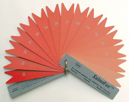
What color is your salmon, flamingo, leaf, soil, golden retriever, yolk, beer, diesel fuel? Measuring color in the field
In a curious sort of information design, salmon farmers apparently choose the desired orangness-pinkness of their product from a color chart (SalmoFan) provided by Hoffmann-LaRoche which supplies the food dyes to color farmed salmon that would otherwise be gray, khaki, pale yellow, or pale pink. The SalmoFan is in tomorrow's New York Times, "Farmed Salmon Looking Less Rosy."
This story in the Times takes on immediate personal interest because tonight we made fresh salmon homebrew sushi for dinner. A leftover piece, held up to the screen, falls about 6 color chips in from the right on the SalmoFan color wheel (assuming accurate monitor color, currently calibrated in the faint WYSIWYG hope of corresponding to CMYK printing on paper).
Or maybe it was wild salmon tonight. Which poses its own environmental concerns.
A Graphical Representation of Meta-data standards
I wonder if you could give us your assessments of a web site that recently came to my attention. I think both the site's subject and approach are interesting and other's views on it would be extremely useful.
The site title is "The Metamap" and it's description is as follows:
"The MetaMap is a pedagogical graphic which takes the form of a subway map. Its aim is to help the information science community to understand metadata standards, sets, and initiatives of interest in this area."
It is a University of Montreal site administered by James Turner and is the collective creation of students under Professor Turner's direction. The course is offered through L'Ecole de bibliotheconomie et des sciences de l'information (EBSI) at the University of Montreal.
Please note that you will need to use a browser capable of displaying Scalable Vector Graphics (SVG) and more particularly, SVG programmed to use the Adobe SVG plug-in. Browsers *excluded* from the list seem to be those based on Mozilla/Ghecko, i.e., Netscape 6 and 7 and Mozilla itself even with the native SVG engine enabled.
Fudging photographic evidence
Earth, Moon, and Jupiter as seen from the Mars Global Surveyor and Mars Orbiter Camera, here.
But heavily adjusted from very thin data; see below.
We use cookies to ensure that we give you the best experience on our website. If you continue to use this site we will assume that you are happy with it.