I was impressed by this map from a Washington Post article:
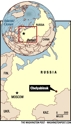
Check out the original article for more context.
I was impressed by this map from a Washington Post article:
Check out the original article for more context.
A common problem I have in a corporate environment is to accurately portray an estimate. We are estimating time and cost for software projects. The key issue is that software development estimates are highly inaccurate in the early stages, with errors of 200-400% quite common and a high degree of positive skew is evident. Overruns are more common than underruns and extreme overruns are alarmingly common.
The main problem is to express the uncertainty as clearly as the expectation, without appearing too elaborate.
In the past, we might say "There is a 90% chance that it will take 1-2 years and cost 5-15 million dollars". This magically turns into "You said it would take 1 year and cost $5m!".
We are dealing here with people who have zero statistical sophistication. There is a confounding factor that people want low numbers so their project gets approved over others.
I have some ideas:
1. Plot time or cost by probability.
2. Plot time by cost as a probability density cloud.
3. Express estimates like this (wide range, round numbers)
"
More than $3m
Less than $30m
"
Tim
P.S. I feel someone will suggest "Do better estimates then you won't have a problem". The fact is, until you have dug into the technical uncertainties and have defined requirements in detail you are subject to major technical risk and scope screep risk. You also have a serious problem of framing - the number the customer first thought of is likely to be way under the mark.
What's the name of the uppercase font used on the book covers?
Investigators must obtain informed consent from human subjects before enrolling them in a clinical trial. This is usually done with a document and a conversation. The information conveyed has to do with risks and benefits, the concept that this is research and not treatment, compensation, and other elements required by regulation. The quality of the informed consent form varies tremendously - readability, reading level, clarity, and so on, and is the object of much review and discussion before the research is approved. My question is inspired by Dr. Tufte's Bose product manual: Would it be possible to convey graphically the information, much of which is abstract, needed by a subject to give informed consent to participate in research? That is, with no or few words?
In yesterday's Times, there's a misleading graphic depicting an "epidemic scorecard" which attempts to put SARS in context of all the other epidemics in the world. A quick glance at the graph gives one the impression that the size of each epidemic's rectangle is relative to the number of deaths (or cases) associated with that disease. However, a closer look reveals that there's apparently no such relation: Denge Fever, with 24,000 deaths a year, is about twice the size as Influenza, with 250,000 deaths a year. Tuberculosis and Diarrheal Diseases have about the same number of deaths, but TB is about 1/3 larger. All of which undercuts the point they're trying to make about SARS relative to these other diseases: SARS, with 353 deaths, is given about 1/2 the space as Yellow Fever which has 100 times as many deaths. (Or 50 times, if you annualize SARS.) Shame on their graphics department for fumbling this one. Thought you might be interested. -- Mike
It will take a little while to download even with a fast connection. It is amazing.
[Link updated February 2005]
Dr. Tufte,
One name that hasn't shown up in Ask E.T. is Gyorgy Kepes. Were he and his books (particularly "Education of Vision") important to you has you formulated your ideas?
Steve Sprague
The local government for which I work is adopting a new computer system. As a result we will be designing new paper business forms for the public — applications for a license, receipts, permits, etc. This seems like an opportune time to improve the forms for clarity and efficiency for many years to come. (These forms are often adopted without much thought and are used unchanged for a decade.) I am familiar with much of the design literature referenced by participants in this forum, and will certainly utilize much that I have learned. However, I have not seen any literature specific to this type of mundane but ubiquitous business form. Suggestions?
Now and then the narrow bandwidth of lists presented on computer screens and bullet points on PowerPoint slides is said to be a virtue, a claim justified by loose reference to George Miller's classic 1956 paper "The Magical Number Seven, Plus or Minus Two." That essay reviews psychological experiments that discovered people had a hard time remembering more than about 7 unrelated pieces of really dull data all at once. These studies on memorizing nonsense then led some interface designers to conclude that only 7 items belong on a list or a slide, a conclusion which can be sustained only by not reading the paper. In fact Miller's paper neither states nor implies rules for the amount of information to be shown in a presentation (except possibly for slides that consist of nonsense syllables that the audience must memorize and repeat back to a psychologist). Indeed, the deep point of Miller's paper is to suggest strategies, such as placing information within a context, that extend the reach of memory beyond tiny clumps of data. George A. Miller, "The Magical Number Seven, Plus or Minus Two: Some Limits on Our Capacity for Processing Information," Psychological Review, 63 (1956), 81-97 (here).
At Williams College in September 2000, I saw George Miller give a presentation that used an optimal number of bullet points on an optimal number of slides—zero. Just a nice straightforward talk with a long narrative structure. (George and I were there to pick up honorary degrees during the dedication of a new science building at Williams College. In addition, Donald Knuth's talk as well as my own deployed no bullet lists.)
"Williams College to Honor Eight Renowned Scientists," September 23, 2000.
