Sam did extraordinary work in analytical design. His designs combined great imagination and excellent craft, both in service to the content.Two of his pieces are double-page spreads in my Envisioning Information: the powerful annotated hospital bill and the beautiful visually annotated (with 21 small images) analysis of Roy Lichtenstein's Mural with Blue Brushstroke. Sam provided his films for the Lichtenstein analysis, so that the reprint looks as good as the superb original.
I still remember a long drive one very rainy night through Connecticut with Sam, after he had taught that day in my class. We talked about what was probably his greatest joy, his own basement printing work at Cycling Frog Press.
Warning: Undefined variable $count in /nas/content/live/graphicspress/wp-content/themes/edwardtufte/archive.php on line 24
Warning: Trying to access array offset on value of type bool in /nas/content/live/graphicspress/wp-content/themes/edwardtufte/archive.php on line 21
The IBM Glass Engine: Interface design reviews
http://www.philipglass.com/glassengine/
seems to be an elegant way of presenting elaborately complex chunks of information, and encourages the user to become truly interactive.
What E.T. information design criteria make this "glassengine" successful/unsuccessful?
What other uses, based on successful "glassengine" information design, might be found?
Graphing with dissimilar units
I'm working on a graphing project for which I'd love to get your advice.
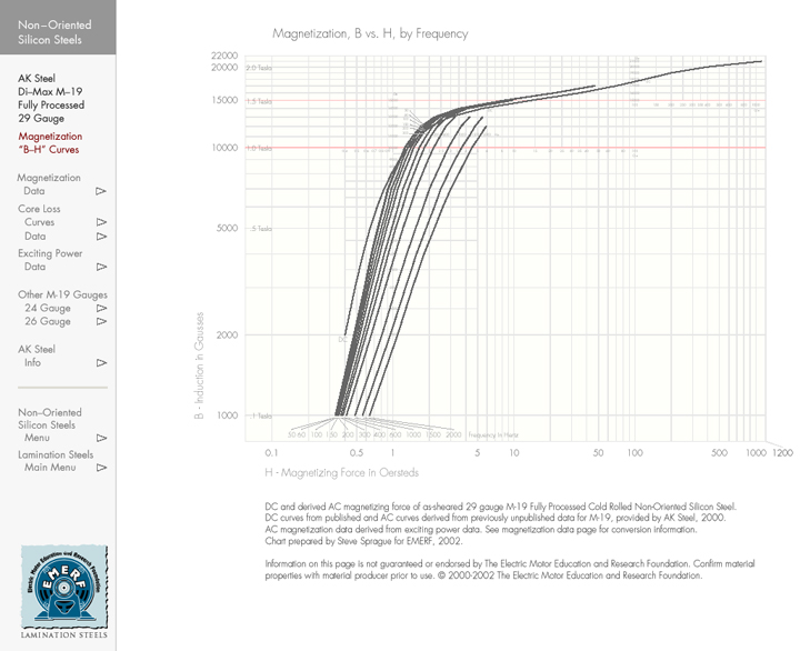
I'm the editor and designer of a large compilation of material information related to the electrical steels used in motors and generators; over past several years, the organization I belong to, The Electric Motor Education and Research Foundation, has published two sets of data on CD-ROM and I'm now working on the third edition. One essential property of these steels is Magnetization, which can generally be thought of as the amount of magnetic induction, or flux density, you get with a given electrical input; this is commonly presented on a log-log Magnetization or "B-H curve" graph (you may recognize this as the first leg of a hysteresis curve). The data I work with is provided to us by various steel mills, produced either from their own tests or from curve-fit algorithms they've developed. There are several material properties covered in the complete document; the question I put before the forum will apply to all of them.
A quick note about the images that follow. They're a workout on a complete page from the Lamination Steels CD-ROM; the core element of this disk is set of massively linked pdf files of which this page is but one (there are over 600 pages in the second edition with over 1000 planned for the third edition). The navigation bar at the left contains location information as well as links to other pages in the document. These graphs were prepared with the intention of their being used in pdf format; hence the small minor scales that help keep the curves in place should one wish to zoom in on them with Acrobat's zoom utility (they should be apparent if not entirely readable in this posting). I wanted to keep the graphs as large as possible so the accompanying datasets are presented on the pages following the graphs. I've tried to keep these graphs as clean, attractive and readable as possible, with careful attention not only to plot accuracy but such compositional elements as line weight, colors, type (typeface, size, weight and color) and type placement (I'm still working on a few issues with the very small type in the minor scales). It was important that the navigation elements reside on the page so I had to carefully consider the composition of the entire page, making the navigation bar readily available and large enough to be used easily without distracting from the graph. One thing I worried over (and still don't know if I got just right) was the visual depth of the elements; I tried to set the color of the body of the navigation bar and the ground of the graph so that they appear to be on the same plane visually, with the hope of getting the curves to "float" just a bit above them thus enhancing their essential importance on the page.
This graph, from our second edition, is a B-H curve for a common grade of electrical steel "M-19" and shows the magnetization characteristics for this material at a number of switching frequencies. You'll see that the magnetizing force on the x axis is in the unit "Oersteds" (Oe) and induction on the y axis is in "Gausses" (Ga). (The red grid lines at 10,000 Gausses and 15,000 Gausses refer to the two standard testing points for these materials.) These units are those routinely used by U.S. producers; for the next edition, I'm developing data and accompanying graphs using what may be called "metric" units: Teslas for induction and Ampere Turns per Meter (A/M) for magnetizing force. Therein lies the rub. While the relationship of Gausses to Teslas is easily handled (1 Tesla equals 10,000 Gausses and you'll see that on this graph I referenced Tesla units), the conversion of Oersteds to A/M is a bit dicey as 1 Oersted equals 1.256 x 10⁻² A/M. I'd like to be able to plot both units on the same graph, yet am concerned about confusing the units or overly cluttering the graph. I've considered several approaches. First, keeping the graph as it is and placing converted A/M values along the major and minor x axis scales:
This graph keeps the log decades on Oersteds with the corresponding A/M units underneath. While appealing in the ease of converting the data points and in having just one grid system on the x axis, I found this solution uncompelling as I'd like to be able to represent both Oersteds and Ampere Turns per Meter as complete systems. This will make it easier for those used to reading these graphs in one or the other set of units and also helps make the relationship of the two unit systems more readily apparent. I was still worried that having two x axis systems would be visually confusing. So, to help get a handle on the workings of two unit graphs, I prepared one with differently colored Oe and A/M grids on their respective decades, reducing it to a bare essential set of elements by removing all the minor scales, just to see how it would look:
After plotting this, I felt that there might indeed be hope for a graph with both x axis systems. Still concerned that a layout similar to the first graph with two grid systems would result in an unreadable spider's web of grid lines, I plotted the minor scales just in the areas of the curves:
My final thought was to produce two separate graphs on separate pages, appropriately linked, but I found a lot to like about this graph and stopped.
So, to the question, Dr. Tufte (and the others on the forum): Do you have any thoughts about producing a graph with these multi-unit issues? Are there improvements you see for my general scheme or should I entertain a different approach?
Thanks for taking a look at these. Steve Sprague
Single-number semi-tables for news illustrations
New York Times, March 20, 2003, p. D1
Medical animation
I took your 1-day course today in Boston and it was wonderful! My area is the production of animations for explaining novel and/or complex medical/scientific ideas. Examples include mechanism of action of drugs at the cellular/molecular levels, function of medical devices, and drug delivery. I'd very much appreciate if you could answer the following questions:
1. When is animation a better solution compared to a still image, or even a series of still images? When is 3D animation better than 2D animation?
2. Is there any evidence that visual explanations are superior to other modes (text, voice) in terms of understanding, retention, or preference by learners?
3. Can you refer me to a review or book on the use of animation in scientific visualization?
Thanks very much!
Stem and leaf displays
In The Visual Display of Quantitative Information, a stem-and-leaf plot is shown of volcanoe heights (page 46 in the 2nd edition).
I can't figure out why the digits on the right hand side of the chart aren't sorted. It seems like sorting this would make it easier to see how many volcanoes are 7,800 or taller, rather than just how many volcanoes are in the 7,000-7,900 foot range.
Is this chart example just not optimal, or am I missing something?
thanks...mike
time on the computer
What is the reason, if known, that time on the computer seems to pass so quickly: that computer time seems to be different and "faster" than "normal" time in other settings? If this hasn't been studies and reported, what are contributors' speculations? J. D. Mccubbin
No Pulitzer Prizes for Information Graphics
Hili Banjo, a student at the Medill School of Journalism at Northwestern University, points out that "Currently there is no prize in the Pulitzer compeitition for information graphics, although that competition recognizes various forms of writing, reporting, editorial cartooning and photography."
There is a questionnaire about news graphics at this URL, which journalists might well fill out.
Image sequence of ski crash: best design?
For years I have saved this sequence of photos that ran in the Seattle Times. There's an interesting tension here between the direction of reading and the implied direction of movement of the subject:
The caption reads:
Austria's Hermann Maier goes airborne, far right, and ultimately
crashes through two safety fences in this sequence taken from
TV footage of his downhill spill at the seventh gate.
So here we have an attempt to reproduce in print the capacity of the moving image to capture the motion of a figure from right to left. This sets up a clear battle against the Western reader'sinstinct to read left-to-right.
I assume this never would have been attempted with, say, a mere sprinter running leftwards. The designer must have assumed that a human in great peril, moving with tremendous force, would be powerful enough to break the reader's eye movement.
I think it's clear the designer judged incorrectly; the reading pattern, left-to-right, predominates no matter the circumstance. The caption writer, finding himself having to tell the reader to begin looking at far right, should have warned the designer that no one would read this correctly on the first try.
I wonder what strategy would have worked best, especially taking into consideration the sense of movement the designer wanted to convey. And, more generally, is there any resolution to the dilemma of communicating right-to-left motion in a medium that is read left-to-right?
Depicting cognitive fixation over time
I'm looking for some help with my study of cognitive fixation during acute medical emergencies in the operating room. My question is how to depict the elements of this cognitive fixation. The goal of the graphic is to highlight how attention (represented by diagnoses, treatments, symptoms noticed) widens, narrows, persists or ceases over time. (E.g fewer symptoms noticed = narrowing of attention). If anyone has examples of how this sort of thing has been handled well by others, can improve on my ideas, or suggest good software for doing a better job than I'm proposing below, I'd be very grateful. The data are diagnoses considered, treatments pursued, symptoms noticed, and a leading vital sign (oxygen saturation.) My current idea is to depict diagnoses in columns (with x's or dots), time in rows, with diagnoses treated appearing in a different color than diagnoses not treated. I would capture the clinical signs considered with a color scale behind the diagnosis x's (darker could equal more clinical signs considered.) Thanks for your help!
We use cookies to ensure that we give you the best experience on our website. If you continue to use this site we will assume that you are happy with it.