Warning: Trying to access array offset on value of type bool in /nas/content/live/graphicspress/wp-content/themes/edwardtufte/archive.php on line 21
Traffic signal lights - impending change
Warning: Undefined variable $count in /nas/content/live/graphicspress/wp-content/themes/edwardtufte/archive.php on line 24
Warning: Trying to access array offset on value of type bool in /nas/content/live/graphicspress/wp-content/themes/edwardtufte/archive.php on line 21
Plotting Share (Stock) Volumes
Any suggestions or examples?
Process Mapping
Traffic Light Colors
Formatting for Financial Scorecards and Detailed Reports
We are redesigning a set of scorecards and related financial reports intended for Senior Management. Our company has a history of using black boxes to visually separate and organize blocks of data. We have been slowly changing this practice by first adopting 50% gray boxes, then doing away with some boxes and eventually moving to 25% gray for remaining boxes and heading underlines, etc. In the current design cycle, we are removing even more, but have run up against the question of whether or not some level of "outlining" is necessary to visually organize the data or to provide visual weight.
The pdf files below show two prototypes that highlight the types of reporting design issues we are confronting. The first page is a Scorecard, and the second is an example of a detail page that would typically supplement scorecard information. The examples do not "foot" as we doctored up the data out of concern for confidentiality.
We would like feedback mainly on the use of lines to visually organize the data, but we are also concerned with the appropriate use of color, bold face and other formatting techniques. Bear in mind we are working in EXCEL, in a fast-turnaround automated environment.
Thanks in advance for any feedback.
Paul Grande
PROTOTYPE 1 (2 pages):
IMAGE=aa
IMAGE=bb
PROTOTYPE 2 (2 pages):
IMAGE=cc
IMAGE=dd
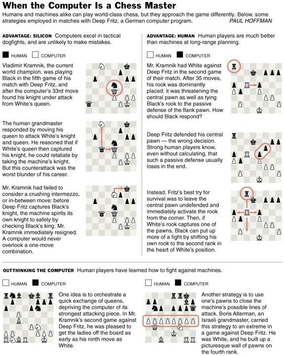
Charting chess
This superb display from The New York Times shows complex narratives with good text/image integration and a precise use of color. The informative and vivid writing is by Paul Hoffman; the excellent work of the analytical designer, however, is not credited.
 Copyright 2003 The New York Times Company
Your thoughts on Information Display Design in Dynamic Environment
As an industrial designer in the automotive industry, I often see the industry's effort and attempt to redefine information design/display in a dynamic environment.
And especially in recent Detroit autoshows, we notice growing number of items listed below in production vehicles.
* Information displays
* Navigation systems
* Multicontrollers
-joystick-type controller to navigate through information on everything from current car-status, weather, map, radio, A/C...
* Displays for Integrated Cellular phones and Web-accessible PDAs
I would like to know what your thoughts are on this topic of Information design in Dynamic environments, where one has a very limited time for attention.
Where, how do you draw the line and limit information available for driving safety?
Is current, automotive instrument cluster, a well-designed example of information design?
et cetera.....
Just curious on how "non-automotive" minds are thinking on this subject.
Sincerely,
Sangwon Choi
Display of musical structure
I'm working on a project that involves the display of as much of the structure of a piece of music as possible. I remember the Music Animation Machine from one of your lectures, but I'm wondering what other work has been done on the display of musical structure.
For example:
* beats and rhythm. (I imagine drummers use some sort of notation for these things, but I'm haven't looked into this yet)
* musical phrasing - a lot of music has both measures and phrases. A bar of music might repeat eight times before something changes in the music. I'm wondering if anyone knows of representations that have been done before -- I'm experimenting with some new designs, but I would love to see what others have done.
* visual representation of frequencies and amplitudes -- again, this would help to show the underlying structure.
* what about represenations of the "jagginess" versus the "softness" of the sounds within a piece of music?
Obviously, the most basic form of representation would be sheet music. But I'm interested in representing something that has already been composed and recorded.
This is both a visualization problem and a data graphic problem, because ultimately I'd like to make a computer program which shows these representations for pieces of recorded music.
I'd love any thoughts you have on this.
Communicating software design
This question was inspired not only by the content of the "visual means of discovery" and "Quality of software, software processes and the UML" threads but also by their proximity. My concern seems to span both those topics.
When I attended the Tufte seminar in Houston (some time ago), my goal was to gather techniques for more clearly representing a computer program as it is being created and as it is or has been coded. Here is the problem as I see it:
A program is a combination of algorithms and data structures upon which the algorithms operate. Both components of a program have representations that are functions of time. While the program is being created, the capture of these representations (mentally, visually/graphically, verbally, in code, etc.) *is* the mechanism of creation. It is also the mechanism by which the programmer communicates the work to be (or that has been) done to himself, to users, to other programmers, and to managers. While the creation process is happening, the captured portion of these representations is necessarily incomplete; and, the next incremental addition depends strongly upon the captured portion having been represented well. Hopefully, the iterative, incrementally additive capture process will converge in an acceptable amount of time and yield a correctly working program that meets expectations.
As an independent software development consultant, i.e., someone who enters a new environment with the expectation of creating a complex, schedule- and budget-constrained mission-critical program that is to be left entirely in someone else's hands, this representation issue is important to me. For example, it would be unethical to leave a customer with insufficent information to maintain a program in my absence. Generally, use of formal tools (e.g., UML) won't fit schedule or learning-curve constraints. Often, any non-verbal representation of software is met with resistance until schedule and budget issues become overwhelming. To make a long story short, typed text plus pencil and paper diagrams are usually the tools of choice. The question is this:
Has your experience with presenting complex but relatively static data allowed you to derive any techniques, best practices or rules of thumb that (1) promote/ensure complete presentation of an idea or set of data, or (2) provide positive indication that a presentation is not complete or has additional as yet unrepresented portions?
By the way, some of the concepts presented in your seminar were, in fact, immediately useful in this context and for purposes of designing a user interface. It was money well spent.
Formalizing photographic aesthetics
Philip's essay, reproduced below, was originally posted on his site.
