Warning: Trying to access array offset on value of type bool in /nas/content/live/graphicspress/wp-content/themes/edwardtufte/archive.php on line 21
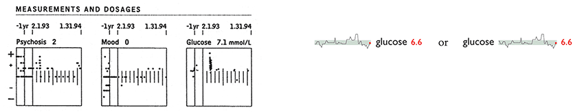
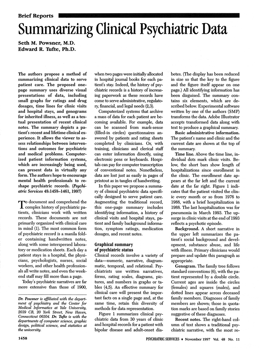
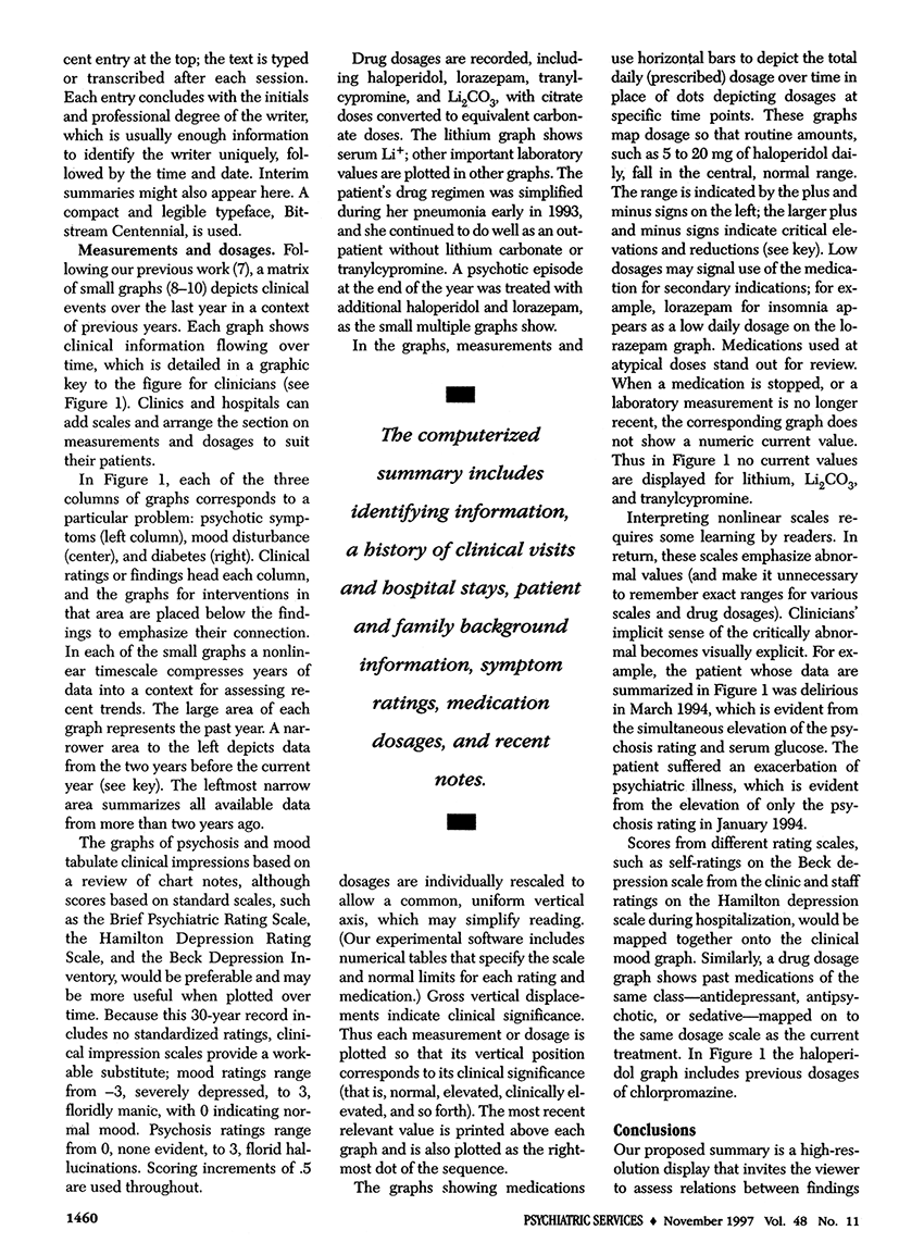
Graphical summaries for medical patients
Note by ET: In these two articles below, better to change the boxes with normal limits to sparklines with normal limits.
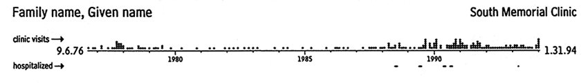
The sparkline-like double-sided patient timeline is medically helpful, data-rich:
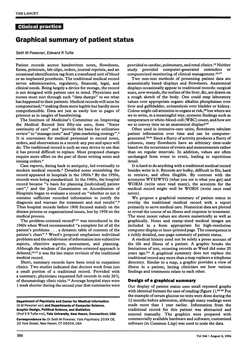
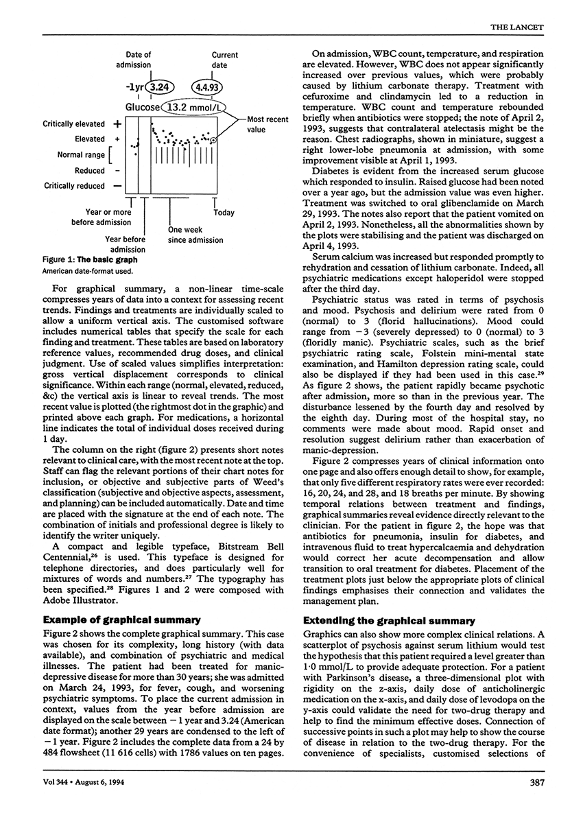
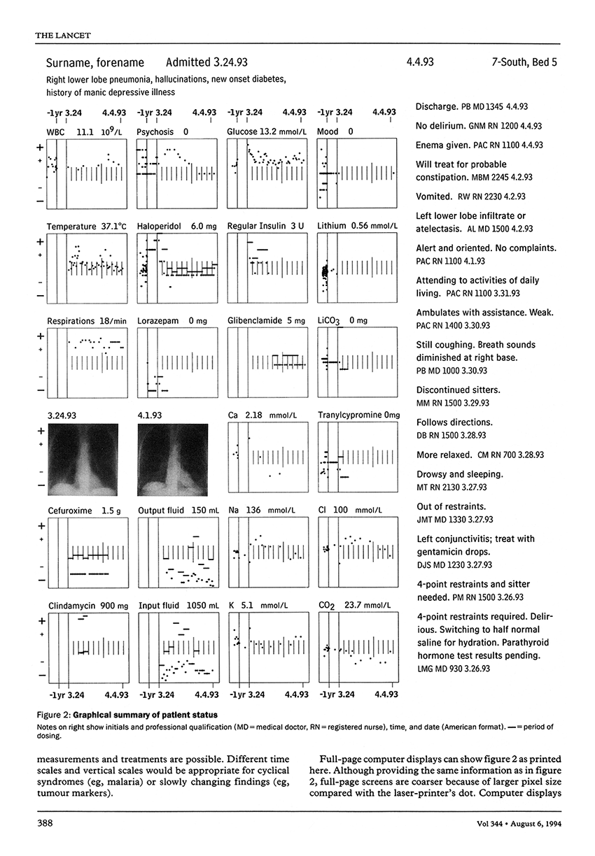
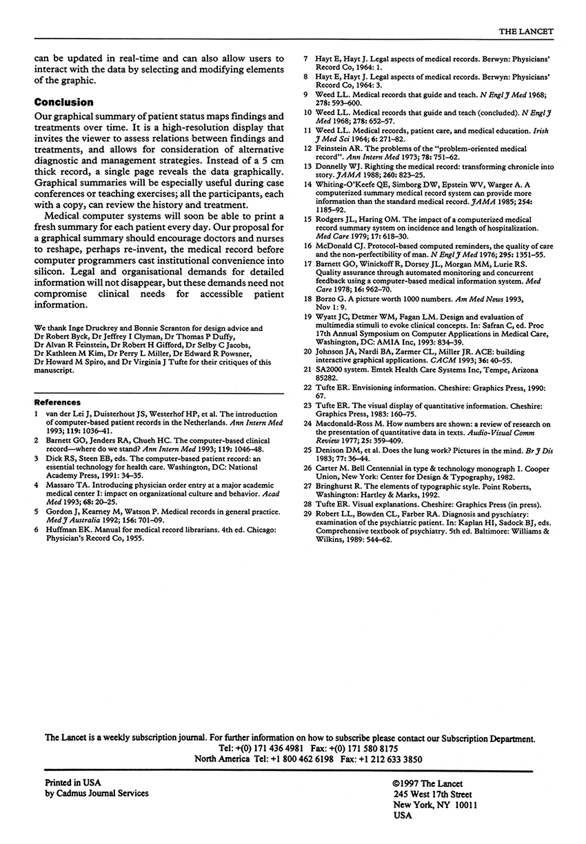
Seth M. Powsner and Edward R. Tufte, "Graphical Summary of Patient Status", The Lancet 344 (August 6, 1994), 386-389.
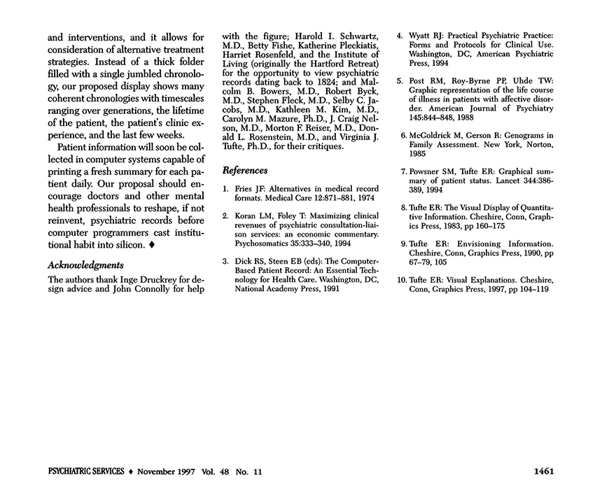
Seth M. Powsner and Edward R. Tufte, "Summarizing Clinical Psychiatric Data", Psychiatric Services 48
(November 1997), 1458-1461.
From: Edward Tufte, Beautiful Evidence, p.47
Warning: Undefined variable $count in /nas/content/live/graphicspress/wp-content/themes/edwardtufte/archive.php on line 24
Warning: Trying to access array offset on value of type bool in /nas/content/live/graphicspress/wp-content/themes/edwardtufte/archive.php on line 21
Light painting, a brilliant technique
http://www.nearfield.org/2011/02/wifi-light-painting
Absolutely brilliant. And light painting has many obvious extensions and uses.
It might be called "light mapping" (which emphasizes the quantitative measurements depicted by the light stick and recorded by the fixed camera) rather than "light painting" (which suggests painting as in brushes and art).
All done with a still camera on a tripod and a person carrying a light stick with a measurement instrument attached. Video by Timo Arnall, Jorn Knutsen and Einar Sneve Martinussen:
See also Timo Arnall and Einar Sneve Martinussen, "Depth of Field Discursive design research through film":
http://www.formakademisk.org/index.php/formakademisk/article/view/68/79
Another Norwegian contribution to analytical design!
About ET: Edward Tufte interviews, biography, contact information
Reporters, interview requests, invitations: contact Pam Mozier at 203 250-7007 or email
(Prior to interviews, reporters should read the piece by Zachary and Thralls below.) For design reviews or comments on your work: Search the topics on ET notebooks, find a relevant topic, read the thread, post your best material by going to the contribution button at the bottom of each thread.
If your contribution is published, it will be available for possible public comment by ET and by visitors to that thread. (For good ideas about your displays, also search Google Images for your topic.)
Joshua Yaffa "The Information Sage" Washington Monthly, June 2011 (Washington work and influences on data displays.)
Christopher Bonanos "The Minister of Information" New York Magazine. (A long account of one-day course and generous speculations about ET influence. Well-illustrated in downlinks.)
Mark Zachry and Charlotte Thralls "An Interview with Edward R. Tufte" Technical Communication Quarterly. (16-page, thorough, revealing interview in question and answer format.)
Phil Patton "Up from Flatland"New York Times Magazine (Long profile on ET supercomputer visualization work for the thunderstorm as well as career up to 1992.)
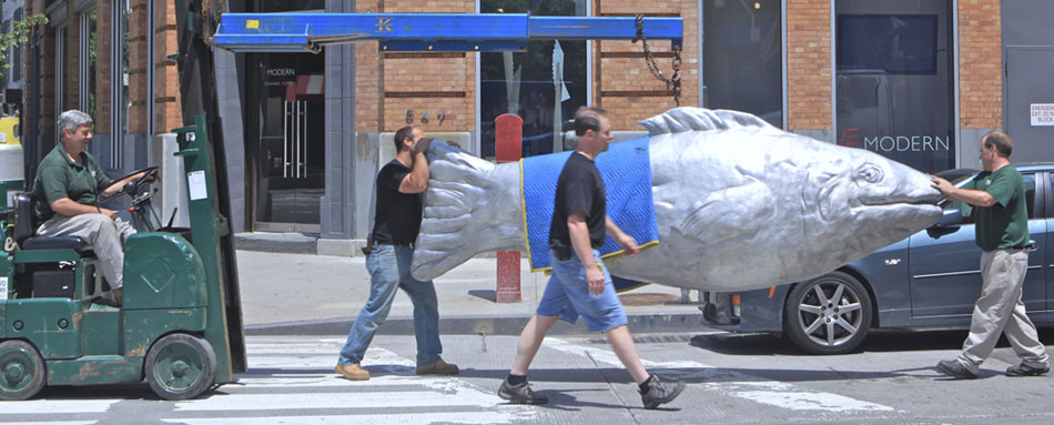
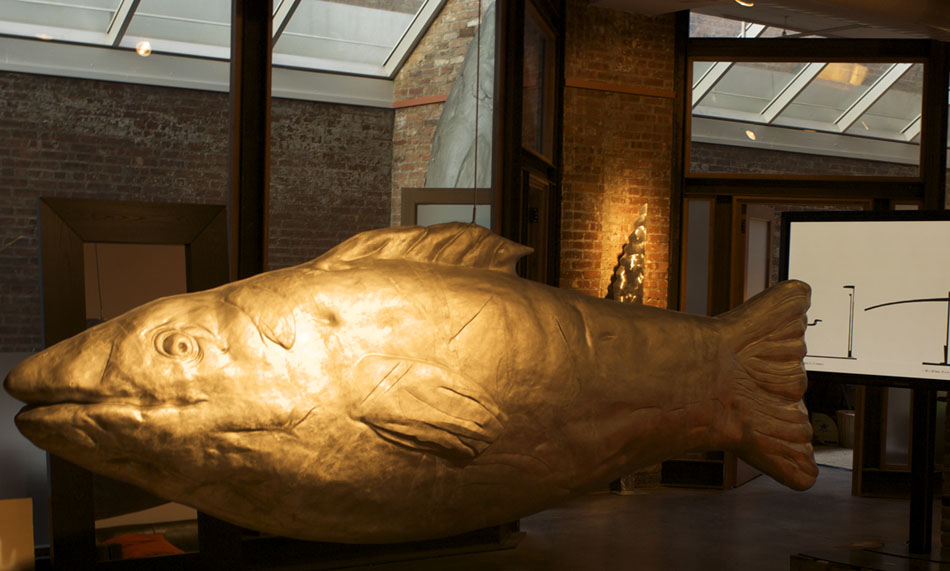
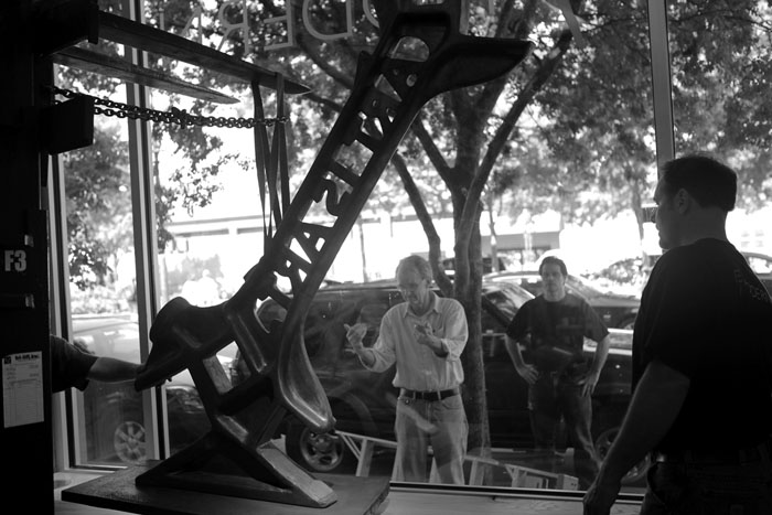
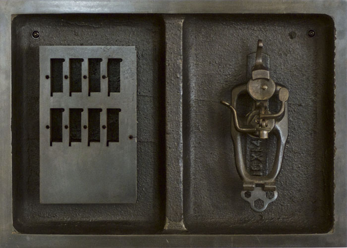
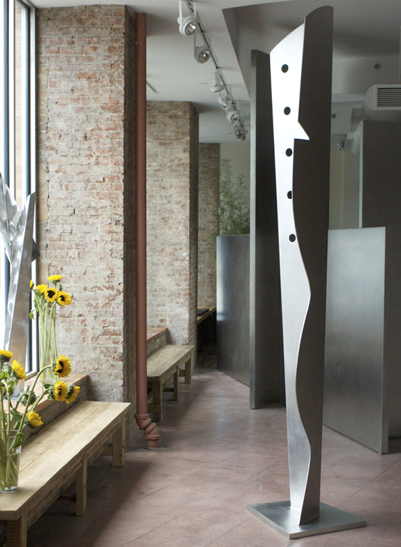
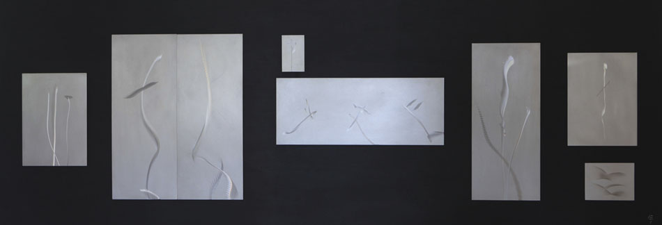
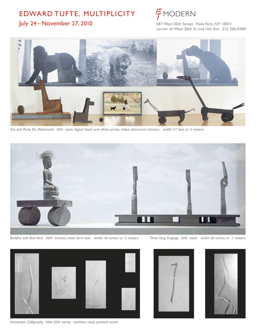
The 7 images below provide a multiplicity of views of the same artwork.
Edward Tufte, Paris1907, 2011, steel forging mounted on wood base.
12 x 12 3/4 x 3 1/2 in or 30 x 32 x 9 cm
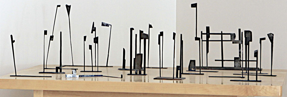
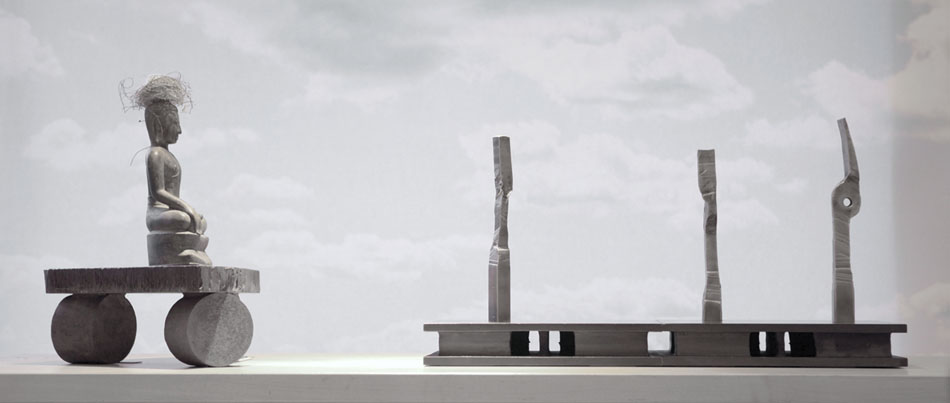
For about a year now, Brad McDougall and I have worked together at his blacksmithing studio in northern Connecticut to make many new artworks. The technical name for blacksmithing is forgings, which is to heat steel red hot and then bang artfully on the steel with manual and power hammers. Below a video by Andrei Severny and ET shows some of the new works and their lively method of production.
This video is also available on YouTube and Vimeo
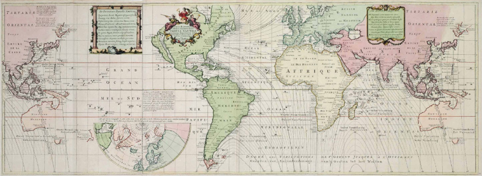
Christie's auction of ET rare books: what's going on
"Beautiful Evidence: The Library of Edward Tufte," auction at Christie's, Rockefeller Center, New York City, December 2, 2010. About 200 rare books, including major works in the history of science, statistical graphics, 20th-century artists books, ET artworks, Sidereus Nuncius (1610), Hypnerotomachia Poliphili (1499).
Christie's electronic catalogue here, then click on slideshow or ecatalogue. Three of my artworks will also be at the auction (see below).
What's Going On
My library was always working library, with the rare books beside my computer as I was writing. But in the last few years, the books were viewed only when a visitor requested a look at the Galileo, Playfair, or Picasso books, or when I took a nostalgic look in the library. Furthermore, the important books in my library are the unread books. My introduction to the Christie's catalog explains exactly what I'm thinking about in doing the auction. In particular, note the second to last paragraph. And I am in excellent health, delighted with new adventures in Washington, DC and New York City, and fortunate to be a working and exhibiting artist.
Great books foster, transmit, and preserve forever knowledge. The books in my research library were always meant to be used: read, skimmed, read aloud, exhibited, photographed, scanned, shared, treasured. And thus my library, which I thought of as The Museum of Cognitive Art, participated intensely in my research, scholarship, writing, teaching, design, artwork. For 30 years, the workaday presence of these wonderful books in my life was inspiring and challenging.
I always sought to write, design, and publish books worthy of my research library: The Visual Display of Quantitative Information (1983, 2001), Envisioning Information (1990), Visual Explanations (1997), and Beautiful Evidence (2006).
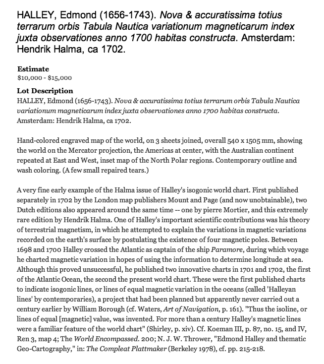
The collection articulated my interests and needs in making my books about analytical thinking, seeing, showing: high science (Galileo, Huygens, Newton, Lambert), high art (Durer, Dufy, Picasso, Ernst, Derain, Albers), practical science (history of perspective, dance notation, magic, aviation, landscape architecture especially Repton), the history of statistical graphics (nearly all of William Playfair's books, Marey, Minard), epidemiology (Graunt, Snow), mapping (Halley, Minard), illustrated books (fish, birds, and whatever), and the classics of book design (Hypnerotomachia, Byrnes' color Euclid, Eric Gill, Bruce Rogers, John Henry Nash, and books published by Giovanni Mardersteig's Officina Bodoni press). Their time past become my time present and time future.
This diverse and quirky collection found a deep unity in my own books. The relation between my work and the research library is
shown directly in many catalog entries.
With this auction, my research library will gradually turn into open-space land in perpetuity for making and exhibiting landscape sculpture Storm-King style, and also into my museum and gallery, ET Modern, in New York's Chelsea art district.
Of course, there's another book (Seeing Around, 2013) underway as well. There always is.
Edward Tufte
I am giving 4 lectures in New York City about the rare books in my books:
Edward Tufte lecture, "Rare Books and Their Relation to My Books" At ET Modern (547 West 20th Street, corner of 11th Avenue), ET will show special rare books from his library to be
auctioned at Christie's on December 2, 2010. He will discuss how those books participated in creating his own books. These historic, beautiful, rare, important books on show include:
Galileo's Starry Messenger (1610), Hypnerotomachia (1499), Durer on measurement (1532), Cousin on perspective (1560), Bayer's first accurate star atlas (1603), Playfair on statistical graphics (1785), and two of Picasso's artists books.
Free lecture at ET Modern on Thursday November 18 at 7.00pm, and again on Friday November 19 at 2.00pm. Free lecture at Christie's (where all 200 books will be on view) on Monday November 29 at 2.00pm and again on Tuesday November 30 at 2.00pm.
Check the homepage for updates.
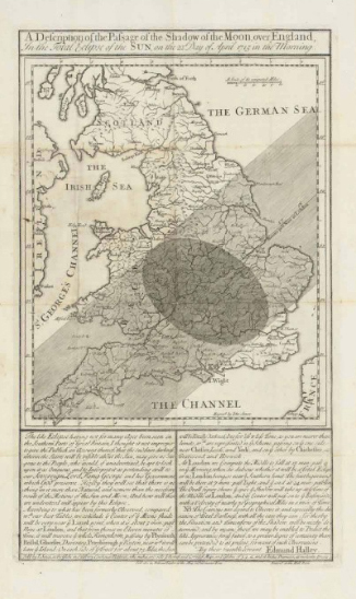
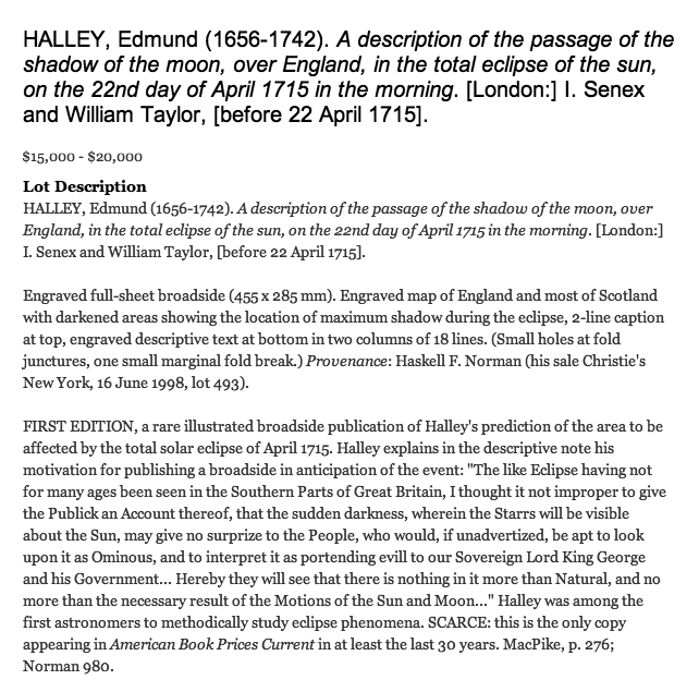
There are six large pieces of flat art in the auction: a grand Halley map, the Cyclogram, and three ET graphic artworks.
Displays of movie-making techniques
To show techniques and plans for making movies requires displays that show time, 3-space, words, and sound. Many highly talented visual workers have done so. Here is the beginning of a collection on storyboards, how-to manuals for moving-making techniques, and project management displays for movies. I hope that our Kindly Contributors will provide many splendid examples.
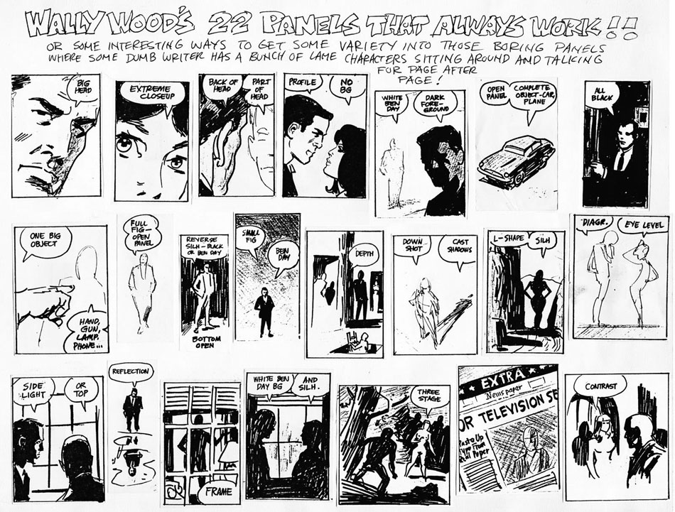
Anne Lukeman of Kill Vampire Lincoln Productions created brilliant small-multiple movies illustrating the classic small multiple "22 FRAMES THAT ALWAYS WORK!!" by Wally Woods.
First, Wally Woods on the design of panels for comic books:
source: Joel Johnson
And here is the wonderful movie version of movie techniques (based on the comic book panels) by Anne Lukeman:
Source: source: Anne Lukeman
As those of a certain age know, "Ben Day" in the comic panels above is the product name for transparent overlays of varying tones created by small dots of equal size for each tone. Roy Lichtenstein featured Ben Day dots in his paintings and sculptures. But "Ben Day" makes no sense in the movie-making world, unless translated into something like "a soft background area of uniform tone."
In Beautiful Evidence, I constructed a storyboard from pieces of Hypnerotomachia Poliphili (Venice, 1499) and compared it with a storyboard for Alfred Hitchcock's North by Northwest (1959):
Source: Edward Tufte, Beautiful Evidence (2006), page 92.
ET Modern
Statistics at the FDA
Here's a 1970 report for the President's Commission on Federal Statistics prepared by Cuthbert Daniel, Joseph Kadane, and ET.
Click here to view the report.
Microsoft's Courier digital journal (Courier cancelled, April 29, 2010)
Here are videos and stills about Courier from engadget.
I think Courier looks very good, particularly its sense of hand and physicality. Courier appears to manage gracefully all kinds of information inputs, has an excellent metaphor (a notebook, a journal), and is crisp and clean. And it is all about content.
With its double-page spread design, the Courier metaphor is also the book, with obvious promise for electronic books (which will require a reasonably high-resolution screen).
It looks like a useful tool for artists and designers, and thus Courier should communicate with the Apple desktop. Courier will be pretty lonely if it is exclusive to Windows. Or maybe the cloud, which one hopes is OS agnostic, will cause appropriate communication and integration.
Probably the greatest challenge in interface design today is a journal notebook. For years, Microsoft, Apple, and many classes in industrial design have attempted to design a good journal notebook. I hope that Courier survives intact, coherent, and focused during its journey through Microsoft, a journey with lots of possibilities or messing it up.
But how close is the relationship between what is shown in the videos and the actual product in use?
Windows Phone 7 Series (WP7S)
The WP7S layout and typography have a looseness found in posters, commercial art and marketing, an inappropriate metaphor for a handheld information and communication device. In the splashy panoramas, there are hints of design-by-focus-group (which is like hiring temps as your design consultants). Instead of impressing focus groups, designers should do a thought experiment: Imagine what Steve Jobs and Jonathan Ive would have to say about your interface. As Jonathan Ive said: At Apple "we don't do focus groups."
The WP7S interface has an extra sequence/layer added by big-button opening screens for the new ways of organizing stuff. Compared to the IPhone, most of the WP7S organizing screens have lower content resolution, which violates flatness and leads to hierarchical stacking and temporal sequencing of screens. In day-to-day use, maybe the panorama screens will solve the stacking/sequencing problem, or maybe they will just clutter up the flow of information. Of course Microsoft's customers are already familiar with deep layerings and complex hierarchies.
The panorama sequence appears to be an interface for an interface, a distancing from the core activities of users, who just want to get on with what they want to do. My view is to let the user's eyes do more on a screen-image rich with opportunities rather than having to slide-and-flip through a sequence of thin decorative screens in order to find the desired action. The way to reduce clutter is not to thin down and sprawl out the content; instead fix the design. Clutter and confusion are not attributes of information, they are failures of design.
On the importance of content resolution and flatness in handheld devices, see my essay and video on iPhone design from January 2008.
The WP7S screens look as if they were designed for a slide presentation or for a video demo (to be read from a distance) and not for a handheld interface (read from 20 inches). For example, the headline type is too big, too spacious. One design lesson here is that most interface design work should be done at actual final scale and all internal demos should be on actual hardware rather than on pitch slides or big monitor screens. After all, users see the interface only at actual size, and so should interface designers, their managers, and so on up the management chain.
A recent unlocking of the WP7S emulator provides many many screens (perhaps all the screens in WP7S) that reinforce my concerns about low content resolution, flatness, and hierarchy. The typography is loose and over-produced, with big blimpy titles burning up content real-estate. The titling typography does not serve user needs or activities. Instead it is about its designer self, and looks like signage on the walls of a fashionable building. Good screen design for information/communication devices is all about the user and should be endlessly self-effacing. It is much more difficult to be user-friendly undesigny than designer-friendly designy.
The booming smartphone market is intensely competitive, with lots of talent, brains, money, and a vast infrastructure at hand. What is the positioning of WP7S in this market, where many users are enthusiastically committed to their new handheld devices? And how does WP7S compare with the well-established BlackBerry, iPhone, Nexus One, Android, as well as their upcoming new releases? Android is free, WP7S apparently has a license fee. Currently the two- and three-syllable platforms are way ahead of the seven-syllable platform.
NOTES
ET reports (favorably) on Microsoft's Courier digital journal here.
We use cookies to ensure that we give you the best experience on our website. If you continue to use this site we will assume that you are happy with it.


 For about a year now,
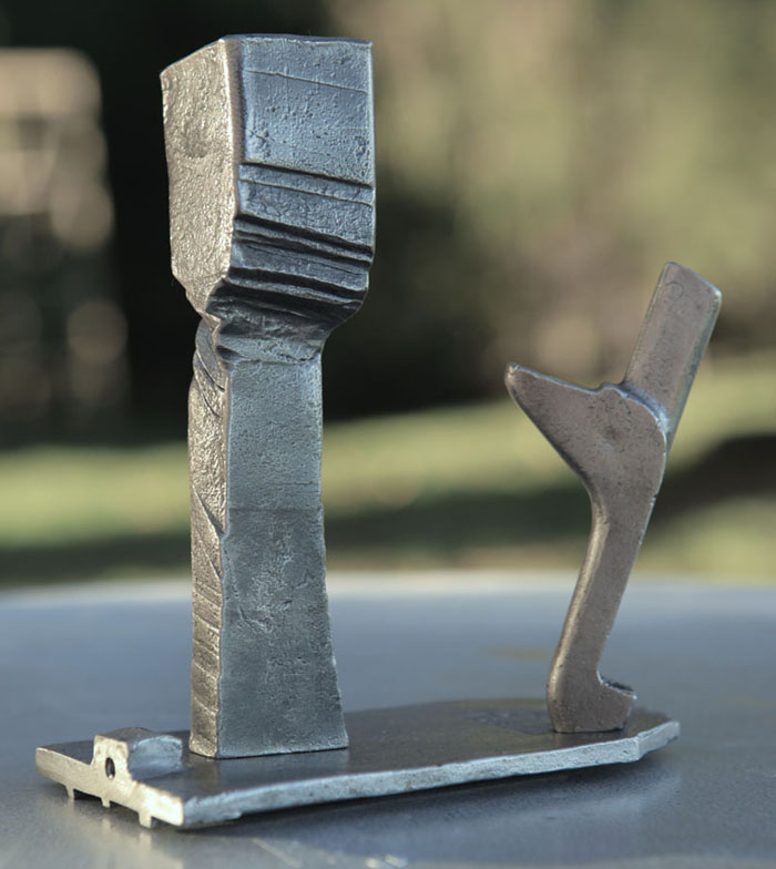


 Source: Edward Tufte, Beautiful Evidence (2006), page 92.