Warning: Trying to access array offset on value of type bool in
/nas/content/live/graphicspress/wp-content/themes/edwardtufte/archive.php on line
21
Data displays for self-awareness
Can our Kindly Contributors think about data, information, and displays for life tracking?
Diaries, calendars, blogs, tweets, income tax returns and their back-up data, Google's retention and display of searches, ISP records, credit card bills, and email history all generate large amounts of data that might be relevant for making life-tracking displays--and, more importantly, for understanding and possibly changing one's life or one's allocation of time.
What kinds of effective displays are used by people in planning, recording, and assessing their daily activities? Since so much information is compiled, it is important to identify what kinds of data are relevant to understanding and changing one's activities, to go beyond score-keeping. So we're looking for data that would help see what we're doing, how much is habit, and how one can be more effectively self-aware. The issues are less about display methods and more about choosing the key data worth looking at.
It would be interesting to see what I suspect are endlessly repeated looping patterns in internet use (in my case, for example, NYTimes to weather to email to flight status to ESPN, and then over and over during the day), with the only variation being whether the loops are executed on my desktop, laptop, or iPhone. Thus one might generate one's own ISP logs or get the records from your ISP.
Here is a start:
http://bits.blogs.nytimes.com/2010/02/09/an-annual-report-on-one-mans-life/?ref=technology
Warning: Undefined variable $count in
/nas/content/live/graphicspress/wp-content/themes/edwardtufte/archive.php on line
24
Warning: Trying to access array offset on value of type bool in
/nas/content/live/graphicspress/wp-content/themes/edwardtufte/archive.php on line
21
Solari train boards
From Michael Leddy,
Orange Crate Art:
"SUNDAY, JANUARY 03, 2010
Solari board
A bright new LED display will soon replace the schedule board at New Haven's Union Train Station. The board to be replaced clicks clicks clicks as its letters and numbers flip. Did you know that this kind of board has a name, or several? It's called a flip board, split-flap display, or Solari board, after its Italian maker, Solari di Udine.
NPR reports that New Haven's LED display will have a simulated click click click.
Related listening, looking, reading:
Solari board photographs (Flickr)
Solari board videos (YouTube)
Train Station Board's Demise Is Sign of the Times (NPR)
Tune Changed on Solari
(New Haven Independent)
POSTED BY MICHAEL LEDDY AT 9:54 AM"
ET's thoughts:
As a frequent user of the New Haven train station, I have mixed views. The Solari board is a wonderful show, especially the click click click, but the information is very limited and lacking in relevant detail. The email (reproduced in the
New Haven Independent story) from Pamela Sucato, a Connecticut DOT official, makes a thoughtful and nearly convincing argument for the LED change, although I love the retro look and sound of the old board. It is important that a new LED board be decently designed. The ADA compliance criteria will damage the design quality, however.
About a year ago, I investigated buying a Solari board for an artwork, in which the labels for trains would be replaced with cryptic art slogans ("Art is art, and everything else is everything else" by Ad Reinhardt; "What you see is what you see" by Frank Stella; and so on). Then the board would click click click sequentially and authoritatively through such art thoughts. But a new board was enormously expensive and difficult to obtain.
Pamela Sucato suggests in her email that the New Haven Solari board might be donated to a museum. My use would not preserve the train schedule data, but would repurpose the board's display method into showing thoughts about art by famous artists.
12 Reviews, ET Art Exhibits
Scroll down for the reviews:
Edward Burtynsky: Oil
See Tyler Green's good report at Modern Art Notes:
http://www.artsjournal.com/man/2009/11/burtynsky_oil_and_its_most_unu.html
The book is amazing, powerful, disturbing.
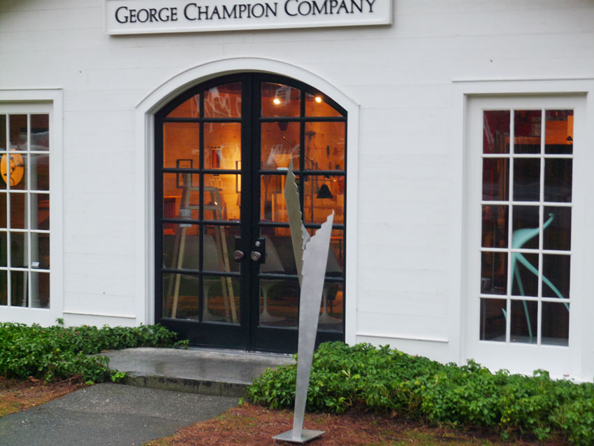
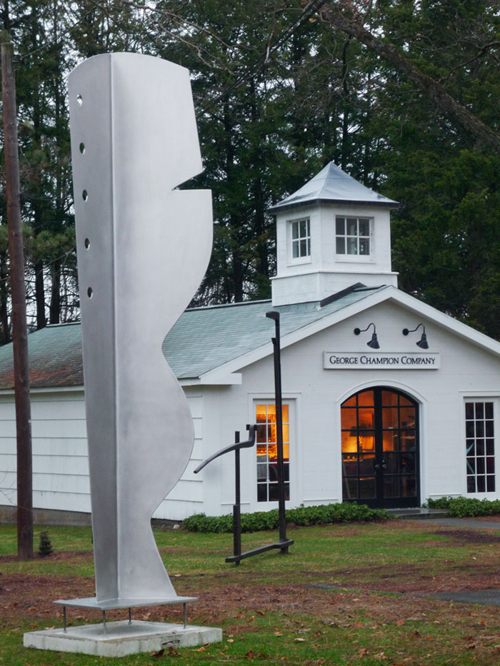
ET show at George Champion Modern Shop
Installed 4 sculptures at
George Champion Modern Shop in Woodbury, Connecticut today.
After 4 museum exhibitions, this is my first gallery show and first selling show. Hogpen Hill Farms LLC, my farm and sculpture garden, is also in Woodbury, which is in Litchfield County in northwest Connecticut. Litchfield County is sometimes described as the "Hamptons for people who like privacy."
I like the area because of its open spaces and many farms, artist residents, historical preservation, quality of workers, and The French Ovens, an excellent bakery.
IMAGE=fish
Microsoft patent claim for "sparklines in the grid"
Microsoft has filed a patent claim for "sparklines in the grid."
The Microsoft filing, made by
- Radakovitz, Samuel Chow (Redmond, WA, US)
- Buerman, Adam Michael (Bellevue, WA, US)
- Garg, Anupam (Redmond, WA, US)
- Androski, Matthew John (Bellevue, WA, US)
- Becker, Matthew Kevin (Kirkland, WA, US)
- Ruble, Brian S. (Bellevue, WA, US)
can be found here.

Microsoft's patent claims deal with putting sparklines in spreadsheets (and, more generally, grids), which many have already done, and which I have suggested for years. Indeed, Beautiful Evidence (page 62) shows sparklines in grid boxes and even explains how to design those boxes! The claims way over-reach and seek to control and to own the use of sparklines in spreadsheets. My spirit in making sparklines was to make something helpful for intense data analysis and give it away to the world. Repayment results from my joy in seeing the use of my open source invention. What Microsoft's patent claims demonstrate is the ridiculous state of the US patent system and of those who seek to exploit that system.
The Microsoft claims appear to go far beyond spreadsheets. The title of their patent submission is "Sparklines in the grid." Note the title is not "Sparklines in Excel." Every data table has a grid, sometimes invisible, sometimes with little ordered boxes. Nearly all typography has an underlying grid, so even a sparkline placed in a sentence might qualify as a "sparkline in a grid." And, of course, every spreadsheet has a grid. The claims involve software code that constructs and possibly drives those sparklines in the grid. All sparklines are produced by software code, one way or another. Although masked by the language of patent legalese, the claims, when taken at their word, appear extremely broad.
Finally, there are many open source programs that produce sparklines into a spreadsheet. These computer programs have been reported at my forum here for years (beginning in 2003).
About 20 different programs, including code, are listed in the link above. Also my students at Yale hacked Excel to produce sparklines, probably around 1996-1998.
Further discussion is found at many other forums. Nearly all the discussants in those forums have ignored the link immediately above, which reveals many prior computer programs that already seem to do what is now claimed by Microsoft.
Peter Norvig of Google reports that sparklines have been in the Google Charts API since 2007.

Further copyright claims have also been spotted in Microsoft's advertising for Excel 2000, as noted by Charlie Park.


Whitney Museum: website redesign
Here's the website for the Whitney: http://www.whitney.org/
The front page is a bit thin, with lots of space devoted to the background rather than to more pictures of the art. This thinness leads to lots of drill-downs, which may lead to viewers dropping out and off the site.
The boxed clickdown buttons on the Whitney frontpage do not seem to display properly in the Safari browser, or maybe they are just clunky.
Here's a review by Perry Garvin: http://www.perrygarvin.net/blog/2009/11/12/whitney-website-redesign/
The review helpfully links to several other museum website redesigns for comparison.
Perry Garvin's Whitney review emphasizes deficiencies in the details of hierarchical ordering of information. The solution to this is not more orderly hierarchies but a flatter structure. Better to show 200 links on the opening screen so that viewers can scan many options arrayed adjacent in space rather than stacked in drill-down hierarchies--in other words, more like the frontpage of a news website or the iPhone. A link-heavy and art-rich homepage would serve as a reliable common base for returning from drill-down forays (again like the iPhone).
More generally, why are museum websites hierarchical and concealing instead of flat and revealing? Another instance of Conway's Law? "Any organization which designs a system . . . will inevitably produce a design whose structure is a copy of the organization's communication structure." More on Conway's Law and design at
https://www.edwardtufte.com/bboard/q-and-a-fetch-msg?msg_id=00025o
T. S. Eliot connection
In your course given in New York July 30 I was struck by your quoting T.S.Eliot at the outset, not only because he is a guru of mine but also because much of your material resonates in passages from Four Quartets. The passage that leapt out at me is from Little Gidding:
"... And every phrase
And sentence that is right (where every word is at home,
Taking its place to support the others,
The word neither diffident nor ostentatious,
An easy commerce of the old and the new,
The common word exact without vulgarity,
The formal word precise but not pedantic,
The complete consort dancing together) ..."
A linguistic analog of the perfect presentation, but without the graphics. And yet the graphical element is almost always implicit, as in this passage from Burnt Norton:
"... daylight,
Investing form with lucid stillness
Turning shadow into transient beauty
With slow rotation suggesting permanence ..."
Eliot seems to have an intuitive grasp of how to pack information into an observation ("The detail of the pattern is movement ...") while spreading out the observation as if unrolling a scroll (11 x 17 if you please) for our perusal. One can find examples of each of your principles in practically every phrase and sentence:
Comparison: " ... neither movement from nor towards, Neither ascent nor decline ..."
Causality: " ... a partial fallacy Encouraged by superficial notions of evolution, Which becomes, in the popular mind, a means of disowning the past."
Multivariate: metaphor, meter, hyperlink, history, location
Integration: " ... the complete consort dancing together ... "
Content: " ... history is now and England ... "
Observations arrayed, not stacked: "The captains, merchant bankers, eminent men of letters, The generous patrons of art, the statesmen and the rulers, Distinguished civil servants, chairmen of many committees, Industrial lords and petty contractors ..."
And above all, the music, which carries us along the journey of discovery (" ... while the narrowing rails slide together behind you, and on the deck of the drumming liner, watching the furrow that widens behind you ...").
So I do not think the reference to Eliot ("Time present and time past ...") was purely accidental. And regarding his apparent preoccupation with religion, I don't see it as any different from, say, a belief in the theories of relativity or the big bang. It's a matter of faith in some unifying principle.
Dennis
Claude Lévi-Strauss on pseudo-theory
Claude Lévi-Strauss has died at age 100. Here is
The New York Times obituary.
The chapter on evidence corruption in my
Beautiful Evidence opens with
this brilliant paragraph from Levi-Strauss:
First you establish the traditional "two views" of the question. You then put
forward a common-sensical justification of the one, only to refute it by the other.
Finally, you send them both packing by the use of a third interpretation,
in which both the others are shown to be equally unsatisfactory.
Certain verbal maneuvers enable you to line up the traditional "antitheses" as
complementary aspects of a single reality: form and substance, content
and container, appearance and reality, essence and existence, continuity
and discontinuity, and so on. Before long the exercise becomes the merest
verbalizing, reflection gives place to a kind of superior punning, and
the "accomplished philosopher" may be recognized by the ingenuity with
which he makes ever-bolder play with assonance, ambiguity, and the use
of those words which sound alike and yet bear quite different meanings.
Claude Lévi-Strauss,
Tristes Tropiques (Paris, 1955; London, 1961), 54.
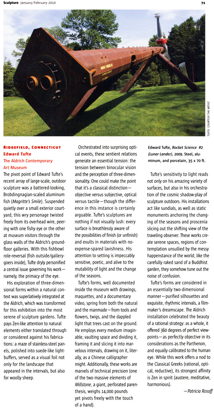
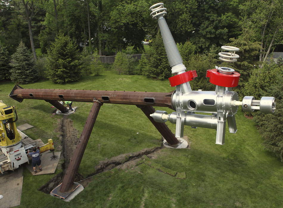
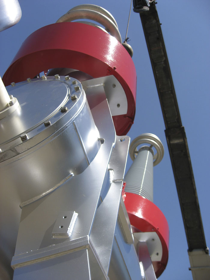
Rocket Science #2 (Lunar Lander)
We recently installed my new sculpture
Rocket Science #2 (Lunar Lander) at the Aldrich Contemporary Art Museum in Ridgefield, Connecticut in preparation for my show,
Seeing Around, June 13, 2009 to January 17, 2010. The piece is in the style of Home-Brew High Industrial Fruitcake. It is 70 feet or 21 meters long, and 35 feet or 11 meters high. The installation was carried out by my staff and by United Concrete (Yalesville, CT), who also constructed the piece.
Below,
Rocket Science #2 (Lunar Lander) during construction and installation.


This video is also available on
YouTube and
Vimeo
