Time-series that move through XY space
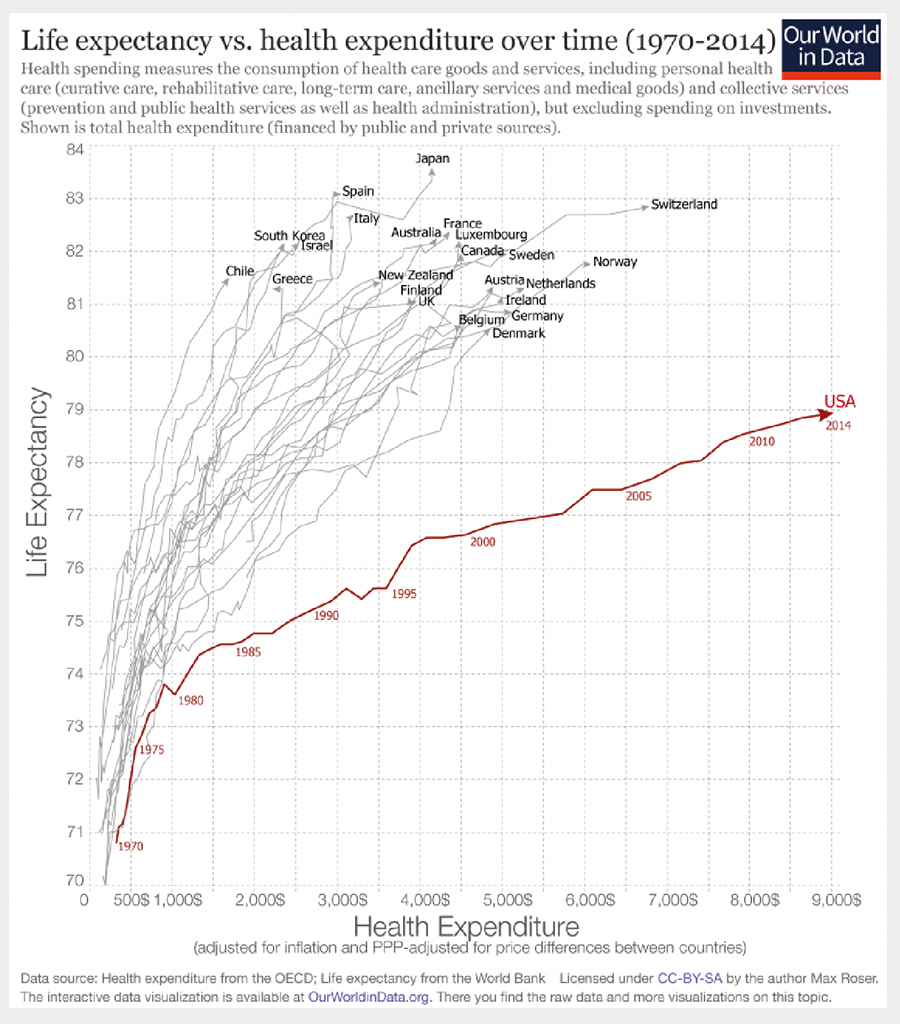
Here are time paths (1970-2014) for 19 countries in XY space of health care expenditures and life expectancy. Toward the upper left are countries that have long life expectancies and comparatively lower health care expenditures for 45 years.
In contrast, toward the lower right, is the path for the United States with greatest expenditures and shortest life expectancy of the 19 countries, a large outlier path suggesting inefficiencies in US healthcare expenditures.
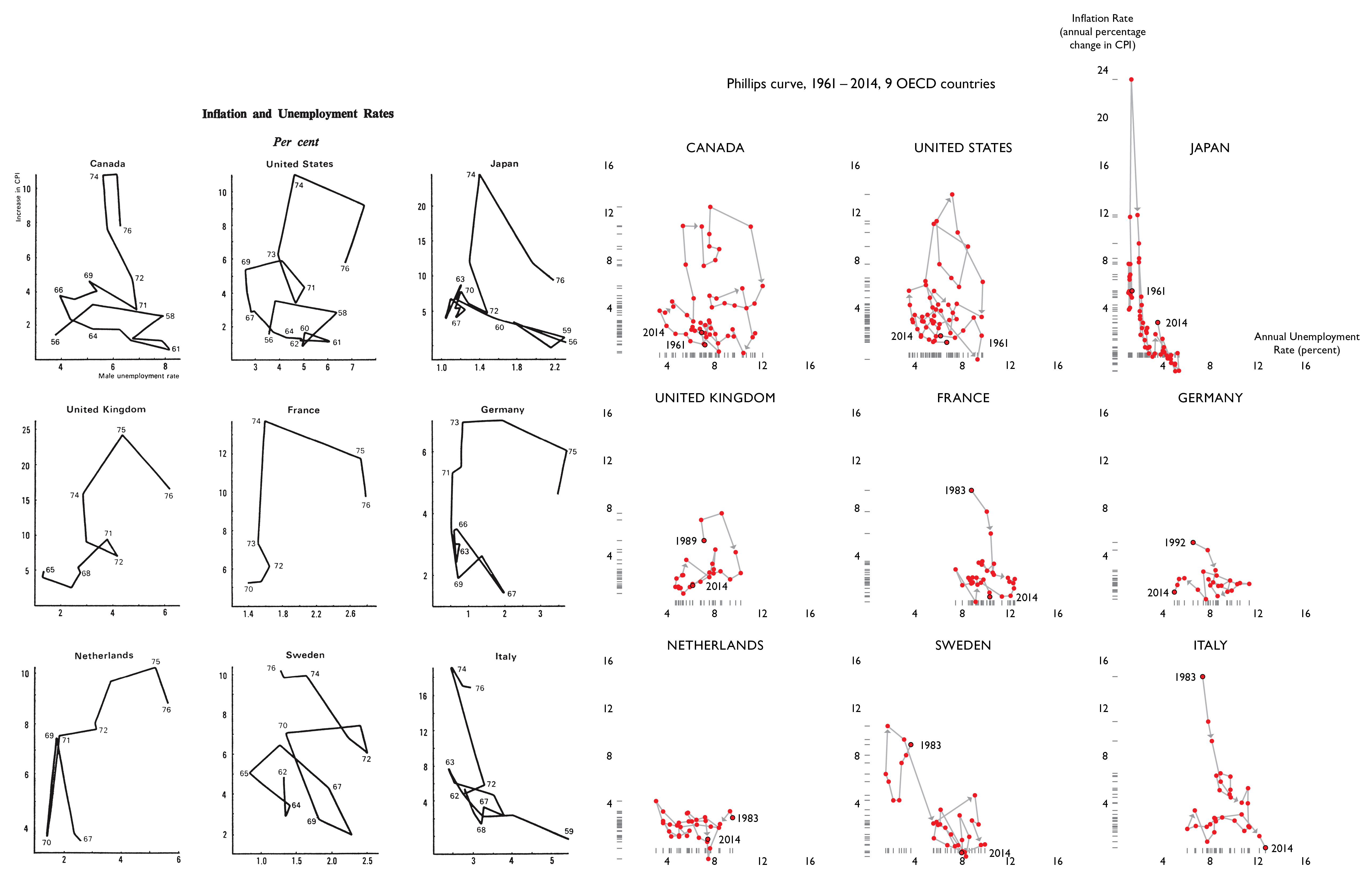
The Visual Display of Quantitative Information presents a small multiple for 9 OECD countries of their time-paths moving through a 2-dimensional space of inflation by unemployment.
This design locates changes in time in a more interesting space than the routine time-series of simply Y against time.
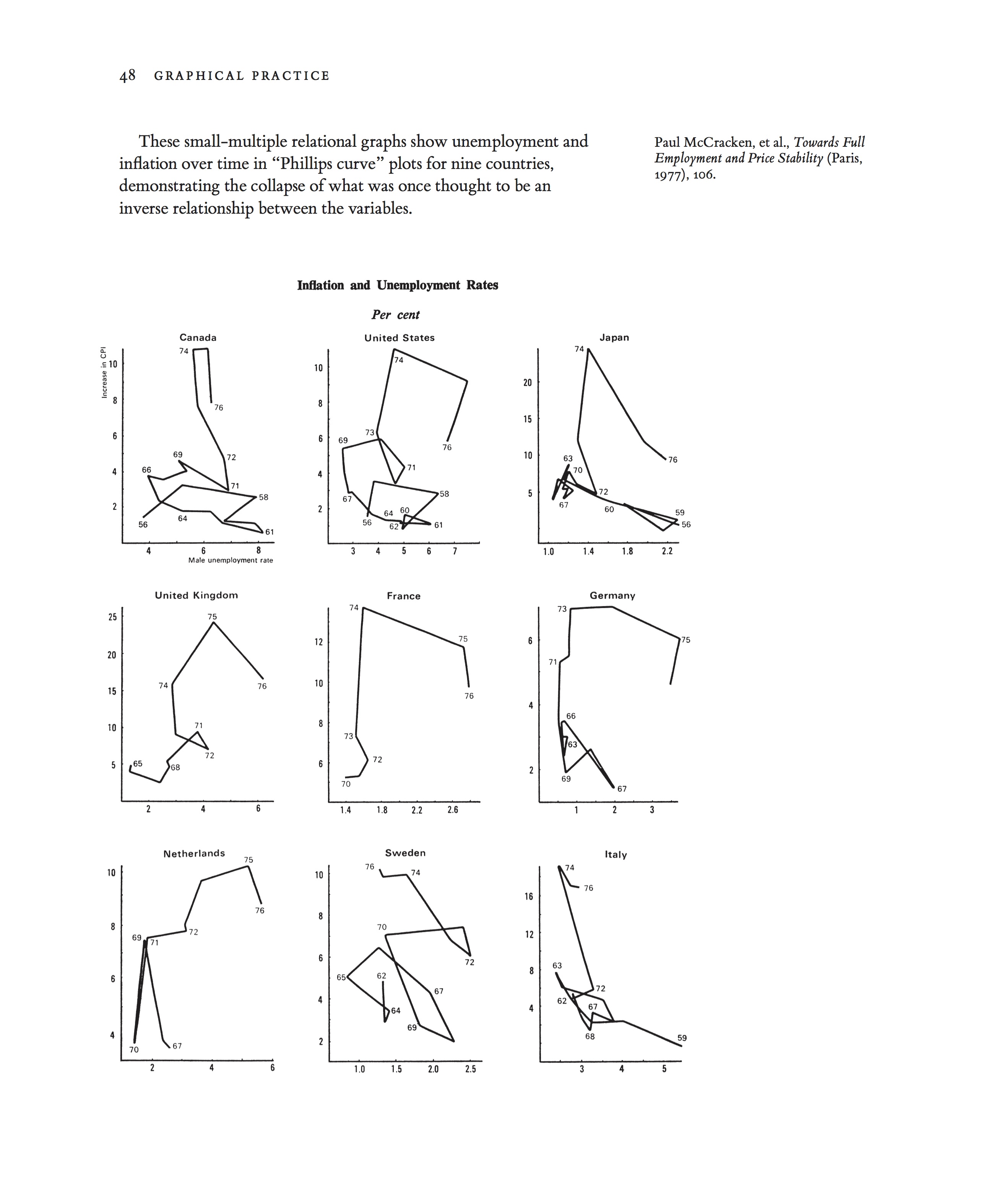
Source: VDQI, p. 48
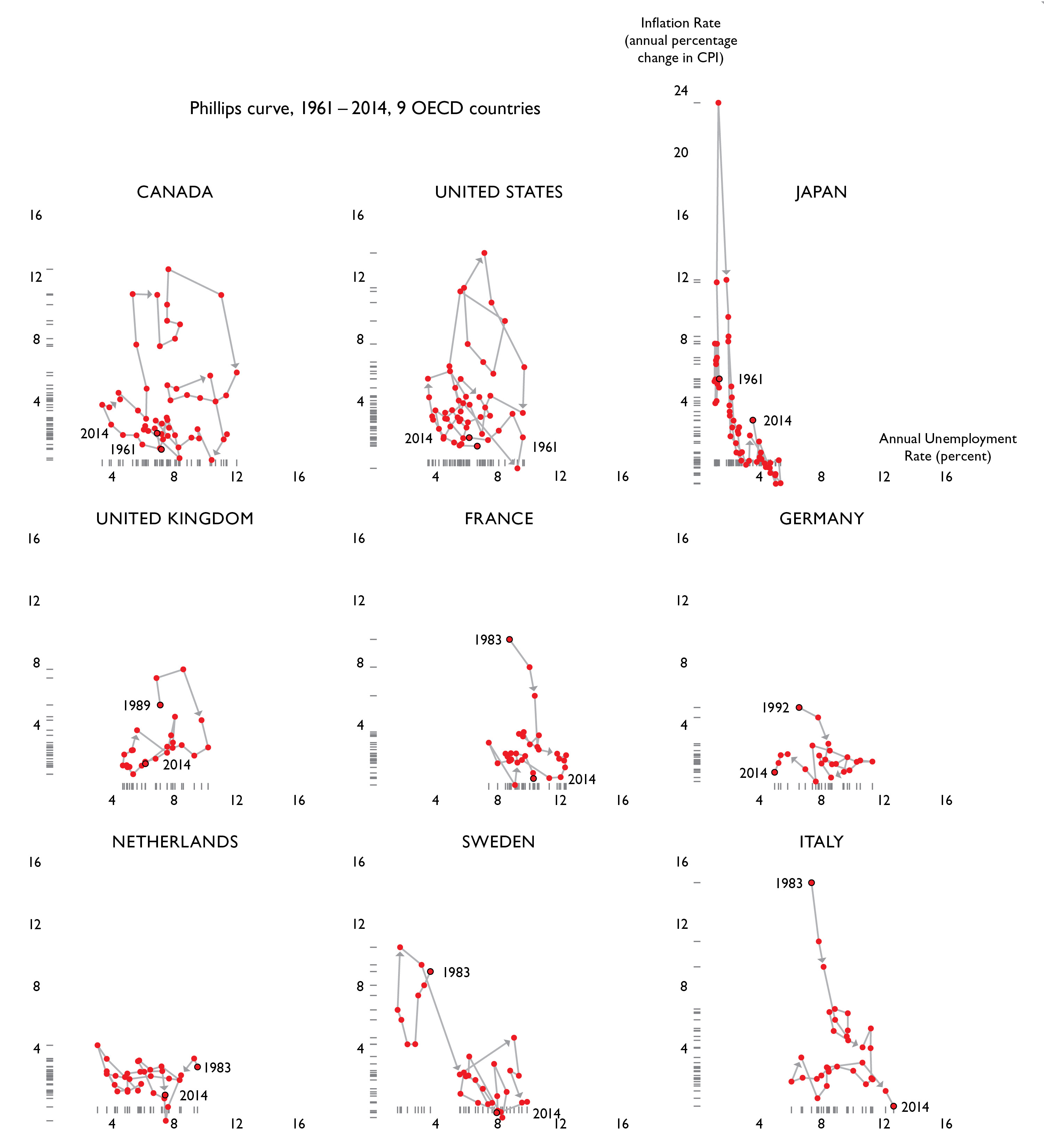
With only ten years of data for a single country, there appears to be an inverse relationship between the inflation rate and the annual unemployment rate. When over four more decades of data points added to the small multiple presented in the The Visual Display of Quantitative Information, we see this supposed correlation collapse even further. Rather than a series of neat curves, we see a tangled mess for each country.
Displaying all years for which internationally-comparable datasets are available. Sources: OECD, https://data.oecd.org; World Bank, http://data.worldbank.org.
Unemployment rate is defined as the annual average of percentage of labor force that is unemployed, where the “unemployed” are defined as people of working age who are without work, are available for work, and have taken specific steps to find work. This definition allows for more accurate international comparisons.
Inflation is measured by the percentage changes in the prices of goods and services that households consume (consumer price index, or CPI). Even though they measure only consumer inflation, CPIs are commonly used as a proxy for the general rate of inflation.
Recently Benjamin Morris of fivethirtyeight did a fine display of Stephen Curry’s path of 7 seasons through an intriguing basketball space – successful shooting % against attempted shots per 100 possessions. His season-by-season progress moves toward the upper right corner, the area of more shots and greater accuracy. If you make the shots, you are not taking too many.
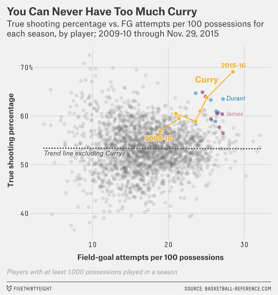
Source: Stephen Curry Is The Revolution


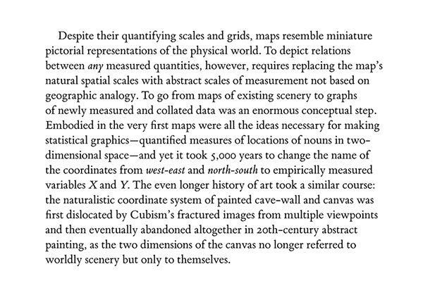
Maps, of course, show all sorts of time-dependent events (weather maps, for example) in Earth’s latitude by longitude two-space. But the big historic step in data graphics was to move beyond representing natural physical spaces to abstract spaces (such as inflation by unemployment), a change that took thousands of years. From my Visual Explanations, p. 14-15:
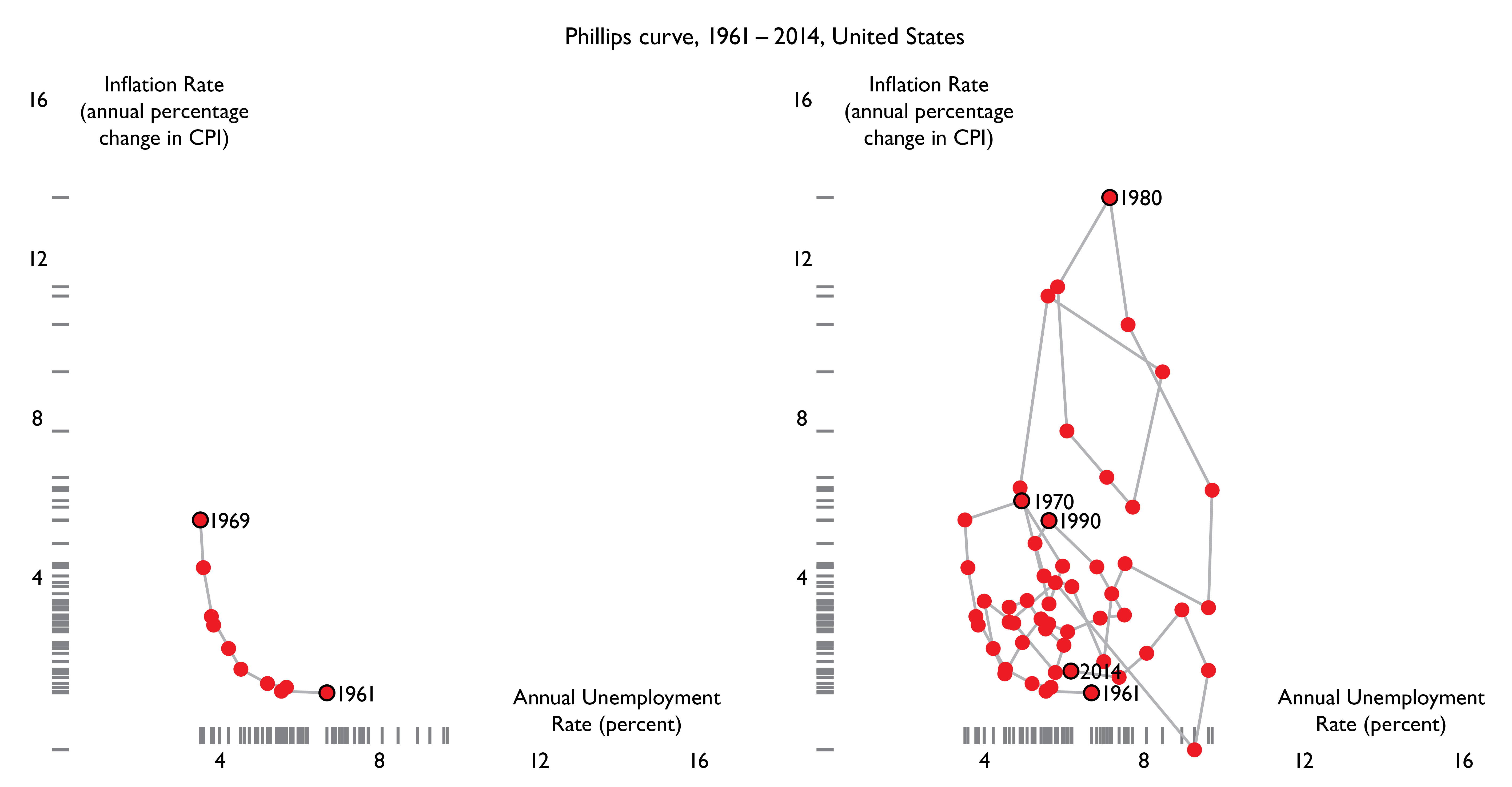
For the United States, 1961 to 1969, there was an apparent inflation/unemployment trade-off between inflation and unemployment – as inflation declined, unemployment increased.
This immaculate curve for 1961-1969, a 2-dimensional path, was swamped by the next 45 years of data, a period with several large economic shocks. No obvious trade-offs are seen for 1970-2014:

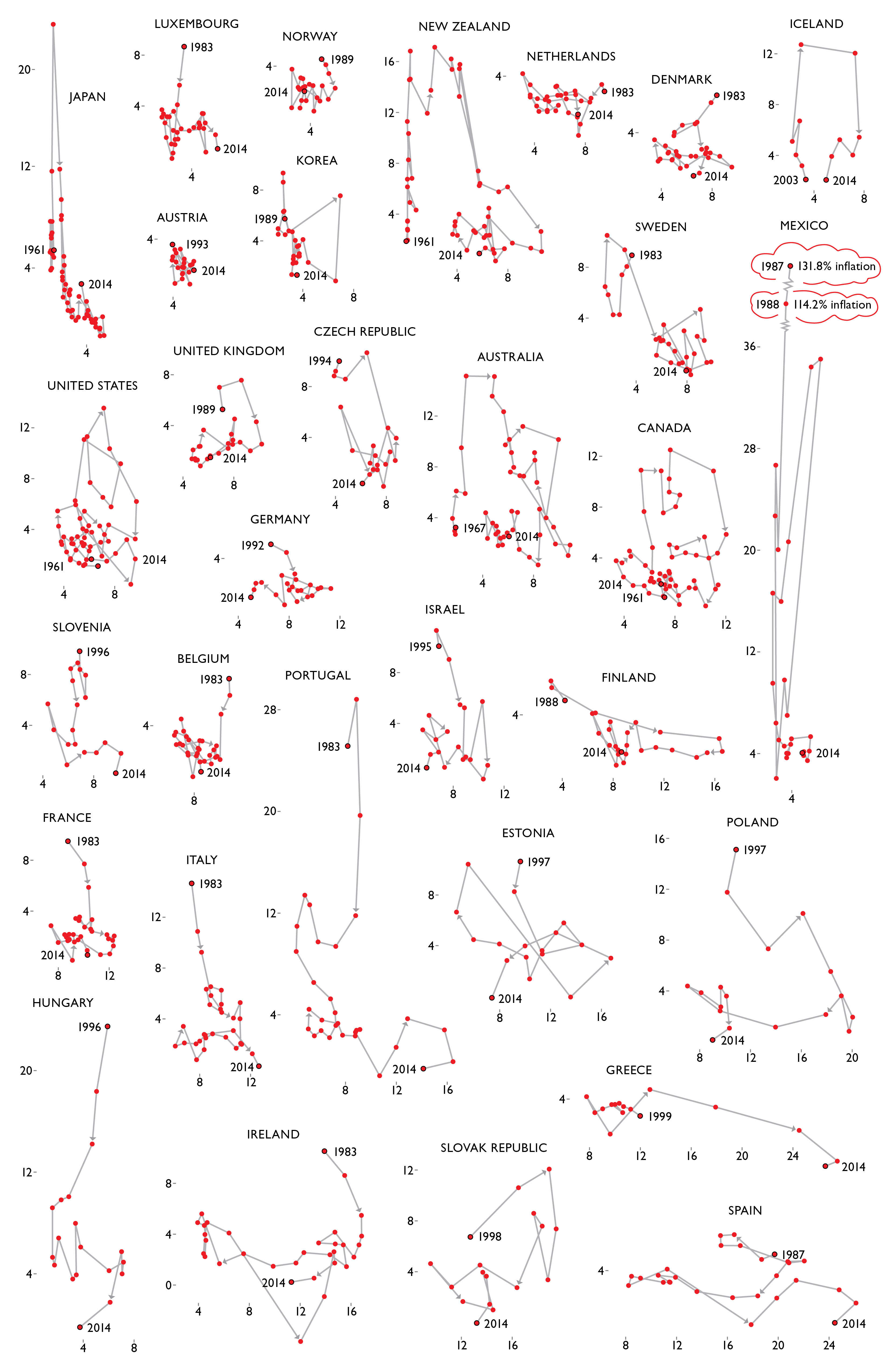
This small multiple below shows time paths in inflation/unemployment space for 31 countries for up to 54 years. Countries are ordered by a “misery index” = sum over all years of inflation + unemployment percents for each country.
The information design strategy:
once you have an interesting plot, small-multiply it, in effect making a data element of each plot.
What we have learned from these comparisons:
economic matters are more complicated than U.S. Phillips Curve early returns suggested.
More generally:
the study of human behavior is not rocket science, it is harder than rocket science.


