|
All 5 books, Edward Tufte paperback $180
All 5 clothbound books, autographed by ET $280
Visual Display of Quantitative Information
Envisioning Information
Visual Explanations
Beautiful Evidence
Seeing With Fresh Eyes
catalog + shopping cart
|
Edward Tufte e-books Immediate download to any computer: Visual and Statistical Thinking $5
The Cognitive Style of Powerpoint $5
Seeing Around + Feynman Diagrams $5
Data Analysis for Politics and Policy $9
catalog + shopping cart
New ET Book
Seeing with Fresh Eyes:
catalog + shopping cart
Meaning, Space, Data, Truth |
Analyzing/Presenting Data/Information All 5 books + 4-hour ET online video course, keyed to the 5 books. |


I'm curious about the font used for the jacket of "Visual Explanations" and here on your website. What's it called, who designed it and can I get a copy?
Thanks, a loyal fan.
-- Aaron Swartz (email)
The display font is Gill Sans, a classic and elegant sans serif font. Gill designed several excellent fonts, which are widely available. In addition to the display font at this website, I use Gill sans a few places in Enivisioning Information and in Visual Explantions.
-- Edward Tufte
Gill Sans is available from many sources. Monotype Company sells it through Adobe at adobe.com and also through the Font Shop (fontshop.com)
-- Glenn Nevill (email)
Gill Sans is also available in a high quality digitisation from Bitstream as the "Humanist 521" family.
-- Toby Thain (email)
Serif vs. Sans Serif
We have been having a debt at my work about which font to use (serif or sans serif) for large blocks of text. I believe a serif (garamond, for example) would be great to use, but others disagree with me.
I'm hoping to get a response from Mr. Tufte, but will take any other suggestions.
Thanks, Erin
-- Erin C (email)
Traditionally serif fonts are used for large blocks of text, but there's some question about whether the serifs are inherently helpful in and of themselves, or whether we recognize serif letterforms more quickly simply because that's just what we are all used to. In my view it doesn't really matter why we recognize them more quickly, but we do.
A typeface should help reinforce the meaning of the text. A typeface sets a tone. It would be as inappropriate to set an apocalyptic science-fiction novel in a Renaissance typeface as it would be to set the Bible in a geometric sans serif.
-- Aaron Priven (email)
Aaron Priven remarks that use of sans serif fonts for religious text would be considered inappropriate. A view I wholeheartedly agree with. However, the United Bible Societies do not. Their 4th edition of the Greek New Testament is printed in a hideous sans serif font. Could they make it worse? Yes, they did --- they printed the body text in italic!! They also made it bold italic sans serif with the glyphs so heavy that it is impossible to use unless you possess 20/20 vision and an megawatt search light.
Until UBS produces a 5th edition in a sensible font I'll make do with my ancient edition originally published by BFBS in the 1950s. There's a huge amount of information crammed on the page but it remains legible to those of us with less than normal vision and in less than perfect lighting despite the page size being smaller than UBS4.
-- Trevor Jenkins (email)
Note though that slab serif (aka Egyptian) fonts are never used for body text; they were intended as display faces and work best used as such. On a screen, where your resolution may be as low as 72 DPI and seldom exceeds 120 DPI, serifs cannot be as fine as they are designed to be; all serif fonts become slab serifs at body text sizes. You can overcome this heaviness in the serifs to some extent by adding extra leading, setting type at larger sizes, and using a serif font designed to cope with the poor display conditions (in other words, intended as a slab serif that's legible at body text sizes). I know of two such faces - Bitstream Vera Serif and Georgia. The former is open source, the latter is widely distributed. At small sizes on screens though, legibility is better served by sticking to a sans-serif font designed for screen use, such as Bitstream Vera Sans or Verdana.
-- viveka (email)
Another religious text in Gill Sans is the Church of England's "Common Worship" from 2000: http://www.cofe.anglican.org/worship/liturgy/commonworship/introduction/
It uses several weights and colours to show how the liturgy should be used. It was designed by the legendary Derek Birdsall.
Details of how Birdsall designed the texts are given in his book "Notes on Book Design" http://www.amazon.co.uk/exec/obidos/ASIN/0300103476/202-8193841-3339851
-- Adam Creen (email)
Some links to sample pages please.
-- ET
What's your font? 2
I would like to know what is the name of the font you used for the schedule of your one day seminar and how can I get it? I took it last 2/28/06 in Boston. Thanks. NP
-- Nico Pirez (email)
Gill Sans. That's also what we use for the navigation bar and titles on the frontpage. Gill Sans seems to be a built-in typeface in the Mac OSX operating system. The font is surely available elsewhere.
-- Edward Tufte
I just attended the one-day seminar in Crystal City, Virginia, it was amazing. There is so much to learn here, I know I'll be going over the books and my notes for a long time to come. I haven't yet found the answer to this question, though, which is why I'm writing in. I have a question about what font to use on a website and whether it should be serif or sans serif, or what kind of mix to use. I notice that on this website you mix Arial and Helvetica with Times and Times New Roman, using the serif font for most of the text. Could you please explain the thinking behind the mix of fonts, why one is used over the other, and where and in what context it's best to use one over the other? I would really appreciate your thoughts on this, E.T. Thank you for the great, stimulating and information-packed seminar.
-- Rich C (email)
About the only real design typographic choice made in the site design was the use of Gill Sans as our display font. As I recall, on the text font I was presented with one serif and one sans-serif web font and so I let it go at that. My view was just make a competent workaday web design and that the content would make or break the site.
In general, I like to see as much design as possible as a solved problem and then get on with the content issues and the substantive analysis. Thus, for the books, I have pretty much stayed with the typography and grid (modestly revised) of the first book (that Howard Gralla and I did together) for the next 3 books.
The page layout of images and text does shift from spread to spread depending upon the content. That is the real design work in the books for me.
In general, I use Gill Sans and ETBembo for everything in print; those typefaces are beautiful and work for my purposes. There is no content-need to develop new typographic styles for my work. There are too many substantive matters to think about and thus I want to limit the number of design decisions. Thus I try not to re-open solved typographic designs.
-- Edward Tufte
Most people, including me, think Gill Sans is one superb typeface. In a well crafted essay, with a nice reading of the history of the face, Ben Archer provides a contrary view. At www.typographi.com and www.typotheque.com/articles/re-evaluation_of_gill_sans/ .
-- Steve Sprague (email)
The available weights of Gill Sans are problematic: GS light is overly light, and GS Bold is very chubby. A medium bold would be helpful.
The commentary on Gill Sans mentioned in the contribution above is largely that Gill changed Johnston's designs. So what? The changes seem to me at least overall neutral in their effects and possibly favoring Gill Sans.
Then the commentator turns to designer theorizing and personal attack: "Gill Sans achieved its pre-eminence because of the mighty marketing clout of the Monotype Corporation and the self-serving iconoclasm of its author."
-- Edward Tufte
An account of the making of Common Worship
John Morgan studio published an account of the making of Common Worship, which contains many sample pages. This case study may also interest book designers. "In the designers' minds it was always going to be Gill Sans."
http://www.morganstudio.co.uk/2003/01/an_account_of_t.html
-- Jason Catena (email)
I have a question and I need advice from experienced book designers. What is your opinion of mixing fonts in a book, i.e. using a serif font for the text and using a sans serif font for all of the subheads, chapters heads, pullout quotes, etc. Is there a standard rule here? Any advice you have for me would be appreciated. Thank you!
-- Janet Schwind (email)
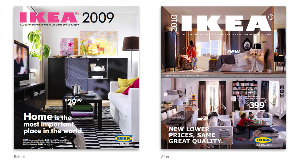
Ikea switches from Futura to Verdana
The comparative images below are taken from Skylar's excellent post on the idsgn blog describing Ikea's recent (and regrettable) decision to switch their catalogue font from Futura to Verdana. For the whole discussion, complete with more comparative images, go here:
http://www.idsgn.org/posts/ikea-says-goodbye-to-futura/
Unsurprisingly, this switch in the world's third most-printed publication received a good deal of attention on the web. Alas, very few of those descriptions provide the reader with adequate visuals. I first came across the story in the online version of the Observer/Guardian, which misleadingly illustrates the story with an image of a worker adjusting the logo on an Ikea storefront.
http://www.guardian.co.uk/artanddesign/2009/sep/02/ikea-verdana-font
To make matters worse, the author of the Observer article makes the unpardonable claim that movable type originated with Gutenberg. One can only hope that his forthcoming "book about type design" will give due credit to China (for the invention of type in wood and porcelain) and Korea (for metal type).
-- Graham Larkin (email)
Fans of Gill Sans and of Edward Johnston's font for the London Underground might want to look at the London Underground font: http://www.p22.com/products/london.html
-- G. Young (email)
Dear ET,
The Internet Archive is an unexpectedly rich source of good quality scans of old books. For example, whilst looking for visual examples of a boustrophedon I found a reference to the following book on Wikipedia along with a low resolution scan.
Digging in to the Internet archive I found exactly what I was looking for at pretty high resolution - a stone rubbing of the Forum inscription taken from the Epigraphy to John Edwin Sandys A Companion to Latin Studies. Cambridge University Press, 1913; p. 732, plate 107. This, in turn, credits Domenico Comparetti (1835-1927), Iscrizione arcaica del Foro Romano, Firenze, 1900. The full book is available (https://archive.org/stream/companiontolatin00sand#page/732/mode/1up.
Best wishes
Matt
-- Matt R (email)
|
||||||