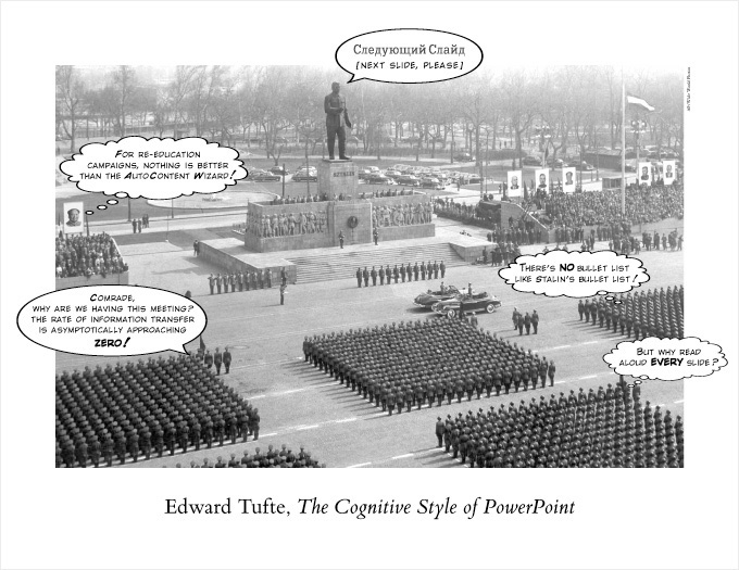
Posters & Graph Paper
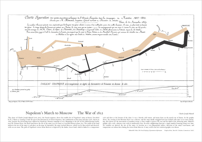
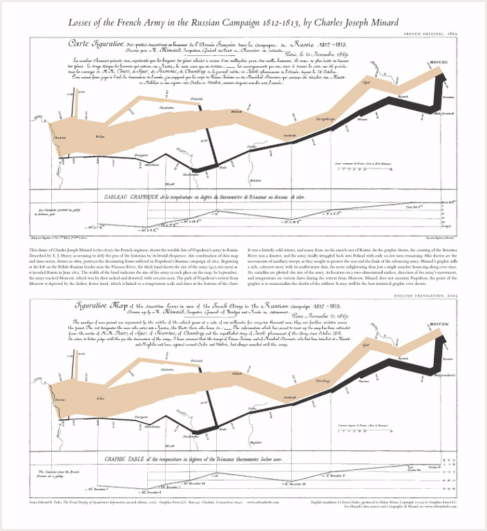
Napoleon’s March – French and English Translation
Charles Joseph Minard
French & English Translation
20.5" x 22.4"
$22.00
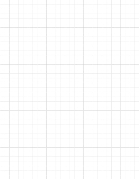
Graph Paper 1/4″-1/2″ Combination Grid
Letter: 8.5" x 11"
1/4"-1/2" Combination Grid
Qty: 2 Pads (48 sheets per pad)
$10.00