|
All 5 books, Edward Tufte paperback $180
All 5 clothbound books, autographed by ET $280
Visual Display of Quantitative Information
Envisioning Information
Visual Explanations
Beautiful Evidence
Seeing With Fresh Eyes
catalog + shopping cart
|
Edward Tufte e-books Immediate download to any computer: Visual and Statistical Thinking $5
The Cognitive Style of Powerpoint $5
Seeing Around + Feynman Diagrams $5
Data Analysis for Politics and Policy $9
catalog + shopping cart
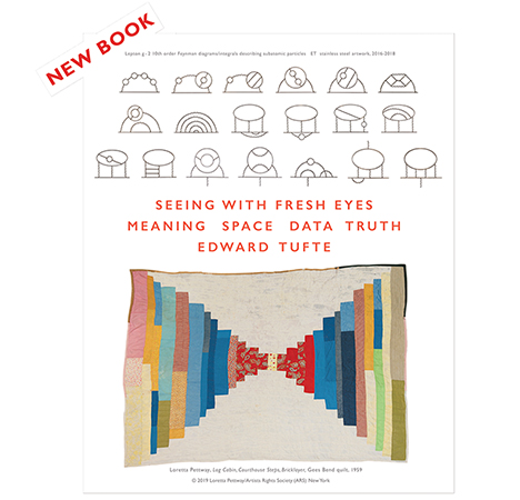
New ET Book
Seeing with Fresh Eyes:
catalog + shopping cart
Meaning, Space, Data, Truth |
Analyzing/Presenting Data/Information All 5 books + 4-hour ET online video course, keyed to the 5 books. |
I attended (and thoroughly enjoyed) your course in San Francisco a few weeks ago. You talked about color choice for computer displays, and recommend reducing glare by picking a black background, as this is less stressful to look at for long periods. You showed a web site or two with this kind of color scheme.
I can't help noticing that your own web site does not follow this approach. Not that I dislike the color theme you selected for the site -- a similar background color to the cover and paper used in the books, red highlights and link color for separation, and a decent sized serif font (Times Roman or equivalent) for easy reading. I just don't know much about color selection and wondered why you made your choice vs. a dark or black background.
Mathew
-- Mathew Lodge (email)
It is worthwhile to consider lighter type on darker backgrounds, and it works for seti@home and for the Music Animation Machine. But my metaphor here is paper, like a book. If reproduced on a dark background, my images (which are generally very light in value) would come blaring and glaring out of the dark surround.
Light backgrounds produce video glare. So turn the screen brightness at night and after working many hours at the computer. It is often useful to dull down the electric-blue white of the computer screen with a soft background tone, as done here.
-- Edward Tufte
One thing to consider is adjusting the color balance of the display to more closely match the quality of light in the surrounding environment. To neutralize the average monitor (~9600˚K) requires using software that can adjust the RGB values individually, at the system level, so that there is a uniform appearance regardless of what application is being used. http://www.bergdesign.com/supercal/ Once that intense cyan cast is removed the degree of eyestrain is somewhat lessened. Decreasing monitor brightness and more closely matching ambient light intensity to the screen helps also. For what it's worth here is my arrangement at work: Apple 22" Cinema displays, both dialed down considerably in brightness, roughly to 70%. The desktop pattern is set to a solid 40% grey and the viewing angle is about 60˚ (when sitting up) at a distance of 30-36". The screen res is 1600 x1024 in 24 bit color and the system font is 18 pt. Palatino. The default color for Navigator (Mozilla's new browser) is an 80% light grey , very similar in value to ET's site. The ambient light in the roon is a mix of 5000˚K flourescent from a viewing booth, northern skylight, and HQ incandescent floods. The intensity of the light at screen level is such that a piece of white paper appears about the same value as a blank page in Navigator. This makes eye strain almost non-existent and helps a great deal when work at the monitor extends over long periods of time.
David/sf
-- David Bishop (email)
In addition to mimicing ever present print material, the use of light backgrounds with dark type offers a sense of improved screen resolution, because the light background intrudes visually onto the dark lines. They seem to be narrower than they actually are. The bright background also provides a higher level of illumination that results in a smaller eye pupil and reduced aberrations.
In contrast, light type on dark backgrounds often tends to "bloom" or appear fuzzy.
-- Phil Lawless (email)
Another consideration is cultural rather than technical. A huge majority of the sites I see with black backgrounds are porn sites.
-- Bruce Holder (email)
|
|||||||||||

