|
All 5 books, Edward Tufte paperback $180
All 5 clothbound books, autographed by ET $280
Visual Display of Quantitative Information
Envisioning Information
Visual Explanations
Beautiful Evidence
Seeing With Fresh Eyes
catalog + shopping cart
|
Edward Tufte e-books Immediate download to any computer: Visual and Statistical Thinking $5
The Cognitive Style of Powerpoint $5
Seeing Around + Feynman Diagrams $5
Data Analysis for Politics and Policy $9
catalog + shopping cart
New ET Book
Seeing with Fresh Eyes:
catalog + shopping cart
Meaning, Space, Data, Truth |
Analyzing/Presenting Data/Information All 5 books + 4-hour ET online video course, keyed to the 5 books. |


A chart offered by the California Highway Patrol to show automobile stopping distance at various speeds seems to miss the whole point by not showing the various MPH distance relationships in scale to each other. Careful reading informs that the total reaction distance at 60mph is greater than the total stopping distance at 30 mph. This information, however, can not be "seen" on the chart. What could be done to display the real message of these distance numbers within the constraints of the web page?
-- Bruce Foutch (email)
I think the simplest, but most effective, way to improve this chart is to just get rid of that total stopping distance bar, and just leave the numbers where they are. Then you can compare the lengths of the bars in between.
I am amazed at how badly that total stopping distance bar distorts the total chart. Not only does it take away any ability to compare the interior bar segments, but it doubles the differences between the bars and causes them to be greatly exaggerated.
-- Mark Bigelow (email)
There's a "credibility gap" between the magnitudes of the numbers and the sizes of the bars and their components.
The "Brake Lag Distance" is in every case assigned a magnitude of "0" although the size of the "0" bar varies from one case to the next. (The text states that the Brake Lag Distance "is generally not taken into consideration in determining stopping distances" anyway. Why graph it at all?) In general, the multicolored bars which compose each larger bar are not sized in accordance w/ their magnitudes. The "15 MPH" case has a larger bar for "33" than for "44", etc. etc.
Just let the bars be proportional to the corresponding numbers, and the graph will be fine. Or, better yet, refer to the text-only version of the same data. No ambiguity, cleaner presentation.
-- Mike Christenson (email)
Can some Kindly Contributors (1) find and post other presentations of stopping data and (2) do a nice table redesign of the CHP data?
-- Edward Tufte
Here are some better examples:
Example 1
Example 2
I like that these are simple and get the point across well.
-- Mark Bigelow (email)
First: here is what I think is a much more useful chart, because it gives distance for "real world speeds," http://a332.g.akamai.net/f/332/936/12h/www.edmunds.com/edweb/editorial/safety/photos/Smemmer_BrakingDistance.jpg
The CHP chart and examples 1 and 2 are really requirement standards and they don't don't give all the qualifications of the standards.
Worse, they don't cover California's basic maximum speed limit, i.e. 65 mph, nor the entire range of legal speeds within the State of California, i.e. up to 75 mph (where posted). Further, they don't include the de facto usual clear freeway speed 70-75, nor the speeds often reported in news account, e.g. "the pursuit involved speeds up to 95 mph". So beyond bad graphics, they are not very helpful within the context of driving on the highways of California.
-- J. D. McCuubbin (email)
Why bar charts? Use 2 smooth curves (for wet and dry pavement) of stopping distance by velocity to show the quadratic relationship. Is effective reaction time greater at night? If so, 4 curves for the 4 wet/dry and day/night combinations.
Or how about a cumulative curve, summed up from reaction time contribution and stopping contribution curves?
There is a very interesting and beautifully designed book I picked up at the Skip Barber Racing School at Lime Rock a while back: Carl Lopez and Danny Sullivan, Going Faster. It has excellent geometric diagrams of contact patches, weight distribution, brake and throttle, steering inputs, and the path through the curve ("trim the apex")--a nice dynamic multivariate problem. After reading the book, I really understood trailing throttle oversteer (or as Porsche drivers say "lift up and die"), and, although that insight didn't help when I later took an XK8 into the bushes, it sure explained things clearly after the fact. Maybe we should have a new thread on analytical designs for explaining race driving.
-- Edward Tufte
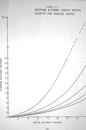
Curves seem to be favored for engineering purposes. Here for instance is the "Stopping Distance versus Initial Velocity for Various Slopes" for the Lunar Rover (full size, found on the fascinating Apollo 16 Final Lunar Surface Procedures). The labels for the slope lines seem to have been cut off at the left edge of the image. |
|
 |
|
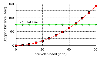
This example of the stopping curve is from a US National Highway Traffic Safety Administration analysis supporting a defect investigation. (NHTSA Report). The 75-foot line is the distance at which a Consumer's Union test simulates an obstacle. |
|
 |
|
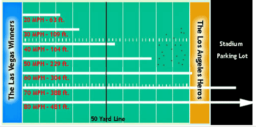
The charts aimed at the driving public all seem to favor bar charts displaying the cause, speed, along the vertical axis. This one from the SUV Internet Training Center uses a football field for the distance scale (SUV One). Because people are notoriously poor estimators of distance, another scale to consider is car length. The image on the web page is animated and illustrates the deceleration, but it also suffers from some unfortunate color choices. |
|
 |
|
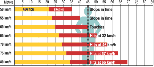
This chart from the Australian Transport Safety Bureau adds another key effect, the speed at which the car will strike an obstacle 45 meters down the road (ATSB). It has an unused range between 70 and 85 meters that could display higher (more realistic) speeds. In my evening of Googling speed/braking charts, this is the best "Public Service Announcement" chart I found. |
|
 |
|
-- David A. Nash (email)
Just wanted to thank you all for your responses and suggestions, and examples. I thought you all would like to see the reply I received from California CHP after I sent them an e-mail with a link to this thread. Kind of sad.
Date: Tue, 17 Jun 2003 09:31:13 -0700 From: "Public Affairs" <PublicAffairs@chp.ca.gov> To: bfoutch Subject: chart
Thank you for writing to our website. We are currently looking at the stopping distance chart you mentioned and we may take it off of our website. Thanks again for writing.
Office of Public Affairs
-- Bruce Foutch (email)
Several attempts to improve the braking distance graph show that it is relatively easy to correct and improve bad graphics.
However, the real problem is that the data is wrong. The simplistic underlying assumptions misrepresent the realities of vehicle braking.
Driver reaction and response times are large variables from driver to driver. So are expected vs unexpected events and vehicle response time as well.
Actual braking performance is a function of how well the vehicle uses available tire grip. A road surface friction coefficient of .70 us well below the Federal braking standard of .83.Road coefficients can vary from a high of 1.1 to as low as .20 for wet pavement. The rate of decelleration varies with braking technique, vehicle weight transfer, brake force bias, tire and road conditions.
The real braking story is not how much braking distance is required as a function of vehicle speed, but rather the wide range of actual stopping distances at any speed.
Real braking distance is a multivariate problem which cannot be reduced to simple driver reaction and vehicle stopping distance.
Nice clean, simple graphics, with all their clarity, mask the real problem which is: "in the real world, we cannot predict actual braking distances with any degree of accuracy." Graph this.
-- David Redszus (email)
It is foolish to publish stopping distances as they vary so much in life. Even assuming that the perfect driver in the perfect car can maintain consistancy, there are still loads of factors.
Road surface: Basic dry/smooth coefficient of friction of the material. Degrading of the above from surface damage (ripples, grooves, bumps, holes, protrusion above the surface)
Foreign material deposited thereon: Rain, oil, sand, rocks etc, evenly or unevenly dispersal. Shall we include heat, too?
Slope: We all know that you can stop quicker going up a hill than down. Don't forget the effect of the sideways slope, called camber, that is needed for drainage.
Car condition: Tires (groove depth & consistancy, size and aspect ratio, material & heat) Wheel aligment(both front & rear) Shocks (and other suspension parts), basic design, condition, etc.
Other: wind speed & direction, minor curving of road, and whatever I have overlooked.
Oh, As far as motorcycles, all is more critical.
Years of messing with and observing / participation in motorsporta and classic car hobby, as well as being a retired engineer and safety officer lead me to believe that it is doing a disservice to drivers to publish incorrect, though "erring on the safe side," figures. Once the drivers see test results or talk with folks like me, the "experts" have lost credibility. Maybe the drivers/ riders will be safer that way.
That's my five minutes
Creed for safety: "What could possibly go wrong?"
Karl
-- Karl (email)
It is quite true that each case is unique for stopping distances, but I suspect that many are looking due to traffic citations. Officers normally quote the stopping distance as a reason for why a given speed is unsafe, yet that is actually hearsay since they did not do the test and don't have the test information, including the vehicle type.
Personally what I would like to see is a chart of the stopping distance for several different types of vehicles, including RVs and trucks, which can be used to compare with a passenger vehicle. Also anti-lock brake vehicles should be compared.
While the results would be interesting, it would not mean much except to compare the vehicles since the skill of the driver comes into play.
-- Kemasa (email)
Can anyone provide automobile compared with heavy truck differences? I would really be interested in receiving that data for our community safety.
-- bill karch (email)
|
||||||